
Abstract
The primary goal of human factors is to create systems that can be easily used by their intended audience, while minimizing the number of mistakes that a user might make. However, sometimes human factors principles are applied in ways that makes a user’s task harder. Sometimes this is intentional, and the designer uses human factors as justification for creating an exclusionary design. In other cases, it is unintentional, and the application of human factors was done in a haphazard or incomplete way, with the resulting design at cross-purposes with the original intent. In either case, that’s bad human factors.
As human factors professionals, our goal is to create products, services, and systems that are easy to use and meet the needs of the user. Our whole profession is devoted to ensuring that people don’t make errors when they use well-designed systems, and that people can easily and safely interact with the systems that we design. Lately, however, I have noticed that sometimes good human factors principles are used, but they are used in bad ways to accomplish goals that are at cross-purposes with the actual users we are tasked with supporting.
Intentionally Bad Designs
For example, when building public seating spaces, designing a bus stop to accommodate user preferences for personal space is clearly a good application of human factors. However, a new design strategy known as “hostile architecture” (Savic & Savicic, 2014) has co-opted some of these good design principles and turned them into designs that restrict use for behaviors (or groups of people) that are considered undesirable. For example, this bus stop in Houston, Texas (Figure 1) looks like it was designed to accommodate a couple of people with good personal spacing, but the design is more likely to have been implemented to prevent people from lying down and sleeping on the bench (Carey, 2018; Starolis, 2020). The design goal should be “support public use,” and although we might disagree what appropriate public use is (de Fine Licht, 2017), it is a public space and we have designed it to exclude some of the public. The “shadow purpose” guides the design, while good human factors principles are suggested as the reason. That’s bad human factors.
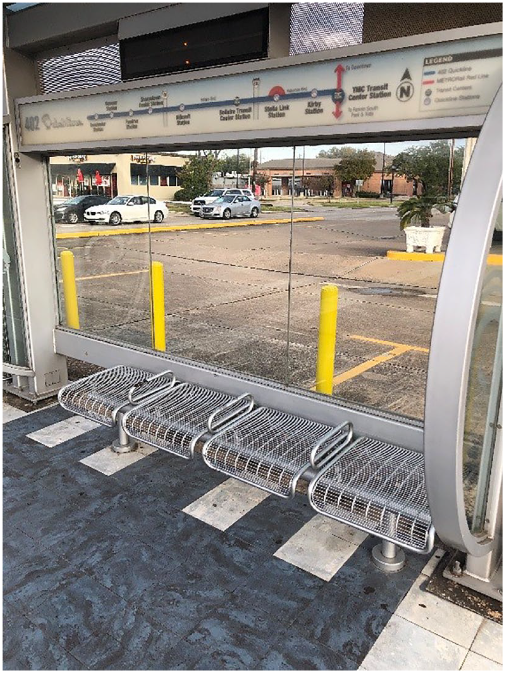
Bench at a bus stop in Houston, Texas that appears to employ “hostile architecture,” potentially under the guise of creating sufficient personal space for the riders.
Another classic example of this is the Texas law (State of Texas Penal Code, n.d.-a, n.d.-b) that specifies the parameters of the sign that must be displayed to prohibit people from bringing a weapon into your place of business, in either an open or concealed fashion.
The law specifies that the text must be at least 1 inch tall, which would be appropriate for good readability, and a good application of the human factors literature, if that was the law’s intent. It also states that the sign must be displayed in both English and Spanish, a reasonable accommodation given the demographic makeup of Texas. It further states that a separate sign must be displayed to prevent open carry and concealed carry, a design specification likely made to ensure that the reader gets explicit instructions regarding the prohibition. Again, it all seems perfectly in line with good human factors principles.
Given the verbosity of the required text (not a good application of human factors) and these other human factors–guided requirements, the resulting design may prove unwieldy for a business owner who does not want guns carried into their business and needs to display the sign, since these signs can take up a sizable portion of the available space in a business’ window, as seen in Figure 2. The sheer scale of the sign is illustrated by comparing it to the door to the left. Similar messaging requirements are not necessary if the business owner wants to enforce other Texas laws on their patrons (such as the prohibition of public lewdness or disorderly conduct), suggesting an intentionality to the design and required display regarding this law.
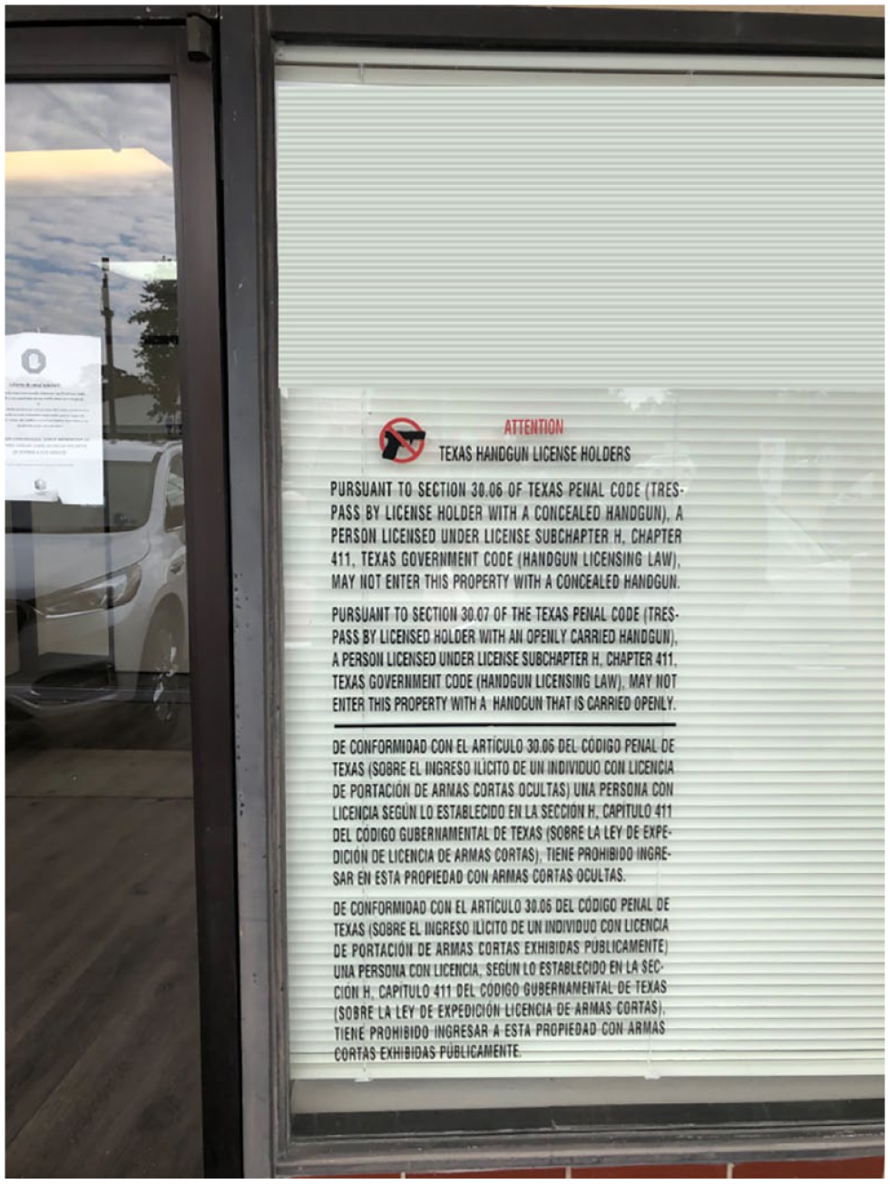
The required size of the sign to prohibit open/concealed gun carry in a business.
Of course, the combination of all these good human factors principles that are reflected in the design of this sign does not result in a warning that is easily understood and heeded by a potential patron. The longer and more complex a sign is, the less likely it is that users will adhere to the admonitions (Laughery & Wogalter, 2006). An obviously better solution would be the simple icon graphic shown in Figure 3. It is clear, concise, and conveys the intended meaning. Unfortunately, a business owner who displays this sign would not be able to enforce the prohibition, because the state mandated sign had not been used. That’s bad human factors.

A simpler, likely more effective no-guns-allowed sign.
Unintentionally Bad Designs
While these two examples suggest that human factors are sometimes intentionally applied in ways that result in bad designs, in other cases the badness is (perhaps) an inadvertent by-product of applying human factors in incomplete or haphazard ways.
For example, take the warning sign shown in Figure 4. We know that explicit warnings tend to be better than nonexplicit warnings (Wogalter, 1999), since they tell the user exactly what to expect. However, one has to ask if the school zone warning signs are really doing what the traffic engineers intended them to do. The sign is located just 25 yards away from the crossing zone to the school, and yet the sign conveys so much information that it requires the drivers to take their eyes off the road. The driver has to process this long and complex sign at precisely the moment they should be focusing their complete attention on the road, so they do not hit any children. That’s bad human factors.
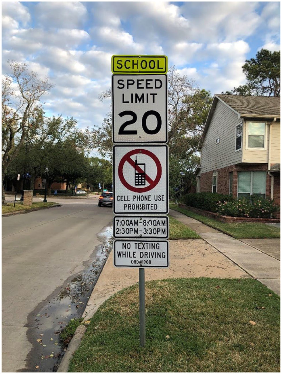
A traffic sign in a small Texas town. The explicitness of the sign comes at the cost of diverting the drivers’ attention at the moment they should be on the lookout for children.
Medicine bottles are another interesting human factors design. In Figure 5, the bottle shown on the left (A) has a child safety lid, which requires you to line up the two arrows and then exert a considerable amount of force in order to open the lid. This design, of course, is specifically engineered to keep young children out of the bottle, which is good human factors. However, try and open this bottle if you have arthritis. It is nearly impossible. Another manufacturer recognized that this was a problem and developed the bottle shown on the right (B), which has an easy-open arthritis lid. If you have arthritis, it is very easy to grasp and open this particular lid, but any 2-year-old can then do the same. If you are a grandparent with grandchildren visiting your house, you’re stuck between a rock and a hard place. You can either have the bottle of medicine you can open and use, or you can make it safe for your young grandchildren. The result is a design that does not work for anybody. That’s bad human factors.
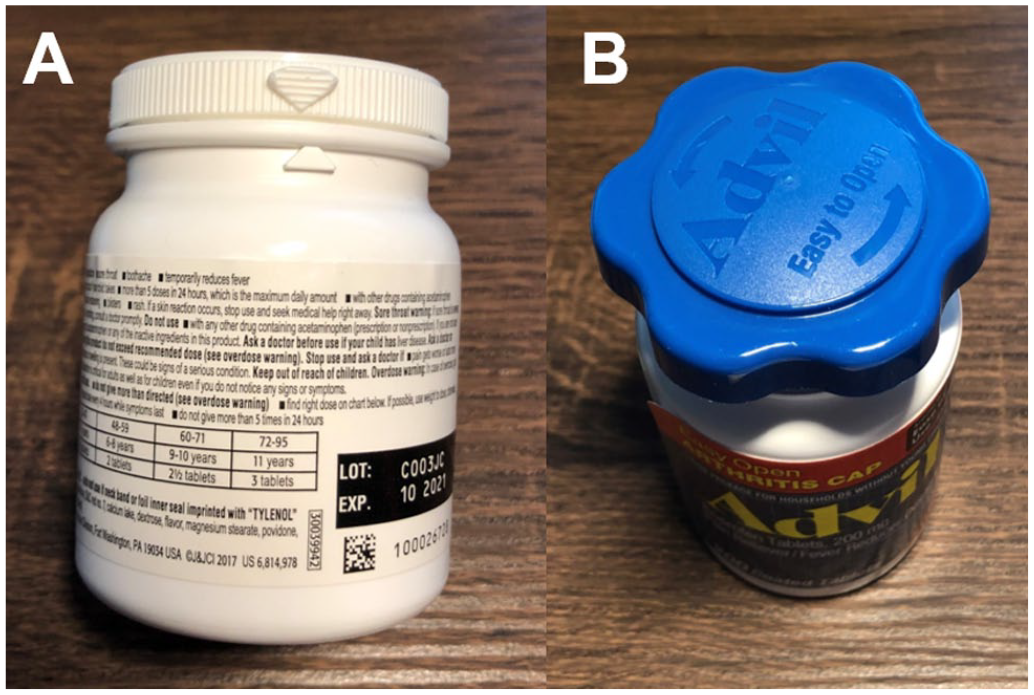
(A) The hard-to-use, but safe design or (B) the easy-to-use but unsafe design.
The example below is clearly a case of bad human factors happening because good design principles were only applied halfway. Figure 6 shows the new ramp built for people with disabilities at the Psychological Sciences building at Rice University. The university spent a lot of time and money reconfiguring the stairs, installing this ramp, and replacing all the surrounding sidewalks. You will note, however, that when they poured the sidewalk to get to the crosswalk, they left two steps in, even though it was completely rebuilt as part of this installation. That’s bad human factors.

Human factors done half-way. A new ramp and sidewalk, but you still cannot use the crosswalk if you are in a wheelchair.
Perhaps one of the most egregious (and consequential) examples of human factors being unintentionally bad comes from the punch card butterfly ballot used in the Palm Beach County presidential election in 2000. As can be seen in Figure 7, the presidential race was displayed in two columns. Using the heuristic that had worked in all the previous elections using butterfly ballots, many voters simply counted down the number of holes based on the position of the candidates on the left-hand side of the ballot. The result was that many people who likely intended to vote for Al Gore ended up instead voting for the Reform party candidate. Normally, candidates only appeared on the left-hand side of the ballot, but in this case, there was an exceptionally large number of candidates running for president, and the administrator who set up the ballot felt the text size was too small. She increased the text size, using known good human factors principles, to make the ballot easier to read for the elderly population (Wand et al., 2001). However, in doing so, the ballot had to be split across two columns, creating a debacle which changed the outcome of the presidential election in the United States (Wand et al., 2001). That’s bad human factors.
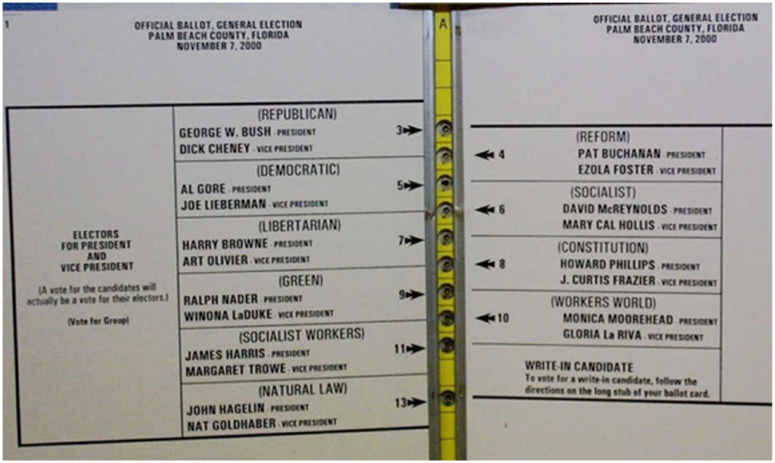
The butterfly ballot used in Palm Beach County in the 2000 presidential election. The increase in font size to improve readability forced a two-column design that has been blamed for Gore’s loss of the presidency.
Conclusion
Good human factors design should always be used to support the user. Using or applying these principles in ways that make the task harder, or force users to commit errors, goes against everything for which human factors stands. As a profession, we should push back against these kinds of uses and ensure the integrity of the principles we use to practice our craft. We should also strive to take an overarching system view, so that the applications of good human factors in one part of the design does not lead to badness in another part of the design.
As with so many things in human factors, much of our professional work has to be devoted to education. We have to convince people that the extra effort taken to make designs effective, usable, and safe, is worth the additional time, energy, and expense. Not only should we self-reflect on our own designs to make sure they are sufficient, we also have to make sure that we do not allow others to haphazardly (or intentionally) apply human factors principles in ways that result in less usable designs. Bad human factors is an oxymoron, and we should make sure that it stays that way.