
Abstract
This article reports on a multiphase study designed to understand how nonexpert users interact with COVID-19 data dashboards, particularly in terms of the dashboards’ actionability, or ability to support decision making. Analysis of the videos and transcriptions of user interviews shows the variable relevance of proposed criteria for dashboard actionability and suggests additional criteria for users’ emotional responses to data and for the presentation of data at degrees of personal and local granularity. These findings advance an understanding of how nonexpert audiences interact with and derive value from complex visualized data.
Amid the COVID-19 pandemic, people urgently needed clear, reliable, relevant information. Everyday activities such as working, going to school, shopping, and socializing presented unknown odds for contact with a potentially deadly virus; everyday decisions made by ordinary people across the world were potentially deadly choices. In an unprecedented global crisis characterized by uncertainty and fear, data and data visualization held a particular appeal. While data visualizations were widely used by experts to facilitate their analyses in all areas impacted by the pandemic, data visualizations also served to engage, inform, educate, persuade, model possible future outcomes, and perform other rhetorical functions for nonexpert audiences. Indeed, the pandemic provided a real-time test of public-facing data visualization. Given what Frith (2021) described as “an unprecedented public engagement with data” during the pandemic (p. 4), technical and professional communication (TPC) researchers have studied how different genres of data visualization—for instance, dashboards (Verhulsdonck & Shah, 2021), charts (Amidon et al., 2021; Lindgren, 2021), and maps (Bowe et al., 2020; Li, 2021)—and other forms of scientific and professional communication helped inform the public in a time of crisis.
The data dashboard, described by Wernimont (2021) as “the iconic interface through which we understand the coronavirus pandemic” (n.p.), was one of the most common genres of COVID-19 data visualization and communication. For experts, dashboards provided an overview of rates of spread and infection along with data necessary for risk assessment and decision making. But many dashboards were also designed for nonexperts: There were likely tens of thousands of data dashboards created during the pandemic, many of them made with commonly available tools, such as Tableau, Power BI, and Environmental Systems Research Institute, Inc (ESRI), and used by different localities, employers, agencies, and organizations to communicate information to residents and stakeholders. The prevalence of dashboards is understandable in that they addressed, for both experts and nonexperts, two of the most important exigencies during the pandemic: to monitor key developments in the spread of the virus and to have accurate, timely data on which to base decisions. Moreover, by visually and metaphorically invoking car dashboards, data dashboards presented to the general public a familiar interface in which users would expect to see critical, real-time information that they could monitor and act on as necessary. Navigating a situation with many crucial unknowns, people turned to data dashboards for information about the virus's reach and impact, locally and globally, over time, covering a range of its medical and nonmedical consequences.
How did nonexpert users interact with and make sense of COVID-19 data dashboards? How did they assess the value of these dashboards, particularly in terms of their actionability or ability to support decision making? Taking up these research questions, this article reports on a multiphase usability study with a small group of users interacting with county-level data presented on two COVID-19 dashboards. Following a survey designed to select a diverse group of participants who had some familiarity with data visualization, I conducted 30-minute interviews with 10 participants that were structured around seven criteria for actionable data. These criteria were proposed and developed by experts in the field of health care communication who assessed 158 dashboards, collaboratively and iteratively deriving the key ways in which dashboards support decision making (Ivanković et al., 2021). My analysis of the interviews showed that the seven criteria differed in their relevance for users, suggesting that it would be helpful to prioritize the actionability features of dashboards intended for a general audience. In addition, although Ivanković et al. specifically developed these actionability criteria for COVID-19 dashboards, this study suggests that the criteria did not capture the importance of users’ emotional responses to the data or their desire for data with personal and local granularity.
The study has implications for researchers not only in data visualization but also in risk communication, rhetorics of medicine and health, and user interface design in advancing an understanding of how nonexpert audiences interact with and derive value from complex visualized data. In their literature review of scholarship on data visualization in TPC, Melonçon and Warner (2017) identified a need for more empirical studies of nonexpert uses of data visualizations, particularly in health and medical settings, to determine effective practices (e.g., Peck et al., 2019). Yang (2020) noted that research on interactive data visualization in health and risk communication has been limited (see also Ancker et al., 2009; Yang, 2017), calling for more research in this area, specifically to understand how various types of interactive data visualization affect health and risk perceptions and behaviors (e.g., Richards & Jacobson, 2022).
As technical and professional communicators gain insight into what users find actionable, they will be better able to design dashboards and other data visualizations that enable users to understand the important trends and stories that experts see in the data. Drawing on information visualization research on different design approaches and measures of effectiveness for data visualizations that address everyday topics, as opposed to visualizations that are utilitarian and designed for data experts and analysts, technical and professional communicators can target a general audience (Hullman & Diakopoulos, 2011; Lupi, 2017; Pousman et al., 2007; Sorapure, 2019; Viégas & Wattenberg, 2007). Some researchers have focused specifically on empathy and other emotional appeals in data visualization (Campbell, 2018; Campbell & Offenhuber, 2019; Kennedy & Hill, 2018; Kostelnick, 2016). In addition, while research (Barbazza et al., 2021; Bos et al., 2021; Ivanković et al., 2021; Pöhler et al., 2021; Verhulsdonck & Shah, 2021) and commentary (Everts, 2020; Schott, 2020; Wernimont, 2021) on COVID-19 dashboards have been published, no studies have yet been published on how people actually used these dashboards to make informed decisions during the pandemic.
Dashboard Design
Pettit and Leao (2017) defined dashboards as “graphic user interfaces that comprise a combination of information and geographical visualisation methods for creating metrics, benchmarks, and indicators to assist in monitoring and decision-making” (p. 2). The dashboard was a ubiquitous format for data visualization prior to the pandemic. Sarikaya et al. (2018) noted that “they are built and employed by nearly every industry, non-profit, and service organization to support data-driven decision making” (p. 682). Few's (2006) definition specified that dashboards should present information “consolidated on a single screen” (p. 12); however, we see entities referred to as dashboards that are both very large (e.g., control rooms, in which the dashboard is spread across walls on multiple screens) and very small (e.g., dashboards with data visualizations presented across scrolling screens on mobile devices). Dashboards can be data portals for organizations and individuals, providing visualized, interactive access to “big data” as well as to personal data in apps in which people can monitor their finances, health, and other aspects of their personal lives (Schott, 2020). Extensive research has also been done on data dashboards for “smart cities”—that is, dashboards used by city governments to inform residents, enable them to monitor city services, and provide data that supports their decision making (Frith, 2017; Kitchin et al., 2015, 2016; Vornhagen et al., 2021; Young et al., 2021).
All data visualizations are rhetorical objects, the result of human choices about what data to create or select and how to present it to specific audiences (e.g., D'ignazio & Klein, 2020; Drucker, 2011; Hullman & Diakopoulos, 2011; Rosenberg, 2013). Dashboards in particular are developed with users and their objectives clearly in mind. Sarikaya et al. (2018) observed that “the visual and functional aspects of a dashboard typically reflect the intended audience, their domain and visualization experience, and their agency relationship with the data” (p. 683). For business dashboards, for instance, researchers described three different types related to the various goals of users: Strategic dashboards present indicators and interactive options that help users make decisions, operational dashboards facilitate monitoring and determining whether action needs to be taken, and analytic dashboards enable users to explore different scenarios (Eckerson, 2010; Few, 2006; Pappas & Whitman, 2011). In short, a user-centered design paradigm underlies the development of data dashboards (Pappas & Whitman, 2011), and as dashboards reach out to wider and more diverse audiences, their tailoring for users via customization, personalization, and adaptation is becoming a more common practice (Vázquez-Ingelmo et al., 2019).
Even the most extensive dashboards are selective in that they cannot present every aspect of the system or situation they monitor, and selections of both the data and their display are ideally determined by what will be most useful to the dashboard users. For example, on the physical dashboards in vehicles, the data displayed, the design of the display, and the interactive options available are all intended to address the driver's most important needs. “Crucially, this system of gauges, meters and indicators,” as Tkacz (2015) noted, “is radically reductive and partial. The information it conveys is entirely based on the needs and perceptual capacities of the driver. Dashboards tell us more about the act of driving than the operation of the engine” (p. 3). Dashboard designers select those aspects of the system that they determine are most important for users to know about, and they display these key indicators in a way that helps users achieve their objectives. These decisions about data and display are ideally made with user input and feedback (Pappas & Whitman, 2011). This focus on users aligns well with the lean methodology that Verhulsdonck and Shah (2021) described that orients dashboard developers and technical communicators toward data that help stakeholders take actions in response to specific situations.
COVID-19 Dashboards and Actionable Data
One of the challenges for COVID-19 dashboards in their orientation to users was that they were often developed for a broad audience with a wide range of concerns and questions about the pandemic. Users of COVID-19 dashboards also brought widely varying knowledge about the pandemic along with significantly different levels of data literacy and familiarity with interactive visualizations. In fact, two of the most frequently used dashboards for the global pandemic—the World Health Organization Coronavirus Dashboard (https://covid19.who.int/) and the global map at the Johns Hopkins University COVID-19 Dashboard (https://coronavirus.jhu.edu/map.html)—essentially addressed a global audience. Having such a broad and diverse target audience made it challenging for dashboard developers to reach the fundamental goal of understanding and designing for the needs and objectives of dashboard users. Developers were further constrained in presenting actionable data—that is, data that can inform decisions that users need to make—by the global scale of the data and the substantial differences, delays, and gaps in data reporting (Naudé & Vinuesa, 2021; Taylor, 2020; Wernimont, 2021). In addition, there were substantial limitations on the actions individuals could actually take during a global pandemic, regardless of how much data they could access (Schott, 2020).
As a result of these challenges and constraints, a proliferation of regional and local dashboards emerged to target more specific concerns that were beyond the reach of global dashboards. Some dashboards were designed to provide data about specific demographic groups, such as Black Americans (https://www.covidblack.org/) or federal prisoners (https://experience.arcgis.com/experience/ab22fb4c564e4f4b986e257c685190e8/). Other dashboards targeted specific aspects of the pandemic, such as government responses (https://www.bsg.ox.ac.uk/research/research-projects/covid-19-government-response-tracker) or vaccine equity, access, and affordability (https://data.undp.org/vaccine-equity/). Finally, many dashboards were framed as “trackers” that focused only on providing information and enabling monitoring rather than attempting to provide actionable data that would support data-driven decision making by users. The Centers for Disease Control, Johns Hopkins University, and Covid Act Now (CAN) all used the term “tracker” or “tracking” interchangeably with the term “dashboard” to describe their presentation of data.
Nevertheless, a repeated criticism of COVID-19 dashboards is that they failed to provide users with actionable metrics to support decision making. Wernimont (2021) argued that “COVID-19 dashboards are remarkably ill-suited to the complexities of our pandemic reality” precisely because they “share information but not in a way that allows ordinary people to take action” and “steer clear of trouble” (n.p.). Similarly, Brownlow (2020) argued that “we cannot take action with this data. If we wanted to use this data for a specific purpose, we would be lacking the necessary context around these numbers to make them useful.” That context would enable individual users to answer questions about both the data's validity and the data's relevance in providing meaningful indicators that might impact their decisions.
Researchers also found that COVID-19 dashboards often did not provide actionable data. Most notably, Barbazza et al. (2021) found that only 20 (13%) of the 153 dashboards they assessed were “highly actionable” and could effectively inform users’ decision making. Ivanković et al. (2021) developed the following criteria for an actionable dashboard (detailed in Appendix A) that have been applied by Barbazza et al. (2021) and Bos et al. (2021):
knowing the audience and their information needs managing the type, volume, and flow of information reporting data sources and methods clearly linking time trends to policy decisions providing data “close to home” breaking down the population to relevant subgroups using storytelling and visual cues
Although these criteria describe best practices for data dashboards, even those that are not primarily designed to support decision making, the criteria also underscore the fact that an abundance of information does not necessarily support users and that, rather, there needs to be a “fit” between the information, the user, and the purposes for which the information is being sought. Yigitbasioglu and Velcu (2012), Barbazza et al. (2021), and other researchers have explored the concepts of “fitness for purpose” and “fitness for use” in order to determine the appropriateness and effectiveness of dashboards’ data selection and display. Their insights track with Boiarsky's (2017) studies of risk communication genres that are more writer based than reader based.
Method
To learn more about how people used and assessed the value of COVID-19 data dashboards, especially in terms of their actionability, I solicited participants for an IRB-approved multiphase usability study (UCSB Protocol ID 10-21-0757). All participants were over the age of 18 and were current Santa Barbara County residents who were able to access the internet on a tablet, laptop, or desktop computer. 1 In Phase 1 of the study, I solicited participants via a post on Next Door Neighbor (http://nextdoor.com) and administered surveys via Google Forms. From the 54 survey participants, I selected 10 participants who indicated that they were available for a 30-minute interview, had a relatively homogenous level of familiarity with data dashboards, and “agreed” or “strongly agreed” that they understood “how to interpret data visualizations such as charts, graphs, and maps.” In addition, these 10 interviewees represented a demographic balance of participants for age, gender, race and ethnicity, and education level. I conducted and recorded the interviews via Zoom and transcribed the audio via Rev.com. I had the transcripts checked for accuracy.
In Phase 2 of the study, the 10 interviewees explored two data dashboards that presented information about the pandemic in Santa Barbara County, California: the Santa Barbara County Community (SBCC) Data Dashboard (https://sbcdashboard.org) and the Santa Barbara County page for the CAN U.S. COVID Risk and Vaccine Tracker (https://covidactnow.org/us/california-ca/county/santa_barbara_county). Both dashboards focus on county-level information and so are comparable in presenting data that is geographically relevant, fitting the actionability criterion of providing data that is “close to home.” The CAN dashboard presents national-level data but prompts users to explore city-level and county-level data in an early and prominent location on its home page. Both dashboards also explicitly state their aim of providing actionable data to support decisions that users need to make. The goal of the SBCC dashboard, created in a public–private partnership, is to give Santa Barbara County residents “access to trustworthy data to make data-driven decisions” and have “timely, accurate data presented in a way that is easy to navigate and understand, enabling residents to take collective action to address the pandemic” (Legacyworks, 2019). Similarly, the About Us page for CAN states that “accurate, accessible and actionable data is critical to help leaders and individuals make impactful decisions” (Covid Act Now, 2020). Moreover, Ivanković et al. (2021) included CAN as an exemplar for several of the seven actionability criteria they proposed.
For the developers of both dashboards, then, actionability was an explicit, important goal. But there are substantial differences in how these two dashboards and, by extension, other COVID-19 data dashboards attempted to provide actionable data. My goal in asking users to compare these dashboards was to develop insight into the relative success of different design strategies to achieve actionability. This goal aligns more broadly with technical and professional communicators’ interest in how the design of visual data displays impacts the delivery of information (e.g., Kostelnick, 2008; Melonçon & Warner, 2017; Yang, 2020).
The SBCC dashboard (see Figure 1) is comprehensive, with multiple modules or widgets on nine tabs related to the pandemic, an additional three tabs with other community data (Flu Report, Child Care, Community), and tabs linking to COVID-19 dashboards for California, the United States, and the world. The local COVID-19 tabs present thematic groupings (e.g., Vaccinations, Variance Surveillance, Health Care) with multiple indicators and different visualization types (line charts, bar charts, pie charts, gauges, and maps). The data visualizations have tabs and other interactive features enabling users to access more information; “info” tabs below every visualization define variables and provide source information for the data. There are also several multimedia features of the SBCC dashboard: a 4-minute video that provides “tips for viewing the dashboard” and a 4-minute embedded video in which local medical officials answer questions about virus spread, vaccination, and intervention measures. The entire dashboard is also available in Spanish with a single click on the top-right corner. It is created with ESRI software and hosted at an http://experience.arcgis.com URL.
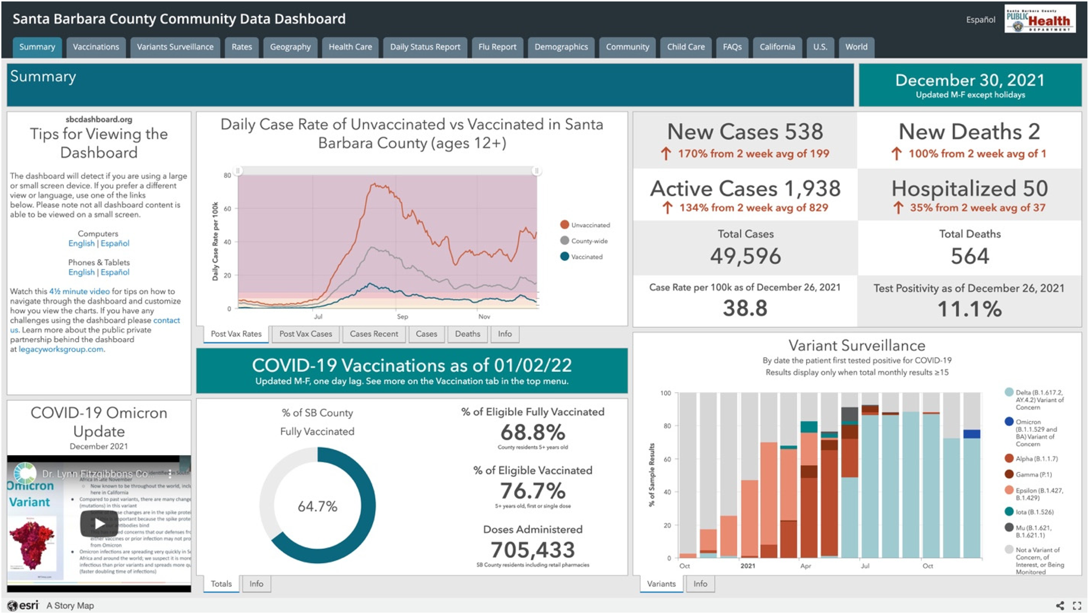
A screenshot of the Santa Barbara County Community Data Dashboard (see https://experience.arcgis.com/experience/030e625c69a04378b2756de161f82ef6).
The CAN dashboard (see Figure 2) is more selective in the themes and indicators it presents, with more explanatory text and visual simplifications via color coding to make the data accessible. The landing page (https://covidactnow.org) indicates CAN's national scope, with a map of the United States and options for state-level data on vaccination progress and risk levels appearing as users scroll down the page. Prior to scrolling to this national-level data, however, users are prompted to enter a city, county, state, or zip code in order to access more detailed local data. Like other county pages, the Santa Barbara County page first shows overview information textually and graphically; most prominent is the composite Risk Level, indicated by a green, yellow, orange, red, or maroon colored dot next to a five-color bar graphic and a corresponding word describing the level of risk (low, medium, high, critical, extreme). 2 The color-and-word combination presents an overall aggregate view of the risk level; users can hover over an information icon to get a brief overview of how CAN calculates risk level, with a link to learn more. Most of the other charts on the county page are similarly color coded, with textual explanation underneath to help users understand the chart.
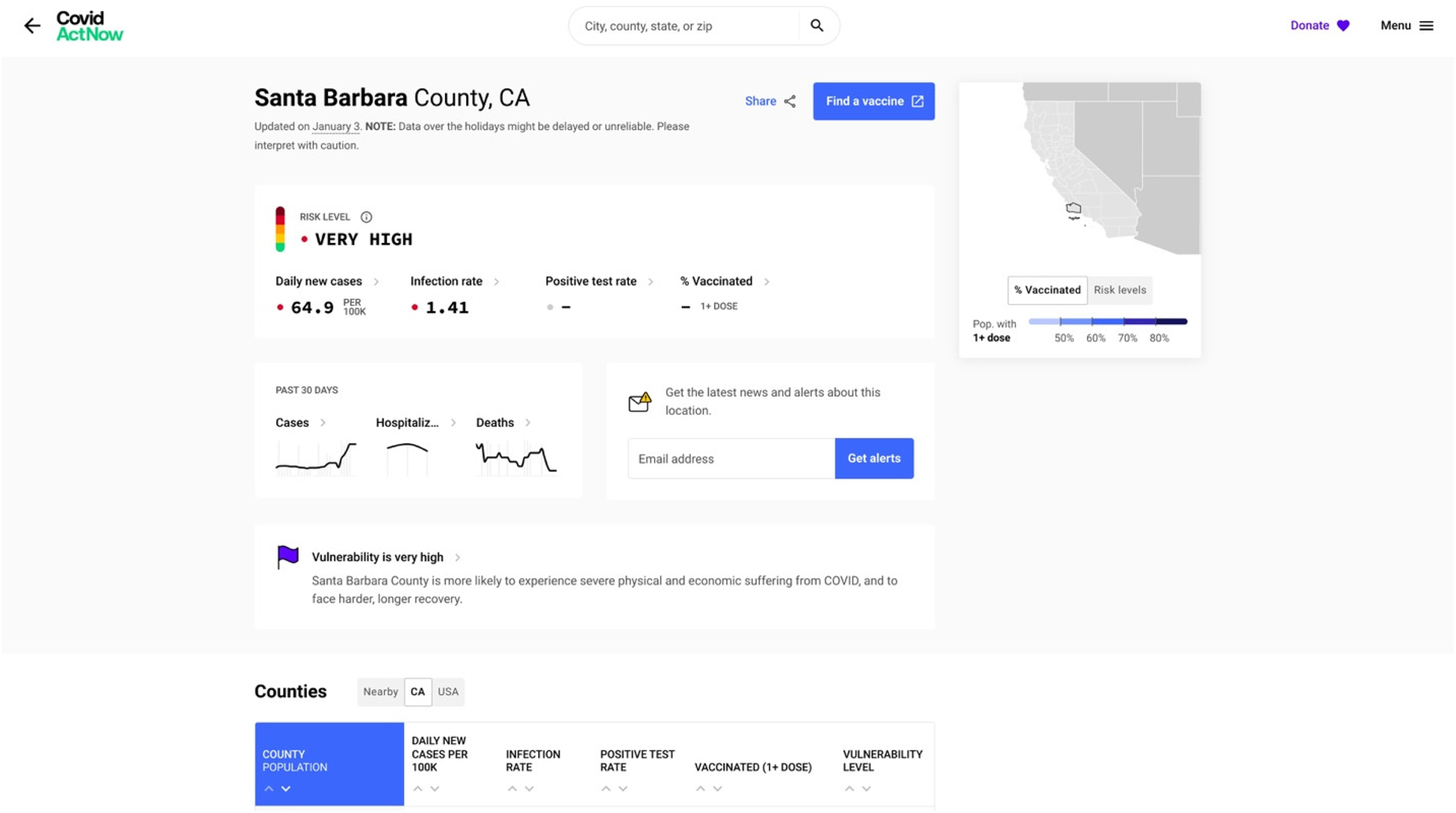
A screenshot of the Covid Act Now dashboard (see https://covidactnow.org/us/california-ca/county/santa_barbara_county/?s = 36902444).
For instance, on November 19, 2021, the text below the chart showing Santa Barbara County's infection rate over time explained that “on average, each person in Santa Barbara County, California, with COVID is infecting 1.03 other people. Because this number is around 1.0, it means that COVID continues to spread at about a constant rate.” Each chart also provides a link to more information about the data, typically in a pop-up window, written in an accessible style (e.g., “This one is a bit complicated”) and with a link to “learn more” that leads to a CAN page with more explanation of the metric and data. A color-coded state map with information about vaccination rates and a “hamburger menu” icon (three vertical lines) at the top right stay on the screen as the user scrolls down to view a table on California counties and line charts showing data over time for vaccination rates, cases, hospitalizations, deaths, and trends.
In Phase 2 of the study, the interviewees were given approximately 10 minutes to explore each of these dashboards, during which time they were asked to share their screen and “think aloud” using a coaching protocol (Olmsted-Hawala et al., 2010) in which I reminded them to verbalize their thoughts, asked questions when they fell silent (e.g., “Why did you choose to click on that tab?”), and gave assistance when they struggled to navigate the dashboard. This active intervention (Dumas & Redish, 1999) used probing questions to gain insight into users’ reactions and access their longer term memory; in addition, providing occasional assistance helped address the navigational and content questions that the users had as (mostly) newcomers to these two fairly complex dashboards. After they had explored both dashboards, I provided a link to a Google survey with items targeting the seven dashboard actionability features that Ivanković et al. (2021) delineated (see Appendix B). After participants completed the survey, I asked several more questions about their overall impressions of the dashboards’ strengths and weaknesses and their impressions of other dashboards they had used. Thus, the interviews generated both concurrent and retrospective verbal reporting, along with recordings of the users’ interactions with the dashboards. Interviewees were given $50 Amazon gift cards to thank them for their time.
To analyze the interviews, I employed thematic analysis, a method of “systematically identifying, analyzing, and reporting patterns (themes) across a data set” (Braun & Clarke, 2006, p. 77), working deductively to identify participants’ actions and comments related to Ivanković et al.'s (2021) seven areas of actionability and to discern other dashboard features that impacted users’ decision-making processes. To identify actionability themes, I reviewed the videos of the interview, observing what users did when they interacted with the dashboards. I also coded the transcripts of the interviews for each of the seven actionability features as well as for an “other” category of comments related to decision making and actionability. Finally, I examined participants’ responses to the postinterview survey (see Appendix B) in light of their comments and actions during the interview.
Results
In explaining the results of this study, I describe how the interviewees’ responses related to each of Ivanković et al.'s (2021) seven criteria for dashboard actionability.
Knowing the Audience and Their Information Needs
Many of the interviewees’ comments centered on the first and second criteria for dashboard actionability, suggesting the centrality of these two criteria in understanding general users’ interactions with dashboards. The personal orientation that participants brought to their interactions with the dashboards displayed the first criterion of knowing the audience and their information needs. Participants frequently looked for information that was personally relevant. For example, Participant A selected the Child Care tab on the SBCC dashboard because she works in that field; Participant D looked at data on health care workers out of her own concern for the trauma they have been through during the pandemic and also to get a sense of whether she would be able to receive care if she were injured. More broadly, participants mentioned the perspectives that they were bringing to the dashboards, reading them as a scientist, a student, someone who had to travel a lot during the early days of the pandemic, and so on. As I have noted, dashboard designers are challenged to make their work relevant for audiences with a wide array of personal experiences and perspectives. But based on the survey, participants were generally satisfied with the extent to which the dashboards provided them with useful information, with all but one participant either agreeing or strongly agreeing that the dashboards addressed their most important concerns.
Regarding the first criterion, Ivanković et al. (2021) also mentioned the use of an “overall composite score” as a technique for connecting with specific audiences and supporting their decision making. In the interviews, 7 out of 10 participants commented directly about the composite score for the Risk Level at the top left of the CAN dashboard (see Figure 2). Participant D said, “That means nothing to me, I don’t need that in front of my face because I’m like, ‘What does that mean?’” In looking through the dashboard, this participant preferred more specific data (e.g., new daily cases, vaccination numbers) and comparisons over time. But six other respondents appreciated having the overall summary indicator, both the word and the corresponding dot of color and color scale. Participant J described this indicator as “good and clear. I know, ‘Okay. Risk level high. I got it.’” Participant G said, “It's very easily accessible and it summarizes what I'm looking for.” She considered it “like looking at your credit score”; others described the color scale as “a weather kind of thing” (Participant H) or a “thermometer” (Participant I), indicating that their familiarity with the visual presentation rendered the metric more accessible. The CAN dashboard provides both an overview (by clicking on an information icon) and a more detailed discussion (via a link to another page) explaining how the overall composite rating was determined, but only two participants looked at this information and then only briefly. We might conclude, then, that nonexpert users are less concerned with the methodology for determining the rating than the rating itself.
Managing the Type, Volume, and Flow of Information
Regarding the second criterion, all participants noted the clear differences between how much information was presented in the SBCC dashboard compared to in the CAN dashboard. For some, the SBCC dashboard felt overwhelming, but they could see its value for other potential audiences. For instance, Participant I said that “if I wanted to explore, I could probably learn a lot, but I found it busy and a little bit overwhelming and squished. It wasn't that reader friendly.” Participant G said that “I feel like the second one [SBCC] has more information and I think it's good for someone who has a lot of time. I mean, I don't have a lot of time.” As Participant A noted more generally, “So I just feel like with this pandemic, it really depends on what you're looking for to find the right dashboard.” This comment somewhat explains the proliferation of COVID-19 data dashboards and the belief that no single dashboard could provide actionable data for all audiences and purposes. It also suggests that designers might do well to include both condensed and more detailed views in dashboards to account for the different amounts of time that nonexperts are willing to spend.
Another element of the second criterion, the effective flow of information, became an issue as participants scrolled through the CAN dashboard. Of the 10 participants, six commented negatively on the experience of scrolling, with some explicitly noting that they preferred the tabs on the SBCC site. Participants D, G, and J mentioned that they felt they had missed parts of the CAN site when they clicked on a link that brought them down the page and then had to scroll back up to see what information they had passed over. As Participant B said, “The fact that it was laid out in like a list format just made it seem like it was a lot more to go through. The fact that SBCC had tabs to be, ‘Okay, I want to look at this specifically,’ and it was just like a tab away versus me having to scroll.” Similarly, for Participant D, the tabs were more informative and somewhat outlined the entire dashboard. The interviews confirmed Pappas and Whitman's (2011) advice that “a dashboard is meant to be viewed at-a-glance, so once the visuals have been selected, they must be arranged in a display that can be viewed all at once, such as a computer screen, without having to scroll or navigate to multiple pages” (p. 253). The participants’ feedback also suggests the value of tabs to help users orient and navigate a dashboard, providing more information than users gain merely through scrolling.
Reporting Data Sources and Methods Clearly
In terms of the third criterion—that dashboard designers report their sources and methods clearly—participants for the most part did not check the data background or meta level information that was provided fairly prominently at both dashboards. Two participants clicked on an info tab at the SBCC dashboard, three participants briefly hovered over information icons, and one read the description of data sources and methods presented via one of these icons at the CAN dashboard. Nevertheless, they reported in the survey that they found the data at both dashboards to be trustworthy, with only one participant disagreeing with the statement “I trust the data presented by the dashboard.” In discussing their impressions of the data's reliability during the interview, participants mostly assessed the data in terms of their previous knowledge and experiences. Participant C, for instance, found the data at both dashboards to be trustworthy by comparison to the dashboard for Guanajuato, Mexico (where she frequently traveled), because she surmised that the United States had more resources for data tracking. Other respondents noted that they found the information at the dashboards reliable because it aligned with what they knew about the pandemic from other sources. Although dashboards should certainly report data sources and methods, designers of dashboards for general audiences could further explore the extent to which their nonexpert users assess the credibility of data via other means. For instance, links to or mentions of news sources might help to enhance the trustworthiness of the dashboard for general users (see also Schneider et al., 2021).
Linking Time Trends to Policy Decisions
No one commented on the fourth criterion although several participants said that they liked seeing the data over time (e.g., about infections, vaccinations, hospitalizations, and deaths) and that current trends were more useful to know about than total numbers. This seems to be a relatively narrowly defined criterion that might be important only to smaller subgroups who are interested in or engaged with policy decisions. But it could have value for nonexpert users if the data connected with policies that matter to them—for instance, policies related to mask mandates or online schooling—could be connected to trends in infection rates or the level of care capacity in a county.
Providing Data “Close to Home”
Because both dashboards presented data about Santa Barbara County, where all of the participants resided, the fifth criterion of visualizing local data would seem to be satisfied by both. In fact, participants noticed that the SBCC dashboard presented more granular data about different locations within the county whereas the CAN dashboard did not; a “view by neighborhood” link at the CAN dashboard led to a separate website, the COVID-19 Community Vulnerability Index, which did provide very detailed in-county information, but only one participant discovered and followed this link. Of the 10 interviewees, 7 noted the demographic differences between north and south Santa Barbara County: The northern part of the county is dominated by the city of Santa Maria whereas the southern part is dominated by the city of Santa Barbara, which is more affluent, white, older, and more highly educated. The college community of Isla Vista, located in south Santa Barbara County, adds other complexities to the demographics of the county. Noting the higher rates of infection in north Santa Barbara County, Participant A commented that “since Santa Barbara County covers a huge area, I like this one [the SBCC dashboard] just because then it kind of gives me an idea in reality, City of Santa Barbara and Goleta where we're at, versus Santa Maria or something like that.” For residents, then, statements about the county as a whole—such as the aggregate risk level that is a central feature of the CAN dashboard—needed to be parsed in terms of differences between north and south locations.
Overall, the interviews suggest that dashboard designers need to attend to the granularity of local data as they think through the “close to home” criterion. Of course, data sets at the level of granularity that users desire (in this case, city or neighborhood data) may simply be unavailable. Research with nonexpert users of data dashboards can reveal important gaps in the current data infrastructure, especially as these gaps impact risk communication for the broader public.
Breaking Down the Population to Relevant Subgroups
Regarding the sixth actionability criterion of providing information about relevant subgroups, only two participants looked at the age and race data on the dashboards, and they looked specifically for data on their own demographic groups. Participant B explained it this way: “What do I see in terms of people like me, right? I just want to see if people like me, how they're affected, and how people different from me are affected, because that's equally important.” It could be that more participants would have explored this data if it were highlighted on the dashboards. Rather, demographic data was located on the ninth tab on the SBCC dashboard and was available only via a link to a separate website (the COVID-19 Community Vulnerability Index) from the CAN dashboard. Atherton (2021) reported on how incomplete demographic data about the spread of COVID obscured the virus's impact on marginalized communities; the low status given to demographic data by virtue of its marginal placement in two county-level dashboards might be seen as another manifestation of data visualization that replicates existing structures of power and inequality.
Using Storytelling and Visual Cues
For the seventh criterion, participants focused on the visual elements and identified several strengths and weaknesses in the design of the dashboards. They generally preferred the design of the CAN dashboard, describing it as clean and clear, with sufficient white space, and easy to read. Participant K explained that “it seems to give you the results that you want to see in a visual way that makes it obvious what the answers are.” Half of the respondents remarked positively on the use of color in the CAN dashboard. For instance, Participant J explained, “I like that the color here is consistent and it tells us just visually with that color where you're at. I didn't even need to read that, that's at high. I just knew that orange meant high if that makes sense, so that's good and clear.” Although the SBCC dashboard was criticized for being too busy and overwhelming, participants did prefer the tabs rather than the scrolling approach of the CAN dashboard. Participant D, commenting on the accurate labels on the SBCC tabs, said, “I found that it was easier to visually navigate the SBCC one” with “tabs that were right there, they were intuitive to me.” No one referenced storytelling as a strategy used by the dashboards though several participants commented on the challenging terminology—“not layman's terms,” according to Participant H—in the explanations offered on the SBCC dashboard.
Additional Key Criteria
One key theme that emerged in the interviews that was not included among Ivanković et al.'s (2021) criteria is the emotional impact of looking at data about the pandemic. Several participants mentioned that reading the data dashboards was a stressful or scary experience. Participant B commented, “It's just a lot to digest, right? And that takes mental strength. It takes energy, it takes capacity. It takes all that to kind of get through that realization, ‘Okay, all this is happening.’ And you kind of get that every time you deal with these COVID data boards, right?” The dashboards are evidence of the pandemic, reminders of past worries about the virus, and may trigger anxiety about possible future developments. In particular, the amount of data on the SBCC dashboard and the aggregate risk level of High on the CAN dashboard elicited these emotional reactions. For instance, Participant G, on first viewing the SBCC dashboard, said, “I feel like this is too much to bear”—expressing the kind of visceral level emotional reaction described by Norman and Ortony (2003). Data dashboards on other topics might not prompt the same kinds of responses, but we might reasonably expect emotional reactions to data about a deadly virus that has taken such a toll on people's lives. Feeling stressed might inhibit people from taking action or encourage them to make decisions that are incommensurate with the data—or even cause them to purposely ignore the data. As Participant C remarked, “I haven't been on these pages for a while because I was really getting, a year ago, kind of obsessed with checking on a daily basis. So I had to step away.” Thus, accounting for the emotional impact of data dashboards, especially in the context of the pandemic or other high-risk contexts, would be a helpful addition to an analysis of their actionability.
The survey administered after the think-aloud segment of the interview showed that participants generally had positive impressions of the actionability features of both dashboards (see Appendix B). 3 Scores for all categories were 0 or above, indicating some degree of agreement with all of the actionability criteria. Overall, the CAN dashboard scored better than the SBCC dashboard (1.2 vs. 0.56), scoring the same or higher on all of the questions except for Question 5 (on showing changes in the pandemic over time) and Question 8 (on showing the effect of the pandemic on different demographic groups).
Conclusions
Focusing on two dashboards that served public health data at the county level, research participants were able to discuss how differing design features influenced whether and how they would use these data in decision-making processes. Overall, the survey and interviews with these nonexpert users of the two COVID-19 dashboards demonstrated that some of the actionability features identified by Ivanković et al. (2021) were more important than others. As they interacted with the dashboards and explained their thoughts and reactions, participants frequently discussed wanting to find data that met their information needs, was relatively easy to navigate, and provided local granularity. Participants commented less frequently on data sources and methods, connections to policy decisions, information about demographic subgroups, and storytelling approaches in the dashboards. Although Ivanković et al. (2021) do not present the seven features in a hierarchy, doing so might be helpful in guiding dashboard designers on what elements and approaches to prioritize. Moreover, both the availability and the presentation of data, as were evident in the dashboards’ displays of data about locality and demographics, impact actionability.
In addition, designers need to consider the emotional impact of viewing COVID-19 data, especially as emotions can affect how users interpret and use data to support everyday decisions. Melonçon and Warner (2017) noted that technical and professional communication research on data visualization tends to focus on either attention or comprehension. Recognition of the potential emotional valence of data visualization can enrich both of these areas of study (Kostelnick, 2016), for instance, by elucidating connections between emotion and usability for user experience designers (Lim et al., 2008; Norman, 2004; Sano-Franchini, 2018) or by highlighting emotional impacts in health and risk communication (McMakin & Lundgren, 2018; Richards & Jacobson, 2022).
This study focused on the actionability of COVID-19 data dashboards in keeping with their intent to support decision making by providing users with data on which they can act. As I noted, both the SBCC and CAN dashboards were designed to inform and support decision making. But prior to the pandemic, Sarikaya et al. (2018) suggested that dashboards “are shifting and democratizing and diversifying as their use proliferates” (p. 682). Particularly with reference to actionable data, they write that “dashboards designed to be used by the general public exhibited more ambiguous decision-making affordances. While about half exhibited strategic purposes, all seemed to be designed for the purposes of communication to and education of the consumer” (p. 687). The development of “trackers” during the pandemic may fit with this idea of dashboards designed for communication rather than to support decision making. Additional studies might examine the effectiveness of dashboards in simply educating and informing users on COVID-19 or other topics.
Limitations and Areas for Future Research
This study suggests areas for future research. The postinterview survey might have yielded different results if questions were rephrased using a quality rather than an agreement approach. In addition, the scale of the study was limited, focusing on a small group of users who were looking at only two dashboards for a short amount of time. Studies with more users or a more homogenous group of users—for instance, in terms of demographics, prior experience with data visualization, or pandemic concerns—would likely yield more focused results. Future research might also compare local dashboards to national or global dashboards, especially given the different challenges of understanding and attending to users targeted by these dashboards of different scope. Moreover, researchers might give users more time to explore the dashboard; having more time to read and interact with the data seems likely to have an impact on whether and how users perceive the dashboard as effectively providing helpful information or supporting decision making. In addition, the interviews were conducted in November and December of 2021, after the peak of the pandemic but prior to the advent of the Omicron variant and at a time when users would be less likely to have an urgent need to visit data dashboards in order to gather information to support everyday decision making. People had perhaps already accommodated to the pandemic in terms of decisions related to risks of catching the virus. Thus, understanding the context in which users access dashboards is an important component of assessing their actionability.
Finally, the actionability criteria studied here were developed specifically for COVID-19 dashboards; technical communicators and rhetoricians could test and revise these criteria in assessing dashboards or other data visualization genres across a range of contexts and purposes. This study, then, suggests a comparative and contextual method that could be replicated in order for researchers in areas such as risk, health, and medical communication and user experience to better understand and design for nonexpert users seeking to learn from and act on complex visualized information.
Footnotes
Appendix
Survey Responses
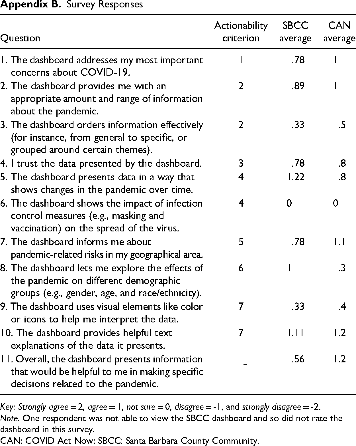
| Question | Actionability criterion | SBCC average | CAN average |
|---|---|---|---|
| 1. The dashboard addresses my most important concerns about COVID-19. | 1 | .78 | 1 |
| 2. The dashboard provides me with an appropriate amount and range of information about the pandemic. | 2 | .89 | 1 |
| 3. The dashboard orders information effectively (for instance, from general to specific, or grouped around certain themes). | 2 | .33 | .5 |
| 4. I trust the data presented by the dashboard. | 3 | .78 | .8 |
| 5. The dashboard presents data in a way that shows changes in the pandemic over time. | 4 | 1.22 | .8 |
| 6. The dashboard shows the impact of infection control measures (e.g., masking and vaccination) on the spread of the virus. | 4 | 0 | 0 |
| 7. The dashboard informs me about pandemic-related risks in my geographical area. | 5 | .78 | 1.1 |
| 8. The dashboard lets me explore the effects of the pandemic on different demographic groups (e.g., gender, age, and race/ethnicity). | 6 | 1 | .3 |
| 9. The dashboard uses visual elements like color or icons to help me interpret the data. | 7 | .33 | .4 |
| 10. The dashboard provides helpful text explanations of the data it presents. | 7 | 1.11 | 1.2 |
| 11. Overall, the dashboard presents information that would be helpful to me in making specific decisions related to the pandemic. | .56 | 1.2 |
Key: Strongly agree = 2, agree = 1, not sure = 0, disagree = -1, and strongly disagree = -2.
Note. One respondent was not able to view the SBCC dashboard and so did not rate the dashboard in this survey.
CAN: COVID Act Now; SBCC: Santa Barbara County Community.
Declaration of Conflicting Interests
The author declared no potential conflicts of interest with respect to the research, authorship, and/or publication of this article.
Funding
The author received no financial support for the research, authorship, and/or publication of this article.