
Abstract

Actionable information is paramount in the context of the COVID-19 pandemic. When information is actionable, it has greater potential to inform decision making and behavior changes that can benefit both individuals and society at-large (Kringos et al., 2020). Verhulsdonck and Shah (2021) described a lean approach to COVID-19 data visualizations using dashboards. Their article provides valuable insights into the importance and use of actionable metrics from the perspective of technical communicators. It is a welcome application of quality-management tools stemming from business, such as balanced scorecards, strategy maps and dashboards, and methodologies based on lean, six sigma and kaizen principles.
With this comment, we—an international network of Healthcare Performance Intelligence Professionals (see HealthPros, 2020)—complement and broaden Verhulsdonck and Shah's (2021) view through the lens of health care performance intelligence. We agree with the importance of data visualization and its contextualization through the use of projections. But we argue for a more holistic approach that extends beyond these features. Our aim in commenting on Verhulsdonck and Shah's article is to bridge between our disciplines and pursue a common understanding of actionable health care performance information.
To do so, we address Verhulsdonck and Shah's (2021) three main points. First, we revisit their description of actionable metrics, arguing for a broader approach to its characterization. Second, we reflect upon their description of considerations affecting actionable metrics by drawing on our own research on the actionability of COVID-19 dashboards. And third, although we agree with the authors’ listing of implications and further areas of study toward a lean approach to data visualizations, we expand on the listed items through a performance intelligence lens.
Actionable Metrics Defined
Verhulsdonck and Shah (2021) described actionable metrics as “tie[ing] data visualization to actions to improve a specific situation” (p. 57). They explored how actionable metrics are used on COVID-19 dashboards by way of applying different models to forecast (project) outcomes. They also described the difference between vanity metrics, which do not incorporate future scenarios based on projections, and actionable metrics. We agree with the importance of communicating with stakeholders using metrics that inspire data-driven decision making. But actionable metrics are more meaningful. They provide users with a richer understanding of how their decision making and behavior contribute to outcomes.
Actionable metrics, however, do not rest only on effective visualization and contextualized data. We argue that a broader description than mere visualizations and added context through projections is needed in defining actionable metrics. The actionability of information is rooted in its fitness for purpose and use (Barbazza et al., 2021). First and foremost, information must be fit for purpose in that it resolves a specific information need. In the absence of this understanding, metrics are developed merely on their potential to be useful. Second, information must be fit for use in that it is the right information in the right hands at the right time and in an understandable form. While visualizations and added context can contribute to actionable metrics, other considerations, such as the availability and quality of the data and the delivery of information to users (i.e., how users gain access to it) also weigh on their use.
Actionable Metrics in Practice
We appreciate Verhulsdonck and Shah's (2021) application of lean methodologies as a means toward actionable metrics, and we agree that the elements of dynamic, interactive, and contextualized data can facilitate this application. But these elements are needed in addition to and in combination with others.
Public reporting and communication in pandemics differ from the typical business processes for doing so and are more nuanced than simply “develop[ing] more reliable contextual data visualization that ‘[helps] stakeholders interpret diagrams to aid them in decision-making’” (Verhulsdonck & Shah, 2021, p. 58). Although online commerce might track use by a visitor's registration to a newsletter or purchases made when visiting a webpage, in the public health sphere, the action sought is less transactional and includes behavior and lifestyle changes. We risk missing the opportunity to measure the success and usefulness of our public pandemic reporting if we reduce the effectiveness of dashboards to commerce-based measures of success that do not capture the complexity of behavior change in the health sphere.
To optimize the conditions for both interaction and action, pandemic reporting should incorporate a number of features conducive to highly actionable COVID-19 dashboards. In the first half of 2020, our international research network launched a global study of COVID-19 dashboards. The study assessed 158 dashboards from 53 countries in July 2020. It explored what makes a dashboard actionable, defining actionability as a dashboard's potential to inform decision making. We identified seven features common to highly actionable dashboards (Ivanković et al., 2021). Figure 1 illustrates the importance and use of each of these features on a hypothetical dashboard. The properties of these features are further described in Table 1. The seven features should be used together to optimize actionability.

A mock-up of the seven features of highly actionable dashboards. Note. Numbers refer to numbered features in Table 1.
Seven Features of Highly Actionable Dashboards.
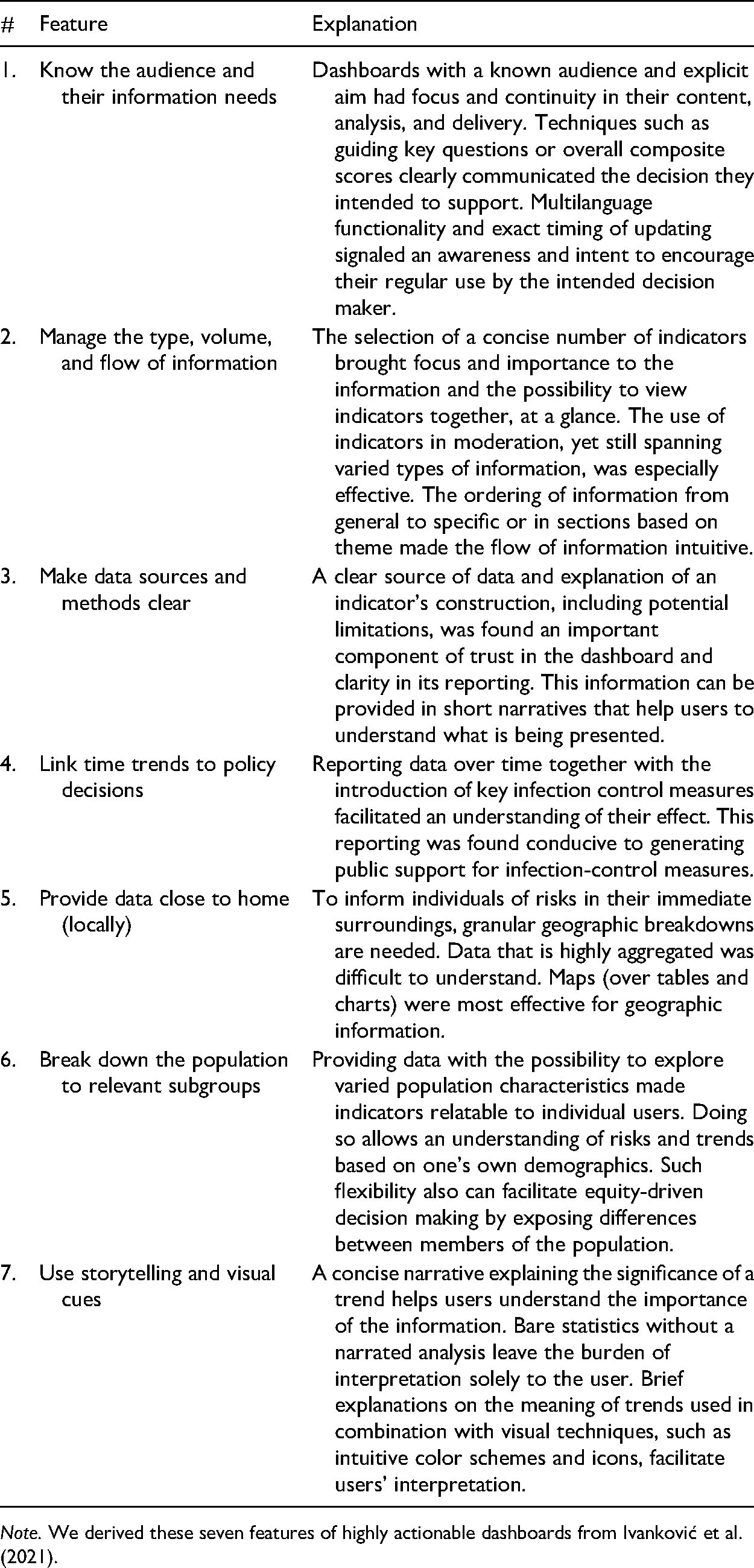
Note. We derived these seven features of highly actionable dashboards from Ivankovic´ et al. (2021).
Additional Research Implications From a Health Care Performance Intelligence Lens
Verhulsdonck and Shah (2021) concluded by raising three implications “for expanding our understanding of contextual and dynamic data visualizations for different stakeholders” (p. 62). We further expand on each implication by drawing from the points we have raised.
Expand the Meaning of “Live” Dashboards
Verhulsdonck and Shah (2021) highlighted the potential to “consider live, dynamic data visualizations” as a modality to support users to explore different scenarios (p. 62). We agree with the notion of a dashboard as a two-way communication platform through which users can realize the effects of their decision making (Ivanković et al., 2021). But we argue that there are other ways in which a dashboard can connect with users beyond creating different future scenarios of what could happen. For example, the World Health Organization (WHO, 2020) has advocated for behavioral insights as a key type of pandemic information; however, in our research on COVID-19 dashboards, we found that behavioral insights were infrequently reported. Future research should explore the ways in which these data can be collected and leveraged in reporting.
Adopt an Interdisciplinary Approach to the Development of Actionable Metrics
Technological advancements can be credited for the speed and volume of data that have supported reporting on the COVID-19 pandemic. But our research on COVID-19 dashboards has underscored the importance of interdisciplinary efforts for actionable information. These efforts include public health, data, and communication specialists at a minimum. In 2021, our research network aims to explore the composition and competencies of dashboard teams with their developers (HealthPros, 2021). Also, to better profile the interdisciplinary teams needed for public reporting of pandemic-related metrics, we want to explore which competencies were lacking.
Enhance Equity-Promoting Population Breakdowns
We agree with Verhulsdonck and Shah (2021) about the importance of transparency in reporting data for the sake of information quality. We found that only one fourth of the dashboards (39/158, 24.7%) in our global study of COVID-19 dashboards did not explicitly report their data sources, signaling the need for improvement in this regard (Ivanković et al., 2021). There is also a critical need to resolve gaps in data, particularly around relevant population subgroups that are missed when reporting is highly aggregated. We consider highly aggregated population data an important ethical issue because data limitations risk masking trends of inequities. Further explorations of the underlying causes of data constraints are also needed to advance data ethics and transparency.
Conclusion
Moving from vanity metrics and their visualization to actionable metrics—including dynamic and predictive visualization—is an important step toward actionable information. We argue that to further improve the actionability of public reporting and communication on crises such as COVID-19, we need to adopt a more holistic approach to defining and operationalizing actionability, an approach that is rooted in users’ information needs.
In the complex adaptive system that characterizes health care, creating linkages across disciplines can facilitate new ways of thinking and needed collaboration. In supplementing Verhulsdonck and Shah's (2021) technical communication perspective to actionable metrics from the perspective of health care performance intelligence, we hope this comment contributes to a cross-disciplinary conversation.
Footnotes
Acknowledgments
This comment draws on earlier collaborations and thoughtful discussions with the following individuals: Véronique Bos, Óscar Brito Fernandes, Kendall Jamieson Gilmore, Tessa Jansen, Pinar Kara, Nicolas Larrain, Shan Lu, Bernardo Meza-Torres, Joko Mulyanto, Mircha Poldrugovac, Alexandru Rotar, Sophie Wang, Claire Willmington, Yuanhang Yang, Zhamin Yelgezekova, and Sara Allin.
Funding
The authors disclosed receipt of the following financial support for the research, authorship, and/or publication of this article: This work was carried out by the Marie Skłodowska-Curie Innovative Training Network for Healthcare Performance Intelligence Professionals (HealthPros) that has received funding from the European Union's Horizon 2020 research and innovation programme under grant agreement Nr. 765141.