
Abstract
Background and Aims:
Historically integral to science, visual elements like Darwin’s evolutionary trees have evolved with technological advancements, leading to more sophisticated and accessible visual representations. Graphical abstracts (GA) and infographics (IG) have become pivotal in enhancing the dissemination and understanding of scientific research by transforming complex data into visually engaging summaries. This review explores the evolution, impact, and design principles of these tools in scientific communication, highlighting their significance in the digital era.
Methods:
We did a comprehensive review of the English literature, in April 2024, from the databases of PubMed, Scopus, Embase, and Google Scholar to curate the appropriate articles related to the GA and IG related to research-publications. We have also made some representative examples of each of these two tools, using published articles in the Apollo Medicine journal.
Results:
The GA and IG, are the tools that not only aid in bridging the gap between scientific communities and the public but also enhance comprehension, engagement, and retention of information across diverse audiences. By utilising strategic layouts, colours, and interactive elements, they make complex information more digestible and appealing.
Conclusion:
This review addresses the challenges of maintaining accuracy and avoiding oversimplification in visual science communication. The future directions suggest a move towards more interactive and immersive visual experiences, emphasising the need for empirical research to optimise design and impact. GA and IG are transforming scientific communication by making research findings more accessible and engaging, fostering a better-informed public.
Keywords
Introduction
Graphical abstracts (GA) and infographics (IG) have revolutionised the way scientific findings are communicated, providing succinct and visually engaging summaries of research.[1] Traditionally, the dense and text-heavy nature of scientific publications can be a barrier to the dissemination of knowledge, especially to stakeholders outside the specific field of study. The GA serve as a bridge, distilling complex research findings into accessible and easily digestible visual representations.[2,3] Whereas, IG extend beyond abstracts to include larger datasets and broader narrative visualisations, further enhancing comprehension and engagement by using strategic layouts, colours, and icons.[4,5]
The importance of GA and IG has grown exponentially in the digital era, where the rapid sharing of information and the ability to capture the attention of a broad audience is paramount. These visual tools are not only effective in academic circles but have profound implications in enhancing public understanding and engagement with science.[6] They play a critical role in the age of social media and digital platforms, where visuals are more frequently shared and can reach a larger audience more effectively than traditional text-based articles.[3] As such, they serve as crucial tools in the toolkit of researchers and publishers alike, aiding in the wider dissemination and increased visibility of scientific research.
This review article aims to critically examine the impact and effectiveness of GA and IG in scientific communication. This involves an exploration of how these tools contribute to the accessibility and dissemination of scientific knowledge, the design principles that make effective visuals, and the potential limitations and challenges faced in their implementation. By reviewing existing literature and case studies, this article aims to provide comprehensive insights into the value of visual summaries in enhancing understanding and engagement with scientific research.
Evolution of Visual Science Communication
The use of visual elements in scientific communication is not a recent phenomenon. Historically, visuals have been integral to the dissemination of scientific ideas, dating back to the early scientific manuscripts which included detailed illustrations of medicinal plants, astronomical charts, and anatomical diagrams. These visuals served as critical tools for explaining complex theories and observations in a manner that was accessible and understandable, even before the advent of modern scientific methodologies.[7] As science advanced, the 19th century saw the emergence of detailed graphical representations in scientific publications, such as Darwin’s evolutionary trees and Mendel’s inheritance charts, which were pivotal in explaining new theories to both scientific and non-scientific audiences.[8]
The evolution of visual communication in science has been significantly influenced by technological and methodological advancements. The advent of digital technology has particularly revolutionised the creation and dissemination of GA and IG. Software tools such as Adobe Illustrator, Canva, and specialised scientific visualisation software have made the creation of complex and precise visuals more accessible to researchers and communicators.[9] Methodologically, the integration of graphic design principles into scientific communication has been a key advancement. This involves the strategic use of layout, colour, and typography to enhance readability, appeal, and understanding, ensuring that visuals not only convey data but also engage and inform effectively.[10] The rise of digital publications and social media platforms has also transformed the dissemination of scientific visuals.[11] These platforms facilitate the rapid sharing of GA and IG, allowing for broader reach and interaction with diverse audiences. The use of visuals in digital media also encourages more dynamic and interactive elements, such as animations and clickable content, enhancing user engagement and understanding.[12]
Currently, the design and use of GA and IG are witnessing several key trends across different scientific disciplines. One prominent trend is the increasing customisation of visuals to suit specific scientific fields. For example, in biochemistry, complex molecular pathways are often depicted in detailed GA, while in environmental science, IG frequently summarises large datasets on climate change trends or conservation efforts.[2] Another trend is the growing importance of user-centred design in the creation of scientific visuals.[13] This approach emphasises the needs and contexts of the target audience, ensuring that visuals are not only scientifically accurate but also tailored to the audience’s knowledge level and interests. This trend is particularly evident in public health communications, where IG are designed to communicate health risks and precautions to non-expert audiences in an immediate and actionable manner.[13] Moreover, there is an increasing emphasis on ethical considerations in visual science communication.[14] This involves ensuring accuracy and avoiding misleading representations, which is crucial given the potential impact of scientific information on public opinion and policy. The scientific community is increasingly advocating for standards and guidelines to govern the creation and dissemination of scientific visuals, promoting integrity and trustworthiness in scientific communication.[15,16]
Impact of GA and IG
The GA and IG significantly enhance comprehension and retention of scientific information. Research has shown that visual representation of information facilitates quicker comprehension and better retention compared to traditional text-based descriptions.[1,17] For instance, a study reported in one of the articles analysed the effects of GA on the understanding of complex molecular mechanisms among undergraduate students. The study found that students who learned through GA retained the information longer and reported higher clarity of understanding compared to those who learned through textual descriptions alone.[18,19] Similarly, another article highlighted a controlled experiment where participants were given either a traditional abstract or a GA of a scientific article; results indicated significantly higher recall rates and comprehension scores among those who received the GA.[2,3]
The engagement of readers with visual content versus textual abstracts has been quantitatively analysed in several studies, underscoring the impact of visuals on scientific communication. GA and IG often attract more attention on digital platforms, as shown by higher click-through rates (which predict the likelihood of a user clicking on a research article), longer page view times, and increased shares on social media.[11] For example, an article reviewed the analytics of an online journal and found that articles with GA received 50% more views and three times more downloads than those without. This indicates that visual summaries not only capture attention but also encourage deeper engagement with the content.[18] Another study measured the interaction metrics on a scientific database and confirmed that articles with IG had higher citation rates, suggesting that increased engagement also translates into greater academic impact.[10]
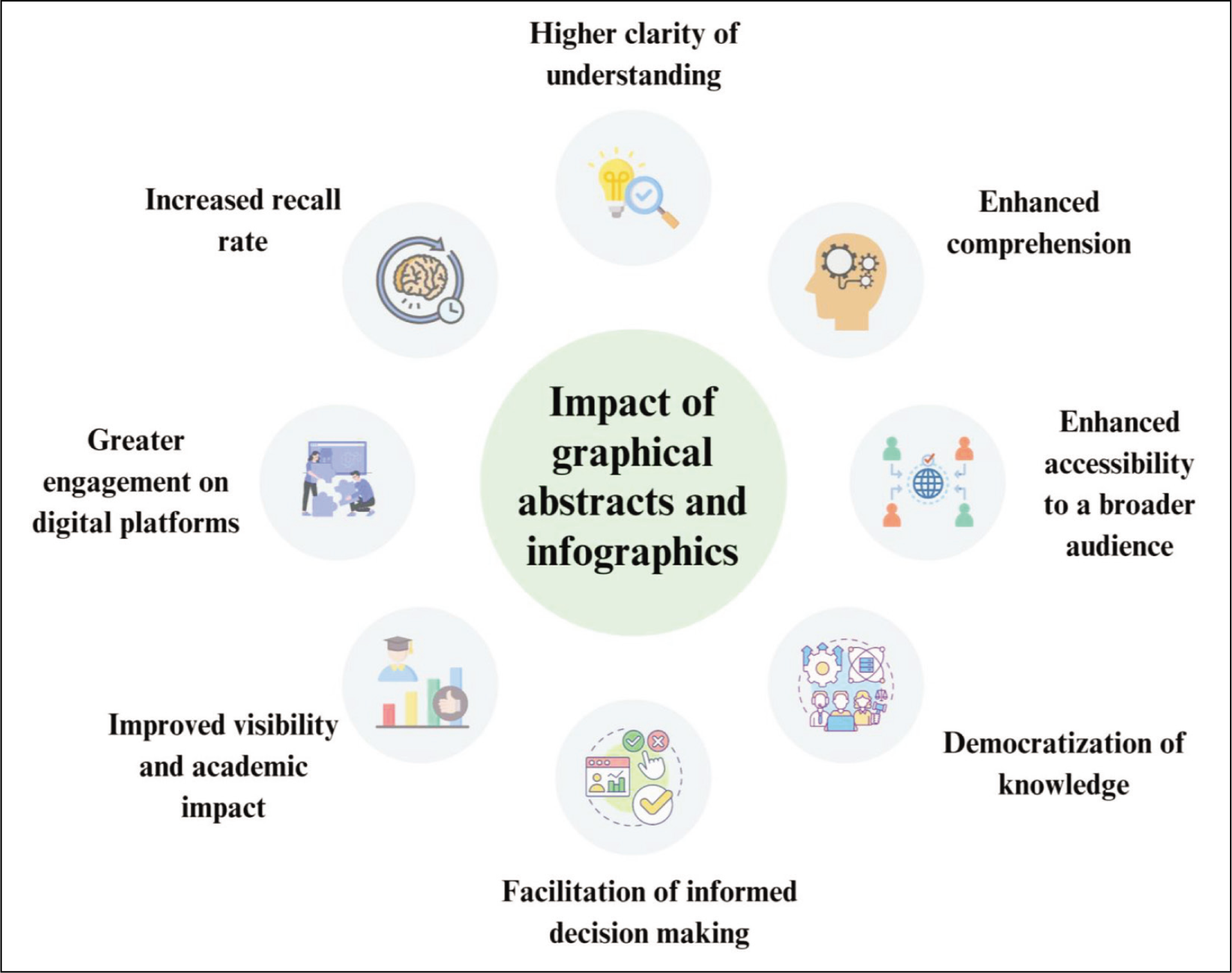
The GA and IG play a crucial role in making complex scientific information accessible to a broader audience, including the community at large. By distilling dense scientific data and jargon into clear, visual formats, these tools bridge the gap between expert knowledge and public understanding. This is particularly important in fields like medicine and environmental science, where public awareness and understanding can directly impact health outcomes and policy decisions. Various studies discuss how IG has been used effectively in public health campaigns to communicate risks and precautions related to infectious diseases to non-experts, resulting in improved public compliance and awareness.[20] Furthermore, another study highlights the use of GA in climate science, where they have been instrumental in summarising research findings on climate change for policymakers and stakeholders, enhancing the accessibility of crucial scientific data.[21] These tools not only simplify information but also contextualise scientific data, making it relevant and understandable for non-specialists. This democratisation of knowledge is essential for fostering informed public discourse and decision-making on scientific and technological issues. The impact of GA and IG are elucidated in Figure 1.
Impact of graphical abstracts and infographics in medical literature
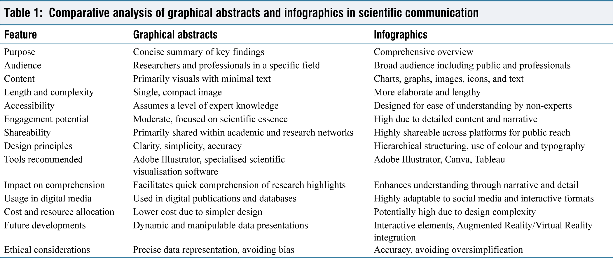
The GA and IG, while similar, serve distinct purposes; the GA are like bite-sized summaries of research, while the IG offer a more comprehensive visual explanation of a topic. Their characteristics and comparative analysis in scientific research and communication are tabulated in Table 1.
Comparative analysis of graphical abstracts and infographics in scientific communication
Best Practices in Designing GA and IG
Effective visual design is foundational in creating GA and IG that not only attract attention but also facilitate understanding and retention of information. Key design principles include clarity, simplicity, and accuracy, which are essential for the effective communication of complex scientific data [Figure 2].
Design principles of infographics and graphical abstracts
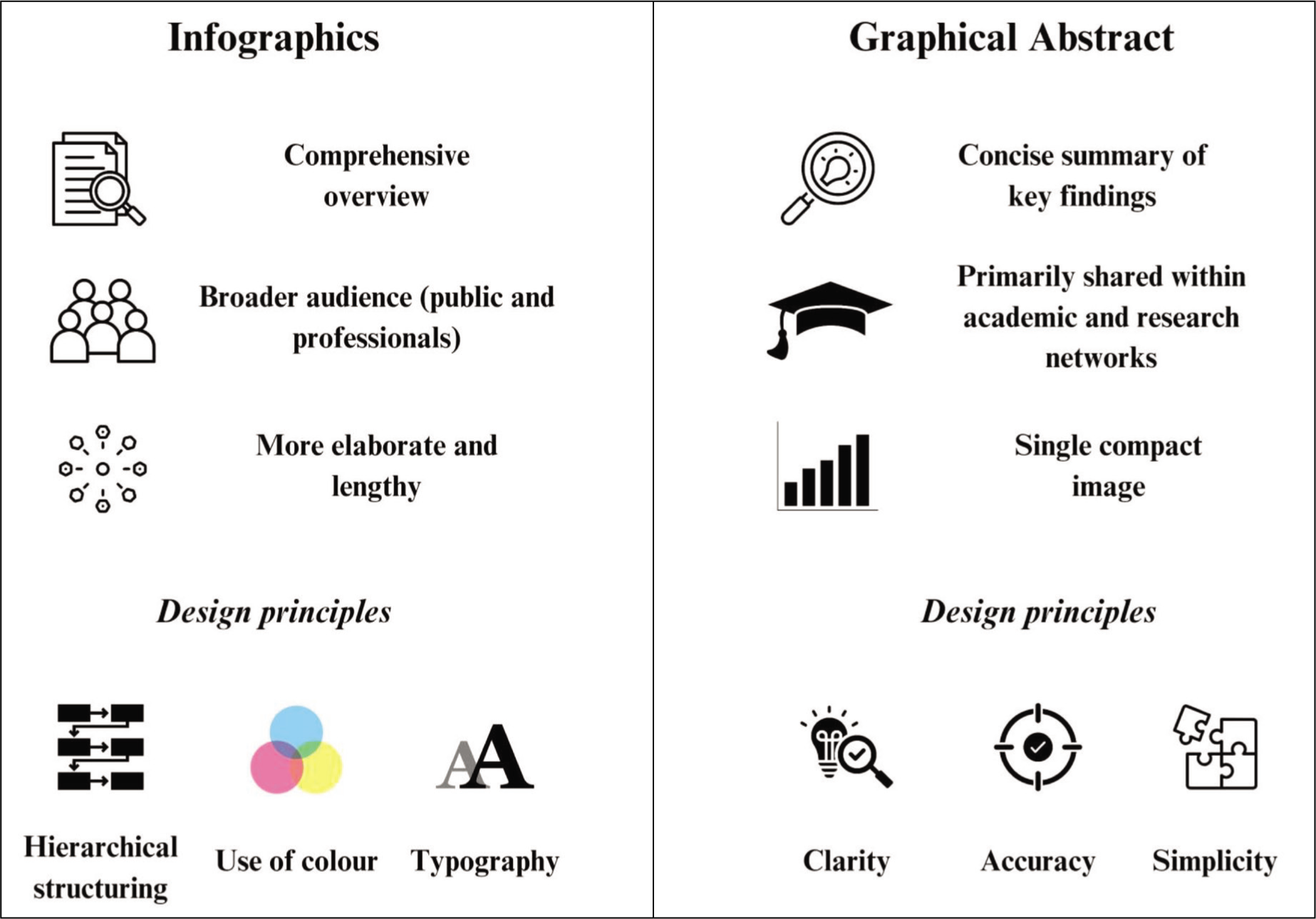
Clarity is paramount in ensuring that the intended message is easily and immediately understood. This involves the use of clean lines, clear fonts and a logical flow of information that guides the viewer through the content without ambiguity. A study detailed in one of the articles emphasises the use of hierarchical structuring in IG, where information is organised in a way that leads the viewer from general to specific details, thus improving clarity and comprehension.[2]
Simplicity involves distilling complex information into its most essential forms. Overloading an IG with too much data or too many details can overwhelm the viewer and detract from the key messages. One article suggests using a limited colour palette and minimal text to keep the focus on the main data points, which helps maintain viewer interest and engagement.[22]
Accuracy is critical to maintain the credibility of the scientific communication. Every visual element must accurately represent the underlying data or concept it portrays. Misrepresentation can lead to misinformation and can damage the trust between the scientific community and the public. The need for rigorous accuracy in GA and IG is well articulated in an article that discusses the consequences of visual misrepresentations in scientific publications.[9]
Software and Tools
There are several software tools and applications that are recommended for creating high-quality GA and IG. These tools provide a range of functionalities from basic graphic design to advanced data visualisation capabilities. Some of the most popular tools are described ahead.
Adobe Illustrator is widely used for its robust features that allow for precise control over every aspect of the graphic design. It is particularly valued for its ability to create vector graphics, which can be scaled without loss of quality—ideal for publishing in various formats and sizes.[23]
Canva offers a more user-friendly interface with a wide range of templates and design elements that are especially useful for those without extensive graphic design experience. It has been praised for its simplicity and effectiveness in creating visually appealing designs quickly.[24]
Tableau is another powerful tool for creating data visualisations and IG that involve complex data sets. It allows users to create interactive elements that can make IG more engaging and informative.[25]
Examining successful examples of GA and IG provides valuable insights into effective visual communication practices. One notable example is a GA published in a leading journal on European Journal of Pharmaceutical Sciences, which depicted the mechanism of a new drug interaction.[26] The abstract used a clean, simplified colour scheme and clear, concise labels to effectively communicate complex interactions in an easily digestible format. Its success was measured by high engagement and citation rates, demonstrating its impact on the scientific community. Another example is an IG used in a public health campaign, designed to communicate the transmission pathways of an infectious disease.[27,28] The IG used bold colours to highlight key routes of transmission and included simple icons to represent complex information, making it accessible to a wide audience. The campaign was successful in increasing public awareness and understanding of the disease, as reflected in improved health outcomes.
Challenges and Limitations
While simplification is a key aspect of designing effective GA and IG, it also presents significant risks of misinterpretation.[2] By reducing complex scientific data into more digestible visual formats, critical nuances or important details might be omitted, potentially leading to misunderstandings of the research findings.[2] Another concern is the potential for GA to emphasise certain results over others, which might unintentionally skew the perceived importance or relevance of findings. This issue underscores the need for designers to strike a balance between simplification and the accurate representation of scientific data.
The creation of high-quality GAs is often time-consuming and costly.[29] In the realm of IG, issues such as the lack of malleability in content applications can limit their effectiveness.[30] IG with creative designs may lack identifiable flow patterns, leading to confusion. The subjectivity in design taxonomy and minimal user assistance further complicate their use.[31] Ambiguities in reading order and unclear relationships between visual elements, along with inconsistent visual styles and missing annotations, make interpretation difficult.[32]
Maintaining scientific accuracy and quality during the design process of GA and IG is another significant challenge. The process of translating scientific data into visual formats requires not only design skills but also a deep understanding of the subject matter to ensure accuracy and reliability. Furthermore, the lack of standardised guidelines for the creation of GA and IG can result in inconsistencies in how scientific data is visually communicated across different platforms and publications.[2] This variation can confuse the audience and diminish the overall credibility of the scientific communication.
To prevent misinterpretation when using IG and GA, it is crucial to implement clear and concise visuals, incorporating labels, legends, and colour coding to enhance understanding.[29] User-friendly design principles should be adopted to simplify complex information and highlight important data points effectively. Interactive elements and tooltips can provide additional context, aiding in better comprehension.[33] Consistent design patterns, visual metaphors, and representational genres should be employed to maintain coherence and clarity.[31,32] Feedback from peers or experts is essential for reviewing and refining these visuals for accuracy and clarity.[29,32] Ensuring that the visual elements align with the content and target audience of the research article is also vital to minimise misinterpretation.[29,32] Regular testing with diverse user groups can help identify potential areas of confusion and improve the overall effectiveness of the IG and GA.[30,31] Additionally, using simple and easy-to-understand language in text elements and ensuring the visuals support the text can further reduce the risk of misinterpretation.[30]
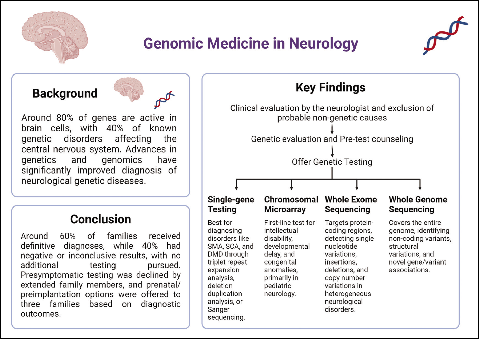
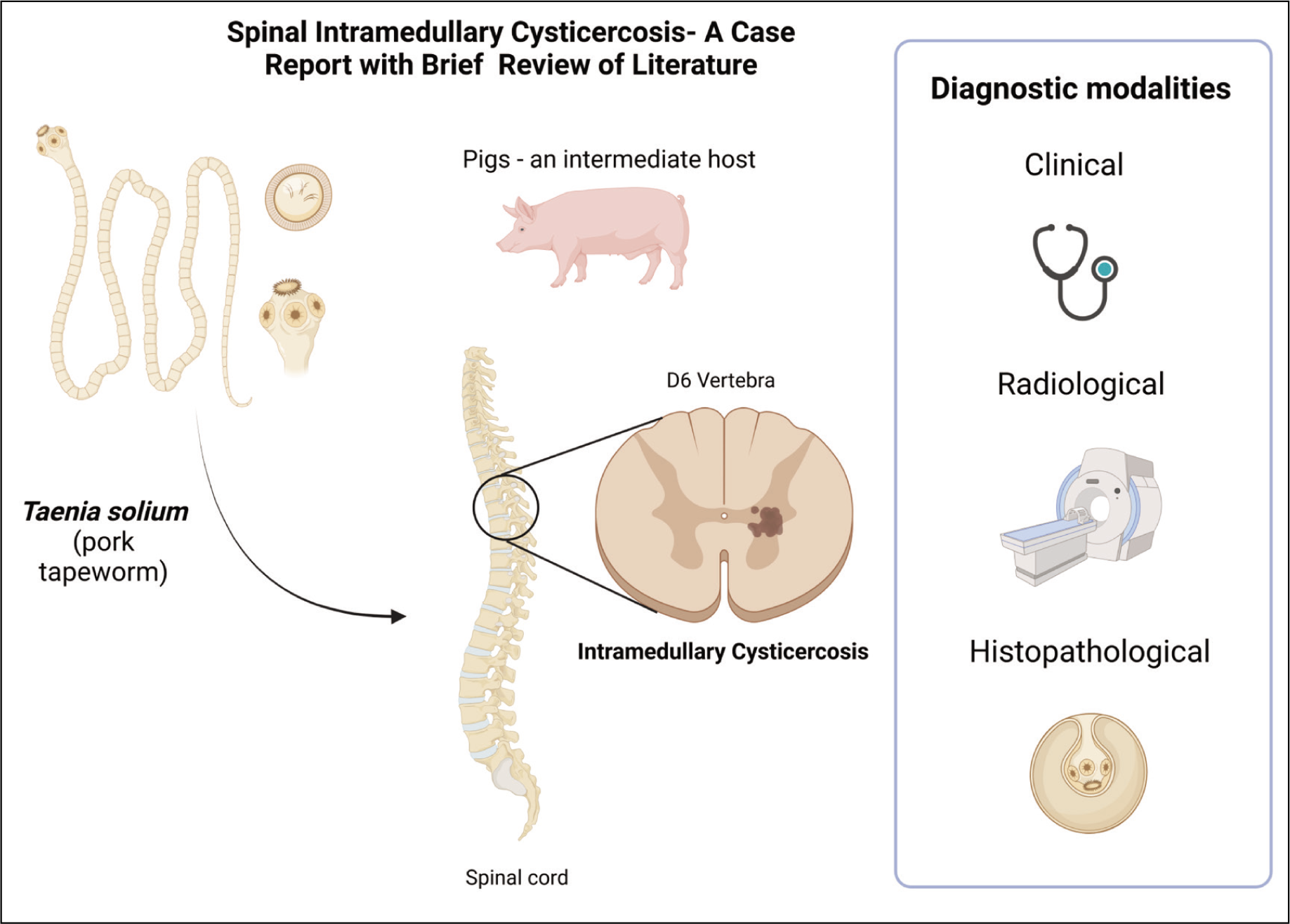
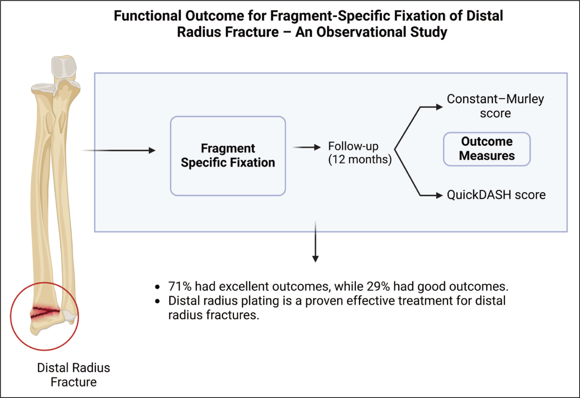
The production of high-quality GA and IG often involves significant costs and requires specific design skills, which can be substantial barriers for many researchers and institutions. Professional graphic design software, while powerful, can be expensive, and there may also be additional costs associated with training or hiring skilled designers. Moreover, the time investment required to create effective visuals can be considerable, adding to the overall resource allocation for research dissemination. For smaller research teams or individual researchers, these factors can limit their ability to utilise GA and IG, potentially impacting the reach and impact of their findings. Figures 3 and 4 provide examples of GA, while Figures 5 and 6 illustrate IG, showcasing the key features of published articles from Apollo Medicine journal.
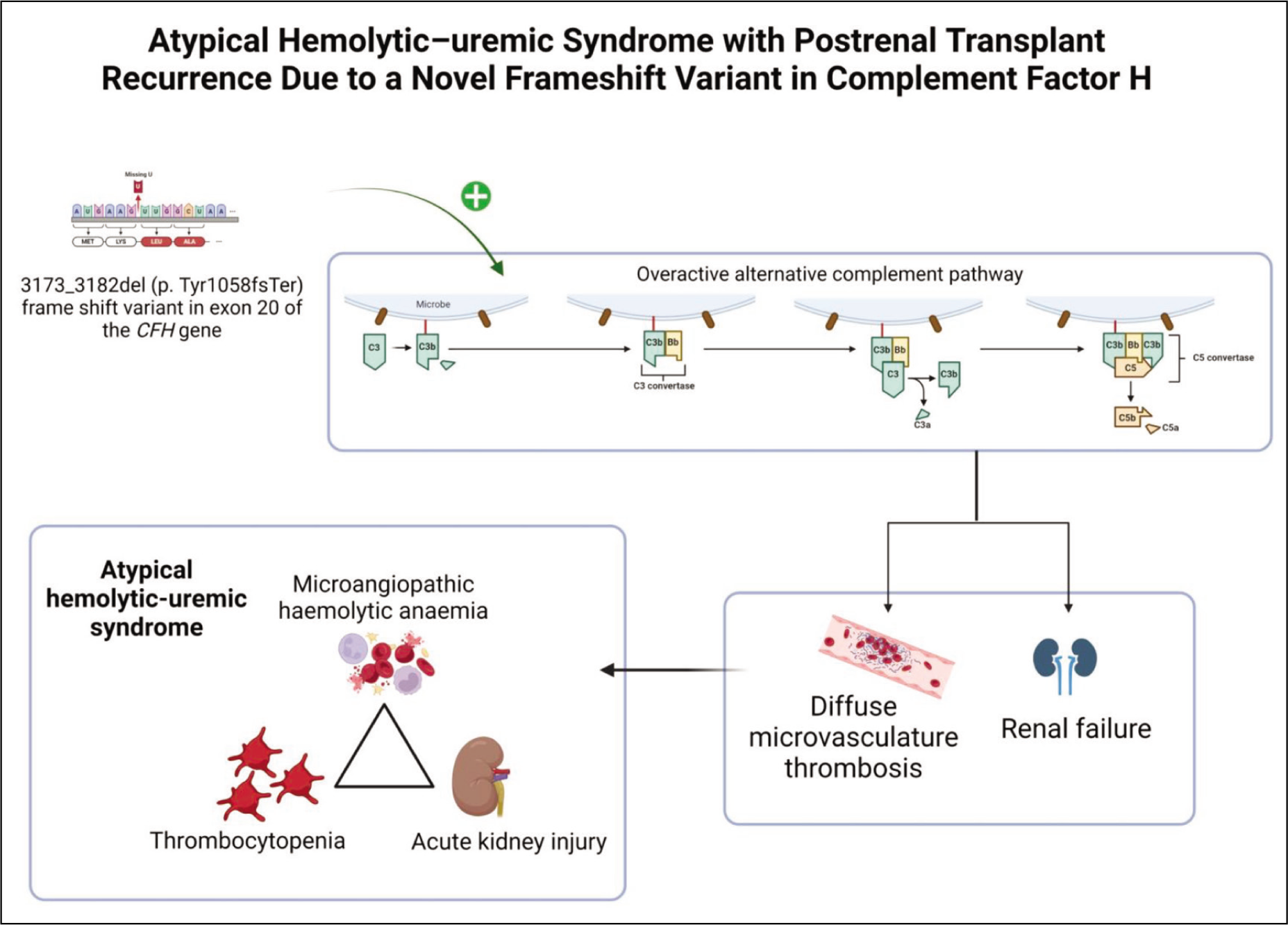
Representational graphical abstract for the article published by Balakrishnan et al.[34]
Representational graphical abstract for the article published by Menon et al.[35]
Representational infographics for the article published by Prachi et al.[36]
Representational infographics for the article published by Feroz Khan et al.[37]
Future Directions
The future of visual communication in scientific research is poised for significant innovation, particularly with advancements in technology that allow for more interactive and immersive experiences. One promising area is the integration of interactive elements in GA and IG, which can provide a dynamic way for viewers to engage with scientific data. For instance, viewers could click through different layers of an infographic to explore more detailed data or manipulate variables to see real-time changes in graphical outputs. Another exciting development is the potential integration of augmented reality (AR) and virtual reality (VR) technologies, which can offer a three-dimensional and immersive experience of scientific concepts. Imagine an AR infographic that could project a holographic model of molecular structures or ecological systems into a classroom or conference setting, enhancing both the educational and engagement aspects of scientific communication.
AI shows promising potential in transforming the creation of GA and IG, presenting significant advancements in efficiency and visual presentation. AI technologies can automate the generation of GAs by extracting pertinent data from research articles, thereby enhancing accuracy and reducing the manual workload for researchers. This automation extends to incorporating dynamic elements such as animations and interactive features, which can make GAs more engaging and accessible to a broader audience.[29] Similarly, automated IG, leverages AI algorithms to produce visualisations like bar charts and scatter plots effortlessly, catering to sectors requiring data-driven insights such as dashboard design and data analysis.[33] The role of AI in enhancing visualisations spans from generating diverse visual formats to refining existing ones and extracting insights efficiently.[38] The capability of AI to analyse vast datasets of GA aids in identifying effective design patterns that can improve the visual appeal and comprehension of scientific publications.[32] By automating repetitive design tasks and offering creative suggestions, AI not only streamlines the creation process but also enhances the overall quality and accessibility of GA and IG in academic and professional settings.
Despite the growing body of research on the effectiveness of GA and IG, there are still significant gaps that need to be addressed. Current studies have often focused on short-term engagement and comprehension metrics; however, long-term retention and the impact of visual tools on scientific literacy among different demographics remain underexplored. Further research is also needed to compare the effectiveness of different design styles and modalities (e.g., static vs. interactive visuals) across various scientific disciplines. This would help identify which visual strategies are most effective for particular types of data or audiences. Additionally, there is a need for more empirical studies that measure the impact of these tools beyond academia, particularly their role in influencing public policy and community behaviour. For example, research could explore how effectively IG convey urgent climate change data to policymakers or health information to underrepresented communities.
The increasing reliance on visual tools for scientific communication also has implications for journal policies and publishing practices. As GA and IG become more common, journals may need to revise their submission guidelines to include specific standards and criteria for visual content. This could involve setting standards for graphical accuracy, ethical representation of data, and accessibility features such as alternative text descriptions for visually impaired readers. Journals might also consider developing new roles or training for editors and reviewers that specifically focus on evaluating the quality and effectiveness of submitted visual materials. Moreover, policies could be implemented that require GA for certain types of articles, particularly those involving complex data or studies with significant public health implications, to ensure that findings are accessible to a broader audience.
Conclusion
GA and IG represent a transformative approach to scientific communication, enhancing the dissemination, comprehension, and engagement of complex research findings across diverse audiences. The integration of advanced technologies like interactive elements and AR promises further innovations, potentially revolutionising how scientific information is perceived and interacted with. However, the effective implementation of these tools requires addressing challenges related to design accuracy, misinterpretation, and resource allocation. Embracing these developments and overcoming associated challenges should enrich the scientific dialogue and enhance public engagement with research findings.
Footnotes
Declaration of conflicting interests
The authors declared no potential conflicts of interest with respect to the research, authorship and/or publication of this article.
Funding
The authors received no financial support for the research, authorship and/or publication of this article.
Institutional ethical committee approval number
Not applicable.
Credit Author Statement
Conceptualization - MJ and RV Manuscript writing - MJ, NJ, and SR Manuscript revision - NJ, AV, and RV Data acquisition - MJ and SR Figures - SR Administration - MJ and RV.
Data availability
Data is contained within the manuscript.
Use of artificial intelligence
We used Grammarly and Bard to improve the English grammar of the manuscript.