
Abstract
The purpose of this paper is to present a new form of chart, which clarifies the inter-relationships between six fundamental urban design parameters that affect the quality and character of any urban layout. These parameters are: built-up area per capita; public ground area per capita (which includes streets and parks); plot factor (the ratio of land area given over to private development to land area available for public use, including that needed for circulation and area available for sport, recreation and public amenities (schools, hospitals, public toilets); floor space index (ratio of built-up area to buildable plot area); net density (population divided by the sum of all buildable plot areas); and gross density (population divided by total area). Mapping these six parameters in a chart shows the complicated trade-offs between one desirable feature and another, including combinations that show that higher densities do not necessarily mean small accommodation and inadequate public space – but they do mean high-rise, and there are severe limits on how high densities can go. The paper also plots diagrams that show the values of these parameters for existing localities in New York, Mumbai (including Dharavi) and Delhi. These diagrams are examples. With more data and more diagrams we might reach a better understanding of what particular values or combinations of values for these parameters we should aim for when designing a new development or modifying an old one. We might also understand the values or combinations of values that we should avoid.
I. Introduction
“High density, low-rise” has long been romanticized to express what was thought of as an ideal solution for urban layouts. High density means more compact cities and therefore more easily managed transport. Low-rise lays claim to various sociological merits deriving from living closer to the ground: easier monitoring of children’s outdoor play; possibly more interaction with one’s neighbours; and no lifts, which means no maintenance costs and no attendant power consumption.
But the expression is incomplete. It should really be: “high density, low-rise, small accommodation”. It is a triangular relationship, and if you want to change one of the parameters you have to accept that one of the other two (or both) must also change. If you want larger accommodation, you must either have lower densities or make buildings taller. You cannot say “high density, low-rise” without also muttering “small accommodation”.
The purpose of this paper is to present a new form of chart, which will clarify the inter-relationships between the various fundamental parameters in the design of an urban layout. Hopefully, it will improve our understanding of how urban layouts work and of the complicated trade-offs between one desirable feature and another. But there is a further possibility, which is that on the chart we can plot diagrams that show the values corresponding to existing localities that we are familiar with in different cities of the world. There are some localities we admire and some we don’t. Perhaps a comparison of these diagrams on the chart will lead us to the values of various parameters that we should aim for and the values, or combinations of values, that we should avoid.
Ii. Definitions
We begin with a definition of these fundamental parameters. They can apply to small pockets (say 20 hectares or less), to intermediate size areas, or to larger areas (say 200 hectares or more), which we might call localities. Note that the most desirable value for each of our parameters may vary according to the size of the area to which it is applied. In this paper we restrict ourselves to the larger areas, large enough to hold all desirable social amenities within comfortable walking distance.
Manhattan’s community districts (CDs) are typically 424 hectares (CD5, the Times Square–Broadway business district) and 313 hectares (CD8, the Upper East Side, predominantly residential). Wards in Mumbai Island city range in size from 214 hectares (C Ward) to 1,220 hectares (F-North). We can sub-divide a large ward like this into smaller areas of about 200 hectares each (that is, two square kilometres). These are localities that are small enough so that as we walk around we can see and feel their distinguishing character, yet large enough to throw up meaningful averages for comparative analysis.
The key parameters are as follows:
The land for public use is divided between the area needed for circulation, both pedestrian and vehicular; the area that is open and available for recreation and sports (parks and playgrounds); and the land needed for public amenities (schools, hospitals, public toilets).
Land for private development is for residential, commercial, industrial or mixed use, and is where private owners are allowed to build.
Annexe 1 gives the formulae that govern the inter-relationships between the six parameters listed above.
Iii. The Chart
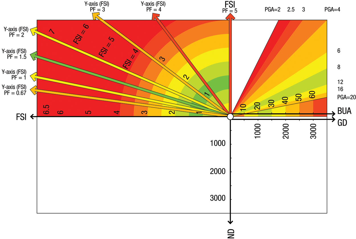
We start by wanting to plot built-up area per capita against FSI. We find that the scale of the FSI axis (the Y-axis) depends on the plot factor. So we decide that the Y-axis may be vertical or may be inclined depending on the plot factor (Figure 1).
Note that the FSI axis may be anywhere between one extreme (the vertical, normally the positive Y-axis) and the other extreme (the leftward horizontal, normally the negative X-axis). The scale we use for FSI follows the circular arcs shown above, with their centre at the origin.
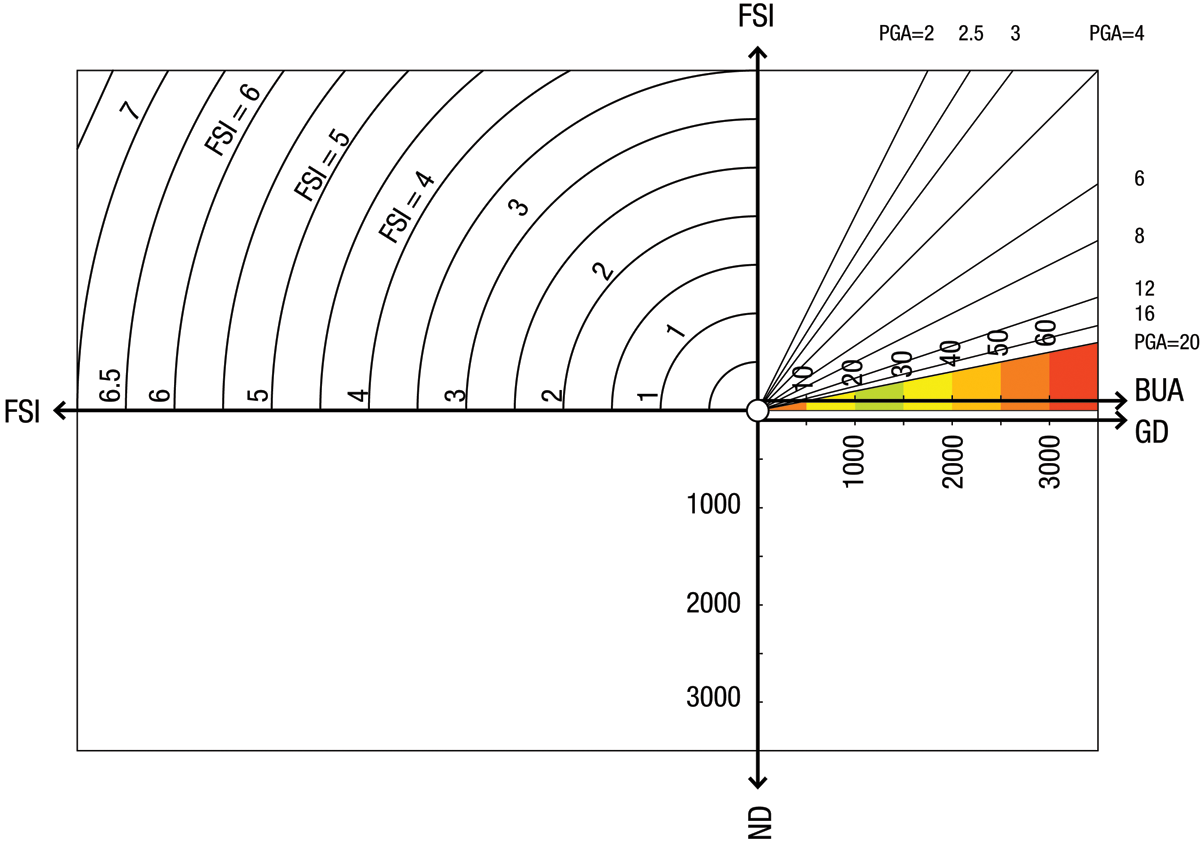
We now extend the graph into the lower third and fourth quadrants (Figure 2).
The third quadrant is a plot of FSI against net densities, which fall on what is normally the negative Y-axis; and the fourth quadrant is a plot of net densities against gross densities, which are aligned with the positive X-axis.
We also add colours to suggest our preferences regarding built-up areas. Green is the most desirable, progressing through yellow and orange to red, which is the least desirable. We suggest on the chart that between 20 and 30 square metres/capita is the ideal – note that this is a personal choice and may vary according to the individual or according to the society in which he lives. The lower value of 10–20 square metres/capita is less desirable, and coloured yellow. Less than 10 square metres/capita is coloured red and considered undesirable; similarly, more than 30 square metres/capita becomes less and less desirable as it is increasingly wasteful of resources.
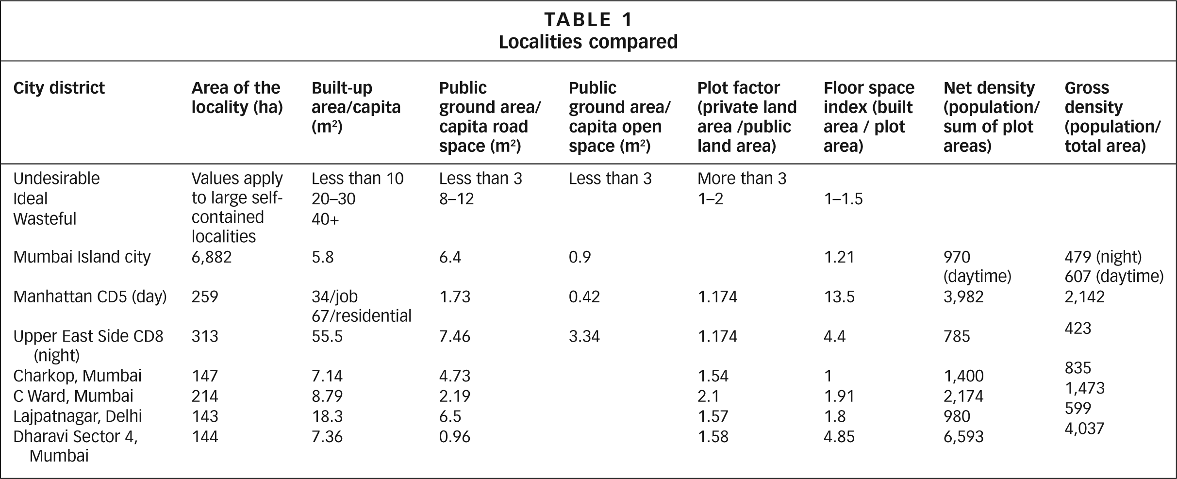
To put these numbers into context, we note that the residential BUA varies from a low of 5.8 square metres/capita in a place like the island city of Mumbai to 55.5 square metres/capita in the Upper East Side (Community District 8 – CD8) of Manhattan, New York. In the predominantly business Community District CD 5 of Manhattan (which includes Times Square and Broadway), where the daytime job population is 20 times the night time residential population, the BUA is 33.7 square metres/job capita and 67.3 square metres/residential capita.
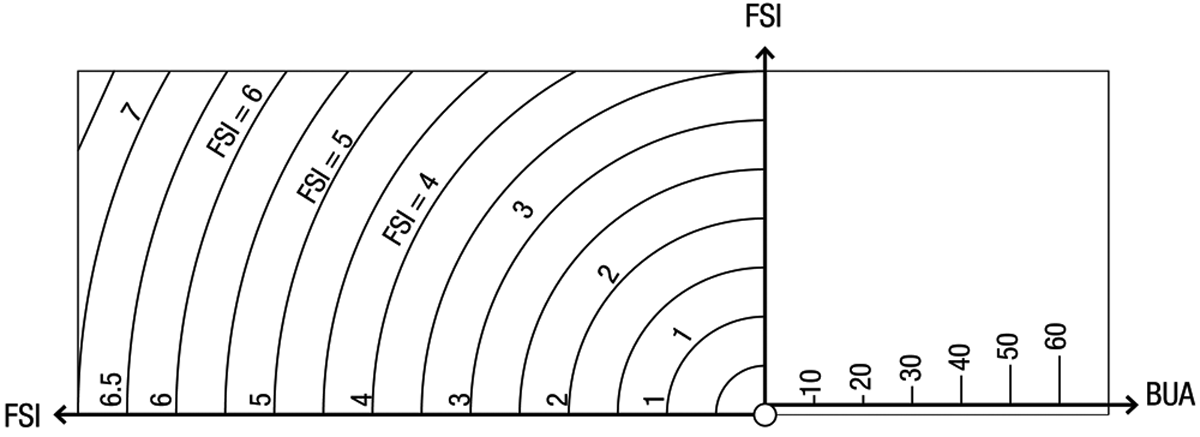
Above these colours for BUA is a spray of diagonal lines representing different values of PGA, ranging from 2–20 square metres/capita. To appreciate the significance of these numbers, we need to look at localities with which we are familiar.
In the Upper East Side (CD8) of Manhattan, a predominantly residential district, at night road area per resident is 7.46 square metres and open space per capita is 3.34 square metres. So the total PGA, excluding schools and hospitals, is 10.8 square metres/capita. In Mumbai’s island city, the average road space per capita is 6.4 square metres/capita and the open space averages 0.9 square metres/per capita – although in several wards, the open space is 0.1 square metres/capita. When comparing figures, we should also remember that Manhattan’s CD8 is served by an underground railway system that carries the bulk of the commuting load.
In Figure 3, we colour the PGA values from green (most desirable) through yellow and orange to red (least desirable). Again, the values we choose are a matter of personal choice. We have set the most desirable PGA at 8–12 square metres/capita. Less than three is most undesirable. So too is anything above 20 because that would probably be open space that lies derelict and unused, with all the attendant ills that that implies (but we should verify this with real world examples).
In Figure 4, in the second quadrant, we have another set of inclined lines. These represent the Y-axis of FSI to be used for different values of the plot factor (PF). To arrive at the FSI for any locality, we begin with the value of BUA, move vertically upwards until we reach the locality’s PGA, then move horizontally leftwards until we reach its PF. From that point on, we follow the arc of constant FSI down to the horizontal axis.
There are two sets of preferred colours possible in the second quadrant. We have preferred values of PF, which call for radial colouring, as well as preferred values of FSI, which require annular colouring.
We colour the radial PF=1.5 green (a matter of personal choice) and the neighbouring values of PF=1 and PF=2 both yellow. We colour the annular rings green for an FSI between 1 and 1.5, grading to red for values above four (again a matter of personal or societal choice).
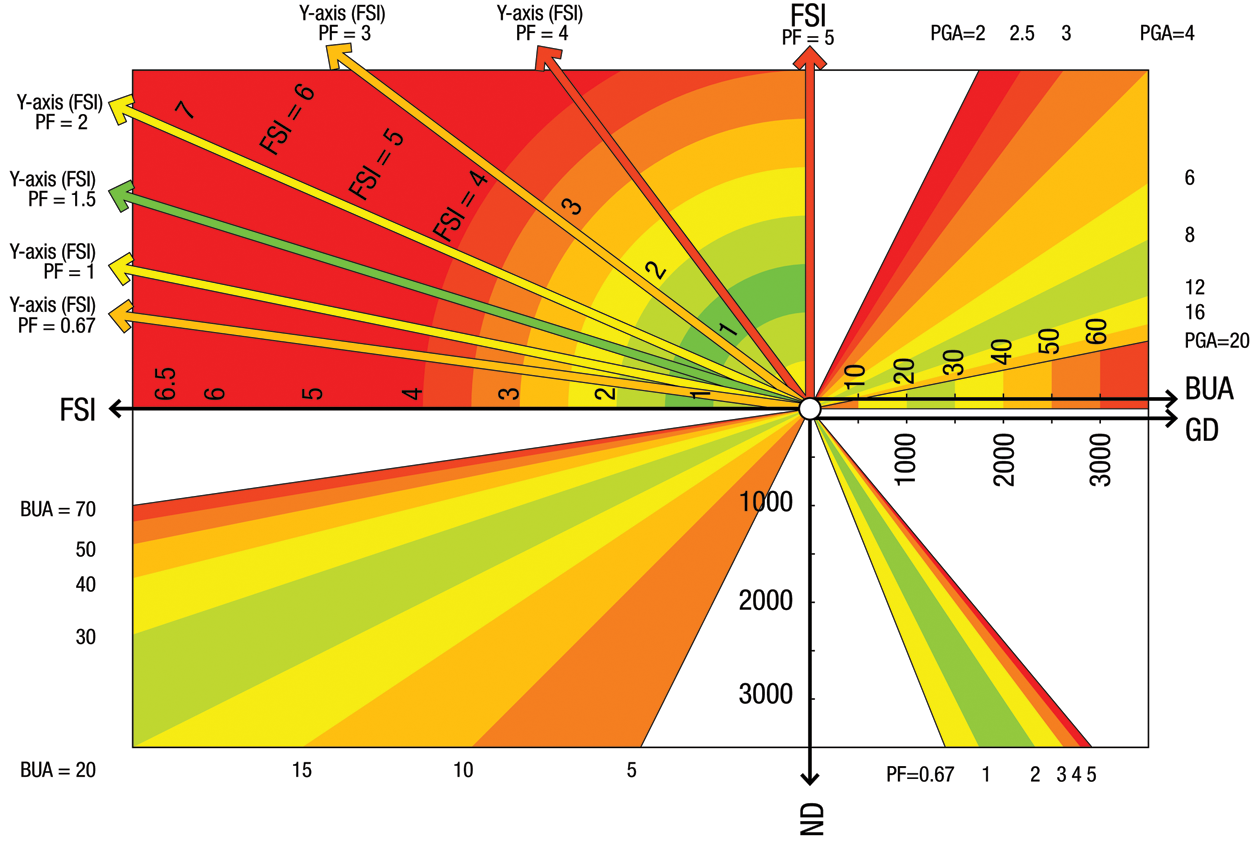
We can now complete the chart (Figure 5). In the third quadrant, we have the relationship between FSI and net density, varying according to the built-up area. We colour the BUA radials with the same colours we used in quadrant 1. In the fourth quadrant, we see that the relationship between net density and gross density varies according to the plot factor, as we would expect. Here also, we colour the radials with the same colours we used in quadrant 2.
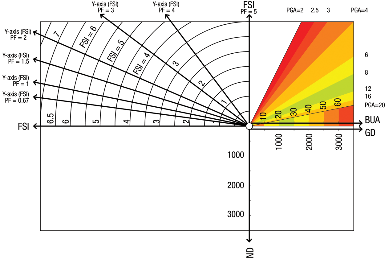
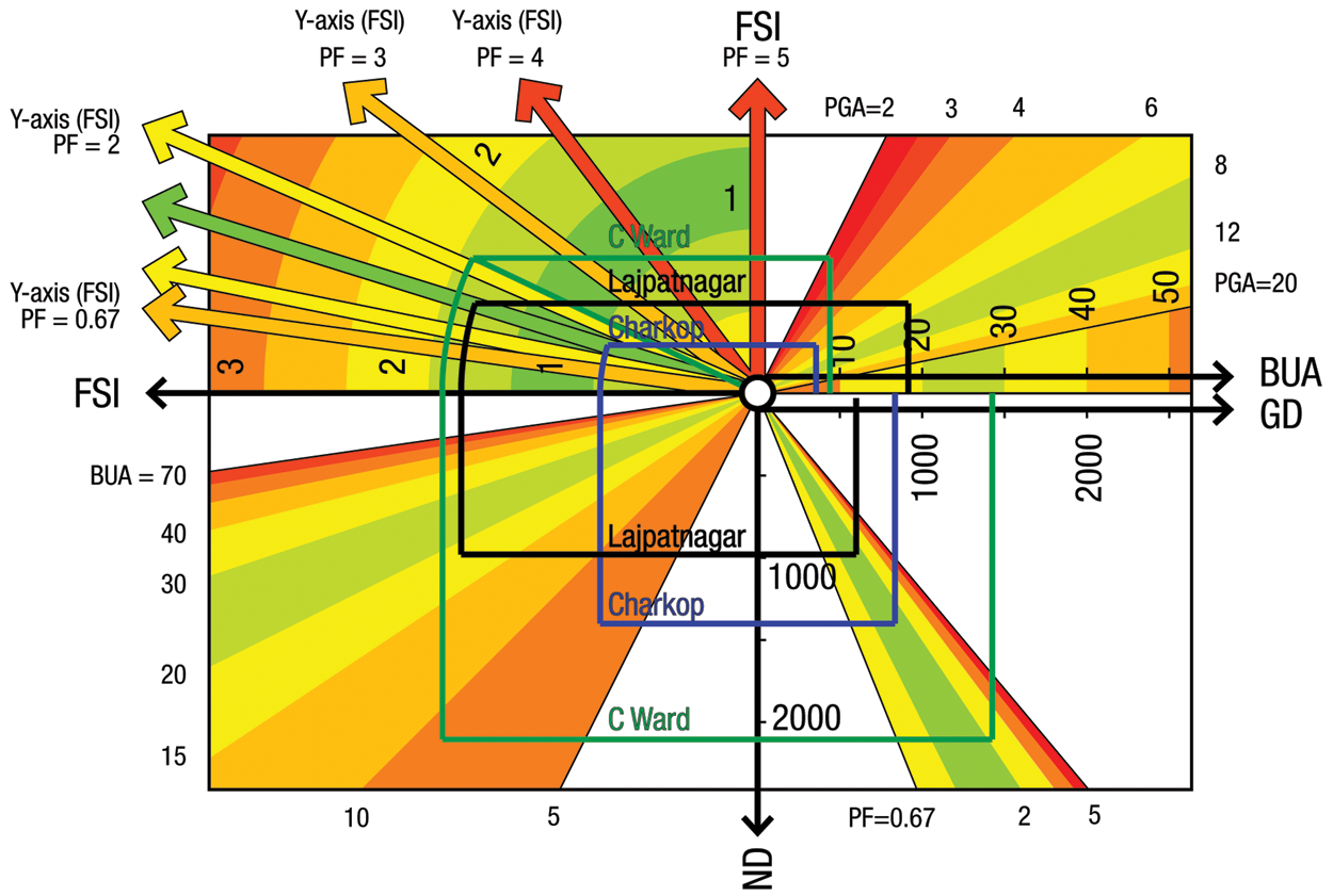
We are now ready to plot real world localities onto the chart (Figure 6).
Iv. Diagrams For Particular Localities
Charkop is a development in the northwest corner of Greater Mumbai, dating from the 1980s, when it was started as a World Bank-funded sites-and-services project. The low-income plinths with a “wet-point” (water supply and sewage connections) were arranged around courtyards with groups of about 33 houses, forming a cooperative society. House costs were cross-subsidized by selling plots to the better-off on which they could build multi-storeyed buildings. Thus there was a mix of income groups sharing the same schools and public parks. The whole scheme is in many ways a model of how housing should be provided to the lower- and middle-income groups in the city.
The total area of the Charkop development is about 147 hectares.(1) The first line in drawing the Charkop diagram on our chart is the one starting at BUA = 7.14 square metres/capita,(2) rising vertically to meet the value of PGA at 4.73 square metres/capita. Here it turns left and runs horizontally until it meets the plot factor of 1.54. The FSI at this point is almost one. We follow the arc down to the horizontal axis, and then vertically down to the same BUA of 7.14, where we turn horizontally and run to the net density axis, where the reading is 1,400 persons/hectare. Continuing horizontally to our plot factor of 1.54, we turn up at this point to run vertically up to the X-axis, where we see that the reading for gross density is 835 persons/hectare.
Now let us look at the diagram for C Ward in Central Mumbai. This is among the most colourful and densely crowded localities in the city. We move from a BUA of 8.79 square metres/capita, through a PGA of 2.19, to a plot factor of 2.1 and an FSI of 1.91, to a net density of 2,174 persons/hectare and a gross density of 1,473 persons/hectare.
Comparing C Ward and Charkop, we see that while the BUA is not very different (8.79 and 7.14, respectively), the really significant difference is in PGA, down from 4.73 in Charkop to less than half that, 2.19, in C Ward. Consequently, C Ward has no open spaces and streets that are far too narrow. The locality is much less comfortable outside the home than Charkop. The plot factor is higher in C Ward (2.1 compared to Charkop’s 1.54) but despite that, the FSI is significantly higher at 1.91 compared to Charkop’s, which is just under one.
The chart also shows the diagram for Lajpatnagar in New Delhi, with a much higher BUA and PGA than either Charkop or C Ward, but correspondingly much lower densities.
Now let us look at some international comparisons. Since we are looking particularly at very high density localities, we chose the Upper East Side (CD8) in Manhattan and the Times Square–Broadway business district (CD5).(3) In CD8, commercial floor space is about 42 per cent of the residential floor space. In CD5, commercial floor space is 10 times residential floor space. These two districts, one predominantly residential and the other predominantly commercial, are probably both extreme examples of high density, high-rise living (Figure 7).
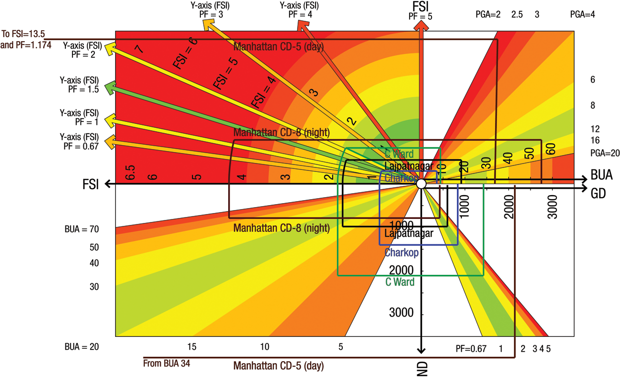
CD8 has a BUA of 55.5 square metres/capita, more than nine times the value for C Ward. The PGA is a crowded but comfortable 7.46 square metres/capita, because the underground railway takes care of the major travel demand. We have a plot factor of 1.174 for both CD5 and CD8. The FSI for CD8 is 4.4, and 13.5 – off the chart to the left – for CD5. For the residential district of CD8 the net density, at around 785 persons/hectare, is a little over one-third that of C Ward’s, at 2,174; and CD8’s gross density is 423 persons/hectare, a little over one-quarter of C Ward’s, at 1,473. But the business district CD5’s net and gross densities, at 3,982 and 2,142 persons/hectare, respectively, exceed, as far as one knows, anything seen anywhere in the world for localities with an area greater than 200 hectares.
Note that in computing these net and gross densities, we have taken the residential and commercial areas as both being fully occupied simultaneously, except in the case of Manhattan. In practice, of course, during the day, residential occupancies are reduced by the numbers in the workforce, and at night, there will be no workers in the area. So actual net and gross densities will always be slightly lower than the numbers suggested here. The worst-case diagrams shown above may not be very different for predominantly residential or predominantly commercial localities, but for mixed use locations a more refined analysis is clearly called for, with separate diagrams for day and night occupancies.
Finally, we come to plans for the redevelopment of Dharavi,(4) a thriving township of probably 75,000 families in a prime location in Mumbai. The driving force behind the redevelopment is not what is in the best interests of the local residents but, rather, it is to make money from the value of the land on which the settlement stands, and this has been explicitly so declared by the city government. The plan is to convert Dharavi, at present a shanty town, into multi-storeyed buildings, with sufficient accommodation for existing residents, at no cost to themselves, and with an additional surplus for sale to new residents, whose purchasing power will finance the entire project and also provide handsome profits to be shared by the government and the developer. Rules for redevelopment have been framed accordingly. Figure 8 shows the result in terms of our six parameters. Admittedly this is drawn from the plans for a small part of the development, about 30 hectares, but all neighbouring developments are similar, and the values we have used here are most likely valid for the entire 144 hectares of Dharavi that are to be redeveloped.
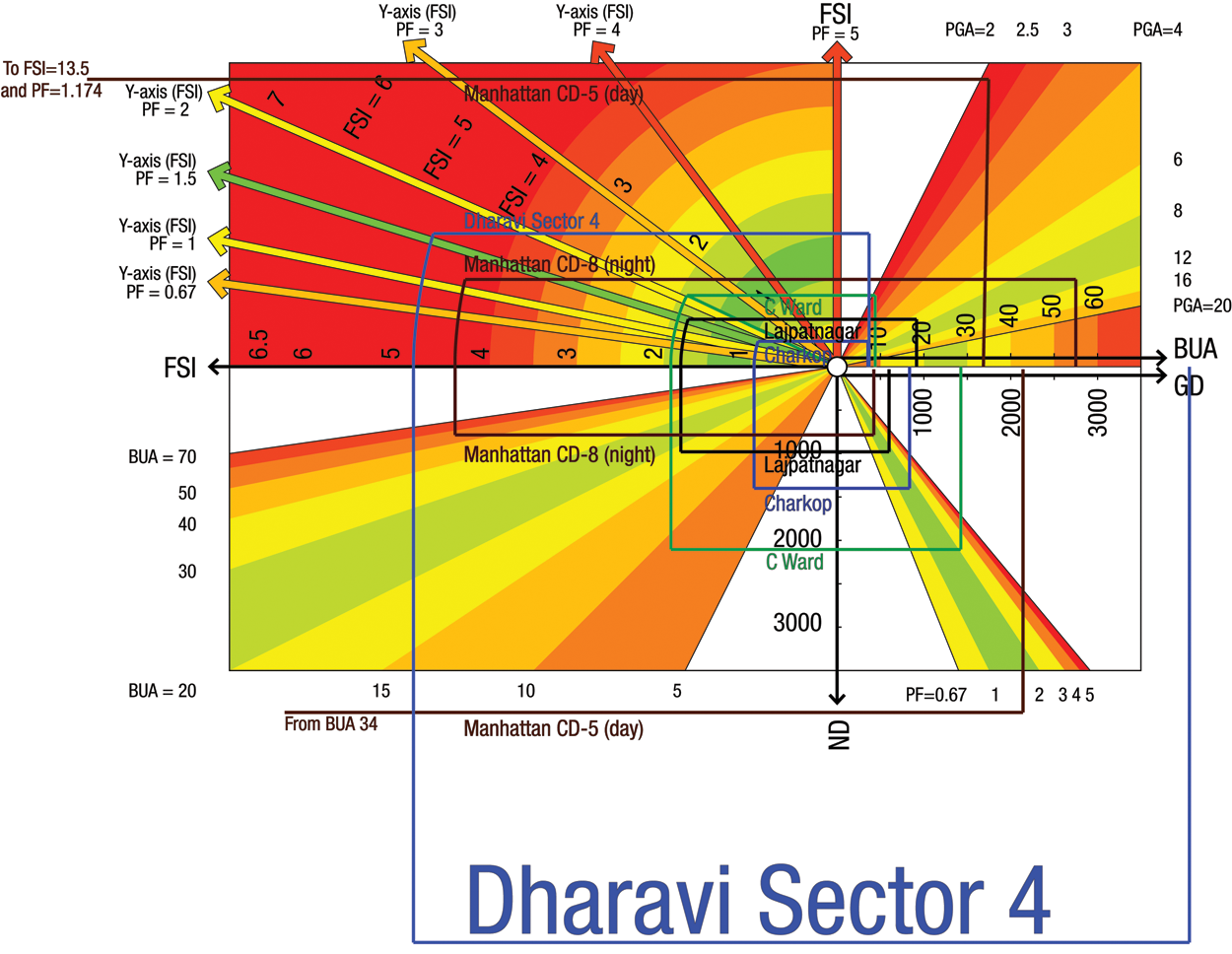
We begin with a BUA of 7.36, not very different from Charkop’s 7.14, and Charkop has a layout we admire. But we then move off the chart into a PGA of 0.96 (compared to C Ward’s 2.19 and Charkop’s 4.73). With a plot factor of 1.58 and an FSI of 4.85, we eventually get net and gross densities of 6,593 and 4,037 persons/hectare, respectively, almost double those of Manhattan’s CD5 – and let us not forget that Dharavi, unlike Manhattan, has no underground railway.
The values shown in the diagrams above are summarized for convenience in Table 1. But note that looking at these numbers doesn’t help much in designing new layouts. For that, it is best to see what kind of diagram shows up on the chart for each layout, how altering one parameter affects another, and how the diagram compares with other diagrams of localities that we know we like.
Localities compared
V. Can High Density Be Achieved With Good Living Conditions?
This question is important because high densities imply a more compact development, and so less commuting time. That is an important item in the basket of factors that make up the quality of urban life. For the moment, we need not go into the power consumption comparisons between more vertical and more horizontal living.
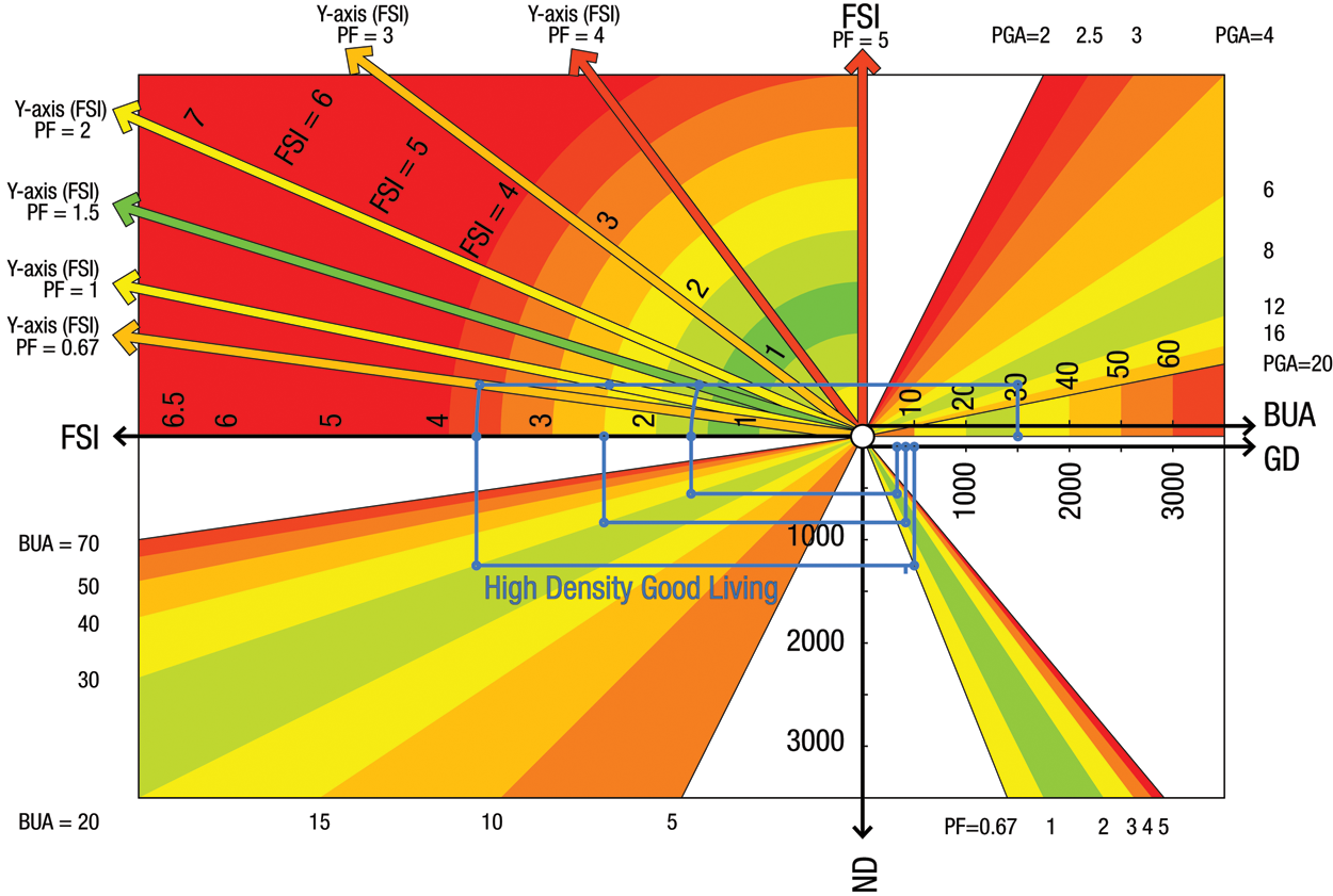
In terms of our six parameters, all concerned with the local environment, let us first agree on what we mean by good living conditions. If we mean a comfortable BUA, say 30 square metres per capita, and if we mean a comfortable PGA, say 12 square metres per capita, then the horizontal line in quadrant 1 is fairly low. Extend it to the left into quadrant 2 and it intersects the radial lines of PF = 1.5, PF = 1 and PF = 0.67 at three different points on the horizontal, at higher and higher levels of FSI. (These three plot factors are equivalent to 60 per cent, 50 per cent and 40 per cent, respectively, of the total land area to be set aside for plots for construction.) Follow the relevant arcs down to the horizontal and drop lines vertically down to the radial in quadrant 3, which represents BUA = 30. At these intersection points, turning right to meet the net density vertical axis, we get net densities of 555 and 833 and 1,250 persons/hectare, respectively. Continuing into quadrant 4, and intersecting the inclined lines that correspond to the three different PFs, we turn up vertically to meet the gross density axis at values of 333 and 417 and 500 persons/gross hectare. The FSIs for the three cases are 1.67, 2.5 and 3.75, respectively. So really, if we want good living conditions, we cannot go much beyond 500 persons per gross hectare. And notice, in particular, that if we want the higher densities we have to have a smaller plot factor – buildable plots should be less than half of the total area. And the buildings on these limited plots will of course be taller.
To carry the argument to its extreme, if we were to have a plot factor of only 0.2, implying that only one-sixth of the total area was buildable plots, our net density would be 4,166 persons/hectare but the gross density would not change much, to 694 persons/hectare and the FSI would be 12.5 – in other words, very tall buildings scattered about in an otherwise open landscape. So the pursuit of high density, if it is to be in the context of good living conditions, is a perilous journey into unexplored terrain.
Vi. Conclusions
This paper has presented a form of chart that links six key parameters, which between them characterize an urban layout in quite a comprehensive manner. The diagrams, above all, relate to large localities of 150 hectares or more, which should be more or less self-contained with regard to all amenities. But such diagrams could be drawn equally well for smaller pockets, say 20 hectares or so, and the permitted values of the six different parameters in that smaller range could well be more extreme, without loss of quality, provided the surrounding areas take care of amenity deficiencies in these smaller pockets. We will probably need different charts and different sets of diagrams for different size ranges, to choose the correct size range for the pocket or locality we want to examine. The point is, from the appearance of the diagram on the selected chart, we should be able to make out what kind of pocket or locality this is likely to be.
Each locality that we are familiar with around the world can be represented as a diagram on this chart. We can then identify those localities that we like and those that we find unsatisfactory in one way or another. A study of these may lead us to a preferred range of values for each of the parameters, which we should try to achieve in any new layout or in any redevelopment of an existing layout, keeping in mind the size of the layout we are working with.
Of course, the choice of defining parameters for a locality has to be in the context of the society in which the layout is set: its values, preferences and wealth. Also in the context of access to, and sufficiency of, the transport systems that serve the locality, both overground and underground.
ANNEXe 1: Formulae For The Relationships Shown On The Chart
Note: These formulae completely represent the relationships shown in the chart. The mathematics is simple but it is hard to understand from the formulae exactly how our six variables are interlocked and interdependent. The chart, on the other hand, presents the same relationships graphically and makes it easier to perceive how altering one variable affects another.
Plot Ratio PR = Buildable Plot Area / Total Land Area; other variables are as defined in the paper.
PF = PR / (1 – PR); and consequently PR = PF / (1 + PF)
GD = (1 – PR) * 10,000 / PGA
ND = GD / PR = 10,000 / (PGA * PF) = FSI * 10,000 / BUA
ANNEXe 2: Inferences From The Chart (For Those Who Prefer Statements To Graphs)
For any given plot factor (that is, any given layout), as the built-up area per capita increases, FSI also increases.
For a given layout, and a given built-up area per capita, as the FSI goes up, the public ground area per capita goes down.
For a given built-up area per capita, and a given public ground area per capita, the lower the plot factor the higher the FSI.
For the same layout, and the same PGA per capita, higher built-up area per capita demands a higher FSI.
Low-rise, high density means small accommodation.
High-rise does not necessarily mean high density. If you have large accommodation you can have high-rise, low density development. But for the same size accommodation, low-rise will mean even lower densities.
For any particular size of accommodation, densities go up in proportion to the number of floors, provided the total footprint area is unchanged.
(Note that for any given population in an urban area, lower gross densities imply greater urban sprawl, and also imply more spacious living.)
The higher the plot factor, the higher the gross density in relation to any given net density.
For any given plot factor, net and gross densities increase or decrease in proportion to each other.
Footnotes
Acknowledgements
We are grateful to the Urban Design Research Institute, Mumbai for all their help with the charts.
1.
2.
Data from personal communication with Dilip V Shekdar, principal designer for the Charkop project, now with CIDCO, Navi Mumbai.
3.
Data from personal communication with Shampa Chanda, Director of Citywide Planning, Department of Housing Preservation and Development’s (HPD), Planning and Pipeline Development Division, New York City.
4.
Data from personal communication from Anirudh Paul, Director, Kamala Raheja Vidyanidhi Institute of Architecture and Environment, Mumbai.