
Abstract
Previous research addressing the relation between income and donations as a proportion of income has revealed predominantly inconsistent results. In this article, we argue that this can partly be explained by the great variance of methodological approaches. Providing a literature review covering 26 studies, we systematically identify how methodological issues such as data, variables, and methods have affected former findings. In addition, we apply different methodological approaches to Austrian income tax data (n = 20,000), demonstrating how different methods lead to a variation in results. Overall, we show that existing studies are hardly comparable as their designs vary strongly. We point out that it is particularly important to use samples with sufficient cases of all income groups and methods that adequately account for the non-linear relation between the two variables, not restricting it to a U-shape. Our findings enable a better understanding and interpretation of diverging findings in philanthropic research.
Charitable donations are considered to strongly vary across income classes. While there is uncontested evidence that the amounts of individuals’ donations increase with their financial resources (e.g., Wiepking & Bekkers, 2012), the debate on how income is related to donations as a proportion of income is far from settled. Although scholars have addressed this relation for more than half a century, their findings vary a lot and there seems to be no general pattern regarding this question. In the light of rising income inequality (e.g., Milanovic, 2011), we do not know how changes in the income distribution may affect total donation volumes. Therefore, it is crucial to determine the proportion donated by each income group. In response, nonprofits soliciting donations may need to adapt their fundraising strategies, including strategies to get high-net-worth donors to give according to their capacity, and public policies supporting donations may need reform (Duffy et al., 2014; Duquette & Hargaden, 2018).
The debate on the “charitable-giving profile” started in the 1990s with several studies revealing contradicting results. Some of them find that the generosity of the population, defined as the amount donated divided by income, follows a U-shaped curve, with individuals at both ends of the income distribution donating the highest proportions of their income (e.g., Auten et al., 2002; James & Sharpe, 2007; Jencks, 1987). For the United States, for instance, those below an annual income of USD10,000 donate about 4.6% of their income, while those with an income higher than USD150,000 give 2.2%, and those in the middle 1.4% (James & Sharpe, 2007). Other studies do not find that lower income groups are more generous, but rather describe the charitable-giving profile as a flat curve with an upward slope for higher income groups (Schervish et al., 2002; Schervish & Havens, 1998). Yet other studies doubt the upward swing on the right-hand side and find the curve to be “reversed J-shaped” (Cowley et al., 2011; Wiepking, 2007). This means that “poorer households are much more generous in terms of the proportion of their total budgets given to charity” (Cowley et al., 2011, p. 3) compared to all other households. Similarly, another set of studies also concludes that the relation between income and proportion of income donated is negative, described by a linear downward-sloping curve (Benediktson, 2018). Finally, some further studies describe the curve to be overall flat, with the proportion of income donated being the same across all income groups (Schervish & Havens, 1995a).
Notwithstanding this large diversity in identified charitable-giving profiles, scholars have proposed theoretical explanations for each of them. Higher relative giving levels for low-income groups are, for instance, explained by religious giving (Jencks, 1987; Schervish & Havens, 1995a); by a better understanding of the needs of others by low-income groups due to their own life-experience (Piff et al., 2010); by the notion of “the committed few,” defined as donors that donate 10% or more of their income (James & Sharpe, 2007); or by the deliberation that donors of this income group make their contributions out of accumulated wealth rather than out of current income (James & Sharpe, 2007; Wilhelm, 2005). An overall downward-sloping curve can be explained by the “giving standard” (Wiepking, 2007), which refers to social norms regarding the appropriate amount individuals decide to donate in specific circumstances that are equal for individuals of all income groups. An upward-sloping curve is explained by greater disposable income (McClelland & Brooks, 2004), the American culture of philanthropy (Ostrower, 1997), more requests for donations (Yörük, 2009), or by tax regulations which reduce the real costs of a donation for individuals facing higher marginal tax rates (Wiepking, 2007).
Given the diverse and inconsistent results, however, we argue that it is crucial to also look at differences in methodological approaches of existing work. We claim that part of the variation in results stems from the multitude of methodological approaches used and therefore pursue the following research question: How do methodological decisions influence results on the relation between individuals’ income and the proportion of income donated? We answer this question first by a literature review based on 26 empirical studies, where we systematically identify how technical issues such as data and methods affect findings on the relation between individuals’ income and the proportion of income donated. In a second step, we use Austrian income tax data (n = 20,000) for an empirical application, where we demonstrate how the various methods lead to diverging findings.
Focusing on methodological issues, this article contributes to the literature by offering a synopsis of previous findings, showing that much of the variety in results can be explained by issues such as sampling or method of analysis. In addition, we demonstrate that while there is value in previous research, the most commonly applied regression-based econometric techniques are limited as much as they force the relation between income and the proportion donated to be linear or quadratic. For that reason, we estimate the relation semi-parametrically, which does not restrict the nature of the relationship and—to our knowledge—has not been used previously to examine this question.
Literature Review: How Methodological Decisions Influence Existing Results
To systematically identify methodological issues that influence findings on the relation between income and its proportion donated, we conducted a literature review and searched for empirical studies addressing this issue available in English or German language. We started our search in the ISI Web of Knowledge database with defined search terms (charitable giving, income) and then used back and forward snowballing to identify relevant studies. Overall, 26 studies met our requirements, nine of them published in journals, five in books, and six each are working papers and reports (Table 1). The large majority of them refer to data from the United States, while the remaining seven investigate data from Europe. Among them are studies on the United Kingdom (3), Austria (1), Denmark (1), and the Netherlands (2). Most of them use survey data as compared to administrative ones.
Overview of Studies on Income and Proportion of Income Donated: Main Findings, Samples, and Methods Used.
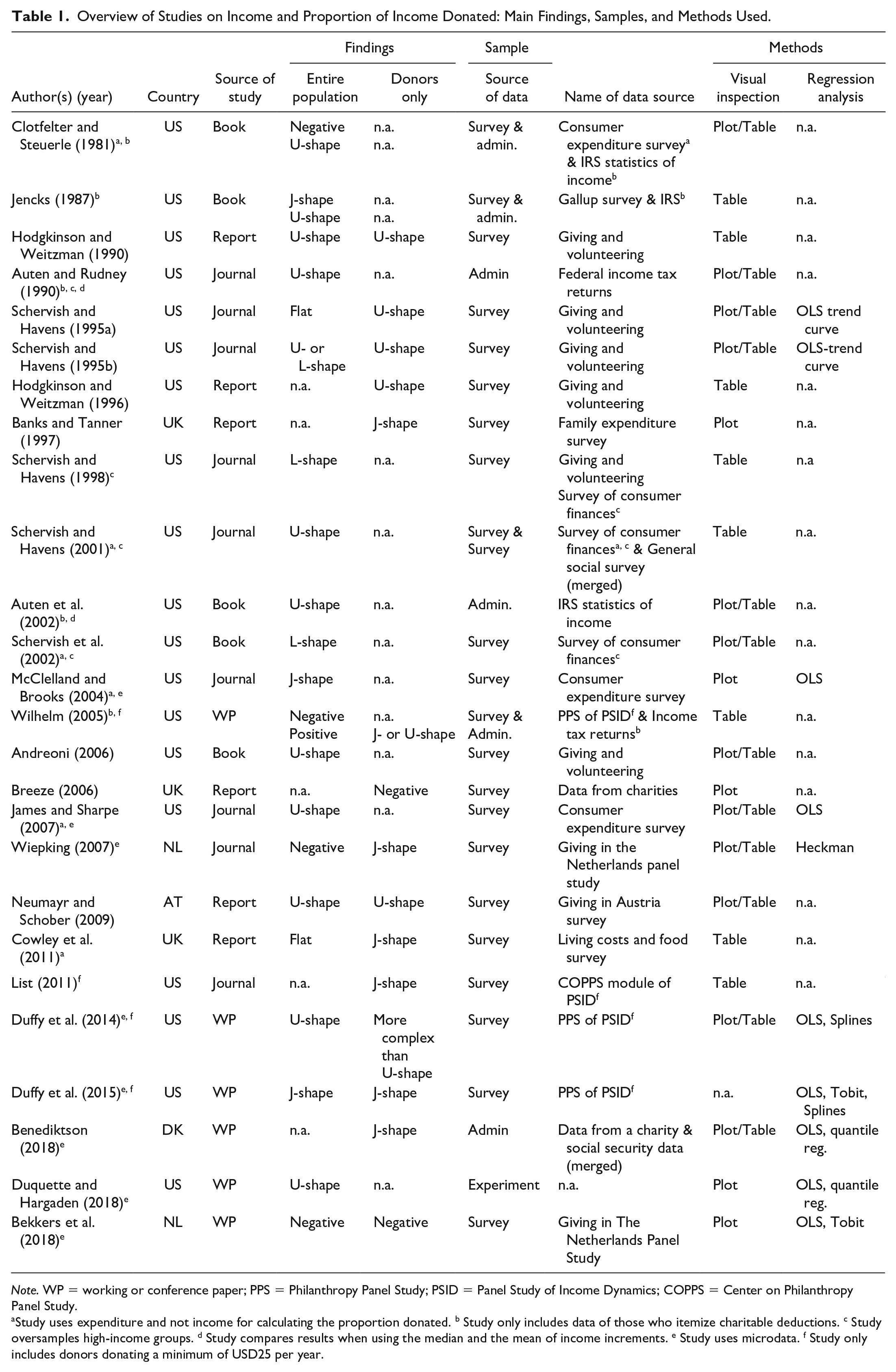
Note. WP = working or conference paper; PPS = Philanthropy Panel Study; PSID = Panel Study of Income Dynamics; COPPS = Center on Philanthropy Panel Study.
Study uses expenditure and not income for calculating the proportion donated. b Study only includes data of those who itemize charitable deductions. c Study oversamples high-income groups. d Study compares results when using the median and the mean of income increments. e Study uses microdata. f Study only includes donors donating a minimum of USD25 per year.
Chronologically, the debate on the relationship between income and the proportion of income donated started in the early 1980s with an article by Clotfelter and Steuerle in 1981 1 and was most lively in the mid-90s. The few studies providing evidence outside of the United States have been added, with one exception, only after 2005.
Regarding the identified charitable-giving profiles, we see some pattern by time and by region (Table 1). Up until the mid-1990s, the U-shaped profile was the main finding to describe giving as a proportion of income (Andreoni, 2006; Auten & Rudney, 1990; Clotfelter & Steuerle, 1981; Hodgkinson & Weitzman, 1996; Jencks, 1987; Schervish & Havens, 2001). Only a couple of researchers revealed other findings, namely an overall flat profile (Schervish & Havens, 1995a, p. 88; 1995b) or a profile that is flat in lower income groups but rises in the higher income section, best described by an L-shaped curve (Schervish et al., 2002; Schervish & Havens, 1998). Starting in about 2004, however, several scholars revealed different descriptions in their findings. They reported negative (Breeze, 2006) or reverse J-shaped profiles of the charitable-giving curve (Benediktson, 2018; Cowley et al., 2011; Duffy et al., 2015; List, 2011; McClelland & Brooks, 2004; Wiepking, 2007), 2 implying that those with lowest income donate the highest proportion of it, while all other income groups give lower and almost constant shares. Studies using data outside the United States often come to this conclusion.
At first glance, differences in results could thus be explained either by a changing giving behavior over time or by diverging patterns in different welfare contexts. We argue, however, that methodological differences are a major source of dissonance in results. These differences can be categorized into three groups: (a) the sample analyzed, (b) the specification of variables, and (c) the method of analysis. Next, we explain them one by one.
Variation in Results Based on Sample Analyzed
In terms of the sample analyzed, it is crucial whether specific parts of the population are included (e.g., non-donors) or represented by a group that is large enough to draw unambiguous conclusions (e.g., high-income groups). While this is no news and has been a matter of debate in philanthropy research since at least the 1990s (see e.g., James & Sharpe, 2007; Schervish & Havens, 1995b), it is striking that hardly any of the studies reviewed explicitly specify for which part of the population (e.g., donors only) results should be valid (exceptions: Breeze, 2006; Wilhelm, 2005). Instead, most of them merely claim to investigate the relation between income and its proportion donated and the reader cumbersomely has to find out to which groups the point made applies. Thus, it is difficult to compare findings because sample restrictions lead to a series of distortions.
Entire population versus donors only
Whether samples of the entire population or donors only are analyzed is particularly relevant for the left side of the giving profile. Many studies identify that a left-side downward-sloping curve virtually disappears when non-donors are included (e.g., Cowley et al., 2011; Schervish et al., 2002; Schervish & Havens, 1995b, 1998). This is explained by the fact that the average amount donated per income group decreases when non-donors are added. One of the reasons therefore is that the incidence of giving rises with income in many countries (Banks & Tanner, 1997; Cowley et al., 2011; Schervish et al., 2002; Schervish & Havens, 1995a; Wilhelm, 2005), making this effect stronger for lower income groups. For countries where incidence of giving does not increase with income such as the Netherlands and Austria, the profile of the curve does not change when non-donors are included (Neumayr & Schober, 2009; Wiepking, 2007).
The sheer definition of a donor also influences whether the share of donors rises with income. In fact, some studies regard individuals as donors only if their donation exceeds a certain amount, such as a minimum of USD25 a year (all studies using PSID data) or of USD500 a year (as the study by Schervish et al., 2002 does). A threshold of USD500 dollars, however, obviously yields a higher share of donors in higher income groups, because fewer individuals in lower income groups can afford to donate such relatively high amounts.
Tax-deduction regulations of donations cause another sample-selection bias. Studies using U.S. income tax data are much more likely to exclude lower income donors due to the itemization requirement. Because lower-income people are more likely to use the standard deduction option instead of itemizing their charitable deductions, their donations are not captured by tax data and they consequently do not count as donors (Wilhelm, 2005). The downward-sloping curve at the left-hand side of the U-shape identified by Andrews (1950) was also attributed to this selection bias (Duffy et al., 2014). In fact, only about 40% of households choose to itemize their charitable deductions and are thus observed as donors in U.S. income tax data, and this 40% typically consist of higher income households (see Wilhelm, 2005, p. 16).
We also found that other groups apart from non-donors were systematically omitted, sometimes without explanatory arguments. In studies based on the U.S. Survey of Consumer Finance (SCF), all households where answers were not provided by the male partner (for mixed-sex couples) or by the older partner (for same-sex couples) were omitted from the sample (Schervish & Havens, 1995a, 2001). This selection process particularly reduced the average giving levels of lower income segments (Benediktson, 2018; James & Sharpe, 2007).
Another selection bias is found in studies that use nonaggregated data. While they usually exclude individuals and households without a positive income to avoid zeros (e.g., James & Sharpe, 2007; List, 2011; McClelland & Brooks, 2004; Schervish & Havens, 2001; Wilhelm, 2005), some even exclude individuals with an income below a certain threshold (e.g., below an annual income of USD25,000; Auten et al., 2002). All of these selections reduce the reliability of the findings on the left of the charitable-giving profile.
Representative sample versus oversampling high-income groups
Representative samples have the downside that they usually do not have sufficient cases of high-income donors or do not include this group at all. In fact, the sheer number of high-income individuals is too small to draw valid conclusions regarding the right-hand side of the charitable-giving profile (Wilhelm, 2005). First, this is due to confidence intervals being very large. Second, the low absolute number of high-income individuals in samples makes analyses more vulnerable to extreme outliers in contrast to the income-spectrum of less well-off persons. This tendency is reinforced by the fact that income (and charitable giving) is very skewed toward high-income groups (Benediktson, 2018; Schervish et al., 2002). Reliable statements regarding the right-hand side of the charitable-giving profile, thus, can only be drawn when high-income groups are oversampled (Benediktson, 2018; Schervish et al., 2002; Wiepking, 2007).
Empirical findings support these arguments. Scholars identifying an U-shaped giving profile found the curve to start to increase at very high income levels. James and Sharpe (2007) show that the share donated starts to rise at an annual income of between USD130,000 and USD150,000 (depending on whether deciles or percentiles were used for calculation), implying that the upward slope of the giving profile may describe the behavior of merely 10% of the population, that is, the 10% at the top of the income distribution. Duffy et al. (2014), however, observe no upward slope using data from the PSID, which has a higher proportion in the greater than USD150,000 income range than the James and Sharpe (2007) data. The data sets in use, however, are considered to estimate giving accurately only up to the 90th percentile (Wilhelm, 2005, 2007). This is why scholars argue that the right-hand side of the curve can only be detected in samples that also include the top 5%–10% of households, as do Schervish et al. (2002) when analyzing survey data that oversample high-income groups.
Survey data versus administrative data
The third issue with regard to sampling refers to the data source and is closely connected to the issues discussed above; it deals with the flaws and strengths of survey and administrative data. One flaw of survey data, which are used by most studies reviewed, is that they are usually based on representative samples that do not include a sufficient number of high-income cases. This is due to cost restrictions because surveys with larger sample sizes or such that include oversamples of certain groups are more expensive (Schervish et al., 2002). In addition, surveys reflect individuals’ self-reported information, which is likely to be biased by people’s imprecise memories (Andreoni, 2006; Bekkers & Wiepking, 2006) and socially desired answering behavior. In fact, lower income groups generally underreport their income (Angel, 2018; Meyer & Sullivan, 2003), effectively increasing the proportion of income donated, while those with higher income usually overrate it (Angel, 2018). Moreover, voluntary surveys are prone to a non-response bias when it comes to individuals with higher incomes. We thus have to be careful when interpreting results for high-income individuals based on survey data.
Administrative data, on the other hand, are mainly flawed for the left-hand side of the charitable-giving profile. This is the case because low-income groups are often omitted or not well represented in income statistics, which are used in five of the six studies that are based on administrative data (i.e., Auten et al., 2002; Auten & Rudney, 1990; Clotfelter & Steuerle, 1981; Jencks, 1987; Wilhelm, 2005). First, since income statistics solely report donations that have been tax deducted, donors with low incomes (who consequently do not pay income taxes in many countries) are less likely to report their donations to tax authorities and are therefore treated as non-donors. In the United States, low-income households are less likely to itemize their charitable deductions—as Wilhelm (2005) demonstrates—and are therefore not observed as donors in income tax data. Second, in some countries, donations can be tax deducted only if their amount exceeds a certain threshold, again treating some donors as non-donors. Since amounts donated increase with income (Wiepking & Bekkers, 2012), such a distortion is more likely to apply to lower income individuals.
We can thus conclude that while administrative data may be problematic for estimating low-income households, survey data may be problematic for estimating high-income households, making both data sources complementary in their flaws and their strengths. A comparison of findings from both data sources was conducted by Clotfelter and Steuerle (1981), Jencks (1987), and Wilhelm (2005). All three of them found that lower income individuals appear to be much more generous than middle-to high-income individuals, regardless of the data source. An upward slope in the curve for high-income individuals, however, was only evident when using administrative data. Wilhelm (2005) found that this upward slope caused by individuals in the top 10% of income was not evident in survey data because this income group was not adequately represented in survey data.
Variation in Results Due to Specification of Variables
The specification of variables, most notably income and the proportion of income donated, is closely related to the source of data used.
Measurement of income
In the six studies that based on administrative data, income is always captured by the effective income relevant for tax authorities, while in survey data it is captured by either self-reported income or self-reported expenditure (Table 1). One has to be cautious when comparing results based on income to those of expenditure. Compared to income, which might fluctuate from one period to the next (e.g., in case of temporary unemployment or for self-employed, Cowley et al., 2011), expenditure is more stable. This is the case because it is based on current and expected future income and thus more appropriate to capture an individual’s standard of living, which determines decisions on the amount donated (Cowley et al., 2011). This particularly applies to low-income households (Meyer & Sullivan, 2003). Moreover, expenditure also better mirrors an individual’s wealth. This is evident as studies which use expenditure are less likely to include donors who give a proportion of more than 10% of their income (referred to as the committed few as explained in the introduction), since they most often make their contributions out of their accumulated wealth rather than out of current income. As U-shaped profiles of the giving curve are more pronounced because of the committed few (see James & Sharpe, 2007), U-shaped curves are less likely to appear or, if they do, are less pronounced when data on expenditure are used, also found by McClelland & Brooks (2004) and Wilhelm (2005).
Measurement of proportion of income donated
There is also room for variation in results due to the calculation of the key variable, the proportion of income donated. Most studies use aggregated data and compute the proportion donated by income groups, using the midpoint (average) per group. Yet, the precise definition of income groups, that is, whether fixed income increments, income percentiles, or percentile rankings are applied, yields different giving profiles (Benediktson, 2018; James & Sharpe, 2007). Sometimes chosen income groups do not have the same sizes over the whole income and researchers do not explain these decisions.
Diverging results were also found when the median instead of the (weighted) mean of each income group is used (Auten et al., 2002; Auten & Rudney, 1990; Cowley et al., 2011). The median makes effects less strong and is less likely to lead to a U-shaped curve, as Auten and Rudney (1990) and Auten et al. (2002) demonstrate. This is the case because the median is less likely to be influenced by donations of the committed few (in each income category), who are those donating much of the larger proportion of income in the categories of both the very-low and very-high income groups. While there are about 10% of committed donors in the middle-income groups, the share is larger and reaches 12% in the groups at either end of the income distribution (Auten et al., 2002, p. 37). Results also differ when one chooses an arbitrary midpoint instead of the mean of an income category. For instance, scholars have applied an arbitrary midpoint of 5,000 instead of USD3,500 for the lowest income category (see Schervish & Havens, 1995a), obviously reducing the share donated by this group. In doing so they make the downward-sloping curve at the left-hand side of the U-shape disappear (James & Sharpe, 2007). Similarly, results of the highest income category are sensitive regarding the midpoint chosen (James & Sharpe, 2007). Moreover, as opposed to aggregate data, few of the studies apply income measured on the individual level for their analysis, thus ensuring the avoidance of the “ecological fallacy that what is true for group differences holds for individual differences” (Duffy et al., 2015, p. 6).
Variation in Results Due to the Method of Analysis
Another aspect causing inconsistency in results is the variety of methods applied. They range from visual inspections of descriptive data and approaches that test for bivariate relationships to multivariate models that investigate the isolated impact of income on individuals’ generosity using regression analyses.
Visual inspection of descriptive data versus statistical testing
The large majority of studies (17 out of 26) base their conclusions on visual inspections of descriptive data. They display the average proportion donated by defined income groups in either a table or a plot (e.g., Auten & Rudney, 1990; Breeze, 2006; Cowley et al., 2011; List, 2011; Schervish et al., 2002; Schervish & Havens, 1998, 2001), which is then interpreted as a positive, negative, flat, or U-shaped curve. This method, though, has two major shortcomings. First, the pattern one “sees” in the table or plot is largely determined by the definition of income increments. As James and Sharpe (2007) and Benediktson (2018) have demonstrated, the visual picture varies depending on the chosen income increments (e.g., percentiles or fixed increments), leading to different conclusions and leaving room for arbitrary interpretation or manipulation. Moreover, in many cases, it is inconclusive and difficult to assess whether the profile depicted describes a flat, increasing, decreasing, or convex relation between income and the proportion of income donated, particularly when data show an unclear up-and-down pattern.
Second, from mere visual inspection, one cannot judge if the differences between the proportions of income donated across income groups are indeed statistically different from zero. Schervish and Havens (1995a) revealed that while their plotted curve (including non-donors) was flat in the beginning with a sharp upward swing for higher income groups, the relation turned out to be overall flat and “not different from a horizontal line” (Schervish & Havens, 1995a, p. 87) when they tested for statistical significance. Therefore, to draw conclusions for the total population, it is necessary to supplement visual inspections with statistical testing.
Bivariate versus multivariate analysis
Caution is also needed when comparing results from bivariate as opposed to multivariate analyses. The trouble here is that they examine two separate issues. Bivariate analyses describe the relation of income and proportion of income donated for a particular population. Multivariate analyses, instead, control for a number of variables such as wealth or age, and thus focus on the isolated effect of income on generosity. It should thus not surprise that their findings diverge.
Examples include the study of James and Sharpe (2007), who applied bivariate analysis to find a U-shaped profile which disappeared when control variables were added. Likewise, Wiepking (2007) found a rather flat charitable-giving profile for religious giving using bivariate analysis, but a different profile with multivariate methods.
Specification of regression analyses
Regarding multivariate analyses, the type of regression and the functional specification of the relation between income and proportion of income donated provide some final sources of dissonance in results. Overall, merely eight studies used regression techniques. Out of them, seven used OLS (Bekkers et al., 2018; Benediktson, 2018; Duffy et al., 2014, 2015; Duquette & Hargaden, 2018; James & Sharpe, 2007; McClelland & Brooks, 2004) and the remaining one used Heckman (Wiepking, 2007). Some of the studies additionally applied Tobit (Bekkers et al., 2018; Duffy et al., 2015) or spline regressions (Duffy et al., 2014, 2015). OLS is the prevailing method for aggregate data or for data of donors only. As soon as data with zeros come into play, Tobit, Heckman, or other approaches are commonly applied. In this respect, there is a lively debate on which approach is most appropriate (e.g., Bekkers & Wiepking, 2006; Forbes & Zampelli, 2011), and results have to be compared carefully.
In addition, it is important to note differences in the definition of the functional form of the relation between income and the proportion of income donated in a model. The usual way to identify a U-shape in the relation between two variables is to include a nonlinear—typically quadratic—term in the regression model, which has been done by James and Sharpe (2007) and Duffy et al. (2014). Another approach to identify a U-shaped profile has been employed by Duffy et al. (2015), who specified the functional form using splines. Some studies included income only as a linear term (e.g., Bekkers et al., 2018; Benediktson, 2018; Wiepking, 2007).
Two of the multivariate studies that found a convex relationship also calculated the level of income at the extreme point of the curve, that is, the point at which the proportion of income donated starts to increase. Unanimously, both found this point at very high levels of income, referring to individuals or households above the 90th percentile of the income distribution. James and Sharpe (2007) estimated an annual after-tax income between USD130,000 and USD150,000 and Duffy et al. (2014) an income of about USD2.9 million. Particularly the latter finding, assessed as “seemingly absurd” by Duffy et al. (2014, p. 10), questions the practical relevance of the upward slope of the curve.
Another conclusion to be drawn from such high levels of income at the curve’s extreme point is that the charitable-giving profile might not be U-shaped. Duffy et al. (2014, p. 11) use a nonparametric regression by introducing linear splines for income in the functional form. Splines are a series of line segments with slopes that are connected with knots. From their findings we may conclude that the relation between income and proportion of income donated is not a downward-sloping, upward-sloping, decreasing or U-shaped, but rather a more complex curve. Yet another alternative solution to allow for a more flexible functional form is the application of semi-parametric estimations, as will be shown subsequently.
Empirical Application: Data and Method
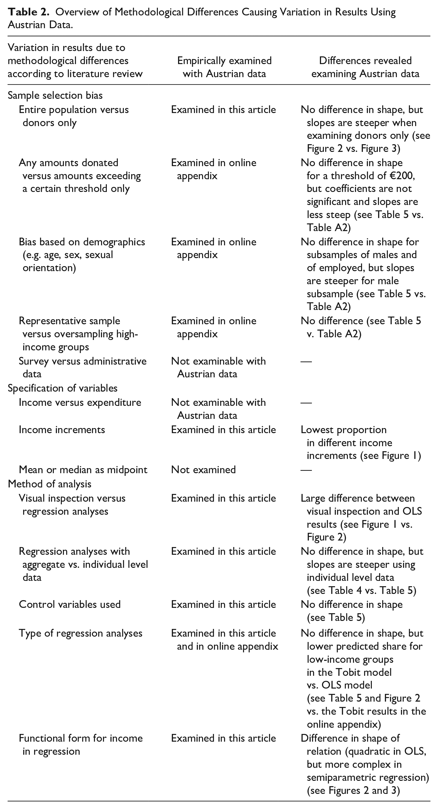
Our empirical application aims at demonstrating whether and how variations in methodological issues, as described above, lead to different results. While we have identified 13 of such issues in the first part of this article (for an overview see Table 2), in this empirical application, we concentrate on a few of them due to limitations of space and due to the reason that not all issues can be examined with the data set in use. 3
Overview of Methodological Differences Causing Variation in Results Using Austrian Data.
For our analysis, we use a sample of Austrian tax revenue data (n = 20,000) for the year 2009, which was the first year in which charitable giving was tax-deductible in Austria 4 . It includes donations to any charitable organization that provide public benefit, emergency relief, development aid, or animal and environment protection and that has registered with the Ministry of Finance, except churches. From this source, information on individual characteristics (such as age, sex, and whether children live in the household), total income (pre-tax and disaggregated by sources of income), the incidence of deducted donations as well as the amount deducted in 2009 is available.
The sample depicts an anonymized stratified random sample drawn from a total of 3.9 million existing tax statements in the year 2009. It was stratified (a) for income source (earned income vs. income from other sources such as profit and rent) and (b) for income levels. More precisely, annual income levels above €75,000 were oversampled. Data were cleaned, and—following the existing literature (e.g., James & Sharpe, 2007; McClelland & Brooks, 2004)—cases with a negative or no income were excluded, resulting in a data set of n = 19,792. Out of this sample, 3,684 individuals made a donation, which accounts for around 18.6%. While the average donation amounts to €35, it goes up to an average of €190 when using the donors-only sample. Compared to other countries, both the share of donors and the average amount donated are relatively low (see, for instance, Duffy et al., 2014; Wiepking, 2007), attributed to a weak philanthropic culture and the fact that tax deduction of donations has been introduced in Austria only recently (Neumayr, 2015). The average yearly pre-tax income of an individual is €28,449 (Table 3). The variable of interest is the proportion of income donated (×100). On average, individuals donated 0.15% of their respective income. Using the donors-only sample, this share increases to 0.78%. The respective shares for each income group are depicted in the last two columns of the upper panel of Table 3.
Percentage of Individuals That Deducted a Donation From Tax, and Mean Proportional Donation Per Individual for Three Versions of Income Increments.
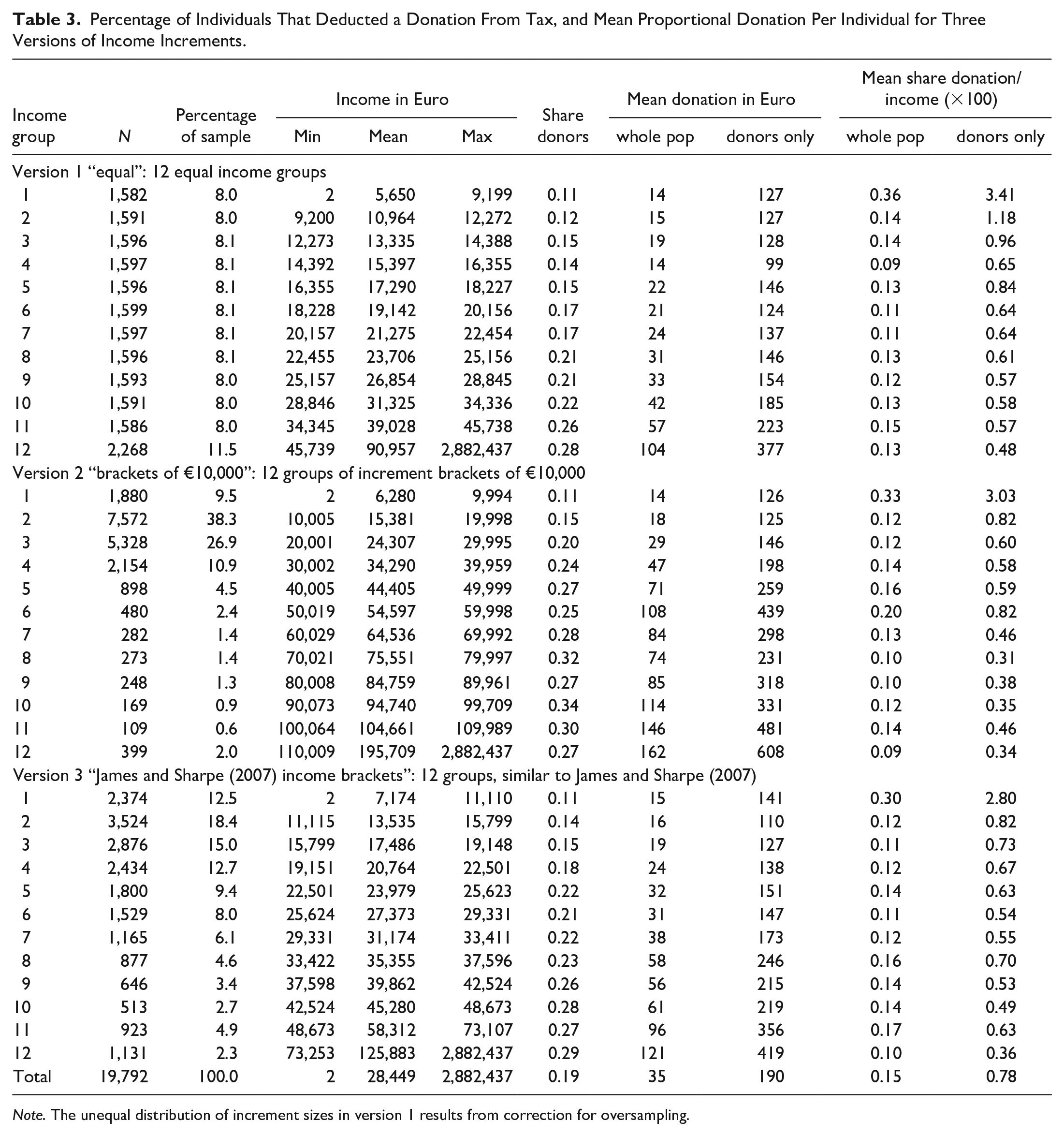
Note. The unequal distribution of increment sizes in version 1 results from correction for oversampling.
Our estimation strategy consists of four steps, following the methodological issues identified (see Table 2). We start with a visual inspection, plotting mean donation shares per income groups, in order to investigate the shape of the relation between the proportion of income donated and income itself. By doing so, we follow the procedure in existing research (James & Sharpe, 2007, p. 222; Wiepking, 2007, p. 351). We deploy three varying income group sizes to check whether and how the definition of income groups pre-determines results. The first definition consists of 12 equal income group sizes (“equal” version 1), so that each income increment includes 8% of the sample (Table 3). As data were corrected for oversampling for the higher income groups, the highest income group comprises more cases. The second income group definition consists of increment distances of €10,000 each (version 2), which leads to very unequally sized income groups with the largest shares of the sample assigned to the second (38%) and third (27%) income increments (Table 3). A third definition uses the increment proportions applied in James and Sharpe (2007; version 3; Table 3). For that to happen, we split our sample to income groups in a way that the percentage of persons in the first, second, third, and so on income increment is the same as in James and Sharpe (2007). Again, the 12 resulting increments contain a varying number of cases. We have chosen this specific group definition just for the purpose of comparison, but could have used any other one as well.
Second, we use the aggregated data of the three versions of income increments and estimate an OLS regression as follows:


Third, we inspect the relation not only by using aggregate values but also by individual-level data and include control variables in the OLS regression. The models are estimated both for the donors-only sample and the whole population. The model is estimated using OLS:

Fourth, and finally, we estimate the relation semi-parametrically, questioning the U-shape of the curve. This method can be especially helpful, because semi-parametric estimations do not impose any parametric restrictions on the relationship between proportion donated and income, while keeping a linear specification for the vector of controls. Compared to nonparametric regressions, this technique compromises two aims, flexibility and simplicity of statistical procedure. We estimate the following equation semi-parametrically:

A two-step procedure outlined by Robinson (1988) is applied to obtain an estimate
While we use a semi-parametric estimation method, there are also other possibilities that allow for a more flexible functional form of income such as nonparametric methods or higher order functions of income in a parametric approach 6 (see Table A3 in the online appendix). 7
Results
The first step of our estimation strategy is a visual inspection of the relation between income and the proportion of income donated. Figure 1 descriptively exhibits the income-giving profile for each of the three versions of income increments, depicting three different lines (values calculated with the whole sample including non-donors and multiplied by 100). The solid line depicts the mean share of income donated for 12 income groups of equal size (version 1), the dashed line income group distances of €10,000 each (version 2), and the dotted line income groups that are based on the approach of James and Sharpe (2007) (version 3). Figure 1 clearly shows that the three versions of income-group definitions produce varying results. While highest shares are always in the first income group, the second-highest ones are either in the 6th (version 2) or 11th (versions 1 and 3) increment, and the lowest shares either in the 4th (version 1) or 12th (versions 2 and 3) increment. Visual inspection does not immediately answer the question what the giving profile is like and leaves a lot of room for interpretation. If any line at all, the solid line (version 1), rather than the other two lines comes closer to a potential U-shape.
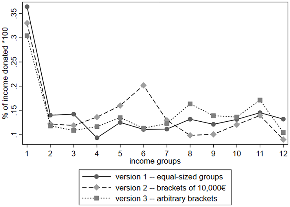
Income-giving profile using three versions of income increments.
In a second step, to gain more clarity concerning this question, mean incomes per increments were regressed on mean giving shares. Table 4 displays the results of these regressions. Although we find a negative coefficient for the linear income variable and a positive one for its quadratic term in all models, suggesting a U-shaped curve, most are not statistically significant. This is due to regressions in Models 1 to 3 relying on 12 observations only. As this number increases to 100 when using percentiles (Model 4), we find both coefficients for income becoming slightly significant, suggesting a U-shape.
Results of OLS Regressions With Group Means.
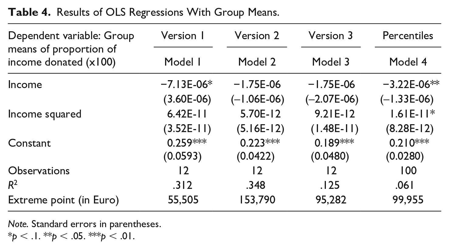
Note. Standard errors in parentheses.
p < .1. **p < .05. ***p < .01.
Even though calculated extreme points of this potential U-shape vary quite substantially (ranging from €55,000 to €154,000), they are always in the highest income group, which is made up of individuals in the top 1%–10% of the income distribution. This finding corresponds with James and Sharpe’s (2007) results for the United States.
Our third step of the analysis presents results of regressions using individual-level data. Models 5 and 6 in Table 5 are estimated for the whole population, and Models 7 and 8 for the donor-only sample. Results for all models again reveal a negative coefficient for the linear income variable and a positive coefficient for the quadratic term, suggesting a U-shaped relation between income and its proportion donated.
Results of OLS Regressions With Individual-Level Data.
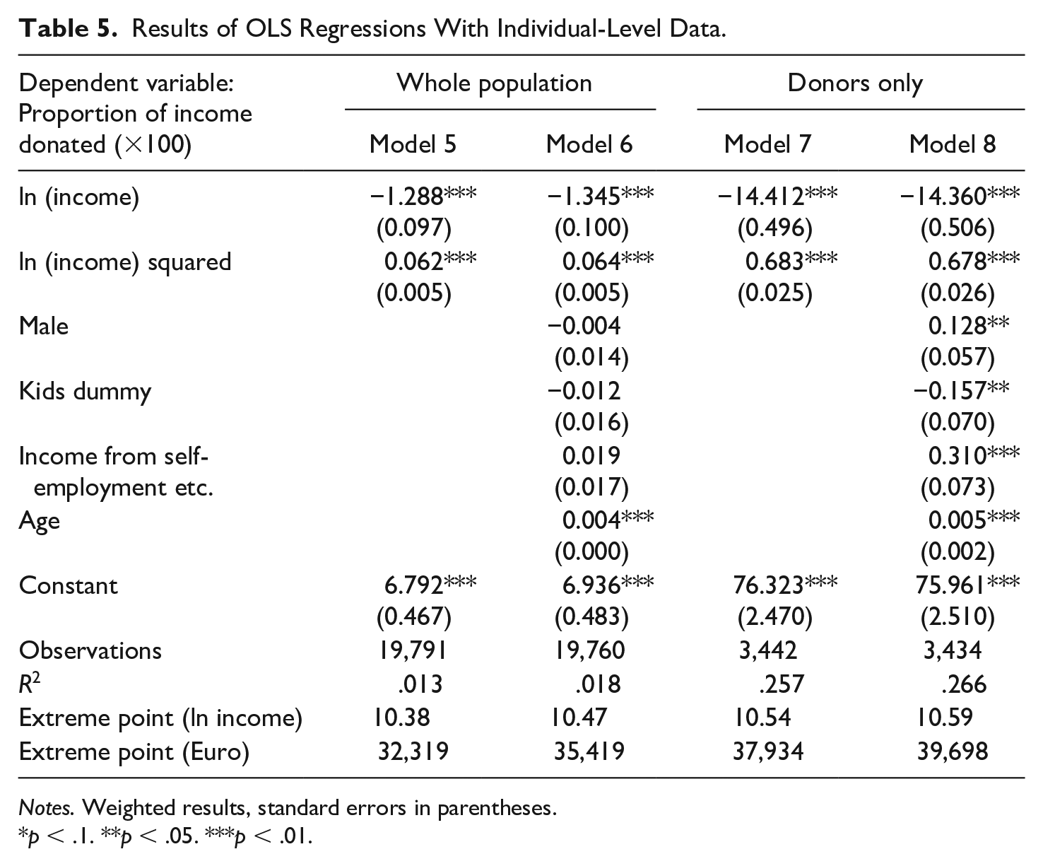
Notes. Weighted results, standard errors in parentheses.
p < .1. **p < .05. ***p < .01.
This is not what we find in the results of the semi-parametric estimation, displayed in the graphs on the right-hand side of Figures 2 and 3. In these Figures, the graphs on the left-hand side display the adjusted predictions based on the regression coefficients of Model 6 of Table 4 (whole population, see Figure 2) and Model 8 of Table 5 (donors-only sample, see Figure 3), which modeled income with a linear and a quadratic term. In these graphs, predicted values for the share of income donated are plotted for each income level, while the control variables are fixed at means. The graphs in the right-hand side display the results of the semi-parametric estimations. These show the non-parametric part of the semi-parametric regression stated in equation (4), with the logarithm of income on the horizontal axis and the proportion donated (×100) on the vertical axis.
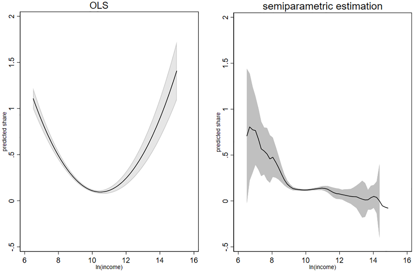
Parametric and semi-parametric evidence on share of giving and income: Whole population.
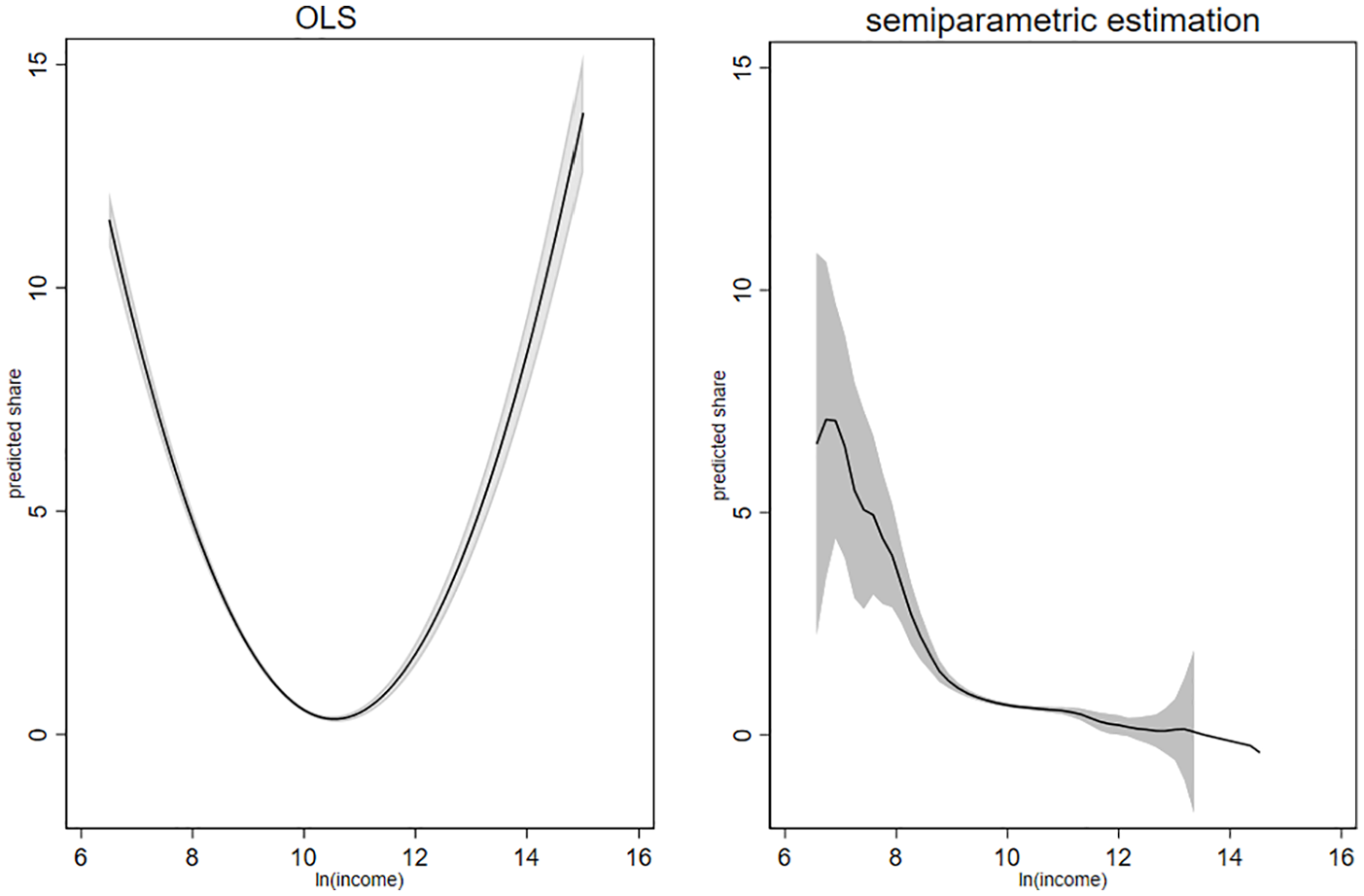
Parametric and semi-parametric evidence on share of giving and income: Donors only.
The two graphs on the left-hand side suggest a U-shaped relation, similar to the results using aggregate data, displayed in Table 4. This differs from what we find when applying semi-parametric estimation. The two graphs on the right-hand side point toward a downward-sloping relation for most income levels, which is in contrast to the findings from regressions that model income with a linear and a squared term only. The U-shaped curve, which results from such models, might thus have been driven by parametric restrictions. The figures also reveal the problem of the low number of cases for very high and low incomes. Confidence intervals become larger at both ends of the income distribution.
Conclusion
In the light of rising income inequality and changes in the shares of both very high and very low-income groups in most western countries, we cannot foresee how this divide will affect philanthropic revenues. Existing research describes the relation between income and donations as a proportion of income with a great variance of shapes. While this relation may vary over time and welfare states, our study demonstrates that the big spectrum of methodological approaches used also partly explains this great variety of shapes identified.
Our work reveals that researchers concerned with the relation between income and its donated proportion need to be aware of at least 13 methodological issues and illustrates how these issues matter for results based on Austrian data (see Table 2). In particular, we find that a mere visual inspection of descriptive data is very sensitive to the definition of income categories, leaving room for a large variety of results. In addition, the empirical application of various methods on Austrian tax data revealed that one must not prematurely deduce a U-shaped relation from analyses that enter income quadratically into the estimated models. The quadratic term may simply be used to provide a better fit to what may be essentially a downward sloping function. Both existing research and our empirical example point out that the upswing of the curve starts in a part of the income distribution that has only limited practical importance.
Future research needs to focus on this upswing point, since it makes a difference if it starts in the 90th or the 95th percentile of the income distribution. In addition, our results suggest to revisit the question of whether and why Tobit analyses reveal different results than OLS. Austrian data have a comparatively high share of nongivers, which might be one explanation for these differences. Data from other countries with lower shares of nongivers would be helpful to analyze this in more detail. Moreover, we identified 13 methodological differences and analyzed 10 of these empirically. It would be interesting to investigate the remaining three with suitable data. Particularly, future research could focus on expenditure data, because these could ultimately be more suitable for such analyses, given that expenditure can capture an individual’s wealth more appropriately. It is interesting to note that—at least in some countries—the share of income spent has increased over time, which might influence amounts donated and is worth further investigation.
In summary, while we know that results vary with the method in use, three conclusions regarding the relation between income and the proportion donated are safe to say. First, people in the lowest income group donate the largest proportion of income. Second, the profile of the charitable giving curve seems to be fairly flat for middle- and high-income groups. Third, regarding the very high-income groups, the relation is more difficult to describe. Particularly for these income groups, the semi-parametric approach can be a better alternative to adequately account for the relation between the two variables, which is not necessarily convex. Labeling the charitable-giving profile either as a U-shaped or J-shaped curve is—in our view—too simple and not adequate to describe reality.
Supplemental Material
sj-pdf-1-nvs-10.1177_0899764020977667 – Supplemental material for The Relation Between Income and Donations as a Proportion of Income Revisited: Literature Review and Empirical Application
Supplemental material, sj-pdf-1-nvs-10.1177_0899764020977667 for The Relation Between Income and Donations as a Proportion of Income Revisited: Literature Review and Empirical Application by Michaela Neumayr and Astrid Pennerstorfer in Nonprofit and Voluntary Sector Quarterly
Footnotes
Acknowledgements
The authors wish to thank Pamala Wiepking, participants of the session on private wealth and philanthropy at the 2018 Annual Conference of the ARNOVA, the editor, and three anonymous referees for their constructive and insightful comments.
Declaration of Conflicting Interests
The author(s) declared no potential conflicts of interest with respect to the research, authorship, and/or publication of this article.
Funding
The author(s) disclosed receipt of the following financial support for the research, authorship, and/or publication of this article: Open access funding provided by Vienna University of Economics and Business (WU).
Supplemental Material
Supplemental material for this article is available online.
Notes
Author Biographies
References
Supplementary Material
Please find the following supplemental material available below.
For Open Access articles published under a Creative Commons License, all supplemental material carries the same license as the article it is associated with.
For non-Open Access articles published, all supplemental material carries a non-exclusive license, and permission requests for re-use of supplemental material or any part of supplemental material shall be sent directly to the copyright owner as specified in the copyright notice associated with the article.