
Abstract
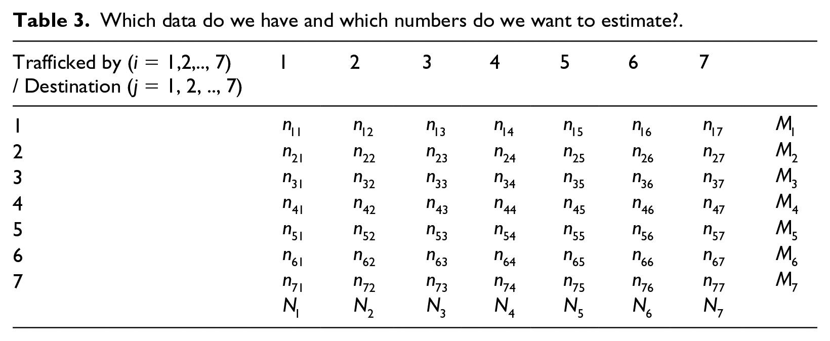
The available aggregated data on the Atlantic slave trade in between 1519 and 1875 concern the numbers of slaves transported by a country and the numbers of slaves who arrived at various destinations (where one of the destinations is ‘deceased’). It is however unknown how many slaves, at an aggregate level, were transported to where and by whom; that is, we know the row and column totals, but we do not known the numbers in the cells of the matrix. In this research note, we use a simple mathematical technique to fill in the void. It allows us to estimate trends in the deaths per transporting country, and also to estimate the fraction of slaves who went to the colonies of the transporting country, or to other colonies. For example, we estimate that of all the slaves who were transported by the Dutch only about 7 per cent went to Dutch colonies, whereas for the Portuguese this number is about 37 per cent.
It is by now a well-known and well-recognized fact that the transatlantic slave trade (1519–1875) involved around 12.5 million Africans. 1 The slave traders originated from various countries, including Portugal, Spain, Great Britain, the Netherlands and France. Typically, the destinations of the slaves were the colonies of those countries, although a substantial number of slaves died en route, either aboard a vessel still at an African coastal location or during the ocean voyage. 2
Our study aims to provide aggregate (estimated) statistics on the links between trading countries and destination. Although there are numerous studies with detailed and important analyses of various routes and voyages, it seems that such aggregate statistics are not available. 3 One way to generate them can be based on a detailed analysis of all the voyages, where an almost full account is available at http://www.slavevoyages.org/ (edited by David Eltis and Martin Halbert). Yet, an alternative method, which we propose below, is based on a computational exercise applied to the available aggregate numbers, as provided by Engerman et al in 2001. 4
To be more precise, consider Tables 1 and 2. Table 1 contains, for 11 consecutive periods, the numbers of slaves that were trafficked by traders from Portugal, Great Britain, France, the Netherlands, Spain, the USA and Denmark. Table 2 contains, for the same 11 periods, the final destinations of the traded slaves, here categorized as colonies of Portugal, Great Britain, France, the Netherlands, Spain, and other countries, and where there is an additional category called Deceased. The numbers in these two tables are the row sums and column sums of the data in Table 3. In simple notation, the available data in Tables and 1 and 2 are
Slaves trafficked by carrier (rounded 000s).
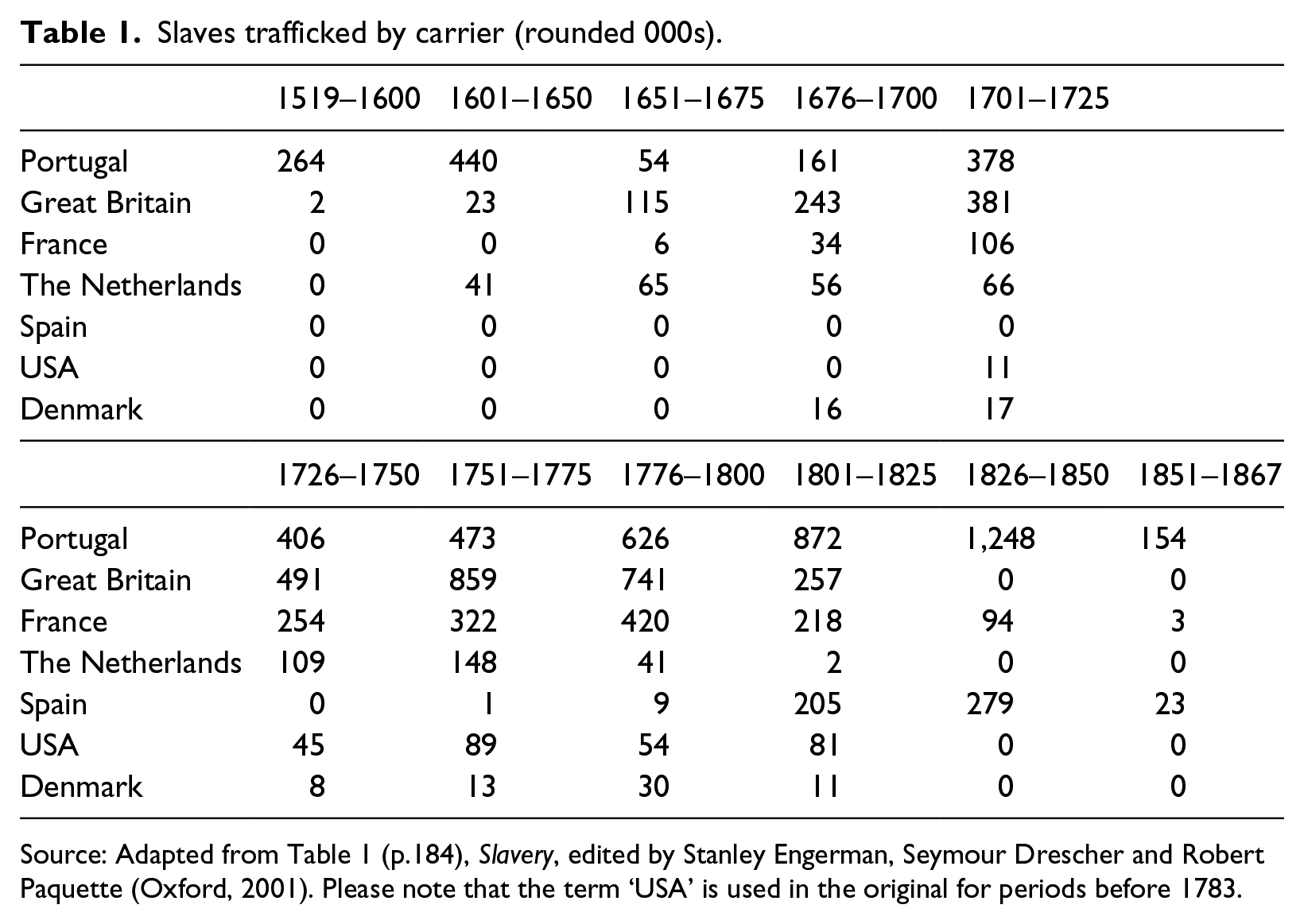
Source: Adapted from Table 1 (p.184), Slavery, edited by Stanley Engerman, Seymour Drescher and Robert Paquette (Oxford, 2001). Please note that the term ‘USA’ is used in the original for periods before 1783.
Destinations of the enslaved (rounded 000s) – European colonies or deceased.
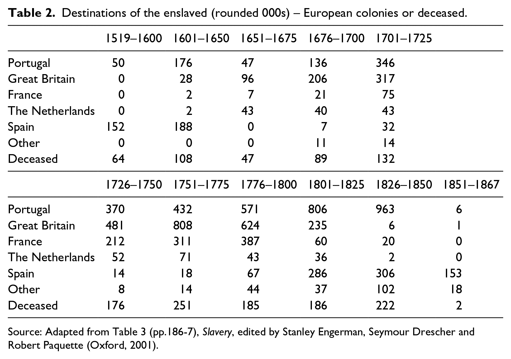
Source: Adapted from Table 3 (pp.186-7), Slavery, edited by Stanley Engerman, Seymour Drescher and Robert Paquette (Oxford, 2001).
Which data do we have and which numbers do we want to estimate?.

and
In this paper, however, we have an interest in the numbers in Table 3, that is in the
Our paper proceeds as follows. In the next section we explain our method. The computer code is available upon request. In the subsequent section we discuss the results and highlight some specific outcomes. The final section offers some conclusions.
Method
Given the data
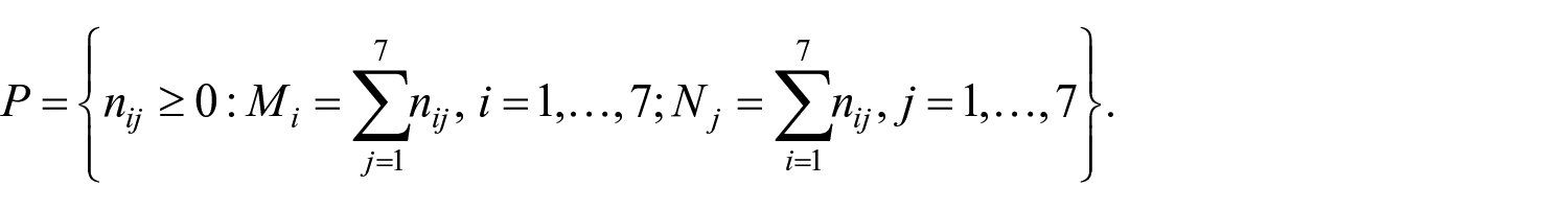
Note that a single point in P corresponds to a possible trafficking table, that is, it specifies the trafficking amount from each origin to each destination location. The set P is a so-called polyhedron, containing infinitely many points in general. As the origin/destination amounts are large, we do not have to assume the points to be integers. A nice property of a polyhedron is that it can be completely characterized by its vertices or extreme points, which can be considered as the ‘corners’ of this (bounded) set. In particular, any point in P can be written as a convex combination of the vertices.
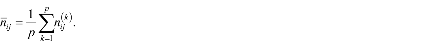
A natural approach to estimate the numbers
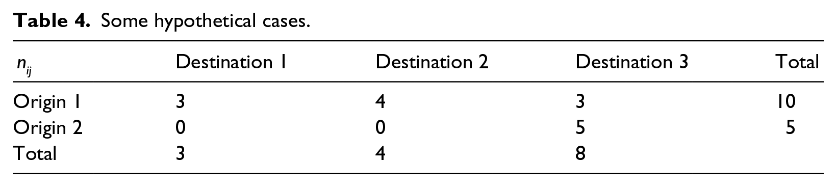
In order to compute the midpoint, we need a procedure to compute all of the vertices. Informally, the procedure to compute the ‘first’ vertex is as follows. We begin with Origin 1 and assign as many slaves as possible to Destination 1, that is,
Example
To illustrate the solution procedure, consider a small (artificial) example with only two origins and three destinations and
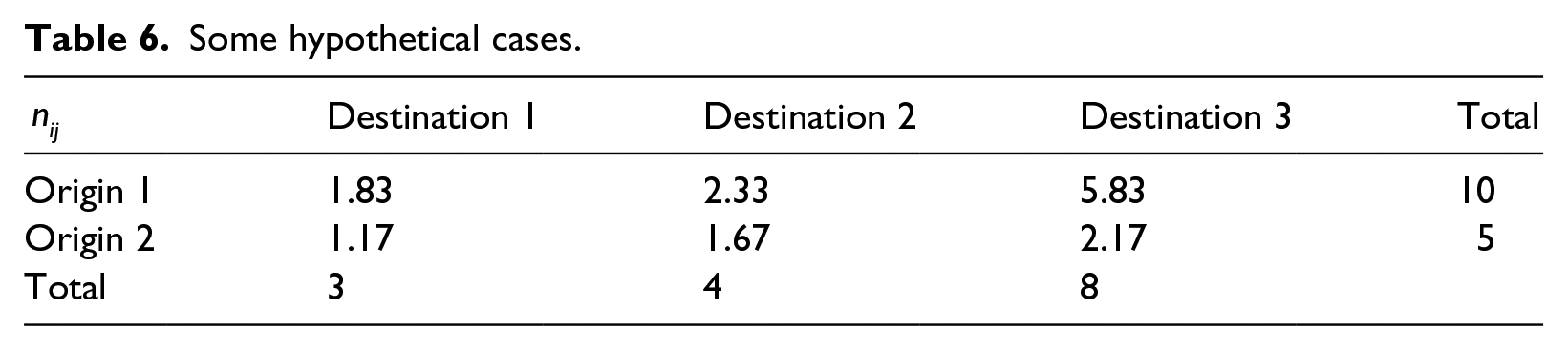
Some hypothetical cases.
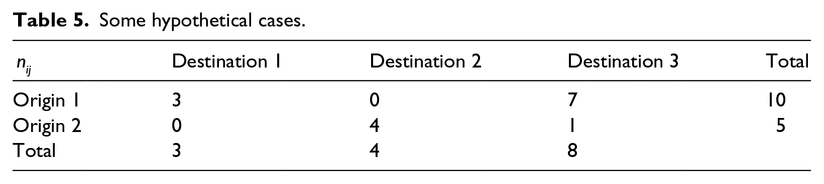
When taking the order 2 – 1 for the origins and 2 – 3 – 1 for the destinations, this results in the vertex shown in Table 5.
Some hypothetical cases.
Furthermore, when taking the average over all 2! × 3! = 12 vertices, we get the midpoint, which serves as the estimate for the trafficking amounts from each origin to each destination, as shown in Table 6.
Some hypothetical cases.
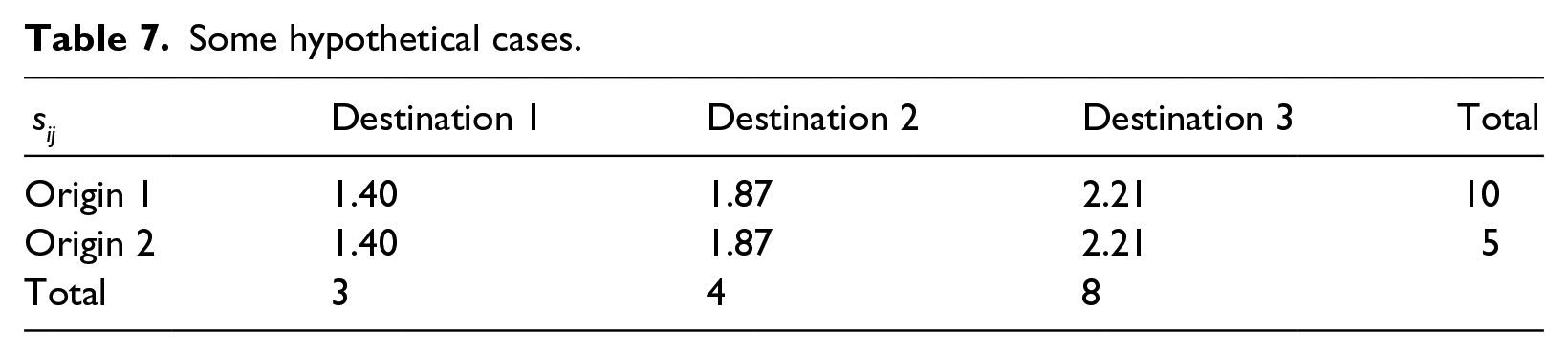
Finally, given all the vertices, we can also compute the standard deviations
Some hypothetical cases.
Back to the Atlantic slave trade
The data that we consider are presented in Tables 1 and 2. Table 1 is the same as Table 1 on page 184 of Engerman et al, after rounding to the nearest 1,000. 5 So, for example, 264.1 became 264 (the first number in the original Table 1). Table 2 is derived from Table 3 on pages 186–7 of the same work. We aggregated ‘British mainland, North America’, ‘British Leewards’, ‘British Windwards + Trinidad’, ‘Jamaica’, ‘Barbados’ and half of the total for ‘Guianas’ as the colonies of Great Britain. The other half of the Guianas is assumed to be Suriname, and together with ‘Dutch Caribbean’, are taken as colonies of the Netherlands. The French colonies are ‘French Windwards’ and ‘St. Dominique’. The Spanish colonies are ‘Spanish N. and S. America’ and ‘Spanish Caribbean’. The Portuguese colonies are ‘N.E. Brazil’, ‘Bahia’ and ‘S.E. Brazil’. The category ‘Other’ includes ‘Other Americas’ and ‘Africa’. Slave mortality en route has been computed from comparing the grand totals. Again, the resultant data are in Table 2.
Our computational method results in a 7 by 7 table with values for each of the 11 time periods, so that is 11 tables. Figure 1 reports on the estimated average death rates over these 11 periods for each of the trafficking countries. Over the 11 periods the averages are 13.4 per cent for Portugal, 17.4 for Great Britain, 16.1 for France, 18.3 for the Netherlands, 12.8 for Spain, 14.8 for the USA and 14.7 for Denmark. These results have face value when compared with the estimates by Hogerzeil and Richardson, and Klein. 6 Figure 1 at the same time shows a downward trend, on average from around 25 per cent in the earlier periods to around 10 per cent by the end of the legal slave trade.
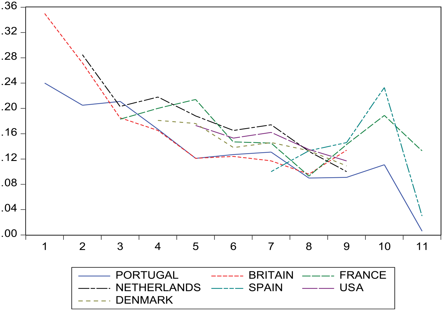
Estimated average slave mortality rates by flag carrier (all periods).
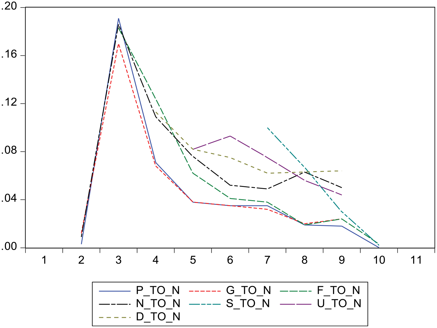
Potentially there are many graphs to make and many numbers to present, but let us highlight just a few. Figure 2 shows the fraction of all slaves arriving at each of the seven destinations (where ‘Deceased’ is inappropriately called a destination too) who were shipped by the Dutch. This graph shows rather common patterns over time across the destinations, and this seems to suggest some sense of reliability of our method. Something similar holds for the patterns depicted in Figure 3, which reports slaves arriving in Dutch colonies by flag carrier. Tables 8 and 9 report on the fractions and
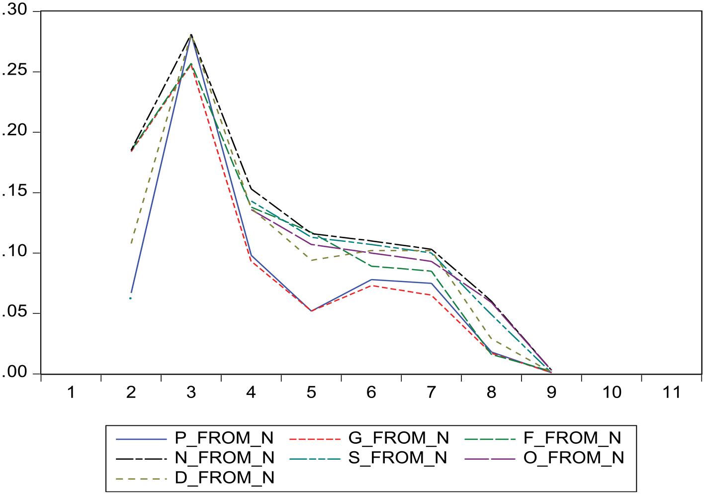
Share of all slaves for each destination (where D is ‘deceased’) shipped by the Dutch (all periods).
Share of all slaves arriving in Dutch colonies by flag carrier (all periods).
Percentage slave arrivals by region and flagc.
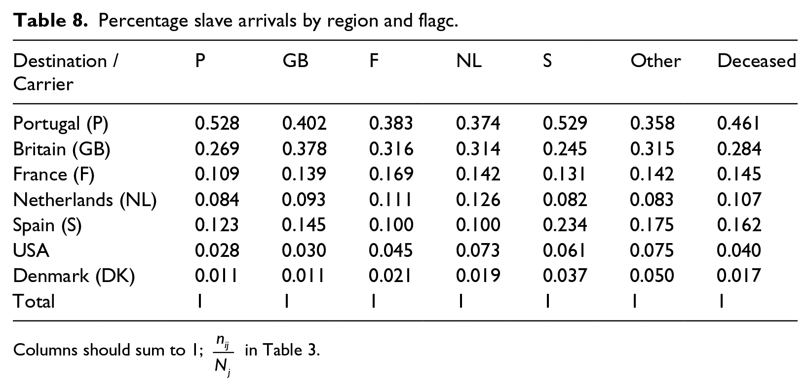
Columns should sum to 1;
Percentage slave arrivals by region and flag carrier (2).
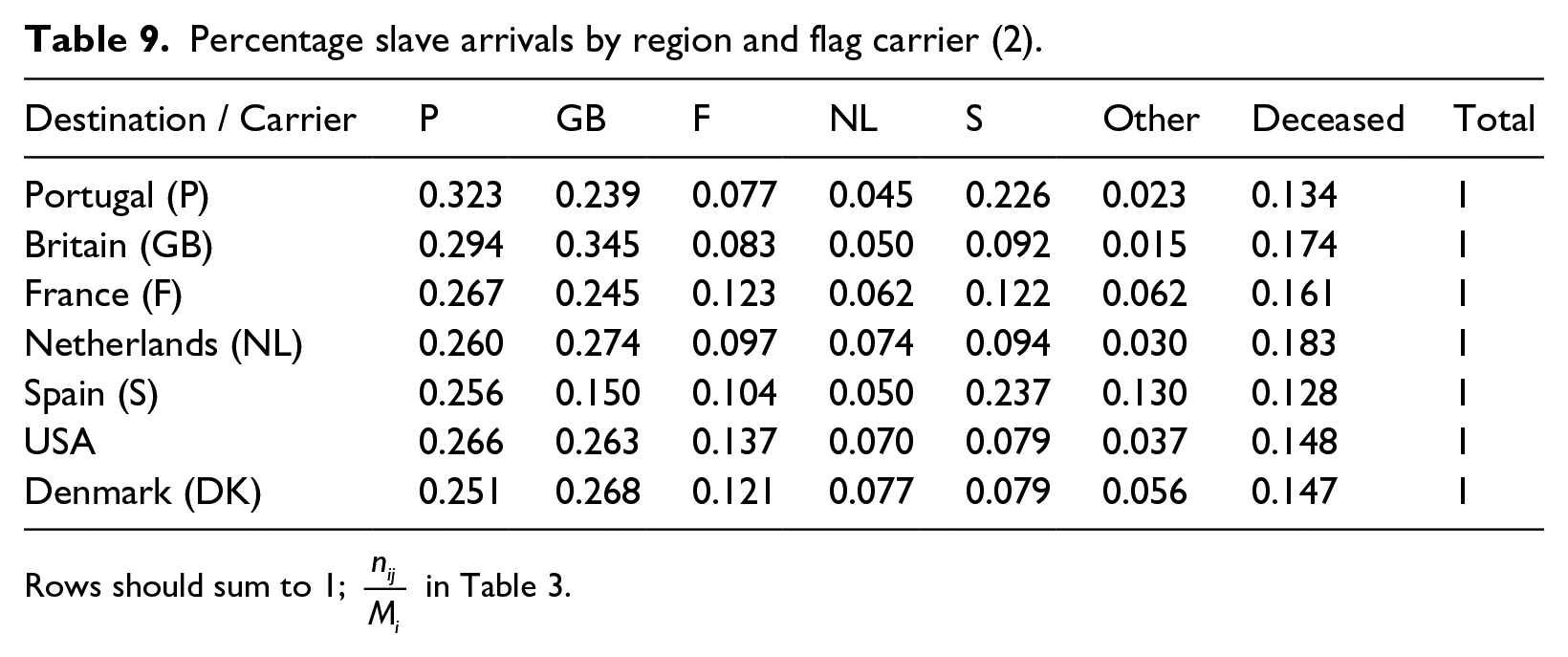
Rows should sum to 1;
Conclusion
It must be reiterated that the data computed in this research note are all estimates. They are estimates of aggregate statistics in 7 by 7 tables linking the main seafaring countries involved in the Atlantic slave trade with regional destinations, with one destination to account for slave trade mortality once slaves were loaded. The tool is simple, but it yields some general conclusions. One is that slave mortality declined over time, supporting the available case-specific data in the literature. A second is that some countries transported most slaves to their own colonies (like Portugal), whereas other countries apparently focused most on the trade (like the Netherlands).
Our method also allowed for the computation of standard deviations. Naturally, as we study all possible combinations, including the boundary cases with 0 per cent and 100 per cent, the standard deviations are high relative to the estimates. On the other hand, when we compare our estimates with others, and when we evaluate patterns over time, we have substantial confidence in the findings reported here.
With:
(the actual numbers for

(which appear in Table 1). We are interested in
Footnotes
1.
See, Philip D. Curtin, The Atlantic Slave Trade: A Census (Madison, 1969); Stanley Engerman, Seymour Drescher and Robert Paquette, eds., Slavery (Oxford, 2001); and Robin Haines and Ralph Shlomowitz, ‘Explaining the decline of mortality in the eighteenth century British slave trade’, Economic History Review, 53, No. 2 (2000), 262–83.
2.
Simon J. Hogerzeil and David Richardson, ‘Slave Purchasing Strategies and Shipboard Mortality: Day-to-day Evidence from the Dutch African Trade, 1751–1797’, Journal of Economic History, 67, No. 1 (2007), 160–90.
3.
Robin Haines, John McDonald and Ralph Shlomowitz, ‘Mortality and Voyage Length in the Middle Passage Revisited’, Explorations in Economic History, 38, No. 4 (2001), 503–33; and Hogerzeil and Richardson, ‘Slave Purchasing Strategies’.
4.
Engerman et al, Slavery.
5.
Engerman et al, Slavery.
6.
Herbert S. Klein, The Atlantic Slave Trade (Cambridge, 2002).