
Abstract
We examine regional inequalities in mortality from the 1918 pandemic in England and Wales. Crude mortality rates (per 100,000 for June 1918 to May 1919) from the Registrar General’s 1920 report were directly allocated to crude mortality rates for 306 administrative units. A custom GIS ShapeFile was constructed to map the rates first as a choropleth and then as a cartogram. The visualisations show a clear north-south divide in mortality in England with the northern areas and – to a lesser extent – the midlands and Wales having higher rates than the south. It also demonstrates an urban-rural divide with more sparsely populated areas – across both England and Wales – having lower rates.
There are significant inequalities in the COVID-19 pandemic – with cases and deaths much higher in more deprived areas and regions (Bambra et al., 2020). Historical research shows that these inequalities were also evident in the 1918 Spanish flu pandemic. In 1918/19, influenza swept across the globe in three waves, infecting 500 million people – a third of the world’s population – leading to an estimated 50 to 100 million deaths (Johnson and Mueller, 2002). Analysis shows that there were clear social and geographical inequalities in the Spanish flu pandemic with infection and death rates substantially higher in less affluent neighbourhoods; amongst the working classes; and in urban areas (Mamelund, 2018). In our visualisations we examine whether there were also regional inequalities in the 1918 pandemic in England and Wales.
The data were sourced from the Registrar General’s 1920 report into pandemic flu mortality which provided weekly death rates (Registrar-General, 1920). Johnson (2001, 2006) calculated the annualised crude mortality rates per 100,000 for June 1918 to May 1919 for 306 administrative units (AU). These AUs comprise named counties, Metropolitan Boroughs, Urban Districts, Rural Districts and remainders of counties. For comprehensive detail on the data, methods and limitations see Johnson (2001).
Data were directly allocated to the AU geography and a custom GIS ShapeFile was constructed (Figure 1). This ShapeFile comprises the original existing individual AUs and the aggregations to remainder and to counties and area in hectares was included in the ShapeFile attribute table. There are many relatively small areas, more urban AUs, alongside rather larger, more rural areas. This size contrast is ubiquitous in GIS vector mapping but exaggerated here due to the AUs being a mix of original (mainly urban) and aggregated (e.g. remainder of counties) areas.
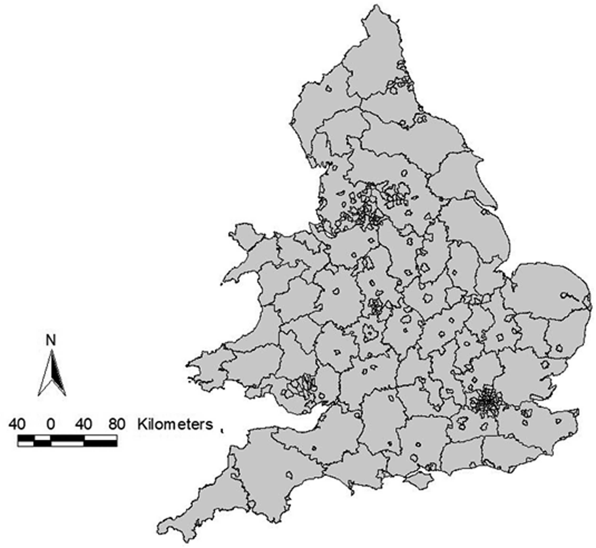
GIS ShapeFile showing administrative unit boundaries for England and Wales 1918/19.
Figure 2 shows a choropleth map of the mortality rates by AUs (in quintiles). It shows a clear north south divide in mortality in England with the northern areas and – to a lesser extent – the midlands and Wales having higher rates than the south (Johnson, 2001, 2006). It also demonstrates an urban-rural divide with more sparsely populated areas – in both the north and the south of England and north Wales– having lower rates (Johnson, 2001, 2006). Some coastal areas also have higher rates Johnson, 2006). Death rates ranged from 188 per 100,000 in Sutton in Surrey in the south-east of England to 1194 per 100,000 in Hebburn near Newcastle in the North East of England (Johnson, 2001).
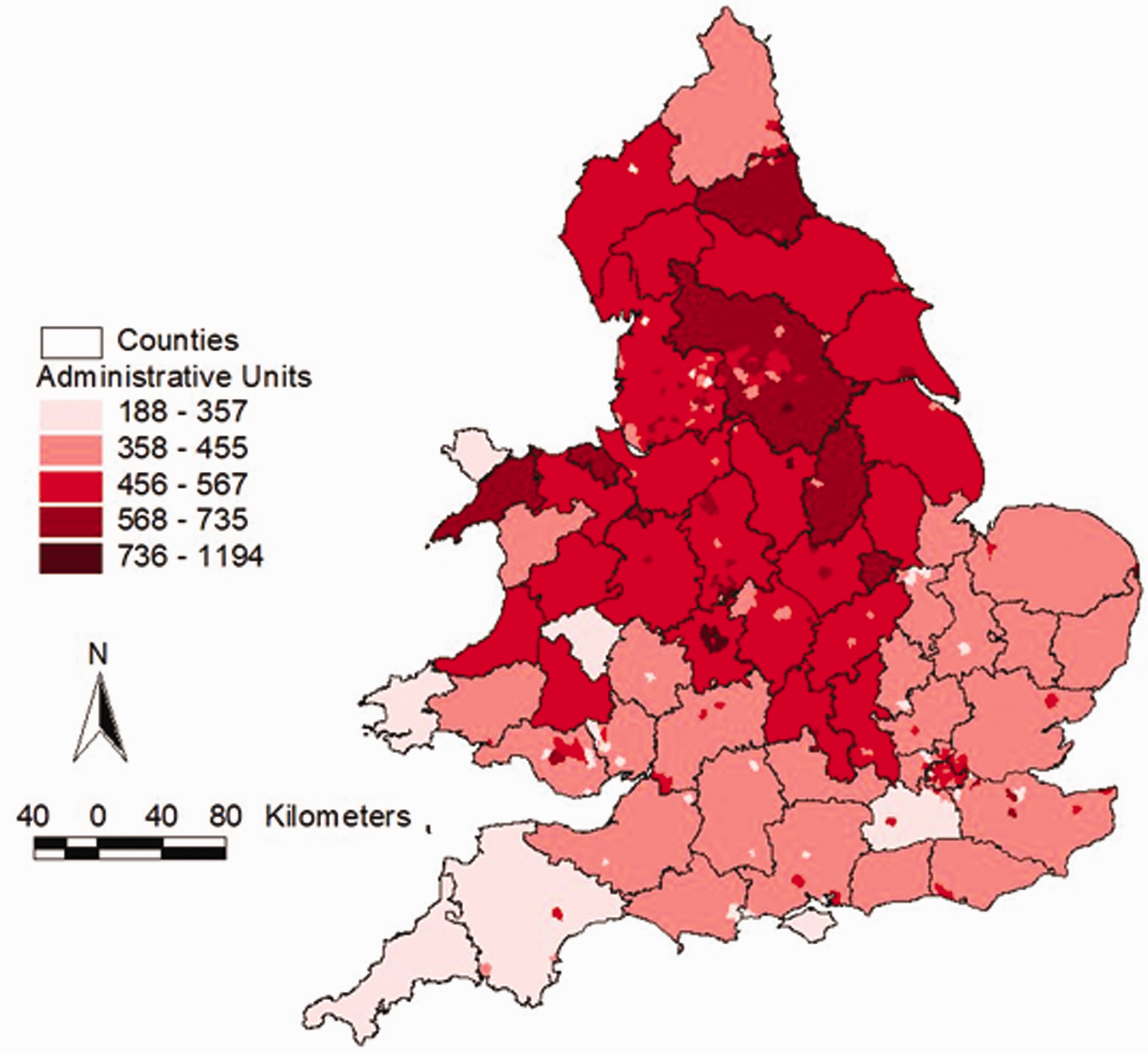
Choropleth of mortality rates of pandemic influenza per 100,000 population (categorised into quintiles), administrative unit boundaries, England and Wales 1918/19.
In Figure 2, the smaller urban areas are hard to see relative to the larger rural areas. Figure 3 adjusts for this urban-rural size disparity by presenting the data mapped using a cartogram. It uses the square root of the area of each polygon. Relatively, this scales up smaller areas and scales down larger areas whilst still retaining sufficient of the original geography that the positions of locations remain familiar. The regional inequalities are still strongly evident.
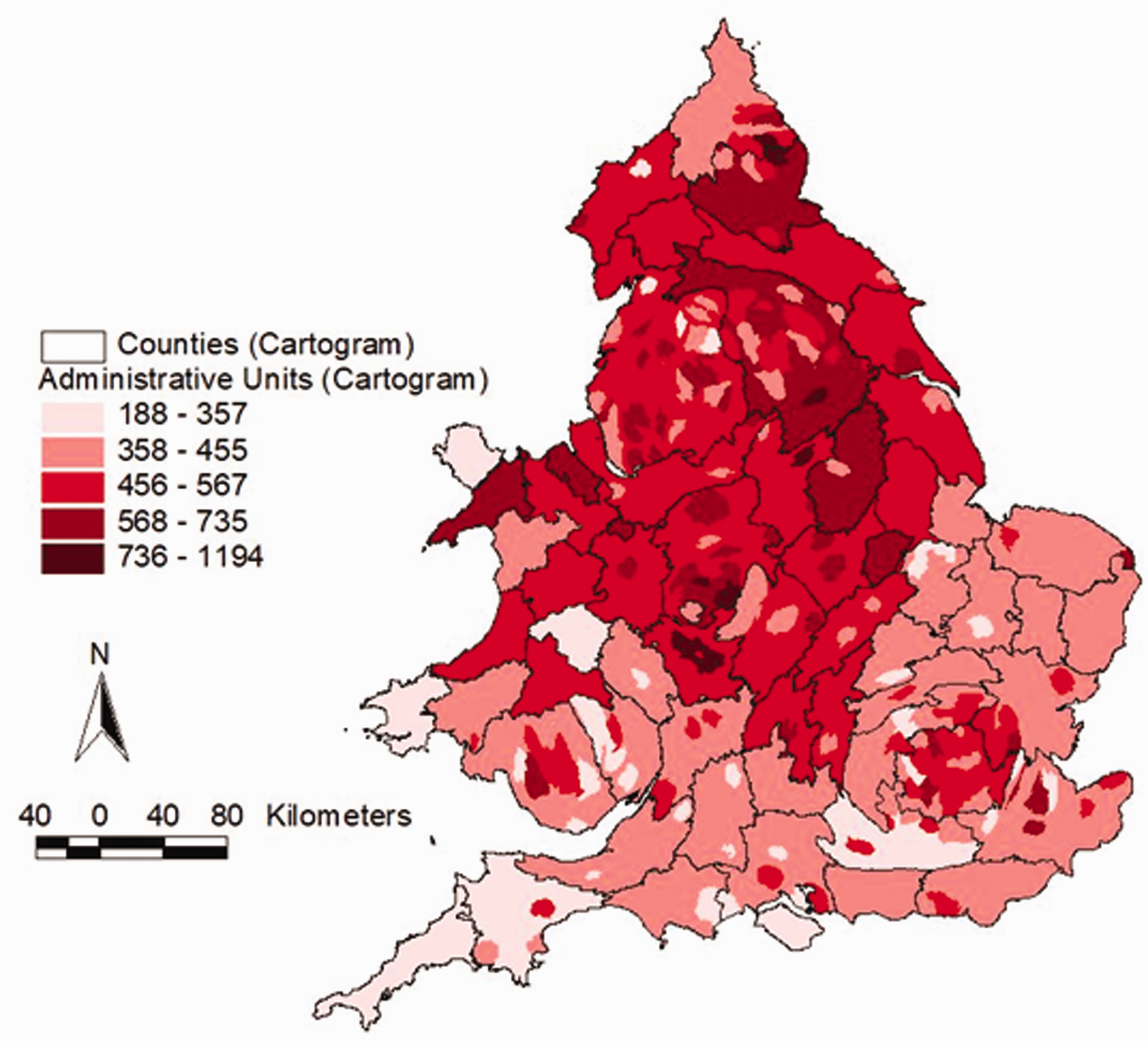
Cartogram of mortality rates of pandemic influenza per 100,000 population (categorised into quintiles), using scaled administrative unit geography (√ hectares), England and Wales 1918/19.
These regional inequalities in pandemic flu mortality were noted at the time, with the Registrar General concluding that the north and the midlands experienced a higher level of death: ‘the northern parts of the country suffered decidedly more, on the whole, than the southern’ (Registrar-General, 1920: 24). The inequalities likely relate to regional differences in deprivation, working conditions, urbanisation, sanitation and overcrowding (Johnson and Mueller, 2002). Previous analysis has found relationships between 1918 influenza deaths and pre-pandemic mortality rates – as well as with deprivation levels today (Pearce et al., 2011). These aspects of regional inequality are also important over 100 years later when examining the shape of the COVID-19 pandemic (Bambra et al., 2020).
Footnotes
Declaration of conflicting interests
The author(s) declared no potential conflicts of interest with respect to the research, authorship, and/or publication of this article.
Funding
The author(s) received no financial support for the research, authorship, and/or publication of this article.