
Abstract
Social capital, the strength of people’s friendship networks and community ties, has been hypothesized as an important determinant of survey participation. Investigating this hypothesis has been difficult given data constraints. In this paper, we provide insights by investigating how response rates and nonresponse bias in the American Community Survey are correlated with county-level social network data from Facebook. We find some evidence that areas of the United States where people have more exclusive and homogenous social networks have higher nonresponse bias and lower response rates. These results provide further evidence that the effects of social capital may not be simply a matter of whether or not people are socially isolated, but also what types of social connections people have and the sociodemographic heterogeneity of their social networks.
1. Introduction
Survey response rates have been declining across the entire survey industry, increasing survey costs and concerns about higher nonresponse bias. There have been multiple proposed hypotheses, such as people receiving too many survey requests (Leeper 2019) or people becoming busier over time (Vercruyssen et al. 2011). One additional hypothesis is that declining social capital is leading to lower response rates, which we will denote as the “social capital hypothesis.” In this paper we define social capital as the strength of people’s friendship networks and community ties. Other terms referring to the same or similar concepts include social integration (Amaya and Harring 2017) or social isolation.
For a given survey at a given point of time, the social capital hypothesis states that more socially connected individuals are more likely to respond to a survey than more socially isolated individuals. Possible mechanisms could be that socially connected individuals feel more social pressure to respond or feel more strongly that their participation will yield benefits for their social group (Amaya and Harring 2017). Survey sponsors often highlight how the results from their survey will benefit someone’s community. From the perspective of Leverage-Saliency Theory (Groves et al., 2000), this pitch of community benefits may either be more important (higher leverage) or more noticeable (higher saliency) for people with higher social capital, so they will likely respond to the survey even if there are some survey attributes that discourage their participation (e.g., privacy concerns over financial questions). The application of social exchange theory to survey methodology (Dillman et al. 2014) is also relevant to the social capital hypothesis. Having less social capital can lead people to see less social benefit from their survey participation or lead to less trust which is often a crucial determinate in the survey participation decision. In summary, various overarching theories of survey participation highlight that people respond to surveys often based on perceived social benefits, so how socially connected someone is may highly affect this cost-benefit analysis.
For the hypothesis that declining social capital is contributing to declining survey response rates, the two key parts are (1) social capital affects survey participation and (2) social capital has been declining over time. For the latter part, there is evidence that social capital has been declining in the United States, the country we focus on for this paper. Buecker et al. (2021) provide evidence from a meta-analysis that loneliness in young adults has indeed been increasing over time. Fry and Parker (2021) note the share of adults living without a spouse or married partner has been increasing since 1990. There has also been documentation of a decrease in the percent of people who say they have any close friends (Cox 2021), who attends a religious service in the past seven days (Brenan 2021), and who say that most people can be trusted (NORC at the University of Chicago 2023).
There has been some evidence that social capital affects response rates. Groves et al. (2000), in providing evidence for their leverage-salience theory showed that more civically engaged individuals were more likely to respond to a follow-up survey. Abraham et al. (2009) and Van Ingen et al. (2009) find that volunteering is associated with higher survey participation. Brick and Williams (2013) examine nonresponse in multiple surveys over time and find that the number of single-person households and commute times are associated with lower response rates.
However, given the concept of social capital is multifaceted and has various definitions, not all forms of social connections may have the same relationship to survey participation. Amaya and Harring (2017) find that this may indeed be the case. They find that civic engagement was associated with higher survey unit response but having family and neighbor connections did not have a positive impact (for the most part). In fact, for one of their surveys, they found that individuals close to both friends and family had lower survey response rates. The intuition here is that civic engagement is more related to seeing the social benefits of survey participation. The influence of civic engagement could be particularly impactful for surveys that emphasize more their survey’s connection to particular societal issues (e.g., financial insecurity) rather than a particular social group. On the other hand, having tighter family or neighbor connections could be associated with having a more insular social network and being leery of interview requests from outsiders. Another way of examining this is that someone’s receptiveness to respond to a survey request by an unknown interviewer could be affected by how much people have friends with different characteristics from themselves, whether that’s in terms of race, age, or income. People in insular social networks may be less likely to respond to self-administered surveys as well, either because they are less trusting and think an interview request is a scam, or they believe the survey doesn’t offer benefits to their immediate social group.
In this paper, we provide additional evidence that the social capital hypothesis is more complicated than an isolated versus not isolated dichotomy. We use the American Community Survey (ACS) to examine geographic variation in response rates and nonresponse bias, as measured by linked administrative data. We then see how these data are related to Facebook social network data constructed by Chetty et al. (2022). Through various analyses, we find some evidence that areas with more homogenous and exclusive social networks have lower response rates and higher nonresponse bias. Our results are somewhat mixed in that some of our effect sizes are small and some of our estimates are insignificant. Additional limitations of our analyses include the unique characteristics of the ACS, which is a government survey with a relatively high response rate and where response is required by law. This may limit the generalizability to other surveys. Furthermore, the underlying Facebook data is based on information for people who are between twenty-five and forty-four years old, which therefore excludes the social behaviors of older individuals.
Despite these limitations, our results make several contributions to the literature. We make use of newly available data on people’s social networks, allowing us to explore a new measure of social capital and social integration not available before. The large sample size of the American Community Survey allows us to use these data in geographic analyses and still have statistical power. And finally, we examine how social capital affects nonresponse bias, while prior literature has only examined unit response rates. This is important because bias is the concept practitioners ultimately care about, particularly with the well-known weak correlation between response rates and nonresponse bias (Groves and Peytcheva 2008).
In summary, our results suggest that the effect of social capital on unit response is not solely driven by how many social ties are present, but also by whether social networks include people from a variety of backgrounds. In other words, if people have sociodemographically heterogeneous social networks, they may be more receptive when an interviewer with different characteristics shows up on their doorstep or gives them a phone call, or to self-respond to a survey that yields benefits beyond their immediate social networks.
2. Data
2.1. Survey Data
The ACS is the largest household survey in the United States, sampling approximately 3.5 million addresses each year, divided into twelve monthly panels for continuous interviewing. It is a multimodal survey where most households are given two months to respond by web or mail, followed by in-person follow-up in the third month for a subsample of each panel. The ACS is one of the few surveys in the United States where response is required by law, so it is a nonvoluntary survey. The survey contains questions on a variety of social, housing, and economic topics, and is the key source of such statistics at the county or subcounty level in the United States.
A primary purpose of the survey is the allocation of trillions of dollars in federal funding (Villa Ross 2023). For this paper, we analyze ACS households sampled in 2021. In this time period, in-person interviewing was occurring for most areas, with some areas of the country being restricted to phone-call only follow-up at the start of 2021 due to COVID-19. Nevertheless, response rates for the ACS in data year 2021 were 85.3%, which is lower than the response rate of 93% and above for most years in the 2000s and 2010s (American Community Survey Office, US Census Bureau, n.d.). This is a weighted AAPOR RR6 response rate, with weights also accounting for subsampling of nonrespondents for in-person follow-up (The American Association for Public Opinion Research 2023).
2.2. Administrative Data
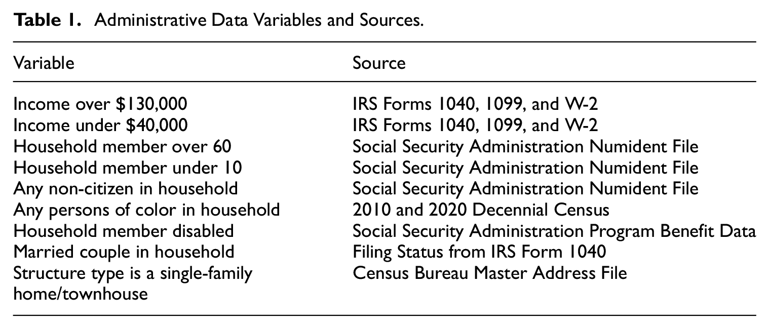
To examine nonresponse bias, we merge with various administrative data from the Internal Revenue Service (IRS), Social Security Administration (SSA), and a few other sources to ACS sampled cases at the address level. We harmonize the data to create variables that are at the household-level. This gives us a measure of, for example, household income for all sampled cases, regardless of whether or not the household responded to the ACS. With this linked data, we can examine how the characteristics of households who respond to the ACS compare to household who do not respond. A description of the variables we look at and their primary source are given in Table 1. A more detailed discussion of the administrative data and how they are linked are given in Supplemental Appendix A.1.
Administrative Data Variables and Sources.
2.3. Facebook Data
The Facebook data we link in at the county-level come from Chetty et al. (2022). The two primary variables we use are economic connectedness and clustering. The economic connectedness variable represents the percent of friends a low-SES (socioeconomic status) person has who are high-SES. SES is defined by income, and someone is defined as low-SES if their income is below the national median. Income is not observed directly for these Facebook users, but rather is estimated by Chetty et al. (2022) using a model that uses ACS estimates on median household income for the block group (geographic areas that have between 600 and 3,000 people) the person resides in as the dependent variable, and variables observed in the Facebook data as explanatory variables. The list of explanatory variables includes age, education, marital status, language, mobile phone type, predicted mobile phone price, and location. Mathematically, the economic connectedness variable is a county-level average of an individual variable that is a proportion. Let
For example, if an individual has 400 Facebook friends and 100 of them are high-income, then
The clustering variable represents the average fraction of an individual’s friend pairs who are also friends with each other. People with higher levels of clustering are perceived to have more insular social networks. To define clustering mathematically, let
And the county-level average is
Where
Both the economic connectedness and the clustering variables are constructed for people who are between twenty-five and forty-four, who have been active on Facebook at least once in the past thirty days and have at least 100 Facebook friends. Chetty et al. (2022) examine how representative this set of people are compared to the overall population in that age group. Compared to ACS estimates, the Facebook sample is similar in terms of age and language spoken, but has slightly more women (53.6% in the Facebook sample vs. 50.1% for ACS estimates). For representativeness of friendship networks, the authors also do an analysis of teenagers in the Facebook data and compare this to social network data and parental income data from the National Longitudinal Study of Adolescent to Adult Health. Using predicted parental income as the definition of high versus low SES in these analyses, they find that at the national-level, measures of economic connectedness are similar between the Facebook data and the survey data. Additionally, Chetty et al. (2022) also do a robustness check where they construct the economic connectedness statistics only using an individual’s ten closest friends and find comparable results. The authors also find the economic connectedness statistics are relatively stable across birth cohorts as well as on an alternative sample of teenagers who use Instagram (which is own by the same parent company as Facebook, Meta). In summary, there does not appear to be substantial bias in the Facebook sample based on comparisons to alternative sources.
One important conceptual difference in our data sources is that the Facebook data measures the social characteristics of younger adults, while the ACS data represents all age groups. Chetty et al. (2022) do find that the Facebook statistics seem comparable for birth cohorts within the twenty-five- to forty-four-year-old age range as well as for teenagers, suggesting the metrics appear comparable across certain age groups. But it is unclear how well this trend extrapolates to the forty-five plus age range which may be less likely to utilize the internet and social media than other cohorts. If the geographic patterns for social capital differ significantly between the twenty-five and forty-four age group and the and forty-five plus age group, this could affect how well our results generalize to older populations. Additionally, it is important to note that these two key variables measure the characteristics of a person’s Facebook friends, not their overall number of friends, and we have no measure of how close any of these friendships are. Thus, we are focusing on two specific dimensions of people’s social networks: diversity and insularity.
In addition to the two primary variables of economic connectedness and clustering, we use two additional variables from Chetty et al. (2022): proxies for “volunteering” and “civic organization.” Their proxy of volunteering is the percentage of Facebook users who are members of a group which is predicted to be about “volunteering” or “activism” based on group title and other group characteristics. Their proxy of civic organization at the county level is the number of Facebook Pages predicted to be “Public Good” pages based on page title, category, and other page characteristics, per 1,000 users in the county. Note that the volunteering measure is based on Facebook group membership and doesn’t necessarily measure how often people volunteer. Similarly, the civic organization measure is based on the number of certain types of Facebook groups that exist and doesn’t necessarily measure how frequently people attend the meetings of these groups, for example.
2.3.1. Geography
The ACS response rates, ACS bias, and Facebook data are all linked at the county-level. Because small counties have a small sample size in the ACS 1-year, we make use of two levels of aggregation which combine counties into larger groups. We use two different methods of aggregation as a sensitivity analysis to see how robust out results are. The first is Core-Based Statistical Areas (CBSA), which roughly define metropolitan areas containing a central city and surrounding suburbs. Counties not a part of any CBSA are all grouped together within a state to form a group. The second is ACS estimation areas for the 2021 1-year. These are the county groupings used in the ACS weighting process. Counties with large or medium-sized populations are their own areas, and counties with small populations are grouped together within state. From the 3,143 counties and county equivalents in the United States as of 2021, the CBSA approach yields about 1,000 county groups and the ACS estimation area approach yields a count of about 2,100 county groups. These county group counts are rounded according to Census disclosure rounding rules (U.S. Census Bureau 2024). The ACS estimation area approach largely splits up larger metropolitan areas into smaller groups. For example, the CBSA for the U.S. Capital, Washington, DC, contains counties from the states of Maryland, Virginia, and West Virginia. With the ACS estimation areas, many of the larger counties in this CBSA become their own group (such as Fairfax County, Virginia, which has a population of over a million people), leading to more units of observation in our analyses.
3. Maps and Correlations
To describe how these data are related with each other, we first graph the data. Figure 1 presents housing unit response rates to the 2017 to 2021 ACS 5-year at the county level. Figures 2 and 3 present the bias estimates (defined in the next paragraph) by CBSA group for the 2021 ACS sample year for two of our administrative-data variables. Graphs for other variables are presented in Supplemental Appendix Section A.2, Figures 6 to 8. Figures 4 and 5 present the two Facebook variables graphed at the county level.
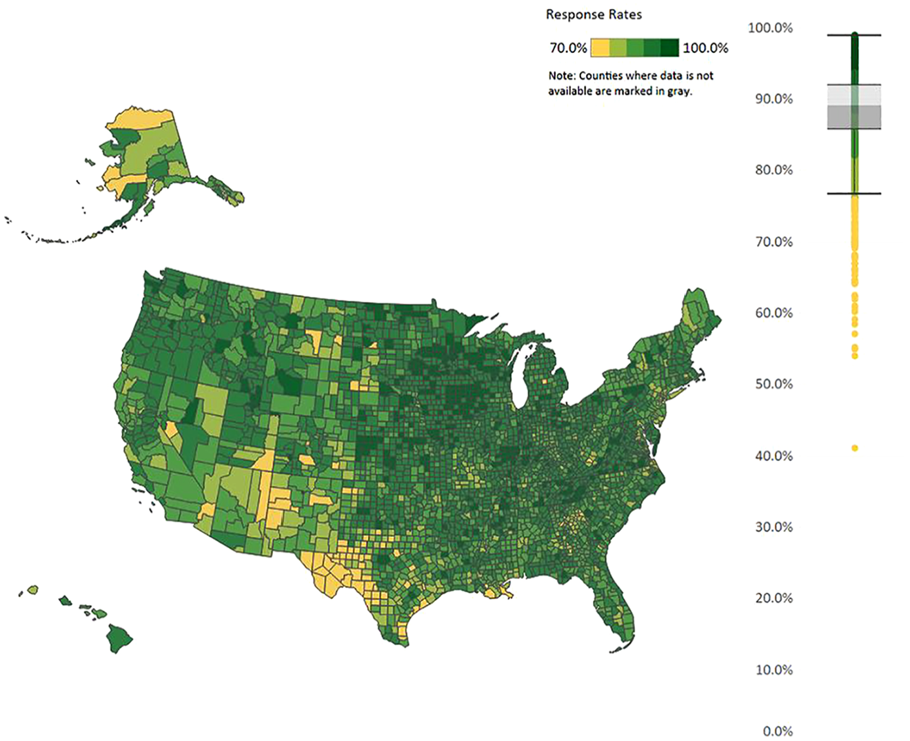
ACS 2017 to 2021 5-year response rates.
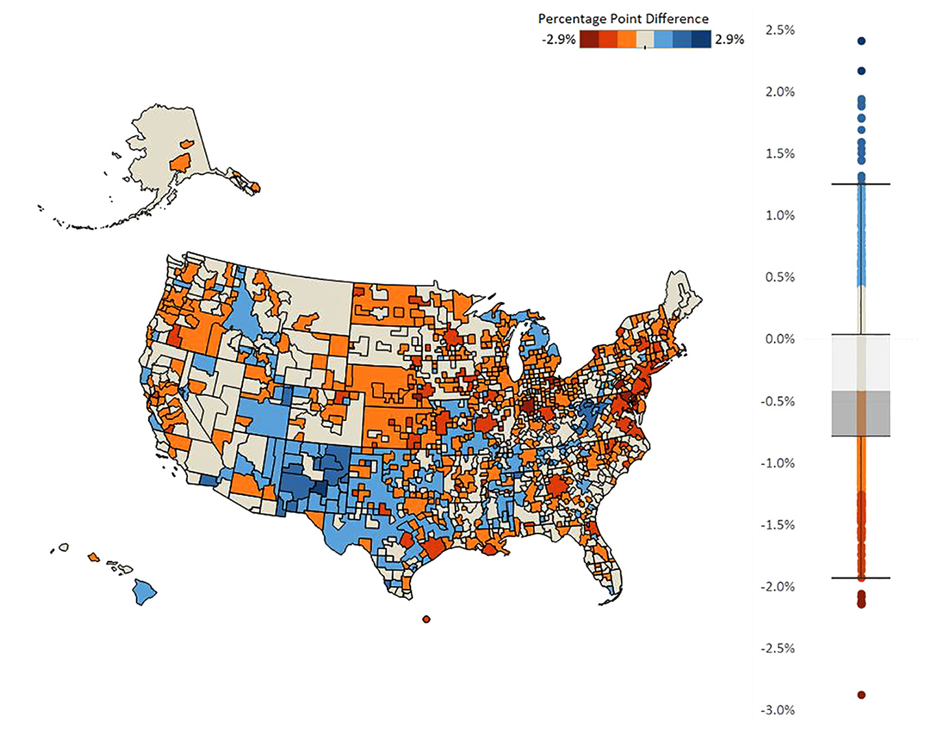
Nonresponse analysis of household administrative data income of less than $40,000.
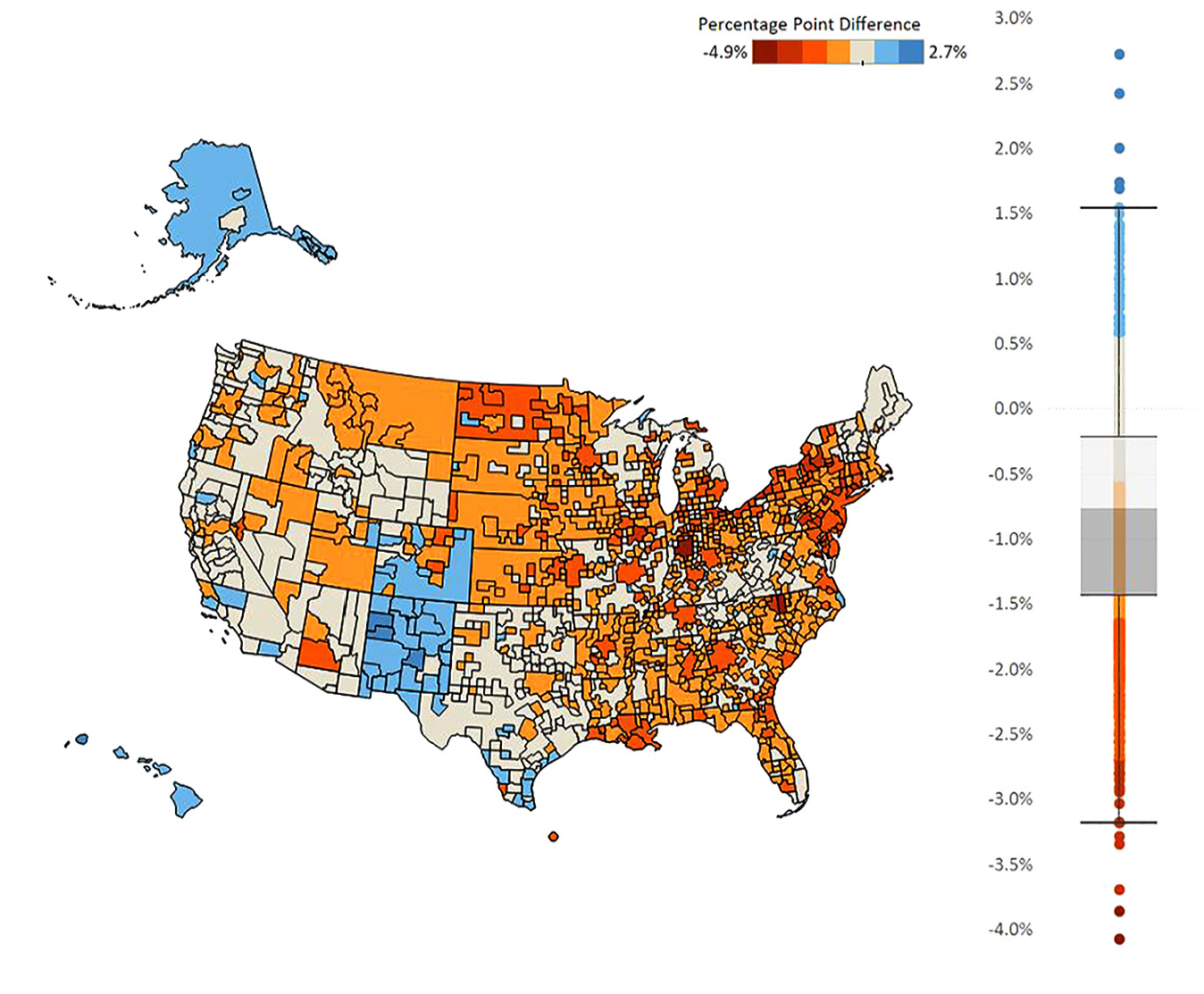
Nonresponse analysis of presence of a household member that is either Hispanic or non-White.
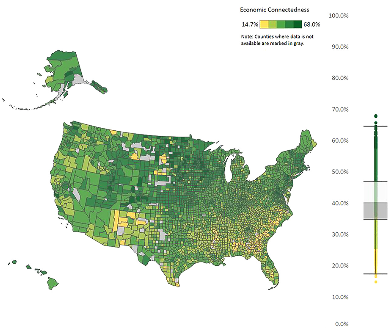
Economic connectedness.
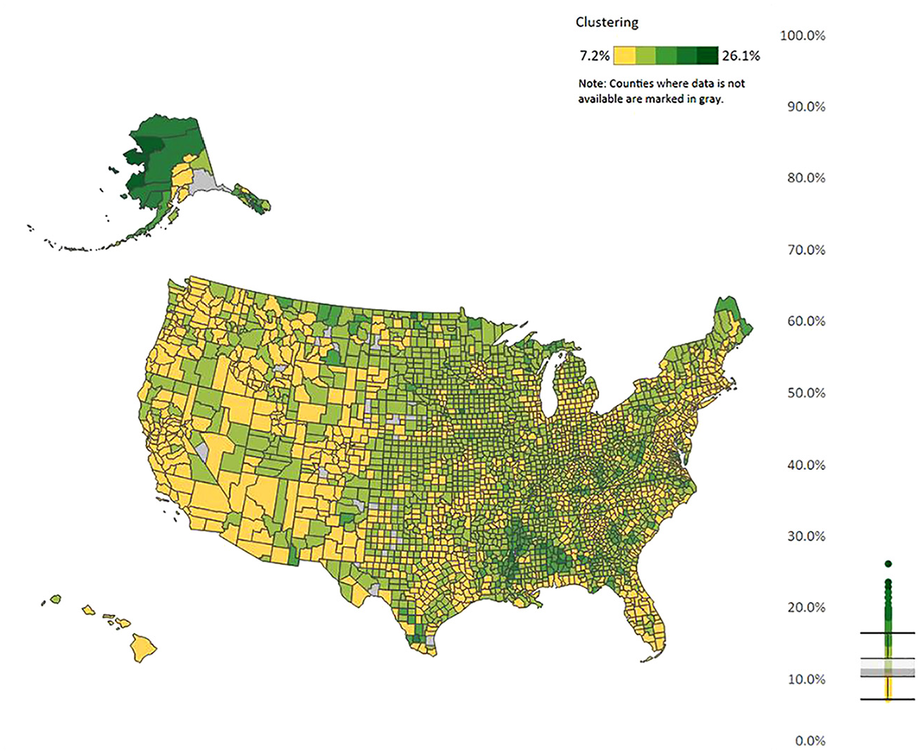
Clustering.
Our measure of nonresponse bias is based on calculating means of administrative data variables. As described in the prior section, we merge our administrative data to all sampled cases, which gives us measures of household-level variables such as household income. We discretize all variables in the paper, so we convert our income variable into indictors of households being in certain income bins. For each administrative data variable, we calculate a pair of means defined as follows:
Respondents: We restrict the sample to only observations that have responded to the ACS. This is denoted as
Benchmark: This mean includes both respondent and nonrespondent to the ACS, which we denote by
From these definitions, we estimate
Figures 1 to 5 show regional variation in these variables. ACS response rates are lower in the Southwest and higher in the Midwest. Note that the response rate is around 60% for some of these counties, even though the overall survey response rate was 85.3% in that year. For the bias measures, Figure 2 presents regional variation in even the sign of the bias variable. That is, the bias is positive in some areas and negative in other areas. In the Mid-Atlantic states, respondents are less likely to be lower income compared to nonrespondents in the same area (negative bias). In rural Southwest, on the other hand, respondents are more likely to be lower income (positive bias). And for Figure 3 for whether there is a person of color in the household, Alaska, Hawaii, New Mexico, and parts of Colorado stand out with respondents being more likely to have such a person in the household, which is a different pattern from the rest of the county. The different patterns between Figures 2 and 3 reiterates a key point from Groves and Peytcheva (2008) who note that bias is variable specific, even within the same survey. For the social capital variables, economic connectedness is lower in the South and higher in the rural Midwest. Clustering is higher with many counties in the South.
While one can qualitatively look at the Facebook variables to see the relationship with the ACS variables, we present correlations in Table 2 to provide a more formal summary. Table 2 presents the correlation between response rates and the Facebook variables for both CBSA and ACS estimation area county groups, as well as the correlation between the absolute value of the bias variables with response rates and the Facebook variables. The table presents the correlations between response rates and nonresponse bias to help put the magnitude of the Facebook correlations in context. We take the absolute value of the bias measures because we consider both a positive bias and a negative bias as an indicator of lower data quality, so we are interested in whether differences in social capital lead to higher bias in any direction. Additionally, Figures 2 and 3 show that the sign of nonresponse bias varies by variable and by geography.
Correlations of Social Capital with ACS Response Rates and Bias.
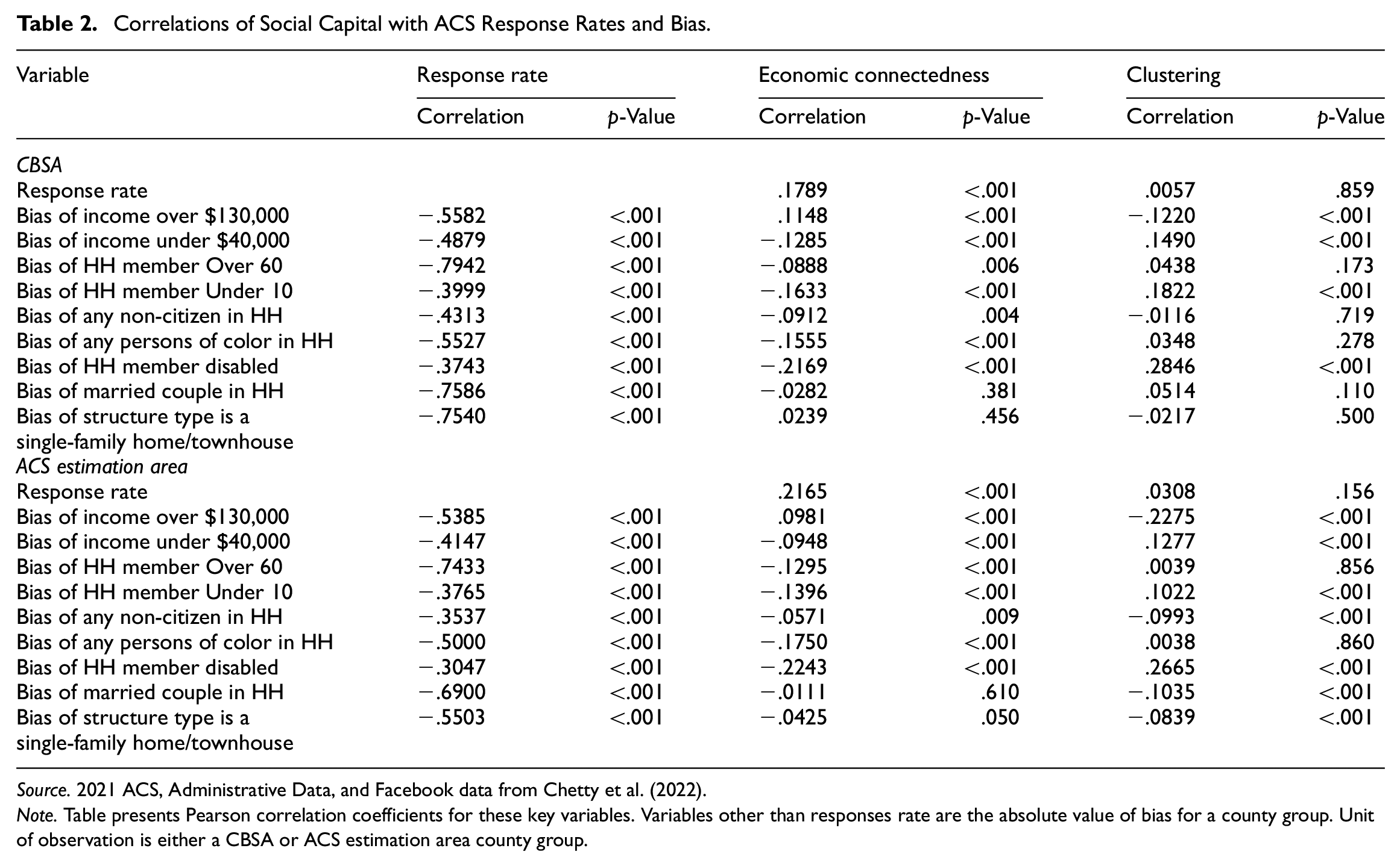
Source. 2021 ACS, Administrative Data, and Facebook data from Chetty et al. (2022).
Note. Table presents Pearson correlation coefficients for these key variables. Variables other than responses rate are the absolute value of bias for a county group. Unit of observation is either a CBSA or ACS estimation area county group.
Overall, the table shows that areas with lower economic connectedness and higher clustering have higher bias. In other words, an area where people have more homogenous and insular social networks have higher bias. There are some caveats to note, though. First, the magnitude of most of the significant correlations are under .2 in absolute value, so the correlations are not high, especially relative to the correlations between nonresponse bias and response rates. The highest correlations are found with the disability variable, which are between .2 and .3 in absolute value. Interestingly, the correlation for disability with response rates is one of the lower values, with estimates of −.3743 (CBSA) and −.3047 (ACS estimation area). Additionally, the sign of the correlations between nonresponse bias in the income over $130,000 variable and economic connectedness is positive, while the correlation is negative between other administrative data variables and economic connectedness. In summary, these maps and correlations show some evidence of a relationship between area-level characteristics of people’s social networks and area-level ACS nonresponse bias and response rates. In the next section, we perform some regression analysis to confirm this relationship is not being driven solely by other geographic characteristics.
4. Regressions
Next, we estimate the following regression model, where the key outcome is the absolute value of nonresponse bias for each variable
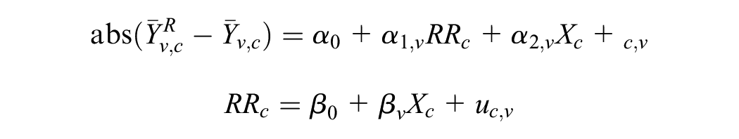
where
Table 3 presents the estimates of the unit response rate regression and Table 4 presents the coefficient estimates on all the dependent variables for the response rate, economic connectedness, and clustering coefficients. The coefficient estimates for all the other explanatory variables are given in Supplemental Appendix A.4, Table 5. Additionally, Tables 6 to 9 in Supplemental Appendix A.5 present estimation results of spatial regression models, which show largely similar results.
Response Rate Regression.
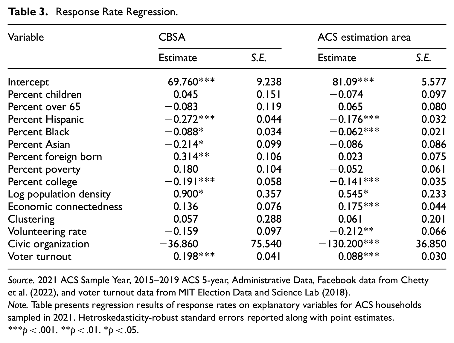
Source. 2021 ACS Sample Year, 2015–2019 ACS 5-year, Administrative Data, Facebook data from Chettyet al. (2022), and voter turnout data from MIT Election Data and Science Lab (2018).
Note. Table presents regression results of response rates on explanatory variables for ACS households sampled in 2021. Hetroskedasticity-robust standard errors reported along with point estimates.
p < .001. **p < .01. *p < .05.
Bias Regression Results for Select Explanatory Variables.
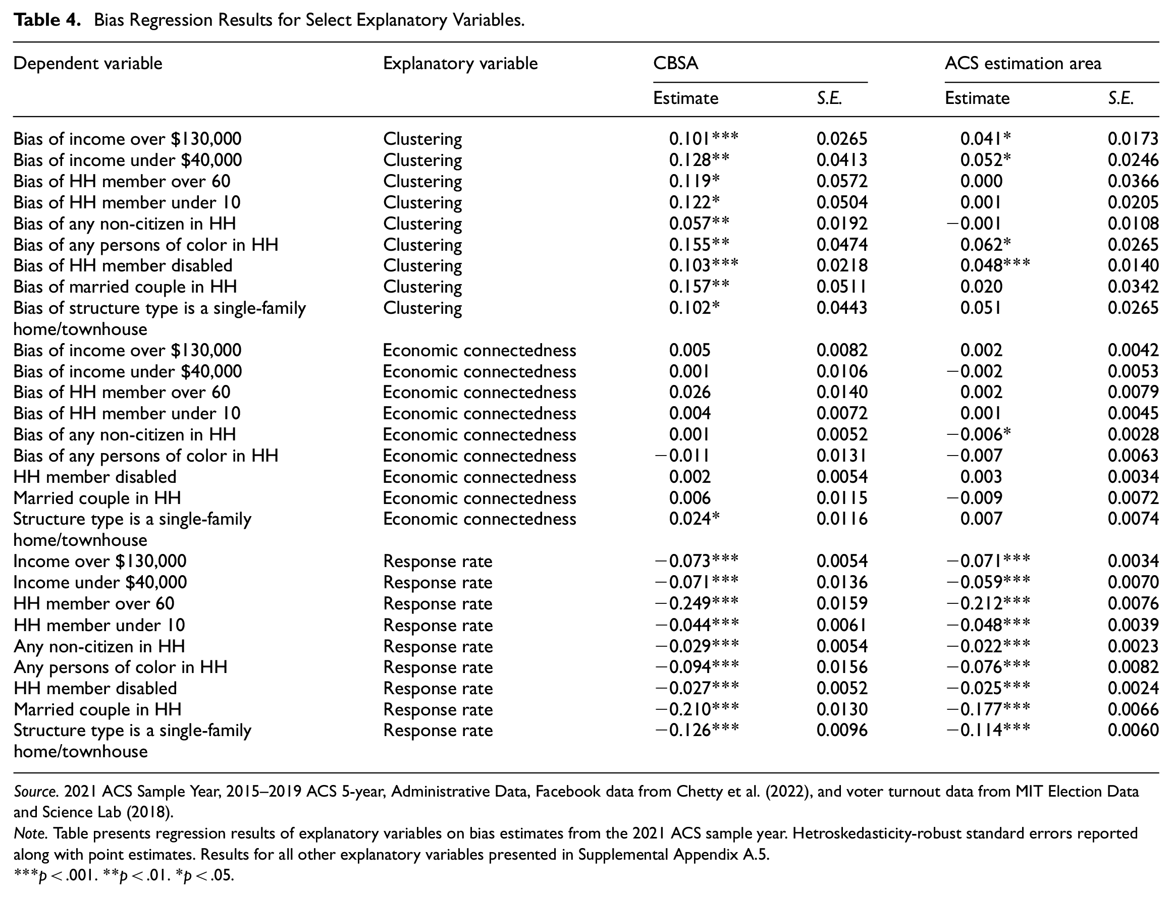
Source. 2021 ACS Sample Year, 2015–2019 ACS 5-year, Administrative Data, Facebook data from Chetty et al. (2022), and voter turnout data from MIT Election Data and Science Lab (2018).
Note. Table presents regression results of explanatory variables on bias estimates from the 2021 ACS sample year. Hetroskedasticity-robust standard errors reported along with point estimates. Results for all other explanatory variables presented in Supplemental Appendix A.5.
p < .001. **p < .01. *p < .05.
In Table 3 for the response rate regression, many of the race and ethnicity variables are significant. For the Hispanic coefficient in the right most set of columns, the estimate of −0.176 means after holding all other variables in an area constant, a 10 percentage point increase in the Hispanic population for an area is associated with a 1.76 percentage point lower response rate. For the social network variables, the clustering variable is insignificant in both regressions, and the economic connectedness variable is significant in the ACS estimation area regression. Of the people in the lower half of the income distribution, the economic connectedness variable represents the average share of their friends that are in the upper half of the income distribution. This coefficient estimate of 0.175 means that, after holding all other variables in an area constant, a 10 percentage point increase in the area-level share of low predicted SES individuals who are friends with high predicted SES individuals is associated with a 1.75 percentage point higher response rate for the area. Higher voter turnout rates in an area are also associated with higher ACS response rates.
In the ACS estimation area column, one odd result is the negative relationship between the volunteering and civic organization variables and response rates. Prior studies find that people who volunteer more are more likely to respond to surveys (e.g., Abraham et al. 2009). However, these proxies are more reflective of Facebook group membership than actual time spent on volunteering and civic engagement. Additionally, the results from Chetty et al. (2022) suggest lower explanatory power in these volunteering and civic organization variables, given they find weak correlations between these two measures and their primary outcome of interest, upward economic mobility. This is in contrast with the economic connectedness and clustering variables which had much higher correlations. Thus, the peculiar results we find in our analyses for volunteering and civic engagement might reflect potential quality issues with these variables or that social media following may not be indicative of meaningful civic participation. This may explain the null findings in Chetty et al. (2022). However, other factors could also be at play, such as differences in how these measures capture civic engagement compared to prior studies.
For the bias regressions, the economic connectedness coefficients are insignificant in most of the regressions. What stands out is the clustering variable, which is significant and positive in all the CBSA regressions, and significant and positive in some of the ACS estimation area regressions. The estimate of 0.041 in the “Income over $130,000” row for the ACS estimation area regression means that if the area-level average percentage of a person’s friends who are also friends with each other increases by 10 percentage points and all other variables are held constant, this is associated with the bias of the high-income variable being 0.4 percentage points higher. In other words, for areas where people who have more insular networks, the bias is higher, even after controlling for response rate and other area characteristics.
Overall, the results in these regressions present similar results to Section 3. The significance of the results vary by which county groups are used, so the results are somewhat sensitive to the choice in how counties are grouped together. But overall, the results suggest that the correlation coefficient estimates from Section 3 are not simply because of other area-level observable characteristics.
5. Conclusion
In this paper, we combine Facebook social networking data with ACS response rate and bias data to examine how social capital affects data quality. Our work makes use of a measure of social capital not available previously. Importantly, we can look at the effects on nonresponse bias, not just response rates. Overall, we find some evidence that areas where people have more insular and sociodemographically homogeneous social networks have higher nonresponse bias in the ACS. The effect sizes are moderate, and the significance of our estimates varies by specification. But overall, we provide evidence that these social capital measures are related to survey participation and data quality.
One key limitation of this paper is the unique characteristics on the ACS. It is a government survey, has a relatively high response rate, and is mandatory (if sampled, someone is legally required to respond to the survey). It is unclear how these social network effects would translate to non-government surveys with lower response rates. Social capital may be more influential in the decision to respond in a lower response rate survey. However, people who don’t respond to a government survey could have even less social capital than nonrespondents to other surveys, so it is unclear a priori how the effects would differ. Unfortunately, such future analyses may be difficult given non-government surveys typically have much smaller sample sizes, compared to the ACS which samples about 3.5 million addresses annually. Additionally, our nonresponse bias measures rely on administrative data that in general are only available for surveys conducted by a government agency. These two issues limit the ability to extend the geographic analyses presented in this paper to another survey.
As for implications, these results suggest possible unit nonresponse bias in any survey that measures characteristics about social networks, such as the number of close friends question on the General Social Survey. There is pre-existing evidence of nonresponse bias in other forms of behavior related to social capital (e.g., Abraham et al. 2009 with volunteering), so bias in social network characteristics would be a related measure that could have similar mechanisms leading to nonresponse bias. An additional implication that is more speculative is that the results could suggest that having interviewers from the same community may lead to higher cooperation rates. Various survey organizations already do this to reduce travel costs. Future studies could further explore how the extent to which the interviewer is local or integrated with the respondent’s community affects data quality. Finally, another speculative implication is that these results suggest that getting a foothold into communities with insular social networks may be important for achieving a representative sample. Combining Respondent-Driven Sampling (Heckathorn 1997), a method for surveying hard-to-reach populations, with traditional sampling methods may yield value for obtaining data from certain communities and people groups.
Supplemental Material
sj-docx-1-jof-10.1177_0282423X251349722 – Supplemental material for Connected and Uncooperative: The Effects of Homogenous and Exclusive Social Networks on Survey Response Rates and Nonresponse Bias
Supplemental material, sj-docx-1-jof-10.1177_0282423X251349722 for Connected and Uncooperative: The Effects of Homogenous and Exclusive Social Networks on Survey Response Rates and Nonresponse Bias by Jonathan Eggleston and Chase Sawyer in Journal of Official Statistics
Footnotes
Authors’ Note
Any opinions and conclusions expressed herein are those of the authors and do not represent the views of the U.S. Census Bureau. The Census Bureau has ensured appropriate access and use of confidential data and has reviewed these results for disclosure avoidance protection (Project 7531477: CBDRB-FY23-0260, CBDRB-FY23-0452).
Funding
The author(s) received no financial support for the research, authorship, and/or publication of this article.
Supplemental Material
Supplemental material for this article is available online.
References
Supplementary Material
Please find the following supplemental material available below.
For Open Access articles published under a Creative Commons License, all supplemental material carries the same license as the article it is associated with.
For non-Open Access articles published, all supplemental material carries a non-exclusive license, and permission requests for re-use of supplemental material or any part of supplemental material shall be sent directly to the copyright owner as specified in the copyright notice associated with the article.