
Abstract
Background
The test tradeoff curve helps investigators decide if collecting data for risk prediction is worthwhile when risk prediction is used for treatment decisions. At a given benefit-cost ratio (the number of false-positive predictions one would trade for a true positive prediction) or risk threshold (the probability of developing disease at indifference between treatment and no treatment), the test tradeoff is the minimum number of data collections per true positive to yield a positive maximum expected utility of risk prediction. For example, a test tradeoff of 3,000 invasive tests per true-positive prediction of cancer may suggest that risk prediction is not worthwhile. A test tradeoff curve plots test tradeoff versus benefit-cost ratio or risk threshold. The test tradeoff curve evaluates risk prediction at the optimal risk score cutpoint for treatment, which is the cutpoint of the risk score (the estimated risk of developing disease) that maximizes the expected utility of risk prediction when the receiver-operating characteristic (ROC) curve is concave.
Methods
Previous methods for estimating the test tradeoff required grouping risk scores. Using individual risk scores, the new method estimates a concave ROC curve by constructing a concave envelope of ROC points, taking a slope-based moving average, minimizing a sum of squared errors, and connecting successive ROC points with line segments.
Results
The estimated concave ROC curve yields an estimated test tradeoff curve. Analyses of 2 synthetic data sets illustrate the method.
Conclusion
Estimating the test tradeoff curve based on individual risk scores is straightforward to implement and more appealing than previous estimation methods that required grouping risk scores.
Highlights
The test tradeoff curve helps investigators decide if collecting data for risk prediction is worthwhile when risk prediction is used for treatment decisions.
At a given benefit-cost ratio or risk threshold, the test tradeoff is the minimum number of data collections per true positive to yield a positive maximum expected utility of risk prediction.
Unlike previous estimation methods that grouped risk scores, the method uses individual risk scores to estimate a concave ROC curve, which yields an estimated test tradeoff curve.
A risk prediction model is a mathematical model that computes the risk of developing disease using baseline covariates such as family history, medical history, other risk factors, and biomarkers. Before risk prediction models are used for treatment decisions, they require evaluation. The scenario for risk prediction evaluation considered here involves the following aspects.
Risk prediction indicates treatment among persons whose risk score, the estimated risk of developing disease, equals or exceeds a cutpoint.
The optimal risk score cutpoint maximizes the expected utility of risk prediction when the receiver-operating characteristic (ROC) curve is concave (the slope of the ROC curve monotonically decreases from left to right). In medical decision making, a utility is a numerical value for a health benefit, a harm, or a monetary cost (that could have been spent on a health benefit) measured in the same units.
No one receives treatment in the absence of risk prediction.
Evaluating risk prediction may involve data collection costs, the monetary costs, and possible harms associated with obtaining data on predictors. Data collection costs are a particular concern when they involve an invasive or expensive test.
The goal is to evaluate risk prediction with data collection costs (relative to no prediction) when the cutpoint for treatment is the optimal risk score cutpoint.
One approach to evaluating risk prediction is a complete decision analysis with specification of all utilities.1–5 When utilities are difficult to specify, investigators may prefer a sensitivity analysis based on a single quantity that is a function of the utilities. Decision curves 6 and relative utility curves7,8 evaluate risk prediction without data collection costs using a sensitivity analysis over the risk threshold or the benefit-cost ratio. The risk threshold is the probability of developing disease at indifference between treatment and no treatment. The benefit-cost ratio is the ratio of the benefit of a true positive to the cost (in the same units) of a false positive or, equivalently, the number of false-positive predictions that one would trade for a true-positive prediction. Relative utility curves differ fundamentally from decision curves (including standardized decision curves 9 ) because they evaluate risk prediction at the optimal risk score cutpoint, while decision curves evaluate risk prediction at the risk score that equals the risk threshold, which may or may not be the optimal risk score cutpoint.
Test tradeoff curves, which are derived from relative utility curves, evaluate risk prediction while accounting for data collection costs. For a given benefit-cost ratio or risk threshold, the test tradeoff is the minimum number of data collections per true positive to yield a positive maximum expected utility of risk prediction when including data collection costs. To better understand the use of test tradeoffs, consider the following scenario involving risk prediction for cancer in asymptomatic persons. Suppose the risk prediction model requires only data on risk factors obtained by a questionnaire and the test tradeoff is 100. In this case, a test tradeoff of 100 questionnaires per true-positive prediction of cancer is likely worthwhile. In contrast, suppose the risk prediction model requires an expensive invasive biomarker measurement and the test tradeoff is 3,000. In this case, a test tradeoff of 3,000 invasive tests per true positive is likely unacceptable.
A test tradeoff curve plots test tradeoff versus benefit-cost ratio or risk threshold. Sometimes investigators want to determine if including an additional predictor in the risk prediction model is worth the cost of collecting data on the additional risk predictor. An added-predictor test tradeoff curve plots the added-predictor test tradeoff versus the benefit-cost ratio or risk threshold.
The starting point for estimation is a set of risk scores and indicators of disease development in an external validation sample, a sample of persons from a population that differs from the sample used to develop the risk prediction model. This article discusses the methodology to estimate test tradeoff curves in a target population from which an external validation sample is random sample, with possibly different rates of sampling by disease status. Hence, when estimating a test tradeoff curve, investigators need to specify the probability of developing disease in the target population, which is denoted by P.
The previous methodology for estimating the test tradeoff curve required grouping risk scores. This article introduces a new method for estimating the test tradeoff curve that uses individual risk scores to estimate the concave ROC curve, the relative utility curve, and the test tradeoff curves.
The article is organized as follows: 1) risk prediction data; 2) estimating a concave ROC curve; 3) finding the optimal risk score cutpoint; 4) identifying the relevant region for benefit-cost ratios, risk thresholds, and ROC curves; 5) estimating a relative utility curve; 6) estimating a test tradeoff curve; 7) estimating an added-predictor test tradeoff curve; and 8) discussion. The underlying theory follows previous work on relative utility and test tradeoff curves7,8 but in the context of individual risk scores and not groups of risk scores. Table 1 summarizes key terms, quantities, and symbols used in the article.
Key Terms, Quantities, and Symbols
Risk Prediction Data
Let D denote a random variable for disease status, where D = 0 denotes no disease during follow-up and D = 1 denotes disease during follow-up. Let S denote a random variable for the risk score. The external validation sample is the set {si, di}, where si is the ith largest risk score and di is the disease status of the person with risk score si.
The analyses of 2 synthetic data sets in the Supplementary Material illustrate the methodology. Data set 1 involves only 40 risk scores to clearly display the steps needed to estimate a concave ROC curve from individual risk score data. Data set 2 involves 375 risk scores for 2 models that predict cancer. Model 1 is based on age and family history. Model 2 is based on age, family history, and a biomarker. The biomarker could involve substantial data collection costs if it is invasive or expensive. For data set 2, the probability of developing cancer in the target population is P = 0.10.
Estimating a Concave ROC Curve
The ROC curve for the risk score plots the true-positive rate, TPR(s) = pr(S ≥ s | D = 1), versus the false-positive rate, FPR(s) = pr(S ≥ s | D = 0), where s is a cutpoint of the risk score. The slope of the ROC curve is ROCSlope(s) = ∂TPR(s)/∂FPR(s). The method for estimating a concave ROC curve based on individual risk scores involves the following 5 steps. Figure 1 illustrates the 5 steps for the small data set 1, which clearly shows individual points. Figure 2 illustrates the 5 steps for model 2 of the much larger data set 2, where the individual points are less visible. Appendix A provides mathematical details for each step.
Step 1. Observed ROC points. For each possible risk score cutpoint s corresponding to a risk score in {si}, estimate FPR(s) as the fraction with D = 0 whose risk scores equals or exceeds s and estimate TPR(s) as the fraction with D = 1 whose risk scores equal or exceeds s. Also include the ROC point (0,0). If s were continuous, the result would be a step function for the ROC curve.
Step 2. Modified ROC points. Some step 1 ROC points may involve multiple true-positive rates for the same false-positive rate. For these points, specify a single ROC point for the average true-positive rate at the false-positive rate. Also, for these points, specify a risk score that is the average risk score at the false-positive rate.
Step 3. ROC points forming a concave envelope. Proceeding from left to right starting with (0,0), select the step 2 ROC point with the largest slope from the previously selected step 2 ROC point. (The slope between 2 ROC points is the difference between true-positive rates divided by the difference between false-positive rates.) For example, after the ROC point (0,0), select the third ROC point if it is the ROC point to the right with the largest slope from (0,0). Then select the fifth ROC point if it is the ROC point to the right with the largest slope from the third ROC point, and so forth. Impute ROC points between these selected ROC points based on a linear model to obtain the step 3 ROC points. If these step 3 ROC points were connected by line segments, they would form a concave envelope around the step 2 ROC points.
Step 4. ROC points after a slope-based moving average. By convention, the slope at an ROC point is the slope from the ROC point on the immediate left. For each step 3 ROC point corresponding to a change in slope immediately after at least 2 consecutive step 3 ROC points on its left with the same slope, replace the true-positive rate for this ROC point with the average of the true-positive rates for the previous ROC point (on the left) and the next ROC point (on the right). Repeat this procedure 5 times. After 5 repeats, there is typically little change in the estimates. If these step 4 ROC points were connected by line segments, they would form a smoother concave ROC curve than the step 3 ROC points connected by line segments.
Step 5. Estimated concave ROC curve in the relevant region. To improve the fit, compute a weighted average of the step 4 ROC points and the diagonal line by choosing weights that minimize the sum of squares errors for the true-positive rates in the relevant region. (As will be discussed, the relevant region for the ROC curve requires that the slopes at ROC points equal or exceed 1.) Let {
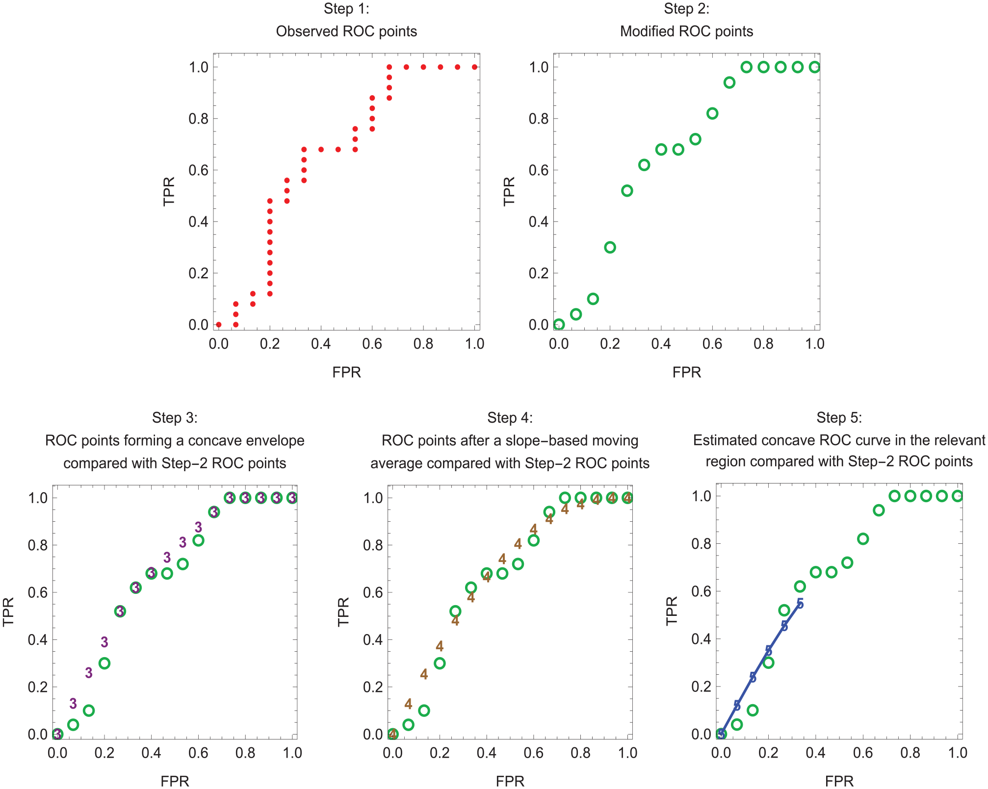
Estimation of a concave receiver-operating characteristic (ROC) curve in the relevant region for data set 1. Dots indicate step 1 ROC points. Open circles indicate step 2 ROC points. Numerals 3, 4, and 5 indicate step 3, step 4, and step 5 ROC points, respectively. Line segments connect the step 5 ROC points, which lie in the relevant region.
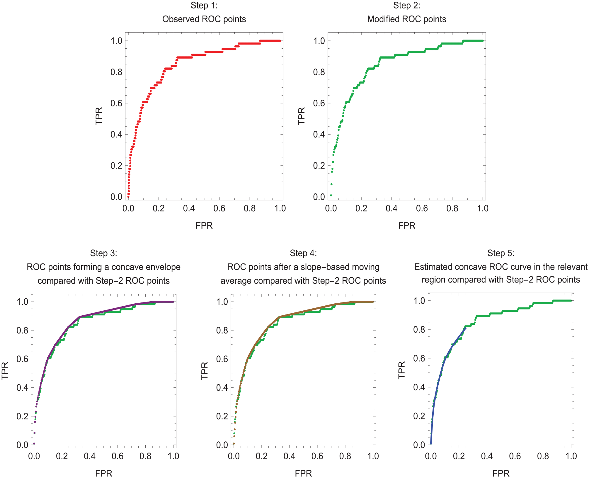
Estimation of a concave receiver-operating characteristic (ROC) curve in the relevant region for model 2 of data set 2. Line segments connect the step 5 ROC points, which lie in the relevant region.
Finding the Optimal Risk Score Cutpoint
This section reviews the fundamental work of Metz 1 for finding the optimal risk score cutpoint based on the expected utility of risk prediction. Although Metz did not specifically mention concave ROC curves, the concavity of ROC curves is implicit in his formulation. For risk prediction, the basic utilities are U = {U(Treat,Dis) U(Treat,NoDis) U(NoTreat,Dis) U(NoTreat,NoDis)}, where
U(Treat,Dis) = utility of treating a person who would develop disease in the absence of treatment
U(Treat,NoDis) = utility of treating a person who would not develop disease in the absence of treatment
U(NoTreat,Dis) = utility of not treating a person who would develop disease in the absence of treatment,
U(NoTreat,NoDis) = utility of a not treating a person who would not develop disease in the absence of treatment
For an example of these utilities, consider predicting the risk of cancer in asymptomatic persons, where the treatment to prevent cancer involves harmful side effects, such as an elevated risk of hip fracture. One might select as reference values U(NoTreat,NoDis) = 0 for the best case scenario and U(NoTreat,Dis) = –100 for the worst case scenario. For intermediate case scenarios, one might set U(Treat,Dis) = –20 for the reduced risk of cancer after treatment among those who would develop cancer without treatment and U(Treat,NoDis) = –4 for the harms of unnecessary treatment. Specifying these utilities can be challenging, which motivates the sensitivity analysis based on the benefit-cost ratio or the risk threshold.
For the test tradeoff analysis, one additional utility is needed, namely,
The overall expected utility of risk prediction in the target population with risk score cutpoint s is UOverall(s) = UPred(s) –CData, where
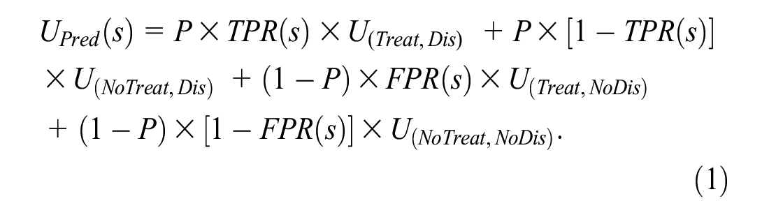
For the target population, the expected utilities of no treatment and treatment in the absence of risk prediction are


Ignoring data collection costs, the expected utility of risk prediction relative to no treatment is
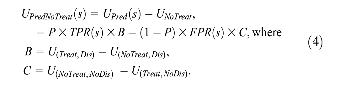
In equation (4), B is the benefit of a true positive and C is the cost of a false positive. Continuing the example with U = {0, −4, −20, −100} yields B = (−20) − (−100) = 80 and C = 0 − (−4) = 4.
The optimal risk score cutpoint, denoted sopt(B/C), is the value of s that maximizes UPredNoTreat(s). Following Metz, 1 sopt(B/C) satisfies the following condition:
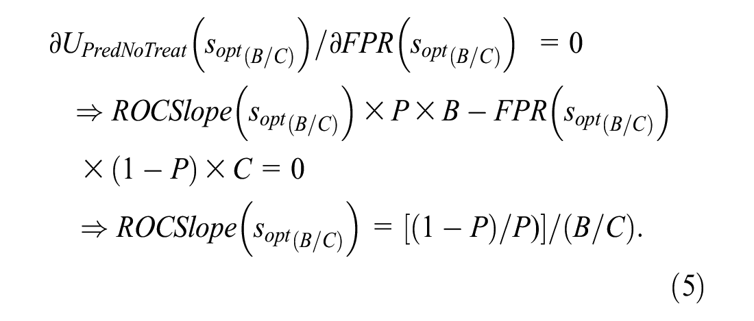
Equation (5) requires a concave ROC curve to ensure a global maximum for UPredNoTreat(s).
As shown in Equation (5), the benefit-cost ratio, B/C, plays a key role in the optimization. The benefit-cost ratio can also be obtained from the risk threshold, which is denoted by R. As derived in Pauker and Kassirer, 10 setting equation (2) equal to equation (3) and solving for R yields R = 1/(1 + B/C) or equivalently B/C = (1–R)/R. Continuing the example with U = {0, −4, −20, −100}, B/C = 80/4 = 20 and R = 1/(1 + 20) = 0.05. If P = 0.01, the optimal risk score cutpoint is the risk score at which the slope of the ROC curve is (0.99/0.01)/20 = 4.95.
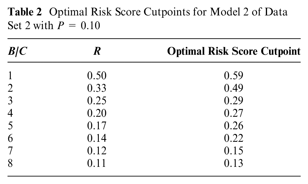
Although estimating the test tradeoff curve does not require computing the optimal risk score cutpoints, investigators may use the linear interpolation in Appendix B to compute the optimal risk score cutpoints as functions of B/C or R. Table 2 shows the optimal risk score cutpoints for model 2 of data set 2 with P = 0.1.
Optimal Risk Score Cutpoints for Model 2 of Data Set 2 with P = 0.10
Identifying the Relevant Region
The relevant region is the range of values for B/C, R, or the ROC curve implied by the scenario of no treatment in the absence of risk prediction. This scenario requires UNoTreat ≥ UTreat, which implies the relevant regions B/C ≤ (1 −P)/P, R ≥ P, and, from equation (5), ROCSlope(sopt(B/C)) ≥ 1. In Figure 3, with P = 0.1, the estimated relative utility and test tradeoff curves lie within the relevant regions of R ≥ 0.1 and B/C ≤ 9. In Figures 1 and 2, step 5 involves the relevant region of ROCSlope(sopt(B/C)) ≥ 1.
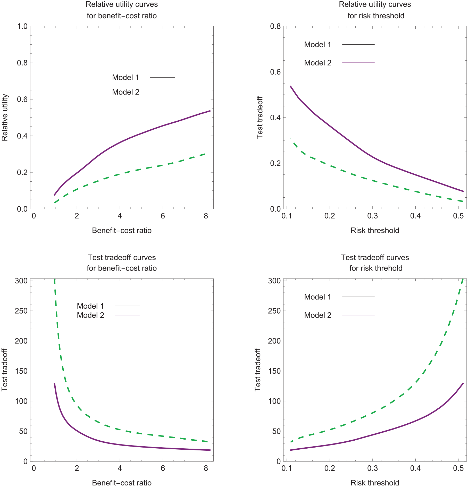
Estimated relative utility and test tradeoff curves for data set 2 with P = 0.1.
Estimating Relative Utility Curves
An intermediate step in estimating the test tradeoff curve is estimating the relative utility curve. Relative utility at a given B/C or R is the maximum expected utility of risk prediction, UPredNoTreat(sopt(B/C)), divided by the expected utility of perfect prediction, denoted by UPerfectNoTreat. Substituting perfect prediction, TPR = 1 and FPR = 0, into equation (4) yields UPerfectNoTreat = P × B. Based on equations (4) and (5), the formula for relative utility corresponding to B/C or R simplifies to
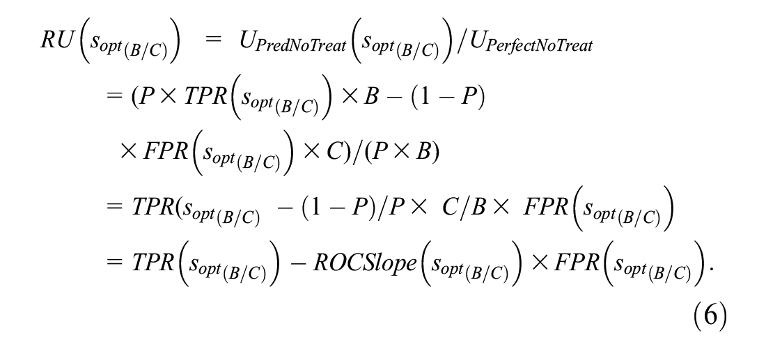
The estimated relative utility treating sj as the optimal risk score cutpoint is

Working backward from equation (5) yields the following imputed benefit-cost ratio for which sj is the optimal risk score cutpoint:

The estimated relative utility curves plots
Estimating the Test Tradeoff Curve
The formula for the test tradeoff corresponding to B/C or R is

The interpretation of equation (9) as the test tradeoff comes from requiring a positive maximum expected utility with data collection costs,
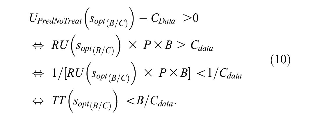
Because B/CData is the number of data collections per true positive, equation (10) implies that TT(sopt(B/C)) is the minimum number of data collections per true positive to yield a positive maximum expected utility with data collection costs.
A test tradeoff curve plots TT(sopt(B/C)) versus B/C or R. The estimated test tradeoff treating sj as the optimal risk score cutpoint is
Estimating the Added-Predictor Test Tradeoff Curve
The added-predictor test tradeoff is the minimum number of data collections for the additional predictor that would be traded for a true positive to give a positive increase in the maximum expected utility of risk prediction when including data collection costs. Let ΔRU(sopt(B/C)) = RUM2(soptM2(B/C)) – RUM1(soptM1(B/C)), where subscripts M1 and M2 denote models 1 and 2, and model 2 adds a predictor to the set of predictors in model 1. The added-predictor test tradeoff corresponding to B/C or R is
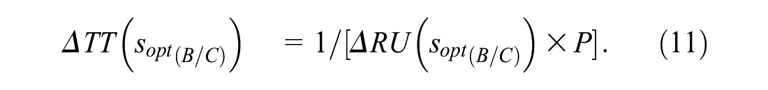
Let CAdd denote the additional data collection cost of the added predictor in model 2. The interpretation of equation (11) as the added predictor test tradeoff comes from specifying that the increase in the expected utility of risk prediction is larger than the added data collection cost, namely,
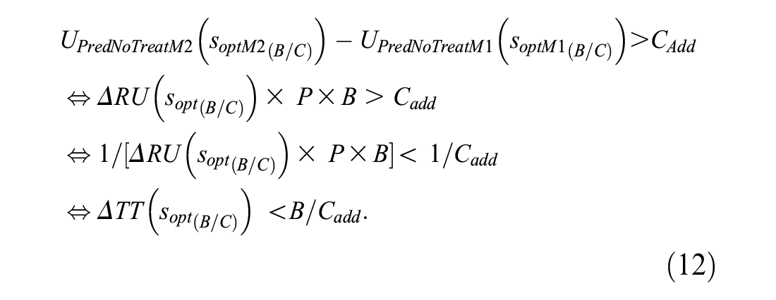
One can interpret B/CData as the number of added-predictor data collections per true positive. Hence, based on equation (12), ΔTT(sopt(B/C)) is the minimum number of data collections per true positive required for UPredNoTreatM2(soptM2(B/C)) – UPredNoTreatM1(soptM1(B/C)) > CAdd. The added-predictor test tradeoff curve plots ΔTT(sopt(B/C)) versus B/C or R.
When estimating the estimated added predictor test tradeoff, one cannot directly take the difference between the estimated relative utility curves for models 1 and 2, because each estimated relative utility curve corresponds to different set of imputed benefit-cost ratios. The solution is the linear interpolation in Appendix B, which computes estimated relative utilities at the same B/C to yield
Figure 4 shows the added predictor test tradeoff curves for data set 2 with P = 0.1. For a risk threshold between 0.10 and 0.20, the estimated added-predictor test tradeoff is approximately 50 with a 95% confidence interval of approximately (0, 100). The added-predictor test tradeoff of 50 says that the improvement in risk prediction with model 2 versus model 1 is worthwhile if one is willing to trade 50 data collections of the biomarker for a true-positive prediction of cancer. If the collection of biomarker data requires an expensive test with a high risk of severe complications, the added-predictor test tradeoff of 50 may not be acceptable.
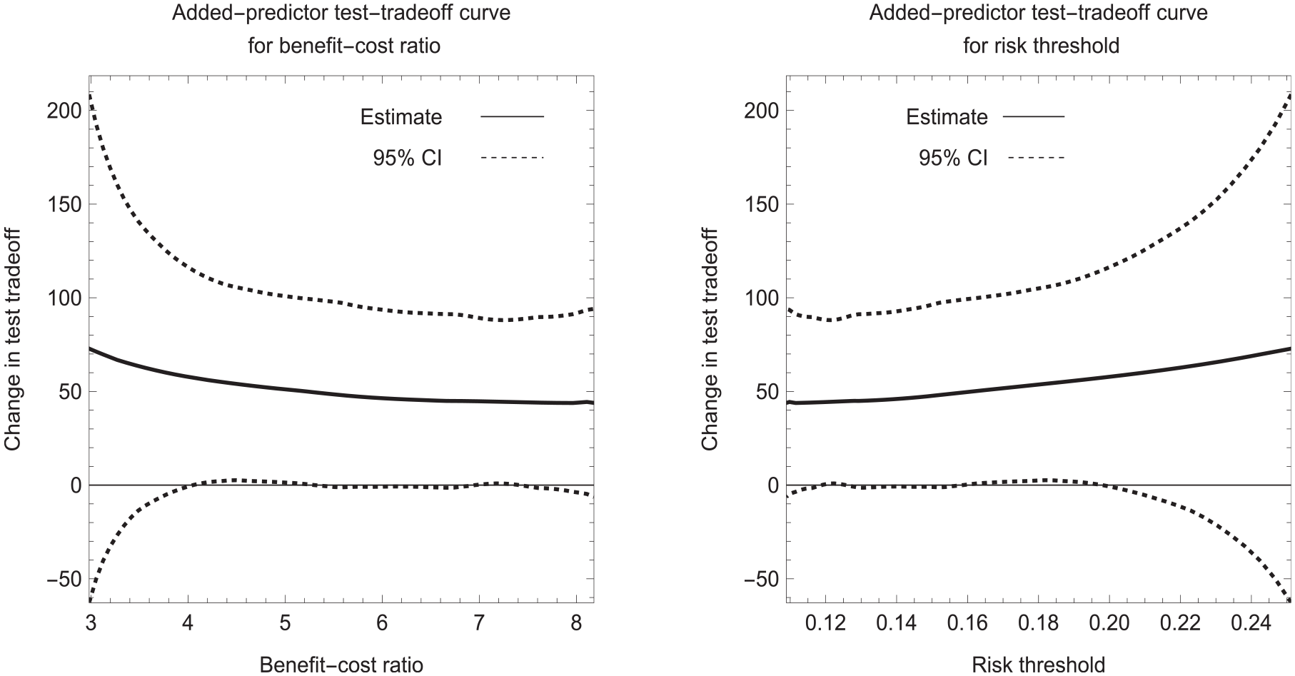
Estimated added predictor test tradeoff curves for data set 2 with P = 0.1.
Discussion
The larger the probability of developing disease in the target population, the smaller the test tradeoff. Therefore, investigators may wish to consider target populations with different probabilities of developing disease. They may find that the estimated test tradeoff or estimated-predictor test tradeoff is acceptable in a high-risk population but not a low-risk population.
If an investigator has only information on the area under the ROC curve, the investigator can estimate the minimum test tradeoff (MTT) over the relevant region by using previously developed methodology.11,12 See Appendix C for the formulas for MTT and the MTT for an added predictor. The MTT is useful for ruling out a risk prediction model but could not rule in a risk prediction model, which requires an estimated test tradeoff curve.
In summary, the novel method for estimating the test tradeoff curve based on individual risk scores is more appealing than previous estimation methods that required grouping risk scores. It can apply to ROC curves of any shape and is straightforward to implement using the 5-step approach.
Supplemental Material
sj-docx-1-mdm-10.1177_0272989X231208673 – Supplemental material for Evaluating Risk Prediction with Data Collection Costs: Novel Estimation of Test Tradeoff Curves
Supplemental material, sj-docx-1-mdm-10.1177_0272989X231208673 for Evaluating Risk Prediction with Data Collection Costs: Novel Estimation of Test Tradeoff Curves by Stuart G. Baker in Medical Decision Making
Footnotes
Appendix A
This appendix provides mathematical formulas for the 5 steps for estimating the smooth concave ROC curve.
Appendix B
This appendix presents linear interpolation estimates based on the imputed benefit-cost ratio in equation (8). For (
and the interpolated change in the test tradeoff corresponding to B/C is
Appendix C
This appendix presents the formula for the minimum test tradeoff (MTT). Let AUC denote the area under the receiver-operating characteristic curve. Based on a previous derivation,
11
the maximum relative utility is
The author declared no potential conflicts of interest with respect to the research, authorship, and/or publication of this article. The author disclosed receipt of the following financial support for the research, authorship, and/or publication of this article: The author is employed by the National Cancer Institute, which had no role in the writing of this manuscript or the decision to submit it for publication. The opinions expressed by the author are his own and this material should not be interpreted as representing the official viewpoint of the US Department of Health and Human Services, the National Institutes of Health, the National Cancer Institute, or the Division of Cancer Prevention.
Data Availability Statement
The data are available in the supplementary material. The computer code written in the Wolfram programming language is available upon request.
References
Supplementary Material
Please find the following supplemental material available below.
For Open Access articles published under a Creative Commons License, all supplemental material carries the same license as the article it is associated with.
For non-Open Access articles published, all supplemental material carries a non-exclusive license, and permission requests for re-use of supplemental material or any part of supplemental material shall be sent directly to the copyright owner as specified in the copyright notice associated with the article.