
Abstract
The results of repeat-dose toxicity tests are usually presented as tables of means and standard deviations (SDs), with an indication of statistical significance for each biomarker. Interpretation is based mainly on the pattern of statistical significance rather than the magnitude of any response. Multiple statistical testing of many biomarkers leads to false-positive results and, with the exception of growth data, few graphical methods for showing the results are available. By converting means and SDs to standardized effect sizes, a range of graphical techniques including dot plots, line plots, box plots, and quantile–quantile plots become available to show the patterns of response. A bootstrap statistical test involving all biomarkers is proposed to compare the magnitudes of the response between treated groups. These methods are proposed as an extension rather than an alternative to current statistical analyses. They can be applied to published work retrospectively, as all that is required is tables of means and SDs. The methods are illustrated using published articles, where the results range from strong positive to completely negative responses to the test substances.
Introduction
Large number of rats and mice are used in repeat-dose toxicity tests in order to assess the safety of chemicals, biological agents, and novel foods. For both ethical and economic reasons, it is important that the tests are done to the highest standards, with the results being presented in such a way as to maximize their value in assessing the safety of the test material. The tests are often based on the Organization for Economic Cooperation and Development (OECD) 408 guidelines (1998) or a similar protocol for 90-day oral toxicity tests. Typically this will involve a control and 3 dose levels with 10 animals of each sex per group. A large number of biomarkers may be measured, usually including hematology, clinical biochemistry, and organ weights. Urinalysis, behavior, and other biomarkers may also be included.
The statistical analysis of these tests usually involves a comparison of the means of each biomarker in the control and treated groups, separately for males and females using a t test, or an analysis of variance followed by post hoc comparisons. In some cases, the data are assessed for homogeneity of variances and normality of the residuals, and a data transformation may be applied. Less commonly, nonparametric methods may be used. An indication of statistical significance, usually at p < .05 and p < .01, is then appended to any means that differ from the control (or other) treatment group. The results are usually published as tables of means and standard deviations (SDs or standard errors) and are interpreted by the authors based largely on the pattern of statistically significant effects, the presence of any pathological lesions, reference to historical data, and likely human exposure.
However, this approach is not entirely satisfactory because
There is an emphasis on statistical significance rather than on the magnitude of any effect. Effects that fail to reach statistical significance may be ignored even if they are, cumulatively, of toxicological importance.
With many biomarkers, the chance of false-positive results (type I errors) is increased. Post hoc tests, which correct for multiple testing, can be used following an analysis of variance of each individual marker, but it is not possible to make a similar correction for the numbers of biomarkers that are studied as this would lead to excessive numbers of type II errors (false-negative results). Thus, authors have to guess whether a “statistically significant” effect is a true-positive or a false-positive effect.
It is difficult to compare the magnitude of the response of different biomarkers because each is measured in different units.
It is difficult for readers of these articles to understand what effect a treatment is having from large tables of means and SDs, although the authorities will have access to the raw data. The asterisks or superscripts used to indicate statistical significance do not always stand out among a sea of numbers that differ widely in the number of digits. Perhaps editors should make them stand out more.
Where reference is made to historical data, it is difficult to assess the validity of such a comparison as the variation in such data is rarely presented.
With the exception of growth curves, graphical techniques to show whether or not the test compound is altering the biomarkers are not widely available.
There is a lack of clarity in the way in which these studies are interpreted. There are often statistically significant effects that are discounted as type I errors in setting no observable effect levels (NOELs), but decisions appear to be made rather subjectively.
Multivariate methods, such as principle components analysis, have sometimes been used in an attempt to overcome some of these problems, but they are not always easy to interpret, require raw data and advanced statistical methods, and lose track of individual biomarkers. They have not become established as useful methods for analyzing such data even though they have been available for more than 30 years (EFSA Scientific Committee 2009; Festing et al. 1984). Even if they were to be used, summary statistics such as means and SDs would need to be presented. Responses are sometimes presented as a percentage of the control group mean. Although these are easy to understand, they fail to take within-group variability into account and do not have particularly good statistical properties (EFSA Scientific Committee 2009).
Toxicologists are familiar with current methods, and it is unlikely that any fundamental changes would be widely acceptable. The aim of this article is to demonstrate the use of the standardized effect size (SES) as a data transformation, which can be used in addition to existing techniques to clarify the results of toxicity tests. These methods require only means and SDs, so can also be used retrospectively to assess published articles.
Indications of Toxicity
Toxicity tests are conducted on the assumption that if there are no differences in the expression of the biomarkers between treated and control groups, it is unlikely that the test material is toxic at the dose levels and by the route and protocol tested. This also assumes that there are no other indications of toxicity such as pathological lesions or alterations in growth rate.
Where “statistically significant” changes are noted, their toxicological significance needs to be interpreted by a toxicologist, taking into account likely human exposure and the possibility that it is a false-positive result. The nature of the changes in the biomarkers may also indicate the target organ that has been affected. When a test substance is toxic, the expression of some biomarkers will change, with some going up while others go down. The net effect is to increase the variability between different biomarkers (as seen in several of the examples presented subsequently), an effect that can be quantified and tested statistically if the biomarkers are all measured in SES units. In particular subtle, but statistically insignificant, changes in several biomarkers may be of more toxicological importance than if a single marker is changed “significantly,” particularly as the latter may be a false-positive result. An overall “bootstrap” test, which takes account of changes in all biomarkers simultaneously, is described here. It should help to distinguish between real effects and false positives due to sampling variation.
Statistical Methods
The SES, also known as “Cohen’s d” (Ellis 2010) is the difference between two means (say treated mean minus control mean) divided by the pooled SD. They are expressed in units of SDs. SESs are one of a family of effect size indicators for comparing group differences that include Glass’s ▵, the difference between two means divided by the SD of the control group, and Hedge’s g, the standardized mean difference between the two groups based on the pooled, weighted SD, which removes a small bias present in Cohen’s d. The coefficient of multiple correlation, R 2, is another indicator of the magnitude of an effect, which is often associated with an analysis of variance. These and other indicators of the magnitude of an effect were summarized in detail in a recent monograph (Ellis 2010). The use of effect sizes is being encouraged when reporting the results of clinical trials (McGough and Faraone 2009), and their more widespread use in biomedical research has also been advocated (Nakagawa and Cuthill 2007). SESs are also used in the power analysis method of sample size determination (Cohen 1988). SESs are also widely used in meta-analysis as an indicator of effect size when comparing the response to a treatment of the same character in different studies. Here it is suggested that they can also be used as a transformation of scale so that all biomarkers are expressed in SD units. This means that different characters in the same study can be compared. In practice, this is already done in toxicity testing in a rather crude way. Where parametric statistical methods such as Student’s t test and the analysis of variance are used, they judge the magnitude of a response in relation to the within-group standard error. However, the continuous variables, t and F, are then turned into a binary response as “significant” or “not significant,” losing useful information.
When sample sizes are the same in each group (the situation dealt with in this article), the pooled SD is the square root of the arithmetic mean of the 2 variances. Equation (1) shows the formula for an SES.
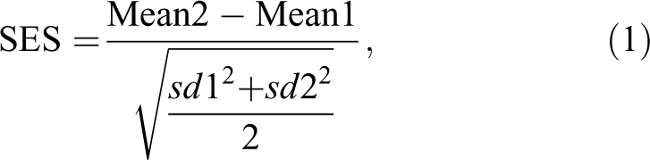
where Mean2 is usually the mean of the treated group and Mean1 represents the control group, and sd2 and sd1 are the corresponding SDs. Note that if the treatment reduces the expression of a biomarker, the SES will be negative; if the biomarker increases, the SES will be positive; and if the treatment has no effect, the expected value of the SES will be 0, with the actual value near 0, depending on sampling variation. An SES might also be estimated using an SD across more than 1 treatment group. It would be the only way of estimating SESs with a randomized block design. This may increase precision, but further research is needed to determine whether it would be worthwhile, given that Cohen’s d is defined for 2 groups and is widely used.
With equal numbers, n, in each group, the SES and Student’s t (equation 2) only differ by a single number 2 or n in the denominator.
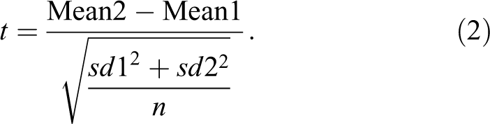
As a result, where multiple biomarkers are being measured in the same experiment, the one which has the highest t value will also have the highest SES and will be judged to show the greatest response.
The advantage of using an SES rather than t is that it does not change as sample size changes.
Within limits, an SES can be used as a universal indicator of effect size. For example, with the sorts of sample sizes used in toxicity testing, an SES of 0.5 SDs is low and unlikely to be detected or be considered of toxicological importance. In contrast, an SES of, say, 10 SDs is likely to be both statistically significant and of biological importance. However, the SES is still dependent on the quality of the study. There should be an absence of bias and no excessive within-group variation, as required for current methods of statistical analysis. Sample size will affect the precision of the estimated SES but not its magnitude. Estimation of the standard error of an SES is not straight forward, but there are websites that will perform the necessary calculations as well as packages in the R programming language such as “compute.es.” However, the techniques used here do not require such estimates as the SESs are used as data for further calculations rather than stand-alone numbers.
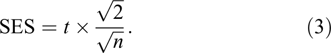
SESs are calculated from means and SDs or standard errors. For each experiment, the 5% and 1% critical values of t, which depends on sample size, can be directly translated into critical values for the SES (equation 3).
The statistical and graphical methods shown here can be applied retrospectively to any article that gives means and SDs, provided that there is no serious heterogeneity of variance.
Although there are problems of type I errors associated with the use of a 5% significance level for each biomarker in studies where many tests are carried out, the concept has been retained here. Such tests are required for regulatory purposes and are used here for comparative purposes. The p value can be regarded as the probability that an observed difference between group means could have arisen as a result of chance sampling variation.
The methods discussed here are proposed as an addition to the existing methods. So there should be no regulatory problems in using them. They help to show the nature of any treatment response across multiple biomarkers, and they also provide an overall statistical test that can be used to assess whether the variation among a set of biomarkers is greater in higher than in lower dose groups.
Tables and Graphical Techniques
Tables
When the means and SDs are converted to SESs, all biomarkers are expressed in the same SD units. Tables can then be sorted according to the response, usually at the highest dose level. In most cases, these tables can be abbreviated showing the identity of the biomarker, the units, the sex, and the estimated SES value, perhaps omitting those biomarkers where the SES is less than a certain threshold. This focuses attention on the biomarkers that have changed most.
Dot Plots of a Single Vector of SESs
The distribution of a single vector of SESs (i.e., all the biomarkers for a single treatment level) can be shown graphically using dot plots. The axes need to be reversed (i.e., the X-axis is the SES value and the Y-axis is the biomarker) in order to accommodate the labels. Vertical lines show statistical significance at one or more specified probability levels. These plots are useful when there are only 2 treatments, usually a control and a treated group as only one set of SES1 can be calculated. They may also be used to show the distribution of any single set of SESs such as one comparing the control with the top dose group.
The Quantile–Quantile Plot
Whether a set of observations has a normal distribution can be assessed visually using a quantile–quantile (qq) plot (Crawley 2005). A straight line indicates that the points are normally distributed. Deviation from the straight line will indicate nonnormality such as skewness or kurtosis (flattening or peaking of a normal curve). Outliers are also clearly seen. Such plots can be used for any set of SESs, but they are most powerful for detecting an effect when the SESs are pooled across treatment groups. Empirically, it is observed that a vector of SESs either from a single treatment or by pooling across treatment groups will often be normally distributed in the absence of a treatment effect, although any serious outliers, which may be due to errors, may need to be removed. This is not a rigorous test, but it adds to any general evidence of toxicity.
Line Plots
Line plots join up points relating to the same biomarker across treatments. They show the pattern of response and any outliers. They can be used in many ways such as looking at SESs for individual or a few biomarkers, subsets such as hematology, biochemistry, and organs, or gender differences in response. However, if there are many biomarkers, it can be difficult to follow and label individual lines or assess visually whether the variation is the same in each group because the plots become saturated with lines.
Box and Whisker Plots
A box and whisker plot is useful for assessing the variation in a set of data. The median is shown as a horizontal line. The box is drawn round the interquartile range. The whiskers show the largest and smallest values that lie within 1.5 times the box size. Points outside that range are classified as outliers and are shown as circles (Crawley 2005). Typically, a box plot could be shown for SESs associated with each treatment group.
Statistical Tests
A Test of Normality of SESs
A Shapiro–Wilks test can be used to assess whether a set of SESs has a normal distribution. It assumes that the data are independent observations. This assumption may not be true for a set of SESs from a single treatment group, where there is a treatment effect, due to correlations between biomarkers. But in the absence of a treatment effect, the variation will be largely due to random effects such as individual differences and measurement error. Pooling the SESs across treatment groups and using the Shapiro–Wilks test for normality may be a suitable way showing the absence of a treatment effect, such as is commonly seen when testing genetically modified (GM) crops. It may lack power if there are less than about 40 SESs and may be oversensitive and detect trivial deviations from normality if there are more than about 400 SESs (Oztuna, Elhan, and Tuccar 2006).
A Bootstrap Test to Compare the Variability Within 2 Sets of SESs
The box plots and line plots may suggest that there is more variation; and therefore, more toxicity among the biomarkers (when transformed to SESs) in higher than that in lower dose groups. In tests involving GM crops, the experiment may include one or more commercial varieties in addition to the isogenic control and the GM food. If the GM food is toxic, the variation among the SESs should be greater in the control versus GM than in the control versus a commercial variety. The test described here is used to investigate both such situations.
The mean of the absolute values of each set of SESs can give an indication of the relative magnitude of a response in experiments where there are 3 or more treatment groups. Confidence intervals could be estimated using the bootstrap method. However, the test described here can be used to test whether the mean absolute response differs among treatment groups.
Most common statistical tests assume that the observations are independent. However, this cannot be assumed in the case of a vector of SESs comprising, say, data on hematological and biochemical biomarkers.
Bootstrap tests, which depend on repeated resampling of the observations with replacement, do not make this assumption (Chihara and Hesterberg 2013). The version given here provides a test of the null hypothesis that the variation is the same in 2 set of SESs. The test could be of value in setting NOELs.
The test is as follows:
Convert the two vectors of SESs (e.g., for a low- and a high-dose group) that are to be compared to absolute values (all effect sizes are now positive).
Subtract the paired values to give a single vector of differences.
Test whether the mean of the differences is different from 0.
This involves repeatedly resampling the vector of differences with replacement. The bootstrap sampling distribution is then used to set a specified confidence interval for the mean. If this confidence interval spans 0, then the variation in 2 sets of SESs do not differ at the specified probability level.
Although this test is not available in most statistical packages, it only takes a few lines of code in the R statistical package (Chihara and Hesterberg 2013). A one-sample t test may be a sufficiently good approximation of the one-sample bootstrap, as SESs seem to behave as though they are independent observations even though they clearly are not.
All calculations and graphics were done using the R statistical package version 2.13.0 (Dalgaard 2003; R Development Core Team 2011). Tables of SESs can also be calculated from means and SDs using an EXCEL spreadsheet. A good statistical package is required to draw the graphs.
Examples of the Use of the Graphical and Statistical Techniques
The techniques described here only require tables of means and SDs or standard errors. So far these methods have been applied successfully to several published articles, mostly concerned with repeat-dose toxicity tests. The articles include negative studies involving many biomarkers and several groups, such as studies of the toxicity of GM crops, as well as those involving positive results with a dose–response relationship.
Preparation of Data
Tables of means and SDs or standard errors from each published article were copied to an EXCEL spreadsheet and put into a standardized format with the biomarkers as rows and the treatment means and SDs as columns. In some articles, biomarkers appeared to have been measured at or close to the limits of detection. Any biomarker where an SD was given as 0 or as a single digit was deleted, as it is not possible to estimate an SES (or a t value) from such data. Even using data expressed to two significant digits will have resulted in some rounding errors, leading in some cases to excessive numbers of biomarkers with an SES of 0. Such rounding errors should be less of a problem when raw data are available. It is usually suggested that tabular data should be presented with three significant digits (Festing and Altman 2002).
Occasionally authors stated that the results are presented as means and standard errors when the analysis showed that they were means and SDs.
1. Tables
Table 1 shows the means and SDs (from the article), the estimated SESs, Student’s t, and statistical significance at the 5% level according to the authors, with all rows sorted on the SES1 values. For brevity, only the 19 most extreme SES values are shown. A negative value indicates that the observation in the treated group had a lower value than the control group, a positive value indicates the opposite. The table draws attention to the magnitude of the response for those biomarkers that are most altered.
Data from Matsuo et al. (2012) showing means, standard deviations, and SESs of biomarkers.
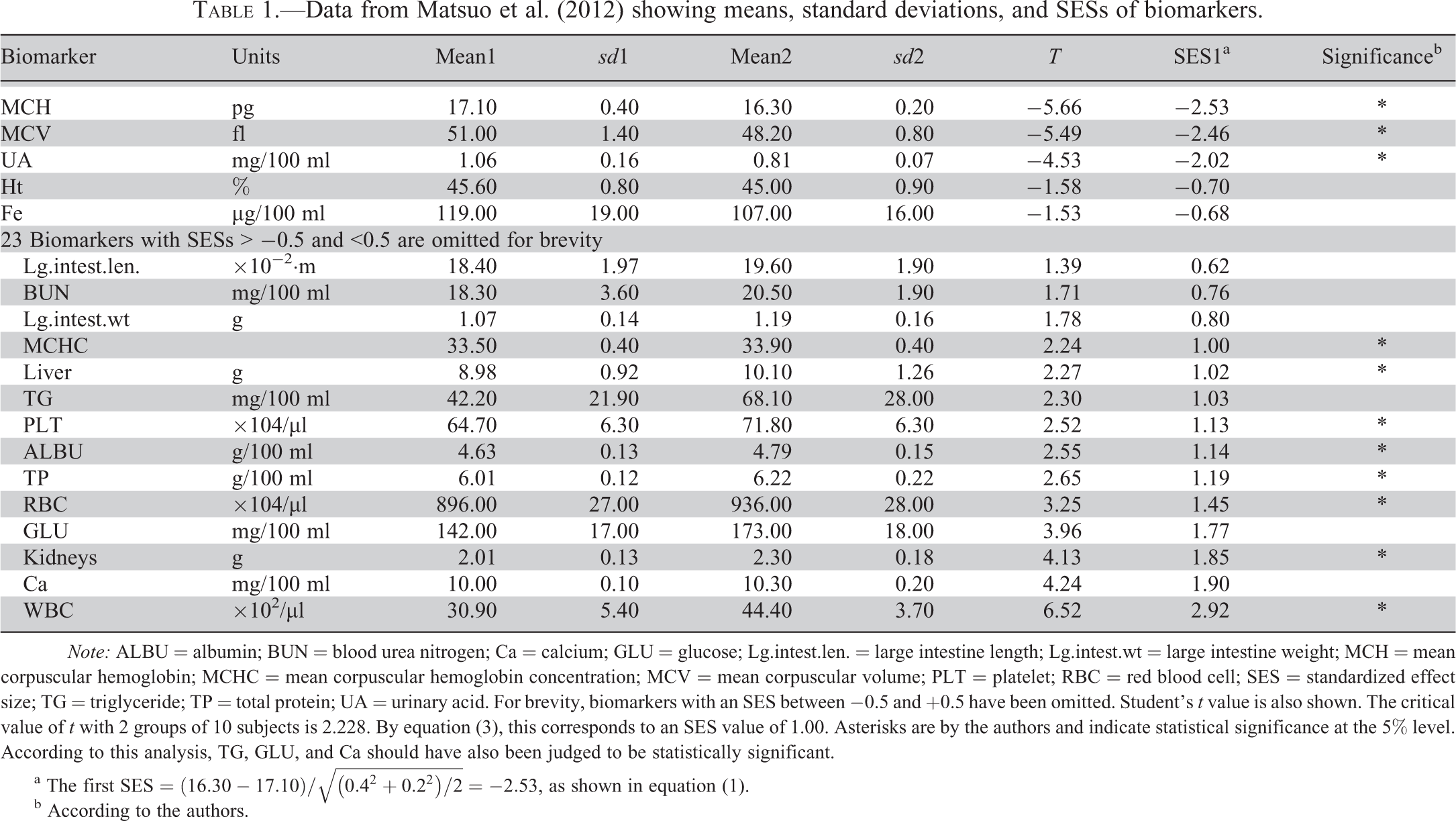
Note: ALBU = albumin; BUN = blood urea nitrogen; Ca = calcium; GLU = glucose; Lg.intest.len. = large intestine length; Lg.intest.wt = large intestine weight; MCH = mean corpuscular hemoglobin; MCHC = mean corpuscular hemoglobin concentration; MCV = mean corpuscular volume; PLT = platelet; RBC = red blood cell; SES = standardized effect size; TG = triglyceride; TP = total protein; UA = urinary acid. For brevity, biomarkers with an SES between −0.5 and +0.5 have been omitted. Student’s t value is also shown. The critical value of t with 2 groups of 10 subjects is 2.228. By equation (3), this corresponds to an SES value of 1.00. Asterisks are by the authors and indicate statistical significance at the 5% level. According to this analysis, TG, GLU, and Ca should have also been judged to be statistically significant.
a The first
b According to the authors.
Table 1 contains excessive detail and is only shown to demonstrate the method. An example of the sort of table that might be used to summarize the numerical results is shown in Table 2 (data from Lindeblad et al. 2010). In this case, the means and SDs are not shown as it is assumed that these will be given in accompanying tables as is usual at present. The results are sorted on the top dose group, which is usually the group of most interest. The sexes have been pooled so any sex difference in sensitivity can be assessed. Here the response is about equal to 14/24, of these more extreme values being male and 10/24 being female.
SESs for 34 biomarkers and 3 dose levels (100, 500, and 2,000 mg/kg/day of pentamethylchromanol administered to rats and sorted by the top dose level (Lindeblad et al. 2010).
Note: ALT = alanine aminotransferase; ALP = alkaline phosphatase; BUN = blood urea nitrogen; CHOL = cholesterol; CREA = creatinine; HCT = hematocrit; HGB = hemoglobin; IP = inorganic phosphorus; PT = prothrombin time; PLT = platelet; RBC = red blood cell; RETIC = reticulocyte; SES = standardized effect size; TBILI = total bilirubin; TP = total protein; WBC = white blood cell. The critical value for statistical significance at the 5% level, two tailed is ±0.94.
2. Dot plots
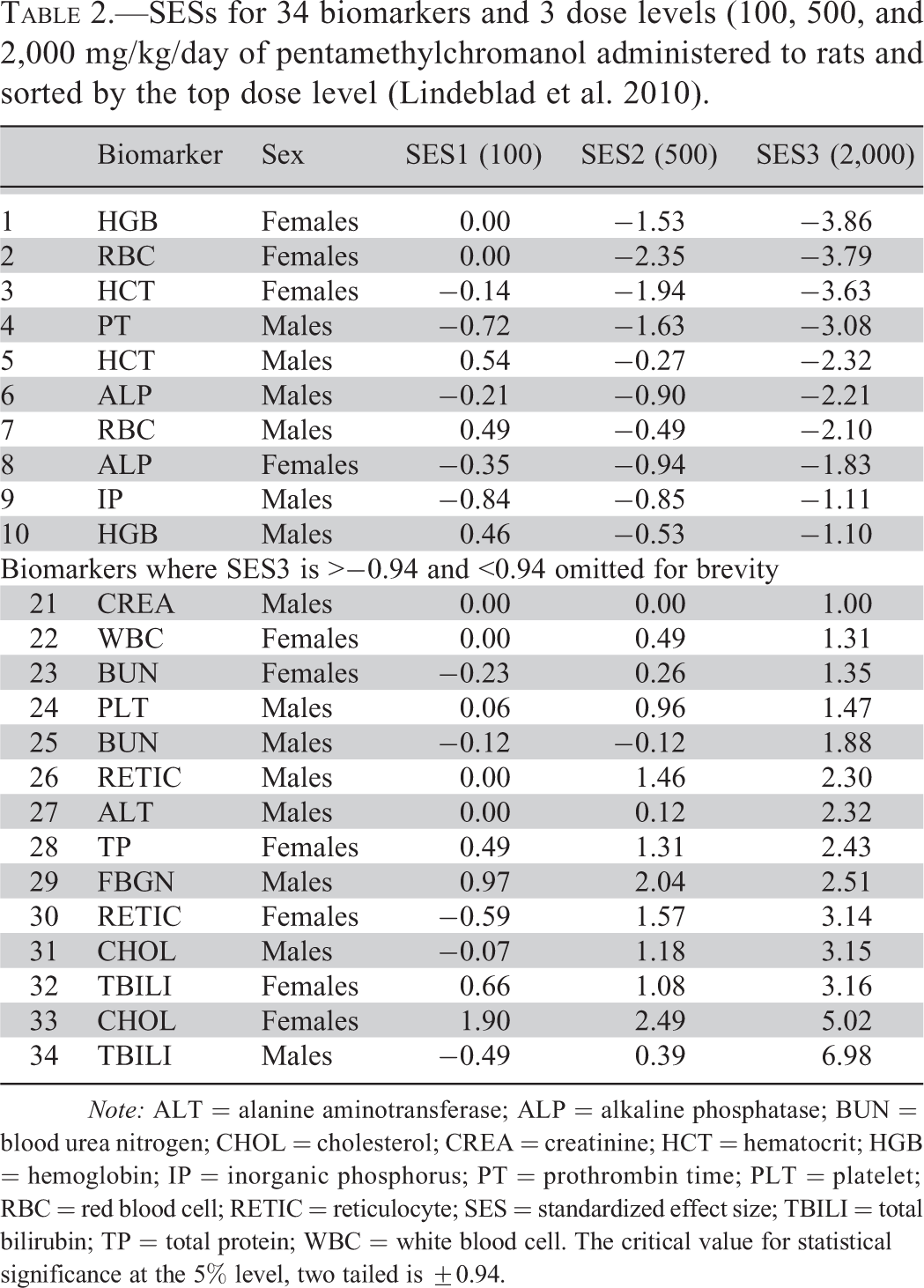
A dot plot of SES1 data from Table 1 is shown in Figure 1. Biomarkers where there is a statistically significant (p < .05, 2 sided) difference between the treated and the control group stand out quite well. However, the authors concluded that in the absence of any pathological findings “… the present study found no adverse effects of
The SES1 from Table 1 shown graphically (Matsuo et al. 2012). Note that the axes have been exchanged in order to accommodate the biomarker labels, and 23 points have been omitted, as in the table. Any biomarker in which the SES falls outside the inner dotted lines is statistically significant at p < .05. Points falling outside the dashed lines are significant at p < .01. SES = standardized effect size.
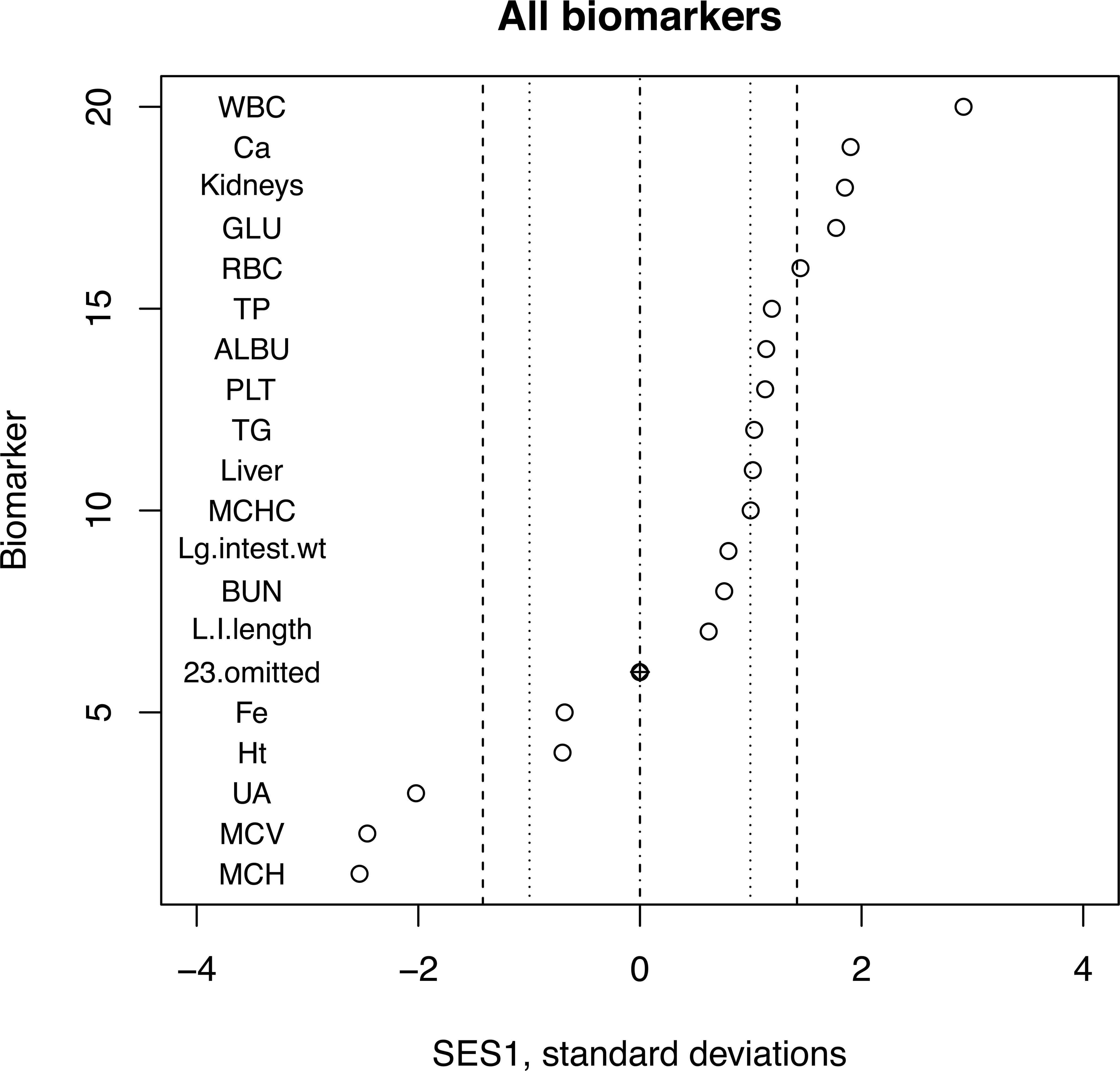
In contrast, Figure 2 shows a similar dot plot for a comparison of a diet containing a GM maize with its near isogenic control. It clearly shows the problems associated with multiple testing. Altogether there are 6 points that are significant at the 5% level and 1 at the 1% level. But with 90 tests, we would expect nearly that number to arise simply by chance. The bootstrap test that also takes into account any trends in biomarkers that are not significant provides a single p value that is not subject to false positives due to multiple testing.
Dot plot of most extreme values of SES1 from a toxicity test comparing GM maize with its isogenic control with 12 rats per group. Data from Delaney et al. (2013). Inner dotted lines indicate statistical significance at p = .05 and dashed lines indicate p = .01. Sixty-four intermediate values have been omitted. Ninety biomarkers are tested here. The statistically significant effects are probably type I errors due to the level of multiple testing. GM = genetically modified; SES = standardized effect size.
3. Normal quantile plots (qq plots) of a set of SESs
A qq plot of the data in Table 1 is shown in Figure 3. Even though the sample size was a bit low for adequate statistical power, the Shapiro–Wilks test gave a p value of <.001, so the null hypothesis that the data are normally distributed should be rejected. In contrast, Figure 4 shows a qq plot from a study of GM maize (Mackenzie et al. 2007) involving 380 SESs pooled across 4 different comparisons. The Shapiro–Wilks test gave a p value of .55. The null hypothesis cannot be rejected, and we can conclude that there is no evidence of a treatment effect in this set of data.
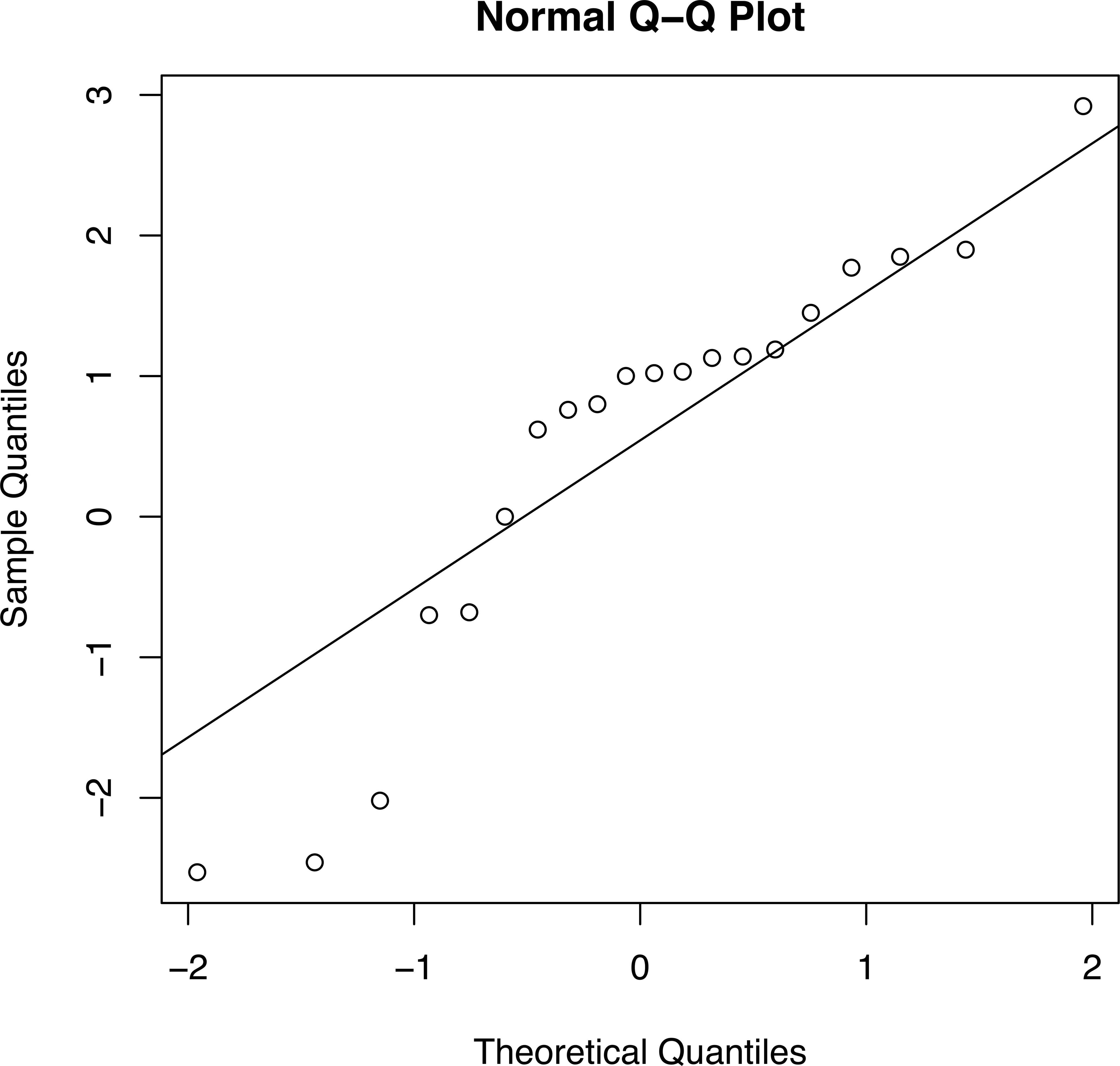
A qq plot of the 42 biomarkers (Matsuo et al. 2012). The three points in the lower left-hand region of the plot correspond to MCH, MCV, and UA in Table 1. The points in the right-hand top correspond to the 11 SESs exceeding 1.0 in Table 1. The Shapiro–Wilks test had a value W = 0.9048 and a p value of <.001, so the deviations from normality are unlikely to be due to chance. MCH = mean corpuscular hemoglobin; MCV = mean corpuscular volume; qq = quantile–quantile; UA = urinary acid.
qq plot for the combined biomarkers for SES1 and SES2 (both comparing GM with non-GM) and SES5 and SES7 (comparing non-GM with non-GM), a total of 380 SESs (Mackenzie et al. 2007). A p value of .544 using the Shapiro–Wilks test suggests that there is no evidence that the SESs deviate from a normal distribution, although there is clearly an excess of values of 0, probably due to rounding errors. Had the GM corn caused toxicity, deviations from normality would have been expected. GM = genetically modified; qq = quantile–quantile; SES = standardized effect size.
4. Line plots and box plots
A line plot of SES1–SES3 for 8 selected biomarkers is shown in Figure 5. This shows how the selected biomarkers respond to a higher dose. Means and SDs come from a toxicity test in which groups of 10 male and female Sprague-Dawley rats were dosed orally with pentamethylchromanol at the rate of 0, 100, 500, and 2,000 mg/kg/day for 90 days (Lindeblad et al. 2010).
Line plot of 8 selected biomarkers from a toxicity test with a control and 3 groups dosed with pentamethylchromanol at the rate of 0, 100, 500, and 2,000 mg/kg/day for 90 days (Lindeblad et al. 2010). Labeling of the lines is only possible when a small subset of biomarkers is being shown. Dashed lines show statistical significance at p = .05.
A line plot and a box plot of SES1, SES2, and SES3 in the same study are shown in Figure 6. This includes all 36 hematological and biochemical biomarkers and both sexes. In the line plot, it is not possible to label individual biomarkers, but the plot shows the general pattern of response. There was an obvious outlier at the 500 dose level, which was almost certainly due to a transcription error.
Line plot (left) and box plot showing all 36 biomarkers pooling sexes in a 90-day repeat-dose toxicity assessment of pentamethylchromanol (Lindeblad et al. 2010). Doses of 0, 100, 500, and 2,000 mg/kg/day were administered to rats by gavage. The box plot clearly shows the increased variation among the biomarkers at higher dose levels. The outlier at the 500 dose level is clearly a misprint in the original article. Dashed lines indicate statistical significance at p = .05.
The box plot shows more clearly the increased variation as the dose group increases: evidence of toxicity. The authors concluded that “in female rats, the NOAEL was not established due to statistically significant and biologically meaningful increases in cholesterol level seen in the 100 mg/kg/day dose group.” A table like Table 2 needs to be included to see which biomarkers were most affected. Sex differences can also be seen if the 2 sexes are pooled.
Line plots and box plots of the results of a study in which Litsea elliptica essential oil was administered by gavage to female Sprague-Dawley rats at doses of 125, 250, and 500 mg/kg, for 28 consecutive days are shown in Figure 7 (Budin et al. 2012). There were some serious outliers, but these were not dose related. The means of the absolute values of the 3 SESs were 0.56, 0.49, and 0.55, implying no dose-related differences, and the box plot shows no evidence of increased variation at higher-dose levels. A table like Table 2 needs to be consulted to see that these outliers are related to hematological parameters. The authors found no histological evidence of toxicity and concluded that “L. elliptica essential oil can be classified in the U group, which is defined as a group unlikely to present an acute hazard according to World Health Organization classification.”
Litsea elliptica essential oil was administered by gavage to female Sprague-Dawley rats at doses of 125, 250, and 500 mg/kg, for 28 consecutive days (Budin et al. 2012). (A) Line plot of the SESs for 25 biomarkers at these doses. Dashed lines indicate statistical significance at p = .05. (B) Box and whisker plots of the same data. There is no evidence that the variation among biomarkers is greater at the high doses than at the lower ones. SES = standardized effect size.
Line and box plots for a 90-day oral toxicity study in male and female F344 rats fed a powdered diet containing 0, 0.06, 0.5, 1.5, or 5.0% concentrations of
Line and box plots of the SESs for 73 biomarkers at 4 oral dose levels (0, 0.06, 0.5, 1.5, and 5.0% corresponding to SES1–SES4) in a 90-day toxicity study of
The line plot is virtually saturated so subsets of the biomarkers, such as hematology, relative organ weight, and biochemistry, may be shown as in Figure 9. This shows that most of the response in the top dose group is due to changes in hematology. A table such as Table 2 needs to be consulted to see which biomarkers are most affected.
Line plots showing the hematological, relative organ weight, and biochemical results separately for the study are summarized in Figure 8. Most of the extravariation at the top dose group is associated with hematological parameters. Dashed lines indicate statistical significance at p = .05.
Tests of GM food such as maize often include the GM crop, its isogenic control, and several commercial varieties of the same food. Figure 10 shows box plots of the SESs for 95 biomarkers with all 10 pairwise comparisons of 5 diets from a 91-day oral toxicity study of GM maize using Sprague-Dawley rats of both sexes, with 12 rats per group (Mackenzie et al. 2007). If the genetic modification is toxic, a set of SESs comparing the GM food with its isogenic control should be more variable than a set comparing the isogenic control with a commercial variety. The box plots have been arranged to show the nature of each comparison.
Box plots of SESs for all possible pairwise comparisons among 5 treatment groups in a study involving GM maize (Mackenzie et al. 2007). Dotted lines indicate statistical significance at p = .05 for individual SESs. Six of the boxes (B–G) involved a comparison of a GM- with a non-GM-containing diet, 3 (H–J) involved a comparison of 2 non-GM diets, and 1 (A) compared low dose with high-dose GM-containing diets. If there is a difference in the height of the boxes and whiskers in B–G versus H–J, it is small. The bootstrap provides a test of the null hypothesis that the mean of the absolute difference between any pair of SESs is not different from 0, as is the case here. Absolute reticulocyte count (ARET) in males was deleted due to an obvious misprint in the SD in treatment 5. GM = genetically modified; SES = standardized effect size; SD = standard deviation.
The diets in the 5 diet treatment groups contained:
Thirty-three percent strain 1507 maize with GM event DAS-Ø15Ø7-1, conferring resistance to the European corn borer and to glufosinate ammonium, the active agent in a herbicide.
Thirty-three percent of the near isogenic control maize strain 33P66.
Thirty-three percent of a commercial non-GM maize strain 33J56.
Eleven percent of strain 1507 and 22% 33J56 (i.e., low-dose 1507 with the commercial variety).
Eleven percent 33P66 and 22% 33J56 (i.e., 2 non-GM varieties).
5. An overall bootstrap statistical test of variability of SESs associated with different treatment groups
A bootstrap test can be used as an overall test of whether there is evidence that some sets of SESs are more variable than others, implying a greater treatment response in the more variable group. Such tests depend on repeated sampling of a set of data to obtain a bootstrap confidence interval for the variation in the data. It does not make the assumption that the SES sets (or the difference between the absolute values of the 2 sets of SESs in this case) are independent observations.
The data in Table 2 (but including all values) can be used to illustrate the method. The means of the absolute values of SES1, SES2, and SES3 are 0.36, 0.97, and 2.00 SDs, respectively. The difference between SES1 and SES2 is therefore 0.61 SDs. A single-sample bootstrap 95% confidence interval for this was 0.28 to 1.02 (note that slightly different results will be obtained if the bootstrap is repeated due to sampling variation). As it does not span 0, we reject the null hypothesis that there is no difference and conclude that the SES2 values are more variable than the SES1 values. For comparison, a single-sample t test gives a similar 95% confidence interval of 0.21 to 1.00.
A similar test comparing SES2 (mean 0.97) with SES3 (mean 2.00) gave a bootstrap 95% confidence interval of 0.48 to 1.57 (a one-sample t test gives a 95% confidence interval of 0.46–1.60). Again, this does not span 0, so we conclude that there is a significant difference in variability in SES3 compared with SES2. These are overall tests that involve all biomarkers.
The mean of the absolute values of SES1-SES10 in the data shown in Figure 10 involving GM maize ranges from 0.307 to 0.371. The bootstrap 95% confidence interval for the differences between these most extreme values is −0.135 to 0.005. As this spans 0 (just), we conclude that there is no evidence that the variability differs between any of the 10 sets of SESs (note that picking two extreme values and doing a statistical test like this to compare them will substantially increase the chance of a false positive [type I error], so it should be done with caution. A negative result should be a safe negative).
Determination of Sample Size by Power Analysis Using SESs
Power analysis is widely advocated for the determination of sample size in controlled experiments. However, it is difficult to apply in toxicity studies because it would require an estimate of the magnitude of the difference between treated and control means likely to be of toxicological importance for each biomarker. This would clearly be impossible. However, if the effect size is specified as an SES in SD units, then it would be the same for all biomarkers.
Assuming sample size is based on a comparison of the means of the control and top dose group using a two-sample t test, toxicologists would only have to specify (1) the required power (usually 90%), (2) the significance level (usually .05), (3) the sidedness of the test (always two sided in toxicity testing), and (4) whether the SES is likely to be of toxicological significance. Using widely available software (such as R), it is then easy to estimate the required sample size.
Suppose, for example, that a toxicologist wishes to be 90% sure of detecting an SES of >1.5 SDs using a two-sample t test and a 5% significance level, then power analysis software shows that a sample sizes of 11 animals per group would be needed.
Alternatively, it is equally possible to show the effect size that is likely to be detectable for a given number of animals per group. For example, a sample size of 12 animals per group will have a 90% chance of detecting an SES of >1.4 SDs and a 70% chance of detecting an SES of >1.1 SDs, assuming a 5% significance level and a two-sided t test. A sample size of n = 5 would have a 90% chance of detecting an SES of >2.4 SDs and a 70% chance of detecting an SES of >1.8 SDs, with the same assumptions. Once toxicologists become familiar with SESs, they should find it relatively easy to specify the magnitude of the effect size that they wish to be able to detect and therefore the required sample size.
Discussion
It is unsatisfactory to do rigorous statistical tests on each biomarker, but then subjectively discount some of them as being type I errors, as is done at present. The approach described here helps to overcome this and other disadvantages of current methods. Unlike multivariate approaches, which would seem natural to many statisticians, the use of SESs builds on and strengthens existing methods. However, the two methods have not yet been directly compared as this appears to be the first time that the use of SESs has been suggested for analyzing repeat-dose toxicity studies. The use of SESs should be relatively easy for toxicologists to understand, and they should soon get a feel for the use of SESs to describe the magnitude of a response.
The starting point is the tables of means and SDs, which are routinely produced following a toxicity test. SESs are easy to calculate from the means and SDs using equation (1), above and an EXCEL spreadsheet or a high-end statistical package such as R. Cohen’s d (the SES described here) is widely recognized as a measure of the magnitude of a response to a treatment, so does not need detailed justification. Its use makes it possible to employ a range of graphical and tabular techniques to give a clearer picture of the nature of any response to a treatment. The bootstrap test based on the differences between the absolute values of 2 sets of SESs gives an overall indication of whether there is a statistically significant response to a treatment across all biomarkers. A one-sample t test may be a reasonable approximation of this test, except possibly in marginal cases. These tests should be of particular value in establishing negative results, say in testing novel foods or GM crops, and in determining the NOEL when testing drugs. Of course, if a statistically significant effect is seen it still has to be interpreted by a toxicologist taking into account a range of other factors. Calculation of SESs also helps to detect mistakes such as claims that the results are ± standard errors when they are SDs, and it helps in assessing the quality of an experiment by showing up outliers and transcription errors.
A change in the design of toxicological experiments to include 2 independent control groups or to ensure that the low dose is at or less than the NOEL would be helpful as it could be used to establish SESs for the control dose level. The common practice of including some commercial varieties when doing toxicity tests of GM crops fulfills this function as any toxic effect of a genetic modification should show up as changes in biomarkers over and above any changes seen when comparing two non-GM varieties.
In conclusion, the use of SESs has many advantages for the statistical analysis and graphical presentation of subacute toxicity tests.
Footnotes
Abbreviations
The author declared no potential conflicts of interest with respect to the research, authorship, and/or publication of this article.
The author received no financial support for the research, authorship, and/or publication of this article.