
Abstract
Objective
To outline best practices for virtual and hybrid presentation effectiveness.
Methods
Retrospective review of recommendations from world experts in how to develop a solid story, design slides that visually communicate, and improve delivery skills that connect with the audience. Virtual and hybrid presenting is not as strongly dependent on all the new technical and software means as supposed. Presentation basics remain critical.
Result
Best practice in presentation effectiveness will statistically decrease the incidence of and risk factors for Nodding-off Episodes per Lecture (NOELs).
Conclusion
The future of presenting is here, and it is mostly online. Mastering the presentation basics and understanding the limitations and opportunities for this new virtual/hybrid presentation space will allow presenters the reach and influence their message deserves.
Introduction
Here is the typical old presentation scenario: just before getting on the plane to your face-to-face conference, you pull together what you can fast, such as articles, figures, data, and already used slides. You end up with a flood of jumbled messages, a “noisy” slide deck, and no clear point to your presentation. 1 Although the incidence of and risk factors for Nodding-off Episodes per Lecture (NOELs) has previously been documented, in the new normal virtual/hybrid presentation space, a subpar presentation that you may have gotten away with before in a conference auditorium falls flat. 2 Not only must you engage both a virtual and live audience at once, but you are also presenting to audiences with drastically shorter attention spans. To make situations worse, your subpar presentation will probably be recorded for an archived webinar to be viewed again and again. Said differently, the “presentation effectiveness” stakes just got higher! Never has there been a better time to go back to the basics of creating fabulous presentations. Namely, developing a solid story with one clear focus, designing slides that can been viewed from mobile-to-desktop screens, and increasing delivery skills because soft skills are more essential than ever for connecting communicators with their audiences virtually.
Hybrid presenting—simultaneously engaging audiences online and face-to-face—is the new normal.3,4 The management consulting firm, Gartner Inc., estimates that by 2024, only 25% of business meetings will happen in person. 5 While some may hope for a return to in-person presentations, hybrid and virtual presentations are here to say. 3 However, on average, when 568 participants were surveyed in how satisfied they were with virtual presentations being a replacement for in-person presentations, the result was 5.97/10 (1 = not satisfied; 10 = very satisfied). 3 Clearly, presenters need to up their game. No longer can simply sharing your screen in a virtual presentation, using your old slide deck, and reading from your presentation notes cut it. In a virtual or hybrid environment, audience engagement is key.
Developing a Solid Story
People listen to stories. They are engaged by them. So, tell a story with your science. Do not make your audience have to work to understand. Often, they are either tired, told to be there, or bored with your topic. In academic medicine, presenters often use the standard manuscript template to present their research: introduction, objectives, methods, results, and conclusion. Here, presenters are being “reporters” rather than “interpreters” of their important work. This report of information is too easily translated into PowerPoint’s default title-bullet format. In fact, approximately two-thirds of the slides in science and engineering contain bulleted lists.
6
If there is anything that will sabotage audience engagement, it is developing a presentation using this tactic. Bulleted lists of information are the antithesis of developing a story. As Tingley Presentations so clearly asserts, although PowerPoint is bundled in Microsoft, “
Because both live and, particularly, virtual audiences have shorter attention spans and increased distractions, developing a powerful story is key for audience engagement. Regrettably, most academic presentations take a Subject Matter Expert (SME) approach rather than a Story Driven Approach (SDA).
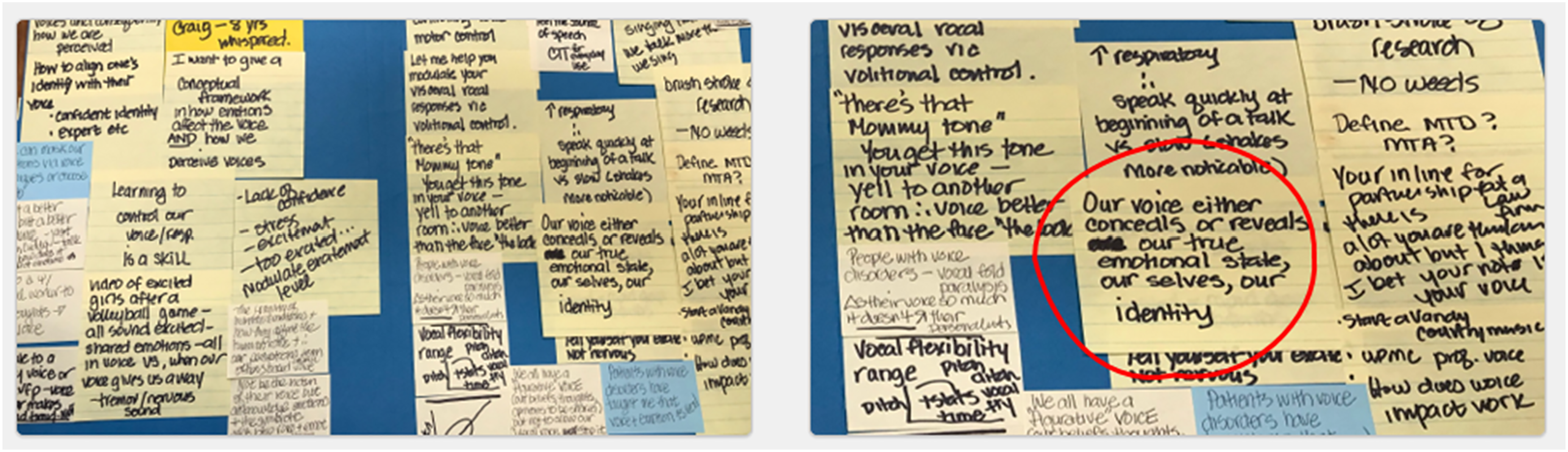
There are many excellent templates for developing a solid story that can be translated into a presentation. All of them involve developing your presentation story before you open a PowerPoint file.1,10,12-14 The best first steps are often pen to paper (or napkin), mind maps, or post-it notes to organize your thoughts (Figure 1). Figure 2 represents a glimpse into my story development for a TEDx Talk ® that I did in 2018.
15
Next, 3 story development techniques will be highlighted. Do not go to slide software first to develop your story but rather pen to paper. Story development example: post-it notes used to develop Gartner-Schmidt’s TEDx talk (2018).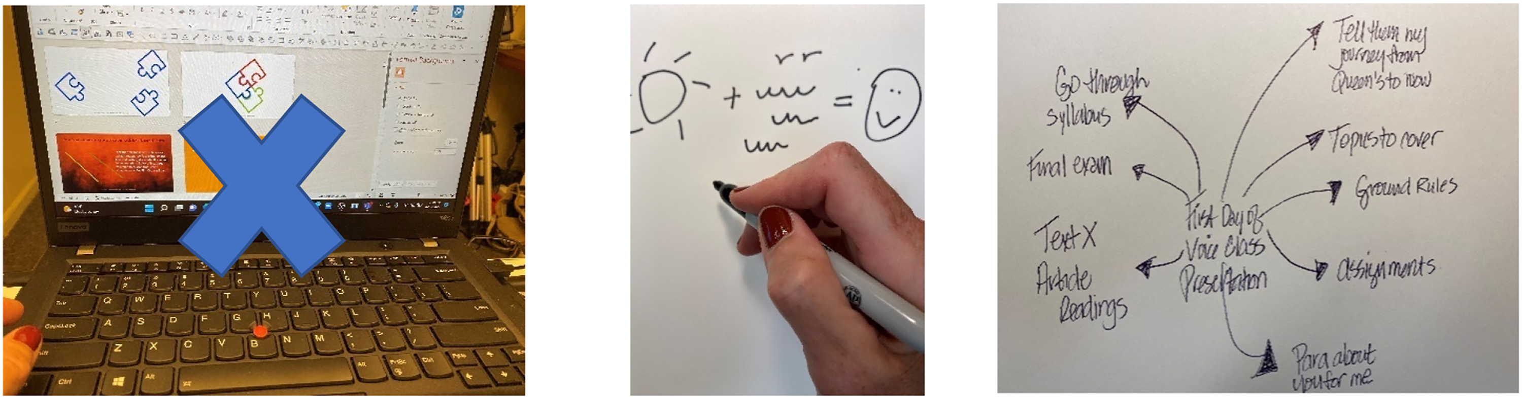
First, Cliff Atkinson outlines the Beyond Bullet Points story template and how the first 5 slides of a presentation lay the groundwork. 12 All 5 slides are used to engage the audience by starting to weave a succinct story which is appropriate for most 5–10-minute scientific podium presentations. The Hook is the first thing you say to grab your audience’s attention, such as a statistic, anecdote, intriguing quotation, or relevant fact. The Relevance is what you say to ensure your audience pays attention. Relevance said differently is the What’s-In-It-For-Me (WIIFM) factor that every audience member asks themselves. The Challenge is how you define a specific challenge that your audience faces. The Desire is what your audience needs as they face the challenge. The Map is the pathway for your audience from overcoming the challenge and achieving their desire. This part is really the bulk of your presentation. 12 These first 5 slides lay the foundation for your podium presentation. You may still use the component parts of a manuscript outline but now they are woven into a story about your research versus a cookbook recipe of what you did and what you found.
To further develop an effective presentation, you must distill your story to a single, connected throughline—a thread. Each slide must transition to another slide with your thread. 16 Nancy Duarte, in her powerful book, Resonate, writes about the “Big Idea” the one key message you want to communicate to your audience. 10 What’s the one thing you want your audience to remember? Kurnoff and Lazarus (2021) offer a simple path to creating your big idea by recommending that every piece of information in your presentation—no matter how minor—must connect to your big idea. 1 Commonly, presenters often struggle with “infobesity.” They want to tell the audience everything they know and get it all in within the average length of a presentation. Doing so, audiences will often disengage. This is especially important in virtual presentations. As Brene Brown recommended after doing her TED Talk, “Plan your talk. Then cut it by half…cut it another 50%.” 16
Second, Duarte coined the term Duarte Presentation Sparkline ™ as a visual representation of how a story line moves up and down between what is and what could be used at the beginning, middle, and end of a story10,17 (Figure 3). This convincing structure incorporates cinematic and literary storytelling techniques for creating and resolving tension.
17
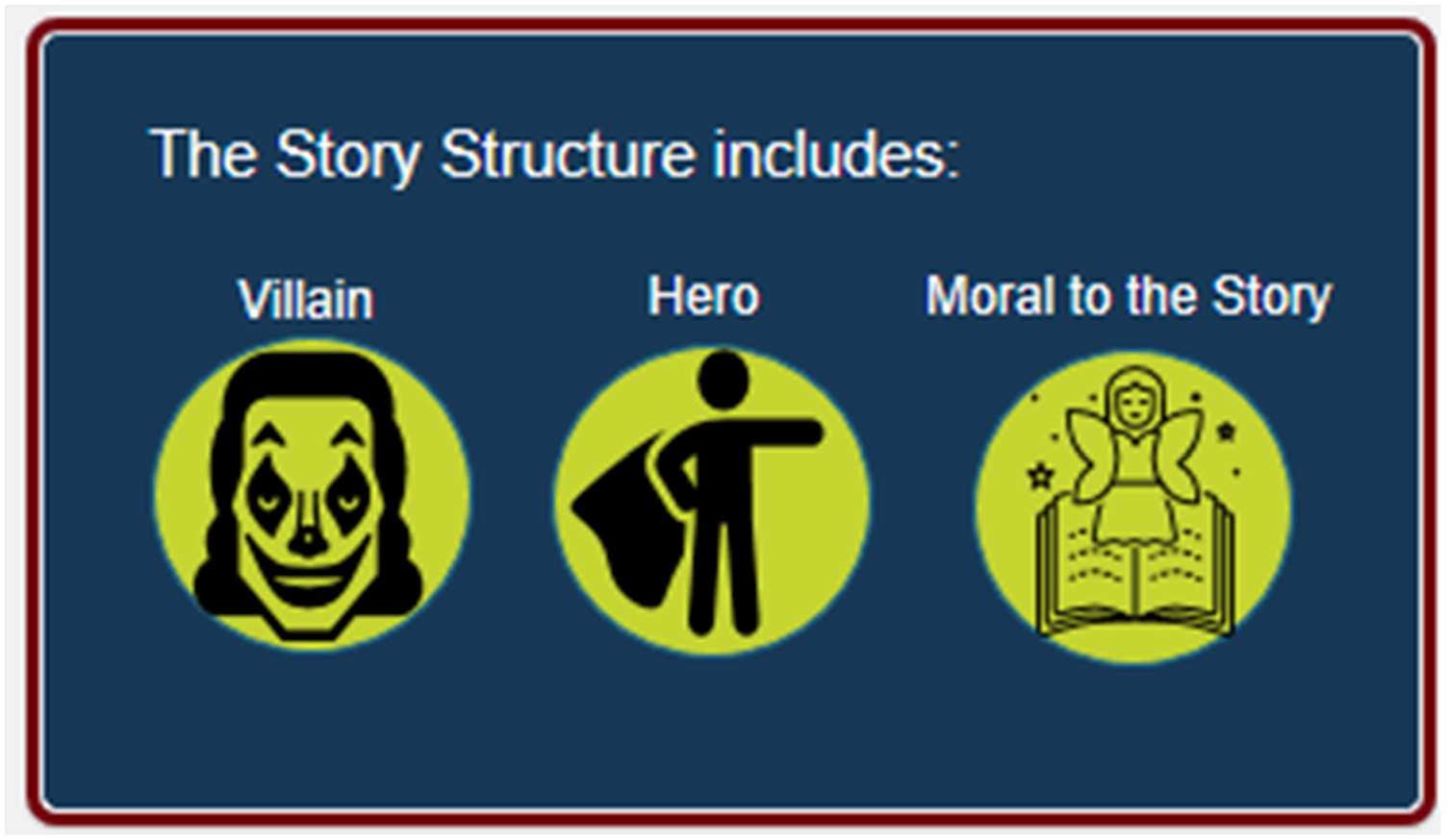
Third, Gallo writes that all of Steve Jobs presentations had a hero (protagonist), villain (antagonist—who poses a problem), and moral to the story [a call-to-action (CTA) what you want the audience to do after listening to you] Figure 4.
13
Story development example: Duarte presentation sparkline ™. Story development example: the villain, the hero, and moral to the story.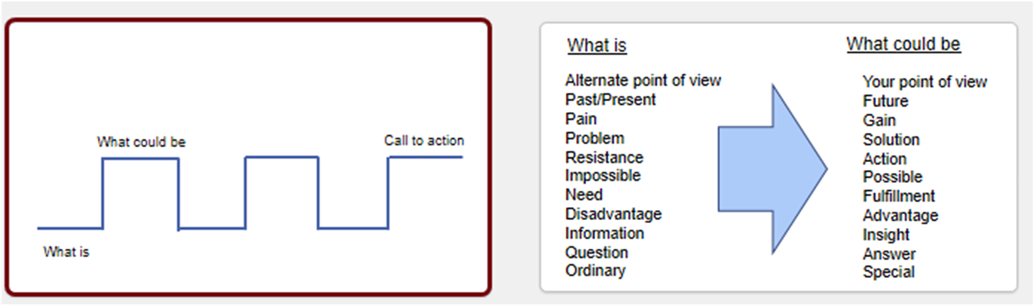
Designing Slides for Your Visual Story
If one big idea per your presentation is the recommendation, there is a comparable suggestion for designing slides.
A little bit of history of PowerPoint is needed here. PowerPoint® was designed in 1986 by an entrepreneur, Robert Gaskins, and a computer programmer, Dennis Austin. 20 The inventors created the default slide templates to mimic the most popular format of that time, which were overhead transparencies, namely, a title at the top, a bulleted list below, and an optional graphic. 12 The defaults were not founded on any research concerning presentation effectiveness. 20 But if the main point of any presentation is “to explain, inspire, inform, or persuade, whether in business, education or on the public stage,” then research related to PowerPoint presentations is in order. 16 However, there is a paucity of research-based guidelines on how best to use the PowerPoint software, which enjoys approximately 95% of the marketplace. 21
Much of what we do know is based in multimedia learning, which can be translated to presentations with slide decks. 22 If audiences try to process too many written words and spoken words simultaneously, cognitive overload occurs resulting in decreased comprehension. 23 Combine this with the reality that we read faster than we listen. If you design a slide with a wall of words on it, you have essentially rendered yourself, as the presenter, irrelevant because people will read your slides versus listen to you. This dual-coding principal was used by Richard Mayer, who is a pundit on research in multimedia learning, who, along with Paivio, found that audiences retain information best when words and relevant pictures are used rather than words alone.22,24 Richard Mayer is a professor of psychology who has dedicated his life to educational psychology and multimedia learning. His numerous experiments are grounded in cognitive theory of how people learn from graphics and words, which he calls the Cognitive Theory of Multimedia Learning. 22 Humans possess 2 qualitatively different channels of processing material—one for visually based representations and one for verbally based representations.22,24
Multimedia presentations, which most PowerPoint presentations are, foster generative processing by making it easier for audiences to build connections between words and pictures.
22
Nancy Duarte calls slides “glance media” as an audience should be able to quickly ascertain the meaning of a slide in ∼ 3 seconds.
11
An analogy is that slides should be like billboards—simple words, relevant graphics, easy to understand message as you drive by at 60 miles an hour. An alternative explanation to keeping slides simple is a principle borrowed from more technical fields such as acoustics or electronic communication and is called signal-to-noise ratio (SNR).
8
As it relates to slide design, SNR is the ratio of relevant to irrelevant elements and information on a slide. The goal is to have the highest SNR as possible on your slides. Low SNR is often seen when communicating data on slides. For example, one can easily degrade the visual message by including irrelevant grid lines, keys, ambiguous labels, icons, and employer logos on slides (Figure 5). Bottom line, if the visual components of a slide do not reflect the one big idea of the slide, remove it. A slide represents valuable real estate—use it wisely to reinforce your content. Example of a chart with all extraneous detail (i.e., grids and label keys) removed.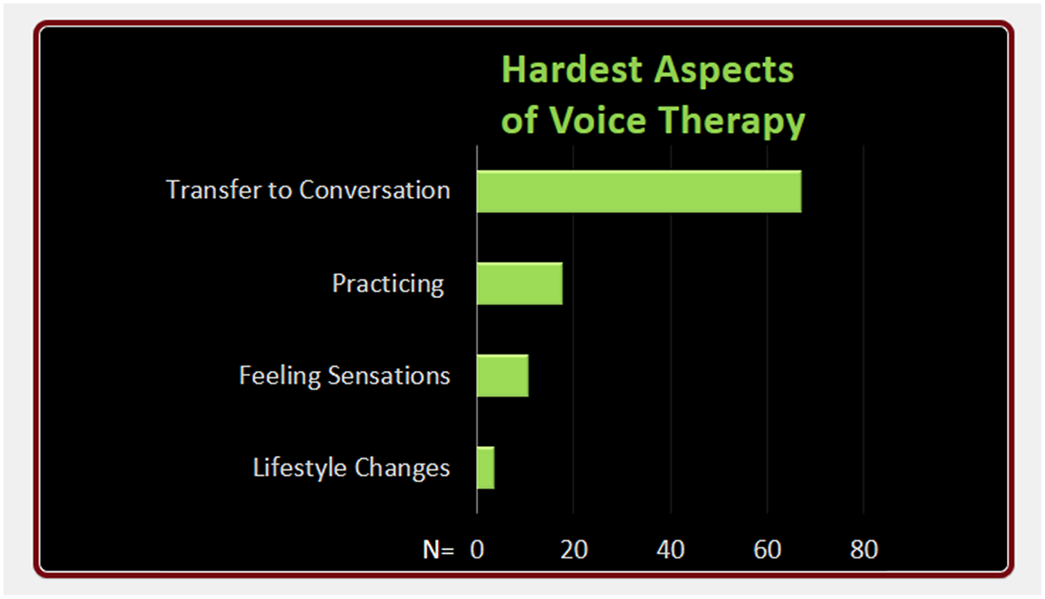
Mayer outlines 5 principles and ways to reduce extraneous processing in multimedia learning.
22
1. Principle of Coherence – reduce extraneous words, sounds, or graphics. 2. Principle of Signaling – highlight important words or graphics. 3. Principle of Redundancy – delete redundant captions from narrated animation. 4. Principle of Spatial Contiguity – place essential words next to corresponding graphics on the screen. 5. Principe of Temporal Contiguity – present corresponding words and pictures simultaneously.
Using some of Mayer’s principals from multimedia learning, Garner and Alley (2013) compared learning outcomes in 110 engineering students who viewed a technical presentation in which the slides either included or breached the multimedia learning principles.
25
Participant revealed superior comprehension for the assertion-evidence slide design group as well as lower perceived cognitive load than the group that used PowerPoint’s default design for slide creation (e.g., Topic-subtopic default setting of PowerPoint) (Figure 6). In addition, there was stronger retention at a delayed post-test with the assertion-evidence slide design. This type of slide design that incorporates some of the multimedia learning principles is called the Assertion-Evidence (AE) slide design.
20
The AE slide design is defined as a slide with a full sentence headline stating the main message of the slide (the assertion), supported with visual evidence (e.g., a photo, graph, chart, etc.) (Figure 7). Bulleted lists are not used in the AE slide design format. The AE slide formats have also been shown to influence the presenter’s understanding of presentation content.26,27 Topic-subtopic bulleted list default from PowerPoint. Example of an assertion-evidence slide design.
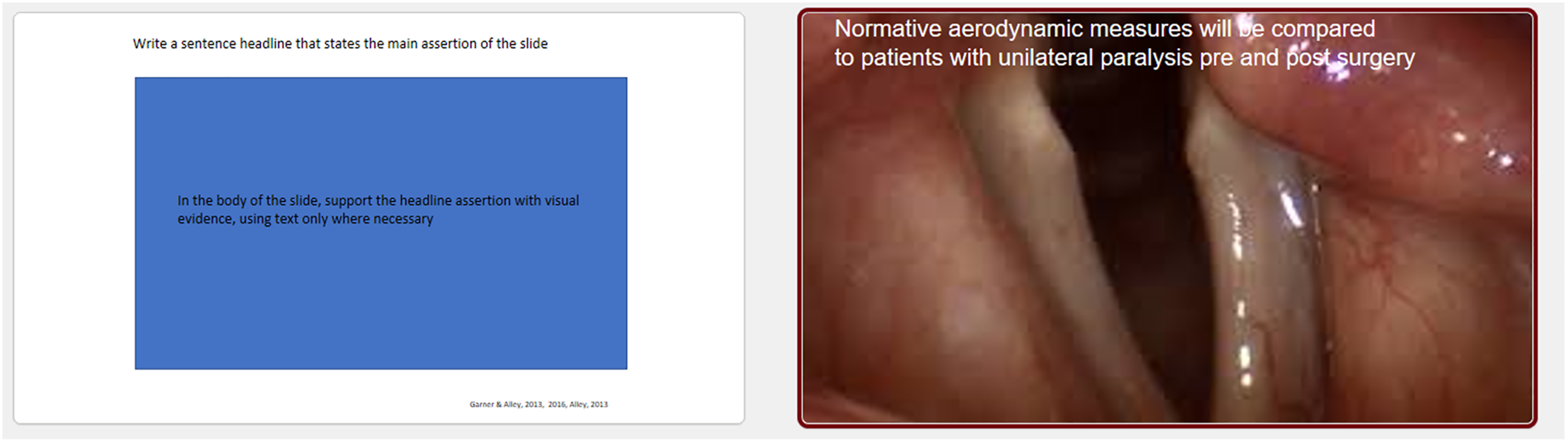
Many other presentation consultants and authors adhere to this recommendation for using concise, yet informative headlines on slides followed by meaningful visuals. When writing the headline of a slide, write complete sentences that orient your audience to what the slide is about.1,6,12,20,27 This technique also alerts your audience if they get distracted. Reading a headline that says: Methods… means nothing to the audience. Rather a headline that says: Phonatory aerodynamics in connected speech were gathered from 150 equally numbered healthy males and females in three different age groups (and then supplementing with visual evidence such as icons, a chart of the data, etc.) is much more communicative. (Figure 8). Example of a pre-post assertion-evidence slide design using full sentence headlines.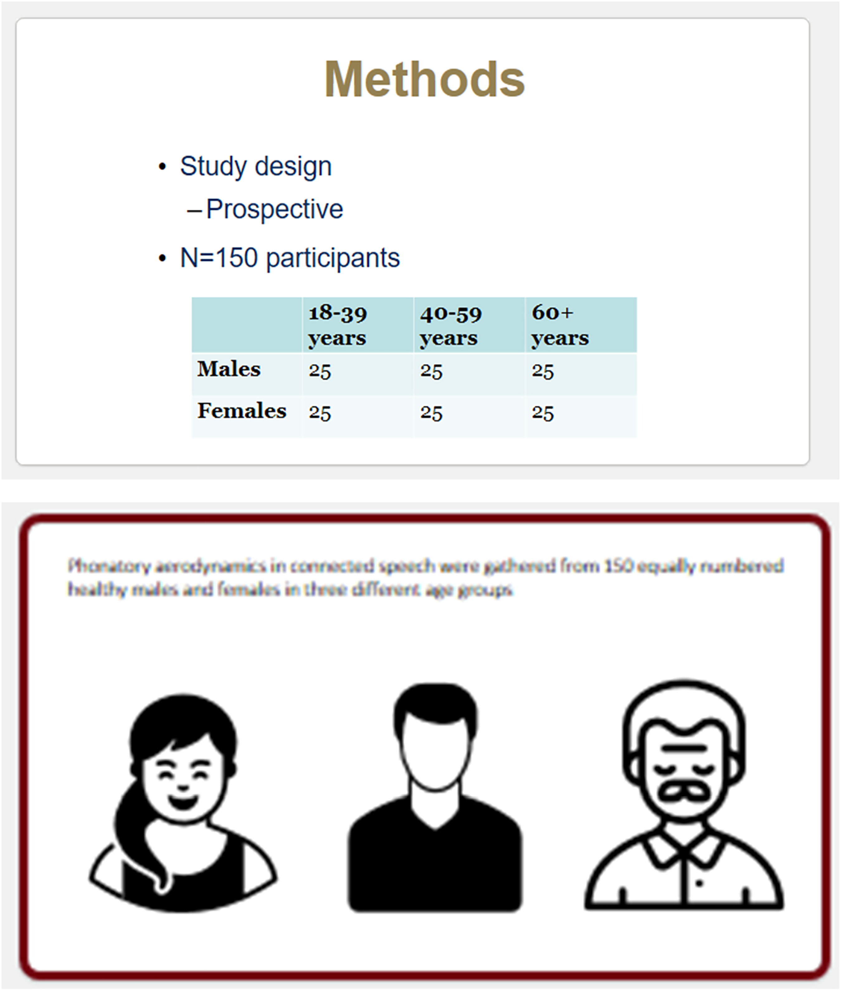
It comes as no surprise, then, that your slides’ headlines should drive your choice of visuals. A word of caution, images that are literal are often much more powerful than metaphorical images. In addition, do not use clip art; it tends to be dated.
7
Last, full edge bleeds are recommended for graphics so that the graphic bleeds to the edge of the slide, which allows the slide to have no margins
18
(Figure 9). Example of full bleed graphics.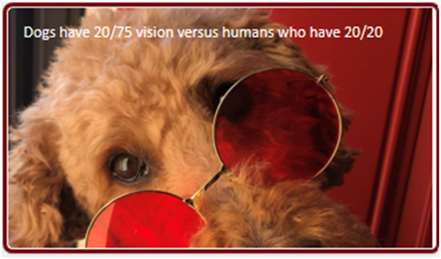
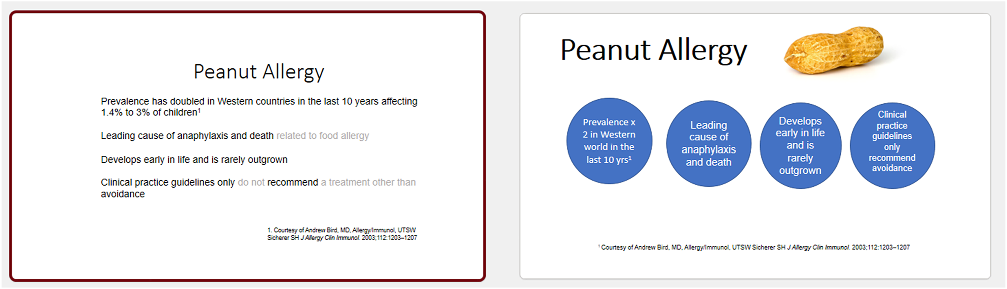
As previously mentioned, the presentation industry largely dissuades use of traditional bullets because they do not adhere to one thought per slide, can clearly turn into a “wall of words,” and typically sabotage a story throughline.4,12,28 However, sometimes they are appropriate if they are concise and “chunked”18,28 (Figures 10 and 11). Rick Altman (2019) refers to The Three-Word Challenge: trying to reduce every one of your bullet points to three words or fewer.
18
This technique is especially pertinent for virtual presentations. Recently, Nolan Haims has released The Better Deck Deck offering 52 alternatives to bullet points organized into ideas for text, shapes, images, and diagrams.
28
Example of pre-post make-over using chunking technique. Example of pre-post make-over using chunking technique.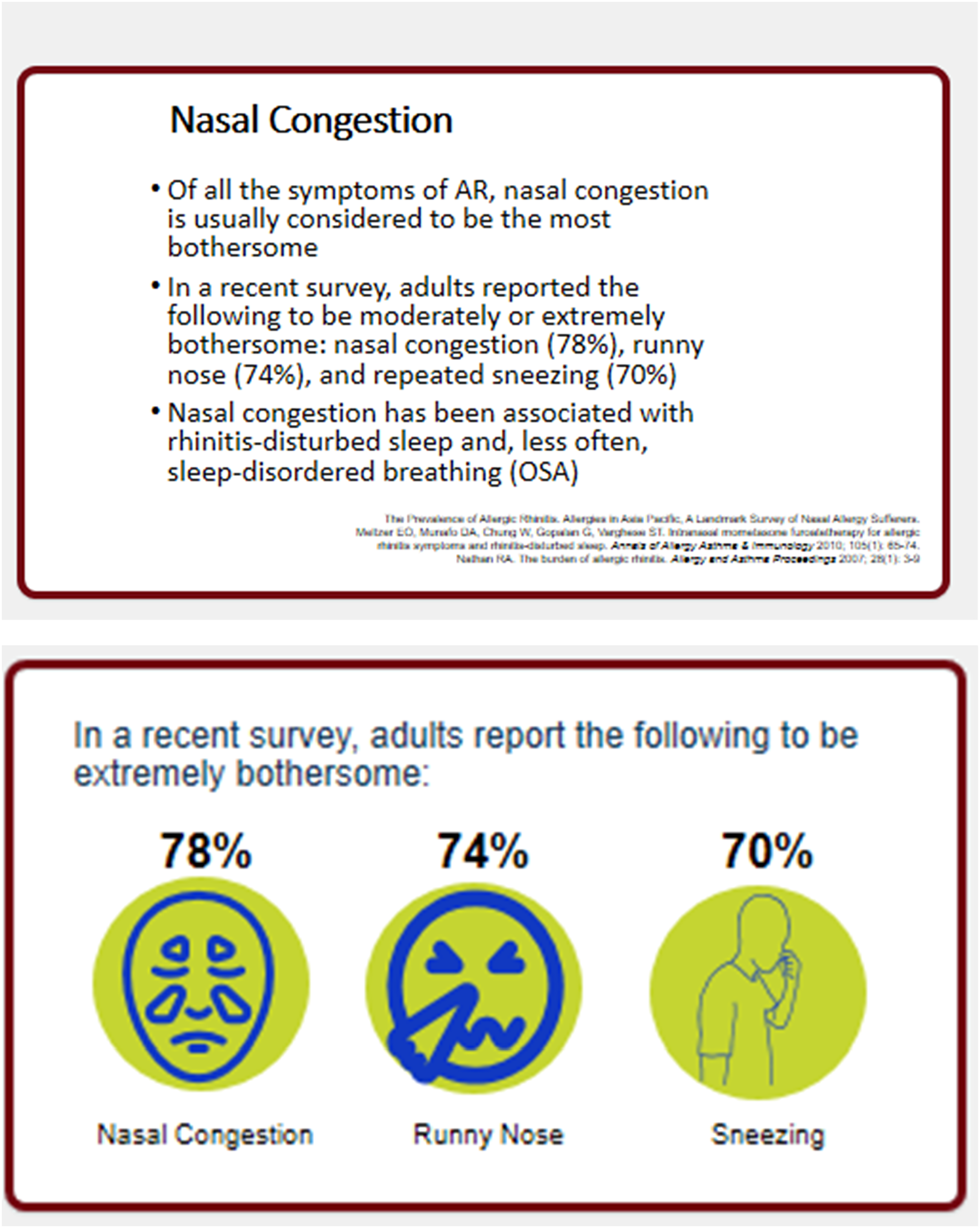
Last, a section on Slide Design would not be complete without recommending a book, known as the template Bible, by Swinford and Terberg (2021), which guides presenters and designers in building PowerPoint® templates, as they are the backbone of great slide decks and ultimately presentations. 29 The authors guide readers in such items as applying settings (e.g., theme colors and fonts) to a new blank PowerPoint file, formatting the slide master (e.g., grids, logos, placeholders), configuring the PowerPoint default slide layouts, creating custom layouts, finalizing the template structure, and then ultimately saving the final template for individual or group use. 29 As presenters, we are not wed to the default PowerPoint templates. Although they are incredibly useful, we can customize our own templates which can make us stand out as presenters. Last, most people have no idea how much time can be saved when using a properly developed template.
The Delivery
The virtual reality is this: your laptop and audio/visual equipment convert and compress your audio and video into digital bits that travel through cyberspace to reach your end viewer. 17 Therefore, technology adds layers between you and your audience. This trip can dilute your virtual impression by making your audio and video less vibrant than real life. 17 Investing in a fast computer with extra processing speed, a professional microphone, external camera, and a direct link from the computer to highest-speed internet (i.e., use an ethernet cable) is well worth the investment. 17
One of the advantages of virtual presentations is intimacy between the presenter and the audience. First, you are much closer in proximity to your viewers (e.g., a couple of feet away from their monitor). Second, you are usually in a more familiar setting for your viewer, be it their home or office, which can make the viewer more relaxed than in a huge auditorium or conference room. A more intimate setting mixed with direct eye contact by looking into the camera means you are perceived as speaking directly to the viewer. That intimacy is not achieved from behind a podium on a stage. If speaking at a hybrid event, it’s vital to schedule times during your podium presentation to look directly into the camera at your virtual audience. Training to look directly into the camera should not be ignored. It is not natural to look into the camera, but just like TV actors who transition from stage to camera, learning to do so is time well spent. Remember, the camera is the “eye of the audience.” 17
Virtual proximity also makes the face plainly visible. Presenters should be aware of any grimaces, frowning, or furrowed eyebrows while speaking and listening as they can be perceived negatively in a virtual presentation. 17 The nuances of these facial expressions are not as evident in a live stage presentation.
Another aspect of the delivery that is given more importance in the virtual space is our voice. Voice is the new body language in virtual and hybrid presentations. 30 In fact, all we have is voice and video in the virtual medium. 31 However, virtual audiences may often minimize the speaker’s video which dictates the voice becomes the primary communicator. Because of potential audio distortion, articulatory precision is important when talking. In addition, while your microphone may record your audio clearly, your audience’s equipment may be of lower-fidelity, or their environment could be noisy. 17
Some of the tenets of a novel voice therapy program—Conversation Training Therapy (CTT)—designed for patients with muscle tension dysphonia and/or vocal fold lesions (e.g., nodules) can be easily applied to the professional speaker.32-34 Clear speech, prosody (pitch inflection), projection, and pauses while talking are dramatically important, especially in virtual and hybrid presentations. Clear speech (e.g., articulatory precision, use of crisp consonants, etc.) has been thoroughly studied in the literature as increasing intelligibility, vocal intensity, voice quality, pauses, pitch inflection, decreasing speaking rate, as well as decreasing vocal fry.35-38 Patterns of stress, intonation, and pausing are also key voice and speech techniques used while delivering presentations. Pausing, for example, allows listeners to process what you have said and anticipate what you will say. Newspapers use white space, so readers are not overwhelmed with a lot of visual words. Pauses provide “auditory white space” so that a listener is not overwhelmed with aural words. This is particularly true because live stream virtual presentations are known to have an approximate 4 second lag time for an audience. 39 Indirectly tied to increasing the pauses in your delivery is making sure your rate of speech is not too fast. Communicating into a camera allows for little audience feedback for the presenter, which can be nerve wracking, especially when making an odd glance at the chat feature, which can accelerate anxiety and correlates to increased rate of speech and increased pitch of the voice. Listeners, whether virtual or not, will perceive anxiety from the speaker when this occurs. 40 In sum, look into the camera, decrease rate of speech, increase pauses, use clear speech, and increase prosody are key delivery guidelines for virtual/hybrid presenters.
Conclusion
The new normal will include some form of virtual communication (e.g., virtual or hybrid). Following the strategies discussed can help in crafting a compelling story, designing a visual story with a slide deck that compliments the content, while delivering the presentation with energy and enthusiasm. Duarte Inc. has used this motto for years: “Never deliver a presentation you wouldn’t want to sit through.” They have since added this important admonition for our times: “Never deliver a virtual presentation that is less engaging than it would have been in person.” 17 Final word, for those interested in learning more about best practices in presentation effectiveness in this new normal, please go to the online portal Presentation Guild and hybrid Presentation Summit conference.41,42
Footnotes
Author Note
Jacqueline Gartner-Schmidt, Ph.D., CCC-SLP, ASHA Fellow is an Associate Professor at Carlow University in Pittsburgh, PA. Previously, she spent 20 years as the codirector of the University of Pittsburgh Voice Center. Dr. Gartner-Schmidt’s 25-year clinical and research focus specializes on care of the professional voice, as well as the clinical effectiveness of voice therapy and respiratory retraining. She is founder and codirector of one of the largest voice therapy conferences in the nation, the Voice Therapy Conference (VTC). She frequently presents nationally and internationally. In 2018, she presented a TEDxTalk® on “How Our Voices Reveal Anxiety”. Dr. Gartner-Schmidt also has a passion to transform how professionals present – to make presenters as effective and accomplished in front of audiences as they are in their work. Voice Now, LLC was created in 2013 for that purpose.
Declaration of Conflicting Interests
The author(s) declared no potential conflicts of interest with respect to the research, authorship, and/or publication of this article.
Funding
The author(s) received no financial support for the research, authorship, and/or publication of this article.
Ethics Approval
No study was conducted by the author to facilitate the writing of this paper. Therefore, no ethics approval was necessary.