
Abstract
New and refurbished non-domestic buildings are failing to live up to their anticipated performance. Shortfalls show in excess energy consumption, high carbon dioxide emissions and other failings in quantitative and qualitative performance metrics. This paper describes the component parts of the performance gap using evidence from building performance evaluations. It introduces a way of visualising the consequences of decisions and actions that are known to compromise performance outcomes using a performance curve methodology (the S-curve) which plots performance, and the root causes of underperformance, from project inception to initial operation and beyond. The paper tests the hypothesis with two case studies. It also covers the initial development of a prototype visualisation tool designed to enable live projects to track emerging operational energy and emissions against a high energy and emissions trajectory created from empirical evidence. The tool aims to help practitioners identify key risk factors that could compromise building performance and mitigate these risks at different stages of procurement.
Keywords
Introduction
For energy consumption to be managed it must be measurable. This is true of buildings in all stages of their procurement, not just in their operational life. The energy profile of a new build or retrofit project emerges from the earliest days of modelling and design energy assessments. That profile—whether actively tracked by a project team or not—grows during procurement and construction as loads appear and as systems move from concept design to detailed design, and thence to installed products. A building’s subsequent operational energy profile becomes cemented during the commissioning phase in terms of the efficacy of installed systems and any tendencies for wasteful or sub-optimal operation. 1 Operational characteristics influenced by parasitic relationships (e.g. heating bringing on cooling, or vice versa) can also become locked-in at the commissioning stage unless such characteristics are quickly noticed and resolved.
Although opportunities to reduce wasteful operation can arise in the Defects Liability Period (DLP), DLP teams tend to focus on more fundamental failings. Consequently, excessive energy consumption can go unnoticed and unresolved. Left unchecked, energy wastefulness and high emissions can become chronic shortcomings. The risks are higher if the professional designers are not retained in the early operational phase to help in fine-tuning, and further still if a systematic post-occupancy evaluation and fine-tuning is not performed. 2
Projects that adopt Soft Landings, 3 either via the RIBA Plan for Use 4 or through Government Soft Landings (GSL) 5 are, theoretically, in a better position to reduce excessive operational energy and carbon dioxide emissions. However, Soft Landings interventions are unlikely to overcome ingrained failings that have occurred earlier in a project’s design and construction phases. Arguably, project teams need greater visibility and appreciation of energy penalties at the point they are incurred (for example through value engineering decisions that save capital costs at the expense of system efficiency) rather than discover them when the building is switched on. At that point it may be too late to mitigate the operational energy failings.
There are many powerful ways for project teams to understand the energy and carbon consequences of their decisions during project delivery. Dynamic simulation modelling (DSM) tools possess the capability to model the energy consequences of most technical choices. CIBSE TM54 Evaluating Operational Energy Performance of Buildings at the Design Stage 6 equips design professionals with the necessary procedures to calculate likely operational energy outcomes. However, these approaches are not a panacea.
For a start, compliance-based energy modelling based on simplified boundary conditions is somewhat different to scenario-based modelling. Simulation modellers rarely possess knowledge of actual building services operation to conduct realistic scenario-based modelling of possible outturn performance. Second, being detached and remote from the build team, energy modellers are also poorly positioned to calculate system diversities (and orders of magnitude of those diversities) that typically drive operational energy consumption and emissions beyond the notional values required for regulatory compliance.
CIBSE TM54 itself has its own shortcomings. Energy analysis is, by its nature, a specialist activity. Although TM54’s procedures can be followed by most design professionals, its use tends to be the preserve of building services design engineers, not architects nor project managers. Consequently, TM54 outputs aren’t necessarily in a form that can be easily assimilated by generalists. Such generalists are usually the ones in positions of authority, such as project managers, budget holders, and a multiplicity of client-side advisors. Above all that, a TM54 analysis, especially at each stage of plan of works, may not be in the project budget. Even when it is—and even made a contractual deliverable—the analysis may not be on the project’s critical path. It may then become side-lined. For all these reasons, energy performance modelling during project delivery does not get the continual and high attention it deserves.
For these reasons, neither compliance nor simplified and isolated performance modelling can prevent large rises in operational energy consumption caused by events that occur during the design and build phases. Some changes may be defensible (e.g. longer hours of use), while others may not (e.g. cost-cutting product substitution). Decades of evidence from building performance evaluations reveal that energy performance gaps between design expectation and building operation remain remarkably resilient to being closed. 7
Arguably a different approach is needed to engage project stakeholders with the operational energy and carbon consequences of their project decisions. The approach would require the ability to compute energy penalties as they emerge, quickly and fairly, with a live project’s consequential energy trajectory visualised in a form that non-specialists can understand and act upon at each key project gateway.
Background: The energy S-curve and its causes
The term performance can mean various things to different project stakeholders. To a building client performance may be measured in staff retention and low absenteeism, while to a facilities manager it may be ease of management and maintenance. To occupants it may be conditions of the internal environment and the quality of control they can exercise. There is no consensus on the definition of the term ‘performance gap’. It all depends on the metrics chosen to represent outturn performance. There are a range of performance assessment procedures 8 and social value metrics.8,9
Shortcomings in performance tend to be most apparent in buildings for which energy efficiency and low carbon dioxide emissions (among other sustainability targets) were key objectives. Such buildings tend to have higher ambitions for their subsequent performance. They tend to be more innovative in design and adopt multiple forms of low-energy technologies and controls. Such buildings possess greater technical complexity, which is often demanding of diligent management and maintenance. Greater attention is paid to target-setting, motivating design teams to apply for various forms of commercial environmental certification (e.g. BREEAM, LEED, WELL) as proof of their commitment to high performance (although achieving it in reality is usually treated as a separate issue).
Irrespective of the level of performance commitment, project teams usually start out with a fluid set of design concepts that gradually solidify to suit the available project budget and the timeframe, possibly in a different form from what was originally envisaged. The factors that determine a building’s ultimate operational characteristics will be put in place, but those characteristics will only be visible to a project team who are paying regular attention to the detail. Opportunities to influence those operational characteristics may occur at project gateways and decision thresholds, but, again, only if those performance characteristics remain under the microscope. The consequences of a change in a performance characteristic will need to be appreciated by the client and project team as something worthwhile addressing. For that it will need to be visible and clearly communicated to all parties in a manner and language that even the non-technical stakeholder will understand. If a problem is undiagnosed and invisible, and therefore not addressed at the right time, the opportunity to intervene and resolve it will be lost. Unaddressed, the risk of under-performance will become ingrained in the project, unnoticed and unappreciated by the project team until the building is switched on, at which point it may be too late.
Furthermore, it is usual for authority, roles, and responsibilities to change as a project moves from design to construction. Priorities will also change, typically from design performance aspirations to build ability and cost control. The degree to which design quality is traded-off against time and cost pressures will strongly influence the performance outcomes. Again, if performance-related decisions (and the consequences of those decisions) are not analysed and made visible as they occur, they are unlikely to be acted upon. The opportunity to intervene to redress any conflict between design intention and performance outcome will be missed. Decades of building performance analyses 10 reveal that the UK construction industry is highly adept at repenting at leisure. It tends to maintain a vicious circle of under-performance while at the same time raising its performance aspirations.11,12
The evidence suggests that better mechanisms are needed to make the invisible, visible. The visibility of a building’s emerging performance needs to be in a form that all members of a project team—clients included—can understand, appreciate and act upon. This is the motivation behind the S-curve concept. 13
Methodology
This section provides an overview of the research methods used to develop a concept for tracking building energy performance through design, construction and operation, and ways to test it.
In order to define the component parts of the S-curve for building performance, the authors focused on empirical evidence from the major building performance evaluation (BPE) research projects conducted in the UK in the preceding 25 years, plus post-occupancy evaluation (POE) evidence available in the public domain 10 In many cases the detailed energy studies had been conducted by the authors. This enabled rapid assessment of data trends and quality.
Devising a theoretical S-curve for building energy performance
S-shaped curves generally represent a growth mode subjected to limitations that, over time, slow down growth and strive towards a maximum value. They are especially applicable to transitional modes, where rapid changes happen within a system in a relatively short period of time before a system reaches its steady state operation. 14
These characteristics make the S-Curve modelling concept a viable option for analysing the evolution of building energy performance throughout a construction project and into building operation. It has the potential to be a mechanism for modelling an end-user’s operational profile, and the fine-tuning of energy-consuming systems to a point where performance reaches a steady-state; influenced, of course, by local contextual factors such as building size, number of occupants and hours of operation.
A theoretical S-curve for building energy performance was devised by the authors based on the BPE research and their qualitative understanding of how the performance gap occurs at each stage of project delivery. This was tested for its validity.
Testing the S-curve hypothesis
The research team concentrated efforts on building types for which high quality, verifiable energy performance data was available, disaggregated by the major end-uses (e.g. heating, fan power and lighting). As the majority of such studies were of educational buildings, the prototype S-curve tool applies largely to schools. Nonetheless, as the database included some office buildings, the energy consumption profiles in the S-curve prototype are partially relevant to office buildings. Energy penalties often have generic causes and are thus not building typology-specific, such as poor control, inadequate commissioning, and failures of management that lead to wasteful consumption.
Background information about the two case-study buildings.
The energy sub-metering in the case studies enabled disaggregation of energy by end-use. Both buildings followed the secondary schools’ calendar in England with some extracurricular activities. Occupancy profiles recorded during post-occupancy study were used for performance modelling.
The following data from both buildings was used to derive curves that track the changes in recorded energy performance throughout the life-cycle of the projects: • Energy projections included in the planning application for School 1. Detailed energy calculations at RIBA Stage D (as prevailing in 2009) based on expected operating conditions for School 2. • Building Regulations compliance calculations for both buildings (BRUKL reports), based on standardised operating conditions. • The EPC certificates and XML source files that include the default equipment load used for the Building Regulations and EPC calculations to estimate heating/cooling loads. This default equipment load was added to the regulated load as a proxy for equipment load at design stages. • Actual equipment loads were established using a combination of functional sub-meters and outputs from energy analysis using the CIBSE TM22 Energy Assessment and Reporting Method.
15
• As the original thermal models were not available, thermal models were developed based on as-built documents and post-occupancy studies to evaluate the effects of actual operating conditions and equipment load. The CIBSE TM54 protocol
6
and IES Apache simulation tools were used for this purpose. • The Target Emissions Rate (TER) was extracted for each building from the respective Building Regulations compliance report and all performances were compared relative to this target. • Evidence of procurement issues that had not been included in Building Regulations compliance calculations were incorporated in the TM54 model. • Actual energy consumption for each fuel was sourced for up to 3 years from Display Energy Certificates, utility bills, and directly from meters.
Energy performance was not calculated at every stage by the project teams. Some energy performance calculations were also not available to the authors. This is a limitation and means there were gaps in energy performance data available at few RIBA stages. Nonetheless, there were enough data points to give a clear picture of key changes in energy performance.
While the effect of actual occupant density and occupancy hours were taken into account, the operating conditions that stemmed from poor building management were not accommodated in the TM54 model. For example, schedules of operations for HVAC systems were restricted to core hours and any possible out-of-hours activity in specific zones. Similarly, no allowance was made for whole-building heating during half-term breaks and school holidays.
As the metric used for whole-building performance in England is carbon dioxide emissions, all energy figures were converted to this metric and normalised by building size and assessment period. For consistency, the same carbon dioxide emission conversion factors used in design stages were applied to the in-use energy use.
Histograms of energy performance for both buildings can show the evolution of performance throughout each project’s life-cycle. A list of procurement-related and building management issues for each building was compiled to give context to the energy data.
Development of a prototype tool to track and manage performance
In 2021 funding was secured via the UK Construction Innovation Hub and the Centre for Digital Built Britain to develop a tool that could visualise an S-curve energy performance trajectory, primarily for use on Soft Landings and Government Soft Landings projects. The following sections report on the initial development of the tool.16,17,18 It explains how the S-curve concept can effectively be used in live projects to identify key performance determinants, risk factors, and mitigation measures with the aim of better management of building performance.
Results
Devising the S-curve concept
This section describes the (simplified) steps in the construction of a building energy S-curve model. To identify the key factors that influence an energy performance gap, from inception to building operation, the authors created a timeline that charts performance expectations and the consequences of activities and decisions against a notional benchmark for a building procured with high performance as a client objective (Figure 1). Four scenarios illustrating suspected fluctuations in building performance against a −3 to +3 scale for performance. The hatched lines of the construction phase illustrate the area of greatest uncertainty as to the actions and events that confound design expectations.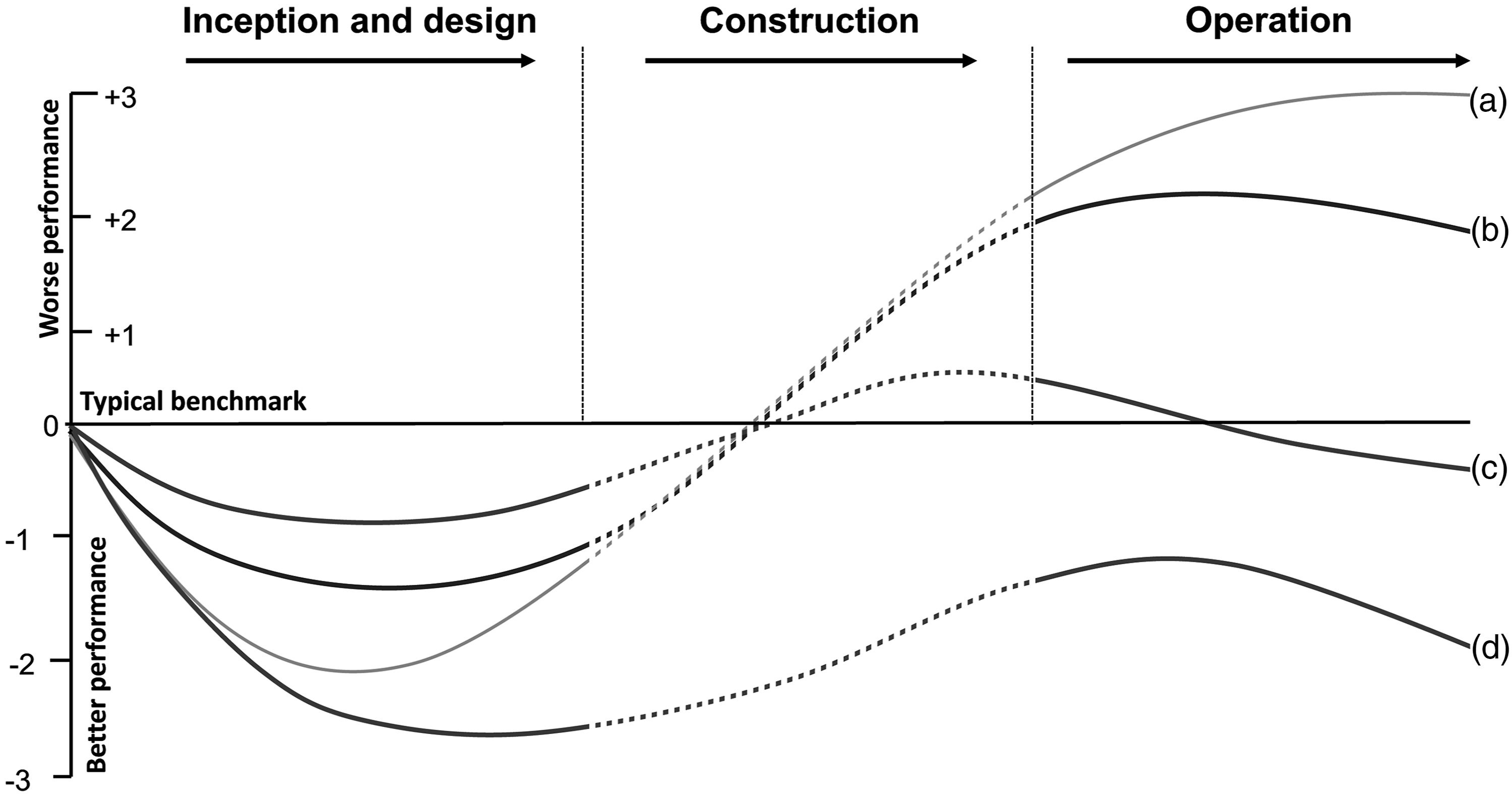
The curves in the diagram depict performance trajectories for four building scenarios. Each one is presumed to have started out with ambitions for sustainable low energy performance that are better than, for example, a minimum compliance standard, a median energy benchmark selected by the design team19,20 or something more stretching, for example to meet net-zero targets. 21
The vertical axis represents +3 to −3 on a performance scale. As explained earlier, such performance could be defined in many different ways—quantitatively (such as energy consumption) or qualitatively (such as occupant satisfaction). For the purposes of this exercise, the performance midpoint is statutory compliance with the energy requirements in Part L of the UK Building Regulations, but it could be any performance metric. (Note that a best practice origin might be at −1, for example if one regards a benchmark reference or the Part L statutory minimum as something to be bettered.)
To illustrate the broad concept, Figure 1 contains four idealised S-curve scenarios that represent performance ambitions and their potential outcomes over the period of a construction or retrofit project.
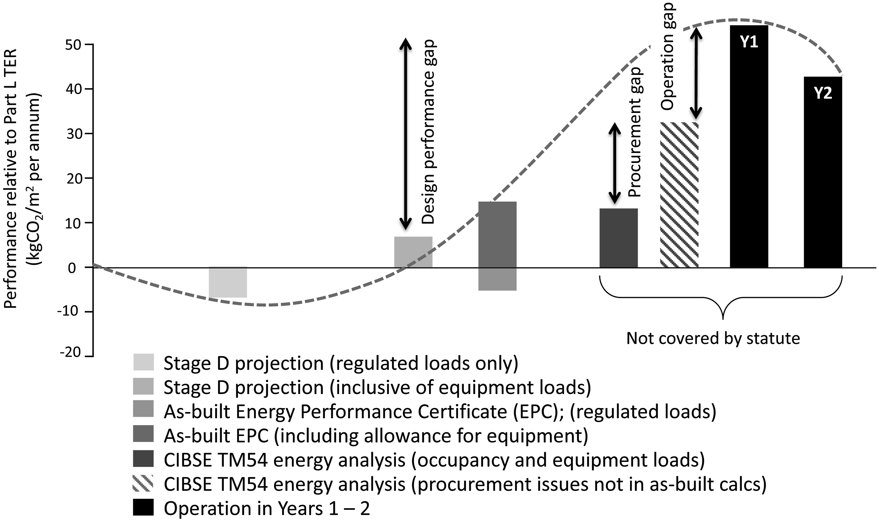
Figure 2 itemises the S-curve concept in the form of histograms. Scenario B is used in Figure 2 for the purpose of defining elements of the S-curve. Even though problems may be less acute than Scenario A, more can be said about the building’s initial in-use management activities. Note that the curves are shown against the RIBA Stages prevailing at the time of publication. A simplified breakdown of the lifecycle of S-curve scenario B in the form of histograms. These are effectively dots on the generic S-curve depicting the changing fortunes of building performance, from estimations made at the project inception stage through to actual operational performance 36 months post-handover. Year 1 includes the Defects Warranty period. Years 2–3 reflect a Soft Landings or RIBA Plan for Use approach to aftercare.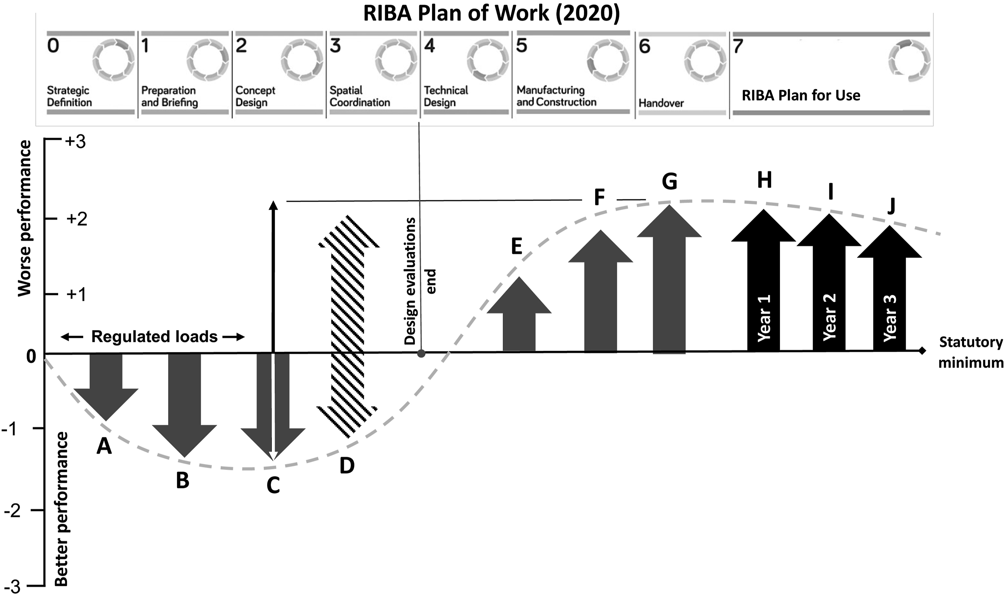
Stage A represents a client that requires the building’s performance to be in excess of the norm (or better than the regulatory minimum). It would typically represent a client’s desire for a low energy building, such as an A-rated design EPC (or a high NABERS UK rating for a base-build office). 22 Such targets may be augmented by commercial certification (e.g. high BREEAM, LEED and Well ratings). Energy and carbon values may be derived from the best practice targets in net-zero guidance issued by various advisory and institutional bodies (e.g. UKGBC, 12 RIBA 2030 Climate Challenge, 21 and the London Energy Transformation Initiative (LETI) 11 ). Such values may be acceptably notional at this stage, as the client’s requirements and the design brief have yet to be developed.
Stages A to C are often well-documented, as are stages H to J where data from post-occupancy studies are available. Hence the authors are confident that the extremes of the S-curve shown are defensible, particularly for cases where performance outcomes are higher (typically between a factor of three to five) compared with initial design ambitions.
Stage B is where the professional design team is developing concepts and testing options. Simulation modelling will be used to assess potential energy and carbon dioxide savings from passive measures, such as high levels of insulation, daylighting and fabric airtightness, and active measures such as heat recovery and demand-led control and switching of services such as mechanical cooling and lighting. Modelling may still be simplified, as many details of the building will not be known.
Stage C represents a stage where more consideration is given to the potential offset from on-site low and zero-carbon renewables (predominantly solar, but in some cases wind and ground sources). Their contribution will be estimated using simplified modelling and calculations in spreadsheet-based programs, either by design team experts or by appointed specialists. Payback periods will be calculated to identify which technologies or techniques show the best return on investment. As a consequence, the design energy estimates may be driven to exemplary levels. As above, this may be motivated by credit-chasing using commercial environmental certification schemes.
From Stages A to C, UK designers will only be required to consider regulated loads covered by Part L of the Building Regulations. They will use notional values for non-regulated loads (as discussed in Background). Some repeat clients with large property portfolios may know their unregulated loads; most one-off or lay clients generally will not. The latter will tend to rely heavily on their design advisors.
The hatched arrow for Stage D contains the greatest amount of uncertainty about the points at which performance outcomes diverge from the design ambitions. Design estimations will be poorly informed unless the unregulated loads are counted. Furthermore, unregulated loads will be creeping in under the radar, along with the client’s intended hours of use and their control and management policies. Unless the design team asks enough questions or performs a range of risk assessments and sensitivity analysis on their calculations, the actual loads in the building could be significantly different to the calculations made to reach statutory compliance. The design may still be ‘deemed to comply’, but the hidden reality may be somewhat different. The actual hours of use will only be known closer to handover, and often only when the user has taken occupation. In any case, energy performance calculations are rarely updated beyond Stage E.
Between Stage D and E of the S-curve, design calculations will be submitted for Part L compliance purposes, and the design Energy Performance Certification (EPC) in the UK. Unless the client pays for continued modelling and estimating, the design energy performance will be fixed. There is usually no instruction or fee provision for the design team—whose design may, in any case, be a contractual deliverable at this point—to refine the energy performance analysis.
Stage E represents the point at which a main contractor is appointed, although this may happen earlier in design & build contracts, and the design is detailed. Risk assessments and sensitivity analysis by the professional design team may have stopped, and the contractor and either the novated designer (or the contractor’s in-house design team) will be refining the design for build-ability and to meet (if not come within) the budgetary constraints.
At Stage F, value engineering decisions may change the design. Product substitution may occur (ostensibly with design team sanction, but not always) which may result in cheaper installations whose subsequent lower efficiency (higher energy use intensity) may not be known or checked at the point of selection.
A client/end-user may know more about their operational requirements at this point, such as hours of use and intensities of use. However, this information may not be sought by the project team and therefore the potential effects on outturn energy performance may not be taken into account.
Vital subtleties of an (ostensibly) low-energy design expressed in an output specification may be delegated to individual contractors and suppliers of specialist packages, such as motorised windows, renewables technologies and controls. Consequently, the evolution of the strategic design into a summation of individual system performances may alter the building’s likely performance outcomes (exacerbated by product substitution of a lower quality). This may happen in the background without anyone noticing. Without formal sensitivity analysis it will not be possible to visualise such consequences, let alone account for it and react accordingly. Even specialist contractors who are well aware of their individual systems may not have an holistic appreciation of the entire strategy and the effect of their contributions (as demonstrated by the case studies below).
Stage G represents shortcomings in commissioning, training and handover, as identified in POE. 10 Buildings are regularly found not to be operationally ready at handover. Operation and maintenance manuals and building logbooks are often inaccurate and/or incomplete, as are as-built record drawings. 23
Stage H represents the period of initial building operation. Operating hours may be different to the design estimations, as might occupancy densities. Whether they are higher or lower, changes will affect the operation of heating and cooling systems (which, due to rushed commissioning and possibly perfunctory training and familiarisation, may perform sub-optimally anyway). More time may be spent during initial operation on resolving defects and resolving wasteful running rather than fine-tuning those systems to deliver their optimum performance. Arguably, this is something that can only happen after a full year’s operation and once most snags have been resolved.
Stage H also incorporates the 12-month defects period. If a building has been procured on a standard contract, without any Soft Landings activities beyond the first year of occupation, a project team may be motivated to rush to judgement on the building’s performance during the defects warranty period because that is the only time available to them. This may involve rudimentary post-occupancy evaluation, including condition monitoring, energy analysis, and occupant feedback, even though the building is incomplete and still suffering from outstanding snags and defects. The situation will be complicated by phased occupation, any post-contract fitout works, and corrective recommissioning.
To make matters worse, the various means of measuring performance may themselves be operating incorrectly. Energy sub-metering systems in particular are often initially dysfunctional. If problems are never identified and resolved, the meters may immediately be useless.24,25
For these reasons, any performance measurements conducted during a defects period may largely be a judgement on the delivery team rather than a useful (let alone fair) reflection of a building’s performance. Inevitably, an energy performance gap is likely to be largest during this period because of various outstanding issues. Premature measurements that indicate underperformance will likely reflect badly upon all involved, with blame and recriminations a probable outcome. Any residual willingness in a project team to resolve problems collaboratively is likely to dissipate completely.
Stages I and J represent a case where some effort has been made to resolve issues to improve performance. However, in the absence of diligent and effective facilities management, a building that suffers the issues described above (and illustrated in Figure 2) is unlikely to see its performance improve. Initial shortcomings may become chronic failings. In which case performance will probably fit Scenario A.
Testing the hypothesis
The following figures show how energy performance evolved from early stages of construction until 2–3 years after practical completion in School 1 and School 2. Some energy calculations prior to building completion include equipment loads and some do not. The hatched trend lines shown in Figures 3 and 4 merely illustrate a (smoothed) S-curve tendency of over-promise and under-delivery. In reality, data are continuous and exist between each data column, but are unrecorded except at the specific points of analysis/measurement and reporting shown. Energy performance measurements for School 1. The RIBA Plan of Work references apply to the RIBA Stage terms that applied in 2013. Planning stage calculations included equipment loads. Energy performance measurements for School 2. The RIBA Plan of Work references apply to the RIBA Stage terms that applied in 2013.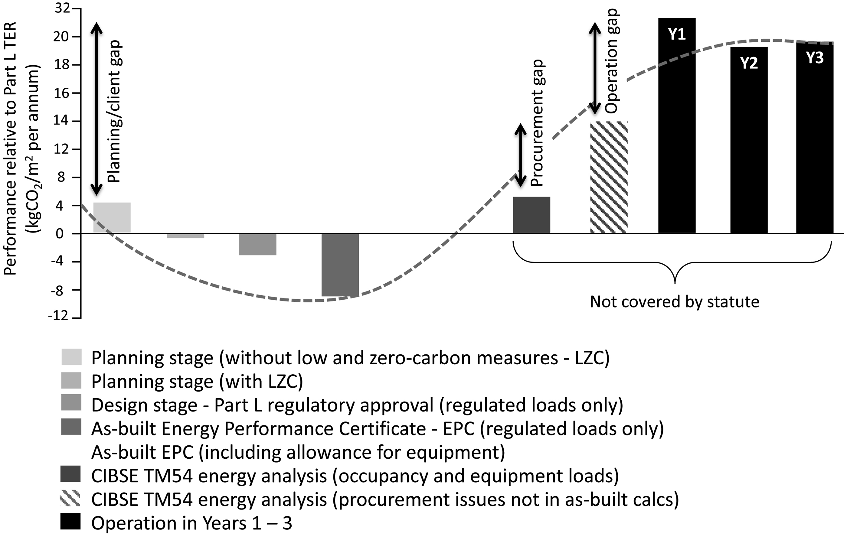
Examples of procurement and operational issues identified in the case study buildings.
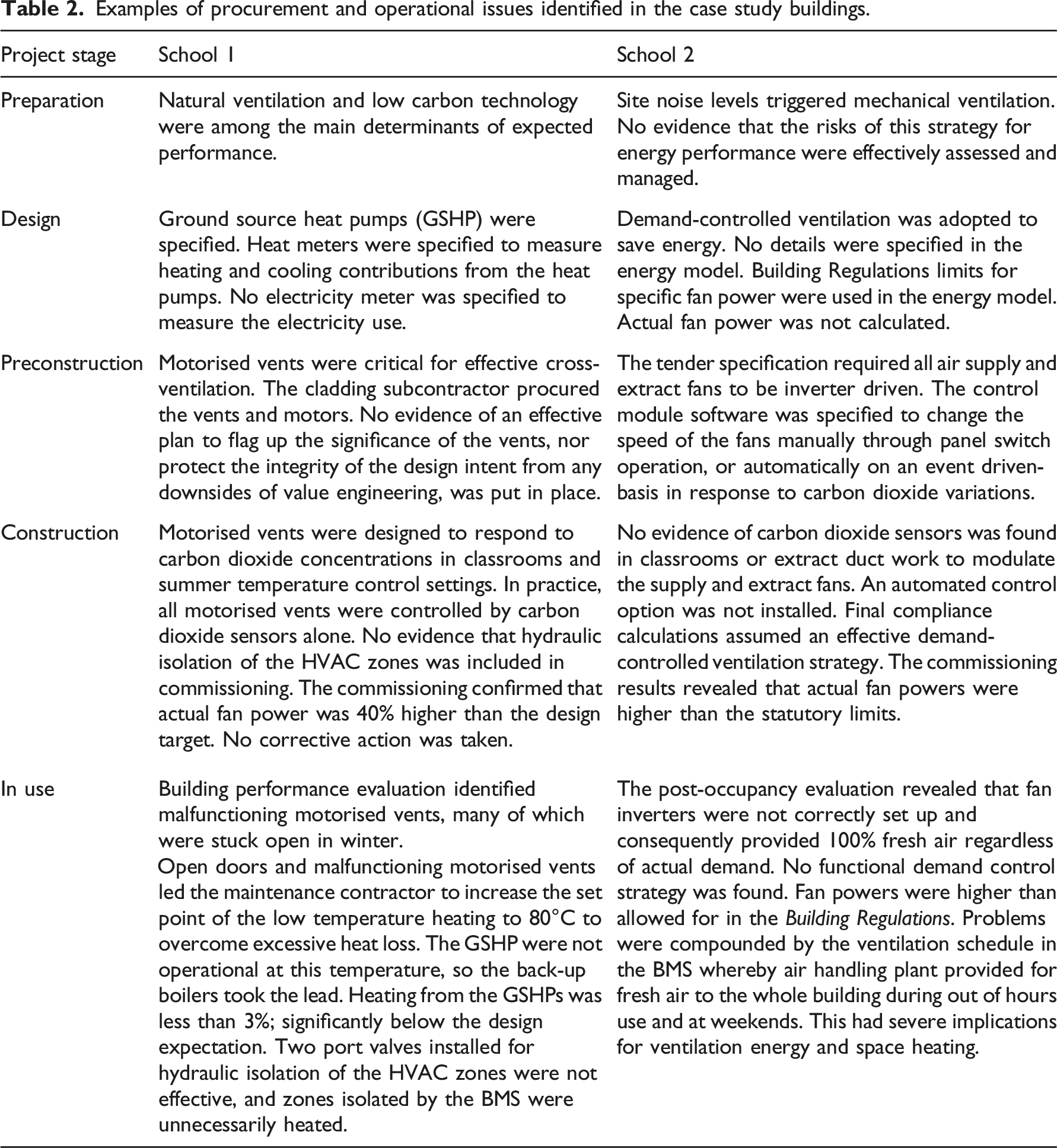
The two in-depth case studies generated the following findings: • Performance profiles typical of many such evaluations: a tendency to over-promise and under-deliver good energy performance and carbon dioxide emissions • A paucity of measurement points outside of Building Regulations compliance reporting • Variations in what is reported, what is included, and when it is carried out • Issues occurring in procurement and construction that are not analysed and reported at the time, and only partially attributable to causes in hindsight, and with a degree of uncertainty.
Based on this empirical evidence, a range of performance gaps between 4 and 6 are probably appropriate for some systems known to cause of high energy wastage, particularly when (baseline) energy targets are set at levels considerably better than the compliance requirement. For example, there are risks of high performance gap factors on projects that aim for net-zero operational emissions but which fail to address common systemic shortcomings in procurement, construction, and building management. Such failings are usually compounded by other factors, typically poor and incomplete commissioning and insufficient control. If a project team using an OpEC S-curve visualisation tool 17 makes little or no attempt to mitigate these risks, it is not unreasonable for the tool to represent potentially severe consequences: i.e. wide performance gaps for particular systems.
It should be noted that the energy performance figures shown on the S-curve are derived with respect to a baseline value (Part L target emissions rate was used as the baseline in the examples provided in this paper). Exclusion of non-regulated loads in building performance compliance calculations can also contribute to performance gap factors.
From S-curve theory to a practical performance management tool
The primary evidence for the shape and amplitude of the default energy trajectory is derived from recorded BPE and POE data. Primary sources included the PROBE research project (1995–2001), the Carbon Trust’s Low Carbon Buildings Accelerator (LCBA) and Low Carbon Buildings Performance (LCBP) programmes (2006–2011), and the BEIS/Innovate UK Building Performance Evaluation (BPE) programme (2011–2015). 10 Detailed datasets held by the Institute for Environmental Design and Engineering (IEDE) at UCL are also being used for trajectory programming, such as the TOP project (Total Operational Performance of Low Carbon Buildings in China and the UK). 2
Most BPE studies of the last 20 years have focused on offices and schools. Although the S-curve trajectory visualisation tool will fit best to these typologies (something it has in common with the 2021 LETI Climate Emergency Design Guide), 11 it will remain broadly applicable to other building typologies.
BPE and POE data tends to vary greatly in quality, accuracy, and completeness. The relatively large database accessible to the researchers provided latitude to use the most valid and robust energy data. A selection of high-quality data is often more useful than large datasets. While superficially impressive, large datasets may be riddled with errors and estimations and lacking explanatory contextual detail. The research team’s focus on BPE and POE sources with the best data enabled energy penalties to be more reliably associated with given events occurring during project design and delivery.
Nonetheless, quantifying the effects of construction decisions and commissioning practices on operational energy is problematic. The consequences of any given action are inherently unpredictable, not least due to interrelationships between systems that can either multiply or suppress a particular energy outcome. Some factors may be context-specific, while others may be particularly sensitive to system complexity and exhibit performance fragilities as a result. Again, commissioning plays a major part. Generally, simple standalone systems are more robust and easier to commission well—with lower risks to outturn energy performance—than interdependent complex ones. Many performance problems lie on a spectrum. Predicting where they may lie for any particular project is not easy.
The authors were not the first to consider what energy penalty factors for inadequate commissioning and management might look like. In 2012 in preparation for the (subsequently aborted) Green Deal, draft modelling guidance was produced as a precursor to a Green Deal-tailored version of the SBEM calculation tool (iSBEM).26,27 The draft guidance for Green Deal assessments considered the application of management scores to energy-consuming topics. The uplifts were based on quartile uplift factors (i.e. a best case factor of 1 and a worse case factor of 4), with a score applied depending on submitted evidence. Topics included HVAC system management skills, energy monitoring and targeting skills, and system maintenance policies and actions. The scores were intended to create an ‘actual’ profile of a building compared with a ‘potentially managed’ profile—not dissimilar to this research concept of project trajectories and default trajectories.
A scaled approach to the calculation of energy performance penalties was regarded as a defensible approach for the prototype OpEC visualisation. Uplifts would be applied to an emerging energy trajectory dependent upon the data and evidence supplied by the user (a project team). As already said, it is not rare for performance gaps to be greater than a factor of 4 over design declarations; many recent buildings have energy performance gaps in excess of that (Figures 3 and 4). However, the uplift factors applied to each energy-consuming item cannot be simply additive.
The research team gave considerable thought to how scores for individual energy factors should be grouped, averaged, and weighted for their overall effect on operational energy (at any given project gateway); furthermore, how individual factors (and groups of factors) might respond to mitigation actions.
Each energy consuming end-use in the OpEC Visualisation (defined by ISO 12655 categories as used in CIBSE TM54 and the Operational Energy and Carbon Reporting Framework 16 ) will have up to six questions requiring evidence as answers. The (notional) topics below cover specific fan power. Projects may not require detailed information at RIBA Stage 0.
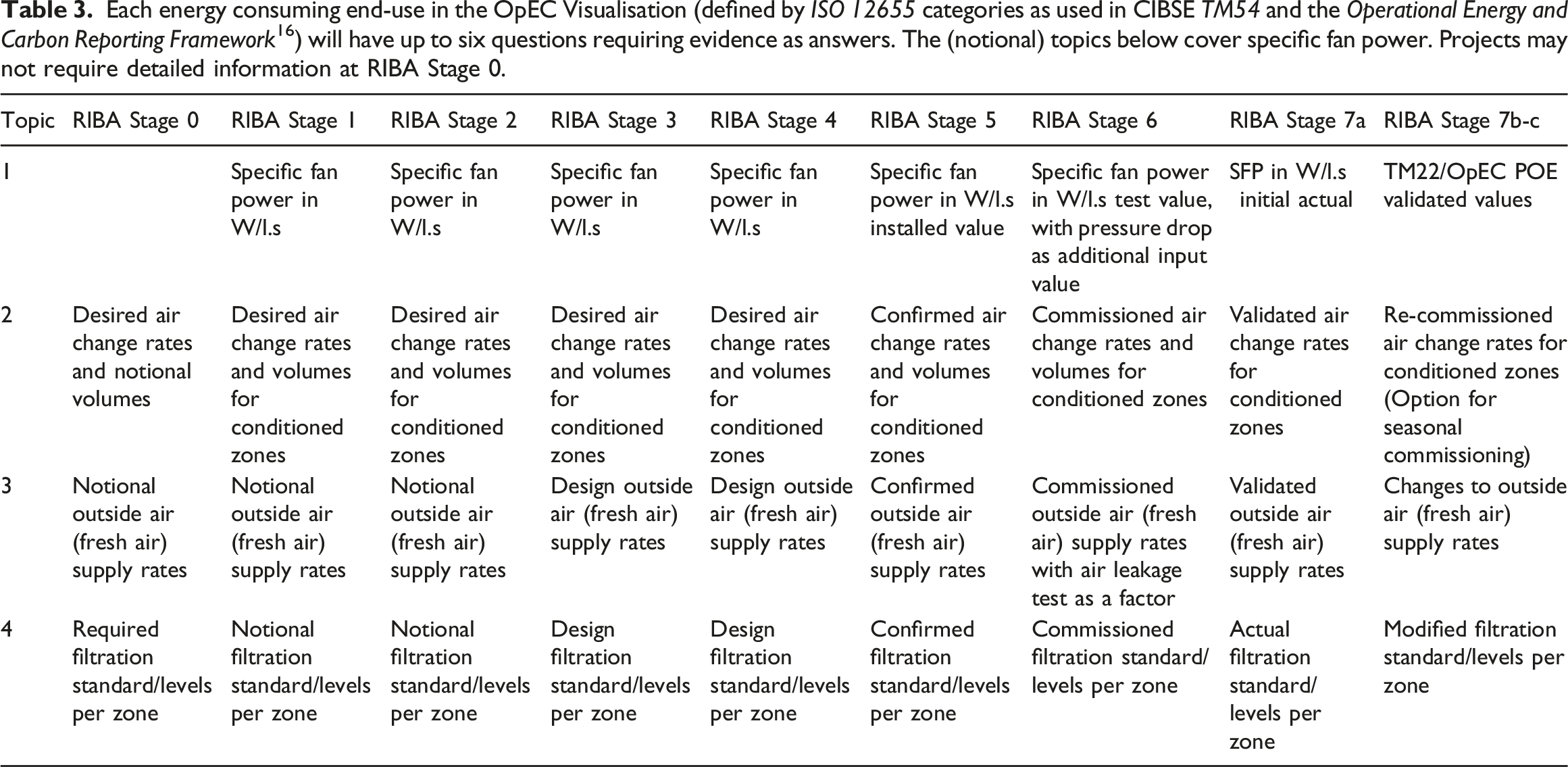
The prototype OpEC Visualisation will initially be confined to up to six key questions per BS ISO 12655:2013 energy end-uses. This will help to ensure the trajectory tool is manageable in practice.
Table 3 shows typical questions or inputs as they relate to specific fan power for each RIBA Plan of Work stage. Each question has four potential answers, ranging from meeting best practice values to a minimum requirement (i.e. a Building Regulations statutory requirement). Each answer demands that the user uploads corroboratory evidence to the project file or BIM, signed-off by the client or representative. Each answer below the best practice response incurs a penalty. A fifth response category, that of ‘absent’ (or no evidence submitted) generates the maximum performance uplift penalty of ‘4’. The performance penalties are added to the sub-system trajectory, which itself contributes to the overall project trajectory.
A weighting structure has been developed whereby a given penalty is subject to a relaxation factor. There are two categories of relaxation factor: ‘early-stage relaxation’ and ‘relative importance’. A maximum relation of 40% can apply to the penalties, in any combination of 10% increments apportioned between the two categories. The specific relaxations are based on knowledge from BPE and POE studies, reality checked for sense. They are pre-programmed into the prototype tool.
An example of how this works for one topic on LED lighting at RIBA Stages 2 and 3 is shown in Figure 5. Source programming for an LED lighting topic. Shown is the question posed, the range of possible answers, and the evidence required to earn a given score. The highest penalty of ‘4’ applies to no answer being given to the question (‘absent’). The example shows relaxations in penalties for RIBA Stage 2 that will no longer apply from RIBA Stage 3 onwards. See Figure 6 for how weighting relaxations were determined. Some questions cease to be relevant at later RIBA Stages, while others become more relevant.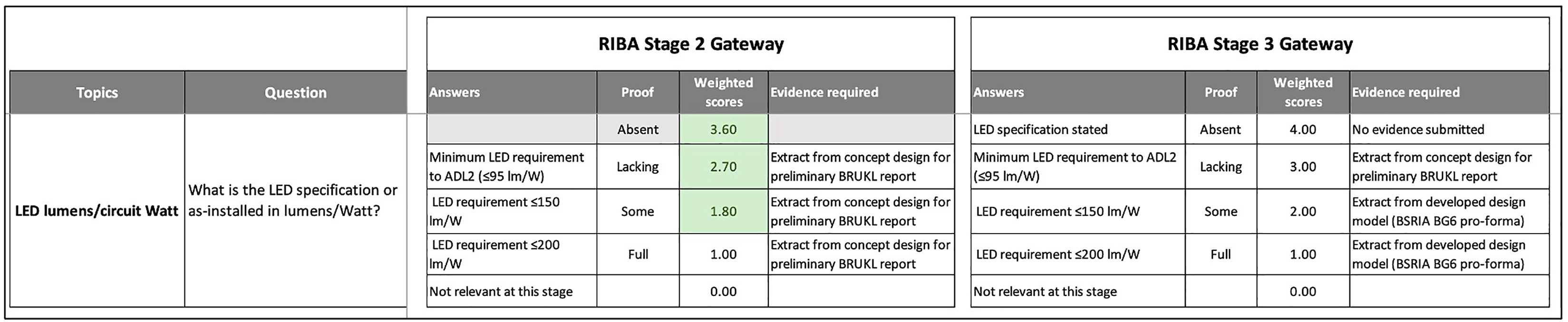
Figure 6 shows the programming of the weighting factors, where a weighting can be applied in 10% increments up to a maximum of 40% discount for each topic. The effects of a 30% relaxation are shown in Figure 7. Although Figures 6 and 7 are only within the OpEC visualisation programming, they illustrate how the development team have recorded the weightings at each RIBA stage for each energy end-use (in this instance, for lighting). The same procedure was used for all major energy end-uses as well as commissioning and management activities. The programming for an LED lighting topic that creates the weightings in Figure 5 (A false example for illustration). Graphical representation of a typical relaxation using data generated in Figure 6. The multiplier of ‘1’ is the minimum obtainable.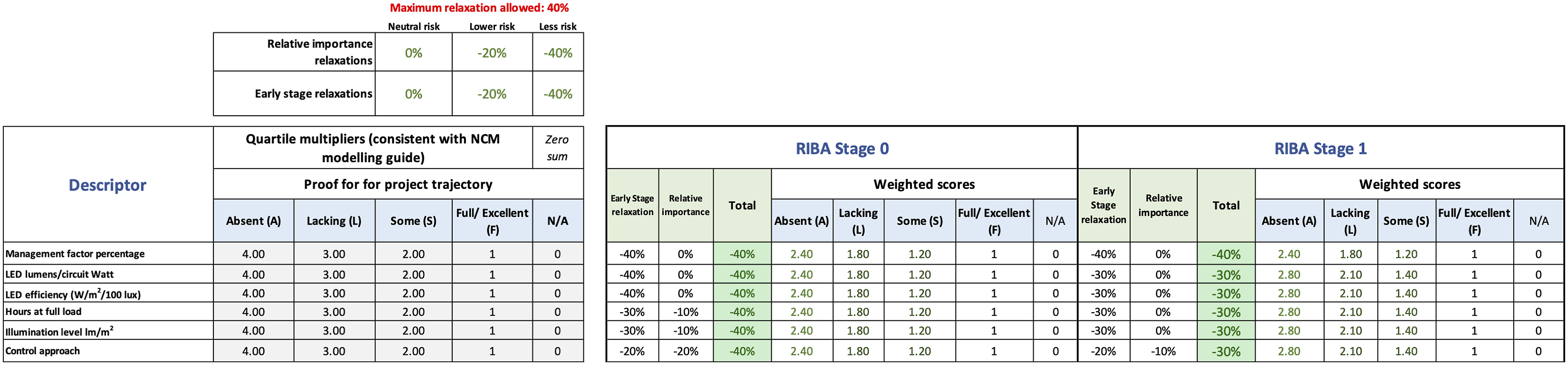
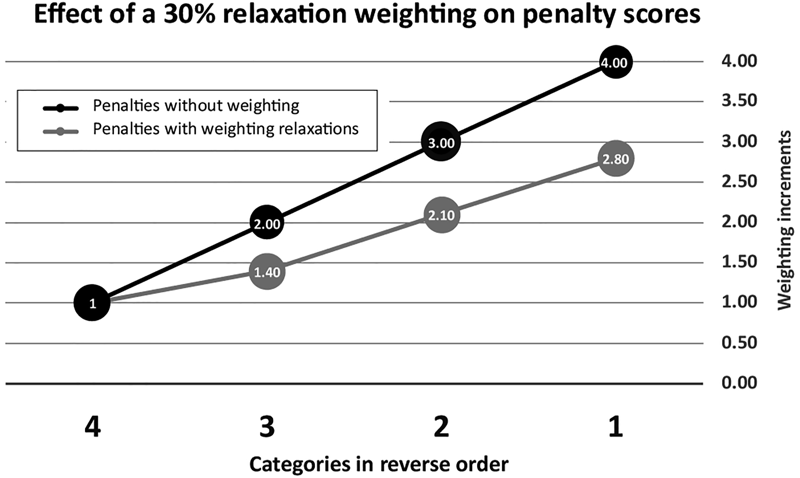
Figure 6 shows the theoretical application of energy penalties to generate a live project trajectory against the high-energy default trajectory. The attribution of an energy penalty to a given load (e.g. fan power, lighting) depends on the submission of evidence for four key questions (as Figure 5) against given topics (as Figure 4) to justify an initial project input value at each RIBA Stage.
The answers can only be recorded by the visualisation tool if acceptable evidence is uploaded and signed off. That evidence could be modelling reports, correspondence, or other documentation that possesses a given degree of technical validity and/or contractual worth. It is the ambition of the OpEC visualisation team that all submitted evidence be logged (and therefore auditable) in a Building Information Model (BIM).
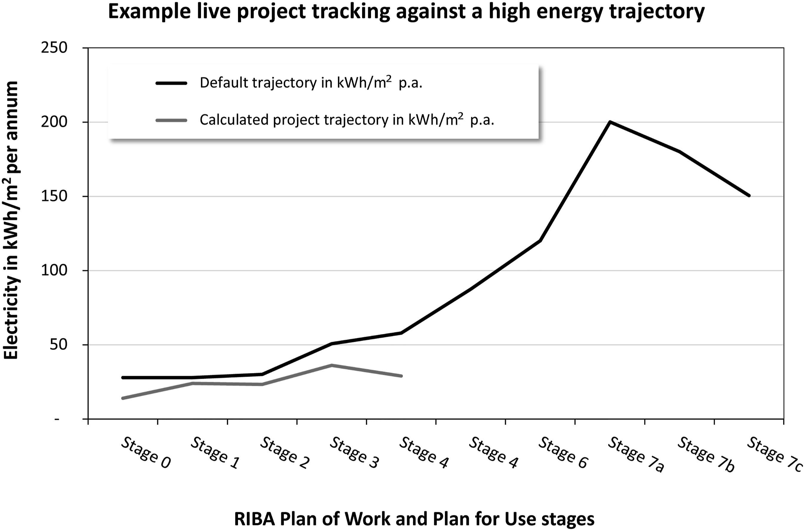
In the theoretical example Figure 8, at Stage 0 a user’s input value of ‘14’ kWh/m2 per annum is justified on submission of all evidence by fulfilling the requirements of Question 1. The project score is thus lower than the default trajectory score of 28 based on a pre-defined default energy multiplier operating at Stage 0. This value becomes locked-in. At subsequent RIBA Stages 1 and 2, evidence of a lower quality has been uploaded, resulting in a penalty multiplier value. A theoretical emerging trajectory for RIBA Stages 0–3 is shown in Figure 9 against the default (high) energy trajectory. (Note this simple example does not contain relaxations.) A theoretical application of energy penalties to generate a live project operational energy trajectory against the high (default) energy trajectory. Black boxes denote fixed entries at the RIBA gateway. An example of how user responses generate a project trajectory against the default energy trajectory. The example shows electricity kWh/m2 per annum. The prototype visualisation will possess the functionality to toggle between electricity, fossil fuel, all fuels, and emissions in kgCO2/m2 per annum.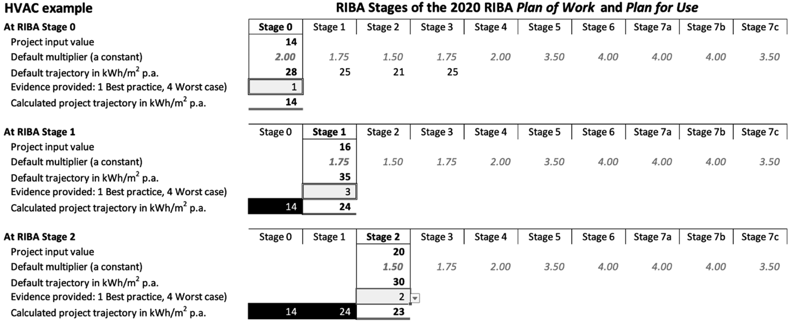
The live project trajectory is subjected to the same multiplier factors as the default trajectory. A project team that fails to adopt best practice engineering and construction delivery procedures would see their project trajectory rise progressively during RIBA Stages to track towards the default trajectory, unless interventions are made to keep their trajectory down.
Discussion
The input data to the OpEC Visualisation is the summation of individual system trajectories (e.g. fan power, lighting, heating and cooling) plus process factors (notably commissioning) that are known to contribute to outturn performance gaps. It is a time-based curve based on a set of typical overshoots for a given building typology, grounded in research evidence. The Visualisation itself will depict a single default (high energy) trajectory that consolidates all individual system and process influences on the operational energy consumption.
The values that make up the default trajectory, and the weightings applied to any particular energy end-use, are not data with a high degree of accuracy; rather they are realistic estimations based on empirical evidence from building performance evaluations. The primary purpose of the OpEC Visualisation is therefore not intended to act as accurate energy modelling, but a way of motivating project teams to do better at each RIBA stage and make interventions they might otherwise avoid. In this way the OpEC Visualisation aims to be more a behaviour-change mechanism, whereby people manage performance risks rather than ignore them. The tool and its underlying algorithms, however, will be developed with the capability to mine the data collated from projects that use the tool. The insights gained will be used to progressively improve the accuracy of the uplift factors and their weightings.
The limit of six topics per energy end-use category is intended to ensure the OpEC visualisation is useable and manageable in practice. Its use cannot be time-consuming, nor more of a burden than a benefit. However, the number of topics per energy end-uses may expand with feedback and as the prototype develops into a practical tool. To cater for different levels of detail there may be three optional versions of the tool: Basic, Advanced, and High-end, with more questions and evidence required for each version. (The latter would be most applicable to zero-carbon projects, for example.)
During 2022, research work focused on the energy penalties of individual energy end-uses, identifying the influences on energy penalties, and determining how combinations may accentuate or supresses energy losses. While the research team has a lot of useful empirical data, engineering judgement will play an important role. Some interaction effects will need to be modelled, particularly as the OpEC Visualisation migrates from proof-of-concept to a useable tool. Ultimately the full extent of the energy performance gap will be characterised for the trajectories in Figure 1. The project will progressively improve its calibration, moving from engineering judgement, through modelling, and finally using feedback from real-world data.
Conclusions
The development of the OpEC Visualisation prototype comes at a time when clients and project teams are grappling with delivering net zero buildings by 2030. Although the climate change imperative is deeply concerning, its virtue is that everyone in a project team—from client down to sub-contractors—are increasingly being forced to focus on the same objectives. There are fewer excuses for not paying attention to aspects of construction that compromise intended standards of energy efficiency and which contribute to sustaining performance gaps. The OpEC Visualisation intends to provide additional leverage to ensure performance risks are made visible and properly dealt with before the failings become embedded and potentially insoluble after handover.
The project team is aware of potential pitfalls. The means of data entry does not make an OpEC Visualisation immune from gaming, whereby a user could play around with input answers to generate the best score before locking-in the values at a given project stage gateway. In this respect the OpEC Visualisation will offer no greater security than that offered by commercial environmental rating schemes, where users are able to tactically trade-off credit opportunities against each other. OpEC’s advantages, however, include a longitudinal approach to building performance and its evolving nature (at every stage of the plan of works), and a transparent and visualised approach to energy risk management.
It will be vital to keep the OpEC Visualisation tool agile and useable as a project moves through the RIBA Stages. More elements will need calculating for their effects on outturn energy performance. As concepts move into detailed design and finally into installed systems, the number of performance-critical factors will increase. The trick is keeping input data manageable; live projects cannot be overwhelmed with factor analysis in a misguided attempt to either measure everything, and/or in minute detail. It must be borne in mind that the ultimate purpose of the OpEC Visualisation is not to be numerically accurate at a high level of resolution, but to motivate project teams to stay on a low energy trajectory—and provide auditable proof to justify the project’s position on that trajectory.
In terms of being motivational, it may be advantageous to add an optional third curve to the OpEC Visualisation: that of a theoretical best-case project curve indicating to a project team where they could be if they made the right decisions and interventions. A toggle for a best-case trajectory could both taunt and inspire a project team to show what they could do if they tried. However, the primary purpose of the OpEC Visualisation Default Trajectory is to serve as a warning to clients and their advisors to constantly question the rationale and evidence for claims of best practice energy performance, given that they do not want a nasty surprise when their building comes into operation. It is not unreasonable to suppose that clients could include contractual penalty clauses for falsifying or otherwise over-promising performance values, or alternatively to offer incentives to motivate honest data input.
At the time of writing the OpEC Visualisation tool was work in progress. Although the underlying datasets are complete along with their initial weightings, additional funding was being sought to create an end-user data-entry module and an S-curve visualisation dashboard suitable for trialling on a live project. By the time of publication (mid-2023) the tool may be in a useable state.
Testing in the field will enable the OpEC project team to refine the source data to improve the accuracy of the visualisation equations. Such source data may derive from post-occupancy evaluation data conducted during Soft Landings, and from the POEs conducted on public sector Government Soft Landings (GSL) projects (e.g. school new build and refurbishments). Government capital expenditure programmes that are mandated to adopt GSL would ideally be primary users of the prototype OpEC Visualisation.
Footnotes
Declaration of conflicting interests
The author(s) declared no potential conflicts of interest with respect to the research, authorship, and/or publication of this
Funding
The author(s) disclosed receipt of the following financial support for the research, authorship, and/or publication of this article: This work was supported by the Construction Innovation Hub.