
Abstract
This article promotes the value of GIS methodologies to integrate and analyze a range of historic sources dating to the eighteenth century, utilizing Charleston, South Carolina as a case study. Data compiled from the 1790 Federal Census, the 1790 Charleston trade directory, and Ichnography of Charleston 1788 provide vital and complementary evidence that allows the population of the city to be located, which in turn provides a means of assessing late eighteenth-century residency patterns and the enslaved urban population. The value of data visualization is explored, underscoring the need for historians to engage with visual representations of data to communicate research results.
Introduction
The “spatial turn” (2009) was a pivotal turning point for the humanities generally, underscoring the conceptual and methodological influence of two decades of spatial analysis in GIS. 1 Urban historians were quick to utilize and advance these methods to identify new patterns of change occurring simultaneously over time and space by linking data with coordinate systems, and recent scholarship continues to highlight the value of GIS in understanding urban space and relationships. 2 British Atlantic cities have benefited from this drive for spatial understanding because of the rich historical sources associated with them, but much of this impactful research has focused on modern cities from c.1840. There is a false perception that spatial analysis does not lend itself to studies of the early modern period, which I will counter below by locating the enslaved population of Charleston in the 1790s.
The analysis of quantitative sources, including trade directories and census data offered in this paper, demonstrates the ability to populate early modern urban space by establishing spatial relationships between different city occupiers. In doing so, early modern scholars can move beyond spatial generalizations that hinge on notions of “improvement” within textual-only analysis of historic source material. Instead, GIS is used to address the question of spatial residency in late-eighteenth century Charleston, South Carolina—specifically from the perspective of free and enslaved populations in 1790. There is a need for increased production of demographic understandings of urban history generally, which can be challenging before the adoption of consistent street-numbering, but in Charleston, where population distributions highlight racial inequality, the need is arguably greater. 3 With the 1790 census providing numerical ratios of nearly the same number of enslaved peoples to free, there is validity in attempting to visualize the distribution of a demographic that is usually hidden—both within the historic record, but also, physically, through built environments that were designed to reinforce separation within individual households. 4 While the analysis presented here does not entirely reflect distributions of race—there were instances of free black residents owning slaves—the distribution is largely representative of an enslaved black population and white slave-owning population.
This paper also responds and expands on an infographic shared as part of #gisday2018. Every year those who enjoy spatial analytics come together under the banner of GIS Day to share contributions of international spatial scholarship, celebrate the technology of geographic information systems specifically, and the importance/use of geography infographics in general. 5 The infographic shared a dot density distribution of the free and enslaved population of Charleston, South Carolina, in 1790, which received some traction (for a history tweet) with teachers and lecturers asking permission to use the image as a learning tool. Given that Charleston’s 1790 census data has been widely published within a numerical format, the popularity of the infographic highlighted the importance of visualization within historical studies. The visualizations offered below—all based on the same underlying data—demonstrate the beneficial impacts and varying pitfalls of cartographic design and presentation in relation to free and enslaved populations, but such graphics achieve greater significance when supported by further research of urban slavery.
Charleston and the Issue of Urban Slavery
By the time Charleston became an Incorporated city in 1783, urban slavery was fused within the economic, social and physical space of the city. From Carolina’s founding, the Fundamental Constitutions (1669) established close ties between the urban and hinterland economy, and Charleston’s status as the primary port of the colony cemented the city as the focal point for relationships between farmers, landed elites and merchants. In addition, Charleston’s geographic location was a major advantage for British Atlantic trade. Located slightly inland between two tidal rivers, Charleston provided favorable access to overseas trade, as well as access to the intracoastal routes along the Atlantic Seaboard. Little wonder then that by 1790 Charleston represented the largest port on the North American continent, south of Philadelphia (Figure 1).
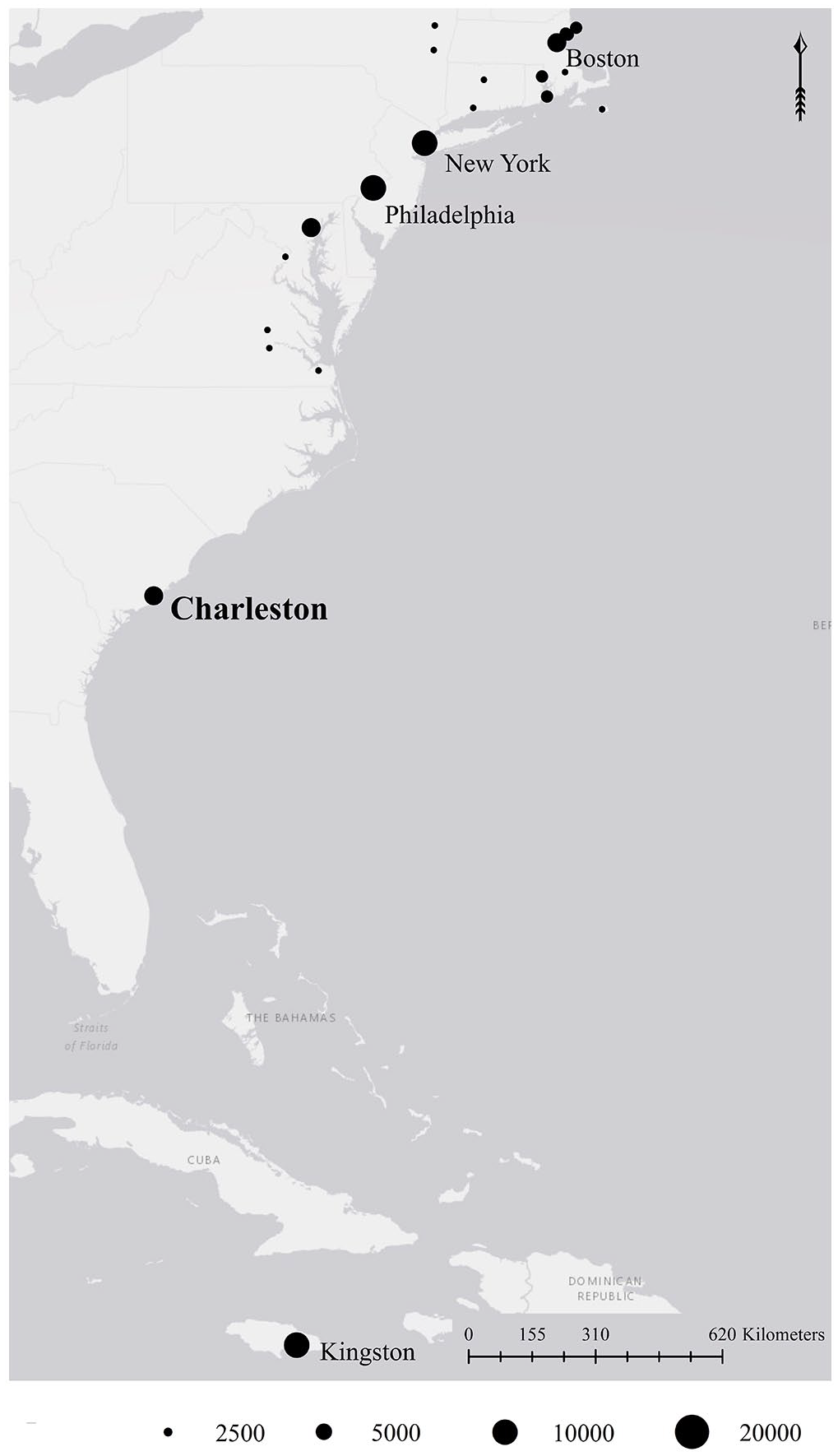
North American and Caribbean settlements by population size, 1790.
It was these circumstances that facilitated Charleston’s slave economy which quickly proved to be more lucrative during the eighteenth century than any agricultural product. By 1770, Carolina’s Governor, William Bull, reported imports of 3000 to 4000 slaves in the city per annum. 6 Within Charleston’s hinterland, slavery was the key factor in the production-to-export chain that kept production costs low and facilitated the creation of the planter class who became wealthy and influential in Charleston through economic, political, and social action. 7 However, slavery impacted the urban environment just as much as the hinterland. By the start of the American Revolution, Charleston had more slaves (c.6000) than Philadelphia, New York, and Boston combined. 8 When Charleston authorities participated in the first decennial census of 1790, the urban slave population had grown to 7,684 in comparison to a white population of 8,089. 9
The impact of urban slavery was part of the planned space of the city with slave quarters often located above detached kitchen blocks within urban housing plots; this feature of the built environment can still be seen within several surviving housing plots such as the Heyward-Washington House, Charleston Museum. 10 As a residential feature the plot design codified domestic space, establishing systems of control by slave owners that were reinforced within the public sphere through places of public racial inequality, such as the location of slave auctions outside of the Exchange Building, or via strict behavioral rules in the City’s Ordinances. However, this physical separation between the house and slave accommodation has resulted in over-emphasis of enslavement within place. I argue that the larger spatial unit of the housing plot, and urban block, should be central in our understanding of Charleston’s eighteenth century demographics. Architectural observations from the street reinforce the hidden nature of urban enslavement, but this is a static observation. At different times of the day and the week, slaves would move throughout the housing plot, the block, and even the city itself. What we need are more meaningful methods for reflecting this mixed-occupancy of the plot, and the production of documents that facilitated spatial understanding in the eighteenth century can help achieve this aim.
Spatial Analysis of the Eighteenth Century City
The use of spatial understanding by civil society endured from Enlightenment principles of knowledge sought by eighteenth century urban residents. Awareness, understanding, and value of spatial concepts such as location or distance increased with urbanization after 1740. In part, this increase coincided with increased population densities present in cities that required greater geographic knowledge to navigate. However, polite society was also engaging in the growing production of topographical literature that included travel writing, local guides, and histories. 11 Authors also included cartographic representations within such texts, which became important products in their own right. Such spatially rich literature, when combined with trade directories, street signage, and improvement commissions, is indicative of a growing awareness that the ability to locate humans and functions was a necessary part of rapidly developing urban centers.
The production of spatial knowledge in Charleston compares favorably with other eighteenth-century British Atlantic cities. In the early years of Carolina’s founding, the production of immigration figures and house and lot provisions were communicated to the Lords Proprietors with regularity, and by the mid-eighteenth century, travel journals increasingly included demographics and settlement size, although they were not necessarily published at this date. 12 The colony, and Charleston specifically, were visualized cartographically throughout the eighteenth century with the earliest detailed example of the city dating to 1711. 13 The first city directory, the Tobler Almanac, was published in 1782 and updated in 1785, and a new Charleston Directory was produced in 1790 that included a fold-out city map as a reference guide. 14 Finally, from 1790 Charleston authorities participated in the first federal decennial census, which established detailed information on the population size and the number of households.
Given the growing strength of spatial concepts and the survival of quantifiable data for the eighteenth century, it seems short-sighted, therefore, that early modern urban historians have been slower in their uptake of GIS and spatial analysis as a primary research component. In part, this difficulty is owing to the false perception that source material can only contribute at the parish or whole city scale. The scarcity of spatially accurate source material alongside inconsistencies that exist with postal addresses has been off-putting. On the whole, spatial analysis of early modern urban case studies requires greater adaptability in combining several historic sources, but new scholarship is demonstrating the possibilities of combining labor-intensive methods with a “self-consciously subjective” and sympathetic understanding of eighteenth century urban space using original sources. 15 The infographics presented in this paper are aligned with these principles, utilizing a mix of historic cartography and quantifiable data alongside subjective spatial analysis, and in light of questions regarding how the original 2018 dot-density infographic was created, it is worth presenting the dataset and methodology in detail.
The Dataset
The infographics were constructed from a dataset that combined and analyzed information from three sources: the Ichnography of Charleston, South Carolina by Edmund Petrie, 1788; Charleston’s trade directory from 1790; and the United States Census for South Carolina, 1790. 16 Individually these sources are not without problems. Petrie’s map was initially commissioned by the Phoenix Fire Company, based in London, for their use. It maps public buildings and wharves, ninety-nine private and commercial dwellings, public wells, and the fire-house. 17 Given its specialized use we have no idea whether it represents an accurate reflection of all property on the peninsula or just those insured by the Phoenix Fire Company. It certainly does not assist researchers with property boundaries or street numbering that are problematic in historic Charleston before centralized property numbering was in place. 18 Similarly, the 1790 trade directory does not represent all people (or even businesses) in Charleston, and the 1790 census data does not include addresses.
While the sources have a number of centralized issues around locational accuracy and exact representation of Charleston’s population, we can be reasonably confident that the dataset reproduced eighty-six percent of the city’s households in 1790. As a direct comparison, the 1790 trade directory contained the names, occupations, and street addresses of 1,620 city residents and businesses across one hundred and five locations, and the 1790 census listed 1,873 households. 19 Furthermore, we can be confident in the breadth of information supplied within the trade directory. It contained a wide-range of professions, with the majority of streets represented, and also included some residential addresses meaning that both men and women (typically widows) were represented. In fact, if we compare the representation of women within the two documents—a group underrepresented generally for the period—the shortfall is only four percent, which offers further assurance that the trade directory can produce valuable insights on the spatial distribution and activity of Charlestonians in 1790, albeit a white majority.
By combining the 1790 trade directory and census information, and locating this data onto Petrie’s map, the resulting dataset populated the urban space in ways that each individual source could not. Crucially, the dataset provided insight into the distribution of Charleston’s enslaved population in relation to slave owners, revealing comparative distributions of residency that were rooted in racial and economic inequalities. Although the use of enslaved labor in association with urban business is well known for the period, the trade directory did not indicate in which businesses this was taking place—an understandable short-fall given the production-aim was simply to advertise. Consequently, the dataset provides insight into the use of enslaved labor across the Charleston peninsula. Aiming for better visualizations of this demographic group is especially important when we consider that they represented forty-seven percent of the total population of the city. On the one hand, such high figures indicate that enslaved peoples were everywhere on the Charleston peninsula—this observation is both accurate and straightforward—but the visual shock that the infographics produce signals the need for non-numerical stimuli in understanding the scale of Charleston’s involvement in the slave trade.
Methodology
The original aim for the production of the dataset was to better understand residency in Charleston as a distribution of people across the peninsula, to move beyond the limitations of architectural history. Residential space impacted a larger proportion of urban residents than any other type of space during the eighteenth century. Everyone, regardless of social status, economic standing, gender, age, or ethnic background “lived” somewhere, although choices in relation to residency were a factor of privilege. In contrast to architectural histories that have focused on buildings as art forms, the ability to establish broad patterns of residential use in GIS provides insight into the people who inhabited the buildings. It is only through an understanding of people in space that we can observe socially and racially motivated segregation and/or inter-mixing, and more generally link variable densities to mixed-use functional space in the eighteenth century city.
My PhD analysis considered the full spectrum of residential distribution patterns in Charleston in line with a chronology of 1740 to 1840. However, the 1790 infographics are presented separately, in this instance, because of the unique methodological problems that the dataset presented. One of the major difficulties for GIS researchers using eighteenth-century cartography is the lack of mathematical precision in comparison to later mapping. These two-dimensional images must be geo-referenced to assign a coordinate system and it is customary for images to become skewed during this process. 20 Researchers have to accept a level of inaccuracy, but in this regard, historians may be at an advantage. They can focus less on the precision of the end-product, which would be favored in the earth sciences, and more on how the source can be used to identify human experience. 21 Furthermore, eighteenth-century historians benefit from cartographic material free of copyright licensing issues.
The Ichnography of Charleston was geo-rectified by utilizing the city’s historic buildings, such as the Exchange at the east-end of Broad Street and St Philip’s Church (Church Street), which provided geographic links between historic reference-points across the peninsula with the modern Cartesian co-ordinate system used in GIS. It was important to use this map specifically because it was contained within Charleston’s 1790 trade directory and we can surmise that its inclusion was intended to provide visual reference for readers. A simplified version of the block distribution and major streets discussed in this paper is reproduced in Figure 2.
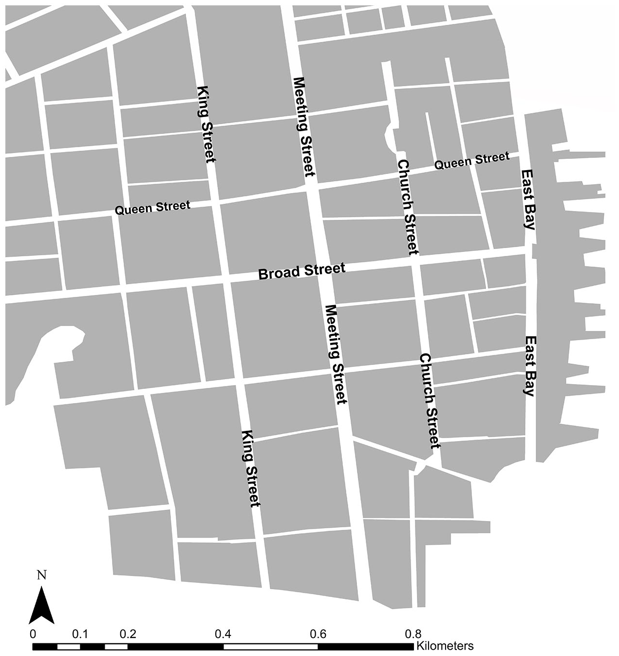
Charleston’s simplified block distribution, 1790.
Similarly to the original, the geo-referenced map provided the visual framework to map the combined trade directory/census dataset, but street numbering presented a significant methodological challenge. Understanding how the challenge of street numbering was overcome underscores the method employed, and the confidence in the results it produced.
Although street numbering was used in the trade directory, the usability of the document was done so from the perspective of contemporary users in 1790s Charleston. In the same way that our own urban landscapes are continually changing to reflect business changes and property development, so too was the late-eighteenth century city, resulting in continual replacement of information. Without access to the specific knowledge relating to eighteenth century urban street numbering systems within any given location, there is always a degree of subjectivity when mapping early modern towns and cities in GIS. Factors for consideration might include whether odd and even numbers should be placed adjacently (on either side of the street) or sequentially, or even which end of the street numbering should start from. Furthermore, researchers are challenged by records that only contain a street-name or where street names have changed, which was particularly problematic with the renaming of Charleston’s wharves to reflect new owners.
GIS-researchers of early modern space are advantaged by using historic maps with lower built-environment densities than more modern examples. Simply put, eighteenth-century maps reflect cities that were still in a state of growth and this feature can assist mapping decisions. Broad Street, running east to west across the Charleston peninsula, provides a case in point. Subjective decisions regarding relative density and sparsity of the population were observable because the street was still subject to considerable development at the west end. The clear migration of properties, represented visually on the map by higher densities at the east end and sparser densities at the west end, was used to determine that street numbering started from the east and traveled west, and that greater address density would be focused at the east end of the street. This conclusion was supported by source evidence that demonstrated that as late as 1836 “improvements” were still required in this part of the city. Robert Hayne’s planned works as City Intendant included “filling up the Marsh Land at the head of Broad Street, at the west end of the City.” 22 Mapping addresses evenly along the street would have been inappropriate in this case and similar decision-making processes were made for Charleston’s other streets.
The employment of map regression techniques to reconstruct Charleston’s 1790 population was also used with some success. Map regression involves consideration of the characteristics and numbering of chronologically-later maps that are then applied to earlier periods. The method has been particularly successful in European cities where the longevity of building footprints and the bounded nature of streets, for example within a city wall, allows for greater utilization of the method. 23 Within this study, Charleston’s 1840 cartography and address data were georeferenced and mapped to provide greater resolution, and as a means of cross-referencing specific buildings, such as corner properties across a time-series.
Of final note, in reference to locating street addresses, was the use of known historic locations (e.g. churches) and geographic descriptions found within trade directories. Additional descriptions, such as “behind the exchange” or “on the corner of . . .” alongside the details of some addresses were invaluable for signaling the imbalanced density distribution along the length of each street. These known reference-points signal a specific location on the map to stop mapping up to and likewise where to restart.
To enable further clarification, the street numbering methodology included a confidence rating within the geodatabase: certain; probable; possible. That means that the placement of every data point across the peninsula was critically assessed with reference to accuracy. In the vast majority of cases (89%) a confidence rating of “probable” was assigned, which reveals the challenges of mapping eighteenth-century data. However, it does represent best-practice in honest data visualization and will facilitate future updates to the dataset if further information becomes available.
The 1790 trade directory was mapped using the above street numbering principles and then used as a base-line to apply the 1790 census data that did not record addresses. Instead, the 1,873 households recorded in this dataset contained the named head of household; number of men, women, and children (within tiered age brackets); and slaves. By cross-referencing the named head of household in the census with names advertising in the trade directory the dataset populated the GIS map with a true reflection of how many people—free and enslaved—lived within each Charleston property in 1790. As with the street-numbering methodology, there was some conjecture within this process, which it is worth reflecting on. Name repetition, for example, had potential to derail the process, but the difference in occupations listed within the trade directory was helpful in determining the likely match for the demographics listed within each census record. The census data for two heads of household both named William Jones provides a useful example of this process—one record indicated occupancy by a single white male and the other revealed greater complexity with one single white male, seven additional white occupants, and three slaves. With trade directory data indicating one William Jones as a clerk operating from Jervey’s Wharf and the other William Jones in trade as a cabinet maker on Broad Street, I determined that the cabinet maker was the more likely candidate for a larger household that included slave-labor.
The final stage in the methodology was to recalibrate the dataset from point data (arranged along the line of a street) to block-distributions as a better indication of people in space. In part, this decision was a purposeful counter-point to the emphasis in architectural histories that focus on the street-frontage. While the street-frontage, as a measurement, can be useful in determining factors such as business distributions, it is relatively poor at understanding the levels of activity within the building plot and/or relationships between plots. This stage was the most subjective part of the analysis as it relied on the accuracy of the original point data as mapped using the street numbering methodology. Wherever possible, the distribution was kept the same as the point data—so, for example, the point data on the north of the street was equally applied to the north-block. Where this approach could not be achieved, block distributions were calculated via a simple process of dividing each section of the street in half and assigning equal distribution to the north and south blocks. On the whole, these instances were rare. Best-practice in honest data-visualization through methods such as confidence ratings were applied and the compromise does present the easiest solution to a problem that would otherwise have made the analysis unviable.
Data Visualizations: The Production of Residential Infographics
The combined trade directory and census information established a new residential dataset for use in understanding the distribution of Charleston’s free and enslaved population in 1790. Utilization of GIS symbology, that visualizes data in different formats, was applied to the numerical data to aid comparison between these two groups. Three different visualization techniques have been selected using the single 1790s residential dataset and methodology explained above. Interestingly, while the dataset remains the same, choice of cartographic design can have huge implications on visual emphasis to the observer and highlights the responsibility of GIS-researchers to think carefully about the way data is used and displayed.
Quantities: Dot Density
The dot density infographic (Figure 3) shows the distribution of Charleston’s free population (blue) versus the enslaved population (orange). GIS assigns a randomized distribution to the dots, but these are set within each relevant street block. The aim of the infographic was to show the least abstracted version of the data. Each dot represents one person, so to the observer, the scale of dots displayed across the peninsula is visually impactful. In comparison to numeric census-data, being confronted with the distribution of people across the peninsula can elicit an emotional response when confronted with the implications of the free-to-enslaved population ratios. In a city still grappling with racial inequality, the infographic reinforces the message that enslavement was a significant part of Charleston’s history. 24
The random distribution of dots equalizes free and enslaved people within each block, demonstrating that slavery was present within every part of Charleston’s urban space. Highlighting the universal presence of slavery across the entire peninsula is useful because the history of Charleston’s enslaved population has frequently characterized the segregation of slaves within place—for example, within the back-lots of houses. 25 Such observations have been useful in recognizing the specific places of oppression and agency for Charleston’s enslaved population. 26 However, the infographic makes clear that enslaved people were more spatially present in Charleston than in a plantation landscape, for example, where slave lodgings could be confined to specific areas that were hidden from view. Numeric statistics do little justice in comparison to the impressionistic pattern, which helps to demonstrate that, during the day at least, the whole city acted as the work-space of the enslaved—slaves legitimately traversed urban space to conduct jobs. Furthermore, as slaves were considered private property, the establishment of a large slave-owning population within the confines of the settlement meant that Charleston’s Corporation (many of whom were slavers themselves) had limited say on the spatial distribution of slavery in the city. While slaves-as-property could not be regulated, the behavior and social aspects of slaves could be. City ordinances introduced strict control-measures, for example the Corporation required slave-owners to license those slaves that they wished to work or hire as laborers in the City, which reinforced the Corporation’s political and economic dominance. 27 This is reflective of an urban authority that was conscious of repressing the enslaved and free-black population because they feared uprisings. 28
That being said, there are also limitations in such impressionistic patterns. Particularly problematic is the dot-distribution along the wharves where the observer is left to question whether people were living along the length of the jetty, or blocks on the west peninsula that appear populated despite low building densities observable on the underlying map. In both instances, the answer relates to the location of people, in the dataset, in sparsely populated parts of the city. In other words the data is mapping fewer people within a larger space, creating greater dispersal than there was in reality. In addition, while it is possible to make some generalized observations about population densities—for example, denser distributions in the blocks west of and parallel to East Bay and at the cross roads of Broad and Meeting Streets—the pattern, alone, provides insufficient questioning of the data for academic analysis. It is not possible to adequately compare the free and enslaved populations to each other so other cartographic designs are required.
Quantities: Graduated Colors
Using the same data of actual numbers of enslaved people, Figure 4 presents the distribution of the enslaved population through a GIS-assigned graduated color scheme organized into five color-ramps. Unlike a dot density distribution, the assignment of the ramps is determined by the mapper, resulting in greater potential for emotional manipulation in the production of the infographic. A lower number of color-ramps produces much starker contrast between each block, but places too great an emphasis on the most densely populated blocks, whereas a higher number of color-ramps dilutes the visual impact of the data. Ultimately, both approaches would become meaningless because the observer would be unable to derive meaning from the image. However, when approached with care the greater sense of proportionality offered in the color-ramp image corrects the impressionistic observations shown in Figure 3.
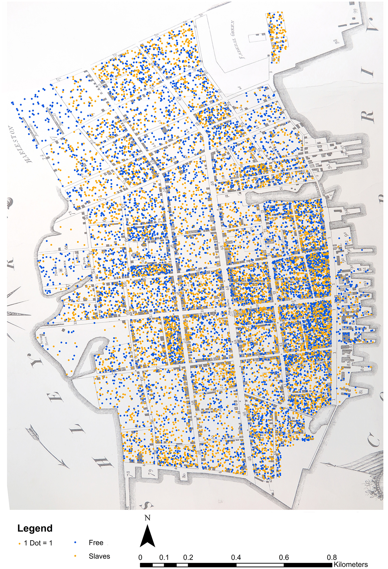
Dot density distribution of the free and enslaved population of Charleston, 1790.
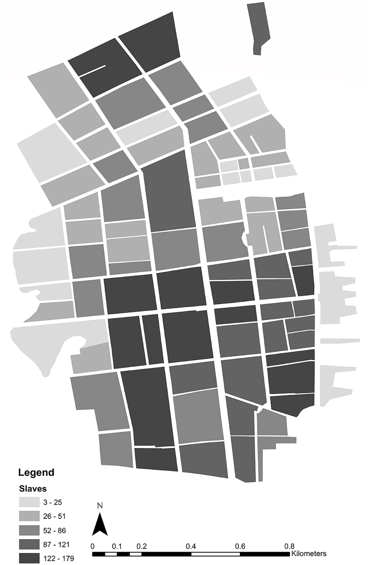
Color-ramp distribution of the enslaved population of Charleston, 1790.
By placing emphasis on raw numbers the viewer is stimulated to reflect on the areas of Charleston that had higher numbers of enslaved peoples. The benefit of visualizing the enslaved population is similar to observations discussed above for Figure 3, but it is also easier to interpret the likely patterns of residential density in this form. Unlike numeric-only census-data, the infographic confirms my assertions that the enslaved population was present across the whole of the Charleston peninsula, but there were areas of denser population that correspond with the area of the original walled city (between Meeting Street and East Bay) and areas of denser populations on the west peninsula, particularly along Broad Street, Tradd Street, and King Street. The dataset also accurately visualizes the distribution of enslaved peoples on the wharves and blocks on the west peninsula, thus overcoming the limitations of the dot-density map.
When combined with information from Charleston’s 1790 trade directory, the distribution in this infographic is helpful in signaling areas of greater residential and/or industrial activity in relation to the enslaved population. It forces the observer to ask questions of the data. For example, why were the two most northern blocks either side of Meeting Street so densely populated by slaves when much of the peninsula north of Queen Street had lower population figures? Consultation of the trade directory confirms the presence of several slavers within these blocks (“Planters” in the directory), which were located on the urban periphery in large houses and with upward of twenty slaves each. But the infographic requires the viewer to be critical of the data in ways that are not always obvious. The inability to compare the data to visualizations of the free population fails to inform about the proportion of slave owners to those enslaved, which may result in false assumptions. Comparison of the densely populated areas of slaves in lower King Street and lower Church Street, which present similar numbers of enslaved peoples, serves as an example of this problem. When considered in conjunction with the distribution of the free population, the blocks on lower King Street denoted a residential area with lower free population figures. Therefore, there were fewer slave owners (typically widows), each of whom owned higher numbers of slaves. By comparison, the blocks on lower Church Street denoted an area that was semi-industrialized because of its proximity to the port and an area with higher transient populations. These characteristics produced almost equal free-to-enslaved population densities as there were higher numbers of slave owners owning fewer slaves each. In other words, the major hurdle with this style of visualization is the additional factors that observers need to be aware of in order to critically assess the image. Without such contextual understanding of Charleston’s urban space it would be easy to surmise that lower King Street and lower Church Street were occupied by similar social groups when, in fact, it was quite the opposite. This problem is made worse without directly comparable data, which brings us on to the final cartographic design.
Charts: Bar
The bar-graphs in Figure 5 show Charleston’s free (blue) and enslaved (orange) populations as ratios within each street block. The quantifiable nature of the image does not lend itself to an emotive response and, as a result, is in keeping with the principles of eighteenth-century knowledge production that sought spatial accuracy. More importantly, it offers the richest infographic for comparative analysis, whilst maintaining an overall sense of density patterns, such as the relative sparsity of the population north of Queen Street or along the west peninsula where land reclamation was ongoing. The dataset provides opportunities to grapple with the arrangement of different social groups in the city—lower numbers of enslaved peoples north of Queen Street corresponded to working-class areas with transient groups, such as sailors. However when combined with detailed examination of the trade directory data, characterization of the Charleston slaver as wealthy is debunked. On any individual street in Charleston, the trade directory demonstrates that the social scale of the residents along its stretch were hugely diverse, indicating significant complexity in social and racial arrangements of space. It would be misleading to characterize urban slavery as domestic, in Charleston, given the large numbers of slaves involved in industrial activities, such as coopering. In consequence, the relative distribution of the free and enslaved populations underscore a key conclusion—during the late eighteenth century, segregation was neither possible, nor desirable.
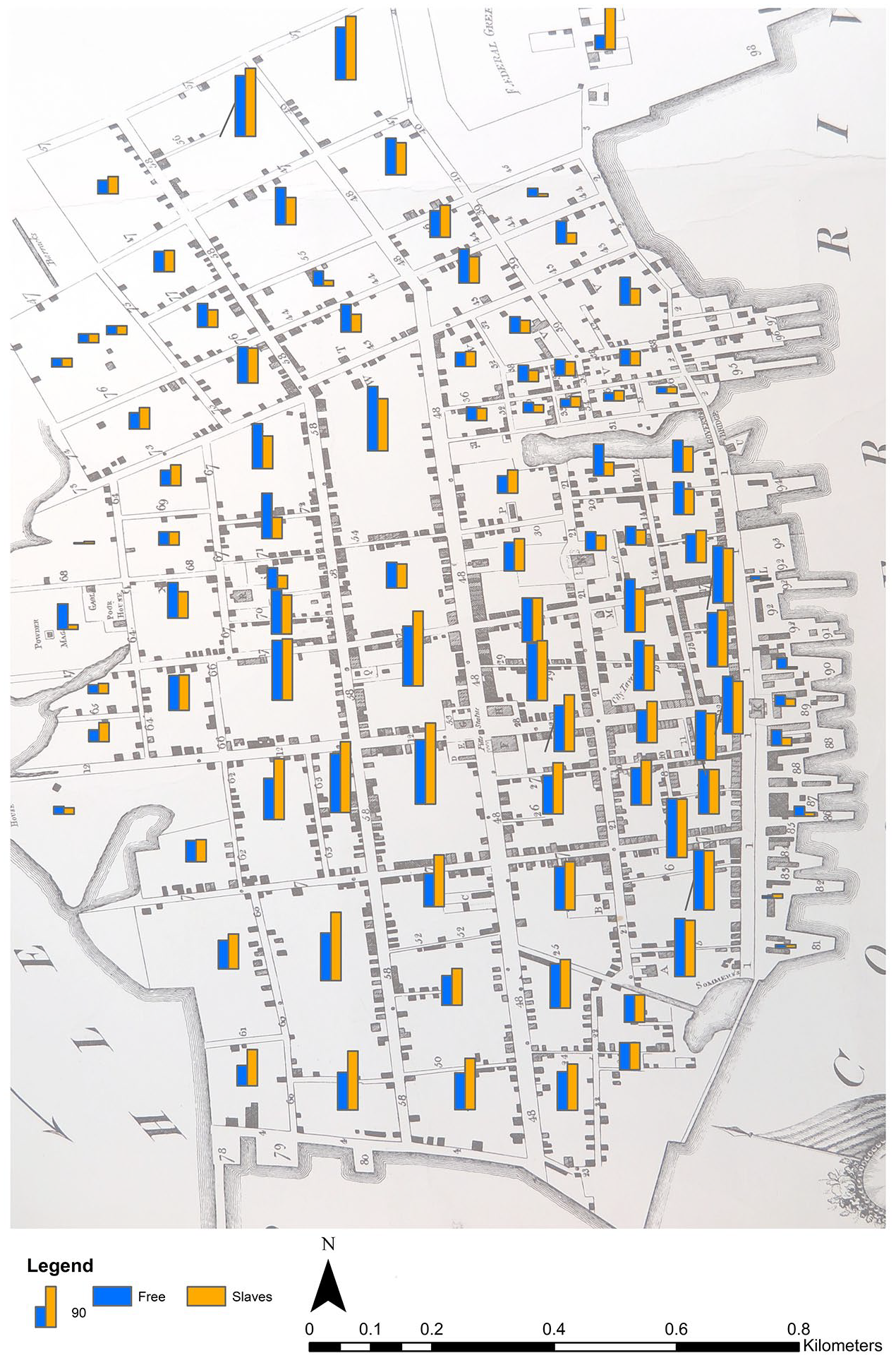
Free and enslaved population of Charleston, 1790, as a bar-graph ratio.
Of greater importance, therefore, is what the image reveals about the gravity of urban enslavement and the implications that has on the institutionalized control of slaves by slave owners and Charleston’s Corporation. Approximately two-thirds of the blocks contained equal or greater numbers of enslaved peoples relative to slave owners. Such observations are consistent with the near equal balance of population figures revealed within purely numerical figures of the 1790 population. However, the balanced distribution of the free and enslaved populations across all urban space goes some way to demonstrate the psychology of oppression that must have been present in 1790s Charleston. While the numeric figures often stimulate questions over why the enslaved population did not revolt more frequently, the infographic shows very few areas where the enslaved population so vastly outnumbered the ratios of slave owners to make uprisings possible. When considered alongside the City’s Ordinances, the residential control of slaves within each household, and coupled with top-down management of public space, mass communication—required for revolt—was extremely difficult.
Conclusion
Humanities scholars have been quick to criticize an over-emphasis on the use of GIS for the production of visualizations, rather than constructing projects around specific research questions. To that end, the visualizations produced within this paper link to specific aims within a broader research framework that seeks to understand residency as a distribution of people across space rather than through analysis of architectural housing styles. The reality however, is that the scarcity of early modern spatial data requires a larger degree of experimentation on the part of GIS specialists. As spatial analysis forms an integral part of the interpretative process, researchers cannot always be certain about the interesting directions that new datasets will take them. In short, there is a compromise between use of a tool that provides spatial understanding and the production of significant visualizations that enhance research.
There is no denying the significance of what is being portrayed, and that is why these infographics are impactful. Each image provides a degree of shock to the observer that simple numerical presentations lack; the scale of Charleston’s involvement in the slave trade in 1790 is unmistakable. However, researchers also need to be aware of the implications their decisions in cartographic design can have while audiences need to be critical of visual manipulation. GIS specialists make conscious choices over what data features to emphasize, for example the choice in this paper to use orange to denote the enslaved population and blue to denote the free population. In this instance, the color choice is reflective of visual inclusion—to engage with those who are color-blind to the red and green spectrum. Furthermore, the selection of complementary colors offers useful high contrast when comparing two features within the same dataset. However, while the data remains the same, a variable as simple as attribution of one color to a given feature can over-emphasize that feature over others. Historians are wary of visual material for this very reason. Attributing the color orange to the enslaved population was a conscious choice on my part, employing the visual attraction of a bright color to reinforce viewer attention, as my aim was to communicate the distribution and high numbers of enslaved individuals in 1790s Charleston. I would argue that this enhances research with self-reflective imagery to enrich our visual understanding of spatial analysis, but it is also a self-conscious choice to impress the importance of Charleston’s enslaved population on my readers. Had I chosen to represent the free population in orange and the enslaved population in blue, the visual emphasis would be different.
While the visual significance of the infographics is important, greater strength rests in the learning opportunities and questions they raise. The method to produce the dataset was applied, not as a way of producing a highly accurate visualization, but as part of a self-consciously subjective analysis of where people lived in the past. The data can be questioned on its own, revealing interesting observations between the distribution of denser free-populated areas and sparser enslaved populations—these instances reinforce distributions of lower slave-owning classes within some blocks on the east peninsula, such as lower-earning tradesmen and transient populations living within multiple-residency dwellings. Or, the data can be questioned alongside other functional distributions, such as commercial ventures, to consider the relative successes and failures of which population density may have played a factor. In reality, the power of the dataset may be in providing a baseline for which other data can be interrogated. The same method could be used to understand census data distributions such as gender or age, or used for later trade directories. 29 In fact, superior source quality would streamline the methodology producing greater precision, and we can hypothesize that the spatial distribution would reveal greater dispersal to the north, particularly of free blacks. These visualizations can be very impactful, but are more significant for their ability to prompt new research questions, and integrate further information for greater contextualized understandings.
Of final note, is what the dataset reveals about the production of early modern GIS projects. There is little doubt that the production of infographics, such as those presented in this paper, require technical expertise and lengthy methodologies. While these factors may be off-putting they are not insurmountable. There is growing early modern scholarship that is demonstrating the possibilities of this research and a community of GIS specialists willing to help. The limitations of source material will continue to prove challenging, but it is possible to combine quantifiable data, text-descriptions, and subjective spatial analysis to produce honest self-reflective visualizations of the early modern city that are highly impactful for research and teaching.
Footnotes
Declaration of Conflicting Interests
The author(s) declared no potential conflicts of interest with respect to the research, authorship, and/or publication of this article.
Funding
The author(s) received no financial support for the research, authorship, and/or publication of this article.