
Abstract
When comparing social science phenomena through a time perspective, absolute and relative difference (RD) are the two typical presentation formats used to communicate interpretations to the audience, while time distance (TD) is the least frequently used of such formats. This article argues that the chosen presentation format is extremely important because the various formats suggest different substantive interpretations. To elaborate upon this issue, researchers from the National Statistical Office, National Health Institute, and general academia were invited to participate in an experiment with alternative presentation formats that describe changes in certain social science phenomena over time. The results revealed a prevailing tendency of respondents to rely on interpretations related to absolute differences, which was additionally reinforced with graphical presentation formats. Therefore, whenever RD or TD is more proper for substantive interpretations, the corresponding presentation format must be designed with special attention.
Keywords
The observation of change within a certain social phenomenon over time is something we frequently encounter in scientific research as well as business, politics, media, and daily life. A typical example of such change is the annual change in the Internet penetration between two countries or two social groups wherein we explore whether or not the digital gap is closing. Other examples span broadly, including comparisons of trends in political party ratings, shifts in public attitudes, differences in gross domestic product growth, trends in well-being measures, comparisons of market share dynamics, and changes in poverty indices across subgroups, among others. However, these comparisons are accompanied by an antagonism regarding the related presentation format. Namely, the presentation of these comparisons in time can focus on absolute difference (AD), relative difference (RD), or time distance (TD). In addition, it can either expose solely one format or combine two or more formats and can be accompanied by tables or graphs. These variations in presentation formats may have different effects on users’ perceptions, which are however all based on the same statistical reality. One cannot ignore that the variations in perceptions also provide room for potential manipulation, and thus, the important question arises as to which of the three is the “right” format.
Decades ago, Tversky and Kahneman (1981:453) warned that presenting the results of comparisons over time in various ways is possible, and these comparisons affect human perceptions differently. However, limited research addresses this problem, of which the existing studies predominantly deal with specific aspects of only one measure or only through case studies (e.g., Citrome 2010; Dolničar 2007, 2008a, 2008b; James 2010, 2011; Sicherl 1973, 2005, 2011, 2012; Svedberg 2004). We encounter an actual experimental study that addresses this issue even more rarely, and consequently, we lack guidance concerning which format should be used in certain situations as well knowledge of certain formats’ effects on perceptions and interpretations. Without this guidance and awareness, research decisions are left somewhat floundering. These decisions strongly depend upon the education, experience, methodological knowledge, and professional ethics of the presenter (e.g., researcher, journalist, editor, reporter, analyst, executive, and politician). The presenter may also be potentially influenced by prejudices, interests, lobbying, and other external motives. These decisions are particularly critical in social science research, wherein substantive researchers often find themselves in a methodologist position (Gelman and Basbøll 2014). This challenge’s roots lie in the human cognition process and in the extent to which one’s sense for understanding numbers is inherited. An important component of the way humans perceive empirical reality is related to the principles they learn through education and other experiences. Both component types—inherent and learned—have a specific impact on our perception of changes over time.
In this article, we first elaborate upon the conceptual background in both the field of neuropsychology and research on numerosity (i.e., cognitive perception of quantities). We then introduce the three basic formats related to the comparison of changes over time: AD, RD (i.e., ratio), and TD. Third, we present an experimental study regarding the perceptions of various formats. The study was conducted with employees of the National Statistical Office, the National Health Institute, and university researchers. Through experimental manipulation, we study how the three formats’ usage (variations and combinations) affects the users’ perceptions, which refers to the judgments regarding the corresponding trend—that is, whether the differences over time are increasing or decreasing. Finally, we conclude the article with a summary of the results and their implications.
Conceptual Background on Human Perception and Numerosity
One of the basic issues concerning the human perception of empirical reality is whether or not there exist inherent predispositions that determine our understanding. Some answers may be found in neuropsychology that presents the number concept (Brainerd 1979)—a phenomenon related to the ability to understand, evaluate, estimate, and manipulate numeric quantities. Dehaene (2011:50) discusses a specific area of the human brain that controls the abilities related to the identification of numbers and quantities—a part that spontaneously develops during the maturation of cerebral neuron networks. This biological process is dominated by a genetic predisposition yet also influenced by the external environment to some extent. Dehaene (2001) claims that the basics of arithmetic stem from the ability to mentally process quantities on a mental number line that has a long evolution history in the development of human neural cells.
Within this context, various studies (Dehaene 2011; Dehaene and Cohen 1994; Lakoff and Nunez 2000) have demonstrated that individuals can easily perceive and distinguish quantities until the number 3, while number 4 is a turning point in perception. Differences can be also detected more easily when the AD is large compared to the base level; for instance, the difference between the numbers 3 and 4 thus seems much larger than is the difference between 103 and 104. Similarly, a 2-percentage-points difference between 100 and 98 seems smaller compared to that between 63 and 61 (Kahneman 2011).
Children are particularly suitable for studies on the inherent human perception of quantities. Given that humans are inherently excellent linguists in that, for instance, a child of four years of age can handle numerous language rules without any formal awareness, the question arises as to whether or not humans are also inherently adept in statistics. Within this context, Kahneman (2011) separates two systems of thinking:
System 1 is the automatic, reflexive, unconscious system of perception, which is related, for example, to the judgment that a certain object is closer than another or that a certain number is different from another. This system also perceives various simple relations and can link information about the same object, although it cannot process more than one problem at a time and cannot formally deal with mathematical information. In our article, we also associate this system with intuition, which is an unconscious cognitive activity whose results become conscious at some point (Rosenblatt and Thickstun 2017). Of course, the notion of intuition—in addition to system 1—also possesses some other aspects and components that are not discussed here.
System 2 encompasses mental operations that require cognitive attention and focus. Correspondingly, these operations stop when the attention span is interrupted. This system enables humans to follow instructions and rules, compare attributes between objects, and make conscious choices between alternatives, which includes the ability to perform mathematical calculations.
Both systems are active while a person is awake; system 1 runs automatically, while system 2 maintains an alert status, ready to be activated for cognitive processing. System 1 has no inherent element of formal logical or statistical thinking, and thus it can be easily tricked. Many popular examples illustrate this fact (Dehaene 2011), such as the Muller–Lyer illusion, wherein two parallel lines of equal length seem different simply because the arrows at their ends are differently oriented (i.e.,  and
and  ). Another classic illustration is the urn problem, in which subjects are offered an incentive to draw a black ball in a situation wherein they can freely select to either draw from either the urn with nine black balls and 100 white balls or draw from the urn with one black ball and nine white balls; in this situation, a substantial proportion of subjects choose to draw from the urn with a larger absolute number of black balls despite the lower chance of success (9 percent vs. 10 percent). Intuitive judgment is thus often wrong, and system 2 must be activated in order for one to reach the appropriate conclusion. System 2 has the role of overcoming the natural perceptions suggested by intuitive thinking and impulsive judgment.
To translate these facts to our problem, we follow the integrative theory of numerical development (Siegler and Lortie-Forgues 2014, 2017), which states that the numerical development from infancy to adulthood involves the following four major acquisitions that develop sequentially: (a) increasingly, precisely represent magnitudes of nonsymbolic numbers, (b) link nonsymbolic to symbolic numerical representations, (c) extend one’s understanding to increasingly large whole numbers, and (d) extend one’s understanding to all rational numbers. The process of division—in our case, the calculation and interpretation of the ratios and RD s—thus applies to our abilities that are comprehended later in life and may also be perceived as requiring a higher cognitive burden. There exists a consensus in psychological science that division is a much more complex and less intuitive operation than is subtraction (Levstek, Bregant, and Podlesek 2013; Lortie-Forgues, Tian, and Siegler 2015). More specifically, learning fractions and decimal arithmetic requires the understanding of additional and differentiating properties of numbers (Siegler and Lortie-Forgues 2014); for this reason, even elementary schools typically introduce multiplication and division a few years after introducing addition and subtraction. In our study, we have followed a specific implication of the above assertions that involves a direct relationship between the level of cognitive effort and the corresponding amount of time a certain task requires (Kreuter 2013; Matjašič et al. 2018; Tourangeau, Rips and Rasinski 2000; Yan and Tourangeau 2008).
While neuropsychology extensively deals with the impact that inherent neurological and psychological features have on the perception of numbers (Dehaene 2011; Lakoff and Nunez 2000), such studies are lacking in the social sciences. At most, the existing research indicates that education has a strong impact on the human development of numerical abilities (Brainerd 1979; Göbel et al. 2011; Nunez 2011; Reyna and Brainerd 2007). Similarly, Lakoff and Nunez (2000) demonstrate that mathematical thinking (i.e., system 2) is strongly influenced by one’s environment and related social interactions. However, they also claim that the essential cognitive mechanisms related to the perception of numbers, space, and distance are inherited and developed in early childhood. Correspondingly, they deem these operations to be relatively independent—to a certain extent—of one’s education, social environment, language, and culture (Lakoff and Nunez 2000).
The issues discussed above relate to general context, whereas in this article, we focus on comparisons of the cognitive processes that are related to the change in social phenomena over time. We further narrow the discussion to the three basic formats for presenting this change (AD, RD, and TD). In the next section, we introduce the three formats and present an overview of the research related to their usage.
Absolute Difference, Relative Difference and Time Distance
In this section, the three basic formats are introduced; an extended discussion on these formats can be located in Dolničar, Prevodnik and Vehovar (2014), Vehovar et al. (2006), Prevodnik, Dolničar and Vehovar (2014), James (2009), and Sicherl (2007).
We should firstly address that, in our elaborations, we assume the variables are on ratio scales, where values can be compared using relative numbers (e.g., ratio, growth rate, indices). Formally, the other (lower) scale types—nominal, ordinal, and interval scales (Creswell 2009)—do not suffice for our calculations. However, it is true that, for practical purposes, we often assume that interval scales (e.g., calendar, temperature, psychological measurement) and ordinal scales (e.g., attitudes on a five-point rating scale) have ratio properties. Nevertheless, we deal exclusively with target variables on a ratio scale (i.e., percentages) in this article. In the remainder of this section, we will thus present the three basic formats as specific statistical measures and assume the variables are on ratio scales.
According to James (2009), the AD at time “t” (e.g., certain year) can be defined as the difference between the values of indicator “X” (e.g., Internet penetration) for two units (e.g., countries): unit 1 (u1, with value X 1) and unit 2 (u2, with value X 2):

The RD is the ratio between the values of two units at the same selected point in time (James 2009):

We must acknowledge here that there are several ways to calculate the relative position of one unit in comparison to another unit in time. Nevertheless, we follow Sicherl (2010), Dolničar (2007, 2010), and James (2009, 2011), all of whom always compare the leading unit (u1) to the lagging unit (u2).
Various derivatives of RD exist, such as indices and growth rates, yet they bring nothing new to this conceptual discussion and thus are not elaborated upon. At this point, it is important to reiterate the finding from this article’s theoretical section that division (e.g., RD) is a cognitively much more complex and less intuitive arithmetic operation than subtraction (e.g., AD) and thus requires greater cognitive effort. The key question is whether or not the two basic formats (AD and RD) reflect the same conclusions when we compare their values at time 1 (T 1) and time 2 (T 2). Figure 1 illustrates four combinations in the comparison of two simple linear trends.
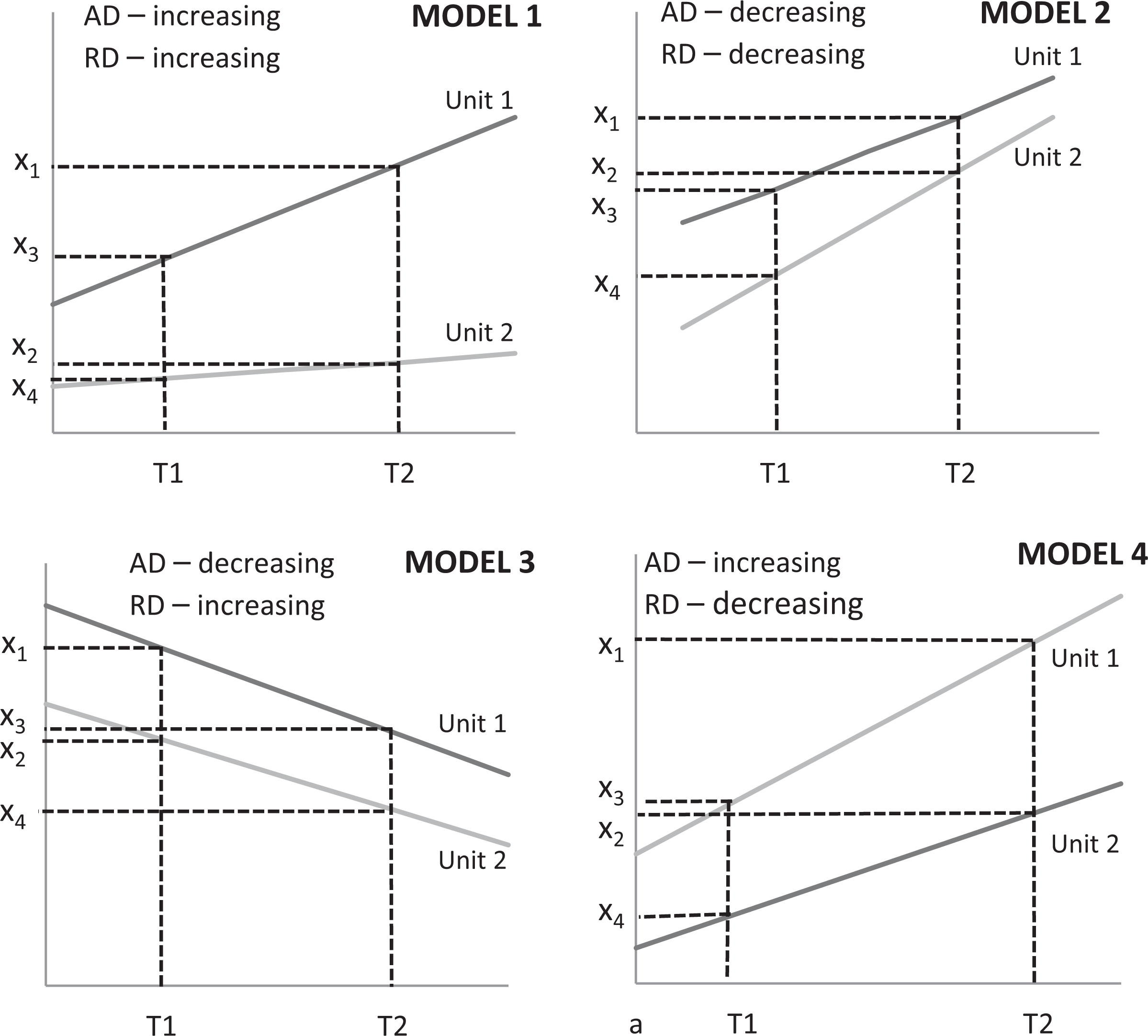
Four models, according to the direction of change (increase or decrease), comparing absolute difference and relative difference in the time perspective.
Both differences are increasing in model 1 and decreasing in model 2, which is however not the case with models 3 and 4. Let us say, for example, that we have the following values for model 4: x 1 = 24, x 2 = 12, x 3 = 13, and x 4 = 5. Correspondingly, AD at times T 1 and T 2 are AD1,2(T 1) = x 3 − x 4 = 8 and AD1,2(T 2) = x 1 − x 2 = 12. Therefore, AD increased from 8 (at T 1) to 12 (at T 2). On the other hand, we have the following ratios: RD1,2(T 1) = x 3/x 4 = 2.6 and RD1,2(T 2) = x 1/x 2 = 2.0. These indicate that RD substantially decreased from 2.6 (at T 1) to 2.0 (at T 2). The researcher is herein obviously faced with a clear professional and ethical dilemma: What is the right message in this situation? Which trend should be communicated to the public? Are the differences increasing (according to AD) or decreasing (according to RD)?
However, a third option must also be considered; TD, or more precisely, the S-time distance—which has been formally defined and elaborated upon by Sicherl (1973, 1978)—provides additional insight into time dynamics. Unlike AD and RD, which are based on the mere perception of the data, TD is conceptually based on the assumption of a trend. We employ the word “trend” in its broadest popular meaning, which is understood as “a general direction in which something is developing or changing” (dictionary entry at www.lexico.com). TD thus reflects the amount of time u2 would need—assuming the continuation of past trends—to reach the value u1 already has at the current time; for example, we claim country 2 would need 10 years to reach the level country 1 is already situated within today.
Formally, TD can be expressed as the comparison between two time horizons for a certain value or a certain level X L, which is related to the variable “X.” At this point, we should note that the definition of TD assumes more observations in time for each unit. Following Sicherl (1973, 1978), the corresponding sequence of values X at times t 1, t 2, t 3, and so on for a certain unit is called a time series, implying that the X values are functions of time (t), and thus, we have X(t). TD communicates the distance between the time points of two time series (u1 and u2) at the point where they reach the same level (value) of variable X—that is, X L. As both the X 1(t) and X 2(t) series are functions of time, we use their corresponding inverse functions of t 1(X) and t 2(X) to properly formulate the S-time distance (Sicherl 2010:328):

In Figure 2, time series 1 (u1) and 2 (u2)—that is, X 1(t) and X 2(t)—illustrate S12(X L) = (T 2 − T 1) as a TD, or the difference in time when both series reached the same value X L. Due to its complexity, we clearly anticipate that TD is cognitively more demanding to calculate and understand than are AD and RD.
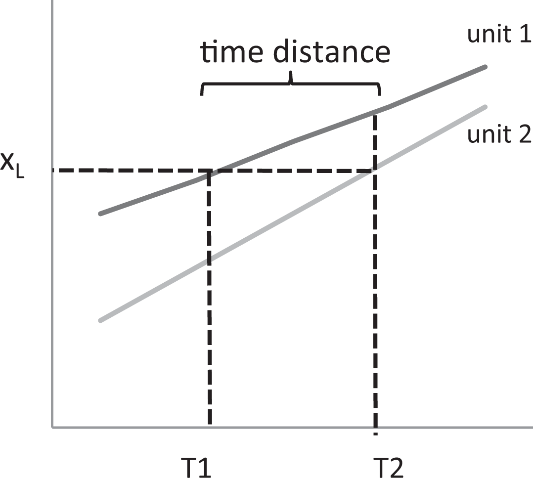
Time distance illustration.
TD complements the insights obtained with AD and RD. In models 1 and 2 of Figure 1, TD confirms the same perceptions—that is, an increasing or decreasing trend—while in contradictive models 3 and 4, TD contributes a special additional insight. In this specific case, perception based on TD fully aligns with AD. However, this result is not always the case as was demonstrated by Dolničar et al. (2004).
The choice to include the TD as the third possible presentation format for studying changes in social phenomena over time is based on a number of factors: TD very clearly adds value, which in many cases has different implications compared to AD and RD. Extensive theoretical and research work exists on these models (Dolničar et al. 2005) and demonstrates that these presentation formats are relatively independent. In survey results and cognitive interviews from the pilot study (Prevodnik et al. 2014), this format has been (somewhat surprisingly) perceived by respondents as additional information that is equally important as is AD or RD.
Research on Presentation Formats Related to Changes Over Time
Now that the three basic formats have been defined, we will summarize the past research on this issue. Several authors have emphasized the importance of recognizing that the different formats might lead to different conclusions, although this problem has been addressed by a surprisingly small number of studies. A summary of some of the most important studies is addressed below, and we add that all these studies applied variables on ratio scales:
Heintz (2010) emphasizes the importance of how comparisons are communicated, whether that be in a textual, numerical, or visual manner. Namely, the data acquire their true meaning exclusively when disseminated to the public in an appropriate way.
Moser, Frost, and Leon (2007) compare relative and absolute inequality measures and identify substantial inconsistencies in the size and direction of inequality over time. The authors provide no guidance but rather simply establish that the interpretation of a trend’s direction depends on the way this inequality is expressed. In a study by Amiel and Cowell (1992), a group of students were introduced to the question of income inequality. One third of the respondents chose relative inequality as the proper approach, one sixth chose the absolute inequality approach, while the rest of the sample rejected both approaches and evaluated the comparison based on some other system. In the psychology of economy field, Azar (2011) studied consumers’ behavior and found that ADs do not exclusively matter in the case of price comparisons as many consumerism theories assume; in fact, the relative aspects are equally important. In relation to economic development, Svedberg (2004) compares countries and determines that economic equality between countries has relatively improved (the relative divide between the developed and developing countries has decreased) in the past few decades, but the absolute divide has significantly increased.
James (2009, 2010, 2011) clearly advocates for AD’s use in international comparisons. Analysis must, in his opinion, reflect the actual reality (score) and not be an exclusive exercise in arithmetic. He argues that, when discussing the digital divide, the International Telecommunication Union, the World Bank, and other international agencies wrongly emphasize RD rather than AD. When comparing developed and developing countries, the level of Internet penetration might change, for example, from 70 percent to 90 percent in the former and from 14 percent to 34 percent in the latter. Although the developing world has decreased the gap from RD = 5.0 (70/14 in T
1) to RD = 2.1 (90/34 in T
2), relatively speaking, a crucial AD yet remains stagnant at T
1 and at T
2—that is, AD = 56 percentage points (0.70 – 14 = 0.90 − 34). In health and medicine, we may encounter similar inconsistencies in risk analyses. In studies of perceptions regarding smoking risks (Krosnick et al. 2010), current and former smokers greatly overstated the health risk when absolute risk was emphasized. On the other hand, when relative risk was emphasized, the majority of respondents underestimated the danger. A conclusion is that it is necessary a specific approach to health information dissemination is developed. A weaker understanding of the actual meaning of relative measures was also established and attributed to a higher cognitive burden.
Malenka et al. (1993) discovered a preference for a certain drug solely because its advantages were expressed in relative terms (the so-called framing effect). When confronted with a choice between two drugs for a certain condition, 57 percent of the respondents chose the drug whose effects were expressed through a relative comparison, while merely 15 percent chose the drug whose effect was expressed with an absolute comparison. Similar results are reported by Moynihan and Cassels (2006), who are popular critics of the pharmaceutical industry. When sales agents promoted the benefits of a certain drug in a relative sense (e.g., reducing the risk of a certain disease by 33 percent), they sold more drugs compared to the alternative of exposing the absolute benefits (e.g., reducing the risk by 0.1 pp, from 0.3 percent to 0.2 percent).
Nelson et al. (2008) describe the ability to acquire, judge, and understand basic health information as so-called health numeracy. For individuals with lower health numeracy, greater effort must be focused into explaining and informing them about the risks to boost their preventive health behavior. In such cases, visual presentations can be particularly effective, considering that various presentations have different meanings.
Kim (2010) presents a composite approach toward the decomposition of changes in the wage gap between White and Black men from 1980 to 2005, wherein the sources of the change over time are decomposed into five contextual factors: education, age, region, metro residence, and marital status. The basic idea of the Blinder–Oaxaca method that was implemented therein is that the wage gap between the two groups at a given time can be decomposed into two components: the coefficient effect—that is, the proportion of the wage gap caused by the difference in the coefficients between the two groups—and the endowment effect—that is, the proportion of the wage gap attributable to the difference in the distribution of explanatory variables across groups. Kim (2010) concludes that the changes result from many contradicting forces and cannot be reduced to a single explanation. Aside from the dilemma related to AD versus RD, some authors consider TD and its variations, such as “social clocks” (Mueller 2010), for monitoring multidimensional social development. Some authors (Dolničar 2008; Sicherl 2005, 2007, 2011) claim that a comprehensive method for comparisons—particularly benchmarking and monitoring—should implement all the three approaches (TD, RD, and AD). Within this context, the digital divide case is fully elaborated upon by Vehovar et al. (2006), who clearly demonstrate TD’s added value. Specifically, in the case of diffusion models (e.g., trends in Internet penetration), the level of the diffusion process is essential (Dolničar 2007, 2008b) for selecting the proper measure. In particular, when a certain adoption approaches the saturation level, the RDs are more suitable than the ADs.
In addition, within the context of comparative analyses, the prevailing focus is usually more and less strongly centered on the contextual questions and methodological issues, respectively (Natoli and Zuhair 2010; Pasimeni 2011; Thomas and Jesse 2011; Granger and Jeon 1997; Nussupov, Umpleby and Khusainov 2008). Many authors thus claim that choosing the proper format depends on the research problem (Citrome 2010; Moser et al. 2007; Mueller and Schuessler 1961; Svedberg 2004), although they do not provide general instructions regarding this relationship.
The above overview might lead to distorted conclusions because the studies are specific to their research areas and often point to different conclusions. We decided to keep the summary strictly descriptive to illustrate the differentiation among authors without hampering the integrity of each researcher’s message. Unfortunately, we have not been able to identify more thorough, comprehensive, and experimental research. It thus seems that no general methodological guidelines exist that would perhaps be similar to the principles related to the usage of central tendencies (i.e., arithmetic mean, modus, and median); for example, all statistical textbooks explicitly provide standardized instructions regarding which central tendency is suitable for a specific circumstance. Similar guidance is lacking with respect to the dilemmas related to the selection of the presentation formats discussed here, as we do not agree with Atkinson and Brandolini’s (2004) claim that no argument supports the preference for either the relative or absolute comparison criteria. According to the authors, all approaches are equally acceptable, and the choice is left to the researcher or other presenter (e.g., journalist).
Research Hypotheses
Our research focus is on the perceptions of the three basic formats for presenting changes over time, wherein the notion of perception relates to the judgment of whether the trend suggested by a certain format is increasing or decreasing (or constant). Based on the discussion above as well as on a pilot study’s specific findings (Prevodnik et al. 2014), our research hypotheses are proposed below.
When introducing the three formats in the section on AD, RD, and TD, we already mention the related increase in cognitive complexity. More specifically, in the section on the conceptual background of human perception and numerosity, we cited authors who have demonstrated first the common agreement in psychological science that division is a much more complex and less intuitive operation than is subtraction and second the existence of the direct relation between one’s level of cognitive effort and the corresponding time a certain task requires. This hypothesis will be tested under the assumption that the subjective perception of the burden, estimated by the users themselves, properly reflects their levels of cognitive burden.
Namely, in the case of the low cognitive burden associated with AD (see Hypothesis 1), the users’ perceptions primarily rely on system 1, as there exists scarce need to activate system 2 with AD; on the other hand, RD and TD are cognitively more demanding, and thus, system 2 must be activated. This activation requires additional stimulation to be fully effective, while in a default setting, the activation of system 2 is relatively weak (Dehaene 2011).
Graphics are very intuitive by nature (system 1) and may thus be consumed without activating system 2. The corresponding perceptions are expected to be similar to AD that is also associated with system 2’s low involvement.
TD requires (see Hypothesis 1) the highest cognitive burden. In the default setting (without additional stimulation, when only system 1 is active), the required cognitive effort is often not (fully) undertaken, and thus, we can expect that the perception related to TD has a smaller impact.
According to Hypotheses 1–4, we anticipate that, with purposive exposition to a certain format (or their specific sequences), we affect the perceptions that can change, for example, from “increase” to “decrease.”
Along with the basic format, several other factors may affect perceptions, which is particularly true for the questionnaire instrument’s characteristics such as the salience and nature of the studied phenomena, the questionnaire’s sensitivity, and other specifics of the measurement instrument (e.g., scale, orientation, values, labeling).
A possibility that must be addressed is the order effect that may occur when information presented earlier on establishes a cognitive framework or reference point that guides the interpretation of later information (Auspurg and Jäckle 2015). We were fully aware of this effect that was then embedded into the experimental design. Thus, the order when respondents were exposed to a certain presentation format was explicitly manipulated. It is true, however, that this manipulation was exclusively limited to AD and RD (the main focus); TD was not included because its inclusion would require six rather than two experimental cells.
There also exists the danger of respondents experiencing the fatigue effect that—according to Auspurg and Jäckle (2015)—typically occurs when respondents evaluate more than 10 cases (i.e., pages with an example to evaluate) or is more pronounced with very complex vignettes (i.e., consisting of more than 12 dimensions). For this reason, we have limited our experimental set to five cases, where merely one factor/dimension (e.g., presentation format type) was altered each time.
Respondents’ perceptions may of course be affected by their characteristics, particularly gender, income, education, mathematical education, and experience with empirical data. However, as the focus here was exclusively centered on the roles of the three basic formats, these other factors were not systematically presented in this article (only a brief illustrative insight is provided). Of course, with respect to their impact on experimental outcomes, no interference occurred due to their full randomization. Nevertheless, because it is important that experiments include a homogeneous population (Auspurg and Jäckle 2015), this was assured by targeting the three population segments with high internal homogeneity relative to the experimental target variables (i.e., academic researchers and professionals from the aforementioned institutions). All respondents were thus generally familiar with the methodological issues addressed in the study (presenting empirical findings, interpreting differences and change), and as such, we may consider them “methodologically savvy.” Correspondingly, we might also expect that the questions’ specific content and contexts less severely affect these respondents compared to the general public.
Method
To explore our hypotheses, we conducted an experimental survey that combined the elements of experimental research and survey methodology. In short, an experiment is an operation or procedure executed under controlled conditions to discover an unknown effect or law, to test or establish a hypothesis, or to illustrate a known law (Reips and Krantz 2010). Following Reips and Krantz (2010), we have conducted this experiment via the Internet to exploit the following advantages of web surveys (Callegaro et al. 2015:18): surveying large numbers of participants quickly, conveniently, and with little effort; ease of performing randomization and branching; and ease of collecting paradata (e.g., time stamps).
Compared to laboratory experiments, Internet experiments are much more cost-effective in time, space, administration, and labor (Reips 2009; Reips and Krantz 2010). Specifically, the randomization option was provided with the online survey application (1KA.si), which also enabled the recording of the time needed to answer a specific question (paradata). For more benefits of Internet-based experiments, refer to Reips (2002, 2009, 2010), and for those of web surveys, refer to Callegaro et al. (2015). We should add that, as is the case with any research, pretesting was essential herein. Namely, the experimental design was very complex and the questionnaire was complicated. For this purpose, the web survey was (i) pretested using cognitive interviews and (ii) reviewed at a later time by several peers. We may add that the general testing of this type of research design had already been performed in the pilot study of Prevodnik et al. (2014).
Vignettes
A vignette is an “illustration” in words, meaning it describes a hypothetical situation that respondents are then asked to judge (Lavrakas, Encyclopedia of Survey Research Methods, 2008). Various dimensions can be experimentally varied such that their impact on a respondent’s judgments can be estimated (Auspurg and Jäckle 2015; Wallander 2009). In survey research, a vignette question typically describes an event, happening, circumstance, or other scenario—the wording of which is experimentally controlled by the researcher—and different versions of the vignette are randomly assigned to subsets of respondents. For example, respondents are exposed to a vignette that describes a hypothetical crime that was committed, after which they are asked a closed-ended question to rate how serious they consider the crime to be and what sentence a judge should assign to the perpetrator. The researcher then experimentally alters the vignette’s wording by varying independent variables (e.g., the victim’s and perpetrator’s gender, race, and age). In our case, the formulation of vignettes has been led by the following criteria: We chose macro indicators (to eliminate subjectivity at the microlevel) that are relevant and salient to the general population. Following the methodological recommendations of Atzmüller and Steiner (2010), our vignettes were descriptions of a comparison between two units (e.g., countries, political parties, and demographical groups) over time within a selected indicator’s context (e.g., poverty rate, level of political support, and percentage of tablets). The indicators were expressed in percentage points to provide the respondents with a bottom and top reference level—that is, 0 percent and 100 percent. The key experimental condition was related to the three basic formats (AD, RD, and TD). The outcome variable (i.e., increase or decrease in trend) reflected the results of the contextual comparisons based on AD, RD, and TD, which were embedded into the vignettes. We additionally studied the impact of the visual presentation (i.e., table vs. graph).
An important limitation to the formulation of vignettes was the decision of a relatively short time span (T 2 − T 1 = 3 years) that slightly discriminated against TD’s strength, as its added value fully manifests in long TDs (Sicherl 2014a, 2014b, 2014c). The five main vignettes (presented in Online Appendix A [which can be found at http://smr.sagepub.com/supplemental/]) are related to the example of the poverty divide between two countries. It must be explicitly stated herein that the choice of countries was random, and the data are hypothetical to fit our needed models; they are not based on real data. Undeveloped countries were chosen due to the low possibility that the respondents had actual knowledge of the poverty situation there, which would have subsequently affected their answers.
Selection of the Models
A systematic analysis of the relationships between the three basic formats was conducted in the project entitled “Research of Internet in Slovenia” (RIS 2004) as well as by Dolničar (2007, 2008), who introduced the SRA notation system in which “S” represents S-time distance, “R” relative difference, and “A” absolute difference. Within this sequential notation, each of the three basic formats (S, R, and A) can be described with any of the three possible directions: increase (I), decrease (D), or constant state (C). For example, model IDC means the S-time difference is increasing (I), RD is decreasing (D), and AD is constant (C). Theoretically, we thus have 3 × 3 × 3 combinations and 27 SRA models.
For the practical purpose of experimental design, the number of SRA models must be reduced and carefully selected because testing 27 models on each respondent is impossible to accomplish. This task would also be very demanding in that the sample would need to support 27 experimental cells. The criteria for the models’ selection included the following: (a) Ambiguous SRA models are excluded if they provide no analytical insight—that is, if all three formats exhibit the same direction (i.e., III, DDD, and CCC). (b) According to the RIS (2004) study, we cannot determine the value of TD when AD and RD are both constant. We thus eliminated the .CC models, wherein the dot (.) can be replaced by any letter (I, D, or C). (c) The pilot study (Prevodnik et al. 2014) revealed that the main influences on the perceptions are either AD or RD. We thus further limited our selection to models in which these two formats indicate opposing conclusions, such as .ID and .DI models. (d) In empirical studies, we are rarely confronted with examples in which a component is constant, so we additionally excluded models .C., C., .C, and CC. More specifically, the exhaustive analyses of the SRA models identified that less than 0.5 percent of the models exhibited C…In addition, our pilot study results (Prevodnik et al. 2014) led us to avoid models with C and focus mainly on the disparities between AD and RD. (e) Additionally, we acknowledge that, according to RIS (2004) and Dolničar (2007), the most common models (next to .II and .DD) are .ID and .DI.
With respect to the sequence of vignettes with different basic formats that respondents will be exposed to during the pilot experimental survey, Prevodnik et al. (2014) demonstrate that TD is not suitable to begin with due to its high cognitive demand.
Further limitations also arose with respect to the changes’ preassumed trends. Namely, the examples in the vignettes were limited to time segments wherein the trends did not change directions (Dolničar 2008). For example, if we observe a three-year period, then we expect to witness the same decreasing (or increasing) trend throughout the entire period—a process that was further simplified to linear trends for the purpose of clarity. Because we are exclusively discussing conceptual issues herein, the essence of our hypothesis is not hampered.
Considering the above limitations, we arrived at four SRA models to include in the experiment: IID, DID, IDI, and DDI.
Experimental Design
First, an overview of the terminology is presented:
Experimental step refers to a set of survey questions that contain a specific vignette with a table or graph (plus evaluation questions) that reflects one of the three basic formats as well as the variations related to the table or graph. Each respondent was exposed to five sequential experimental steps (denoted by A, B, C, D, and E) in which the corresponding vignette differed. A set refers to one complete sequence of the five experimental steps (A–E) to which each respondent was exposed. After concluding the initial set (denoted as set 1), which was related to the poverty divide context (illustrated in Table 1, Online Appendix B [which can be found at http://smr.sagepub.com/supplemental/]), the respondents were given the option to continue with set 2 (with a vignette related to political party support) and then with set 3 (penetration of the tablets across subgroups). Of course, this may ascribe some selection bias to sets 2 and 3, although we solely analyze set 1 herein.
Experimental manipulation is the change within a certain experimental step or entire set (e.g., order of the steps) for which the effects have been measured, which is also a factor of experimental comparison (Cochran and Cox [1957] 1992). In our case, the variations were based on the basic format (AD, RD, or TD), on using a graph or table, and on the order of the experimental steps within each set. An experimental group is a subset of respondents who are exposed to the same experimental manipulation. They have the same SRA model (e.g., IDI) and the same vignettes but differ in the sequential order of the vignettes exposed to each respondent. For example, some respondents were first exposed to AD (step A) and second to RD (step B), while the other group was exposed to the opposite sequence (RD–AD); we label these sequences IDI1 and IDI2, respectively. The first and main outcome variable relates to the estimated direction of change. For example, the question after each vignette in set 1 was “In your opinion, has the divide in the percentage of people at risk of poverty in Congo and Uganda in this time period increased, decreased, or remained constant?” The responses were recorded on an ordinal scale as decrease, no change, or increase (according to Wallander 2009). The second outcome variable relates to the cognitive burden the respondents reported at each step (after answering the first outcome variable) based on a 1–5 ordinal scale by answering the following question: “How hard was it for you to answer the previous question?” (1—not hard at all, 2—somewhat hard, 3—hard, 4—very hard, and 5—extremely hard).
The main study’s experimental design (set 1 and IDI model) is illustrated in Figure 3, and it is worth mentioning that the IDI model basically resembles model 4 from Figure 1. All combinations for model IDI, the schematic of all sets for the full experiment, and the entire questionnaire are available online (https://www.1ka.si/2018).
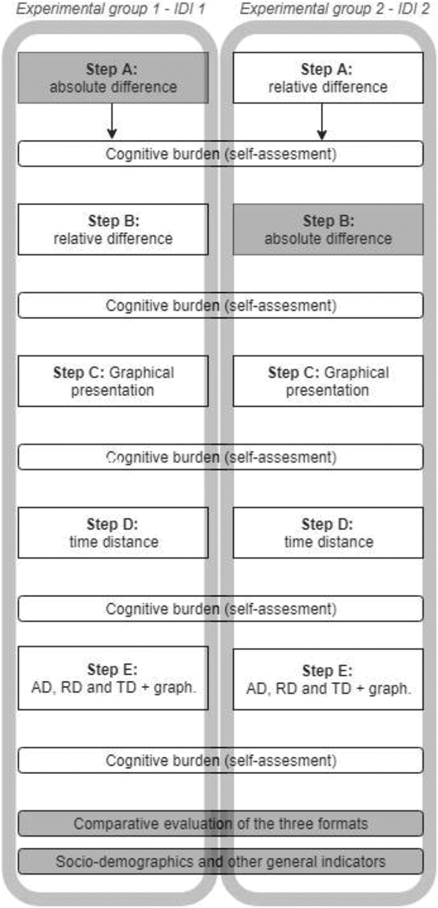
Main experimental designs with five experimental steps (A–E) for two experimental groups (IDI1, IDI2) of model IDI within set 1.
The respondents were randomly assigned to experimental groups with the assistance of the web survey application. This procedure eliminates the systematic differences among respondents’ characteristics that may affect their answers. Consequently, the statistically significant differences among the experimental groups can solely be attributed to the experimental manipulations (Creswell 2009).
Figure 3 illustrates how the respondents in the two experimental groups (IDI1 and IDI2) were exposed to the experimental steps—that is, to the sequence of vignettes. As a reminder, the IDI model implies that the data constitute the pattern of increasing trend (I) according to TD, decreasing trend (D) according to RD, and increasing trend (I) according to AD. The main idea of changing the sequences’ order was to vary the basic format that appeared in the first step (AD or RD) such that we could study the initial perception, while in subsequent steps, we studied the impact of further experimental manipulations.
In step A, each respondent was thus introduced to a vignette that addressed either AD or RD depending on the experimental group (i.e., IDI1 or IDI2). In step B, a respondent was exposed to the alternative vignette (RD or AD). The following steps of C, D, and E remained the same in both groups and were also based on both the same SRA model (i.e., IDI) and the same context (i.e., poverty divide). In step C, the vignette employed a graphical presentation (GRAPH), while step D employed TD. Finally, in step E, a respondent was exposed to the vignette, which included the table, graph, and the calculations for all three presentation formats together. Following each vignette in the corresponding experimental step, the respondents evaluated the trend’s direction and their cognitive burden. Upon completion of set 1, essential sociodemographic questions and other general indicators (e.g., education, training in mathematics and statistics, opinions on methodology and statistics) were asked.
The questionnaire’s design was similar for other models (IID, DID, and DDI). We had two experimental groups for each of the four models (IDI, DDI, IID, and DID), and thus, there were altogether eight experimental groups in set 1. Additional experimental groups were related to sets 2 and 3. As mentioned before, in our analysis, we exclusively focus on the experimental groups (IDI1, IDI2) related to model IDI in set 1 (poverty divide), for which we attribute two strong reasons. First, this was the sole model to be exposed to all three target populations, and thus, its sample size was by far the largest. Second, the findings from the other three models (DDI, IID, DID) essentially replicated the results from the IDI model in set 1, and the same is also true for the results from the other two sets (sets 2 and 3).
Data Collection
The survey was conducted on three target populations: all researchers in academia in Slovenia with a public business e-mail address
1
(ACAD; NACAD = 5.417 e-mail invitations), with RACAD = 552 respondents (for the entire experiment), and an American Association for Public Opinion Research—AAPOR response rate RR2ACAD = 10.2 percent; all (professional) employees of the Statistical Office of the Republic of Slovenia (SORS), NSORS = 320, RSORS = 135, RR2SORS = 42 percent; and all (professional) employees of the National Institute of Public Health of the Republic of Slovenia (NIPH), with NNIPH = 200, RNIPH = 90 respondents, RR2NIHP = 45 percent.
2
Data were collected from May 27 to June 19, 2014. Invitations and one reminder (after one week) were sent to all units. The e-mails were sent directly to the researchers, while for the other two populations, the invitations and reminders were sent through their organizations’ internal e-mail systems by the corresponding authorities. Due to our design’s experimental nature, the sociodemographic structure of the target populations was not the focus of our empirical work. However, we have tested various multivariate regression models (with cognitive burden or change evaluation as dependent variables and with sociodemographic variables as predictors), but very few effects were found. This result might be due to the abovementioned homogeneous—that is, methodologically savvy—target populations. For illustrative purposes, we add that the sample presented in this article consisted of 37 percent male and 63 percent female respondents, of whom 11 percent were younger than 30 years of age, 33 percent were aged between 31 and 40 years, 29 percent were aged between 41 and 50 years, and 28 percent were aged older than 50 years. Of this sample, 42 percent had obtained a master’s degree or PhD; compared to the general population, the respondents clearly held greater seniority with respect to both age and education, and the number of women was greater.
Analysis and Interpretation of the Results
The graphs in Figure 4 present the main outcome variable, which represents the respondents’ perceptions at each experimental step of the questionnaire. The graphs indicate whether the respondents interpreted the corresponding vignette as either an increase or decrease in change or as a constant state. The share that reached a “constant” interpretation was always very low in percentage and exhibited little variation, and thus, we removed it from the graphical presentation. The exact figures and corresponding sample sizes can be found in Table 1, Online Appendix B (which can be found at http://smr.sagepub.com/supplemental/). We exclusively discuss the sample formally because we actually address the entire population; nevertheless, we herein employ the usual assumption for these situations: Our population is in fact the manifestation of an infinite population or corresponding super population model, and thus, standard hypothesis testing can be applied.
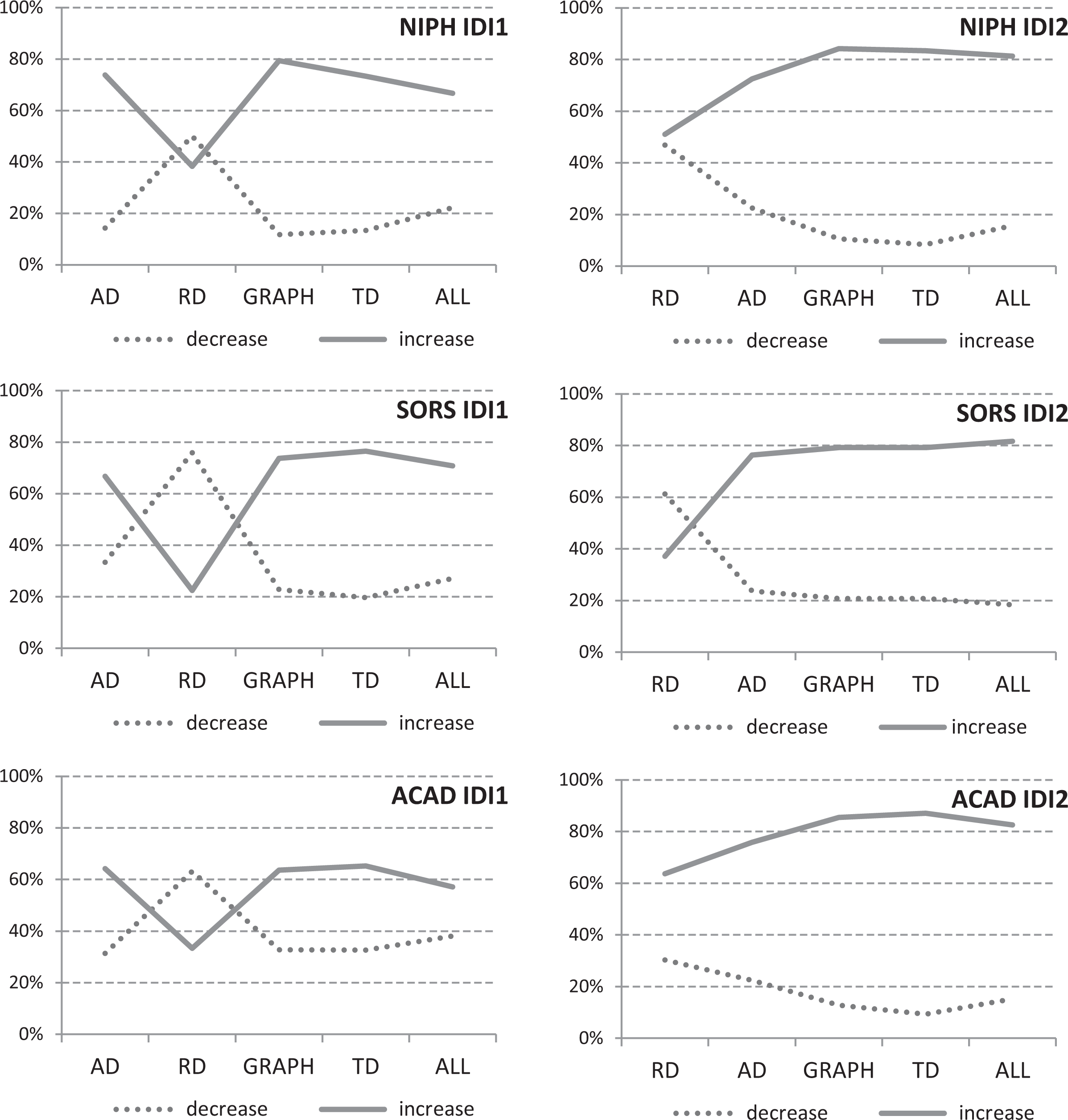
Percentage of respondents according to their perceptions of the trend (decrease, increase) for five experimental steps (A–E) in experimental groups IDI1 (left panel) and IDI2 (right panel) in set 1 for three population segments: NIPH IDI1 (n = 27), NIPH IDI2 (n = 32), SORS IDI1 (n = 48), SORS IDI2 (n = 49), ACAD IDI1 (n = 42), and ACAD IDI2 (n = 46). NIPH = National Institute of Public Health of the Republic of Slovenia; SORS = Statistical Office of the Republic of Slovenia; ACAD = employees in academia (university).
All the data were carefully inspected, and due to scales with a limited number of categories, the outliers did not occur. After analyzing the distribution of the studied ordinal variables, we can confirm they are close to normal distribution, and thus, we applied the usual assumption of a multivariate analysis to treat them as ratio variables. Nevertheless, every analysis of variance was repeated with a robust nonparametric test (Kruskal–Wallis and Mann–Whitney tests) as well as the associated post hoc tests (Bonferroni and Dunnett’s post hoc tests). All the results have been thus confirmed by both analyses, and no deviations from these results were recorded. The key results are presented in the next section according to the relevant hypotheses.
Cognitive Burden Increases From AD to RD and TD (Hypothesis 1)
The hypothesis regarding the cognitive burden (Hypothesis 1) can be largely confirmed by comparing the evaluation variable’s overall means (i.e., across all six groups; see Table 2, Online Appendix C [which can be found at http://smr.sagepub.com/supplemental/]): The lowest overall burden was within the GRAPH (the overall average was 1.79), and this was also true within four of six groups. However, in the remaining two groups (SORS IDI1 and ACAD IDI1), the GRAPH was not statistically significantly different from RD, which was therein the lowest. Overall, AD reached the second-lowest burden (2.05). Overall, RD reached the third-lowest burden (2.07). Overall, TD’s average burden was second highest (or fourth lowest), with an overall average of 2.35. The highest burden was in the last vignette (ALL), which presented the three measures and the GRAPH, with an average of 2.51.
The actual differences were generally even higher if we take into account a certain measure’s exact position order (i.e., starting with AD or starting with RD) and exclusively compare the corresponding subtotals that relate to the subsample of units with the same order—that is, either AD-RD-graph-TD-ALL or RD-AD-graph-TD-ALL (which matches the IDI1 and IDI2 models).
We should mention that the effects of fatigue can potentially appear for vignettes presented later on (GRAPH, TD, ALL). However, as mentioned in the section concerning the research hypotheses, this effect only appears alongside more than 10 vignettes (Auspurg and Jäckle 2015).
The possibility of an order effect (between steps A and B) can also appear here, and it is true that the GRAPH and TD options were not fully randomized (as was the pair RD–AD); this may weaken the corresponding conclusions due to the potential memory and training effect by, for example, reaching to the GRAPH respondents who have already gained in-depth familiarity with the problem being exposed to AD and RD, which is even truer for TD and ALL.
When studying the order effect related to the AD–RD pair within each group of model IDI1 (left part of Table 2 in Online Appendix C [which can be found at http://smr.sagepub.com/supplemental/]), in which AD has been presented in step A, the difference between steps A and B is significant in two (SORS, ACAD) of the three subsamples (in the NIPH subsample, this difference also exists but is not significant). The fact that respondents evaluated AD as more cognitively demanding than RD due to the specific order, in which AD was presented first, was somewhat surprising because our presumption was that RD is always more demanding than AD. In model IDI2 (the middle part of Table 2), the cognitive burden from step A (with RD) to step B (with AD) decreases even more sharply, thus also confirming that information (i.e., RD) provided in the first step makes evaluation at the second step (i.e., AD) somehow easier. Therefore, the presentation format (i.e., AD or RD) does not appear to matter as much as does the positioning (i.e., the order).
In addition, for the AD–RD pair, we analyzed the amounts of time (in seconds) respondents needed to complete certain pages (one page per one vignette). We first focused on the difference between the time spent for the AD and RD vignettes upon their appearance in step A for the IDI1 and IDI2 models, respectively. The results (following the exclusion of outliers above the reading speed of 2.5 seconds read per word multiplied by the number of words on a page) indicate that the respondents who were first assigned the RD vignette needed significantly more time (average time = 179 seconds) than did those who were first assigned the AD vignette (166 seconds). A significant difference was also identified in the same direction when either the RD or AD vignette appeared in step B (74 vs. 53 seconds). These differences further clarify the findings from the self-reported cognitive burden, which—aside from reconfirming the higher importance of position (i.e., first or second)—also suggests that AD has a lower cognitive burden than RD because, according to psychological research, response times reflect cognitive burden (Mayerl 2013).
Overall, this hypothesis seems to be the least conclusive and needs further research to be clarified. Nevertheless, we can still infer the following: (i) with respect to the AD–RD pair, the cognitive burden decreases from step A (presented first) to step B (presented second) regardless of the order of the presentation formats (AD or RD); (ii) clear evidence (particularly from paradata) supports that AD is cognitively less demanding than RD; (iii) TD is cognitively most demanding, particularly because it was exposed to the respondents as the fourth step (step D) in which respondents had already become considerably familiar with the case presented (context, numbers) and could thereby help decrease the cognitive burden; and (iv) the GRAPH’s cognitive burden seems to be the lowest, although this finding might be argued because the potential order effect was not randomized here (as was the case for the AD–RD pair).
Susceptibility to Follow Interpretations From AD (Hypothesis 2)
The susceptibility to follow AD exists particularly in the IDI1 group, in which the respondents were first exposed to AD (reflecting “increase”) and in which they immediately followed this interpretation (i.e., slightly more than two thirds of the respondents in all three populations agreed with the “increase”; see Table 1, Online Appendix B [which can be found at http://smr.sagepub.com/supplemental/]). In step B, when respondents were solely faced with RD (suggesting “decrease”), they changed their minds, although only temporarily; a paired samples t test for each group separately exhibited statistically significant differences (sig. = 0.000). 3 As soon as the exposure to RD ceased in step C, exposure to the GRAPH resulted in a strong return to the initial AD interpretation (“increase”), which then only slightly declined postexposure in steps D (TD) and E (all formats together—ALL).
Susceptibility to AD (i.e., perception of “increase”) was also observed in the IDI2 group, in which it existed even during step A. During this step, the respondents were initially exposed exclusively to RD, which was surprising because we expected that RD’s message (“decrease”) would strongly prevail here since the respondents had solely been exposed to RD at this point. We believe this finding reflects the fact that the vignettes also included the table with data wherein AD could be recognized with a relatively low cognitive effort. This effect was particularly strong with ACAD, which may be due to interpretations based on the AD format that was discovered (calculated) indirectly as well as academics’ analytical and professional (questioning) minds. On the other hand, this effect was absent in the SORS population, which may be in part explained by the clerical nature of public servants belonging to a large hierarchical organization who are trained to strictly follow the established suggestions and rules. 4
Further exposures for the IDI2 group in steps C, D, and E (i.e., to GRAPH, RD, ALL) reinforced the AD for all three segments similarly to IDI1, which additionally confirms the susceptibility of respondents to follow the interpretation related to AD.
The Trends’ Graphical Presentation Reinforced AD (Hypothesis 3)
We can observe from Figure 4 that, in both experimental groups (IDI1 and IDI2) and in all three populations, the graphical presentation in step C either reestablished—following RD’s disruption in step B—the initial understanding based on AD (IDI1) or further reinforced (IDI2) the perception based on AD. All these differences were statistically significant (sig. = 0.000).
Weak Susceptibility to Follow Interpretations Based on TD (Hypothesis 4)
The effect of TD, which exhibits an “increase” message in the IDI models, was very weak, although it did reveal a slight (nonsignificant) and consistent tendency toward reinforcing “increase” in almost all the experimental groups. In part, this is an effect of the tail experimental step (D) particularly because it was presented following the graphical presentation (C), when the respondents had already been strongly convinced that the trend was an “increase.” We may add that similarly weak and statistically nonsignificant effects were encountered with the DDI models in which the trends of AD (“increase”) and TD (“decrease”) differed. One reason for TD’s weak effect is its high cognitive burden (Hypothesis 1); additionally important is the fact that TD was evaluated as the least descriptive 5 (average for IDI1: TD = 2.88, AD = 3.23, RD = 3.15; for IDI2: TD = 2.93, AD = 3.48, and RD = 2.66) and the least understandable 6 among the three basic formats (average for IDI1: TD = 3.12, AD = 3.96, RD = 3.65; for IDI2: TD = 3.31, AD = 4.05, and RD = 3.57).
On the other hand, the results of the general survey (see Table 3, Online Appendix D [which can be found at http://smr.sagepub.com/supplemental/]) indicate that the respondents still highly valued TD regardless of the fact that they did not consider it when evaluating their perceptions (i.e., judging the trends); in fact, the average agreement with the statement that “TD is an important additional information” reached 3.16 on a scale of 1–5. TD clearly has the potential to contribute added value, but it should be additionally stimulated and explained to respondents in order for it to gain value. It is also true that TD was not fully elaborated upon (compared to AD and RD) in our experiments, and thus, the specifics of our experimental design—from the examples’ short time span (three years) to the placement of the vignette with TD at the end of the experimental steps—prevent a firmer generalization of this hypothesis.
Respondents’ Perceptions Can be Deliberately Manipulated (Hypothesis 5)
The experimental manipulations clarify that the respondents’ perceptions substantially changed. When initially exposed to AD (IDI1), the respondents followed the interpretation related to AD, whereas their support for the AD interpretation (“increase”) was significantly lower when they were initially exposed to RD (IDI2); nevertheless, the respondents (despite their exposure to RD) followed the AD suggestion to a considerable extent. The manipulations’ largest effects, however, occurred when comparing one- versus two-step situations, for which all results are presented in Table 1, Online Appendix B (which can be found at http://smr.sagepub.com/supplemental/): The IDI1 group respondents, exposed first (A) to AD and second (B) to RD, exhibited a decline in their support of “increase” in the second step as expected; merely 30.2 percent supported “increase” in step B, compared to 67.4 percent in step A (the mean across the three groups). All differences were statistically significant in each segment (sig. = 0.000). The IDI2 group respondents, exposed first (A) to RD and second (B) to AD, demonstrated even greater support for the perception of “increase” in the second step within all three segments (75.2 percent, mean across all three segments after achieving 50.9 percent in step A) compared to the corresponding support in step A among the IDI1 group (67.4 percent). The difference is statistically significant (sig. = 0.000). Similarly, the support for the RD interpretation (“decrease”) was significantly greater in step B of IDI1 (following exposure to AD in step A) than in step A of IDI2, which holds true for all the three segments (in total, 65.1 percent in IDI1 vs. 45.7 percent in IDI2).
AD is clearly reinforced in the IDI2 model if it is presented as the second step (B) after RD is presented in the first step (A); this reinforcement effect is even stronger with RD, which might be due to a certain “warming” effect. Namely, if the respondents were presented with RD in the first step, they neither considered it much nor valued its descriptiveness; they only valued RD more greatly than AD if they were presented with the former later on. It is possible that the respondents were surprised by the fact that they had not considered this option in the first place and thus tried to emphasize or acknowledge its meaning more strongly in the questionnaire’s subsequent steps. A similar effect has been noted in research on order effects in vignettes (Auspurg and Jäckle 2015).
Therefore, we have reached what nearly appears to be a rule: Exposing the message of a certain basic format (e.g., RD or AD) is much more effective when done during the second step and after the initial exposure to the alternative (opposite) format in the first step (e.g., AD or RD). In any case, the exposure to various presentation formats had a very strong effect on the respondents’ perceptions.
Conclusion
In this article, we investigated the role each presentation format plays in users’ perceptions while analyzing changes in social phenomena over time. More specifically, we focused on the effects of using absolute difference (AD), relative difference (RD), and time distance (TD) as the formats that present the dynamics of social phenomena. The main challenges arise from the fact that the various presentation formats suggest differing and often even contradictory interpretations of a change’s direction (i.e., “increase” or “decrease”).
We first overviewed existing research on the human perception of quantities and numbers. We particularly elaborated upon the findings from neuropsychology and the notion of number sense (Kahneman 2011). Within this context, we exposed an important separation between the intuitive mind (system 1), which is biological and inherited, and the analytical mind (system 2), which requires cognitive effort and is learned with education; it is human nature (Kahneman 2011) to exclusively activate system 2 when needed or adequately encouraged.
As different presentation formats may suggest different substantive interpretations, the perception of change over time can depend upon the selection of the presentation format to a certain extent. If the above assertions about users’ varying levels of susceptibility to different presentation formats are true, then they can be additionally employed to deliberately create desired perceptions, which may involve issues of potential manipulation, professional ethics, and public interest.
We referred to the above concepts to formulate hypotheses for our experimental survey, and we argued that the simple and intuitive presentation format of AD (system 1) would dominate among the users unless they were specifically exposed to the two alternatives (RD or TD), both of which are cognitively more demanding and require system 2’s activation. To address these issues, we designed a research experiment wherein professionals from academia, the National Institute of Public Health (NIPH), and the National Statistical Office were exposed to various presentation formats. The key experimental variable was the exposure to AD, RD, or TD. These three formats were then randomly assigned in various sequences within a web questionnaire. We focused our analysis on a social indicator related to the poverty gap in two countries and on a data model in which AD and RD suggested an increase, while RD suggested a decrease in the difference (i.e., model IDI).
The results suggest that AD required the least cognitive burden from the respondents, which was followed by RD and TD (Hypothesis 1). Correspondingly, the simplicity and intuitivism of the ADs made this format the most susceptible to respondents (Hypothesis 2). Graphical presentations, which are genuinely intuitive, additionally reinforced this perception (Hypothesis 3). On the other hand, to convey and persuade the users to accept the interpretations stemming from RD or TD, extra effort is required to activate system 2. Without this additional encouragement, TD has a particularly weak impact on perceptions (Hypothesis 4). The results also reveal that, with a deliberate combination of the formats and their sequences, we can substantially manipulate users’ perceptions (Hypothesis 5).
We also determined that, to effectively expose a format that requires the activation of system 2 (e.g., “decrease” based on the RD format), this format should not be presented alone or during the initial step; on the contrary, it should be preceded with an alternative format (e.g., AD) that preferably points in a different direction (“increase”). We explain this effect with the cognitive “warming” process, within which the users obtain familiarity with a specific issue that subsequently serves as a precondition such that further reasoning and argumentations based on system 2 achieve a greater effect.
Our findings thus point to the importance of being cautious when selecting presentation formats to describe changes of social phenomena over time, which is particularly critical when the substantive interpretation we wish to communicate stems from RD or TD rather than AD. The immediately practical implication of our research is that, in such situations, we should begin with AD and a simple graphical presentation; only after this preliminary step should we move to exposing the desired presentation format (based on system 2). We can also speculate that reinforcing this format with specifically designed graphics might be useful, such as a trend showing change in RD rather than change in AD related to raw figures.
Throughout this study, we have assumed that, from the substantive point, we (somehow) knew which was the right interpretation (e.g., increase). Accordingly, we exclusively discussed the problem of selecting the correspondingly right presentation format, although finding the right interpretation can be in fact highly problematic. Some literature suggests that this process depends upon a phenomenon’s context and specifics, although no existing systematic study confirms this; on the other hand, it might also be true that the selection of the presentation format predominantly depends upon the trend’s characteristics regardless of the context and substantive problem area as might be the case with diffusion models (Dolničar 2008a). Although this point was not our goal, there exists no doubt that, given their importance, the principles guiding researchers toward identifying the right substantive interpretation (e.g., “increase” or “decrease”) are heavily under-researched.
Another stream of potential future research is a more precise elaboration upon the various aspects of the presentation formats (e.g., role of the graphics). Similarly, the vignettes’ characteristics (e.g., content, wording), measurement instruments (e.g., survey mode, evaluation question format), and respondents’ characteristics deserve additional research attention.
With respect to the limitations of our research, we should first reiterate that TD was not treated with equal attention as were AD and RD; this was, however, our deliberate decision because we could not afford additional experimental cells. Another limitation stems from the specifics of the surveyed population, which might in a different environment produce different results. Nevertheless, our findings were robust and achieved merely minor specifics across three relatively different populations. In addition, some aspects addressed in a pilot study that focused on convenience sampling on the Internet aligned with our key results (Prevodnik et al. 2014). Finally, we repeat that, in this article, we did not address the effects of covariates, the specifics of other models (aside from IDI), or other contexts (i.e., sets 2 and 3) aside from the poverty gap example (included in set 1).
Supplemental Material
Supplemental Material, Appendix_A_Figure_5_REVISED_2019_(1) - Methodological Issues When Interpreting Changes in Social Phenomena Over Time: Perceptions of Relative Difference, Absolute Difference, and Time Distance
Supplemental Material, Appendix_A_Figure_5_REVISED_2019_(1) for Methodological Issues When Interpreting Changes in Social Phenomena Over Time: Perceptions of Relative Difference, Absolute Difference, and Time Distance by Katja Prevodnik and Vasja Vehovar in Sociological Methods & Research
Supplemental Material
Supplemental Material, Appendix_B_Table_1_REVISED_(1) - Methodological Issues When Interpreting Changes in Social Phenomena Over Time: Perceptions of Relative Difference, Absolute Difference, and Time Distance
Supplemental Material, Appendix_B_Table_1_REVISED_(1) for Methodological Issues When Interpreting Changes in Social Phenomena Over Time: Perceptions of Relative Difference, Absolute Difference, and Time Distance by Katja Prevodnik and Vasja Vehovar in Sociological Methods & Research
Supplemental Material
Supplemental Material, Appendix_C_Table_2_REVISED_(1) - Methodological Issues When Interpreting Changes in Social Phenomena Over Time: Perceptions of Relative Difference, Absolute Difference, and Time Distance
Supplemental Material, Appendix_C_Table_2_REVISED_(1) for Methodological Issues When Interpreting Changes in Social Phenomena Over Time: Perceptions of Relative Difference, Absolute Difference, and Time Distance by Katja Prevodnik and Vasja Vehovar in Sociological Methods & Research
Supplemental Material
Supplemental Material, Appendix_D_Table_3_REVISED_(1) - Methodological Issues When Interpreting Changes in Social Phenomena Over Time: Perceptions of Relative Difference, Absolute Difference, and Time Distance
Supplemental Material, Appendix_D_Table_3_REVISED_(1) for Methodological Issues When Interpreting Changes in Social Phenomena Over Time: Perceptions of Relative Difference, Absolute Difference, and Time Distance by Katja Prevodnik and Vasja Vehovar in Sociological Methods & Research
Footnotes
Declaration of Conflicting Interests
The author(s) declared no potential conflicts of interest with respect to the research, authorship, and/or publication of this article.
Funding
The author(s) disclosed receipt of the following financial support for the research, authorship, and/or publication of this article: The authors acknowledge this research received public financial support from research grants: J5-9334, J5-8233 and P5-0399, administered through the Slovenian Research Agency.
Supplemental Material
Supplemental material for this article is available online.
Notes
References
Supplementary Material
Please find the following supplemental material available below.
For Open Access articles published under a Creative Commons License, all supplemental material carries the same license as the article it is associated with.
For non-Open Access articles published, all supplemental material carries a non-exclusive license, and permission requests for re-use of supplemental material or any part of supplemental material shall be sent directly to the copyright owner as specified in the copyright notice associated with the article.