
Abstract
Medicare Advantage (MA) enrollment has grown significantly over the last 2 decades while Medicare program spending per capita has moderated over that same period. An open question is how the growth in MA enrollment has impacted Medicare program spending. The objective of this study is to estimate the association between MA penetration (ie, the percentage of Medicare beneficiaries enrolled in MA) and total Medicare spending per capita. We estimated linear regression models that examine the relationship between county-level MA penetration and total Medicare spending per capita. The study used county-level Medicare spending and enrollment data—including MA, Medicare Fee-for-Service, and Part D—from the Centers for Medicare & Medicaid Services from 2012 to 2021. The study included counties from all 50 states and Washington, D.C. 3045 counties were included in the analysis, which represents 97% of U.S. counties. We found that counties with higher MA penetration showed lower standardized Medicare spending per capita. Specifically, 10 percentage point higher annual MA penetration was associated with $194 lower (P < .001) total Medicare spending per capita, representing 1.5% lower spending. After adjusting risk scores to reflect the Medicare Payment Advisory Commission’s estimates of higher coding intensity in MA, 10 percentage point higher annual MA penetration was associated with $146 lower (P < .001) total Medicare spending per capita, representing 1.1% lower spending. If these associations are causal in nature, then higher MA enrollment over the last 2 decades may have moderated total Medicare program spending over the same period.
Introduction
The Medicare Advantage (MA) program is the private sector alternative to the Medicare Fee-for-Service (FFS) program. MA plans combine Part A (hospital), Part B (medical), and often Part D (prescription drug) benefits into one plan. Additionally, many MA plans offer services not covered under Medicare FFS, such as supplemental benefits (eg, dental benefits), care coordination programs, and disease management programs.
MA enrollment has increased steadily over the past 2 decades. From 2010 to 2024, the number of MA enrollees increased from approximately 11 million (25% of the Medicare population) to 32 million (54% of the Medicare population). 1 This growth is particularly pronounced in counties in the East and Southwest (Supplemental Figures 1 and 2). 2
Over this same period, Medicare spending has been unexpectedly low relative to government agencies’ projections; actual Medicare spending from 2010 to 2020 was approximately $431 billion less than the Congressional Budget Office (CBO) had projected in 2010. 3 The CBO reported that most of the difference stemmed from overestimating spending per beneficiary. (See actual and projected per capita spending in Figure 1.4,5) Similarly, Medicare spending was $339 billion less than what the Centers for Medicare & Medicaid Services (CMS) Office of the Actuary projected in its 2011 Trustees Report. 6

Actual and predicted total Medicare spending per capita, 2010-2020. Data from the Congressional Budget Office. For predicted Medicare spending per capita: Medicare spending per capita is the sum of separately derived Parts A, B, and D spending per capita calculated as the benefits outlay for each Part, less any respective offsetting receipts, divided by enrollment for that Part (ie, Part A, B, or D). Parts A and B spending include both Medicare Fee-for-Service and Medicare Advantage spending. For actual Medicare spending per capita: Medicare spending per capita is calculated as described above using data from the Congressional Budget Office Baseline Report of the year following (eg, 2010 actual spending is from the 2011 baseline projections). In years with more than one baseline report, the latest one was used.
Prior research has suggested several reasons for the lower than projected spending. Fewer heart attacks and strokes occurred, partly driven by cheaper and more widely used cholesterol and blood pressure medicines. 7 Another contributor may have been lower growth in provider payment rates over this period, especially for physician services. 8
One unexamined factor in the literature is MA penetration (ie, percent of eligible Medicare beneficiaries enrolled in an MA plan). Previous literature has studied the relationship between MA penetration and FFS spending. Several studies with data from the post-Affordable Care Act era find that higher MA penetration is associated with lower FFS spending, with one paper suggesting a causal link between higher MA penetration and lower FFS spending.9 -11 Our study examined the association between MA penetration and total Medicare spending (including FFS spending, MA plan payments, and Part D plan payments); we are not aware of any studies that have examined this relationship.
Methods
Data Sources
For our primary data sources, we used CMS data on Medicare spending and MA penetration: the Geographic Variation Public Use File (GVPUF), MA plan payment data, Part D plan payment data, and MA and Part D enrollment data. The GVPUF contains county-level data for the following: annual FFS spending per capita, annual MA penetration, and annual FFS enrollment. 2 FFS spending and enrollment are only included for beneficiaries with both Parts A and B who did not have any MA enrollment during the given calendar year; for our study, this makes them more comparable to the MA population. Regarding spending, the GVPUF includes actual FFS spending per capita, FFS spending per capita standardized for geographic differences in payment rates, and FFS spending per capita standardized both for geographic differences in payment rates and for individual beneficiaries’ health status using CMS hierarchical condition category (HCC) risk scores. 12 This study used FFS spending per capita standardized both for geographic differences in payment rates and for individual CMS-HCC risk scores.
The MA plan payment data contain county-level per member per month (PMPM) MA plan payments and risk scores by plan type. 13 For this study, the payment data were (1) annualized, (2) standardized for geographic differences in payment rates (using factors backed out of the FFS data), and (3) standardized for beneficiaries’ health status using average CMS-HCC risk scores by county and plan type. Factors for geographic differences in payment rates were calculated as geographic-adjusted FFS spending divided by actual FFS spending (both at the county-level); MA plan payments were multiplied by these factors at the county-level. Additionally, plan payments were adjusted for direct graduate medical education (GME) and indirect medical education (IME) payments. The FFS spending geographic adjustment, which we applied to MA plan payment data, removes GME/IME payments (in addition to adjusting for differences in geographic payment rates). Because the unadjusted MA payment data already exclude GME/IME payments, this study added GME/IME payments back to the MA plan payments data before applying the geographic adjustment. County-level GME/IME factors come from CMS MA Ratebook data. 14
The Part D plan payment data contain PMPM Part D plan payments and risk scores by contract and plan benefit package. 13 For this study, the payment data were (1) annualized and (2) standardized for beneficiaries’ health status using average RxHCC risk scores by contract/plan benefit package. We did not adjust Part D plan payments for geographic differences in payment rates because we are not aware of standardization factors to apply and because there is less geographic variation in prices for prescription drugs.
The MA and Part D enrollment data contain monthly enrollment figures for both MA and Part D. 15 Separately for MA and Part D, April enrollment data of each year were joined with plan payment data to derive an enrollment-weighted average of payments within a county across different plan types.
For demographic and economic controls, this study used the CMS Landscape files and the Area Health Resource Files.16,17 All spending data were inflation-adjusted to 2021, the last year of the study period. We did not include federal emergency funding paid to providers during the COVID-19 pandemic because it does not seem relevant for capturing the relationship between MA penetration and total Medicare spending.
Outcome and Exposure Variables
The primary outcome measure was total standardized Medicare spending per capita, calculated as the enrollment-weighted average of standardized FFS spending per beneficiary and standardized MA plan payments per member, plus standardized Medicare Part D plan payments per member.
The secondary outcome measure was total standardized Medicare spending per capita, but with adjusted MA risk scores to reflect some policymakers’ and researchers’ claims of higher MA coding intensity. Risk scores were adjusted using coding intensity estimates from the Medicare Payment Advisory Commission (MedPAC)’s March 2024 report. 18 Since we standardized MA plan payments using the CMS-HCC risk scores, altering the risk scores alters the MA payment amounts used to create the primary outcome variable. (Supplemental Table 1 illustrates how the risk scores were adjusted.) Both outcomes were annual, at the county-level, and inflation-adjusted to 2021 dollars.
The primary independent variable was annual MA penetration at the county-level. This came from the GVPUF and is calculated as the percent of eligible Part A and Part B beneficiaries with MA enrollment sometime during the calendar year.
We restricted the data to counties from the 50 states and DC over the years 2012 to 2021 (the most recent data available at the time of the analysis).
Analysis
To evaluate the association between MA penetration and Medicare spending per capita, we estimated linear regression models. The regressions included several county-level control variables that vary by year: number of MA plans, total population size, percentage of the population aged 65 years and older, percentage of residents with income below the federal poverty level, median household income, unemployment rate, and number of primary care providers per 1000 residents. Additionally, the models included year and county fixed effects. Standard errors were clustered at the county level.
For sensitivity analyses, we adjusted the regression specifications to reflect plausible alternatives. Sensitivity analyses included dropping all control variables (except year and county fixed effects), lagging MA penetration by 1 year, using weights when estimating the regression model (where the weight is a county’s Medicare population size), using state fixed effects in place of county fixed effects, dropping the years 2020 and 2021, and log-transforming the dependent variable. We believe that our main specification is the most appropriate. First, while lagging the MA penetration variable may better capture the lag between MA penetration and the potential spillover effects to FFS (as some papers have noted9 -11), it does not seem appropriate for capturing the relationship between MA penetration and MA payments. Second, with a correctly specified model, using weights is less efficient for estimation when the intent is estimating causal effects. 19 Third, because MA plans do not randomly choose which counties to enter, MA penetration may be endogenous to Medicare spending; county fixed effects likely handle this endogeneity better than state fixed effects. Fourth, although the years 2020 and 2021 were the first 2 years of the COVID-19 pandemic, including them provides more recent data and increases our sample size. Lastly, we prefer the interpretation of the model where the dependent variable is not log-transformed.
To understand how the recent increase in MA penetration may have affected total Medicare spending, we developed back-of-the-envelope calculations using the model estimates. We compared actual MA penetration each year to baseline MA penetration in 2011 (28%). Using the difference in MA penetration between each year and baseline, we multiplied the difference by our model estimates for the association between MA penetration and total Medicare spending per capita and the number of Medicare beneficiaries in that year. This final estimate suggests how different Medicare spending would have been had MA penetration stayed at 2011 levels throughout the study period. We performed all analyses in SAS, version 9.4 (SAS Institute) and R, version 4.4.0 (R Foundation).
Results
Sample Characteristics
3045 counties were included in the analysis, which represents 97% of counties in the United States. Of the 3045 counties, 90% had 10 years of data for the study (CMS suppresses data for counties or plans with enrollment of 10 persons or less, which is the primary reason for our study’s missing data). Characteristics about these county/year combinations are shown in Table 1. The county-level average MA penetration rate increased from 2012 to 2021, consistent with overall trends in MA penetration. The county-level standardized Medicare spending do not show a consistent trend, though they are generally decreasing from the beginning to the end of the period. Other characteristics either do not change much or appear as expected.
Summary Statistics (County-Level Sample Means by Year).
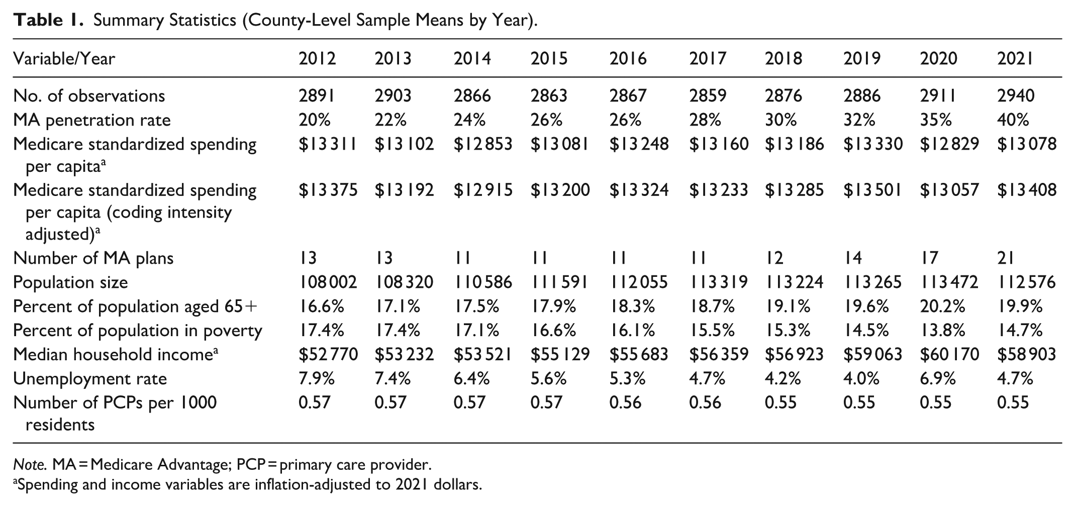
Note. MA = Medicare Advantage; PCP = primary care provider.
Spending and income variables are inflation-adjusted to 2021 dollars.
A scatter plot shows the association between the change in MA penetration and change in total standardized Medicare spending from 2011 to 2021 (Figure 2). The scatterplot shows a moderately negative correlation (R = −.33), meaning that larger increases in MA penetration were associated with larger decreases in standardized Medicare spending per capita.
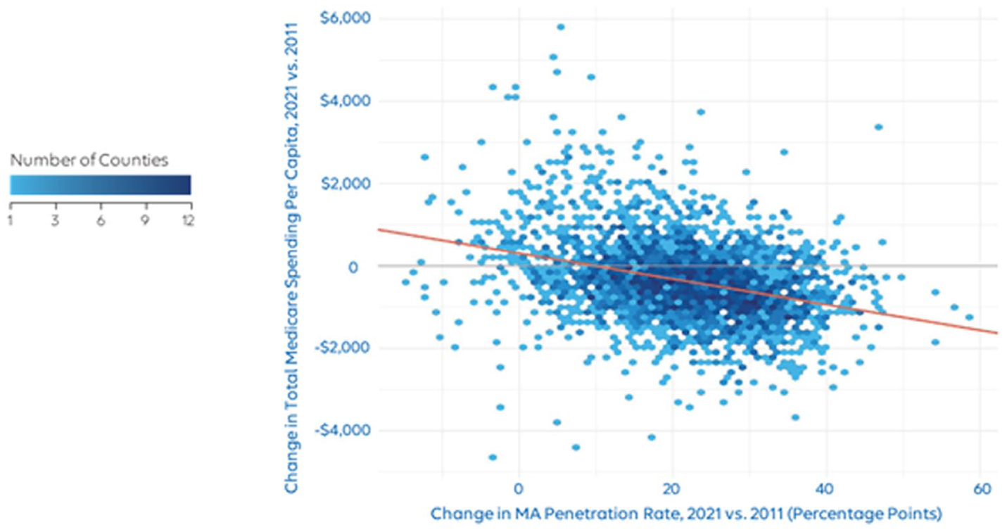
Association between change in Medicare Advantage penetration and change in total standardized Medicare spending per capita, 2021 versus 2011. The red line is the line of best fit. Total Medicare spending per capita is the sum of the enrollment weighted average of Fee-for-Service spending per beneficiary and Medicare Advantage plan payments per member, plus Medicare Part D plan payments per member. Spending is inflation-adjusted to 2021 dollars and standardized for other factors as described in the Methods section.
Regression Models
Regression model estimates for the primary independent variable are found in Table 2 (regression model estimates for all independent variables are found in Supplemental Table 2). The estimate is the association between standardized Medicare spending and a 10 percentage point increase in MA penetration across counties. The main estimate shows that 10 percentage point higher annual MA penetration was associated with $194 lower (95% CI, −$221 to −$167; P < .001) total Medicare spending per capita (Table 2). This represents 1.5% lower total Medicare spending per capita.
Association Between 10 Percentage Point Increase in Medicare Advantage Penetration and Standardized Medicare Spending.

Mean is average county-level per member per year spending (in $2021) across all 10 years.
When MA payments were adjusted to reflect claimed coding intensity, 10 percentage point higher annual MA penetration was associated with $146 lower (95% CI, −$173 to −$119; P < .001) total Medicare spending per capita. This represents 1.1% lower total Medicare spending per capita.
To understand how each component of Medicare spending was associated with MA penetration, we developed results where the outcome variable was each component. The results are in Supplemental Table 3.
Sensitivity Analyses
Table 3 shows sensitivity analyses results. For all sensitivity analyses, the results were qualitatively similar to our main estimates—all show that higher MA penetration was associated with lower standardized Medicare spending per capita. When dropping all control variables, lagging MA penetration by 1 year, or weighting estimates using Medicare population size, all results were similar to our main estimates. When using state fixed effects instead of county fixed effects or when dropping the years 2020 and 2021, estimates were slightly larger in magnitude. When log-transforming the dependent variable, the estimated semi-elasticities were very similar to the percent changes derived from the main specification’s coefficient estimate and its dependent variable mean.
Sensitivity Analyses.

Note. MA = Medicare Advantage.
Mean is average county-level per member per year spending (in $2021) across all 10 years (except for the specification that drops observations from the years 2020-2021, which averages across the other 8 years).
For the regressions with a log-transformed dependent variable, the “Estimate” is the coefficient for the primary independent variable (MA penetration). Thus, one must exponentiate the “Estimate” and subtract 1 to calculate the actual semi-elasticity (which in this case is very close to the coefficient estimate itself).
Back-of-the-Envelope Estimates
The regression estimates suggest that higher MA penetration was associated with lower Medicare spending per capita. Plugging the regression estimates into our back-of-the-envelope calculation implies that higher MA penetration over the study period was associated with lower Medicare program spending. If 10 percentage point higher MA penetration is associated with 1.5% lower total Medicare spending per capita, then cumulative savings from 2012 to 2021 are estimated at $111 billion (in 2021 dollars) compared to if MA penetration had remained constant at 2011 levels (28%). If 10 percentage point higher MA penetration is associated with 1.1% lower total Medicare spending per capita, then cumulative savings from 2012 to 2021 are estimated at $83 billion. We broke down the savings to each component of Medicare spending in Supplemental Table 4. Our estimates suggest that approximately 52%, 38%, and 6% of these savings can be attributed to lower per member per year (PMPY) FFS spending among FFS beneficiaries (ie, spillover), lower PMPY MA plan payments among MA beneficiaries, and lower PMPY Part D plan payments among all beneficiaries, respectively.
Discussion
This study examined the association between MA penetration and total Medicare spending per capita. We estimated a negative association between the 2 variables. When accounting for MedPAC’s estimates of unadjusted-for-coding intensity in MA, we still found a negative association, though the estimates were slightly attenuated.
Over the last 15 years, Medicare spending trended lower than projected in government analyses. Policymakers, researchers, and other stakeholders want to understand the factors contributing to this trend. This study is the first to suggest that growth in MA enrollment may have contributed to the recent trend in Medicare spending.
The study’s results could have been driven by a few factors. One factor is spillover effect; that is, as MA enrollment increases, providers adapt their behavior to align with MA plan incentives for quality and efficiency—such as chronic condition management and reduced utilization of costly services like advanced imaging—for all their Medicare patients, whether in FFS or MA. Thus, FFS spending decreases as MA enrollment grows, which is consistent with both our regression estimates for FFS spending (Supplemental Table 3) and prior research.9 -11
Some other drivers could be related to MA plan payments. Our regression estimates in Supplemental Table 3 suggest that higher MA penetration was associated with lower MA plan payments per MA member. Several mechanisms could explain this relationship. First, if the spillover effect described above is accepted, then this would lead to lower benchmarks in the MA program; because MA benchmarks are a function of FFS spending in a county, any reduction in FFS spending driven by increased MA penetration will also drive down benchmarks. Subsequently, lower benchmarks translate to lower MA plan payments under the MA payment formula. Additionally, lower benchmarks may also lead to lower bids, 20 which would also drive down MA plan payments for plans that bid below the benchmark. Second, as MA penetration increases, plans may be able to spread operational fixed costs, such as the costs to build out provider networks, across more members. If these lower fixed costs per member lead to lower bids, then this would also lower MA plan payments. A third driver could be a competition effect from increases in MA penetration. Evidence suggests that MA markets with lower insurer concentration (ie, more insurers in a market) are associated with modestly lower plan bids.20,21 If markets with lower insurer concentration also have higher MA penetration (which some evidence suggests 22 ), then markets with higher MA penetration might also experience lower bids, which would lower MA plan payments.
Another factor that could be driving the results are lower costs in MA versus FFS. There is much debate as to whether a Medicare beneficiary costs the government more in FFS or MA, with some citing higher MA costs and others citing lower MA costs.23 -25 From the data available in this analysis, standardized per capita plan payments among MA enrollees were approximately $490 lower than standardized per capita spending among FFS enrollees (Supplemental Table 3), indicating that the overall study findings may also be partially driven by cost differences between the 2 options. While this difference does not represent a true apples-to-apples comparison due to data limitations (eg, the lack of hospice users in the MA population), our back-of-the-envelope calculations suggest savings specifically due to the lower PMPY cost of MA beneficiaries (Supplemental Table 4).
For both the spillover effect and the direct comparison of MA and FFS costs, an important follow-on question is: what kinds of utilization are related to the spending differences? Some hypotheses include: low value care and waste are avoided, valuable services are forgone, lower-cost care is substituted for higher-cost care (eg, outpatient surgery substituted for inpatient surgery), and health outcomes are different under MA versus FFS leading to differences in utilization. Given the vast literature on this subject,26,27 we do not attempt a comprehensive review here; however, we discuss select studies relevant to these mechanisms. Evidence both supporting and not supporting each proposed mechanism exists. This includes findings related to reductions in low value care and waste,28 -31 forgone valuable services, 31 substitution of lower-cost care for higher-cost care, 31 and differences in health outcomes.26,27 Directly assessing the relationship between Medicare costs and these proposed mechanisms remains an important area for further study.
In addition to program-level costs, policymakers must also consider the tradeoffs that Medicare beneficiaries face between MA and Medicare FFS. MA plans must include a maximum out-of-pocket limit (which FFS does not) and most offer Part D coverage as well as additional benefits beyond FFS—such as dental and vision benefits—often without any premium aside from the standard Part B premium.32,33 Some research suggests that for Medicare beneficiaries not eligible for Medicaid, MA plans’ additional benefits lead to, on average, lower out-of-pocket costs (combined premiums and cost sharing) for MA beneficiaries relative to FFS beneficiaries, regardless of whether a FFS beneficiary is enrolled in Medigap. 34 The tradeoffs for MA enrollees may include accepting provider networks rather than the open access of Medicare FFS35,36 as well as utilization management for some services.37,38 Another alternative is choosing FFS and enrolling in a standalone Part D prescription drug plan (PDP) as well as a Medigap plan, which covers some or most of out-of-pocket medical costs for FFS beneficiaries. Medigap plans, however, generally do not cover additional benefits, and they have supplemental premiums that are often much higher than MA. 39 Further, in 2025 the average PDP premium was nearly 6 times greater than the Part D portion of the average MA plan premium. 40 All of these tradeoffs are relevant for Medicare beneficiaries.
Limitations
This study has several limitations. First, CMS does not publicly provide data for total Medicare program spending by county. Therefore, the study’s total Medicare spending numbers by county were aggregated from Medicare FFS spending, MA plan payments, and Part D plan payments. This method does not include certain spending that was unavailable, such as FFS spending for enrollees only in Part A or only in Part B and hospice spending for MA enrollees.
In addition, some plan types were excluded because of data availability. Specifically, payments to Medicare Medical Savings Account plans, Demo plans, 1876 Cost plans, Health Care Prepayment Plans (HCCP-1833 Cost Plans), and Program of All-Inclusive Care for the Elderly (PACE) plans were not available. The Part D data does not include information that could attribute retiree drug subsidy payments to a given county; therefore, these subsidy payments were also excluded.
Another limitation is the validity of the results to other time periods. The study period includes the initial years of the COVID-19 pandemic (2020 and 2021), an anomalous time for both population health and health care systems. Additionally, we cannot control for all the different Medicare or health care-related policies occurring in the time period studied, which may have impacted our study findings. To test possible concerns about the years 2020 and 2021, we performed a sensitivity analysis that removed these years; estimates of the primary independent variable were larger in magnitude when 2020 and 2021 were removed, meaning our main specification is more conservative.
Regarding the main regression model, county fixed effects may not fully address confounding at the county-level. One concern is how MA insurers select the counties they offer plans in. If insurers select counties with lower expected spending growth, then MA penetration may be endogenous to Medicare spending; if the preceding argument is true, then the endogeneity could bias the estimates toward a negative association. Nevertheless, based on the bidding process in MA, we think this endogeneity is unlikely because insurers should select counties where they can provide benefits more efficiently than FFS, which in turn allows them to offer more supplemental benefits, attracting enrollment. This circumstance may exist in counties with either lower or higher Medicare spending per capita. Ultimately, the uncertainty in this matter means it remains a limitation of the study.
Lastly, this study identified an association between MA penetration and standardized Medicare spending rather than a causal relationship. We cannot say whether increased MA penetration led to lower standardized Medicare spending per capita during the study period. Future research should study this relationship using a causal framework.
Conclusion
Our study estimated a significant association between higher MA penetration and lower total Medicare spending. If this association is causal in nature, then the increase in MA penetration over the last 2 decades may have contributed to the recent unexpected slowdown in overall Medicare spending. More research is needed to understand how other factors may contribute to slowing the growth in Medicare spending, such as the introduction of value-based payment models in FFS.
Supplemental Material
sj-docx-1-inq-10.1177_00469580261433163 – Supplemental material for Medicare Advantage Enrollment and Total Medicare Program Spending
Supplemental material, sj-docx-1-inq-10.1177_00469580261433163 for Medicare Advantage Enrollment and Total Medicare Program Spending by Brett Alfrey, Aliza S. Gordon, Michelle Nguyen Locke and Jennifer L. Kowalski in INQUIRY: The Journal of Health Care Organization, Provision, and Financing
Footnotes
Ethical Considerations
Not applicable, as no patient/member data were included in this analysis.
Author Contributions
All authors contributed to the conception and study design. BA and JLK acquired the data. BA analyzed the data, and all authors interpreted the data. All authors drafted, reviewed, and approved the manuscript.
Funding
The authors disclosed receipt of the following financial support for the research, authorship, and/or publication of this article: The authors are employees of Elevance Health and conducted this study as part of employment duties. No other funding was received for this study.
Declaration of Conflicting Interests
The authors declared the following potential conflicts of interest with respect to the research, authorship, and/or publication of this article: The authors are all employees of Elevance Health. JLK and ASG reported owning stock in Elevance Health. No other disclosures were reported.
Data Availability Statement
All data used in this study are publicly available at the locations cited in the references.
Supplemental Material
Supplemental material for this article is available online.