
Abstract
The study of infectious disease models has become increasingly important during the COVID-19 pandemic. The forecasting of disease spread using mathematical models has become a common practice by public health authorities, assisting in creating policies to combat the spread of the virus. Common approaches to the modeling of infectious diseases include compartmental differential equations and cellular automata, both of which do not describe the spatial dynamics of disease spread over unique geographical regions. We introduce a new methodology for modeling disease spread within a pandemic using geographical models. We demonstrate how geography-based Cell-Discrete-Event Systems Specification (DEVS) and the Cadmium JavaScript Object Notation (JSON) library can be used to develop geographical cellular models. We exemplify the use of these methodologies by developing different versions of a compartmental model that considers geographical-level transmission dynamics (e.g. movement restriction or population disobedience to public health guidelines), the effect of asymptomatic population, and vaccination stages with a varying immunity rate. Our approach provides an easily adaptable framework that allows rapid prototyping and modifications. In addition, it offers deterministic predictions for any number of regions simulated simultaneously and can be easily adapted to unique geographical areas. While the baseline model has been calibrated using real data from Ontario, we can update and/or add different infection profiles as soon as new information about the spread of the disease become available.
1. Introduction
Bacteria, viruses, fungi, and parasites are all infectious agents, capable of infecting many people and causing mass fatalities. In December 2019, a novel coronavirus named SARS-COV-2, which produces a disease known as COVID-19, emerged and became a global pandemic within the span of 1 month. Never in the history of our species have pathogens such as SARS-COV-2 been able to travel the entire globe at a rapid pace. Actions were taken by governments to restrict international travel and encourage the social isolation of citizens, but all precautions proved insufficient to prevent the pandemic. The cumulative global fatality count due to COVID-19 infection exceeds 5.8 million people as of February 2022, 1 resulting also in significant economic impacts.
The COVID-19 pandemic highlights the importance of studying and combatting the spread of pathogens so that their effect on daily life may be controlled. If the mechanisms of disease spread are understood, then efficient interventions may be implemented to contain local pandemics before they spread globally, and in the event, they do become global to prepare for the impacts. In particular, the study of pandemics and pathogens can be used to develop predictive models of how particular infectious agents may spread in specific geographical environments over time, which can assist governments and health authorities in planning and implementing containment policies.
Despite the efforts of health agencies, many countries are still coping with new waves of COVID-19 cases, often associated with variants of concern, are typically reaching higher peaks than the first wave in 2020.2,3 One difficulty with the control of the pandemic of COVID-19 is due to the asymptomatic carriers—that is, those individual not showing symptoms and being unaware that they are infected. As these individuals do not take precautions, they may spread the disease to at-risk individuals unknowingly. 4 The proportion of asymptomatic carriers can be as high as 80%.5–8 In December 2021, a new variant of COVID-19, Omicron was discovered in over 89 countries. Omicron spread throughout the world faster than any other variants of concern. Studies were performed in sub-Saharan Africa to study the new variant, one of these studies found that the Omicron variant had a much higher rate of asymptomatic carriage compared to other variants of concern. The study found many of these asymptomatic carriers had high nasal viral loads, suggesting these asymptomatic carriers may have been a major factor in the rapid spread of Omicron. 9 Due to these issues, short of regular testing of the population (which did not prove overly effective in the few countries attempting it), modeling and simulation showed to be helpful for estimating the spread of the disease, including the prevalence of asymptomatic carriers. 10
This is not the first time that organizations and governments use mathematical models and simulations to forecast and prevent the spread of infectious diseases. Models have been used to predict the spread of serious pathogens such as Ebola and HIV,11,12 and health agencies have long relied on predictive models to estimate future trends and to assess the potential effectiveness of various disease control methods. 13 One of the most widely used models uses compartmental differential equation models, describing how individuals in different states of infection interact and influence one another. These compartmental epidemiological models, introduced by Kermack and McKendrick, 14 classify the population in individuals Susceptible to the disease, Infected (i.e. can transmit the disease), and Recovered (SIR). Modifying the parameters of the model, public health officials can investigate how much a disease might evolve depending on the measures put in place (such as lockdowns, mandatory quarantines, and physical distancing). With the emergence of the SARS-CoV-2 virus, these models have become relevant, being used to track and monitor the potential spread of the disease.
Often missing from the differential equation approach to modeling is the consideration of how populations are distributed over physical space, and how they travel between geographical regions with unique characteristics. Such so-called geographical models allow for geolocated simulations of various phenomena; their resolution typically ranges from continental models to city neighborhoods. 15 For instance, each component in city areas can use its own defined population and characteristics, allowing for an accurate representation of a given geography. Geographical modeling can determine which regions are most impacted by a given infection. These insights can help create improved public health measures.
A popular method to model spatial distribution of the disease is cellular automata (CA), which has been widely used in recent years to investigate the spatial dynamics of disease spread.16–18 CA divides physical space into a grid representation of cells, with rules of interaction between adjacent or neighboring cells. This division is traditionally a two-dimensional (2D) uniform square grid, where cells are related to one another in a uniform neighborhood pattern. However, the geography in which populations reside is rarely uniform, contradictory to the use of regular neighborhood patterns in traditional CA.
Considering these issues, this research discusses the definition of new methods to represent the spread of COVID-19, with the objective of predicting the spread of COVID-19 in distinct geographical areas using a geography-based model. Our research considers the population of each geographical area in a non-uniform neighborhood topology, where each cell population is divided into age groups, each of which may have different infection characteristics and behaviors. We use groups as an example of a population division where the behavior for transmitting the disease differs. In other scenarios, age groups could represent people with different levels of education, social status, wealth, and so on.
More specifically, the contribution of this paper is introducing a new methodology for modeling disease spread using geographical models, Cell-Discrete-Event Systems Specification (DEVS), and the Cadmium JavaScript Object Notation (JSON) library. We demonstrate how these methodologies and tools can be used by developing different versions of SIR-type compartmental models that consider geographical-level transmission dynamics (e.g. movement restriction or population disobedience to public health guidelines), the effect of asymptomatic population, and vaccination stages with a varying immunity rate.
Our approach provides an easily adaptable framework that allows rapid prototyping and modifications. We show how the model can be quickly revised as new disease information is discovered (for instance, the change of infectivity by new variants like Omicron). Our implementation allows users to run the model in user-specified geographical regions, to visualize how COVID-19 might spread through a city, town, or country. For example, Ralli et al. 8 show the negative effects of asymptomatic COVID-19 infections within homeless shelters. Our model could be used to geographically locate homeless shelters within specific neighborhoods and simulate the effect of homeless shelters on surrounding neighborhoods.
Section 2 explains the foundations of the SIR model, CA, the Cell-DEVS formalism, and irregular geography-based cell spaces. Using this knowledge, section 3 defines a baseline Cell-DEVS model and gives simulations of the model in the geography of Ontario, Canada. Section 4 gives an extension of the baseline model to accommodate the effect of asymptomatic infection carriers. Section 5 gives a further extension of the baseline model in which a two-dose vaccination schedule is implemented, and finally, this paper concludes in section 6.
2. Background
Mathematical disease models date back to the 17th century, where Bernoulli published the first formal disease spread model which assessed the effect that variolation to smallpox could have on average life expectancy in France. 19 In 1927, Kermack and McKendrick 14 defined the SIR model using differential equations. This model remains the basis of many infectious disease spread models used at present because of its success in describing the spread of disease. In this section, we will discuss the related work used as a basis for our model specifications.
2.1. SIR models
Following Ross 20 and Ross and Hudson, 21 Kermack and McKendrick 14 defined a model that classified a given population into three “compartments”: SIR. They defined how individuals within a population could move from one compartment to another over time. The SIR model divides each member of a population into one of three categories: susceptible (S), infected (I), and recovered (R). Susceptible individuals are vulnerable to the pathogen and will become infected if they have sufficient contact with infected people. Infected people spread the disease to susceptible individuals through their daily contacts. Recovered people have overcome the disease and have permanent immunity (or died) and are no longer infectious.
The amount of people in the states S, I, and R over time, can be expressed as a function of time, and as a fraction of total population (N). For example, s(t) = S(t)/N represent the fraction of susceptible people at time t. At time zero (and therefore, at any other time), the sum of these fractions must be 100% (i.e. s(0) + i(0) + r(0) = 1).
By making some assumptions about the behavior of the population, the model is completed by the set of differential equations (Equation (1)), which describe the rate of change between states over time, typically measured in days:
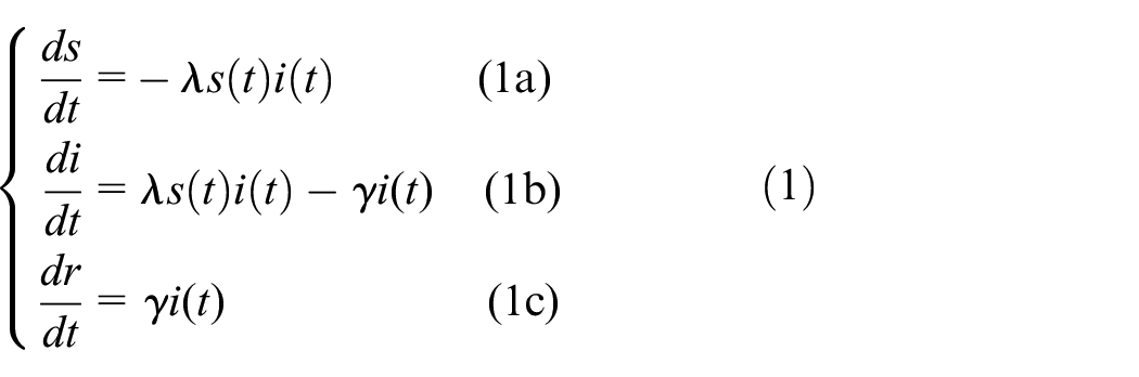
Two new parameters are introduced in the set of equations (Equation (1)) to model disease characteristics: λ (the virulence of the disease), which describes the level of infectious contact that Infected people have with Susceptible people, and γ (the recovery rate), which defines the rate at which Infected people become Recovered each day. The change in the Susceptible population is described in Equation (1a) as being proportional to s(t), i(t), and the virulence rate of the disease. The negative sign indicates that this is always a net decrease in the number of people in the Susceptible population, as members of the population transition to Infected. Equation (1b) describes the change in the Infected population as the addition of new infections (λs(t)i(t)) and the subtraction of new recoveries (γi(t)). The daily change in the Recovered population is given in Equation (1c) as the product of the Infected population i(t) and the recovery rate γ. All members of the population are also assumed to have a consistent number of daily contacts with others, implied in λ, no matter their infection state. These assumptions serve to simplify the model, but certainly decrease the accuracy of predictions. In addition, since the sum of s(t), i(t), and r(t) is 100% at time zero and the model assumes there is no birth, death, or migration in the population, that condition will be satisfied at any time.
The typical trajectory of an SIR model pandemic is shown in Figure 1, where the curves shown are the values of s(t), i(t), and r(t) in percentage as defined in Equation (1). The trajectory described by the SIR model is predictable: a population begins as 100% Susceptible before a pathogen spreads, the Infected then rises exponentially as the pathogen spreads and infects the population, and the number of Recovered increases over time as in the graph of Figure 1. The exponential growth of the Infected is slowed by the decreasing number of Susceptible that may become Infected, as the Recovered state is terminal.
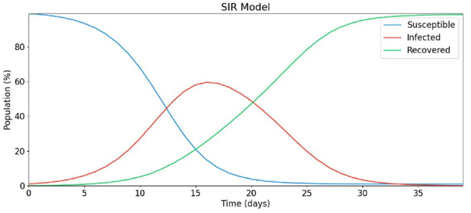
SIR model trajectory.
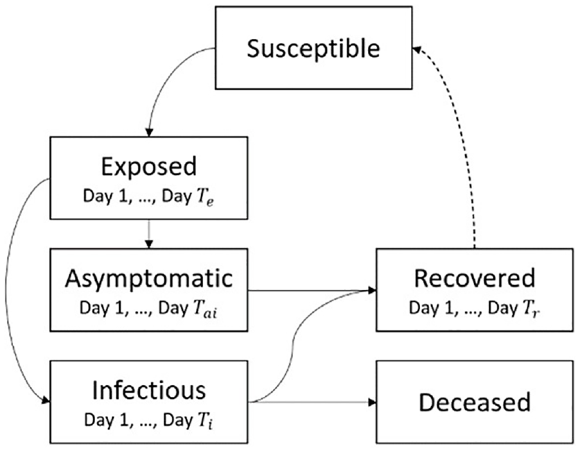
Kermack and McKendrick’s work defined the framework and mathematics that SIR-type models continue to follow today. The model assumes that every person behaves identically, having a constant number of daily contacts at random, regardless of any person’s infection status. These assumptions make such a simple model impractical for predicting the real world. To increase the accuracy of this model, more infection states can be added. This standard SIR model has evolved over the years to incorporate more advanced disease spread rules and more compartments. The simplest of these evolutions is the SIRD model which incorporates a Deceased (D) compartment which models terminal illness and the permanent removal of individuals from the population and includes death factors and fatality rates. 22 SEIRD models add an Exposed (E) state which describe the latency period preceding contagious infection used as a transition from Susceptible to Infected. 23 Over time, these models became significantly more advanced, having different, complex compartments such as quarantined, which describe a period of reduced human contact while in a phase of infection; 24 Asymptomatic states (A) which define individuals who are not aware of their infection but are contagious; Hospitalized, 25 Diagnosed 23 , and among others. The infection states that do vary over time in the real world (Exposed, Infected, Recovered) can also be modeled with sub-states that represent time-varying disease characteristics in sequential days of infection. Real-world data can then be used to profile how the infection behaves on average per infection day, from initial exposure to eventual recovery or fatality. Populations in the Exposed state can transition to the Infected state according to a statistical curve of the pathogen’s incubation time. Each day of the Infected state can have variable contagiousness, probability of recovery, and probability of fatality. A state transition diagram of an SEIRDS model is given in Figure 2. Adding a second S to the end of the model type name indicates that the Recovered population becomes Susceptible again after several days spent in the Recovered state.
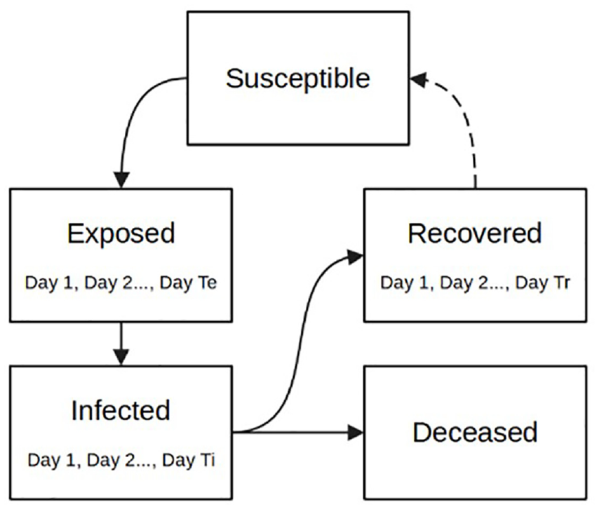
SEIRDS state diagram.
The spread of COVID-19 using non-geographical SIR models has been successfully predicted in individual cities and countries. Caccavo 26 describes an SIRD model that correctly estimates the spread of COVID-19 in China and Italy. An SEIIR model presented in Danon et al. 27 having two distinct phases of Infected was shown to predict the COVID-19 outbreaks in Wales and England. Similar compartmental differential equation models have accurately predicted the spread of COVID (as discussed in detail in the next section). However, not may offer specific estimations of spatial disease spread dynamics.
2.2. Asymptomatic infection and SIR-type models
In medicine, an asymptomatic patient is one that tests positive for a disease but shows no symptoms. 24 Asymptomatic carriers can shed the disease to those around them, but at a slower rate than those that are symptomatic. 4 The main issue is that asymptomatic carriers do not know they have the disease; thus, they may not follow the same procedures as someone who knows they are infectious. For example, someone who has a cough may cover their mouth to protect those around them; however, if they did not have any noticeable symptoms, they will spread the disease unknowingly. 8
The asymptomatic effect has caused problems in tracking and planning for many diseases including COVID-19.5–7 The proportion of asymptomatic infections that make up the COVID-19 pandemic has been widely debated, and ranges between 4% and 80%.4–8 The problem with these studies is how to collect and validate their data, which is more complex considering the asymptomatic carriers.
Several studies have explored the integration of the asymptomatic state in disease spread modeling. For example, Sen and Sen 28 proposed an SIARD (Susceptible, Infected, Asymptomatic, Recovered, Dead) and an SQIARD model (where Q is the Quarantine state). The SIARD model uses a simple transition from the Susceptible state to the Infected or Asymptomatic state using a given infectious rate. The SQIARD model incorporated the Asymptomatic state as a transition from the Quarantine state. The model splits the population that moves from the Quarantine state to the Asymptomatic or Infected state using specific rates. This model provides results that resemble real-world case counts in different countries such as China, India, Italy, and the United States. Giordano et al. 25 proposed an advanced SIDARTHE model, which also includes states for Diagnosed (D), Ailing (A), Recognized (R), Threatened (T), Healed (H), and Extinct (E) individuals. Asymptomatic individuals are added using multiple disease subcategories under one state: Asymptomatic is a subcategory of the Infected state. When an individual moves from Susceptible to Infected, they can become Asymptomatic, Infected, or undetected. The Asymptomatic individuals will then move to either Diagnosed, Ailing, or Healing. If an Asymptomatic individual becomes detected, they are considered diagnosed Asymptomatic. Asymptomatic individuals who move to Ailing develop symptoms and become undiagnosed symptomatic, and those who move to Healing will recover from the infection. The proportion of individuals who move to each state is defined by the states specific transition rate, that is, those who move from Asymptomatic to Ailing is denoted by the probability for a host to develop symptoms. The authors also remark the importance of those who are asymptomatic or undetected as they will not be isolating like those who are known infectious.
Barman et al. 23 presented an SEAIRD model that showed a similar transition method as those described previously. They use an Asymptomatic state where an asymptomatic rate α is defined to split the infected population into Infected (I) or Asymptomatic (A). Susceptible individuals can become exposed to the virus (E) or remain in the susceptible (S) state. Exposed individuals can become asymptomatic (A = αE) or infectious (I = α(1 − E)). The model showed how asymptomatic cases can affect the rate and magnitude of new infectious cases in a population. The authors also described a more advanced model called the SEAIRD-Control model where a Quarantine state and a Hospitalization state have been introduced. Although our focus is on the influence of asymptomatic cases, these extra states (Quarantined, Hospitalized, etc.) can be considered as future additions to our model.
None of the models above include the geographical aspect of the disease where the relationship between two neighborhoods impacts how the disease can spread. The model described in this paper addresses this idea and incorporates geographical attributes in disease transmission dynamics.
2.3. CA pandemic models
Traditional SIR models have no consideration of physical space, and therefore, geographical spread of pathogen. CA can be used together with differential equations to create a spatial pandemic model. CA is a mathematical formalism that describes an N-dimensional space of adjacent cells that contain values that can change over time. Any number of dimensions may be represented in CA, but the most practical models are in either two or three dimensions. The value of each cell is computed by the same set of transition rules executed in discrete time steps, which describe how the value of neighboring cells affects each other.
SIR-based discrete time CA models have widely studied, including to study the spatial spread of COVID-19. Medrek and Pastuszak 18 described a CA SEIR model that uses the age group distributions and population counts of regions to stochastically generate heterogeneous cell spaces. The model includes geographical considerations in creating the cell spaces and uses a regular neighborhood pattern. A probabilistic SEIQR CA defined in Ghosh and Bhattacharya 17 use similar methods of cell space generation based on population density and variation to define a cell space representing a country. The authors use a genetic algorithm to find the optimal disease parameters based on what is known from the epidemiological data of near areas.
A limitation of traditional CA is that it may not provide realistic neighborhoods when modeling large and complex geographical areas. Using real geographical data to define cell spaces is preferred to hypothetical scenarios because the model results are verifiable to a degree and offer more useful results to decision-makers. The research in Tobler 29 gives a foundation of cellular geography, including the description of geographical regions as cells in both regular and irregular neighborhood patterns. Zhong et al. 16 defined a geographical SIRS CA using irregular geography-based cell spaces, where a cell’s neighborhood is defined by the amount of border length shared with other regions. This neighborhood definition allows cells to have unequal influences on one another, based on the shape of their 2D geographical borders. Cárdenas et al. 30 introduced a similar SIR model with unequal border lengths using the Cadmium Discrete-Event System Specification simulation library (the software used to implement the model presented in this research).
The question of how to best model geographical relations is difficult. A simple guiding heuristic principle of geographical relation is every geographical area is related to every other geographical area, but near areas are more related than distant areas.
31
Using this principle, a correlation factor can be calculated to represent the level of relation or connection populations have between a pair of geographical areas. The simplest possible correlation factor is represented as a binary state, either indicating that no correlation exists (zero) or a correlation does exist (one). More complex correlation factors can be derived based on geographical features and population sizes. For instance, when working with irregular topologies in which each cell represents a geographical region, we can compute a geographical weight
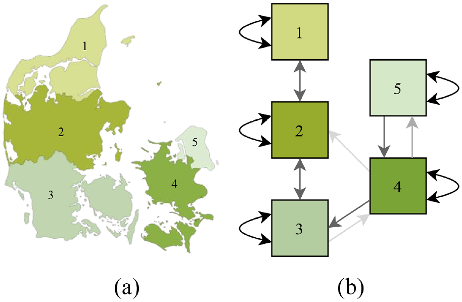
Irregular cell-DEVS schematic: (a) Real Map and(b) Irregular Cell-DEVS equivalent.
Cell i is usually a neighbor of itself, and its autocorrelation factor
As SIR-based models track infection of a geographically dispersed population, its correlation factors should represent the flow of population between geographical areas.
A correlation factor cij based on shared border between two cells i and j can be calculated as follows:
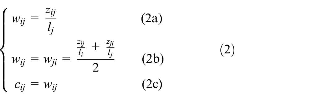
Equation (2a) describes a weight w ij between two cells i and j based on their shared border length zij and the total border length lj. This weight is not identical in both directions of correlation between the two cells. Equation (2b) defines a weighting factor for cells i and j that are identical in both directions of correlation. Equation (2c) states that the correlation factor is equal to the weighting factor in this case, and no additional computation is required to scale w ij and w ji to the range of 0–1.
The correlation factor of Equation (2c) can be used to describe how strongly a Susceptible population of one cell interacts with the Infected population of another cell. Cell-DEVS neighborhoods can be defined by Equation (2c) instead of by predetermined neighborhood patterns, where a cell is in another cell’s neighborhood if there exists a correlation factor between them that is greater than 0. A neighborhood defined this way allows cells to have any number of neighbors. We have used this method of neighborhood construction and shared border length correlation factors.
Cárdenas et al. 30 define an SEIRDS with more details in the infection profile, built using new simulation methodologies and tools. The model described here builds on this, including vaccinated states, and in turn, immunity rates, which affects the rate of exposures and thus infections.
We define an SEIRD cellular model that predicts the state of infection of a group of cells over time, where the state variables S, E, I, R, and D describe the percentage of total cell population having that state at a given time t. We further specify some of these states with time-varying behavior by giving infection characteristics that vary per day spent in that state. For instance, the length of the Exposed state is TE days, where each sequential day incurs a higher probability of transitioning to Infected. Infected individuals who have caught the disease are contagious for TI days, and have time-varying contagiousness. Recovered individuals have overcome the disease and are indefinitely immune. In a model that includes reinfection, the Recovered population would have immunity from the disease for a period of TR days before becoming Susceptible again. The Deceased state describes the population that dies because of infection but do remain in the original population count.
The cell space of the SEIRD CA model is formed using 2D geography-based neighborhoods, consisting of a set of cells M = (m1, m2,…, mi) each with population Ni, where the subscript i is the cell’s index. Each cell i has a unique neighborhood definition Vi that is defined as a set of cell names (neighbors) and their correlational weights, Vi = {(mi, 1), (mk, cik), …, (mx, cix)}, where a cell’s autocorrelation factor is 1. The Exposed and Infected states of this model include time-varying characteristics per day spent in the state, where each day within a state is referred to as the phase q of the state. The population in a specific phase q of Exposed at time t can be further specified as Ei t (q), and the population of a specific phase of Infected can be specified as Ii t (q). Each cell population Ni is divided into age groups, specified by the subscript a, which describes the proportion of total cell population Ni that are members of age group a. Dividing each population into age groups allows the incorporation of the age-specific factors that influence human behavior and disease outcomes. A summary of this notation is given in Table 1, and will be used throughout this paper.
SEIRD CA cell and state notation.
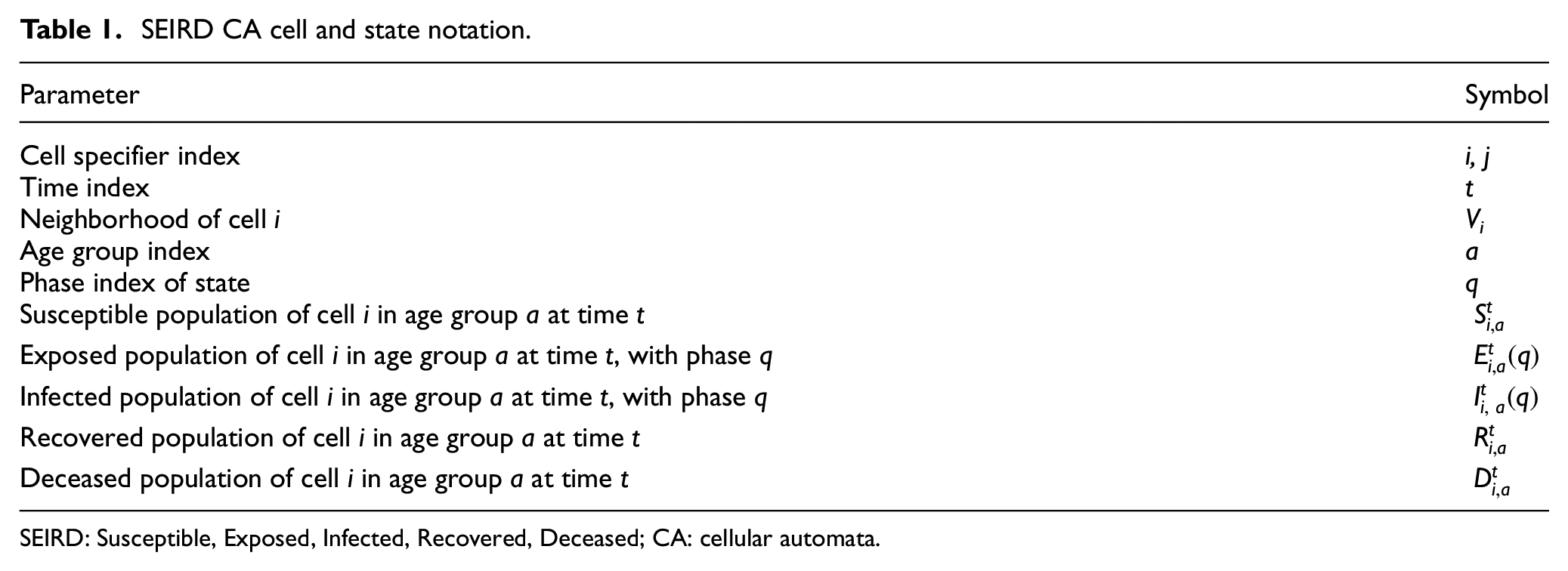
SEIRD: Susceptible, Exposed, Infected, Recovered, Deceased; CA: cellular automata.
The probability that an Exposed individual enters the Infected state is controlled by the incubation rate ε(q). The probability that an Infected individual becomes Recovered is controlled by the recovery rate γ(q). The probability that an Infected individual enters the Dead state from each phase of Infected is controlled by the fatality rate δ(q). The contagiousness of individuals in each phase of Infected is given by the virulence rate λ(q), which approximates the epidemiological Ro of the disease over the phases of Infected. The rate at which individuals make potentially infectious contact with others is described by the mobility rate µ(q), which models the difference in movement behavior between age groups. Further definitions of parameter symbology are given in Table 2.
SEIRD CA cell and state notation.
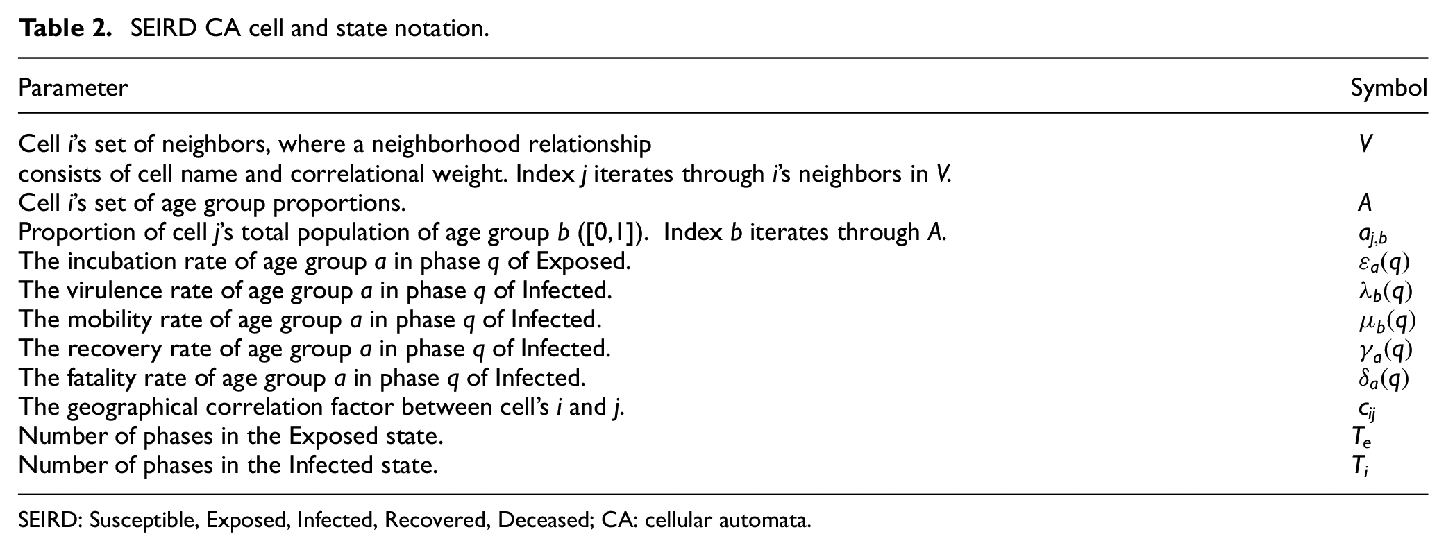
SEIRD: Susceptible, Exposed, Infected, Recovered, Deceased; CA: cellular automata.
The local transition function of the discrete time SEIRD model is defined by Equations (3a)–(3g):
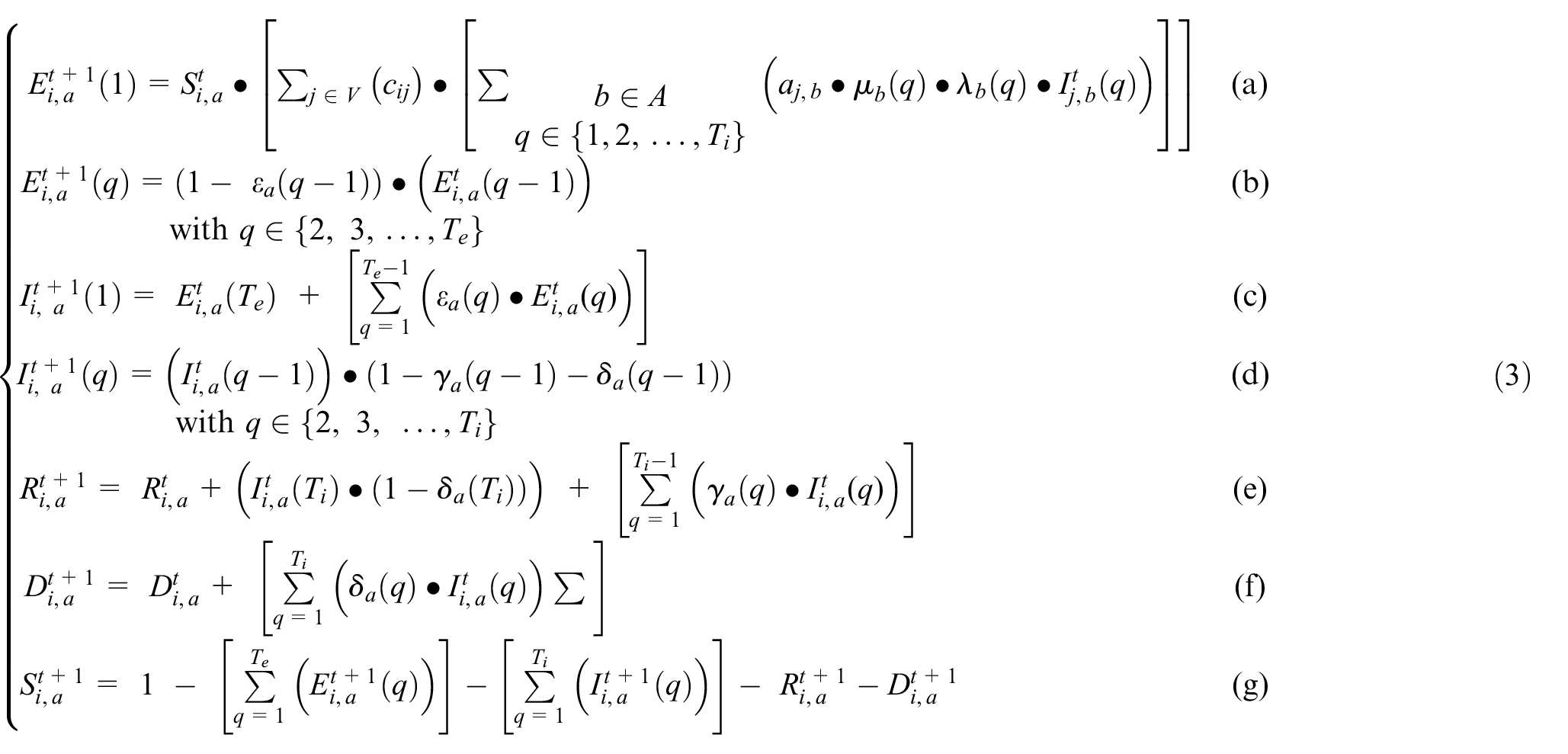
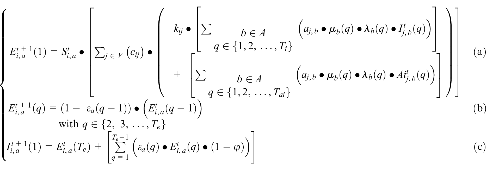
Equation (3a) describes how the Susceptible population of cell i interacts with neighboring Infected populations of all age groups, calculating the new Exposed. The first Exposed phase population (q = 1) is equal to the product of the Susceptible population, the value cij ∈ [0,1], and the Infected in each phase q considering the virulence and the mobility of infected individuals in phase q. The geographical correlation factor between regions i and j (cij) describes the amount of population interaction between cells i and j. The A symbol represents the set of age groups within cell j. Equation (3b) describes the population in all Exposed phases except the first. The population in all subsequent Exposed phases is the Exposed population in the previous phase multiplied by 1 minus the incubation rate of that phase. Equation (3c) describes the newly infectious population in Infected phase 1. The population in Infected phase 1 is equal to the population leaving the Exposed state, where all individuals who reach the final Exposed phase become Infected on the next time step. Equation (3d) states that the Infected population in each subsequent phase of Infected is equal to the Infected of the previous phase, minus the recoveries and deaths that occur during that phase. Equation (3e) states that the Recovered population is equal to the Recovered population of the previous time step, plus the sum of all new recoveries from each phase of Infected, plus the entirety of all Infected that reach phase Ti and do not die. The Dead Equation (3f) states that the total deaths within a cell are equal to the deaths of the previous time step plus all new deaths occurring due to each phase of Infected. The Susceptible Equation (3g) states that the sum of all infection states within an age group is always equal to one. The sum of all age group proportions in A is also always one.
2.4. Geographical Cell-DEVS models
As discussed earlier, our research focuses on defining advanced geographical models that consider the population of each geographical area and uses a non-uniform topology including non-uniform cells divided into age groups each of which may have different infection characteristics and behaviors. Traditional CA is not adapted to such kinds of representation. Instead, Cell-DEVS32,52 allows the incorporation of these factors. The Cell-DEVS modeling methodology allows the definition of cell spaces based on the DEVS. 33 Cell-DEVS describes an n-dimensional cell space where each cell represents a DEVS atomic model. The cell space containing the n cells is defined as a DEVS coupled model where each cell is connected to its neighboring cells, as in Figure 4.
Cell-DEVS model: (a) atomic cell schematics and (b) two-dimensional Cell-DEVS neighborhood.
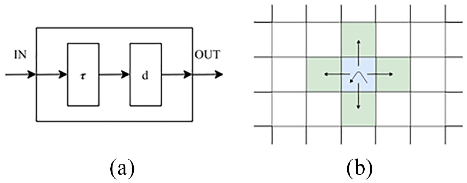
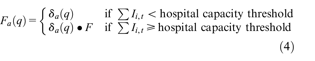
When a cell receives an input, the local computing function τ is activated, which will compute the next state for the cell. This discrete-event approach only considers and computes active cells using a continuous time base. If there is a change in the cell’s state, the change is transmitted after a time delay d. In Figure 4(b), we can see how a cell (center) will transmit information to the neighboring cells using a von Neumann neighborhood. Cell-DEVS accepts other neighborhoods and irregular topologies as well (as discussed later). Compared to CA models, each cell executes asynchronously only when activity is detected, improving performance. Discrete-event models use a continuous time base, making it simpler to deal with a variety of time scales in the models. The delay functions also allow defining complex time specifications at the cell’s level, without relying in a centralized global clock which can introduce timing management complexities in the model.
Cell-DEVS inherits the modularity and hierarchical modeling ability of DEVS. This allows for models to better interact with other models, tools, data sets, and visualization tools, making it an easy and efficient method to build complex cellular models. The DEVS is a formalism used to model and simulate discrete-event systems. Cell-DEVS can be used to specify and implement cellular models and facilitates their simulation and integration with other models. In this research, we use the Cadmium tool, 34 which allows users to define model inputs using JSON, a data format to store and transmit large amounts of human readable data. JSON stores data in key-value pairs allowing for the simple representation of neighborhoods, their attributes, and their relationships. Cadmium allows the user to include complex geographical inputs that load into the model at runtime resulting in a flexible model that allows for efficient rapid prototyping. Rapid prototyping allows modelers to add new disease characteristics to existing models, adapting them to fit their evolving needs. These changes should be efficient and accessible to modelers. This approach also enables one to incorporate additional critical parameters not known when the modeling commenced. The Cadmium JSON library enables the user to load cells from a JSON format file, allowing the user to generate complex neighborhoods and state variables to be run as scenarios of the model. This project generates a Cadmium JSON cell space from geographical data and state information before using it as an input to the model. The 2016 Canadian census offers good data on populations per geographical regions and is used in generating the results of this model. The input JSON is generated by a python script, which parses geographical census data from input files and creates a cell space with neighborhoods corresponding to the geographical data, virus characteristics, and initial pandemic conditions. For each geographical area in the input data, a cell ID is created, a set of cell state variables are initialized, and the neighborhoods of each cell are constructed by a correlation factor.
SIR models have been enhanced through the use of complex topologies based on geographical information. Cárdenas et al. 30 described a model for the spread of infectious diseases among geographic regions. They describe how individuals can become mobile and be in contact with individuals in other regions, resulting in the spread of a disease across regions. They show how geographical information can complement the standard SIR model as well as lead to better, more defined results. Cárdenas et al. 30 described a geographical Cell-DEVS SIR model. Their model is based on Zhong et al. 16 to simulate the spread of epidemics in a geographical-based 2D cell space. The model has described that at time t, a given cell (i, j) has a given population Nij. Each cell stores the proportion of individuals in each state. The SIR model described in Zhong et al. 16 and translated to Cell-DEVS in Cárdenas et al. 30 uses a geographical correlation factor defined by the shared boundaries as defined in the set of Equation (3). The correlation factor is a method the model uses to link two regions together to allow for interaction between their populations. This is not necessarily the most accurate method to model the flow of populations as it does not take other key factors into account. For example, it does not consider the density of population areas and workplace hubs such as downtown Ottawa. Adding transportation networks 35 or human movement and mixing models 36 shows how the addition of these factors would give more accurate results. However, the shared border length correlation method has been shown to produce accurate results, and it is easily adaptable for geographical simulations. 16 Being able to quickly adapt a model to receive new data is crucial for rapid prototyping, and this model allows the user to change both the geographical level they are simulating as well as the disease characteristics. The equations for the correlation factor between neighborhoods (i.e. cells) are the ones shown and explained in Equation (2). The model developed in Cárdenas et al. 30 also includes parameters that define hospital capacities and lockdowns correction factors.
Cárdenas et al. 30 extend the geographical model described in Zhong et al. 16 to incorporate deaths and the ability for a cell’s recovered populations to become re-infected.37,38 Davidson and Wainer 39 further extend the model with the ability for a cell’s population to move from the Susceptible state to an Exposed state before becoming Infected, developing the SEIRD model presented in section 3 that was used as starting point for the SEAIRD model framework we propose in this research. When adding the Exposed state, the rate at which a cell’s population would move from Susceptible to Exposed remained unchanged. But, when the population moved from Susceptible to Exposed, a new value was considered, the incubation rate, ε. The Exposed state is an important addition to the model as it includes the variable onset in infectiousness seen in individuals. The model can simulate realistic incubation period of COVID-19, showing the time it takes for someone to be exposed to when they show symptoms. The problem with this is that not all individuals develop symptoms after exposure, thus the need for an asymptomatic state.
3. Baseline Cell-DEVS model
The model presented here is an evolution of a simple Cell-DEVS model first presented in Cárdenas et al., 30 and is based upon a discrete time SEIRDS CA model. 16
3.1. Methodology, software, and hardware
To define the model, we follow the Cell-DEVS formalism. We first define a Cell-DEVS SEIRD model as an extension of the model in section 2.3. The model is implemented using the Cadmium tool, a Cell-DEVS simulator implemented using C++ programing language. The model can be run in different operating systems including MacOS, Ubuntu, and Windows. The models presented in this paper were run on regular desktop and laptop computers with 16 GB RAM and Intel core i7. The simulation results were available in the order of minutes (between 2 and 10 min depending on the scenario), and the graphs were automatically generated using Python scripts. The Cell-DEVS model definition and implementation presented in this section becomes the foundation of SEAIRD and SEVIRDS models given in later sections.
3.2. Model definition
The SEIRD model includes new features, including a fatality rate modifier when high levels of infection are present in a cell’s population, and movement restriction effects that model public health lockdown policies. Parameters for the model are also chosen based on known characteristics of COVID-19 before using the model to generate simulation results.
Equation (3) was used to define the local computation function of the Cell-DEVS model, with direct substitutions to the fatality rate δa(q), and the geographical correlation factor cij to account for new functionality. To model the effect of an over-capacity health care system in times of high levels of infection, above a certain level of cell infection the baseline fatality rate is multiplied by a constant factor F (called the fatality rate modifier). The fatality rate modifier is greater than 1, while the product of F and the fatality rate does not exceed 100%. Equation (4) defines this modified fatality rate
Equation (5) shows the cumulative sum of the proportion of population in each of the Infected phases across all age groups at a given time. Levels of infection within a cell that cause model parameters to change are also referred to as infection thresholds, such as the hospital capacity threshold of Equation (4). Equation (6) can be used to check whether a cell exceeds a target infection, always bounded by the range [0,1]:
The concept of infection thresholds is also used to define movement restrictions. Instead of using a static geographical correlation factor cij as in Equation (2), new factors are introduced which decrease the amount of correlation between cells when the infection thresholds within each cell are exceeded. This serves to model the restriction of mobility both within a cell’s own population and the restriction of mobility between neighboring cells. An infection correction factor kij is now multiplied with cij to yield an infection dependent geo-correlation factor gij as in the following Equation (6):

For each cell, infection thresholds and correlation modifiers are assigned to model each cell’s individual set of lockdown policies. Each correlation modifier, also known as a mobility restriction factor, is assigned a hysteresis value so that mobility restriction policies remain in place for some time after infections fall below the threshold at which they were triggered. The nth mobility restriction policy of cell i (Kn,i) is defined by the three variables: infection threshold (τn), mobility restriction factor (mn), and hysteresis factor (hn) in a map relationship as seen in Equation (7). Cell i’s set of lockdown policies can then be defined as a set of n mobility restriction policies, as seen in Equation (8):

Each neighbor pair’s combined set of lockdown policies (Ki and Kj) are then used to calculate a kij between two neighboring cells. As individual cells always have a single lockdown policy in effect (Kn,i), the policy with the highest infection threshold that has been exceed between the two cells is selected for their interaction. In other words, the more restrictive policy in effect between two cells is always used in their correlation, as demonstrated by the edge case of a cell with closed borders (mn = 0), where no infection should cross borders in either direction. This selection of a single Kn,i for interaction between cells i and j, demonstrated by Equation (9), yields the mobility restriction factor Ki,j that is used to calculate the infection correction factor ki,j. Note that a cell’s interaction with itself simply selects the Kn,i with the highest infection threshold in the set Ki that has been exceeded:

A public health agency recommending mobility restrictions is, however, not enough to guarantee that all members of the population follow them. The final piece of the infection correction factor is a variable that describes the proportion of population that do not follow any mobility restrictions in effect. The disobedience factor d describes the portion of a cell’s population that are unaffected by any Ki,j selected for cell interactions. The infection correction factor for the interaction between two cells i and j as used in Equation (6) can be calculated using the disobedience factor and the mobility restriction factor Ki,j selected for i and j as in Equation (10). The extended SEIRD Cell-DEVS model simply uses the set of Equation (3) with the substitutions of gi,j in place of ci,j, and

The model parameters were defined using known disease data for COVID-19. The mean incubation rate of COVID-19 used was 5.4 days following a log-normal distribution. 40 This distribution was used to define both TE = 14 and the incubation rate ε(q). The mean symptomatic infection length of COVID-19 was considered to be 10 days, and it was used to develop an infection profile of TI = 12 days, where the recovery rate γ(p) controls the proportion that recover in each phase of Infected. 41 The virulence and fatality rates of the model were varied to match infection case data during experimentation.
3.3. Model implementation
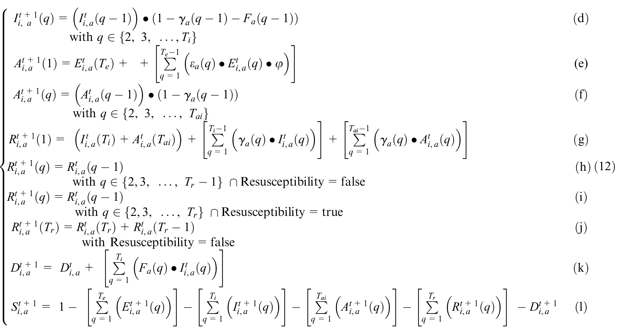
The extended model is implemented in Cadmium, defining atomic cell models of type geographical_cell coupled to form a cell space. Each geographical cell uses a cell ID (C), a state object that contains state variables (S), and a vicinity object that describes the structure of the neighborhood (V). The relationships between the classes involved can be seen in the UML diagram of Figure 5.
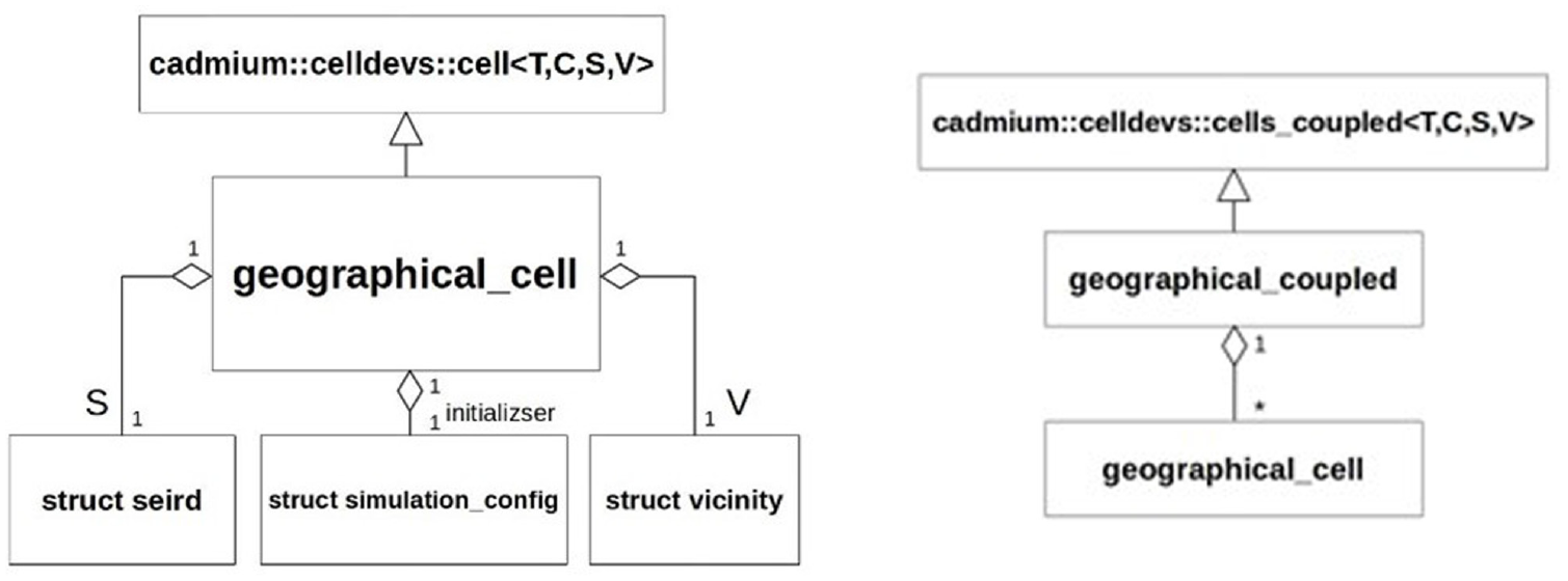
Geographical cell model UML class diagrams.
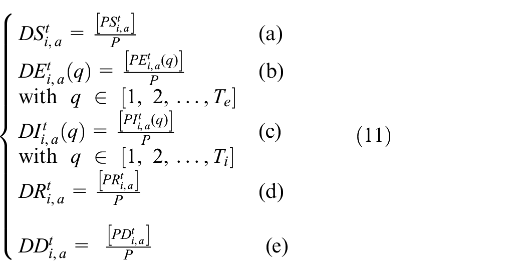
The infection state variables S, E, I, R, and D computed in the local transition function are discretized per Equations (11a)–(11e). The precision divider P is used to discretize each state variable, and the use of square brackets denotes a round operation:
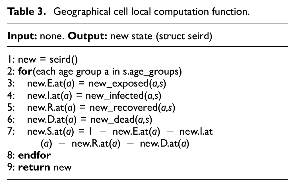
The local computation function implemented in the geographical_cell class is described by the pseudocode of Table 3. The algorithm begins by allocating a state object new in line 1, which will be used to store the new values of cell state variables. Lines 2 through 8 calculate the new state variables for each age group based on the cell’s current state object s and store the result in new. These six lines implement a cell’s local computation function at a high level (Equations (3a)–(3g)). The resulting state object is returned in line 9 to be written as the new cell state.
Geographical cell local computation function.
The method new_exposed() (line 3, Table 3) described in the local computation function is responsible for calculating the infective interactions between all neighboring cells. This method corresponds to Equation (3a) of the local computation function with the extensions defined in this section, including the calculation of the infection correction factor ki,j of Equation (6). The calculation of new exposures for an age group b of a single cell i can be seen in the pseudocode in Table 4. The algorithm begins by calculating the movement correction multiplier of cell i, using the movement correction function which scans the set of movement restriction factors ki and chooses the most suitable factor to apply. The infection correction factor gi is calculated in line 2 by considering the proportion of disobedience d that will follow the movement restriction policy and the mobility restriction of the ki selected. In line 3, the variable infStrength is declared and used to sum how much infective contact is made with cell i from each of its neighbors. We then iterate over all neighbors of cell i, summing the amount of infective contact made with all neighbors. This is done by first calculating the infection correction factor of the neighbor cell j, and then choosing the more restrictive correction factor between i and j to describe their interaction (lines 5–7).
New exposures algorithm.
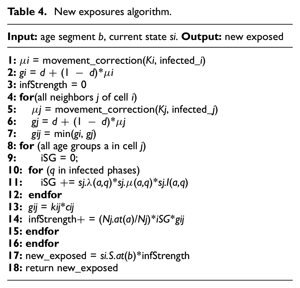
Next, the algorithm calculates the infective potential of each age group in neighbor cell j by summing over all infection phases the proportion of population with phase q multiplied by their mobility rate (µ) and their infectivity rate (λ) (line 11). The total infective weight of the age group is then calculated in line 14 as a function of the proportion of population in that age group, the infective potential of the age group, the infection correction factor kij, and the geo-correlation factor cij. The algorithm concludes in lines 17 and 18 by multiplying the Susceptible population in age group b by the sum of infective strength of the neighborhood and returning the result.
The baseline model was validated and calibrated using real-world data of the province of Ontario, Canada, including 34 Public Health Units (PHUs), as shown in the map presented in Figure 6. 42 The simulation results were compared to the reported case data in these regions for the period of 1 January 2020 to 2 February 2021. The case data used were reported by the Government of Ontario, in the form of confirmed new cases per date and their resulting outcome. 43
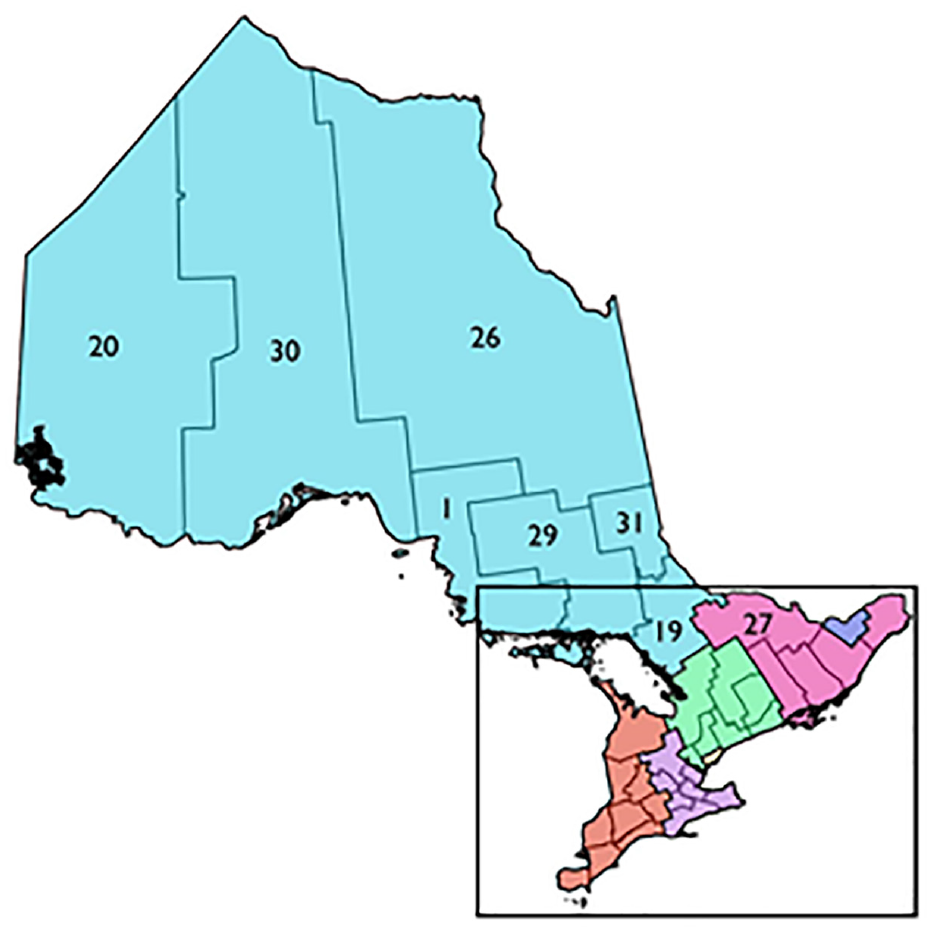
PHUs of Ontario. 42
The SEIRD model predicts the number of active cases present at any time but does not report the data in the form of new cases per day. To calibrate and validate the model results, the confirmed cases were converted to active infections and cumulative fatalities over time. Each confirmed case was assumed to follow the 10 days mean infection length of COVID-19 when converting case reports to active cases. Fatal outcomes were still considered to produce contagious individuals with an active infection length of 10 days. The geographical boundary used in defining the cell space for the Ontario PHUs was provided in Ontario GeoHub. 44 The PHUs of Ontario were placed in five groups based on their location: Central East, Central West, Southwest, East, and North. A visualization of the case data over for these groups is shown in Figure 7. The default experimentation parameters used in experimentation as well as the specific structure of the cell state variables can be found at https://github.com/SimulationEverywhere-Models/Geography-Based-SEIRDS. We examined the effect of movement restriction policies in the Toronto PHU in terms of the movement correction factor’s infection thresholds, hysteresis values, and mobility multipliers. Without movement restriction policies to limit infection spread, most of the population in all 34 cells become rapidly infected in a severe trajectory.
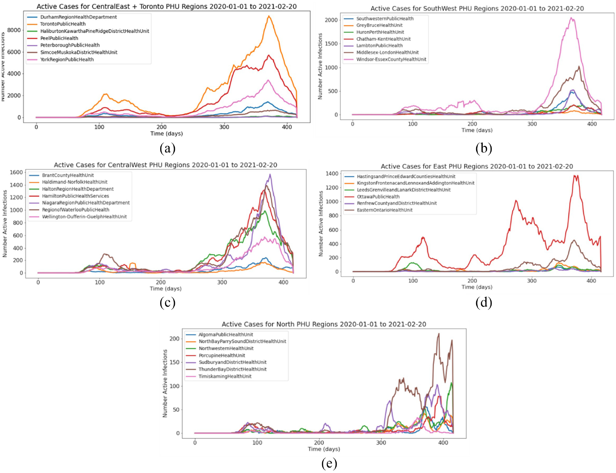
Ontario PHU Case Data from December 2020 to February 2021: (a) Central East; (b) Central West; (c) Southwest; (d) East; (e) North.
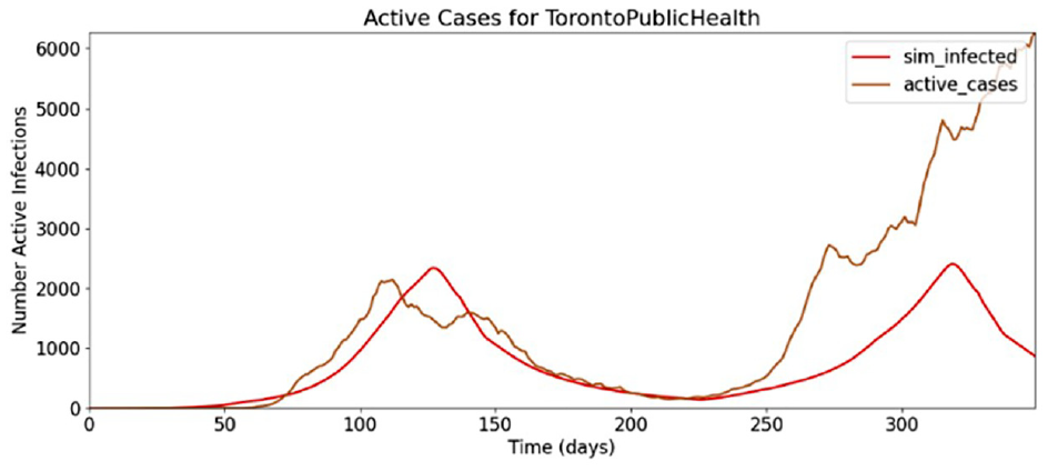
Figure 8 shows simulation data compared to the reported active cases. This demonstrates an infection threshold (ki) that is too high, resulting in movement restrictions that are applied later than what is represented in the case data. The predicted active infections would have been more accurate had the infection threshold of the limiting policy been in effect at half the number of active infections.
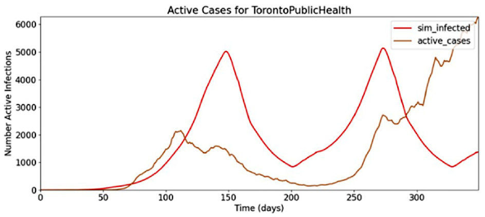
Toronto pandemic, movement restriction factor #1.
Using an infection threshold 50% lower than the simulation of Figure 9, the movement restriction policy comes into effect at a more accurate level of infection, as shown in Figure 9.
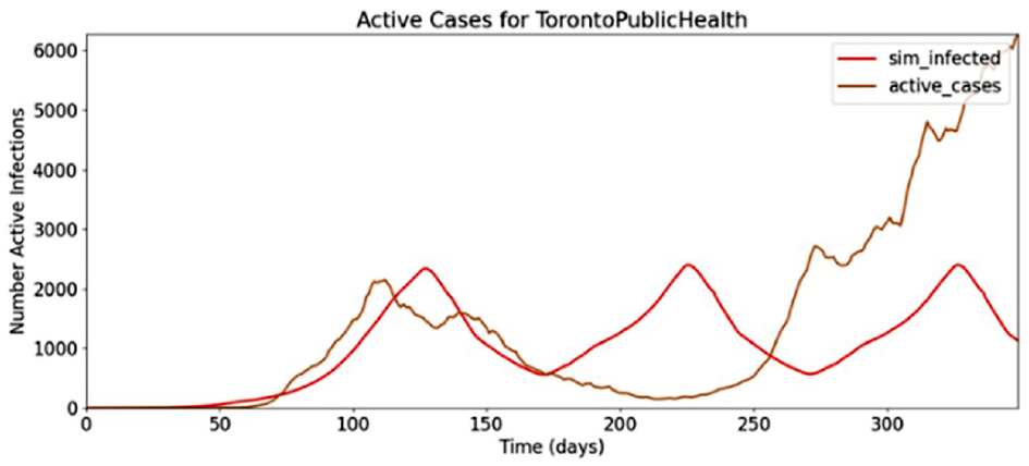
Toronto pandemic, movement restriction factor #2.
However, these restrictions are lifted too soon at day 170 of the simulation, and a second wave begins while the case data indicate a continual fall of cases at this time. This indicates that not enough hysteresis was used in the dominant infection correction factor, and that the hysteresis factor should be increased such that the number of active cases will fall to a lower level before movement restrictions are lifted. A larger hysteresis factor results in a better match of the Toronto PHU infection, shown in Figure 10.
Toronto pandemic, movement restriction factor #3.
After these preliminary tests, we conducted a series of simulations and compared the model results to the known case data to calibrate the parameters of the model. The virulence rate and infection correction factors were found to be the most influential determinants of model accuracy, which was improved by increasing the virulence rate above the default level.
While the first wave of the COVID-19 pandemic in Ontario was the strongest in Toronto, other regions further away also had significant levels of infection relative to their total population size, namely, the Ottawa and Windsor Essex PHUs. A single infection source beginning in the Toronto cell was insufficient in producing the first wave infection curves far away from Toronto, so a smaller amount of infection was added to the initial conditions of Ottawa and Windsor Essex which also had considerable levels of first wave infection. Figure 11 shows the results in the regions surrounding Toronto, Ottawa, and Windsor Essex.
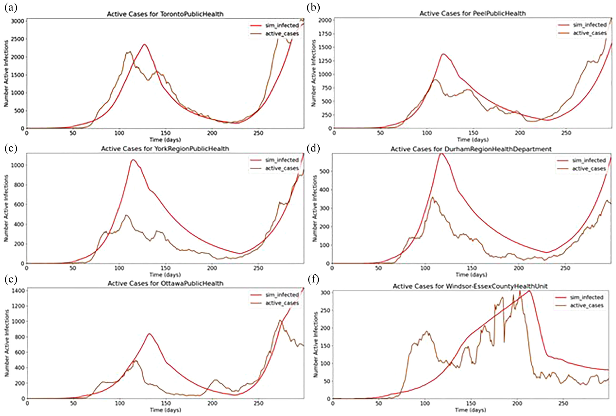
Pandemic in (a) Toronto; (b) Peel; (c) York; (d) Durham; (e) Ottawa; (f) Windsor Essex.
The simulations in these regions do track the general shape of the case data, but some predictions significantly overshoot case estimation. Toronto has the highest overall accuracy as the model parameters were initially developed to match Toronto before considering more regions. Every cell is using the same set of infection correction factors, which could be a significant source of error because each region’s population density and human characteristics are region specific by nature. In fact, in the case of regions directly adjacent to Toronto, the level of simulation error is proportional to the population density of each region. The population density of the Peel PHU is 25% that of Toronto. Similarly, the population density of York is 11.74% of Toronto, and Durham is 5.46% of Toronto. Given that Toronto has both the highest population density and the highest model accuracy, and that Durham has both the lowest population density and accuracy, a population density correction should be investigated in the future.
4. Extending the model: asymptomatic individuals
The validated baseline models presented in section 3 were extended to include asymptomatic individuals, and then incorporated into a geographical SEAIRD model that can be used for conducting experiments with different population scenarios as will be shown in this section. Each model shares a defined asymptomatic rate where a given proportion of the Exposed population move to either Infected or Asymptomatic. We use the methodology, software, and hardware explained in section 3.1.
4.1. Model definition
Our proposed geographical SEAIRD model is based on Cárdenas et al. 30 and Davidson and Wainer 39 by adding an Asymptomatic state (A) as depicted in the diagram in Figure 12, which shows that a cell’s population starts in a Susceptible state before becoming exposed. From there, the Exposed population will move to either Asymptomatic or Infected. If Asymptomatic, they will eventually become Recovered, but if an individual is Infected, they can move to either Recovered or Deceased.
SEAIRD state diagram.
The dotted line in Figure 12 from Recovered to Susceptible shows how a population can become re-susceptible after recovery. Each transition is based on their defined time behavior and described using the delay function. Exposed, Infected, Asymptomatic, and Recovered states have a defined set of days that a population can be within the state described by Te, Ti, Tai, and Tr. Each state has a defined state transition that occurs at each day within the state. The days within each state set of days are described by q = {1, 2, …, Tstate}. For example,
Our model uses m unique geographical cells. The proportion of a population’s age group a found in each state is described by:
SEAIRD model new definitions.
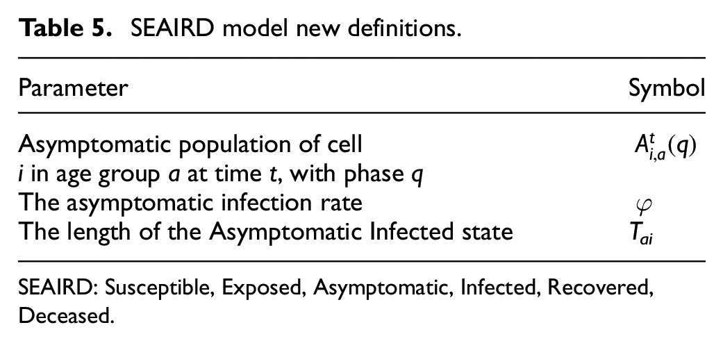
SEAIRD: Susceptible, Exposed, Asymptomatic, Infected, Recovered, Deceased.
Equation (12a) is based on Equation (3a), and it is used to calculate the proportion of newly Exposed population. This is a result of the Susceptible population in contact with either the entire Infected population or the Asymptomatic population of neighboring cells j. The first sum in the second part of the equation calculates the proportion of a cell’s Susceptible population exposed to an infectious individual (I) and the second sum, the proportion exposed to an asymptomatic individual (Ai). The symbol A defines the set of age groups in cell j, where each age group is represented by b. Each cell’s population represented by the subscript b, which represents Nj divided into age groups. As before, each cell is related to its neighbor by a geographical correlation factor cij that describes the impact each neighboring cell has on a given cell, including virulence and mobility rates a given cell’s population has with its neighbors. Finally, kij defines a correction factor between cells i and j, applied to the infectious half of the equation to simulate different behavior for infectious and asymptomatic populations: we consider that asymptomatic individuals to be more carefree; thus, they will expose more individuals. The correction factor kij is defined using the models disobedience factor d, where kij = min(ki,kj). The correction for individual cells i and j is defined as kcell = d + (1 − d)*mc. The infection correction factor mc is defined in the model as a function of the infection threshold (ITH) that triggers a specific mobility correction factor (cm) and a hysteresis level (H).
Equation (12b) describes how the Exposed population transitions to the Infected or Asymptomatic state. The equation defines the Exposed in phase q as equal to the exposed of the previous day multiplied by 1 − εa(q − 1), where εa (q − 1) defines the incubation rate for an age group a for state q − 1. The incubation rate defines the probability of the population moving to Infected or Asymptomatic. Equation (12c) describes the new Infected population that will occupy day 1. The equation considers the Exposed population from all phases and all age groups. As defined above in Equation (12b), a proportion of the Exposed population moves to Infected or Asymptomatic depending on the incubation rate εa. The rate at which the Exposed population becomes either Infected or Asymptomatic is defined by asymptomatic rate φ. Thus, for the case of new Infected population, the rate is defined as (1 − φ). Equation (12d) describes the portion of the Infected population that moves to the next phase. The infectious population for phase q equals the population of infectious in the previous phase, q − 1 minus the population who move to either Recovered or Deceased. The portion of the population that moves to the Recovered or Deceased states is defined by recovery rate γ and fatality rate
Equations (12e)–(12f) define the asymptomatic state behavior following the same rules described in Equations (12c) and (12d). Equation (12e) defines the proportion of the exposed population that moves to the asymptomatic state (here, the asymptomatic population rate remains as φ). Equation (12f) follows the same rules defined when asymptomatic cases either move to the next phase q, recovered, or deceased.
Equation (12g) describes the proportion of infectious or asymptomatic populations that become recovered. The equation defines that the total number of recoveries is equal to the total number of recoveries from the previous day plus the newly recovered population. The current day recoveries are calculated by taking the proportion of infectious and asymptomatic infections that move to the recovered phase using rate γ. Finally, the equation checks for the population that is on the final day of either infectious or asymptomatic, if their population does not move to the deceased state, they are added to the recovered state. (Equations (12h) and 12j) are used only if re-susceptibility is not enabled. Once the Recovered population reaches the final day of recovery, they remain there for the rest of the simulation time. Equation (12i) is an equation only used when re-susceptibility is enabled, that is, patients who are recovered will go through each day of recovery, when they reach the final day of recovery, the population will move back into the susceptible population pool where they can be re-exposed.
Let us consider fa(q) as the fatality rate of infected phase q for age group a; λa(q) their virulence; μa(q) their mobility rate; εa(q) the incubation rate; γa(q) the recovery rate and φ as the asymptomatic infection rate. As defined in section 3, cij is the geographical correlation factor between cells i and j; kij is the correction factor applied to both cells i and j to model movement restriction and disobedience. Equation (12k) is used to calculate the proportion of Deceased at a time t. The proportion of Deceased next day is the total of current Deceased plus the sum of the Infected population that died the day before. New Deceased is equal to the newly deceased population moving from the infectious state multiplied by the fatality rate. The Deceased transition does not consider asymptomatic infections as they do not lead to deaths. Equation (12l) is a “special equation” needed for the integrity of the model. Since we know that any given population starts in the susceptible state (excluding the starting cell), then the population that are not in any other state should remain susceptible.
4.2. Model implementation
The model is implemented as a coupled Cell-DEVS where the cell space represents a geographical region, and each cell (of irregular topology) is a district in the city/province. It relates to its neighboring cells using an irregular topology. Each cell consists of a cell ID, a set of state variables, a model configuration, and neighboring cell’s correlation factors.
We implemented these equations using the baseline model in section 3 and included the equations in this section. When all the geographical cells are defined, they are placed into a top level coupled cell model called geographical_coupled, with configuration as seen in Figure 13. At runtime, geographical_coupled is initialized using the cell’s data provided from in a JSON input file (using the methods described in the top model class cadmium::celldevs::cells_coupled <T,C,S,V>); Figure 13 shows how this coupled cell model is defined. At the bottom level of Figure 13, the three structures define the inputs to the geographical cells.
SEAIRD coupled cell diagram.
The SEAIRD structure defined the state variables that will hold the population as well as the infection correction factors and the disobedience factor (Figure 14). The simulation configuration structure defines the attributes used to characterize the disease being modeled including recovery rates, fatality rates, and asymptomatic rates (Figure 15). The vicinity structure holds the information that defines the correlation factors between two cells (geographical_ cell). The three structures are read in at runtime to create the single parameterized model geographical_cell. The collection of geographical cells and their relationships define the geographical coupled model.
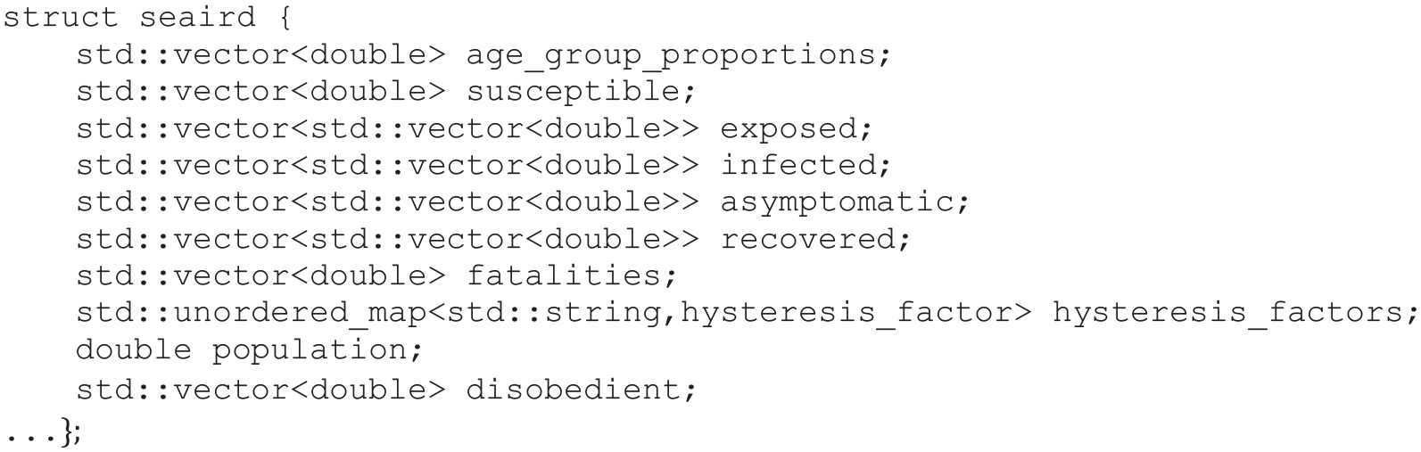
SEAIRD configuration code.
Simulation configuration.
Each cell contains the relevant information defined in the SEAIRD configuration file. At runtime, each cell has a unique population which is divided into described age groups. Each cell’s population will then be divided into one of the six states. If modeling the beginning of a pandemic, a single cell will hold the initial case(s) and the remaining cells will be 100% susceptible. At t = 0, the proportion of a cell’s population in each state is defined in by the values provided in the SEAIRD structure. Defining the SEAIRD structure at runtime with user-defined inputs allows users to choose the point of time they want to start a model (if they are interested in the middle of a pandemic, they can tailor the input values to hold the number of individuals in each state at that time).
In Figure 15, the simulation configuration is declared; these values are used to change the ways a population transferred from one state to another. These structures define the geographical_cell atomic model presented in Figure 13. A geographical_cell atomic model is defined for each geographical cell in the model, these cells make up a geographical_coupled model where each cell is connected by a correlation factor. Finally, this geographical_coupled model is defined by methods found in class cadmium::celldevs::cells_coupled <T,C,S,V>.
4.3. Simulation results
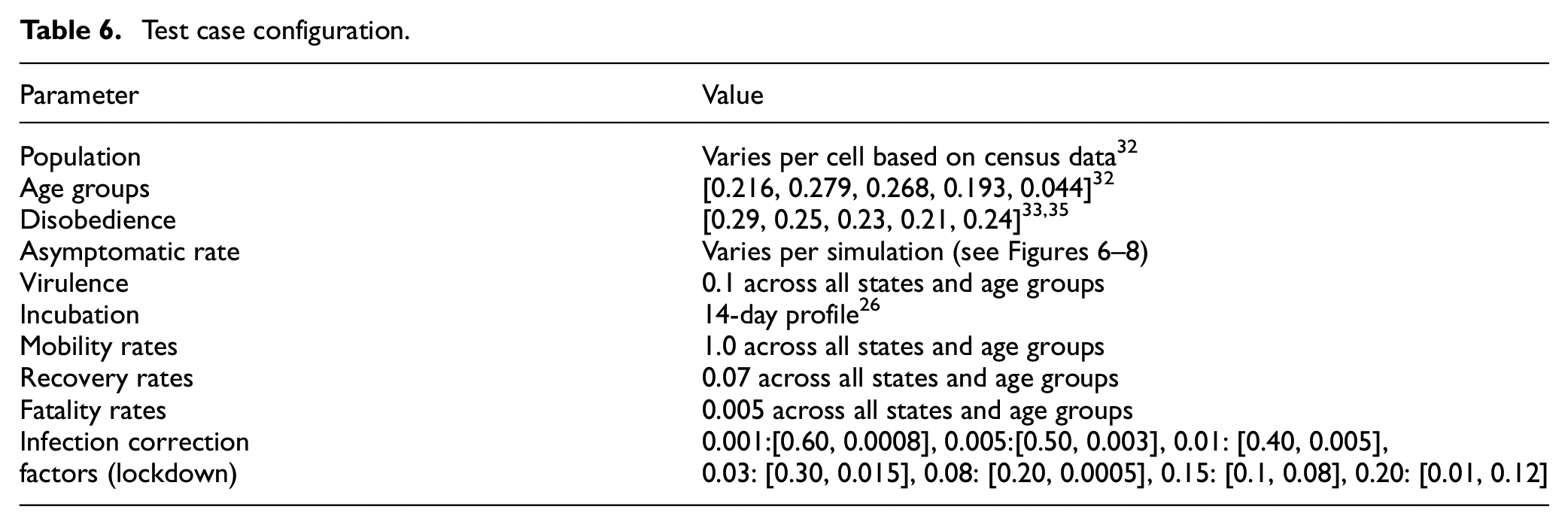
The SEAIRD results presented in this section are generated using source data from the 34 Ontario PHUs where the population is generated using census data. 45 A configuration file is built using a geopackage Geopandas 46 to determine shared boundaries (correlation factor) between each PHU. Figures 16–19 were created using the graphing tools in Cárdenas et al., 30 R, 47 and Plotly. 48 The implementation of the model is available at https://github.com/SimulationEverywhere-Models/Geography-Based-SEAIRDS. The results presented in this section show and compare the effect the asymptomatic state has when added to the simulation. The parameters used in this study are shown in Table 6.
Test case configuration.
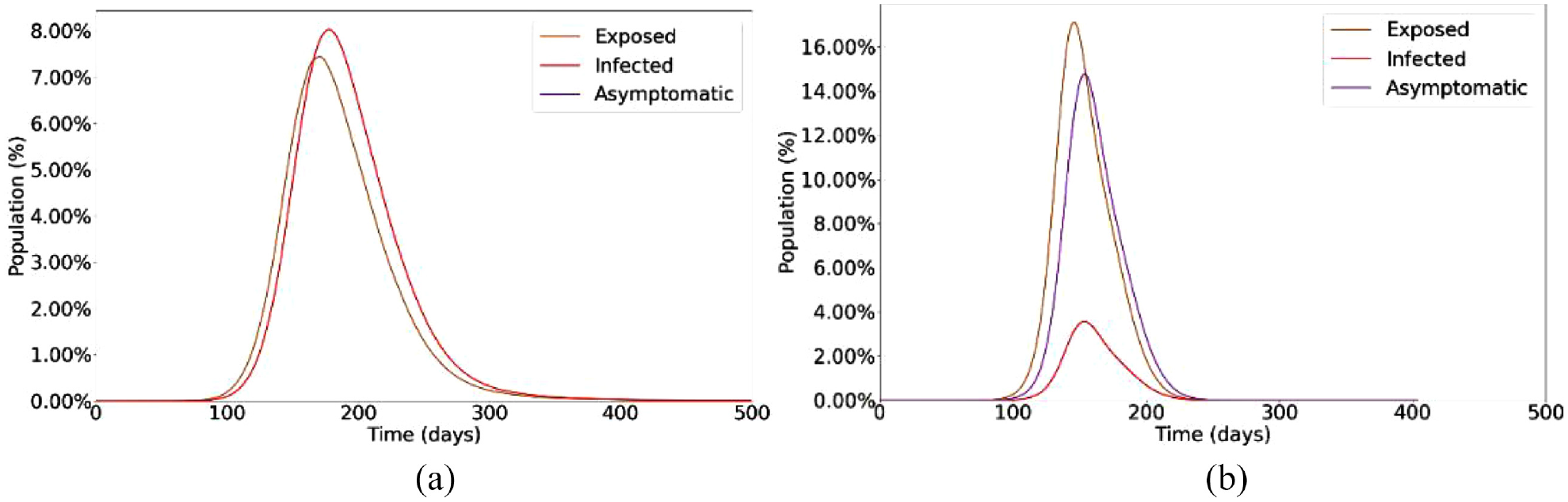
SEAIRD model (a) 0% Asymptomatic and (b) 80% asymptomatic.
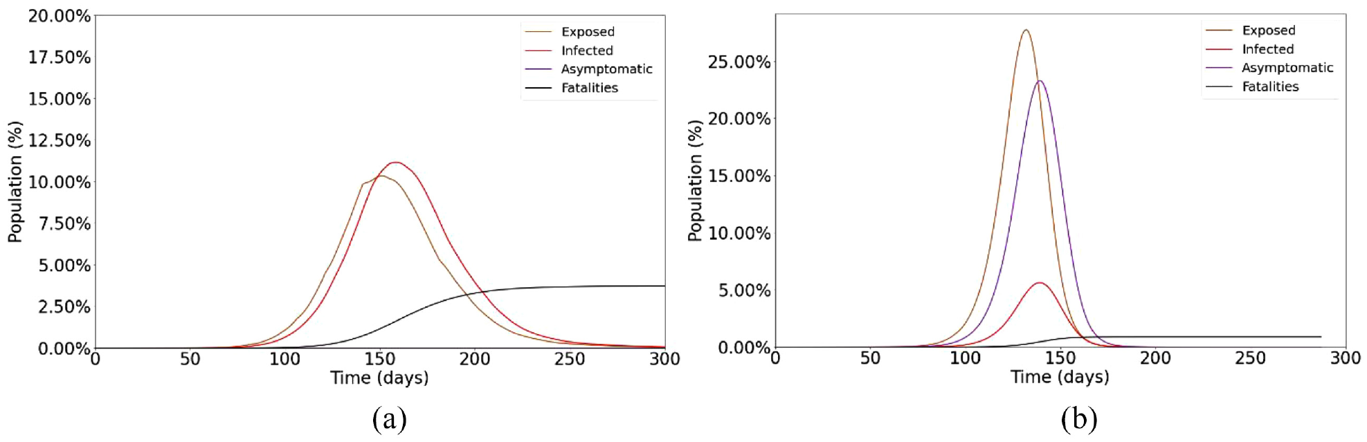
Single Cell SEAIRD (a) 0% Asymptomatic and (b) 80% Asymptomatic.
SEVIRDS model infection state diagram.
Baseline simulation of SEVIRDS model with vaccination disabled.
We start with the population of each geographical area. We then use a vector of values to represent the proportion of the total population in each age group. Age groups are an abstract set of values defined by the modeler; in our case, individuals 0–12, 1319; 20-44; 45–65, and over 65 years old. Disobedience follows the same format as age groups where the values in the vector represent the proportion of each age group that is disobedient to lockdowns. These values were estimated using data gathered from.49,50 The asymptomatic rate is the proportion of the exposed population that become asymptomatic (the rest become infectious). The virulence rate represents the rate at which the disease spreads; the value represents the amount of age groups population in contact with the infected population per day of the infection. Incubation rate is the proportion of the exposed population that become infectious or asymptomatic, defined using a 14-day profile where each day a proportion of the exposed population will move to the next state. 39 Mobility rates define the freedom of the population to move (1.0 mobility rating means the population can move freely). Mobility rates are defined for each age group for each day of the infection; it is assumed that mobility rates are not restricted at all at the beginning of the pandemic. Recovery rates define the proportion of an age group infected population that will recover each day of the infection. Fatality rates define the proportion of an age group–infected population that will move to the deceased state on each day. Infection correction factors describe the proportion of the population that needs to be infected before a lockdown is put in place, described in Equations (7)–(11) where the mobility restriction factor reduces the mobility of a cell by the given value.
Virulence rates, recovery rates, fatality rates, and infection correction factors were informed by data gathered at Public Health Ontario. 3 The values were evaluated and slightly modified; the final values shown in Table 6 provided the most accurate results in testing.
Figure 16(a) shows the simulation results with 0% asymptomatic cases. The results show the steady rise of exposed individuals (orange line), and then 1–14 days after their exposure, they become infected (red line). The results show how the initial wave rises and settles in a little over 350 days with approximately 8% of the population becoming infected. Next, we studied the effect of an 80% asymptomatic rate using the same parameters. Figure 16(b) shows a lower rate of infectious carriers and a higher rate of asymptomatic carriers.
With this higher rate of asymptomatic carriers, the total exposed population reaches a higher peak than it had without asymptomatic cases (approximately 110% more exposures occur). This higher exposed count is due to that the different asymptomatic and infectious carriers have on the susceptible population. Since the asymptomatic carriers travel more than the infectious carriers, more of the population are exposed to them, causing higher overall infections. The initial curve rises and settles in approximately 250 days; this is 100 days less than the model with no asymptomatic infections. This shows that the asymptomatic carriers expose the susceptible population at a much higher rate than the model showing no asymptomatic cases. We can see that approximately 14% of the population become asymptomatic carriers with an additional 4% being infectious carriers. Although in this case, we can see higher overall rates of infections, the asymptomatic infections are less lethal, leading to less deaths and more recoveries. We see this difference when analyzing a single neighborhood cell in Figure 17.
Figure 17(a) shows a single cell and how its population transitions through the states with a 0% asymptomatic rate. It should be noted the cell is still exposed to its neighboring cells. When examining the graph at day 133, we can see a cumulative exposed population of 7.1%, cumulative infectious population of 5.65%, cumulative fatalities of 0.4%, and since we have no asymptomatic infections, an asymptomatic infected population of 0%. If we then compare this to a graph showing the curves with an asymptomatic rate of 80% in Figure 17(b), we can see that at day 133 we have a cumulative exposed population of 27.7%, cumulative infectious population of 4.7%, cumulative fatalities of 0.02%, and an asymptomatic population of 19.4%. We can see that the exposed grown to 27.7% from 7.1%. This 20% increase can be accredited to the asymptomatic carriers spreading the disease to the surrounding neighbors at a higher rate than the infectious population. We can also see that we have fewer deaths, linked to the fewer infectious cases.
We can now simulate the effect an “invisible” population of disease carriers may have on a pandemic combined with the advantage of having a model that includes geographical aspects. If 80% of total COVID-19 cases are asymptomatic and the case counts show 5% of a population are infected, we can expect that 20% more of the population is also infected but not showing symptoms and not aware they are infected. These asymptomatic individuals will be spreading the disease to the healthy population, causing rises in the number of exposed individuals, resulting in more infectious. Although a high asymptomatic rate will lead to more overall cases, these cases are not as deadly; asymptomatic cases do not show symptoms, and in the case of COVID-19, they do not lead to death. If we were to model a disease where asymptomatic cases could lay dormant for years and later lead to death, we would see more interesting fatality results.
5. Rapid prototyping of vaccination effects
The baseline Cell-DEVS model defined in section 3 was also extended to model the effect of population vaccination, providing a mechanism for experimentation. Vaccines decrease the likelihood of infection and death from SARS-CoV-2, but do not provide full immunity from the disease. The addition of the vaccinated state makes this model an SEVIRDS model, where re-susceptibility to disease is specified by the model’s user. We modeled vaccination using a two-dose schedule like the one seen the global distribution of mRNA COVID-19 vaccines from Pfizer or Moderna. 51 Three classes of vaccination status for individuals exist concurrently within this model: unvaccinated, vaccinated with dose 1 only, and vaccinated with two doses. Infections in the unvaccinated class of population are implemented using the Cell-DEVS SEIRD model defined in section 3, while the other two classes of vaccinated population are implemented using a modified version. We used Thomas et al. 51 in which the vaccines do not provide statistically significant immunity to infection with SARS-CoV-2. Vaccinated populations were modeled using a modified Susceptible state, having increased resistance to infection and fatality with each sequential dose of vaccine. The model can be easily extended to include third or fourth doses.
5.1. SEVIRDS model definition
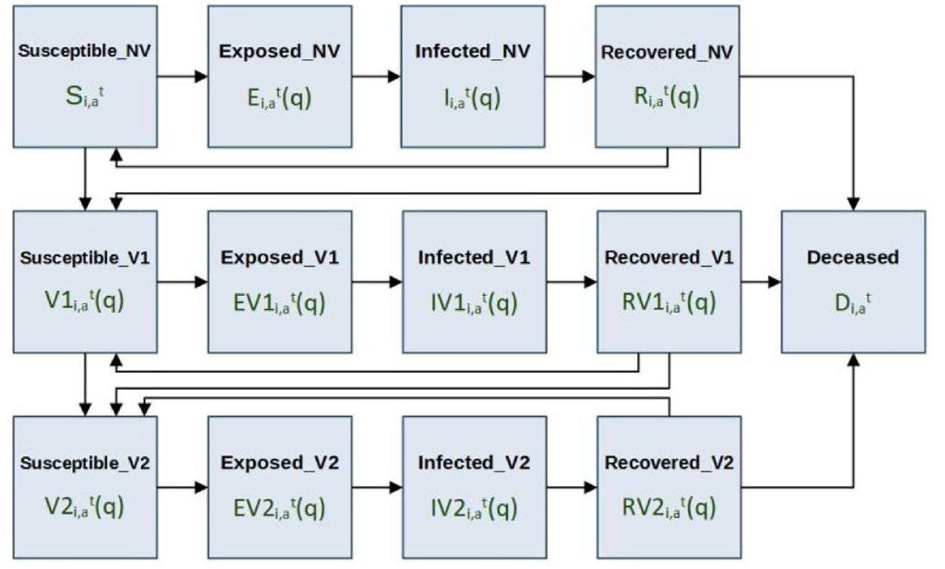
The three classes of vaccination status are modeled using concurrent SERID models with a shared Deceased state, and flow of population from less vaccinated states to more vaccinated states. Individuals are only considered for vaccination if they are not in an Exposed, Infected, or Deceased state. A state diagram for the model’s population is given in Figure 18, where the bold text indicates the name of the state, and the text below each name is the state symbology used in the local computation function’s equations.
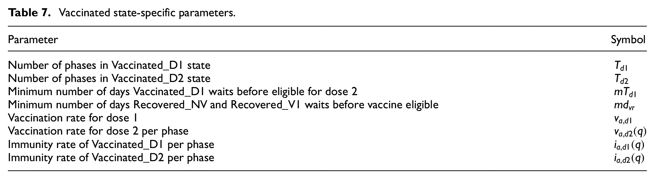
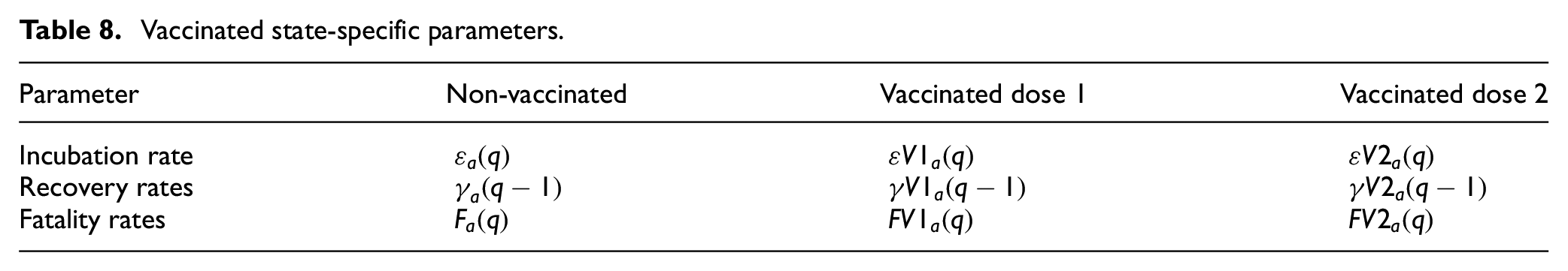
All states that end with the letters “NV” specify the non-vaccinated population. Similarly, all states that end with “V1” specify the population that has received only one dose of vaccine, and all states that end with “V2” specify the population that has received two doses of vaccine. Members of the Susceptible_NV and Recovered_NV states are considered eligible for vaccination, and transition to state Suscetible_V1 after vaccination according to the population vaccination rate of dose 1 (va,d1). Members of the Susceptible_V1 and Recovered_V1 states are also considered eligible for vaccination, and transition to state Suscetible_V2 after vaccination according to the population vaccination rate of dose 2 (va,d2(q)). The timing of vaccinations within the states Recovered_NV, Susceptible_V1, and Recovered_V1 is restricted only to the later phases of these states so that a minimum recovered time before vaccination, and a minimum second-dose interval is implemented. Members of the vaccinated states have increased protection from infectious exposure specified by immunity rates (ia,d1, ia,d2), and have incubation rates, recovery rates, and fatality rates that differ from the non-vaccinated population. When re-susceptibility is enabled, individuals enter the final phase of susceptibility in their vaccination class when they become susceptible again, meaning that in the case of Susceptible_NV and Susceptible_V1, individuals who enter these states as re-susceptible are immediately eligible for vaccination. The parameters that are specific to the vaccinated states and are new to the SEVIRDS model are given in Table 7. The parameters that were defined in the base Cell-DEVS model but now have vaccination status dependency are given in Table 8.
Vaccinated state-specific parameters.
Vaccinated state-specific parameters.
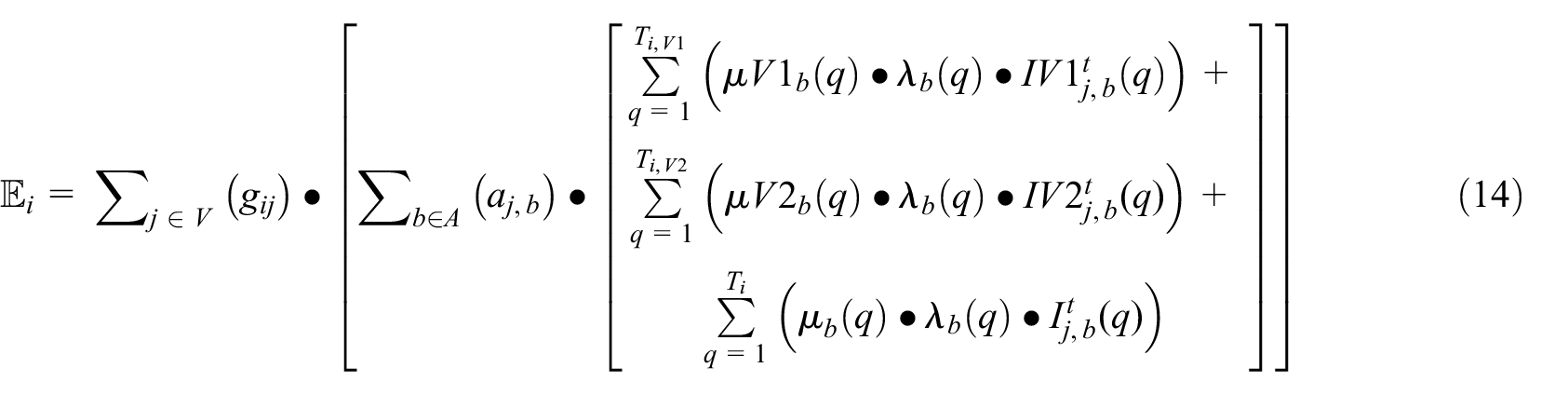
The equations that govern the Vaccinated states of dose 1 and dose 2 are given in the set of Equation (13), which describe these states for a collection of cells M = {m0, m1, …, mi} at time t. Equations (13a)–(13d) describe the phases of the Vaccinated_D1 state, and Equation (13e)–(13g) describe the phases of the Vaccinated_D2 state. Age group-specific variables are indexed by the subscript a character, and the cell for which the equations are applied is specified by the subscript i character as previously defined in sections 2, 3, and 4. The symbol
Equation (13a) defines the new Vaccinated_D1 (q = 1) with their first dose as the sum of the Susceptible_NV and Recovered_NV populations that receive their first dose. Both the Susceptible_NV and Recovered_NV populations are vaccinated at the age group–specific rate of va,d1, where the Recovered_NV are only vaccinated after having been recovered for a minimum of mdvr days. Equation (13b) defines how the Vaccinated_D1 population advances through the phases of Vaccinated_D1 before they become eligible to receive their second dose at q = mTd1. It states that the Vaccinated_D1 population in phases q = 2 to q < mTd1 is equal to the Vaccinated_D1 population on the previous day, minus those that become Exposed_D1 according to their immunity rate ia,V1(q − 1) and the level of infectious neighbor contact in
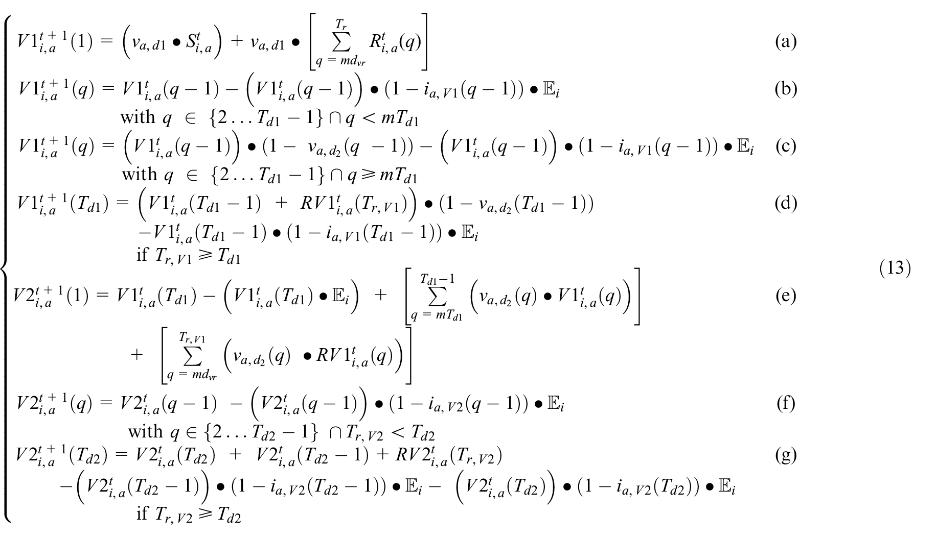
The new exposures in this SEVIRDS model are calculated as the sum of exposures resulting from all age groups and classes of vaccination status interacting with the Susceptible populations: Susceptible_NV, Susceptible_V1, and Susceptible_V2. The mobility rate per age group, vaccination status, and the per-cell movement restriction policies make these population interactions non-heterogeneous. The neighbor impact factor
Equation (15a) states that the new Exposed_NV population in age group a is equal to the product of the Susceptible_NV population and the neighbor impact factor
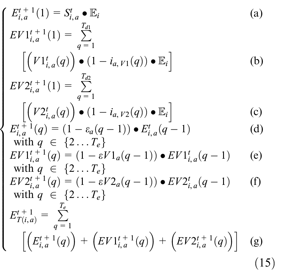
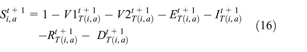
At all times, the Susceptible_NV follows Equation (16), stating that the sum of all population proportions per age group is equal to 1. The total proportion of population in infected states (IT), and recovered states (RT), are calculated as a sum across the three vaccination classes, following the form of Equation (15g):
5.2. SEVIRDS model implementation
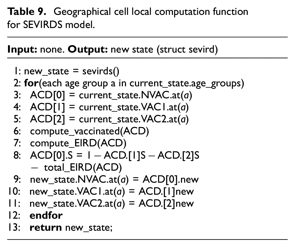
The SEVIRDS model is implemented using Cadmium as before, having the same structure as Figure 5, similar state discretization to Equation (11), and a local computation function is based on the one in Table 1. The state object of each geographical cell is now a struct sevirds, containing all infection state variables. A C++ class AgeData was developed to calculate the infection state variables per age group and vaccination status. A single AgeData object is used to hold the infection state variables S, E, I, R, and D for a single age group and vaccination status, where three AgeData objects are used to calculate the struct sevirds state variables for a single age group. The use the of AgeData can be seen in Table 9, where the non-vaccinated states, vaccinated dose 1 states, and vaccinated dose 2 states are stored in AgeData objects (lines 3–5). The variables new_state (line 1) and current_state are of type struct sevird, the first being allocated to hold the result of the local computation function’s call, and the second containing the value of the cell’s state variables before the local computation function is called. The local computation function calculates all struct sevirds state variables one age group at a time (line 2). The set of Equation (13) is calculated in line 6 using all three AgeData objects of the current age group. The exposed, infected, recovered, and deceased state variables are calculated in line 7 using the three AgeData objects with the exception of Susceptible_NV. Equation (11) describing the proportion of Susceptible_NV is calculated in line 8. Lines 9–11 copy the new AgeData information into the struct sevirds new_state. Once the calculation is complete for all age groups, the object new_state is returned to conclude the local computation function.
Geographical cell local computation function for SEVIRDS model.
5.3. SEVIRDS model simulation results withoutre-susceptibility
In the following, we present a simulation based on Ontario’s population distribution and COVID-19 relevant data (e.g. virulence rates and recovery rates) gathered at Public Health Ontario, 3 that show the effect of a two-dose vaccinated population. In Figure 19, we show the results of the first simulation run, without vaccines and without re-susceptibility enabled.
The first graph in Figure 19 shows how over 500 days the population of Ontario moves gradually from Susceptible to Exposed, then Infected, then either Recovered or Deceased. Once in Recovered, they do not return to being Susceptible as re-susceptibility is disabled, and thus, if the simulation ran for longer, we would see the Susceptible curve decline to zero, with the Recovered curve being nearly 100% of the population. The second graph shows the Exposed and Infected curves, while also show the Deceased curve. We can see the percentage of the population being added to each of the respective states on each day of the simulation, that is, new exposures, new infections, and new recoveries. For example, the peak for the Exposed state, which was around day 160, translates to just above 0.3%, meaning roughly that percentage of the population moved to the Exposed state on that day. In other words, whereas Figure 21 show the total population percentages in each of the states, Figure 20 shows the percentage of the population being added to the Exposed, Infected, and Recovered states, respectively. With respect to Equations (7)–(9), this graph shows, for each day of the simulation, the percentages for the different states when
Daily new exposed, infected, and recovered for baseline simulation.
We use these base simulation results to analyze the effect of different types of immunity for vaccines.
5.3.1. Vaccination with linear increase in immunity rate
We first analyze the effect of vaccination configuring vaccines so that the immunity received from each dose increases in linear fashion respective to each dose. We assume that the immunity is uniform across all age groups. As there is no precise data, we show the simulation results obtained using Table 10 (since these are rapid prototyping parameters, they can be adjusted as soon as new data becomes available).
Linear increase immunity rates per week.
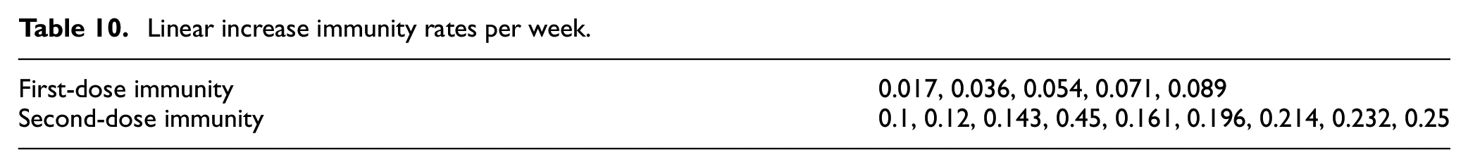
When a portion of the population is vaccinated, they begin with 0.017 immunity (i.e. 1.7%), this increases to 0.036 the following week (i.e. 3.6%), and so on until the end of the first dose. They are then moved to the second dose, with 0.1 immunity (i.e. 10%) and this increases until 0.25 (i.e. 25%), as re-susceptibility is off. These changes to the configuration produce the results shown in Figure 21.
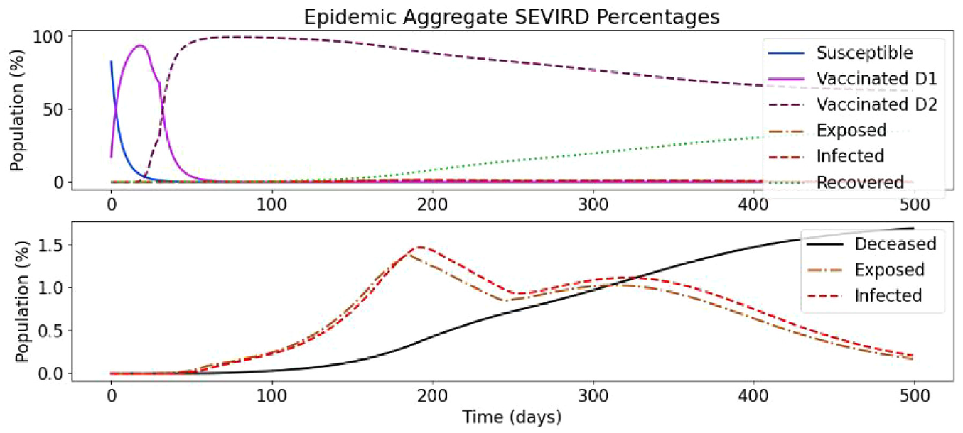
Vaccination simulation with linearly increasing immunity rates.
As we can see in Figure 21 (top), there are two new curves, Vaccinated_D1 and Vaccinated_D2, which track the two susceptible vaccinated states. Exposed_D1, Exposed_D2, Infected_D1, Infected D2, Recovered_D1, and Recovered_D2 states are aggregated with their non-vaccinated equivalents for brevity. The Susceptible curve represents the Susceptible_NV discussed earlier. This figure shows how the population moves quickly from Susceptible_NV to their first dose, then just as quickly to their second dose, where they mostly remain, although close to 40% eventually contract COVID-19, with most moving to the Recovered_V2 state and around 2.5% moving to the Deceased state. In the bottom part of the figure, the Exposed and Infected curves are half of what the respective curves are in the no-vaccine simulation (see Figure 19), while the Deceased curve rises slower and is also around 1% lower than in the previous simulation, demonstrating the protection provided by vaccination.
Figure 22 shows the new exposures, infections, and recoveries. Compared to the based scenario (Figure 20), the curves have a similar share, but peaks at a smaller percentage. The peak for new daily exposures, in the simulation without vaccines, was nearing 0.35%, and it remained above 0.3% for a few days, whereas the very slim peak in this simulation is only nearing 0.175%. Interestingly, the second “wave” in this simulation appears to rise higher, proportionally to the whole simulation. That may be explained because the number of people infected in the first way was smaller than in the original scenario. Nonetheless, there is an overall decrease in exposures and infections per day with a very basic vaccine configuration.
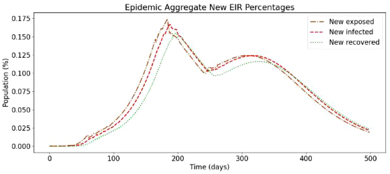
Daily new exposed, infected, and recovered in linear immunity rate.
5.3.2. Vaccination with immunity rate decay after linear increase
This scenario is a complex vaccine simulation that by includes a linear decay to the immunity received from the second dose over time. The second-dose state is short to quickly show what happens when immunity decreases over time and to demonstrate the configurability of the model.
This setup works the same as the previous simulation with a two changes. First, first- and second-dose immunity rises quicker as shown in Table 11. Second, halfway through the second-dose state, the immunity begins to decrease at the same rate that it increased during the first half of the state.
Linear increase immunity rates with decay.
This configuration produces the simulation results as shown in Figures 23 and 24. As shown in Figure 23 (top), with re-susceptibility still disabled, there is no visible change to the Susceptible_NV, Vaccinated_D1, and Vaccinated_D2 curves. The changes are evident in bottom part of the figure where the Exposed and Infected states still hit the same peak but remains near it much longer than in the previous simulation. In addition, the deceased curve rises to 2%, which is still lower than the simulations without vaccines but around 0.5% higher than with no decrease in immunity. In Figure 24, we can see that the daily increases are slightly higher than in the previous simulation, with the peak being wider and just past 0.2% versus 0.175%. However, it is still just over 0.1% lower than without vaccines.
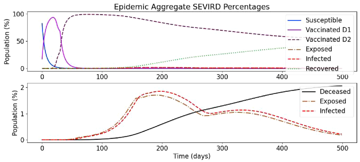
Vaccination with decaying immunity rate.
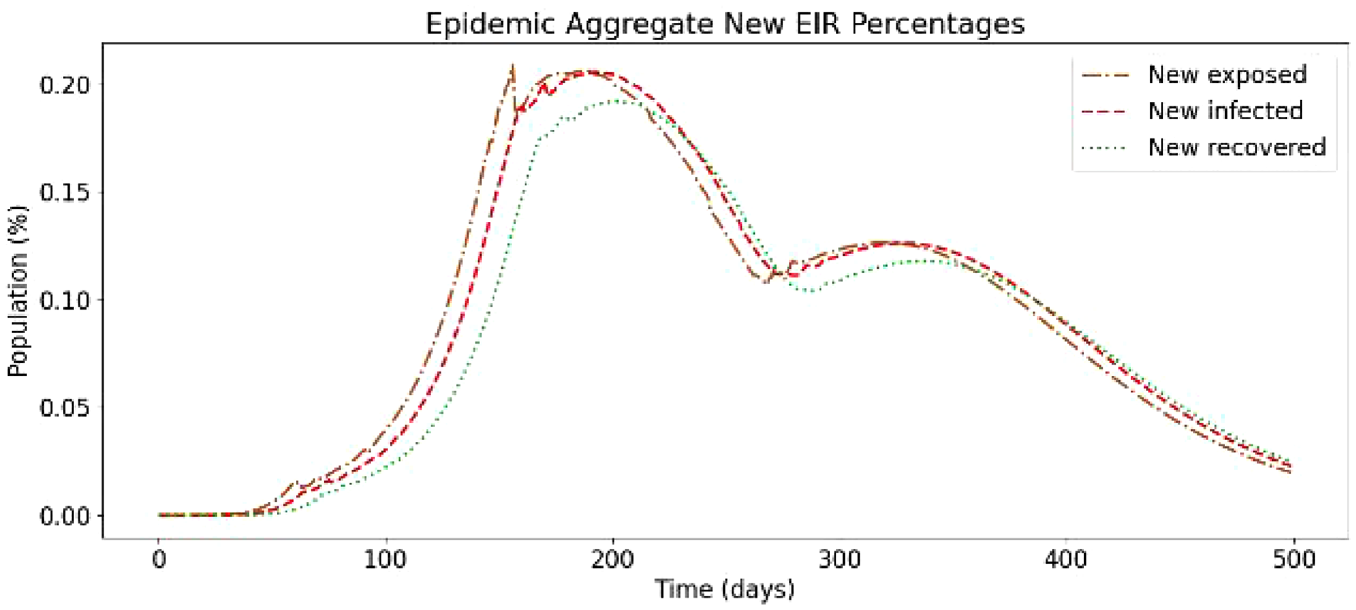
Daily new exposed, infected, and recovered with decaying immunity rate.
5.3.3. Vaccination with immunity rate decay after curved increase
We show an additional scenario without re-susceptibility where the immunity rate increases slower than in the previous scenario but decreases faster. The immunity rate values can be seen in Table 12.
Curved increase immunity rates with decay.
These configuration parameters produce the results shown in Figures 25 and 26.
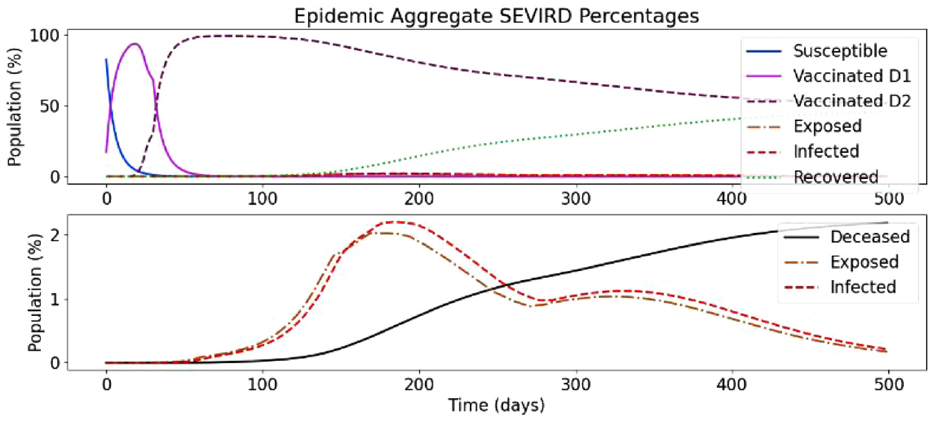
Curved increase immunity rate simulation with decaying immunity rate.
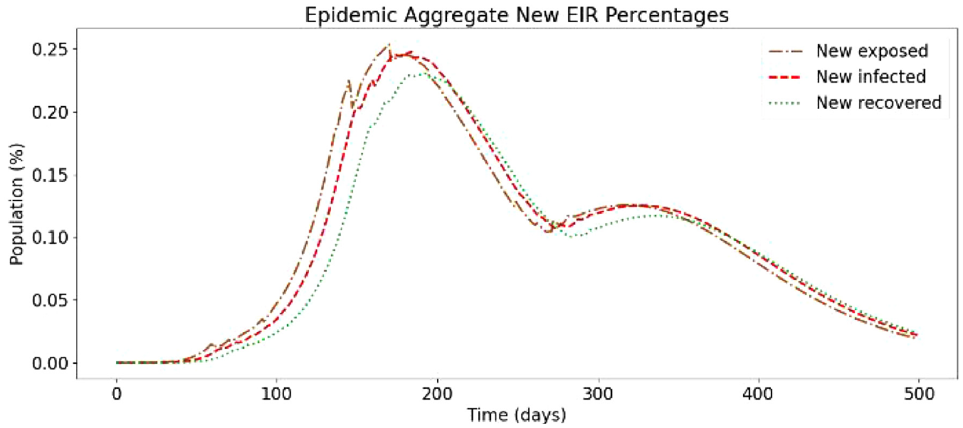
Daily new exposed, infected, and recovered with curved increase immunity rate and decay.
The difference with the previous scenario (section 5.3.2) is that the final phases of Vaccinated_D2 provide lower immunity rates, resulting in a higher magnitude of exposures, infections, and recoveries. The value of the second-dose immunity rate’s final phase is the most impactful value, as people who reach this remain at the level of immunity rate unless they become Exposed. The peak infected in this scenario reaches 2.2% of Ontario’s total population, versus 2.9% in the case of the base simulation without any vaccinations, and 1.8% in the case of previous simulation. While the immunity rate profiles of the Vaccinated_D2 state of this simulation and the previous simulation (section 5.3.2) are similar, their outcomes differ greatly because of the difference in the lasting immunity rate ia,V2(Td2) of Vaccinated_D2.
In Figure 26, we can see how the cases per day peak and then drop before raising again but are less in magnitude than the base scenario. Compared to the previous simulation scenario, the curves in this graph are very similar, having a slightly larger magnitude of infections because the final phase Vaccinated_D2 immunity rate is now lower (0.09) than the previous simulation (0.15).
5.4. SEVIRDS model simulation results with re-susceptibility
We have also studied a base scenario with no vaccination and re-susceptibility. The configuration is identical to the base scenario presented in section 5.3, but with re-susceptibility. Re-susceptibility highlights the importance of vaccines.
Figure 27 shows the simulation results of this new scenario. Compared to the base scenario presented in section 5.3 (Figures 19 and 20), the smaller recovery curve is the most evident difference, along with the very aggressive incline on the Deceased curve. As re-susceptibility is enabled, once recovered population has reached the end of the recovered state, they become susceptible again, and this pattern will, in theory, continue like this until all the population are in the Deceased state. The results in this simulation do not seem so severe as around 75%–80% of the population remains either Susceptible or Recovered. However, analyzing the bottom part of Figure 27, the Exposed and Infected curves show no sign of decreasing over time, they remaining is stable at a 3% rate. What is more worrying is that the Deceased curve has an increasing trend and has already passed 5% (around 2% higher than without re-susceptibility).
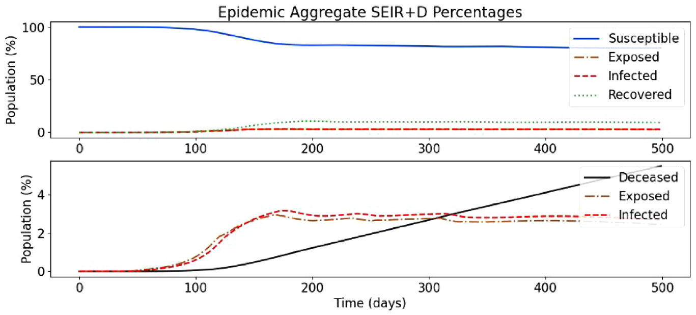
Baseline SEVIRDS simulation with re-susceptibility.
In Figure 28, we also observe that the Exposed and Infected curves show little signs of dropping, and it spikes around 0.05% higher than in the base scenario without re-susceptibility. The Recovered curve is very close to the Infected curve, meaning most people recover from COVID-19 in this simulation. The gap between them represents the daily portions of the population that are Deceased, and as this is not zero, eventually, as alluded to earlier, the whole population would end up in the Deceased state unless some measures are taken to control the spread.
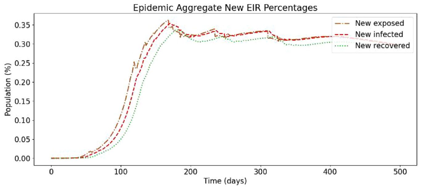
Daily new exposed, infected, and recovered for baseline simulation with re-susceptibility.
6. Conclusion
A Cell-DEVS COVID-19 model was defined and simulated to study the spread of infectious disease in geographical environments. The model defined in this paper uses a method of geographical CA like that used in Zhong et al. 16 in their simulation of the original SARS pandemic but considers more factors in the implementation of movement restriction policies. The model was simulated using the geography of Ontario, Canada, and divided the province into geographical cells by PHU. The methodology of adjusting the model and disease parameters was demonstrated, and the accuracy of the model was improved substantially. Many directions for future improvements exist including the following:
Defining region-specific disease characteristics based on epidemiological data.
The addition of a different class of cell to represent the coupling of each cell to the outside world.
The addition of a population density correction factor.
Increasing disobedience or changing the infection correction factors over time.
We implemented the asymptomatic cases using a basic infectious/asymptomatic ratio value that can be input by the user. The asymptomatic carriers expose more individuals than their non-asymptomatic counterparts. This is intended to represent the effect of not taking adequate precautions due to the absence of awareness. Users can also input a described group of neighborhoods and run the model through the neighborhoods, allowing for visualization of how a disease might spread through a city, town, or country. We use a case study where the model’s neighborhoods are defined as the PHUs of Ontario. Our results show how an asymptomatic set of carriers can lead to sharper increases in case counts resulting in a change to the total numbers of cases that a population would experience. Our model provides a framework to rapidly prototype disease spread in their neighborhood where asymptomatic infections can be considered and incorporated where necessary.
We presented a model that allows users to create rapid simulation prototypes to simulate how much of an impact asymptomatic cases would have on disease case counts. Another important note about the model, although it has been built around the COVID-19 pandemic, it can be used for any other disease. This can be done in a quick, efficient manner. If users have the relevant information for a disease along with the asymptomatic rate at which a disease transmits, they can simply change the parameters and re-run the model. The model also gives the users the ability to efficiently adapt the geographical level that the model is being run on.
Future work will focus on deeper analysis of the models to investigate the influence of different model parameters in the transmission of the disease. For example, we will investigate how is connectedness correlated with transmission or how does the number of spatial units impact the robustness of the model.
Future adaptations plan to incorporate asymptomatic disease transmission rates (modified virulence rates), asymptomatic rates by age group, a more accurate susceptible to exposed transition and new compartments to represent individuals who are vaccinated, and therefore less susceptible to the disease. The model can be easily adapted to simulate variants of concern by tuning the test case configuration data found in Table 1. In future adaptations, variants of concern will be addressed in a formal manner allowing for the simulation of single and multiple variants of concern.
Footnotes
Funding
This research is funded by NSERC Alliance research grants.