
Abstract
Objective:
We report three experiments investigating the ability of undergraduate college students to comprehend 2 × 2 “interaction” graphs from two-way factorial research designs.
Background:
Factorial research designs are an invaluable research tool widely used in all branches of the natural and social sciences, and the teaching of such designs lies at the core of many college curricula. Such data can be represented in bar or line graph form. Previous studies have shown, however, that people interpret these two graphical forms differently.
Method:
In Experiment 1, participants were required to interpret interaction data in either bar or line graphs while thinking aloud. Verbal protocol analysis revealed that line graph users were significantly more likely to misinterpret the data or fail to interpret the graph altogether.
Results:
The patterns of errors line graph users made were interpreted as arising from the operation of Gestalt principles of perceptual organization, and this interpretation was used to develop two modified versions of the line graph, which were then tested in two further experiments. One of the modifications resulted in a significant improvement in performance.
Conclusion:
Results of the three experiments support the proposed explanation and demonstrate the effects (both positive and negative) of Gestalt principles of perceptual organization on graph comprehension.
Application:
We propose that our new design provides a more balanced representation of the data than the standard line graph for nonexpert users to comprehend the full range of relationships in two-way factorial research designs and may therefore be considered a more appropriate representation for use in educational and other nonexpert contexts.
Introduction
Factorial research designs are widely used in all branches of the natural and social sciences as well as in engineering, business, and medical research. The efficiency and power of such designs to reveal the effects and interactions of multiple independent variables (IVs) or factors on a dependent variable (DV) has made them an invaluable research tool, and as a consequence, the teaching of such designs, their statistical analysis, and their interpretation lies at the core of all natural and social science curricula.
The simplest form of factorial design is the two-way factorial design, containing two factors, each with two levels, and one DV—for example, the differences in word recall (DV) between amnesiacs and a control group (IV1) in an implicit versus explicit memory task (IV2). Statistical analysis of these designs most often results in a 2 × 2 matrix of mean values of the DV corresponding to the pairwise combination of the two levels of each IV. Interpreting the results of even these simplest of designs accurately and thoroughly is often not straightforward, however, but requires a significant amount of conceptual understanding—for example, the concepts of simple, main, and interaction effects. As with most other statistical analyses, however, interpretation can be eased considerably by representing the data in diagrammatic form.
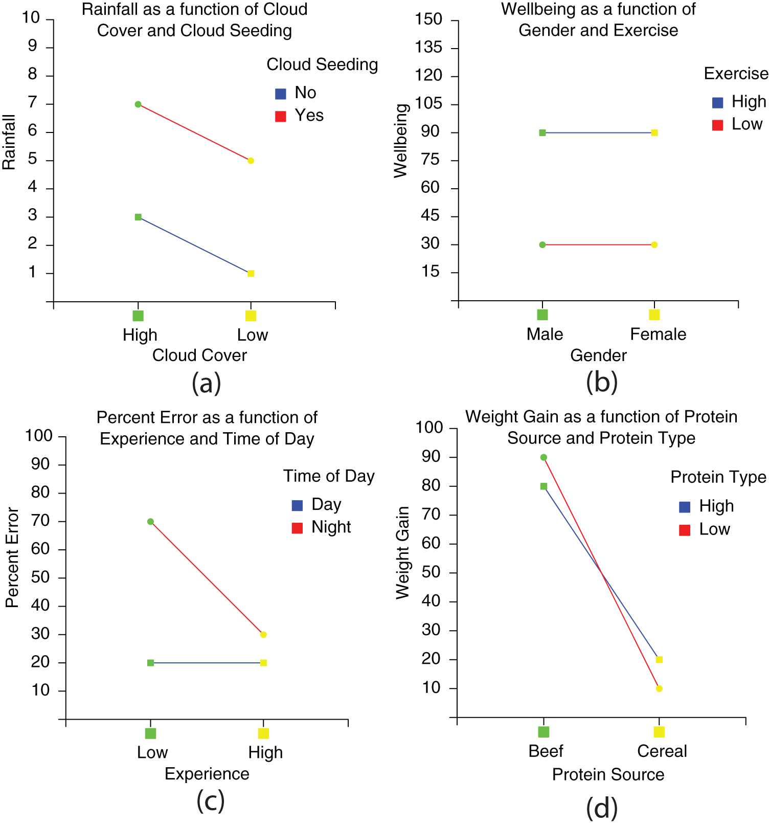
Data from two-way factorial designs are most often presented as either line or bar graphs—variously called interaction or ANOVA graphs. Examples of such bar and line graphs (taken from the experiments reported here) are shown in Figure 1. Bar and line graphs, such as those in Figure 1, can display the same data set in the same coordinate system and are informationally equivalent (Larkin & Simon, 1987).
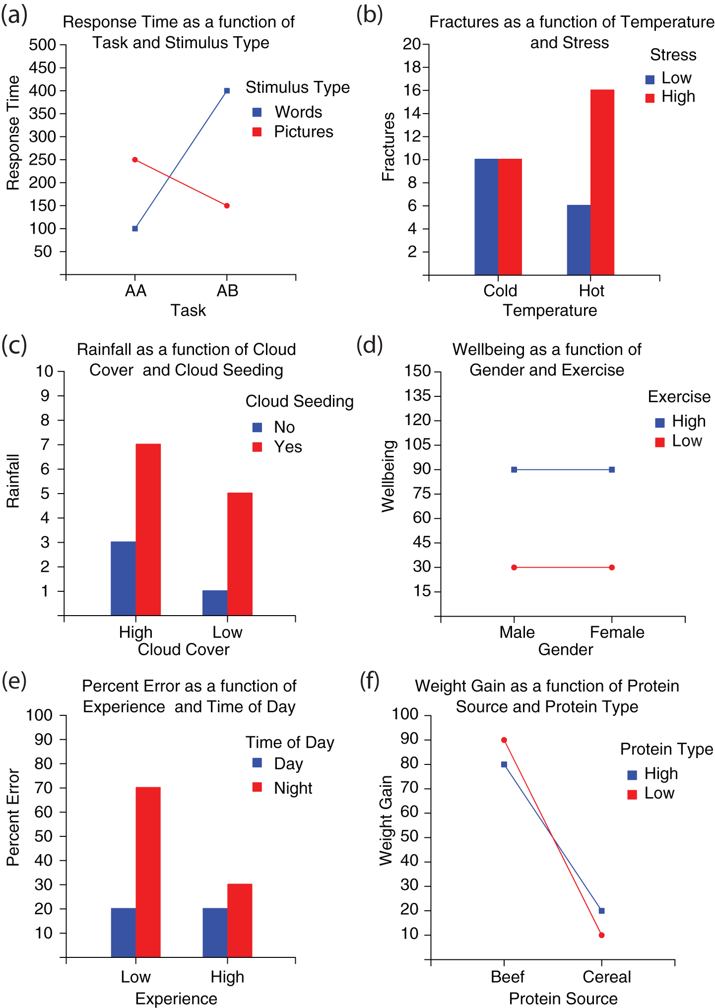
Bar and line graphs representing the six data sets used in Experiment 1. All graphs are in the “normal” orientation.
In terms of their visual and conceptual structure, bar and line graphs have a great deal in common, the key difference being the way in which the data points are represented in the coordinate system. However, this relatively minor difference has been shown to have a remarkable effect on which features are made salient, which in turn influences the type of information extracted from the display.
In line graphs, lines integrate individual plotted points into single objects, features of which (e.g., slope, height relative to other lines) can indicate relevant information about the entire data set (Carswell & Wickens, 1990, 1996). This feature has been found to lead people to encode the lines in terms of their slope (e.g., Simcox, 1983, reported by Pinker, 1990) and to interpret them as representing continuous changes on an ordinal or interval scale (Kosslyn, 2006; Zacks & Tversky, 1999). For this reason, line graphs are typically regarded as a form of configural or object display.
In contrast, bar graphs are an example of a separable display, as each data point is represented by a single, separate bar. Because of this design, people are more likely to encode bars in terms of their height and interpret them as representing the separate values of nominal scale data (Culbertson & Powers, 1959; Zacks & Tversky, 1999).
These differences in encoding and interpretation can result in significant performance variation for different tasks; people are typically better at comparing and evaluating specific quantities using bar graphs (Culbertson & Powers, 1959; Zacks & Tversky, 1999), whereas people are generally better at identifying trends and integrating data using line graphs (Schutz, 1961). This situation is therefore a prime, real-world example in which two informationally equivalent and relatively similar representations are widely used but are known to be computationally inequivalent (Larkin & Simon, 1987) in certain circumstances. It seems appropriate to ask, therefore, whether these computational differences significantly affect the ease and efficiency with which people interpret them and the depth and accuracy of the interpretations produced.
According to the proximity compatibility principle (Carswell & Wickens, 1987), graph format should correspond to task requirements, so that configural displays should be used if information needs to be integrated, whereas separable displays are more appropriate if specific information needs to be located. In the case of interaction data however, there are reasonable arguments for using either format.
Interaction graphs differ from more conventional line graphs in that the variables plotted on the x-axis are categorical, regardless of whether the underlying scale could be considered as continuous (e.g., hot–cold) or categorical (e.g., male–female). The argument for using bars for interaction graphs is that because people encode bars as separate entities, they are less likely to misinterpret the levels of the x-axis variable as representing two ends of a continuous scale (Aron, Aron, & Coups, 2006; Zacks & Tversky, 1999). By contrast, line graphs are more likely to be interpreted as representing continuous data with points on the lines representing intermediate values on the scale. Proponents of the line graph (e.g., Kosslyn, 2006) have argued, however, that the risk and costs of misinterpreting line graphs are outweighed by the benefit of lines for producing easily recognizable patterns that can be associated with particular effects or interactions.
Our reading of the academic psychology research literature suggests that bar and line interaction graphs are used roughly equally. To test this impression, we counted the number of bar and line interaction graphs in the 2009 volumes of two journals widely recommended to our undergraduate students as academic sources and that together cover a broad range of topics and methodological practices: Psychological Science and the Journal of Experimental Social Psychology.
Our analysis revealed that this impression was generally the case. The mean numbers of interaction bar and line graphs per issue of Psychological Science were 11.83 (SD = 5.89) and 16.83 (SD = 5.27), respectively, and those for the Journal of Experimental Social Psychology were 25.17 (SD = 11.75) and 24 (SD = 24.40), respectively. Taking the two journals together, we found that the proportions reveal a slight preference for line graphs (54%) to bar graphs (46%).
This preference was found to be more pronounced in undergraduate psychology textbooks, however. A similar analysis carried out on two current popular psychology textbooks used in the undergraduate Introduction to Cognitive and Developmental Psychology class at the University of Huddersfield (Boyd & Bee, 2006; Eysenck & Keane, 2005) revealed that line graphs were favored 20% more than bar graphs.
These latter data are consistent with those from a study by Peden and Hausmann (2000), which investigated bar and line graph use in a wide range of psychology textbooks. This study showed that 85% of all data graphs in textbooks were either line graphs or bar graphs but that line graphs (64%) were approximately 3 times more common than bar graphs (21%).
Which diagram to use for displaying two-way factorial design data may not always be down to an explicit rational decision by the user but may often be constrained by external factors. For example, one of the most popular statistical software packages in academic use, PASW Statistics (produced by SPSS) provides only the line graph option as part of its ANOVA functions. It is not unreasonable, therefore, to assume that undergraduate students are more likely to be required to use the line graph format when analyzing their own data and to comprehend them in some detail to be able to interpret their experimental results.
If the visual properties of line graphs can lead users to focus on features that suggest incorrect interpretation (e.g., a continuous valued x variable) or distract attention away from the plotted data points, then they may not be the best representation to use, particularly in educational settings where novice users are learning how to analyze and interpret the various relationships.
When attempting to compare and evaluate performance with different graphical formats, it is essential to have a set of behavioral criteria or categories with which to do so. From the considerable number of studies conducted into graph comprehension, a consensus has emerged on the broad, three-level taxonomy of skills required for the task. In a review of five studies, Friel, Curcio, and Bright (2001) characterized the three levels as elementary, intermediate, and advanced (or more descriptively as “read the data,” “read between the data,” and “read beyond the data,” respectively). At an elementary level, people focus primarily on extracting specific values. At an intermediate level, people interpret the data presented more fully and, to a certain extent at least, integrate the information together. At an advanced level, people also make inferences beyond what is explicitly stated in the graph by hypothesizing on the basis of trends depicted in the graph.
Although there will always be differences between individuals in terms of their general graph sense (Friel et al., 2001), a characteristic that develops with experience over time and involves knowledge of such things as how coordinate systems work and general rules of labeling by color and so on, it is reasonable to assume that individuals will differ in terms of their ability to work with different graph types. This differential ability can be for a number of reasons, such as familiarity, particular idiosyncrasies of the representation, or the structure of the data being presented. For example, if individuals are unfamiliar with the particular representational features of a format, then they may be able to work at only an elementary level with the only option available being to read off individual values.
Our experience of teaching undergraduate psychology students to interpret two-way factorial data with the line graphs found in common statistical software provides us with at least anecdotal evidence that this discrepancy is indeed the case. We have typically found that students who have little difficulty working at an intermediate—or even advanced—level with line graphs when they represent continuous or interval data may be able to produce only elementary performance with two-way factorial line graphs. Furthermore, we have noted that this discrepancy in performance can persist despite substantial amounts of exposure and instruction, with many students continuing to have difficulty interpreting the line graphs accurately and often being able to obtain only a superficial and incomplete understanding of the relationships between the variables.
For example, in our previous work (Peebles & Ali, 2009), we have observed that students will often be able to identify and reason about the variable represented in the legend (e.g., the stimulus type variable in Figure 1a) but fail to do so for the variable represented on the x-axis (the task variable in Figure 1a). One explanation for this is that the plot lines distract attention away from the more relevant graphical features (the points at the ends of the lines) and then to the value labels in the legend rather than to the labels under the points on the x-axis.
There is reason to believe that this pattern of behavior may not be found with bar graphs, however. Peebles (2008) demonstrated that people perceive informationally equivalent bar and line graphs quite differently. For example, when required to compare values plotted in bar and line graphs with an average (represented as a line drawn from the y-axis parallel to the x-axis), bar graph users significantly underestimated the size of the plotted value relative to the mean compared with line graph users. The effect occurred despite the fact that the values being compared were plotted at exactly the same locations in the two graphs and was explained as resulting from a process whereby bar graph users’ visual attention was drawn to the length of the bars as they extend from the x-axis (cf. Pinker, 1990; Simcox, 1983) rather than to the distance between the top of the bar and the mean line—thereby accentuating the perceived difference between them.
The fact that the bars in bar graphs are attached to the x-axis may provide a more “balanced” representation in which the graphical features index both IVs more evenly. We set out to test this hypothesis (Peebles & Ali, 2009) in an experiment in which people were asked to interpret informationally equivalent bar or line graphs representing two-way factorial design data as fully as possible while thinking aloud. Analysis of the verbal protocols revealed significant differences in how people interpreted the two graph formats. Specifically, we found that 39% of line graph users either were unable to interpret the graphs or misinterpreted information presented in them. No bar graph users performed at this level. This finding led us to propose a fourth, lower category of comprehension ability, which we termed pre-elementary.
The main error produced by the pre-elementary line graph users was what we had noticed anecdotally in our statistics classes: ignoring the x-axis variable entirely or ignoring one level of the x-axis variable. In addition, we found that bar and line graph users identified different IVs as the primary focus of their interpretation; line graph users typically used the legend variable, whereas bar graph users were more likely to use the x-axis variable.
Gestalt Principles of Perceptual Organization
We explained this reversal effect by identifying Gestalt principles of perceptual organization (Wertheimer, 1938) acting in each graph (Peebles & Ali, 2009). Gestalt principles of perceptual organization are regarded by many as playing a crucial role in the visual processing of graphical representations. Pinker (1990), for example, argues that Gestalt laws are one of the four key principles that determine the nature of the mental representations that users generate when reading a graph. According to Pinker, the Gestalt laws of proximity, similarity, connectedness, continuity, and common fate all determine how individual graphical features are grouped together to form coherent wholes and so relate patterns to variables and their values together. Table 1 describes these five principles and the effects they can have on graph comprehension.
Five Gestalt Principles of Perceptual Organization and Their Application to Graph Comprehension
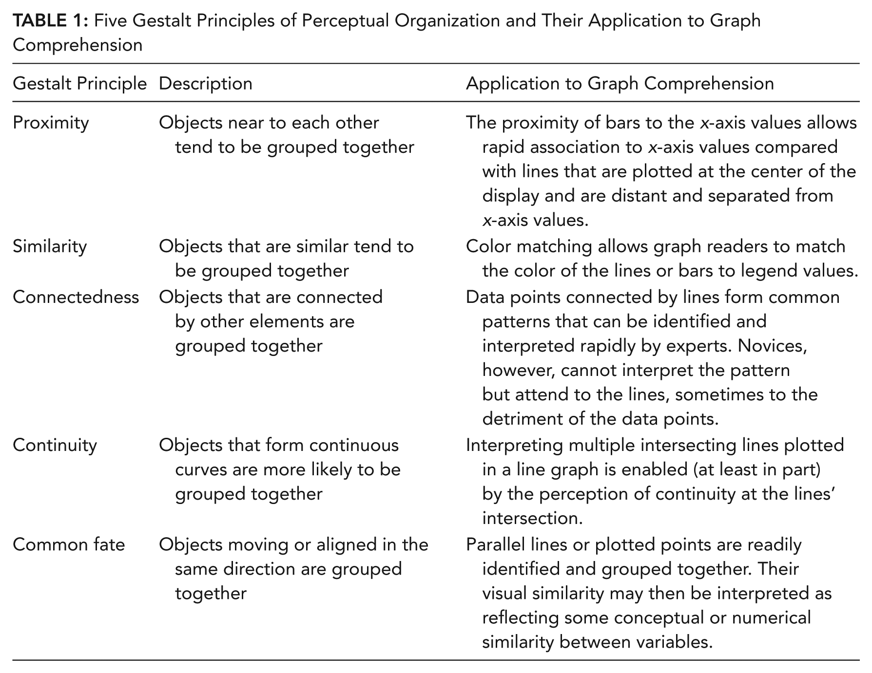
The processes of relating plot features to referents can be facilitated by increasing the number of appropriate Gestalt principles in the diagram. Parkin (1983, cited by Pinker, 1990) demonstrated this relationship by manipulating the number of Gestalt principles associating labels to lines in a line graph. He compared the speed of readers’ comprehension times to graphs with labels using no Gestalt principles (placed in a legend or a caption) with labels with one Gestalt principle (proximity, continuity, or similarity) and two Gestalt principles (proximity and continuity). Consistent with predictions, it was found that—providing principles did not lead to a competing organization of labels with labels—increasing the number of Gestalt principles associating labels to lines led to a reduction in response time.
Shah, Mayer, and Hegarty (1999) have demonstrated how the appropriate use of Gestalt principles can improve the interpretation of statistical graphs. They conducted an experiment identifying graphs from social science textbooks that high school students failed to interpret appropriately (the students did not describe the overall trends the graphs depicted but simply focused on specific values). The authors argued that this misinterpretation was attributable to inappropriate grouping of perceptual information in the graphs rather than the graph format used, and using Gestalt principles, they regrouped the relevant information, either by connecting data points in a line graph (the principle of connectedness) or by placing them together in bar graphs (the principle of proximity). Their modified graphs significantly increased the ability of students to identify the global trends in their interpretations, demonstrating that when used appropriately, Gestalt principles can improve conceptual understanding of statistical graphs.
Kosslyn (1989) also regards Gestalt principles as being vital in determining the ease with which graphical representations can be understood. He proposed a set of “acceptability principles” for the various components of a graph, which he argued must be followed for it to be read appropriately. For example, Kosslyn advises that for the Gestalt principle of proximity to operate in an associative process, variable labels must be sufficiently close to the feature representing the variable (relative to other features).
On the basis of our previous findings (Peebles & Ali, 2009), we argued that participants’ interpretations were affected by different Gestalt principles in each graph type. In the case of bar graphs, the x variable values are grouped together on the x-axis, and by the Gestalt principle of proximity (Wertheimer, 1938), each cluster of bars forms a separate visual chunk. Participants identify these chunks, access the associated labels, and then use them as the values by which to compare levels of the z variable (e.g., in Figure 1b, a user may say, “With hot temperature, high stress produces a lot more fractures than low stress”).
In the case of line graphs, however, data points are connected by the lines, which, by the Gestalt principle of connectedness (Palmer & Rock, 1994), form individual visual chunks. This design leads users to identify these chunks rapidly, access the associated labels in the legend by color, and then use them as the values by which to compare levels of the x variable (e.g., in Figure 1a, a user may say, “With word stimuli, response time is much faster in Task AA than for Task AB”).
We have taken the findings of our initial study as providing preliminary evidence that the representational features of bar and line interaction graphs strongly influence their interpretation and result in marked differences in people’s ability to comprehend the relationships depicted fully and accurately. In addition, our results suggest that the two graph formats produce significantly different patterns of comprehension, with users’ attention being attracted to different variables and regions of the graph.
In our first experiment, we set out to address a limitation of our earlier work. Although providing valuable initial insights, the experiment had one main limitation: The 29 participants were drawn from both staff and students from the University of Huddersfield, with a wide age range (23.1 to 62.2), with a majority (48.3%) being academic staff from different schools in the university and smaller proportions of nonacademic staff (20.7%), postgraduate students (20.7%), and undergraduate students (10.3%). Therefore, the sample varied widely in terms of their exposure to data analysis in general and interaction graphs in particular, from complete novices to experts.
As the primary aim of this research is to determine how graphical features affect relatively inexperienced users—particularly in an educational context—a more homogeneous sample taken from an appropriate student population will provide a more accurate indication of the proportion of students who cannot understand these types of graphs accurately. It will also allow a more precise measure of the specific effects of graph format on comprehension by minimizing the potentially confounding effects of familiarity and expertise.
Overview of the Experiments
The aim of the first experiment is to compare the levels and patterns of comprehension between undergraduate psychology students using informationally equivalent three-variable bar and line interaction graphs. We predict the differences between bars and lines found in our earlier study (Peebles & Ali, 2009) will be more pronounced in Experiment 1, as the sample will consist solely of undergraduate students.
The aim of Experiments 2 and 3 is to test modified line graphs, which we developed with the aim of improving performance to the level of bar graphs. With one design, which is tested in Experiment 2, we attempt to combine the features of bar and line graphs by the use of drop lines to balance attention between the independent variables. We predict that this design will strengthen the association between the data points and the x-axis levels but that this effect may be moderated by visual clutter.
With the second design, we dispense with the bar graph model and test whether increasing the number of Gestalt principles in the diagram will improve performance. The modified design uses the same color feature used for the legend variable to associate the plot points to the x-axis, thereby maintaining the line pattern as the primary visual feature. We predict that this design will balance the representation and that graph readers will index both IVs equally, as the same process is used to associate the pattern to referents for both variables.
In all three experiments, comprehension ability is measured as the number of correctly interpreted trials (as defined in more detail later), and performance on this measure is used as the criterion for subsequent categorization into elementary and pre-elementary groups.
Experiment 1
Method
Participants
For the first experiment, 42 undergraduate psychology students (36 female, 6 male) from the University of Huddersfield were paid £5 (approximately US$8) in grocery store vouchers to take part. The age of participants ranged from 18.8 to 37.11 years, with a mean of 21.2 years (SD = 3.77). The participants were in their 1st or 2nd year of study (21 students from each year) and were randomly allocated to the experiment conditions.
Design
The experiment was an independent-groups design with two between-subject variables: type of diagram used (bar or line graph) and the allocation of IVs to the x-axis and legend (labeled normal and reversed). We allocated 21 participants to each of the two graph conditions. There were 11 participants in the normal-bar condition, 11 in the normal-line condition, 10 in the reversed-bar condition, and 10 in the reversed-line condition.
Materials
We carried out the experiment using a PC computer with a 43-cm display. The stimuli were 12 bar and 12 line three-variable interaction graphs depicting a wide range of (fictional) content. The graphs were 18.5 cm wide by 16 cm high and were drawn black on a light gray background with the legend variable levels colored red and blue.
The variables and levels of each data set are shown in Figure 1. The content was identical for both bar and line conditions. The numerical values for the variables were selected to provide the range of effects, interactions, and other relationships between three variables commonly encountered in these designs (typically depicted in line graphs as parallel, crossed, and converging lines; one horizontal line and one sloped line; two lines sloping at different angles, etc.).
The six normal bar and line graphs had IV 1 on the x-axis and IV 2 in the legend, whereas the six reversed graphs had the reverse allocation. This counterbalancing was undertaken as a precaution against the possibility that any particular variable would be more readily interpreted as continuous or interval data, thereby possibly biasing interpretation of the line graphs. Stimuli were presented by a computer program written by the second author, and participants’ verbal protocols were recorded by the computer’s digital audio recorder.
Procedure
Participants were informed that they were to be presented with a sequence of six three-variable bar or line graphs and that their task was to try to understand each one as fully as possible while thinking aloud. The nature of the task was further clarified by telling participants that they were being asked to try to understand the relationships between the variables (rather than simply describing the variables in the graph), to try to comprehend as many relationships as possible, and to verbalize their thoughts and ideas as they did so.
In addition to the concurrent verbalization, participants were asked to summarize the graph when they felt they had understood it as much as possible before proceeding to the next graph. During the experiment, if participants went quiet, the experimenter encouraged them to keep talking. If participants stated that they could not understand the graph, it was suggested that they attempt to interpret the parts of the graph they could understand. If they still could not do this, they were allowed to move on to the next trial. When participants had understood the graph as much as they could, they proceeded to the next trial by clicking the mouse on the graph. The graphs were presented in random order.
Results
The verbal protocols participants produced while interpreting the graph were transcribed and their content analyzed. Only statements in which a sufficient number of concepts could be identified were included for analysis. For example, the statement “Well-being is higher for high exercise than low exercise” was included, whereas “Well-being is higher when . . . um . . . I’m not sure” was not.
Data analysis was conducted according to the procedure and criteria employed in our original study (Peebles & Ali, 2009). For each trial, the participant’s statements were analyzed against the state of affairs represented by the graph. If a participant made a series of incorrect statements that were not subsequently corrected, then the trial was classified as an incorrect interpretation. If the participant’s statements were all true of the graph or if an incorrect interpretation was followed by a correct one, however, then the trial was classified as a correct interpretation. In this way, each participant’s trials were coded as being either correctly or incorrectly interpreted.
The verbal protocol for each trial was initially scored as being either a correct or an incorrect interpretation by the first author (who was not blind to experiment condition), and a sample (approximately 25% from each graph type) was independently scored by the second author (who was blind to experiment condition). The level of agreement between the two coders was 95.3% (κ = 0.90). When disagreements were found, the raters came to a consensus as to the correct code.
This measure was then used as the basis for subsequent categorization into elementary and pre-elementary groups. For the purpose of our analysis, we classified participants as pre- elementary for their graph type if they interpreted 50% or more trials incorrectly (i.e., at least three of the graphs were classified as incorrect interpretations). This criterion was considered appropriate because it indicates that the user is unable to produce an accurate description of the data (even such basic information as point values) after at least two previous encounters with the same graph type, suggesting a lack of understanding of the basic representational features of the format (rather than just the content of the graph) and resulting in comprehension performance that does not meet elementary level criteria (Friel et al., 2001).
Our hypothesis that a higher proportion of pre-elementary users would be found in the line graph condition was supported. According to our classification criterion, 62% of the line graph users were pre-elementary compared with 24% in the bar graph condition. A chi-square test revealed that this difference was statistically significant, χ2 = 6.22, df = 1, p < .05, replicating the result of our original experiment (Peebles & Ali, 2009). Whether participants were categorized as pre-elementary was not affected by their year of study, χ2 = 1.165, df = 1, p = .204, or by whether they saw normal or reversed graphs (Fisher’s exact test, p = .268 [line] and p = .256 [bar]).
To determine that these differences were not simply an artifact of our classification of participants into pre-elementary and elementary categories, we also compared the number of correct trials between the two graph conditions. A Mann-Whitney U test revealed that the number of correctly interpreted trials in the bar graph condition (mean ranks = 25.26) was significantly greater than in the line graph condition (mean ranks = 17.74), U = 141.5, p < .05.
In addition to this trial-level performance analysis, we also analyzed the nature of the errors made in incorrectly interpreted trials. When participants made an erroneous interpretation that was not subsequently corrected, in addition to classifying the trial as an incorrect interpretation, we coded the type of error against the trial. The nature of the fault was categorized according to which of the variables had been ignored or misrepresented or whatever other error had occurred.
Errors followed a similar pattern to the original experiment. Next, we describe each error type, providing example statements and suggesting explanations.
Ignoring the x variable
Consistent with our original findings and those of Carpenter and Shah (1998), line graph users in this experiment typically identified the legend variable and its levels first and then used them as the basis for comparing the levels of the x variable. A substantial proportion of line graph users (17.46%), however, simply described the effect of the legend variable and ignored the x-axis variable altogether. This error was the most common single error in the line graph condition, made by more than twice as many line graph users as bar graph users. An example of this type of error for the line graph in Figure 1a is “Response time for words is increasing, whereas for pictures, it is decreasing.” This statement simply describes the slopes of the blue and red lines, respectively, as read from left to right and does not explicitly identify any information regarding the levels of the x-axis variable.
Ignoring the z variable
This error can be considered the opposite of the previous one and occurs when participants describe the effect of the x-axis variable but ignore the legend variable. An example of this type of error for the graph in Figure 1a is “Response time for Task AA is increasing, whereas for Task AB, it is decreasing.” As with the previous error, the user is simply describing the slopes of the lines but in this case is associating each line with a level of the x variable. Compared with the corresponding x variable error, the proportion of participants producing this error was approximately equal between the two graph conditions, with the number of line graph users doing so dropping by roughly 50%.
Although ignoring one of the IVs will always produce an erroneous interpretation, depending on the data, some statements may be limited while also being a true description of the graph. For example, the statement “Beef causes a higher weight gain than cereal” for Figure 1f is correct. However, if it was produced without any further elaboration or qualification, the interpretation is limited because the effects of both protein source and protein type have not been taken into account, and ignoring the effect of the latter on weight gain results in an incomplete interpretation.
Whether the interpretation is incomplete or an error depends, however, on the pattern formed by the bars and lines in the graph. For example, accounting for only one of the IVs in Figure 1f (e.g., to say, “Low protein type results in higher weight gain than high protein type”) would be categorized as an incorrect interpretation of the data.
Therefore, to capture the limitations of statements consistently, irrespective of other extraneous features in the graph, we coded all such partial statements as errors consistently across both graph conditions. This decision was informed by our analysis of the verbal protocols, which revealed that a large number of participants were unable to integrate all three variables. For example, participants would make statements such as “High exercise results in more well-being than low exercise. I can’t see where the information is for gender. There’s a blue and red line for high and low exercise, but the information for gender doesn’t seem to be there” (Figure 1d).
Content-specific errors
Two of the graphs resulted in specific patterns of error that we interpret as being related to the nature of their content. The first concerns the relationship between temperature, stress, and fractures (Figure 1b). We observed a number of participants (6.3% in the bar graph condition, 5.6% in the line graph condition) producing statements indicating that they thought that the two IVs were causally related (i.e., temperature increases stress) and omitting the DV (fractures). An example of a typical statement was a participant saying, “As temperature increases, so does stress, whereas cold doesn’t affect stress.”
The second instance occurred for the graphs depicting the relationship between protein type, protein source, and weight gain (Figure 1f). In this situation, a number of participants (2.4% in the bar graph condition, 3.2% in the line graph condition) combined the variables plotted on the x-axis and the legend because they assumed that high protein was associated with beef (protein source) and low protein with cereal. In these trials, participants usually said something along the lines of “Beef is a high protein type and so causes a higher weight gain, whereas cereal is a low protein type and so results in a lower weight gain.”
In both cases, these errors can be explained as resulting from the top-down influence of participants’ prior knowledge of the variables and their possible causal links—in the former, the connection between temperature and stress in some materials and, in the latter, that beef is a relatively high source of protein. However, in both instances, the number of these errors was low and was roughly even between graph conditions. In addition, the number of errors unrelated to content for these two graphs far outweighed these content-related errors.
Miscellaneous single errors
An error was categorized as miscellaneous if participants were relating all three variables to each other but their interpretation was incorrect either because they were relating the variables incorrectly or because their description was not consistent with the information in the graph. Miscellaneous errors, unlike the previous errors, were not systematic in that each error categorized as miscellaneous occurred only once. For example, one erroneous interpretation of the graph in Figure 1d was “Men do more exercise than women, and so their well-being is higher.”
A number of statements were neither correct interpretations nor errors but consisted solely of descriptions of graphical features (e.g., bars or lines at the center of the display) and did not relate the pattern to the variables. For example, a participant might say, “Two diagonal lines—red higher than blue.” Conversely, participants would sometimes simply name the variables and not relate them to the pattern at the center of the display. Other statements were either incoherent or were not related to the information the graph was depicting (e.g., if a participant simply stated, “I’ve no idea what this graph is about. This is really hard.”). Trials consisting solely of such statements were classified as missed trials and were not analyzed further.
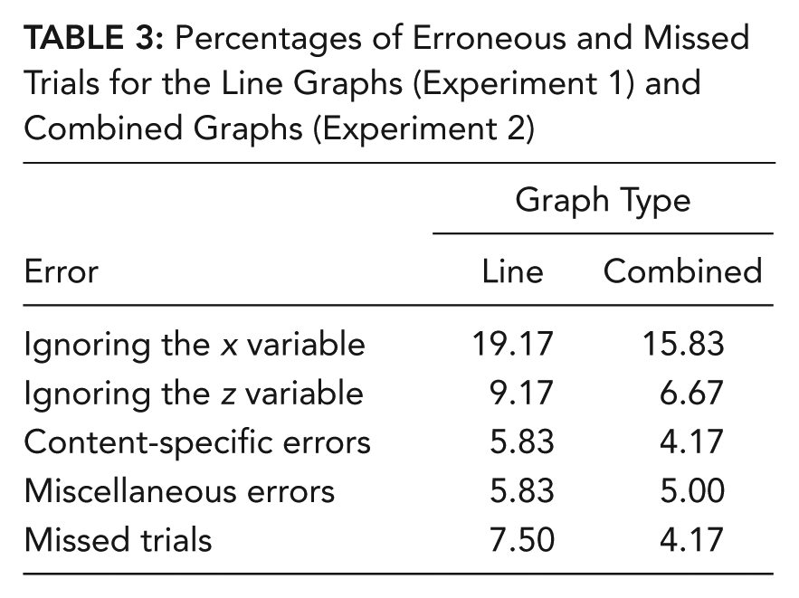
Each participant’s total number of erroneous statements was then calculated for each trial (with repeated instances of the same error within a trial recorded as one error). In this way, each participant’s trials were coded according to the specific interpretive error the participant made on that trial (with each erroneous trial categorized as being attributable to a single error type). The percentage of erroneous trials according to graph and error type are presented in Table 2. We calculated these percentages by dividing the total number of errors of each type by the total number of trials (126) in each graph condition.
Percentages of Erroneous and Missed Trials for the Line and Bar Graph Conditions, Experiment 1
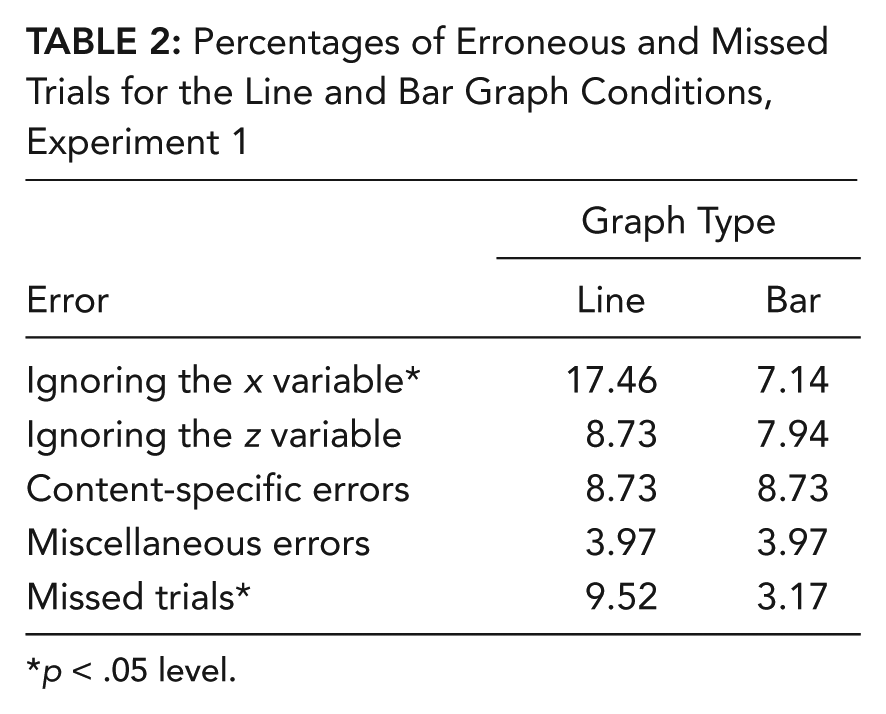
p < .05 level.
Table 2 shows two large and significant differences between the graph types, whereby line graph users were significantly more likely to ignore the x-axis variable, χ2 = 6.216, df = 1, p < .05, or to produce no coherent interpretation, χ2 = 4.271, df = 1, p < .05, than were bar graph users.
Discussion
These results replicate those of our prior research and reveal that the effect of graph format on interpretation is more pronounced in an undergraduate psychology student population. The pattern of errors found is identical to that of the first study, but the new results show a dramatic increase in the proportion of participants identified as pre-elementary. In our earlier study, we found that 39% of line graph users were classified as pre-elementary (Peebles & Ali, 2009). In the current experiment, the proportion of both graph users in this category increased by approximately 24 percentage points, with 62% of line graph users and 24% of bar graph users classified as pre-elementary.
We introduced the pre-elementary category to further develop the previous analyses summarized by Friel et al. (2001), which designates elementary classification as the lowest level of performance. What our research shows is that a large majority of undergraduate student line graph users do not meet the criteria to be classified as elementary.
Not only were the proportions of pre- elementary users and correctly interpreted trials different for the two graph types, but the pattern of errors differed between the two, as it did in the first study. These differences can be explained by the same Gestalt laws of perceptual organization employed earlier to account for the different IVs each group was more likely to use as the primary focus of its interpretation. To reiterate, the sole difference between bar and line graphs is the pattern representing the data at the center of the display. Data points are represented in bar graphs by a single bar for each level of each IV, with bars grouped together according to x variable value and rooted to the x-axis. According to the Gestalt principle of proximity (Wertheimer, 1938), each cluster of bars forms a separate visual chunk anchored to the x-axis. This design ensures that when participants attend to these chunks, they are able to identify the nearby x value label quickly and to easily and more readily associate the bars with the variable plotted on the x-axis.
The bars are also colored, however, with a legend containing patches of the same colors next to the level labels of the other IV. According to the Gestalt principle of similarity, this shared color allows users to also associate each bar with its associated level rapidly and easily. The two principles combined ensure that users are no more likely to ignore one IV versus another (both IVs were ignored in roughly 7% of trials).
In the case of line graphs, however, data points are represented by colored shapes (squares and circles) connected by similarly colored lines. According to the Gestalt principle of connectedness (Palmer & Rock, 1994), each line with its two end points forms an individual visual chunk. As in the case of the bar graphs, line graph users are able to associate each line with a level of the legend variable by shared color and the Gestalt principle of similarity.
Unlike the bar graphs however, there is no equivalent perceptual grouping process available in the line graphs to facilitate the association between the points at the ends of the lines and the variable values on the x-axis. Although points and labels may be associated by vertical alignment, it is clear that this association is not sufficient to counterbalance the color-matching process, most likely because perceiving the line as the primary representational feature impairs users’ ability to differentiate the points from the line.
This imbalance in the visual dynamics of line graphs results in a reduced ability of users to determine which part of the pattern depicts the variables on the x-axis and in twice the number of x variables being ignored than legend variables (16.7% and 8.7%, respectively). For example, for the line graph in Figure 1f, participants would often say, “There is more weight gain with high protein type than with low protein type” and be unable to elaborate further or would sometimes make statements such as “There are two lines—for high and low protein type—but where’s the information for protein source?”
The effect of the lines is more pronounced in the undergraduate population, we assume, because undergraduates have not yet acquired the interpretive knowledge that associates each point at the lines’ ends with a value of both the x and legend variables. Interaction graphs are relatively uncommon and specialized compared with two-variable line graphs, and in our experience, many undergraduate students are encountering them for the first time in our classes. Therefore, novices may well be approaching these graphs with interpretive schemas and processes (Pinker, 1990) only for two-variable graphs, and it may not be surprising, therefore, that the large proportion of the errors we found (ignoring the x or z variable, the content-specific errors) involved interpreting a three-variable graph as a two-variable one.
This lack of general graph knowledge may make novices’ interpretations more susceptible to the influence of domain knowledge. A number of studies have shown that users’ interpretations of graphical representations can be affected—for good and ill—when they have some knowledge of the variables and how they relate to each other. For example, it has been demonstrated that people are more likely to extract general trends in line graphs and incorrectly estimate correlation strength in scatter plots when the variables are known compared with when they are unfamiliar (Freedman & Smith, 1996; Shah, 2002). Shah (1995) has also shown that domain knowledge can cause novice graph users to interpret relationships incorrectly if the positioning of variables does not follow convention (i.e., if the axes representing the DV and IV are reversed).
We interpret a small subset of errors for two graphs in our experiment as resulting from participants’ prior knowledge of the relationships between the variables—specifically, the relationships between temperature, stress, and fractures (Graph 2) and between protein type, protein source, and weight gain (Graph 6). In both cases, these content-related errors were relatively rare and were found in both graph conditions. However, in comparison to the number of non-content-related errors this study has revealed, the effect of content on interpretation can be seen to be relatively minor. Our study shows that for novice users of 2 × 2 interaction graphs, the effect of graphical representation far outweighs that of content.
Having identified the problem with line graphs, the inevitable question arises whether—and if so, how—this effect may be reduced or perhaps eliminated entirely. Three alternatives come to mind. The first is to eschew line graphs altogether and to use bar graphs exclusively. Although bar graphs are currently a common choice, it has not been established that they are superior to line graphs for every task—the identification of interactions and main effects, for example. Furthermore, it is by no means the case that the bar graphs cannot be misinterpreted in the same way as line graphs; 24% of bar graph users in our experiment were also classified as pre-elementary.
A second way to remedy the situation is to provide explicit instruction on their interpretation and use, identifying the key representational features and contrasting them with two-variable line graphs. This instruction avoids the more error-prone (although we suspect quite common) situation in which students must work out the rules of interpretation for different graph types through reading the literature and analyzing their own data. Although explicit teaching may be appropriate and feasible in some educational contexts, it is not always possible for all target audiences, and it is quite possible that the effect of this knowledge may diminish over time—particularly with infrequent exposure.
The most effective and widely beneficial solution, therefore, may be to modify the graphical representation itself to reduce the visual imbalance and strengthen the link between the data points and all four variable values. One modification that seems—at least intuitively—plausible is to combine the features of both bar and line graphs. More specifically, if a graphical feature having a similar function as a bar were introduced to the line graph that reinforces the connection between the line points and the x variable values (without causing additional problems or confusion through increased visual complexity), then we might predict that novice users would be less likely to ignore the x variable in their interpretations.
This problem has previously been addressed by graph designers by the use of “drop lines” or “tethers” to anchor data points to reference points, lines, or planes, and Harris (1999) provides a wide range of diagrams (including line graphs) with one or more such lines. In the second experiment, we design a new graph in which dashed lines connect the plot line end points to the x-axis and test the hypothesis that pre-elementary performance will be significantly reduced with this design.
Experiment 2
The 12 line graphs used in Experiment 1 were modified to form a set of “combined” graphs (four examples of which are shown in Figure 2). To incorporate the bar graph feature effectively, we first displaced the lines slightly (by the same distance) to the left and right so that the four line ends were placed at the same locations as the centers of the bar tops. We then projected a dashed line from each point (of the same color as the point) to the x-axis. Dashed lines were used to reduce the perception that the resulting representation consisted of a single object comprising two points and three lines. Compared with unbroken lines, we found that dashed lines serve to anchor the line points to the axis while maintaining the plot line as a distinct representational object. In addition, using broken lines clearly distinguishes them from the plot lines when they intersect.
Four combined line graphs used in Experiment 2.
Method
Participants
For the second experiment, 40 undergraduate psychology students (31 female, 9 male) from the University of Huddersfield volunteered to take part, for which they received course credit. The age of participants ranged from 18.0 to 36.1 years, with a mean of 20.3 years (SD = 3.8). All participants were in their 1st year of study.
Materials, design, and procedure
Experiment 2 had the same design as Experiment 1, with 10 participants being randomly allocated to each of the four conditions. The experiment was carried out with the same equipment and the same procedure as in Experiment 1.
Results
We analyzed the data using the same method as for Experiment 1, finding a level of agreement in the coding of participants’ verbal protocols of 89% (κ = 0.87). The proportions of erroneous and missed trials are shown in Table 3. There were no significant differences in these values between the two conditions.
Percentages of Erroneous and Missed Trials for the Line Graphs (Experiment 1) and Combined Graphs (Experiment 2)
Our hypothesis, that there would be a significantly higher proportion of pre-elementary line graph users, was not supported. The proportion of line graph users classified as pre-elementary was 60%. The modification did produce a 20% reduction in pre-elementary performance, with only 40% of combined graph participants in this category, but statistical analysis revealed that this difference was not significant, χ2 = 1.6, df = 1, p = .172.
A comparison of the number of correct trials between the two conditions revealed that the combined graphs resulted in more correctly interpreted trials than did the normal line graphs (mean ranks: line = 18.03, combined = 22.98), but this difference was also not significant (U = 150.5, p = .183).
Finally, analysis showed that participants’ categorization as pre-elementary was not affected by whether they saw normal or reversed graphs, χ2 = .417, df = 1, p = .374.
Discussion
Although the combined graphs resulted in a reduction in the number of errors participants made, a high proportion of the sample was still pre-elementary. Consistent with the line graph data from Experiment 1, the most common error participants made was to ignore the x-axis variable, suggesting that any visual anchoring or guidance to the x-axis provided by the drop lines was not sufficient to balance the salience of the colored lines from which they project. This finding may be attributable to the fact that color is preattentively processed (Treisman, 1985), which means that attention is drawn early on in the comprehension process. Combined with the Gestalt principle of similarity, this process enables a rapid and relatively effortless matching of colored lines to legend values compared with identifying the labels at the end of the drop lines (which were displayed in the same color as the line from which they projected to facilitate discrimination).
Analysis of the verbal protocols also revealed that participants were often surprised by the new design and unsure (at least initially) as to how to interpret the drop lines, with several commenting that they found the visual pattern confusing. Some participants asked what the dashed lines were for or (as in Experiment 1) stated that they could not find the information for the x-axis variable.
It is true that the addition of the drop lines, which intersect the solid plot lines, increases the visual complexity of the representation. The displacement of the plot lines slightly to the left and right of the x-axis tick marks also has the effect of placing the dashed lines to either side of the x-axis-level labels. Unlike the bars in the bar graph, the two drop lines that project to an x-axis value do not spread across the value label and do not touch. It is possible, therefore, that they do not combine to form an individual visual chunk with a strong link to the label in the same way the bars do.
Some participants focused on the distance between the dashed lines and the label. In a number of cases, participants made statements that suggested that they were interpreting a dashed line as representing a value below or above that indicated by the location of the tick mark and the level label (e.g., “Before it gets cold . . .”). It seems, therefore, that displacing the drop lines not only can reduce the successful association between the perceptual feature and the x-axis label but also can encourage participants to attach unnecessary significance to their location.
Perhaps the strongest conclusion to be drawn from this experiment, therefore, is that although it provides some support for our approach of modifying design features to improve the base level of comprehension, the selection of which additional graphical object to introduce in a display is not trivial, because factors such as visual clutter, the strength of the visual effect introduced, and the level of user unfamiliarity may obviate the desired effect.
What is needed, therefore, is a modified graphical representation whereby the perceptual features relating the pattern to both IVs are more evenly balanced. Additional constraints on any design are that it should not look too unusual or unfamiliar to users, should not overcomplicate the diagram visually, and ideally, should allow the same process by which readers effortlessly relate the pattern to the legend variable to be employed in relating the pattern to the x-axis variable.
Our proposed solution to this problem is a novel design that, rather than using features that associate two locations by explicitly drawing a line between them, uses the same color feature used for the legend variable to associate the plot points to the x-axis. Examples of this new “color-match” design are shown in Figure 3.
Four color-match graphs used in Experiment 3.
In the new graphs, a color patch similar to those in the legend is placed above each of the x variable values, and the corresponding points at the ends of the plot lines are similarly colored so that using the same color-matching process, users can more easily associate the data points with the value labels while still being able to associate them with the legend values via the colored lines. As can be seen from Figure 3, the association between the colored points at the end of each line and the colored patch above the x variable value is enhanced by their vertical alignment.
We hypothesize, therefore, that this color association will allow users to associate the data points with the values of both IVs, thereby reducing the level of pre-elementary performance to that of the bar graph condition of Experiment 1.
Experiment 3
Method
Participants
For the third experiment, 40 undergraduate psychology students (28 female, 12 male) from the University of Huddersfield received course credit for taking part. The age of participants ranged from 18.1 to 31.4 years, with a mean of 19.3 years (SD = 3.26). All participants were in their 1st year of study.
Materials, design, and procedure
Experiment 3 had the same design and was carried out with the same equipment and procedure as in the previous two experiments. The stimuli used in this experiment were the 12 original line graphs from Experiment 1 and the same 12 line graphs modified to include the additional colors to the line points and the color patches to the x-axis values. Figure 3 shows four of the new stimuli. We randomly allocated 10 participants to each of the four conditions.
Results
We again employed the analysis used in the previous experiments to categorize the errors participants made, with a level of agreement of 94% found between the two codings (κ = 0.93). The proportions of erroneous and missed trials are shown in Table 4.
Percentages of Erroneous and Missed Trials for the Line Graphs (Experiment 1) and Color-Match Graphs (Experiment 3)
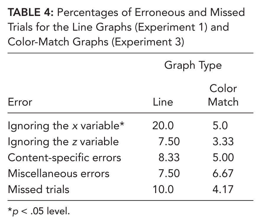
p < .05 level.
Our hypothesis that there would be a significantly higher proportion of pre-elementary performance in the line graph condition was supported. As with Experiments 1 and 2, a high proportion (55%) of participants in the line graph condition were classified as pre-elementary. The modification produced a statistically significant reduction of 40% in pre-elementary performance compared with the line graphs, with only 15% of color-match graph users classified as such, χ2 = 7.03, df = 1, p = .01.
A comparison of the number of correct trials between the conditions also revealed that the color-match graphs resulted in more correctly interpreted trials than did the normal line graphs (mean ranks: line = 14.75, color match = 26.25). This difference was also significant (U = 85.0, < .01).
As with the previous experiments, participants’ categorization as pre-elementary was not affected by whether they saw normal or reversed graphs, χ2 = .311, df = 1, p = .577.
Discussion
In producing such a significant reduction in pre-elementary performance, the color-match design supports the suggestion that standard line graphs create an unbalanced visual representation that overemphasizes the legend variable values to the detriment of the x-axis ones. The results of Experiment 3 also support the hypothesis that additional color patches are sufficiently salient to balance the representation by drawing users’ attention to the x-axis values without looking too unusual or unfamiliar to users or making the diagram too visually complex.
In regard to comparing performance on the four graph types, it is clear that the color-match graphs produce the lowest number of errors of all and that the frequencies of the error type are much more similar. Crucially, the pattern revealed in the previous experiments—that readers are twice as likely to ignore the x-axis variable as they are the legend variable—was not found. In this condition, the frequencies of these two errors were much closer.
This pattern can be explained by identifying how many—and which—Gestalt organization principles are having an effect. In the original line graph condition, the principle of similarity allowed participants to relate plot lines to legend values by color, but there was no equivalent grouping principle facilitating the association of plot features to the x-axis values. In fact, this association is actually hindered by the operation of a second Gestalt principle, connectedness (Palmer & Rock, 1994), which encourages the perception of plot lines as single objects rather than as connections between data points. This combination of Gestalt principles strongly directs novice users to relate the plot pattern to only the legend and y-axis variables, resulting in the catalog of errors found in the previous experiments.
In the color-match graphs, differentiating the plot lines from their data points by color prevented participants from perceiving the line as a single object and made the individual data points more visually salient. Placing the color patches above the x-axis values then balances the visual dynamics of the graph by bringing the Gestalt principle of similarity into effect for the x-axis variable as it does for the legend variable—readers can match the line colors to the legend values and the data point colors to the x-axis values.
This analysis is supported by the verbal protocols we recorded. In the previous experiments, participants would often match plot lines to legend values (e.g., for Figure 1d, “Blue is high exercise, red is low exercise”) but then fail to incorporate the x variable values into their interpretation. Users of the color-match graphs, however, were far more likely to continue their interpretation of Figure 3b (e.g., “Blue is high exercise, red is low exercise. Green is male and yellow is female.”).
By allowing novice readers lacking the interpretive knowledge for these graph types to associate all referents to the plot pattern using the same visual features and Gestalt principles, the color-match design balances the features of line graphs and brings user performance on a par with that of the bar graph users in Experiment 1.
General Discussion
Gestalt principles of perceptual organization (Wertheimer, 1938) are regarded as playing a crucial role in the grouping of graphical elements to produce coherent interpretable objects and relationships. Knowledge of the various effects of Gestalt principles on perception and subsequent interpretation can inform graph design and use to ensure that the features and locations of objects are appropriate for their function. Conversely, insufficient care in the design or selection of a graph may result in the inappropriate grouping of elements, leading to failures in comprehension. Kosslyn (1989) illustrates this latter point with a Cartesian graph in which the y-axis label is placed too close to the origin. Kosslyn argues that this placement violates his acceptability principle of “organisation of framework and labels” because the label’s proximity to both x- and y-axes makes the intended association ambiguous. This ambiguity can be remedied by positioning the label closer to the vertical scale.
Although it is no doubt true that the relationship between Gestalt principles and comprehension can have negative consequences if not appropriately applied, as Lewandowsky and Behrens (1999) have argued, producing guidelines for avoiding these limitations is problematic because there are no accepted principles for predicting what constitutes inappropriate grouping in statistical graphs.
For example, although we have highlighted negative consequences of the Gestalt principle of connectedness operating in line graphs, it is this very same principle that allows experienced readers to integrate data and identify trends (Schutz, 1961) or rapidly interpret frequently encountered patterns. A prime example of the latter in the 2 × 2 interaction graphs used in our experiments is the cross pattern (Kosslyn, 2006), an example of which is shown in Figure 1a.
Experienced graph readers can often swiftly identify this pattern as representing a “crossover interaction” between the two IVs and explain that it reveals that they are not independent but that pairwise combinations of their levels produce reversals in relative DV values. A recent computational model of expert comprehension of 2 × 2 interaction line graphs developed by one of the authors (Peebles, 2012) using the Adaptive Control of Thought–Rational cognitive architecture (Anderson, 2007) explicitly incorporates such recognition processes in the initial pattern comprehension stage.
Such considerations have led us to stress previously the importance of taking into account the specific requirements of the intended task and how well they are supported by the representational properties of different graphical features when deciding which graph format to use (e.g., Peebles & Cheng, 2003; Peebles, 2008). Task and graphical representation are only two dimensions of the cognition-artifact-task triad (Gray & Altmann, 2001), however, and it is also vital to understand the characteristics of the various intended users of the graph.
As part of their training, students of the natural and social sciences are expected to develop sophisticated graphical literacy skills, as much of their work will involve the production and interpretation of graphical displays of data. Interaction graphs form a significant proportion of this experience, and it is vital, therefore, that the processes involved in their use are understood so that skills may be taught appropriately and the best graphical formats used.
Students’ difficulty with interaction graphs may, in part, be attributed to the coverage of them in the statistics textbooks they encounter during their studies. In discussing graphical representations of factorial designs, statistics textbooks aimed at undergraduate psychology students either focus entirely on or strongly emphasize the interpretation of main effects and interactions (e.g., Aron et al., 2006; Dancey & Reidy, 2008; Field, 2009; Howitt & Cramer, 1998; Langdridge & Hagger-Johnson, 2009).
Although this practice is not surprising, given that it is the primary function of such graphs, it may often be the case that students are being presented with advanced interpretive instructions when their basic conceptual understanding of the graphical representation is lacking. Our research suggests that students’ difficulties with these graphs could be addressed by more explicit instruction on the basic representational features of interaction graphs and the processes required to interpret them correctly.
It has been assumed that students can interpret both bar and line interaction graphs equally well and that the benefits of line graphs enjoyed by experts can readily be acquired by novices. We have demonstrated the limitations of this assumption and have shown that a large proportion of undergraduate students struggle to interpret line graphs even at an elementary level—none of the participants in our experiments demonstrated advanced interpretive performance (i.e., identified main effects or interactions).
There are several possible responses to these findings. One is to maintain the status quo, that is, continue to employ both bar and line graphs equally with the recommendation that the correct interpretation of line graphs be more explicitly taught. Although this response is indeed an option, it is limited because it places the onus of successful interpretation on external factors, thereby risking the possibility that it may not be carried out appropriately, for example, because of lack of space for detailed instruction in a curriculum. However, educators do play a key role in determining what—and how—students use to understand and work with factorial designs, and so it is important that the results of experimental research into the visual and cognitive processes involved in graph comprehension are communicated and used to inform teaching and support to learners. A key tenet motivating this work is that a primary aim of research into graph comprehension should be to inform decisions about the most appropriate methods for teaching science.
Another response is to suggest that students be encouraged to use bar graphs predominantly and recommend that bar graphs be more widely used in textbooks and research literature. Although we regard this approach as perhaps being a more practical and viable option than the previous one, it, too, is limited. A consequence of adopting this approach would be that students receive less exposure to line graphs and so are less likely to acquire the pattern recognition schemas that experts use so effectively.
A third alternative would be to adopt the color-match graph we have developed here that combines the benefits of both line and bar graphs. Students using this graph format may benefit from the balanced visual dynamics found in bar graphs, which facilitate the matching of data points to the levels of both IVs through color, while maintaining the global line-based patterns found to be so useful in line graphs. For expert users, although the additional color patches may be initially surprising, because they follow the same principles as the legend patches, it is reasonable to assume that they will be interpreted in a similar manner. Furthermore, the primary representational features of the graphs (lines connecting data points) remain the same, so that the patterns that experts are so familiar with are still available.
Before this alternative can be recommended, however, further research must be conducted to examine the generalizability of this recommended design modification. In particular, it is necessary to evaluate the color-match graph with additional populations varying in expertise and spatial ability and with a range of tasks. This additional testing will allow us to conclusively determine the degree to which this design-based solution provides the appropriate representational features to support correct associations between pattern and referents that promote accurate interpretation and the development of pattern recognition schemas.
Key Points
Gestalt principles of perceptual organization are regarded as playing a crucial role in the visual processing of graphical representations.
It has been assumed that students can interpret both bar and line interaction graphs equally well and that the benefits of line graphs enjoyed by experts can readily be acquired by novices.
We have demonstrated the limitations of this assumption and have shown that a large proportion of undergraduate students struggle to interpret line graphs even at an elementary level.
The “color-match” graph we have developed combines the benefits of both line and bar graphs.
Footnotes
Nadia Ali is a senior lecturer in psychology at University Campus, Oldham. She received her PhD in cognitive psychology from the University of Huddersfield in 2011.
David Peebles is a reader in cognitive science in the Department of Behavioural and Social Sciences at the University of Huddersfield. He received his PhD in cognitive science from the University of Birmingham in 1998.