
Abstract
As a result of the growing use of state and national testing of literacy and numeracy among school students, there are increasing demands for teachers to interpret assessment data. In light of this, there is a need to provide benchmarks or a framework that identifies critical aspects of teachers’ understanding that are needed to interpret data effectively. In this study, 24 items from the Attitudes and Statistical Literacy Instrument are used with 704 teachers to provide a hierarchical scale of teacher ability to interpret these assessment data. Using an item response theory model for partial credit scoring, three levels of ability are identified, related to reading values, comparing values, and analyzing a data set as a single entity. Teacher ability is then compared across various demographic variables, such as number of years of teaching, main teaching grade levels, previous professional learning experience, last time statistics was studied, and gender. Implications are drawn for professional learning for teachers and for further research.
Keywords
Introduction
The intention of the recent move towards large-scale student assessment programs, such as the National Assessment Program – Literacy and Numeracy (NAPLAN), is to lead to school improvement, with the Ministerial Council on Education, Employment, Training and Youth Affairs (MCEETYA, n.d., p. 3) urging that “the outcomes of these assessments be used to inform future policy development, resource allocation, curriculum planning and, where necessary, intervention programs”. This outcome is, however, dependent on whether or not these data can be put to such use, with at least one senior administrator suggesting that School improvement is being held back because many teachers lack confidence and skills to analyse NAPLAN student test data … Effective use of data by teachers is, however, the crux of school improvement. (Bruniges, New South Wales Director General of Education, quoted by Milburn, 2012)
The current climate of large-scale assessment protocols means that schools are providing education system authorities with data across numerous aspects of schooling, not least of which is student assessment data such as NAPLAN. The statistical reports that are generated from such data are returned to schools and teachers, where it is expected these data are to be considered for planning and decision making. Given the complex nature of the data and the variety of ways in which they are presented (see, for example, Figure 1), teachers and principals need commensurate statistical skills in order to interpret data meaningfully, and apply the findings evident from the data within their local contexts. The education situation just described is but one example of the need for statistical literacy in today’s society generally, and workplaces more specifically.
Example of statistical report sent to schools (used as a basis for survey items).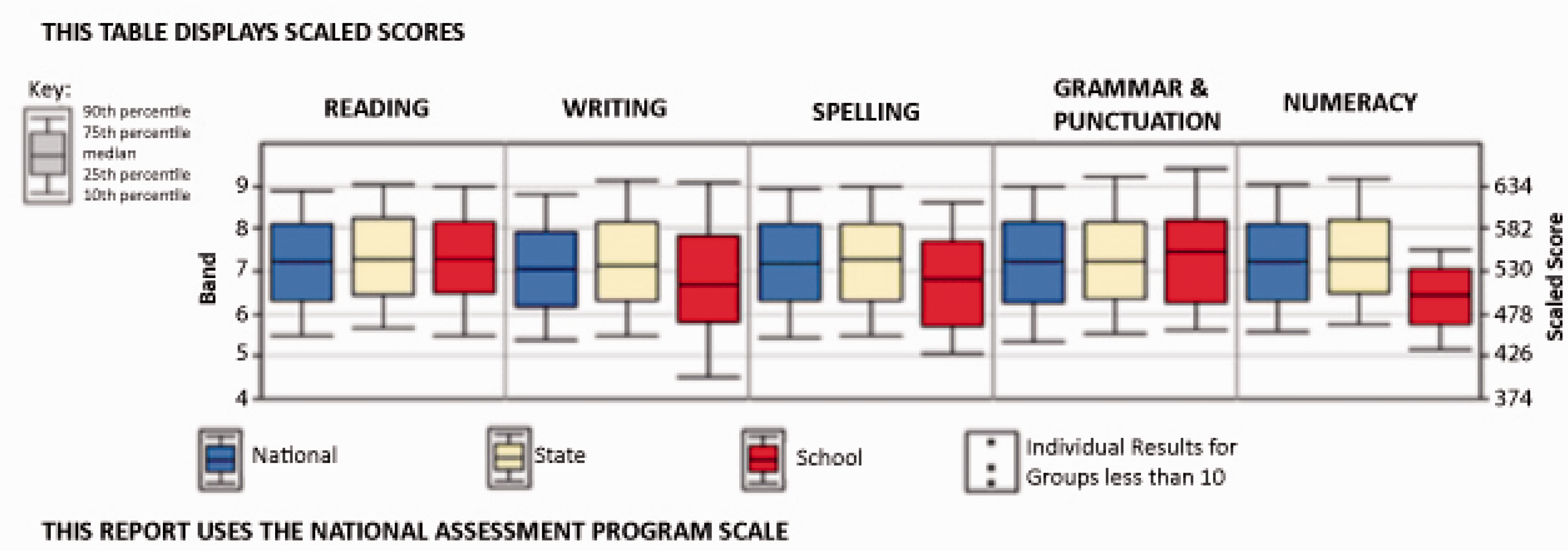
In this paper, we report on research trialling a proposed framework (Figure 2) to describe professional statistical literacy, in this case for school principals and teachers. The validity and efficacy of the framework are tested by considering the Partial Credit Model (PCM) analysis of the responses to survey items based on this framework.
A framework for considering professional statistical literacy (Pierce & Chick, 2011, p. 633).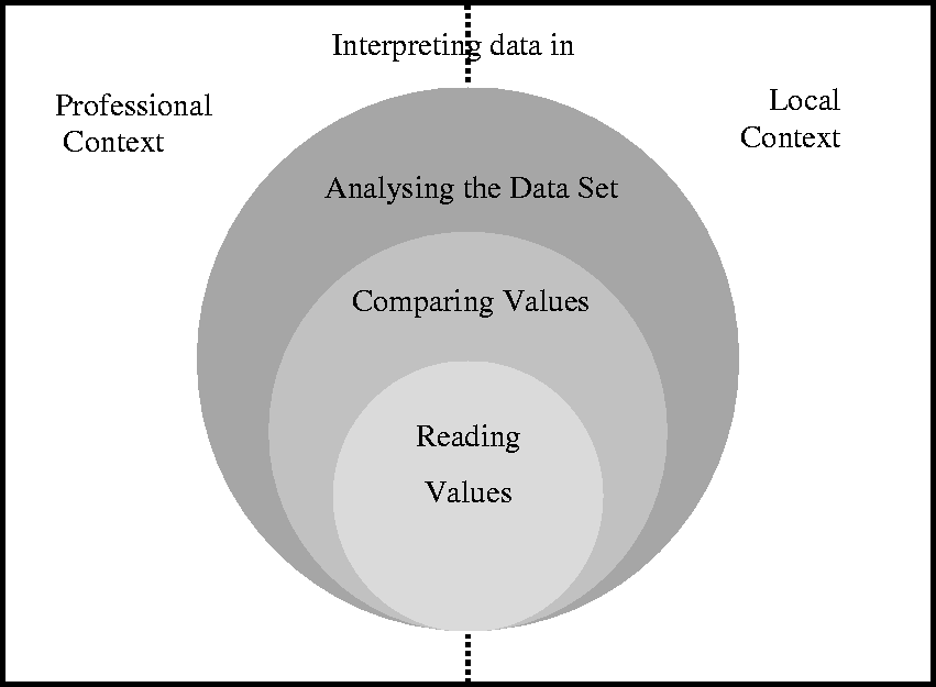
This paper provides, first, some background to statistical literacy and the details of the study are explained. The results of the PCM analysis are then discussed, both in terms of validating a proposed statistical literacy hierarchy and in terms of examining variables that may impact on teachers’ facility with statistical literacy in their workplaces. Our purpose is to determine whether or not there is a hierarchy of understanding for professional statistical literacy, and what areas are difficult for teachers. The final sections of the paper consider the implications for teachers’ professional learning in this area.
Background
Statistical literacy
As suggested in the introduction, the process of analyzing and interpreting quantitative data in the context of a school setting—or any workplace—is not a trivial task. Meaningful data interpretation is not simply a matter of statistical knowledge, but requires principals and teachers to be able to think critically with data. This particular kind of expertise has attracted growing research attention in the past decade and is known as statistical literacy. It involves having sufficient knowledge and understanding of numeracy, statistics, and data presentation to make valuable use of quantitative data and summary reports in a personal or professional setting (Ben-Zvi & Garfield, 2004; Watson, 2006). The key features of the statistical literacy construct were encapsulated by Gal (2002, pp. 2–3) as incorporating the ability to interpret and evaluate statistical information from diverse contexts, and discuss the meanings of, implications of, and concerns about such data and conclusions. As applied to education—the “diverse context” that is our focus in the present study—this definition of statistical literacy encompasses the expectation that teachers should be able to interpret national testing data. The question naturally arises about what actual “level” of statistical literacy is required in order for teachers to do this. Is the kind of general education in statistical thinking, as acquired by most individuals as part of their secondary school education, sufficient for teachers’ needs? Alternatively, do these reports—involving many variables, using a variety of statistical approaches, and arising in the context of a complex workplace—require a level of statistical literacy more sophisticated than might be required for more everyday situations?
A number of authors have proposed hierarchies for statistical understanding and statistical literacy. Curcio’s (1987) graph comprehension study was conducted with young students, and involved relatively elementary data sets. It has been widely cited, and identified three levels for graph reading: “reading the data” (directly reading factual information clearly evident on the graph), “reading between [or within] the data” (attending to multiple points from one graph or many, often for comparison), and “reading beyond the data” (predicting and inferring from the data). Shaughnessy (2007) and Shaughnessy, Garfield, and Greer (1996) posited a further category that acknowledged the role of context in making sense of data, which they named “reading behind the data.” Watson’s (2006) three-tiered statistical literacy hierarchy also emphasized the place of context but is a broader framework than Curcio’s graph-focused one and concerns statistical ideas more generally. Her first tier involves understanding basic statistical terminology and techniques (so is, in a sense, concerned with technical facility), the second tier focuses on understanding language and concepts within the context of wider social issues (which addresses the role of context in data interpretation), and the third tier focuses on challenging and questioning statistical claims (which goes beyond a consideration of context to expect critical interpretation). Finally, Gal (2002) himself proposed a statistical knowledge base (p. 10), which again goes beyond mere technical skills to larger questions of the purpose of statistical techniques. He emphasized the importance of knowing why data are needed, having familiarity with basic terms, and understanding how statistical conclusions are reached. In addition to statistical knowledge Gal also acknowledged the impact of “disposition.” He noted that “It is hard to describe a person as fully statistically literate if this person does not show the inclination to activate” and use his/her statistical knowledge (Gal, 2002, p. 17, emphasis in original).
A hierarchical framework for professional statistical literacy
Pierce and Chick’s (2011) framework for considering professional statistical literacy draws on and synthesizes this background (Figure 2), incorporating both the technical and contextual aspects of data interpretation. In order to make effective use of a set of data, the teacher must be able to examine it at multiple levels, each of which is more complex than and dependent upon the lower levels (as indicated by the nested circles in Figure 2). The lowest level, reading values, involves understanding features such as keys, scale, and graph type, together with the capacity to read specific data points on the graph or table. These features are, usually, explicit components of the data as presented in a report or similar. The second level, comparing values, requires attention across multiple facets of a graph or across one or more representations (graphs or tables). It involves awareness of relative and absolute differences, early informal inference, and low-level statistical tools. Finally, the third level, analyzing the data set, involves being able to consider the data as a whole entity: observing and interpreting variation, trends, and changes with time or other variables; and attending to the significance of results. In addition to this hierarchy of technical facility, the framework also acknowledges the role of context, with two key contexts identified as being significant, as shown by the surrounding split rectangle in Figure 2. Professional context concerns information relevant to the profession and needed to interpret the data set (e.g., the meanings of specialist terms such as “band” and “Victorian Essential Learning Standard (VELS) level”). This context acknowledges that a statistically literate person may be able to make sense of technical aspects of the data, such as noting that a distribution is skewed, but may not know what, specifically, is actually being measured by one of the variables. The second aspect of context, here referred to as the local context, comprises knowledge about the situation or context that gave rise to the data that are not evident in the data set alone. This context includes things like knowledge of the local school situation such as the school’s socio-economic context or local events that may have had an impact on test results. These two context components may overlap, hence the dashed line between them in Figure 2. This theoretical framework has been used to analyze data representations to determine the requisite levels of statistical literacy necessary to interpret such representations (Chick & Pierce, 2013). For the current study the framework underpinned both the structure of and content of items created for the study, in order to assess school principals’ and teachers’ statistical literacy.
Tools for professional statistical literacy for principals and teachers
The professional statistical literacy framework described above is intended to be generic and applicable to a variety of workplaces. Its broad applicability comes about, in part, through acknowledging the role of context. Context does, however, play a part in some of the specific requirements of the technical levels (the circles in Figure 2), because the statistical tools required to analyze data are dependent on the form in which the data are supplied. In the present case, where we are concerned with NAPLAN data presented to teachers in the Australian state of Victoria, the main graphical tool that is used by educational data service providers for data representation is the box-and-whisker plot (box plot), although some data are also supplied in tabular form, with numerical summary statistics. Appropriate interpretation of box plots is therefore essential for high-level statistical literacy in this particular context. Although straightforward definitions of the box plot are found, for example, in the Australian Curriculum: Mathematics (Australian Curriculum, Assessment and Reporting Authority, 2012, pp. 72–73; see also Watson, 2012), many variations in format exist, as summarized by Wickham and Stryjewski (2011) in their discussion of the 40-year history of the box plot. It is thus important to read carefully the keys associated with any presentation of box plots. In addition, there is a subtlety associated with the frequency versus density representation of a box plot compared, say, to a bar graph. In a bar graph the length of the bar represents frequency of values, whereas in a box plot length represents density of values. Bakker, Biehler, and Konold (2005) presented evidence of this confusion from students as a reason for postponing the introduction of box plots to the later middle school years. Teachers’ ability to interpret box plots is hence a major component of assessing their statistical literacy understanding. It should be noted that although other state jurisdictions may use representations other than box plots, a similar analysis such as that carried out above is required to determine the technical statistical issues that are pertinent in each case.
Understanding what is and is not represented by the box plot graphics used in the reports sent to Victorian schools is key to being able to interpret such data correctly. The key shown on the top left of Figure 1 highlights that only the middle 80% of student results are represented, whereas the highest and lowest 10% are not. Discussion during a number of focus group sessions conducted as Stage 1 of this project (not reported in detail here) revealed that many teachers assumed that the graphic represented the full distribution, including their best and weakest students. A few teachers appeared to think that the whiskers themselves were essentially decorative and that the box component alone represented the spread of the whole cohort. In addition, frequency rather than density thinking was evidenced by teachers’ open written responses interpreting the information shown in box plots like the school (red or rightmost) boxplot for Writing in Figure 1, with some teachers failing to realize that the same number of students are represented in each of the whiskers: “The long tail means there is a big group of students who need extra support” (Pierce & Chick, 2013, Table 3, p. 198). Understanding that, for example, a long whisker indicates greater diversity rather than a larger number of students is necessary for principals and teachers to make appropriate decisions about planning and the need for a differentiated curriculum.
The study
Instrument
This study was conducted with teachers from Victorian government schools, and was Stage 2 of a larger project. Stage 1 had involved the use of pen-and-paper questionnaires and face-to-face focus group discussions with 152 teachers (see Pierce & Chick, 2011). The purpose of Stage 1 was to probe, in a semi-structured manner, principals’ and teachers’ perceptions of statistical reports and their statistical skills and understanding of typical education system reports. The results of Stage 1 of the project led to the development of an online questionnaire for Stage 2, the focus of this study. The questionnaire was intended to allow rapid collection of large-scale data and to be a prototype for instruments that will allow teachers’ statistical literacy to be examined.
The online Attitudes and Statistical Literacy Instrument (ASLI) took each respondent about 20 min to complete, and included items on beliefs and attitudes (only partly reported here; see also Pierce, Chick, & Gordon, 2013) together with items focussing on statistical literacy. The latter section included items used in Stage 1’s longer pen-and-paper instrument, but refined to include multiple-choice response items that, in some cases, used the Stage 1 teachers’ own language. This section was designed to target key misconceptions and knowledge gaps identified in Stage 1 that had particular professional relevance for the Victorian principals and teachers. Items from the pen-and-paper questionnaire on which almost all teachers were successful—for example, identifying an individual students’ score or response provided in a table—were not included. In addition to targeting aspects of statistical literacy already known to be necessary for interpreting NAPLAN data (cf. Pierce & Chick, 2013) the individual items were designed in such a way that they addressed aspects of the posited hierarchical statistical literacy framework, with some items focusing on comparing values and others requiring attention to the nature of the whole data set, or the context.
This paper reports data from the 16 items that formed a statistical literacy section of the online ASLI. These items are included in Appendix A. The first nine items were based on typical reports regarding student achievement that are returned to Victorian schools following analysis of NAPLAN data. These reports were chosen because NAPLAN reports are sent to most schools and the reports of Victorian Certificate of Education data follow a similar format. These items were numbered 1–9 for the purposes of the PCM analysis in this paper, and correspond to those items from the actual ASLI that were numbered 13–18, together with sub-parts of those questions (see Appendix A). Further items (numbered 10–16 in the PCM analysis, or 19–25 in the ASLI) targeted teachers’ broader understanding of distributions represented by histograms and boxplots. Items numbered 8, 9, 11, and 16 in the PCM analysis were open-response items, with teachers typing their responses into a small window (about 180 characters, but extendable). The remaining questions were multiple-choice items using distractors based on data from the Stage 1 questionnaires and focus group interviews. [For the present paper, the item numbering, from 1 to 16, is used throughout, but the original ASLI numbering has been included in Appendix A in order to allow cross-referencing with other papers from this data set.]
Data analysis
For multiple response items the options were coded on a numerical scale where the best or correct answer was allocated the highest score. For certain items the multiple choice options may have included less satisfactory choices that still included some correct elements; in this case the coding scheme allowed a partial credit score.
Example scoring rubric (item 9—contrasting graphs).
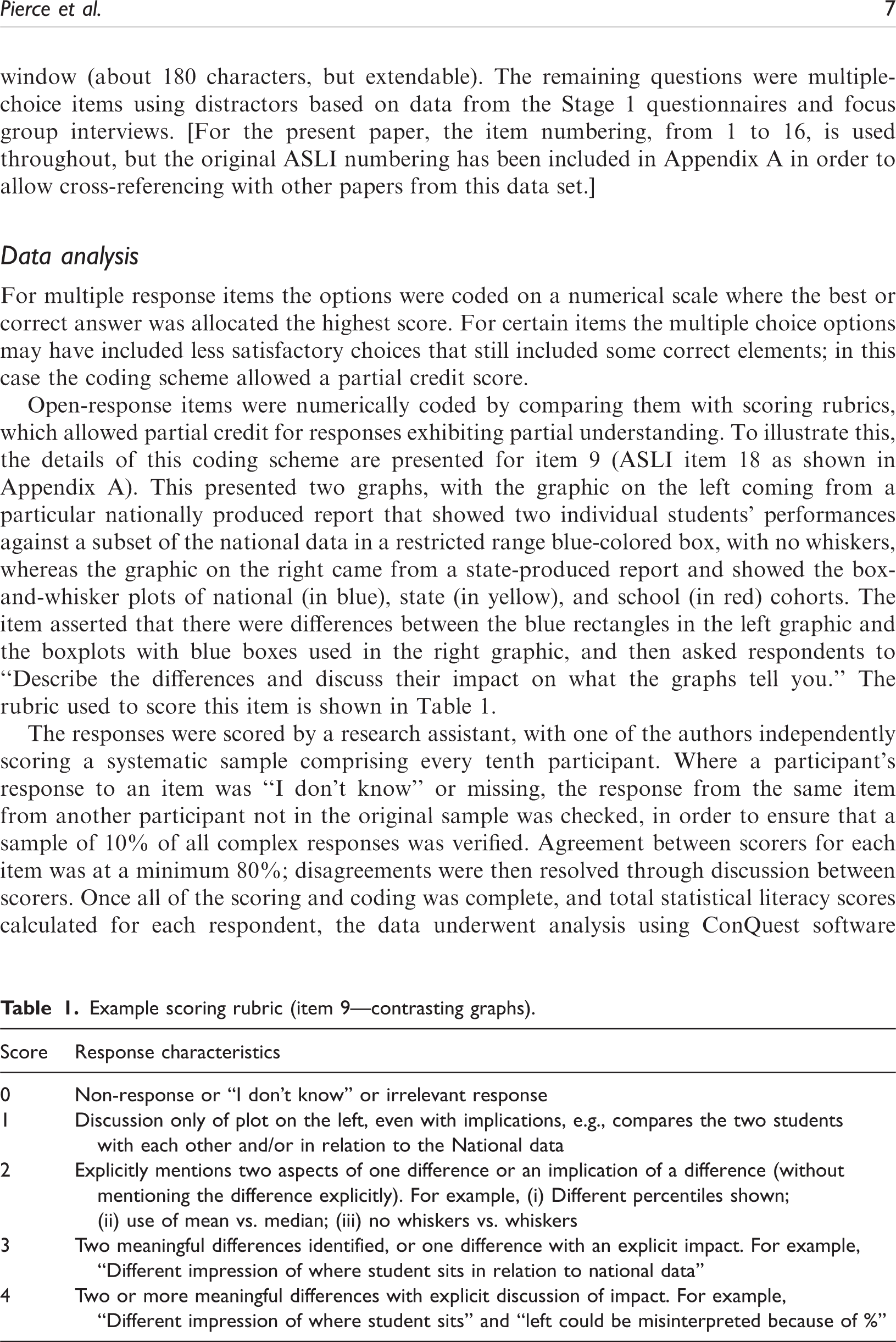
The responses were scored by a research assistant, with one of the authors independently scoring a systematic sample comprising every tenth participant. Where a participant’s response to an item was “I don’t know” or missing, the response from the same item from another participant not in the original sample was checked, in order to ensure that a sample of 10% of all complex responses was verified. Agreement between scorers for each item was at a minimum 80%; disagreements were then resolved through discussion between scorers. Once all of the scoring and coding was complete, and total statistical literacy scores calculated for each respondent, the data underwent analysis using ConQuest software (Australian Council for Educational Research, n.d.) using PCM. A partial credit model is a commonly applied Item Response Theory model for scaling polytomously scored data such as that for the ASLI survey. PCM coding assigned 0 for a non-response, “I don’t know,” or an irrelevant response; and a numerical step-code for other answers, based on the order identified by the scoring rubric, resulting in the item step-codes such as 9.0, 9.1, 9.2, 9.3, and 9.4 (see Figures 3(a) and (b)). Items allocated the 0 step-code do not appear in the analysis.
Left: Variable map of latent distributions and response model parameter estimate. Right: Items and parameter estimates ordered by item ID and shaded by level of difficulty as determined by the parameter estimates.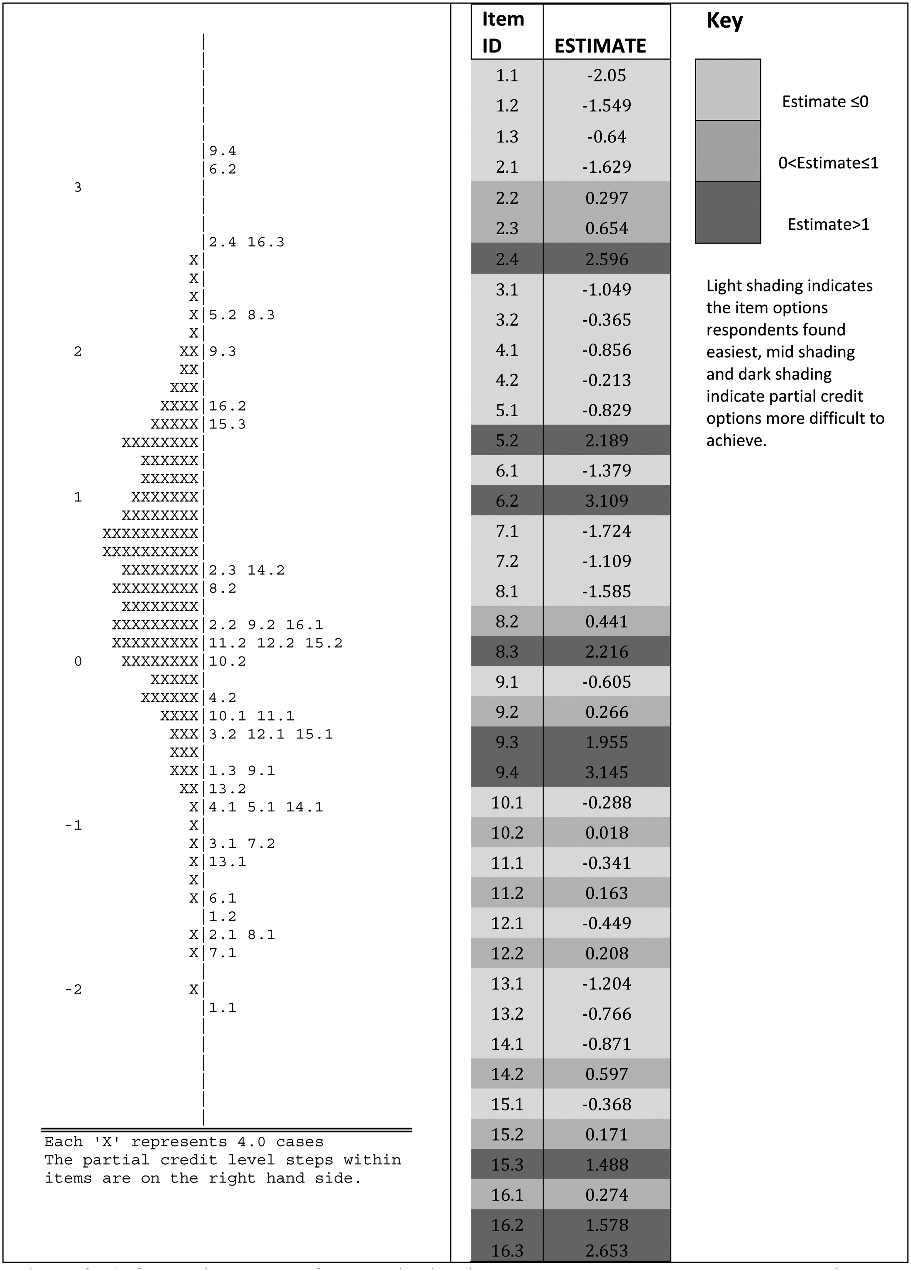
The typical output of such an analysis shows individual participants aligned with questions that are ordered in terms of how difficult those participants found them to be. Participants further up the scale are more likely to be able to answer correctly the items placed below them on the scale in comparison to those participants below those items. This analysis was intended to determine whether, as hypothesized, professional statistical literacy as described here is a uni-dimensional hierarchical construct.
In an analysis described in detail in Pierce et al. (2013), further ASLI survey items framed by Ajzen’s (1991) Theory of Planned Behavior probed the teachers’ disposition towards use of statistical knowledge (Gal, 2002). These items addressed three factors: teachers’ attitudes towards the statistical reports; their subjective perceptions of norms regarding engagement with these reports; and their perceived behavioral controls, which present barriers to their use of the reports. In the section of the study reported in this paper teachers’ scores for each of these three variables were correlated with their statistical ability scores.
Participants
The goal for Stage 2 was to gather data from a random sample of 1000 Victorian primary and secondary government school teachers (excluding those who had participated in Stage 1 of the project). In anticipation of a 60% school participation rate and then a participation rate of 50% from teachers within those schools, 104 randomly selected schools were approached. Sixty percent of principals agreed to their school’s participation but in the end only 704 teacher responses were received (217 male, 487 female; 314 primary and 390 secondary teachers). This still provided a sufficiently large sample from which to draw tentative conclusions about areas of success and difficulty for teachers with respect to professional statistical literacy, and for examining the hierarchical nature of this construct. The proportions of male and female teachers, primary and secondary teachers, and the levels of seniority of teachers in the sample were generally representative of the broader population of government school teachers (see Pierce et al., 2013, for details).
Results
A hierarchy for professional statistical literacy
Item response theory analysis is useful for determining whether or not a set of items form a hierarchy with respect to a particular construct. The PCM analysis of data from the statistical literacy items of the ASLI showed that all items had individual weighted mean square values between the commonly accepted values of 0.75 and 1.30 (Bond & Fox, 2007) and that the item infit mean square was 1.00 (standard deviation, SD = 0.124), suggesting that the items form a hierarchical uni-dimensional scale. An alpha reliability value of 0.81 indicates that the scale also meets the requirements of classical psychometric theory. For this study, PCM analysis produced the graph shown in Figure 3(a), with respondent abilities marked by Xs on the left and item difficulty on the right. The existence of many respondents above logit 0 suggests that the ASLI included items that the teachers found to be easy. This was, in fact, a deliberate part of the design, intended to counter the anxieties with respect to quantitative data exhibited by many teachers in the pilot study and to encourage completion of the questionnaire.
Figure 3(b) shows the parameter estimates for the steps in each item created by the PCM. These values have been shaded to indicate estimates less than zero (light), between zero and one (mid-grey) and greater than one (dark). These divisions were chosen as natural break points when the estimates were rank ordered. The patterns in the shading indicate that the scoring rubrics were appropriate: respondents were less likely to achieve the higher step-codes; that is, much less likely to score 5.2 than 5.1.
Items, difficulty, and classification in the statistical literacy framework.
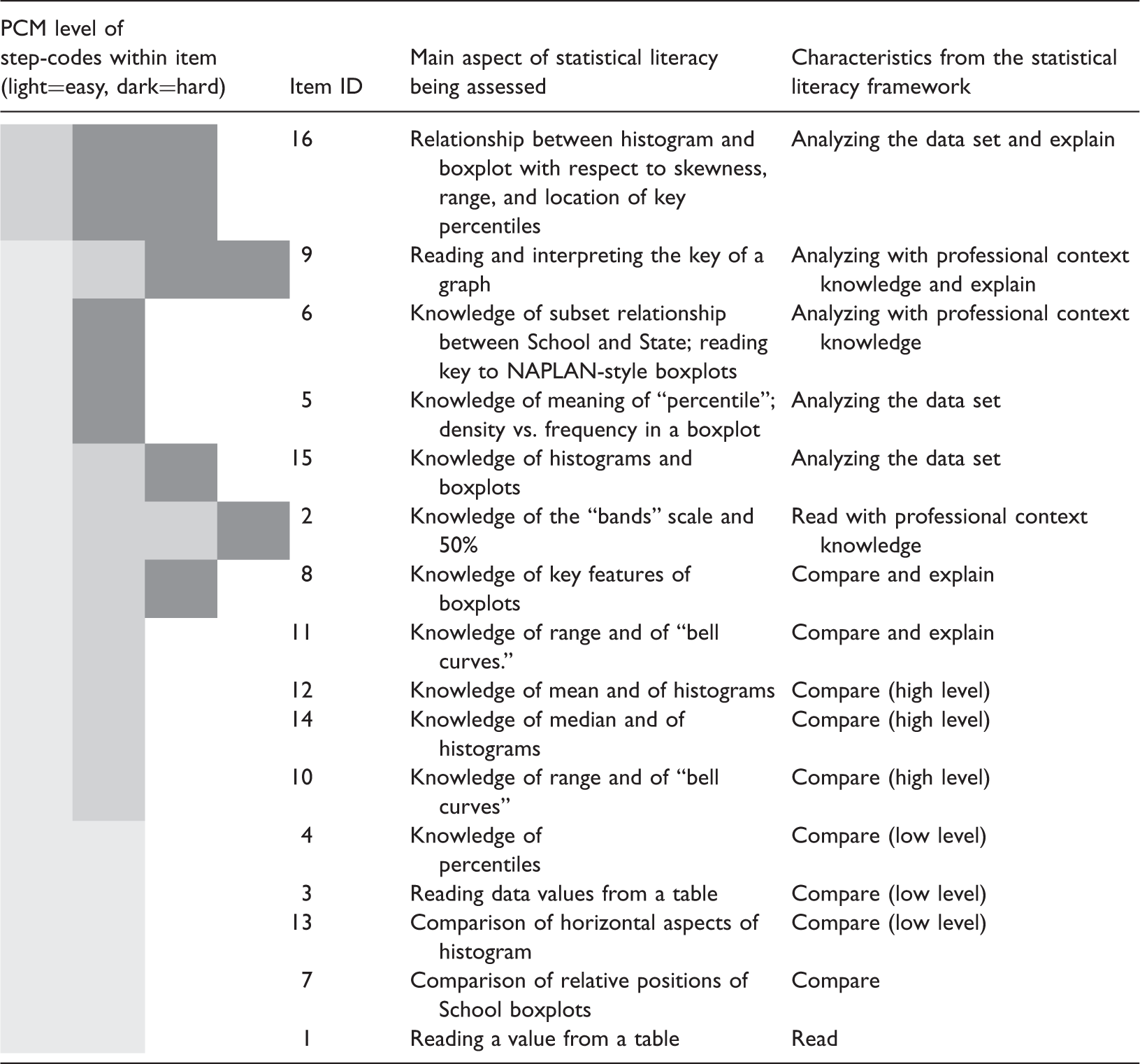
The item successfully answered by the largest number of teachers, as indicated by the PCM analysis (see Table 2), was an item that required teachers to locate a single datum from a table based on the locating information supplied in the item. This was possible to achieve even without needing the context for the data, because all required information was present and clearly labelled. The next most common successfully answered items involved some form of comparison between or among values. One of these, item 3, involved comparison of two readable and identifiable data points from within a large table of results, while item 13, another of the commonly correct items, required participants to compare the spreads of two boxplot graphs. Examining spread involves paying attention to the extreme values of the graph. This comparison necessarily involves more than two data points, which suggests this item should have been the harder of the two. That this was not the case may be due to the complexity of locating, in a large complex table, the two specific values needed for the comparison in item 3.
The remaining item that targets a statistical task that most teachers did well, item 7, involved the comparison of boxplots, and asked teachers to identify the school’s weakest area from the data presented in Figure 1. The work of Pfannkuch (2006) highlights that a full comparison of box plots involves consideration of the “five number summaries” of the relevant data sets (in other words, the critical components of the box-and-whiskers in a box plot). This suggests that item 7 had the potential prove to be a difficult item, because of the number of comparisons to be made, both between any two boxplots, and then across the collection of box plots. The school’s numeracy box plot (the rightmost box plot in Figure 1), however, is markedly different from and lower than the others at the macro scale, and so even a simplistic reading and comparison of the plots could yield the correct answer. It is hypothesized that if the differences had been less “gross” then this item would have been correctly answered by fewer teachers.
At the other extreme, most of the items that fewer teachers could answer correctly involved not only analysis of the data set as a whole entity but also attention to context as well. Item 5, however, focused on key technical knowledge about the box plot representation. It specifically addressed the “density vs frequency” misconception associated with box plots, in which the size of a displayed region is taken to be proportional to the number of data points in it (which is true for histograms but not for box plots). To answer item 5 correctly teachers had to understand that the two components of the box in a box plot—determined by the median and the 25th and 75th percentiles—actually contain the same number of data points. This involves understanding the way in which a box plot depicts the whole data set, and knowing the technical meanings of median and percentile, and how they are concerned with proportions of the data rather than absolute numbers of data points. This understanding needs to be deeply held in order to over-ride the visual impression of “more” conveyed by a larger component within a box plot.
Items 6 and 9 addressed particular peculiarities of the reports that are supplied to teachers by government agencies. In Australia, although NAPLAN testing is nationally-based, many of the reports that are supplied to schools are generated at the state level. This brings professional context into play, because these report-based characteristics are a consequence of how the agencies choose to depict the data, and may impact on teachers’ capacity to deal with the resulting representations. Although the key for the box plots in Figure 1 is present in the reports and clearly states that the whiskers end at the 10th and 90th percentiles, the results from item 6 indicate that teachers were misled by the visual image of the box plot. In particular, teachers had a tendency to assume that the box plot showed the full range of the data, rather than hiding the results of the top and bottom 10% of students. Similarly, the open-response item 9 (the coding scheme for which was described in Table 1) asked teachers to explain the differences between two kinds of box plot representation that they receive, neither of which show the full data set. The results indicated that teachers were not always aware of the “invisible” data. The difficulties presented by these two items highlight the power of a graphical image to give rise to misleading convictions, in this case associated with ignoring what is not explicitly seen.
The item on the ASLI that fewest teachers answered correctly and completely, item 16, was an open-response item asking teachers to explain why a particular box plot represented some data that had originally been presented in a frequency histogram. In this case, the context was irrelevant (although one was supplied), with the question targeting statistical understanding. In order to receive full credit, teachers had to identify and link key points on the box plot with the original histogram data. This required extensive analysis of the full data set in order to locate the appropriate percentiles and median.
Items 8, 15, and 2 raise some questions for ordering the items, as Figure 3(b) indicates that the steps within these items were answered with varying degrees of success. Item 8 asked the respondent to justify their answer to the previous item 7, which had required them to identify the school’s weakest area. Partial credit could be obtained by an answer that merely involved reading and comparing while full credit required deeper analysis. Similarly the lowest level of partial credit could be scored in item 15 by carefully reading the graphs, mid-level credit required reading and some comparison, while full credit required reading, comparing, and analysis of a number of key indicators. Item 2 appeared to involve the straightforward reading of data from a graph, with a well labelled axis. In this case, however, professional contextual knowledge was needed in order to realize that the graph datum could only take a whole number value, rather than the apparent continuum of values that were shown on the vertical axis. Most teachers who got this wrong were successful in reading an appropriate fractional value, but did not know that the corresponding variable was discrete. Here the impact of professional context knowledge on professional statistical literacy is particularly evident; the lowest level of partial credit could be scored by reading the graph and choosing a likely answer, but choosing the correct response and allocation of the highest coding required that professional understanding of the context.
The remaining items, lying between the two extremes of successful completion rates and thus adjudged to be of middle difficulty according to the PCM analysis, generally involved comparisons, or relatively straightforward analyses of the data set as a whole. Two of these are worth examining more closely. Item 12 required teachers to determine which of two distributions, displayed as histograms, had the larger mean. Here the item design process may inadvertently have had an impact on the results. In order to design two data sets that had unambiguously distinct means, it so happened that the resulting distributions presented to teachers were quite noticeably distinct. It is suspected that this made it possible to guess correctly which mean was greater based on a superficial examination of the graphs rather than the item being such that it forced a deep analysis of the range of possible values for the means. (In fact, this deep analysis is precisely what the authors needed to consider when designing the item; but the constraints on the data resulted in a too-obvious distinction that was not necessarily so demanding for the participants.) This may explain why this item was successfully answered by more teachers than we may have expected; it seems plausible that a similarly focused item could be “designed” that fewer teachers would have been able to answer correctly.
Associations with demographic factors
The result of the PCM analysis confirms that teachers’ statistical literacy ability can be measured reasonably using total statistical literacy skills scores based on the scoring of ASLI items. A complete analysis using logit score means instead of raw score means yielded equivalent results. The analysis using raw score means has been included here in preference because it is more readily related to the actual ASLI and associated scoring.
The maximum possible score was 40 and the totals, for the 653 teachers who completed all items, varied from 1 to 40 with a mean (rounded) of 23 and SD of 8. The distribution was negatively skewed as shown in Figure 4. We can see that while no teacher attained a perfect score and few teachers (4.4%) scored above 35, most teachers achieved a moderate score, being successful across a range of items, as discussed above. Only 18% scored less than 10, but a significant minority of teachers achieved low scores (below 20).
Distribution of total scores for statistical literacy skills items.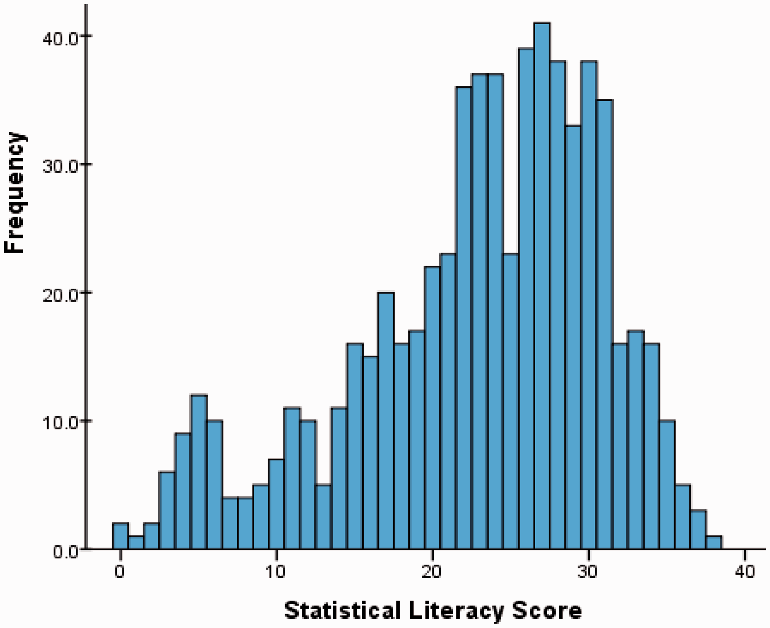
Results of comparison of raw statistical literacy score means.
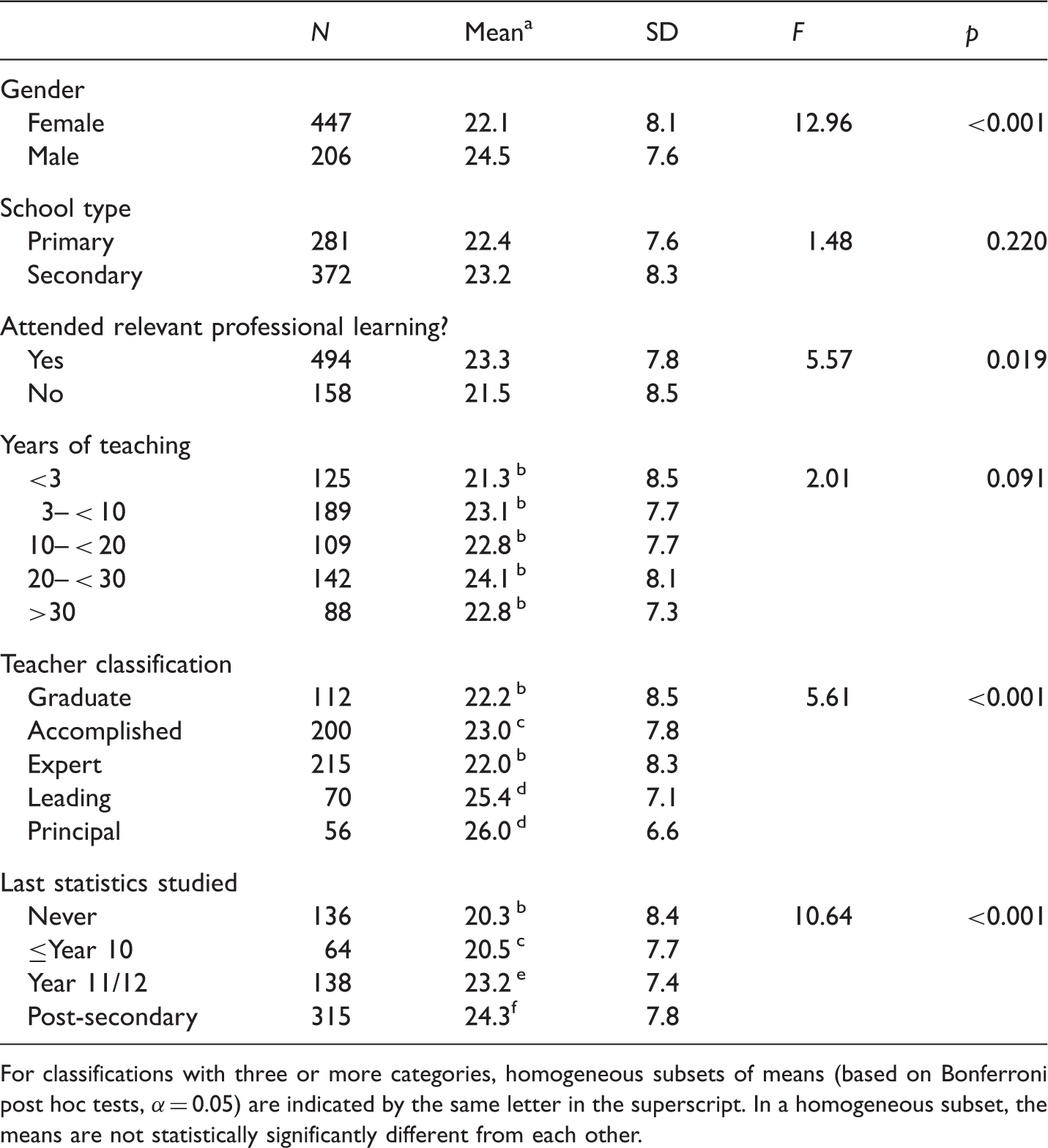
For classifications with three or more categories, homogeneous subsets of means (based on Bonferroni post hoc tests, α = 0.05) are indicated by the same letter in the superscript. In a homogeneous subset, the means are not statistically significantly different from each other.
Next, the teachers’ statistical literacy scores were correlated against the three factor scores that summarized teachers’ attitudes towards statistical reports on student achievement, teachers’ subjective norms regarding the use of this data (e.g., whether they felt that dealing with data was what was professionally expected), and teachers’ perceived behavioral controls (e.g., elements that they perceived as barriers to their ability to deal with these data). This investigation found that all three linear correlations (r = 0.24, r = 0.13, and r = −0.32) were statistically significant (p < 0.001, p = 0.001, and p < 0.001), meaning that higher statistical literacy scores were associated with teachers who had positive attitudes towards data, had a greater sense that attending to data was part of teachers’ work, and had lower perception of difficulties inhibiting data use.
Discussion and implications
A hierarchy for professional statistical literacy
The PCM analysis of the statistical literacy items on the ASLI suggests that there is, indeed, a hierarchy for professional statistical literacy. Moreover, the hierarchy of items reflects, to a reasonable degree, the different levels proposed in the professional statistical literacy framework in Figure 2. Teachers appeared to have little difficulty with straightforward data reading of single values in clearly presented representations such as graphs and tables; furthermore, they could undertake successfully simple comparisons of data values (again, where the representation was straightforward) or comparisons among whole data sets where the distinctions were grossly evident. In contrast, but reflecting the hierarchy, the items that caused greater difficulty were those that required deeper analysis of the whole data set, and/or attention to the technicalities of the data presentation in this particular professional context. It is also evident that, within each level of the hierarchy, explaining or communicating statistical ideas (Gal, 2002) added to the difficulty of the item. Because of the scope of the survey, which was intended to be used with teachers across a range of school contexts and hence had to use generic data rather than data from their own specific schools, the role of local context could not be explored.
The results suggest that we can safely assume that teachers can read straightforward aspects of data representations. Nevertheless, the results also indicate that teachers do not always have a good understanding of the technicalities of certain kinds of representations, and highlight, in particular, that at the highest level of the hierarchy a reasonable level of technical fluency is necessary in order to gain the required perspective on the whole data set. In this case, the extensive use of box plots for presenting data causes difficulties, particularly because the ones used in the reports have certain idiosyncrasies, such as the cut off percentiles for the whiskers. It should be acknowledged that a key was supplied, so that the nature of the representation type was explicitly provided, yet even the basic graph-reading principles of actually reading the key of a graph seemed sometimes to be neglected by data users. This may have been because teachers assumed that they already knew what was being depicted or because of the power of the image itself. The second point was alluded to earlier, and is illustrated in follow-up work with Stage 1 teachers (See Pierce, Chick, & Wander, in press). During this follow-up work, which involved a half-day professional learning program, participants showed they were not fully cognizant of the implications of the fact that the box plots do not show the top and bottom 10% of the data. They were noticeably surprised when they realized that their strongest and weakest students were, in effect, invisible in the data representation. Similarly, the prevalence of the density versus frequency misconception, observed by Bakker et al. (2005) for school students, also suggests that the value of box plots is being undermined by lack of familiarity or fluency with this graph type. It is easy to suggest that alternatives would necessarily be better, but it must be noted that any representation—be it an alternative graph type or a collection of summary statistics—that attempts to succinctly depict a whole data set for comparison purposes must compress information or process data in some way. This “condensing,” whether it results in a box plot or some other alternative, still demands an understanding of how it depicts the whole data set, and an awareness of what is displayed or hidden by the consequential representation. Regardless of the representation type, it seems that professional learning for teachers will need to focus on gaining fluency with holistic analysis and how whole data sets are depicted.
Impact of disposition
Correlations of statistical ability with disposition factors affecting teachers’ intentions to engage with the school statistical reports indicate that only a small amount of the variation in the ability scores may be explained by dispositional factors. However, the relationships were statistically significant, indicating a positive relationship between attitude and score, and a negative relationship between perceived barriers and scores. This is a case where further investigation would be required to actually identify which is the dependent variable, as it can be envisaged easily that those with demonstrated statistical ability will feel more positive about dealing with statistical reports and similarly expect fewer barriers. On the other hand those not disposed towards engagement with statistical reports are less likely to develop their statistical knowledge base.
Implications for professional learning
The data reported above clearly indicate a link between prior learning in statistics either through study at the senior secondary or tertiary levels, or through professional learning programs, and teachers’ statistical literacy needed for working with assessment data such as NAPLAN. The results also indicate that those planning professional learning programs need to be aware of the participants’ statistical backgrounds but also should be cognizant of both gender and the participants’ roles in their schools. The female teachers on average had lower statistical literacy scores than the male teachers as well as a less positive attitude and a stronger perception of barriers to being able to deal with the reports (see Pierce et al., 2013). Professional learning programs will need to promote relevance, and boost confidence as well as statistical knowledge. Those teachers who have school leadership positions did, on average, demonstrate stronger statistical literacy but they also have more reports to analyze.
The findings of this study point clearly to some areas of importance for teachers’ and principals’ professional learning in statistical literacy, if they are to be expected to make effective use of these reports. As a result of our findings a pilot professional learning program was developed (Pierce, Chick, & Wander, in press) that sought, among its objectives, to build teachers’ fluency with the kinds of representations typical of the reports they receive. The feedback from teachers from 14 trial schools was very positive and at every session during the first activity there were audible “Ah-ha” moments as the meaning of the graphic representations became apparent and teachers linked the abstract representation to images of students.
Briefly, the first activity introduced teachers to a hypothetical group of 30 students with individual NAPLAN test results. Students were depicted on separate narrow cards as images together with their individual assessment data. The teachers, working in groups, used the image cards to plot the distribution of Reading scores on a large number line, and then built a NAPLAN report-like boxplot. This simple, quick exercise (requiring about 5 min) used images of students, not just points, in order to make the abstract data concrete and to keep foremost in teachers’ minds that the purpose of looking at the data was to understand more about the student cohort.
In this paper, we have limited description of the professional learning program to this first activity because it was key in addressing the common misconceptions highlighted by the ASLI results. It suggests that principals’ and teachers’ professional statistical literacy deficit, if carefully identified, can be addressed with targeted teaching that links the concepts to the professional context. It is expected that similar activities would be appropriate for other representations if, as anticipated, it is the third level of the professional statistical literacy hierarchy—with its more technical demands and need for comprehending how whole data sets are depicted—that is the area of difficulty for teachers.
Conclusions
The hierarchical professional statistical literacy framework provides a reminder of key issues to be addressed in the teaching of statistics, to ensure that high-level statistical literacy skills, applicable beyond school, are developed. In particular, the results and framework highlight the impact of and need for paying attention to statistical context (e.g., key and scales), and appropriate technical statistical knowledge (e.g., knowledge of particular representations), along with professional and local contexts in all work with data. The hierarchy highlights the importance of building understanding of how to interpret data about entire groups. Given the varied nature of representations used by different agencies, and the varied past statistical experiences of teachers, it seems that quite targeted professional learning may be necessary to build the fluency necessary to make meaningful interpretations of such data and then, as a consequence, make appropriate educational decisions. The role of context, too, is highlighted, and although the entire scope of local and professional context has not been systematically studied in the present research, there has been anecdotal evidence with Stage 1 teachers of how critical context is when trying to build evidence-based teaching practice. De-contextualized skills may result in incomplete interpretations of data, limiting the statistical literacy of the user and failing to lead to good educational outcomes.
Footnotes
Acknowledgements
We thank the schools and teachers for their involvement in this project. We also acknowledge the contributions of other members of the research team: Sue Buckley (Victorian Department of Education and Early Childhood Development (DEECD)); Ian Gordon, Sue Helme, Roger Wander (University of Melbourne). An early version of this paper was presented at the 35th Annual conference of the Mathematics Education Research Group of Australasia, held in Singapore, July 2012 and included in the proceedings (see Pierce, Chick, Watson, Dalton, & Les, 2012).
Declaration of conflicting interests
None declared.
Funding
This research was funded by the Australian Research Council (LP100100388), the Victorian Curriculum and Assessment Authority, and the DEECD.