
Abstract
Google Trends has for over a decade been used by researchers in medicine and the social sciences who want to use information about internet searches to gain new data and insights concerning medical and social issues. A similar tool by the same company, Google Flu Trends, was abolished by Google in 2015 due to serious problems with accuracy; raising larger questions about the quality of the data provided, not only by Google, but by all platforms collecting big data. In this article, I use an unplanned experiment to test the reliability and replicability of Google Trends. The results strongly indicate that scientists in all fields should refrain from using the tool Google Trends when conducting research.
Introduction
Google Trends, first launched in 2006, is a tool provided by Google that measures the relative popularity of particular search terms on Google, given that the term in question has reached a minimum threshold of searches during a certain time period (Jun et al., 2018; Trevisan et al., 2018). Since 2009, when Ginsberg et al. published a very influential article in Nature (Jun et al., 2018), advocating for the use of Google searches for detecting influenza epidemics (Ginsberg et al., 2009), Google Trends has gained ground as an important analytic tool for researchers in medicine and social science who want to use the data emanated from Google searches to investigate medical or social aspects of modern-day society. A very positive view of the tool is presented in a systematic review of the use of Google Trends in medical research written by Mavragani et al. (2018). In this study, the authors conclude that “Google Trends provides the field of big data with new opportunities, as it has been shown to be valid and has proven valuable, accurate, and beneficial for forecasting” (Mavragani et al., 2018: 2). There is no systematic review regarding the use of Google Trends in the social sciences but researchers within this tradition have, for example, used Google Trends to predict mobilization of members of the Tea Party movement on a state level in the United States (Digrazia, 2017), to investigate the possible connection between Google searches for high status products and income inequality (Walasek and Brown, 2016), to examine if Barack Obama lost votes in the American presidential elections in 2008 and 2012 due to racial animus (Stephens-Davidowitz, 2014), the level of interest of Puerto Ricans in moving to the American mainland (Vicéns-Feliberty and Ricketts, 2016), to predict short-term events in the economy (Choi and Varian, 2012), to produce a new method to measure religious beliefs at the national level (Yu-Cheong Yeung, 2019), and to investigate how media events such as political debates and gaffes made by politicians influence British and American voters’ Google search queries during election campaigns (Trevisan et al., 2018).
The literature in the social sciences is generally very positive toward the analytical tool, claiming that Google Trends is a cheap, reliable, and fast way to collect highly interesting data. Social scientists especially praise Google Trends alleged ability to efficiently collect views and information from individuals that they might be hesitant to share with researchers such as racist attitudes, religious beliefs, or certain health conditions (Digrazia, 2017; Stephens-Davidowitz, 2014; Yu-Cheong Yeung, 2019).
Google Trends—an unplanned experiment
During the final revision before sending my doctoral dissertation to the printing house, I decided to redo a Google Trend graph in Excel to make it esthetically more pleasing to the reader. Very surprisingly, I found that, even though I used the same search term, place, and time period, the Google Trend graph now looked quite different. This is the original graph from 4 August 2020 for the search term “Jakob Scharf” (Jakob Scharf was 2007–2013 chief of the Danish security service Politiets Efterretningstjeneste (PET) (Figure 1). 1
Eleven months later during my final revision on 19 July 2021 the same search term (“Jakob Scharf”), in the same country (“Denmark”) for the same exact time period (1 January 2004–4 August 2020), produced a rather different chart on Google Trends. I took a screenshot so the reader can see the exact time. This is the new chart (Figure 2):
There are several differences between the two charts. First, the peak in interest in the search term “Jakob Scharf” is no longer somewhere between 1 January 2004 and 1 December 2008 but near the date of 1 November 2013. The three clear spikes of interest in the first chart have turned into two spikes in the second chart (the first spike of interest has decreased by 50%). The oddest thing is that the graph is only based on historical data. How is it possible for the peak of Google searches for the term “Jakob Scharf” in the period 1 January 2004–4 August 2020 to have taken place several years later in the second chart in comparison to the first one when speaking of historical data in a fixed period? This does not make any sense at all. A new search on 18 January 2022 using the same search term, time period and place, again produced a completely new chart with a very different look and a new peak of interest for the search term “Jakob Scharf”. Using Google Trends to analyze historical data in the form of the search term “Jakob Scharf” in Denmark between 1 January 2004 and 4 August 2020 resulted in three completely different graphs depending upon the date of inquiry. Clearly, there seems to be a very serious problem concerning reliability and replicability when using Google Trends. My experiences made me start reading articles in sociology and political science that used Google Trends graphs. In every case, I put in the stated search term, place, and time period to see if I would get an identical graph. Usually, I did not.
This should perhaps come as no surprise. In a systematic review of the use of Google Trends in health care research, Nuti et al. make several interesting observations, including that 93% of the investigated articles report positive findings using the tool from Google, suggesting, according to the authors, “the possibility of publication bias” (2014: 4). They also note that only 7% of the studied texts provided enough information to be replicable and that it is highly problematic, from a scientific point of view, that information about the algorithms governing Google Trends, is secret. Nuti et al. main conclusion is that further research must be conducted to evaluate the level of reliability of Google Trends (2014). When a group of scientists in Germany investigated the Google Trends indices (this is an index going from 0 to 100 that Google Trends creates for each search term, measuring its relative popularity at a particular time and place) for the terms “dachdecker”, “kurzarbeit”, and “sofa” in Germany, the researchers also noted, as I did (although I looked at the Google Trends graphs and not at the indices), that depending on the time of the search, results could vary greatly. Concerning the words “kurzarbeit” and “dachdecker”, the scientists observed that the relative standard deviation was more than 100% between 15 April and 17 April 2020 for these search terms in Germany (Behnen et al., 2020: 380).
It is very likely that the same criticism that was directed toward Google Flu Trends in 2013 and 2014 is also valid for Google Trends today. In February 2013, it was noted that Google Flu Trends was considerably worse than traditional surveillance data from medical laboratories at making correct predictions about the prevalence of patients looking for medical appointments with doctors regarding influenza-like sickness in the United States (Butler, 2013; Lazer et al., 2014: 1203). There had been warning signs before, Google Flu Trends failed already in 2009 to recognize the A-H1N1, that is, swine flu (Butler, 2013; Lazer et al., 2014: 1203). In a well-quoted paper in Science by Lazer et al. concerning the problems of Google Flu Trends, the authors make the argument that the problems with the tool in question goes beyond Google Flu Trends and are indeed potentially applicable to all forms of platforms relying on big data. They make the very accurate observation that the commercial companies running the platforms collecting big data keep changing their algorithms to raise profits (2014). They ask the question: “Platforms such as Twitter and Facebook are always being re-engineered, and whether studies conducted even a year ago on data collected from these platforms can be replicated in later or earlier periods is an open question” (2014: 1204). After having conducted my unplanned experiment, I argue that the answer to the question posed by Lazer et al. must be a resounding “no”, at least when talking about the analytical tool Google Trends. We now know that Nuti et al. were right in asking for more research into the level of reliability of the tool (2014).
The problems concerning Google Flu Trends could not be solved and the mother company Google put an end to the project in the summer of 2015 (O’Connor, 2015). As for the relative popularity of the Danish ex-spy chief Jakob Scharf on Google in Denmark from 2004 to 2020, I redo the Google Trends graph one final time on 10 March 2022. As expected, it differs substantially from the previous three graphs depicting the exact same internet search on Google. It appears at least sometimes, big data involve big problems.
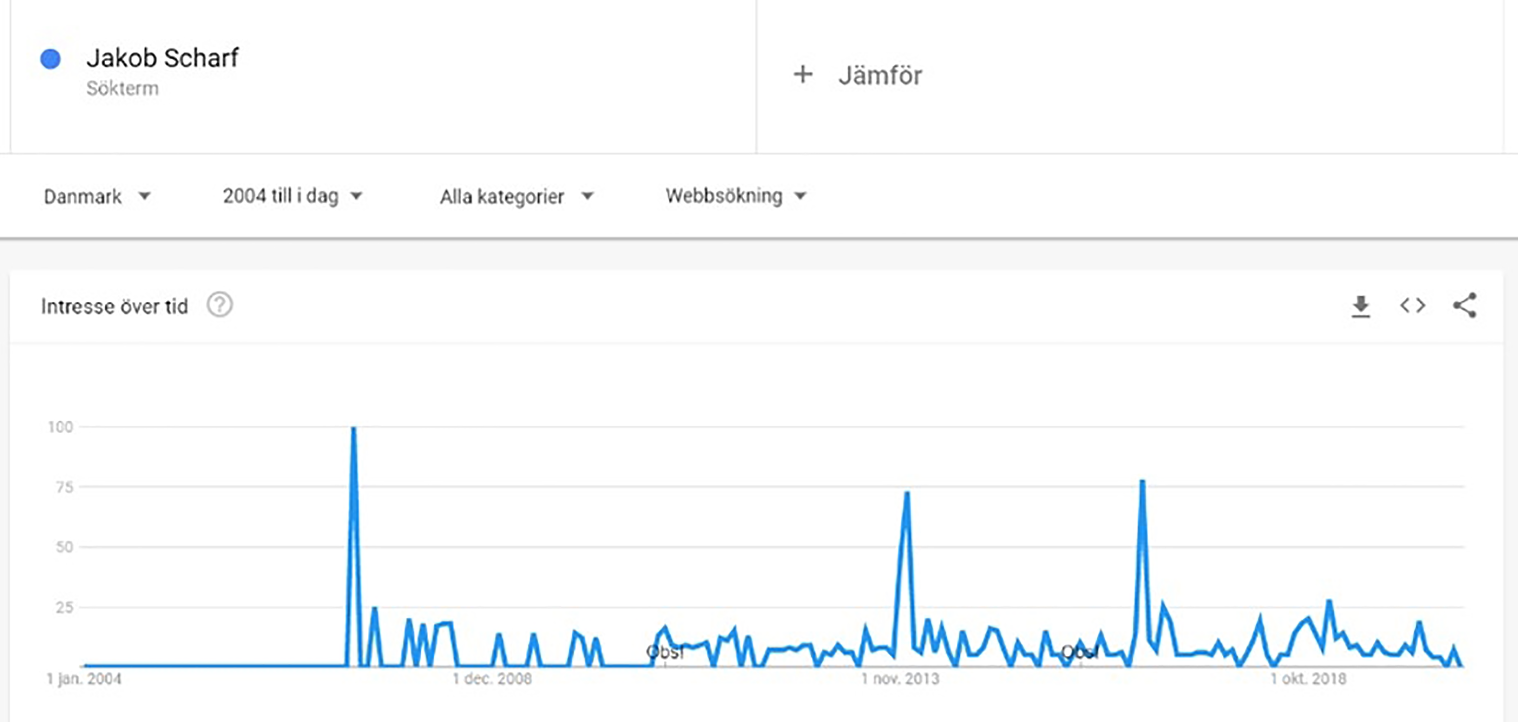
The interest on Google for the search term “Jakob Scharf” in Denmark from 1 January 2004 to 4 August 2020. Graph over the relative popularity of Google searches for the term “Jakob Scharf” in Denmark from 1 January 2004 to 4 August 2020.
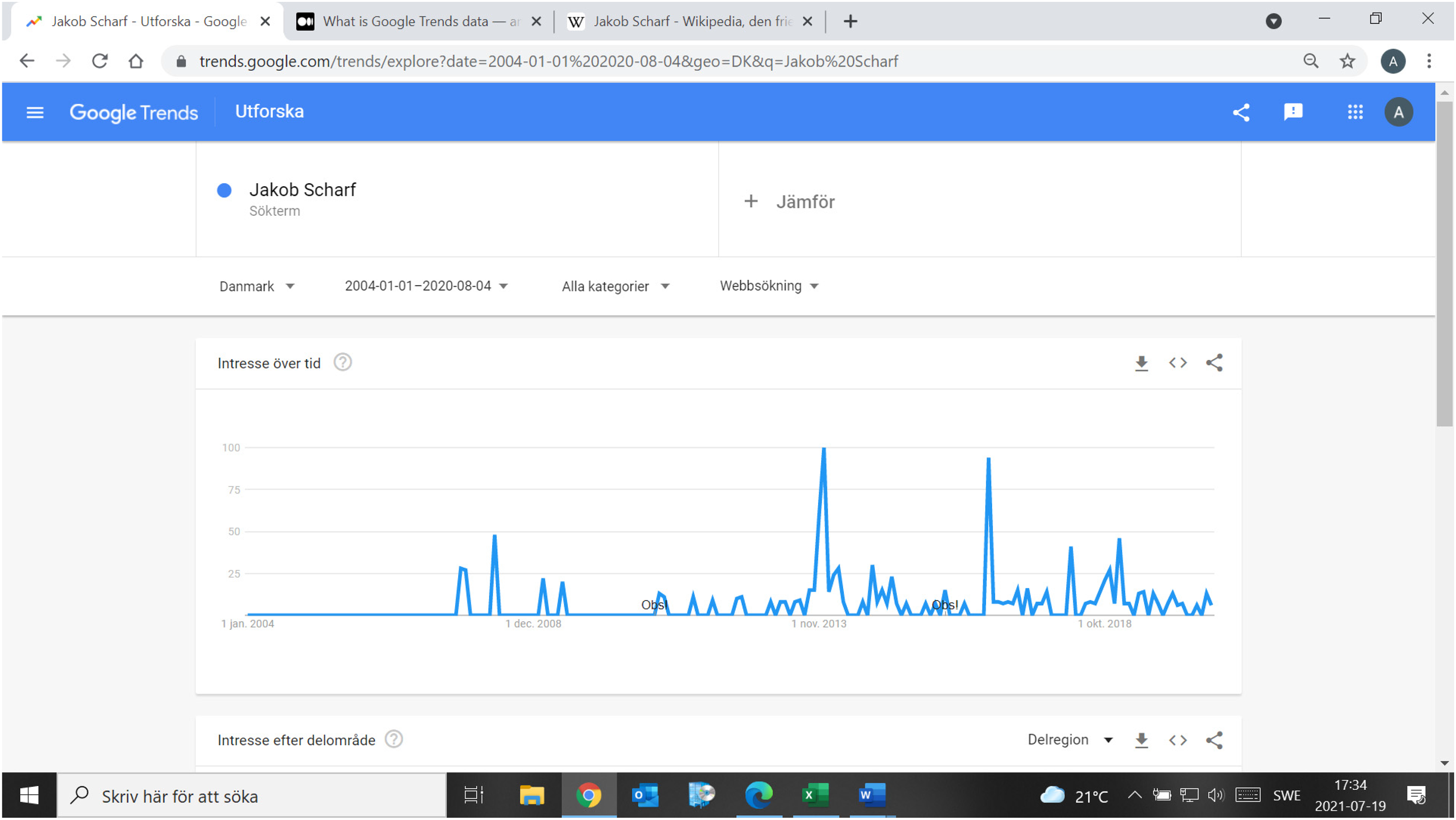
The interest on Google for the search term “Jakob Scharf” in Denmark from 1 January 2004 to 4 August 2020. Graph over the relative popularity of Google searches for the term “Jakob Scharf” in Denmark from 1 January 2004 to 4 August 2020.
Footnotes
Acknowledgments
The author is grateful to Mimmi Barmark, Christofer Edling, Björn Hansson, Tobias Olofsson, Per Simonsson, and the anonymous reviewers for helpful comments and conversations.
Funding
The author(s) received no financial support for the research, authorship, and/or publication of this article.