
Abstract
Multimodal visualization of network data is a method considering various types of nodes and visualizing them based on their types, or modes. Compared to traditional network visualization of nodes of the same mode, the new method treats different modes of entities in corresponding ways and presents the relations between them more clearly. In this paper, we apply the new method to visualize movie network data, a typical multimodal graph data that contains nodes of different types and connections between them. We use an improved force-directed layout algorithm to present the movie persons as the foreground and a density map to present films as the background. By combining the foreground and background, the movie network data are presented in one picture properly. User interactions are provided including detailed pie charts visible/invisible, zooming, and panning. We apply our visualization method to the Chinese movie data from Douban website. In order to testify the effectiveness of our method, we design and perform the user study of which the statistics are analyzed.
1. Introduction
In recent years, the film industry has experienced rapid development. According to the data released by the Motion Picture Association of America, there are about 210 million people engaging in film-related industries directly or indirectly, generating 143 billion dollars of labor income in 2010 in the United States. By the year of 2014, the global box office revenue reached 37.5 billion dollars. In China, the number of film screens has soared from 3000 in 2007 to 15400 in 2013.
With such a huge film market, a growing number of producers and directors began to use movie network data to aid the decision of themes and actors of movies to produce successful films with high box office. For example, in 2012, by means of big data analysis Netflix introduced the popular US drama “House of Cards.” Leveraging the advantage of having a large number of users' online viewing habits data, Netflix got three conclusions. The first was that the users were very fond of the 1990 BBC miniseries “House of Cards.” The second was that people who were keen on this episode also enjoy Kevin Spacey's work. The last one is that the users who met the above two conditions were the fans of the director David Fincher.
These three conclusions are presented in Figure 1 and eventually Netflix decided to remake the “House of Cards” which achieved a great success. So it is important to leverage the analysis and forecast based on movie network data for the success of the film industry. We collect the movie network data from the Douban website (http://movie.douban.com/) [1] which is a social website for users to view, rate, and comment on different movies. It also provides movie information like IMDB [2]. Besides, users make friends or groups according to their interests. The movie network data fetched from Douban are also very similar to the sensor network data since they are both distributed and collected through the network. As we all know, it is important to discover the latent knowledge hidden in the distributed sensor networks. The patterns and rules behind the movie network data are also crucial for us to understand the data and make proper decisions. We show in this paper how to design appropriate visualization techniques to present movie network data for us to better understand the relations and patterns hidden in the abstract movie data for effective visual analysis.

Three important observations about “House of Cards” [12].
Movie network data form a complex network where the nodes are of different types or modes. The nodes can represent films, filmmakers, or actors. There are edges connecting nodes of films and directors if the filmmakers made that film. Also there are edges connecting actors and movies if the actors appeared in that film. The directors and actors are connected if they cooperated in the same film. So there are three different types of edges connecting nodes of different modes (intermode edges) as shown in Figure 2. Besides the intermode nodes, there are within-mode edges connecting the nodes of the same mode, such as the edges connecting the actors who have cooperated in the same film. From the above analysis, we can see that the movie network data have intermodal and within-modal connections, which comprise the complex network structures. According to the decision process of making “House of Cards,” we find that the three modes of movie data (i.e., movies, directors, and actors) have all played important roles in movie data analysis. Considering only one mode or simply transforming multimodes network to unimode network will lead to incomplete connection and missing of information [3]. Therefore, for the visual analysis of movie network data, we need to design specific multimodal visualization strategy to reveal the complex connections among different nodes and infer useful knowledge.

Multimodal relations among movie data.
There has been some work on visualization of movie data which mainly focus on certain types of movie data, such as the actors/directors network with the characteristics of “small-world networks” [4–8] or the movie scores and other statistical movie data. These works only visualize one mode of actors [9] or movies [10] and analyse partnerships between actors or similarity between movies by movie awards or other movie box office indicators. There is no visualization work considering the three modes of movie, actors, and directors simultaneously, that is, presenting the network data of movie-director-actor at the same time.
Multimodal visualization was first proposed by Cai and Sakas in medical data visualization [11]. In other types of visual analysis works, there were also problems about presenting different types of relations. In Ghani et al.'s work, he brings multimodal concept to visual analysis of social networks [3]. In this paper we map films, directors, and actors to three different modes based on multimodal visualization concept and focus on visualizing the data relationship among and within the three modes.
In order to present the three different modes of movie data in one view, we propose a two-layer visualization method combining the foreground and background. The foreground shows the relations among movie persons including directors and actors with an improved node-link layout algorithm. The background visualizes the distributions of movies via the density map. The foreground and background are aligned according to the positions of the directors.
In the foreground, the nodes of directors and actors are treated differently to emphasize and highlight the different cooperative relations. Specifically we design three different force parameters to match three types of relations among nodes of different modes. By assigning customized forces to any pair of nodes according to the node modes and attributes, we get the graph layouts which clearly show the interesting movie groups. The density map of the background can maintain scalability even for huge numbers of movies. We encode the indicators of movie popularity to the colors and shapes of density map. By combining the background and foreground visualizations in the same view, we find that the background provides a rich context for us to understand the cooperation between movie persons more precisely. For example, we can find out what types of movies a specific director and actors do well and how directors and actors interrelate for a certain kind of movie. We also introduce zooming, panning, dragging, glyph showing, and hiding to provide an interactive interface for users to view and analyze the multimodal movie data.
The data we study was fetched from the movie channel of Douban website. We fetched 10217 films including their directors, actors, ratings, number of ratings, and summary.
In summary, the contributions of this paper are as follows:
A double-layer multimodal visualization system which presents all three modes of movie network data in one view. An improved force-directed graph layout algorithm which assigns the forces between pair of nodes according to the modes and attributes of nodes to get the layout results associated with the characteristics of multimodal movie data. Applying our movie visualization system to Douban internet movie data and performing the user study to test the effectiveness of our system.
In this paper, the content of the following paragraphs is organized as follows. In Section 2, we describe the related work, which includes data visualization on movies and multimodal visualization works. In Section 3, we depict the overview of our multimodal visualization system. The improved force layout algorithm to show the cooperation among directors and actors is introduced in Section 4. In Section 5 we present the design of density map to visualize the distributions of films and the double-layered visualization that shows all three different modes of movie data integrally. In Section 6, the experimental results of visualizing Douban movie data, as well as the user study to verify the effectiveness of our system, are described. Finally, we summarize our work and introduce the future work in Section 7.
2. Related Work
In this section, we describe the related work in the following research fields including visualization of movie data and multimodal visualization of network/graph data.
2.1. Visualization of Movie Data
For the visualization and visual analysis of movie data, the traditional way is to use statistical charts to analyse the data. Herr et al. [9, 13] showed the changes of the film production over time by a scatter plot graph. Eckenroth et al. established MOVIEmeter and STARmeter metrics, showing the rating changes of movies and actors over time [14]. Such system can display movie statistics and the relationships between films and their corresponding rating values intuitively. However, the movie relational data could not be presented with such methods.
Node-link graph is widely used to visualize the relational graph data [15–17]. Movie data contain a lot of relational data, such as the cooperation between directors and actors and in which films the actors/directors participate. There has been some work to use the node-link graph to visualize movie data [18]. For example, Svonava and Vlachos proposed a scale not only applicable to the distance scale but also applicable to nondistance method, by which the relationships between the films were visualized [10]. The method of [18] proposed by Ahmed et al. mainly focused on cooperation between the actors in the 4-ring structure, and the nodes are connected by parallel coordinates chart considering both the details and the overview. Shannon et al. [19] used multiview to depict multiattribute data. One view uses parallel coordinates and the other uses the node-link diagram. The multiattribute network graph is visualized by combining these two views. Herr et al. combined the scatter plot diagram and node-link to represent partnerships [9]. Auber et al. [6] mainly used force-directed algorithm to demonstrate the “Small World” [3–6] phenomenon in actor network. The “Small World” phenomenon within actor network is visualized through node-link graph with layer information.
The above work uses node-link diagram to visualize only one type of movie relational data, such as the relationship of movies and the relationship between actors. They can only present the relation among the same type of data and cannot display the links among various types of data.
2.2. Multimodal Visualization of Network Data
There are three types of methods for network data visualization: node-link based, matrix based, and the combination of both, summarized by Von Landesberger et al. in [15]. The node-link diagrams were proved in line with people's intuition, simple and more appropriate to the path-related tasks [20]. This kind of methods is better for small sparse graphs. The matrix-based visualization is free from edge crossing problem and nodes coverage problem and therefore is suitable for dense graph [15, 21]. However, it is difficult to display all data in a single view for matrix-based visualization when the size of data is too large [22]. Besides, it is not so intuitive to detect the connections among nodes via matrix-based methods [23]. The hybrid methods that combine node-link and matrix visualization inherit the advantages of both methods [24]. However, it is difficult for the users to effectively understand the data with more than one view while they need to switch their focus on different views [25]. In this paper, we propose the one-view visualization for multimodal network movie data.
With the development of sensor networks, there have been more and more data of different modes appearing. Although for traditional network visualization there has been no work on explicitly displaying different modes of data in one view, our review of network visualization shows the following methods related to multimodal visualization of network data.
Some methods of compound network visualization consider multimodal graph data as a single mode. These methods differentiate the modes and links by different colors and shapes. There are some visualization systems applying these methods. However, these methods are mixing all modes into one view which leads to visual confusion. Meanwhile, if it is only displaying some important links or nodes to reduce visual complexity, it will result in data deficiency. Liu et al. [26] proposed the method that projected data modes to a specific mode to reduce the number of modes. This approach preserves the structure of data with the price of losing information.
The methods of multiview used multiple views to present multimodal relations. Each view shows different modal data, respectively. Among modes, their connection is presented by the links or brushes between them. When a node is selected in one view, another view's counterpart will be highlighted. VisLink [25], Semantic Substrates [27, 28], Jigsaw [29], and SmallWorlds [30] are examples of this kind. These four works provide nodes of different modes with different views. The system VisLink brings in information deficiency as visual element overlapping. Semantic Substrates, Jigsaw, and SmallWorlds did better in control of information mixture, but that is mainly because they do not show the relationship within the modal, which will also result in information loss.
With the rise of social network and visualization techniques in recent years, recently researchers introduce the concept of multimodal data to social network visualization. Ghani et al. [3] point out that real-world social network contains more than one type of nodes and different types of nodes can be viewed as different modes. They proposed a parallel coordinates visualization tool with node-link binding (PNLBs) to show the relationship between and within modes. Their approach is proposed as a primary visualization method for a design study to be applied in multimodal social network analysis. Their method is only applied to NSF dataset and has not been extended to handle more real-world data.
3. The Overview of the Multimodal Visualization System of Movie Network Data
In this section, we first introduce the visualization data and problems we want to solve. Then the overview of our multimodal visualization system of movie network data is presented.
3.1. The Visualization Problem
The problems we want to solve from the visualization of these movie data are as follows:
The interesting cooperative patterns of the director-actor network data: For example, can we find out which directors occupy the central position of the network and which are on the edges of the network? Which actors are more exclusive in cooperation; that is, they tend to cooperate with a certain director, and on the contrary which actors are more likely to cooperate with various kinds of directors? The relations between directors and movies of the director-movie relational data: Are there any connections between directors and the movie types, ratings, and number of ratings which are regarded as the indicator of movie popularity? Are there any connections between the popularity of specific director's work and their movies' type? The relations between movie types and the pattern of director-actors cooperation network: For example, is there any difference between drama and romantic films' directors and actors cooperation network?
3.2. Our Approach
We propose the double-layer visualization system to present the multimodal movie data corresponding to the problems aforementioned as shown in Figure 3. For relations between directors and actors, we propose the improved force-directed graph layout method to position the nodes based on their modes and attributes. For director-movie relationship, we present the movie data using the density map which is shown as the background of the node-link layout of directors and actors. Thus, by combining the foreground and background, the multimodal movie data including films, directors, and actors are shown integrally.

Module diagram of visualization system.
The traditional force-directed models usually are applied to the nodes of the same type. The nodes' types or edges' attributes have not been considered in the layout process. Our improved force-directed algorithm designs different force functions for different relations between nodes of different modes, that is, directors and actors. The force parameters determining the layout of directors and actors are designed to relate to their own influences in the film field. The specific design details are to be described in Section 4.
There are no obvious topological relations between films as that in director-actor network. Besides, the number of films is so large that it would be better for us to adopt the scalable visualization method. So we propose to use the density map to visualize all films, which is used as the background of the previous force-directed layout. By relating the movies to the directors, the background provides rich context for users to understand the foreground visualization. For example, the background shows us the productivity and movie types of directors while we explore the cooperations between directors and actors. The visualization of films by the density map and the combination of the foreground and background is to be described in detail in Section 5.
4. Improved Force-Directed Layout Algorithm for Network of Directors and Actors
The traditional force-directed graph layout algorithm treats the nodes and edges in the graph as steel rings and springs in the physical model [20, 31, 32]. There is repulsive force between two nodes when the edge connecting them is stretched and attractive force when the edge is contracted. Besides, there are universal repulsive forces between any two nodes. Through iterations the graph layout is obtained when the system achieves the stable state of minimum potential energy.
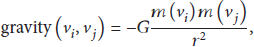
The force models of the spring model are

In the following part of this section, we first introduce how the changes of forces parameters affect the layouts of the graph to deduce the rules to set the force parameters to get the desired graph layouts. Next, the detailed designs of force parameters for three kinds of relations in our method are described.
4.1. The Three Force Parameters
From (1) and (2) we can see that each force parameter serves a specific purpose:
Gravity (G): it controls how much nodes attract/repel each other. Spring constant (K): it controls how stiff, that is, how strict or important, edge length is in the layout. Spring length (L): it controls the desired edge length.
Figure 4 shows how the values of the above three parameters influence the graph layout. From Figure 4 we find that when the gravity of G increases, the repulsive forces between nodes increase and thus the nodes are repelled from each other to a larger distance, which is the same for the parameter of spring length L. However, as the parameter of spring constant K increases, the nodes get closer to form a contracted graph. We can manipulate the above parameters to adjust the forces between the nodes in the network of directors and actors. In general, we get the guiding principles for us to set the values of the force parameters as follows. If we want to make two nodes close, we can lower the gravity parameter G, increase the spring coefficient, decrease the spring length,
and vice versa for distant nodes. The first rule of changing of gravity parameter G is applicable to any two nodes in the graph, while the next two rules related to spring forces can only be applied to the nodes connecting by edges.
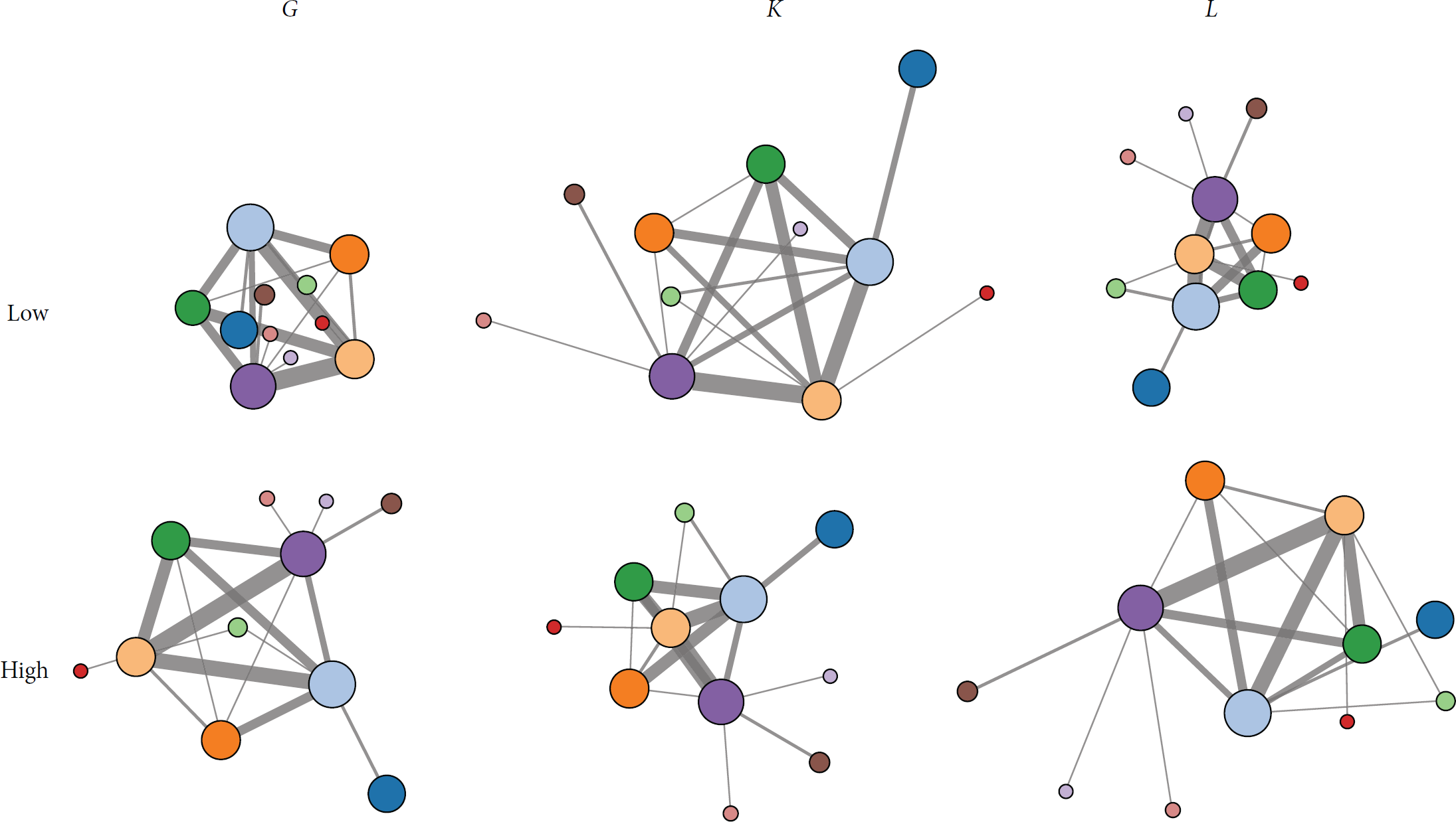
The graph layouts for varied force parameters G, K, L.
4.2. The Design of Force Parameters of Network of Directors and Actors
In our graph layout, we need to distinguish the treatments of the nodes of directors and actors since they play different roles in the movie industry. Usually, the directors are more important in the movie industry than actors and thus we want to emphasize the directors in the graph layout. In order to highlight the director-centric layout, we need to make the repulsive forces for nodes of directors to directors much larger than the other two types of relations to make the directors occupy most area of the layout. For directors that have cooperated with each other the repulsive force is smaller than that of noncooperative directors. So the more the directors cooperated, the closer they are to each other, and less cooperated director nodes are pushed away from each other. In section The Director-to-Director Relationship we show how to design the customized forces for the director-to-director relationship in detail.
As for actors and directors, there is an edge between the actor and the director if they have cooperated in one movie. The actors may have cooperated with multiple directors and they also may have worked with one director for multiple times. To strengthen the cooperation closeness between the actors and directors (i.e., the actors are placed closer to the director if they have cooperated more often) we need to improve the attractive forces for the actors and directors who have cooperated many times. By linking the attractive force strength to the cooperation times between directors and actors, the cooperation pattern of actors and directors can be illustrated. The Director-to-Actor Relationship section shows the details of how to compute the forces between directors and actors.
Apart from the above two kinds of relations, we also need to consider the actor-to-actor relationship. The two actors who have cooperated with each other more times than other actors should be placed closer. Besides, in order to highlight the director-centric layout, the attractive forces between directors and actors should in general be larger than that between actors and actors in case the actors are dragged away by other actors.
In the following, we describe in detail how to set the three force parameters to get the desired forces leading to the mode-influenced layout of movie data.
(i) The Director-to-Director Relationship. The relationship between directors and directors is computed based on their codirected movies. We use

In order to let the actors be laid around the director without being crowded, we need disperse directors which have no edge connected. So we set
Within the directors that have cooperation, we need to lay out them based on their cooperation relations and the numbers of the movies that are directed by them. Therefore, we take (4) as the original length between director nodes and length is proportional to canvas edge length and inversely proportional to the number of nodes. Len is the original length of spring:

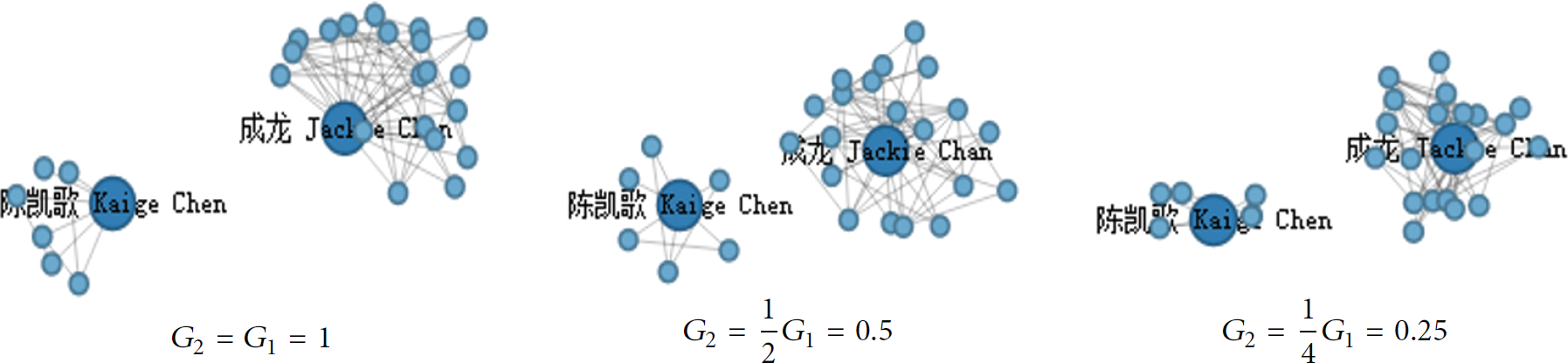
Then the constant K will have a large impact on the layout. In Figure 5 we show different layouts of 100 directors in

The layouts of director nodes for different values of
(ii) The Director-to-Actor Relationship. As for the layout of the director and actor nodes, we need the large repulsive forces pushing nodes apart to avoid visual clutters. We use
The relations of cooperation between the directors and the actors need to be closer than the relationship within directors and be able to demonstrate cooperation closeness between the actors and the director. So we make the weight
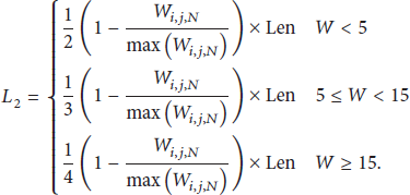
In (5), we adopt the piecewise function to place high cooperation numbers actor nodes close to the director ones and thus we enhance the visual saliency. When calculating the layout, we hope that the force between directors and actors is less than the force among directors. So we adjust the
When parameters K and L are fixed, G affects the space distant between the nodes that are not linked. Figure 6 show how the layout changes for different
The layouts of director and actor nodes for different values of
(iii) The Actor-to-Actor Relationship. The actor nodes that cooperate frequently with each other are to be placed closer to indicate their close relationship. The actor i is represented as

In order to highlight the importance of directors, the attractive forces between directors and actors need to be in general larger than that between actors and actors, so we set

The parameter of

The graphic expression of the function.
Furthermore, when dealing with the relationship between actors, the actor-actor cooperation matrix is relatively sparse. But actors who belong to different clusters still have links. This leads to a cluttered graph layout as shown in Figure 8. Therefore, we use “main connection” [24] to simplify the layout. First, starting from one actor, we only preserve the edge connecting to the director with whom he cooperates most to be visible, and the edges connecting to other directors are made invisible. Second, edges between actors who belong to different directors after the first reduction are also made invisible. Such processing deals with both actor-director and actor-actor relationships, which greatly reduces visual clutter as shown in Figure 9.
The cluttered layout of actors with all edges shown.

Only the main connections are shown in the layout.
According to the analysis of the experiments, we summarize the force parameter functions we designed for network of directors and actors in Table 1.
Force parameter functions.

5. The Double-Layered Visualization Combining the Foreground and Background Views
In this section we first introduce how to use the scalable density map to visualize the distribution of films. After that the double-layered visualization and the user interaction are described.
5.1. The Visualization of Films Distribution Based on the Density Map
The density map is often used to show the distributions of objects. Recently, the density map has been used in many visualization systems [33, 34]. One advantage of this method is that it is highly scalable and capable of handling very large amount of data. In this paper we need to deal with more than ten thousand movies. So we decide to apply the scalable density map to visualize the set of movies instead of the node-link view which would produce visual clutter for large amounts of nodes. Besides, the linking relations between films are not as obvious as the relations between directors and actors, which make it not suitable for the node-link view. The density map is adopted to show the clusters of movies which provide the background context for better understanding of the cooperation among movie persons. In this section we introduce how to apply the density map to visualize the overall distribution of the films as the background.
First the film is evenly and randomly placed as a point on the circle of which the center is the director who shot this film; that is, the film is positioned around the director. The radius of the circle is proportional to the influence of the director. We define the influence of one director as the sum of the products of the films' rating number and ratings, as shown in (8). 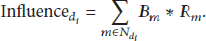

Influence circle of the director.
After all films have been placed on the canvas, we get the initial layout of films similar to the scatter plot. In this layout the film points are of the same size and the differences in terms of the rating of the film have not been considered. In order to visually encode such differences into the film points, we show the film points with different area. Specifically, the points are designed as a square that looks like Figure 11, whose side length is defined as d.
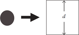
Movie points extended to movie squares.
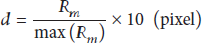
d is computed as

Colors of the movie squares.
This is to distinguish the directors who shot a lot of movies of average quality and who shot a few excellent movies. As shown in Figure 13, Stephen Chow and Hark Tsui have similar size of density map blocks, but their pattern is obviously different. The map color of the director who shot fewer but more popular films will be much redder.

The density map visualization of Stephen Chow and Hark Tsui.
After the above design and calculation, we get a neat density map after adopting the KDE smoothing. The color of the density map indicates the ratings of the films as shown in Figure 14.

The density map layout of film data.
5.2. The Double-Layered Visualization
After obtaining the node-link foreground view and density map based background view, we need to superimpose the foreground on the background to get the final hybrid view. The connections among three modes of movie data are presented in the final double-layered view as shown in Figure 15.

The double-layered visualization combining the node-link view and the density map view.
6. Experimental Results and User Study
6.1. Results On Douban Movie Data
We developed a crawler script to collect the movie network data from the Douban website. Usually the data need to be processed before visualization [35, 36]. After data filtering and cleaning, we have collected 10217 movies which were shot in China including Mainland, Taiwan, Hong Kong, and Macau. Some coproductions that were partly shot in China are also included. The items that lack names or rating information are deleted. The directors, actors, ratings, number of ratings, release dates, and synopses of movies are gathered from the movie data. Totally there are 2123 Chinese movie persons gathered, including directors and actors. The statistics of our crawled movie data are as follows. The average movie rating is 6.3, the highest is 9.4, and the lowest is 2.1. The average number of ratings of each movie is 2980; the highest is 544695.
The programming language for visualization of all movie data is JavaScript. In order to ease the implementation, we use the third-party libraries d3.js in our work. We separate data processing and visualization to two different stages. The data are generated and processed offline, and the visualization pictures are produced online.
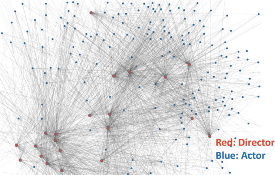
By using the layout algorithm described above, we show the connections among the directors, actors, and films of the Douban movie data in one view as shown in Figure 16. Nodes with names are directors; others are actors.
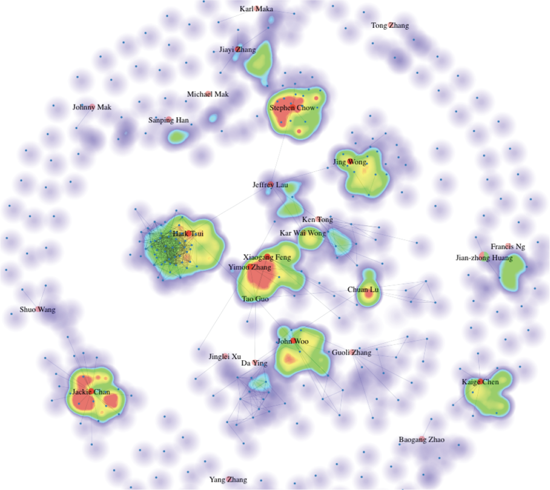
Visualization data on Douban movie data.
From the layout results, we find that the cooperation patterns for different director and actors are quite different. Through a multimodal layout of movie data shown in Figure 17, we find that for some directors, like Hark Tsui, the actors who frequently cooperate with him also have close cooperation with each other. However, for other directors, like Jing Wong, the cooperation among the actors who cooperate with him frequently is not so close.

Multimodal visualization of Hark Tsui and Jing Wang.
In addition, from the density map as the context background, we see that different directors have different areas of expertise, and whether the movies directed by them are popular or not can also be obtained from the density map. For example, what we observe from the part of Jackie Chan and Hark Tsui is really interesting. As shown in Figure 18, we find out that Jackie Chan and Hark Tsui have similar area of density map which means they shot almost the same number of movies. But the color of Jackie Chan's map is much redder than that of Hark Tsui's, which means that Jackie Chan's movies have higher ratings. Meanwhile, the actors cooperation network of Jackie Chan is relatively sparse compared with Hark Tsui's, which indicates that Hark Tsui has a wider actor social network. This proves that our system can help solve Visualization Problem 3 we talk about in Section 3.1.

The density map of films by directors of Jackie Chan and Hark Tsui.
As for user interaction, users can drag and zoom in/out to view the layout of the location. Meanwhile, we also provide the switches for users to hide or show the director pie chart glyphs as well as the names of the actors.
6.2. User Interactions
In such double-layered view, we further adopt the glyph to represent more information of director nodes. The glyph is designed as a pie chart of which the radius is proportional to the average ratings of all movies of the corresponding director node. The pie chart is divided into several colored regions. The distribution of the colored regions within the pie chart corresponds to the distributions of different movie types that the director has produced.
To choose the colors representing different movie types, we design the following mapping scheme: the drama: light blue, love: pink, cartoon: green, comedy: red, horror: purple, action movie: blue, documentaries: orange. In Figure 19 we show two pie chart glyphs of two different directors for comparison.

Two pie chart glyphs of directors Jing Wong and Chuan Lu.
From Figure 19 we learn that Jing Wong mainly shoots comedy (red) and action films (blue), as well as a relatively small number of files of drama (light blue), romance (pink), and horror (purple) types. Compared with Jing Wong, the director Chuan Lu of the new generation in Mainland China has taken mainly drama (blue), romance (pink), and documentary (orange). Besides the color distribution, we find that the radius of the pie chart of Jing Wong is much larger than that of Chuan Lu's, which means that the overall ratings of Jing Wong's movies are higher than that of Chuan Lu's. This indicates that Jing Wong is more influential than Chuan Lu in China, which is consistent with the actual situation. Figure 20 shows the visual effect of force-directed layout after combining the pie chart.

Visual effect with pie chart.
As for user interaction, users can drag and zoom in/out to view the layout of the location. Meanwhile, we also provide the switches for users to hide or show the director pie chart glyphs as well as the names of the actors.
6.3. User Study
In order to verify the effectiveness of our work, we invited 30 subjects to participate in the experiment and survey. These 30 subjects have no particular background in movie industry. We design the following tasks:
From the perspective of rating, who is the most successful Chinese director? From the perspective of the film production, who is the most successful Chinese director? Which director is best at shooting comedy? Which director is best at shooting romance film? Which director has shot various types of films and gained broad influence? Which director shot many films but the rating was not high? Which director is at the center of director's cooperation network [37]? Which directors shoot only four or less kinds of movies? How do you rate the usability of our system (minimum 0, maximum 10)? How do you rate the visual aesthetic of our system (minimum 0, maximum 10)?
Questions 1–4 are designed to answer Visualization Problem 1 in Section 4.1 and questions 5–8 are designed to answer Visualization Problem 2. Question 9 is about the general usability and question 10 is about the aesthetics of visualization design of our system.
Feedback Statistics and Analysis. Here the visualizations of the statistics of the feedback are shown and we give our analysis for the results.
The statics of answers of (Q1) and (Q2) are as shown in Figure 21. As we can see that for (Q1) the participants votes were for four directors and Stephen Chow got the highest number of votes. For (Q2), the participants votes were for five directors.

The answers to question 1 (a) and question 2 (b).
Answering the first and the second question requires the participants to compare the size and color of pie charts and density map. The answer to the first question focused on Jing Wong, Yimou Zhang, and Stephen Chow, while the answer of the second question focused on Stephen Chow, Hark Tsui, and Xiaogang Feng. This result agrees with the real statistical data, and it is also close to our common sense.
The statistics of answers to (Q3) and (Q4) are as shown in Figure 22.

The answers to question 3 (a) and question 4 (b).
For the third question, all participants choose Stephen Chow. The answers of the fourth question concentrate in John Woo, Xiaogang Feng, Jing Wong, Yimou Zhang, Kaige Chen, and Kar Wai Wong. Where John Woo and Feng Xiaogang are in the lead group, the other directors are in the second group. Compared with the previous questions, the answers to this question become a little diversified.
The statistics of answers of (Q5) and (Q6) are visualized as shown in Figure 23.

The answers to question 5 (a) and question 6 (b).
The answers of (Q5) focus on Stephen Chow, Yimou Zhang, Hark Tsui, and Jackie Chan. From the feedback statistics of (Q6), we find that the opinions of the participants are not so concentrated and they vote for six directors, among whom Jing Wong and Kaige Chen get the highest votes. The differences of these votes are small compared with the previous results. The diversified voting results are produced since this problem requires participants to consider two visual indicators—the size of the pie and the size of density map—which is a bit visually demanding.
The statistics of answers of (Q7) and (Q8) are as shown in Figure 24.

The answers to question 7 (a) and question 8 (b).
The answers to the seventh question are relatively concentrated, and most people answered Feng Xiaogang and Jeffrey Lau. The answers of (Q8) are varied, but all subjects have found at least one director who shoots only four types of movies. Chuan Lu, who is voted for the most (Q8), is a freshman on behalf of the director and is indeed one of the directors who are shooting least types of films.
The statistics of answers of (Q9) and (Q10) are shown in Figure 25.
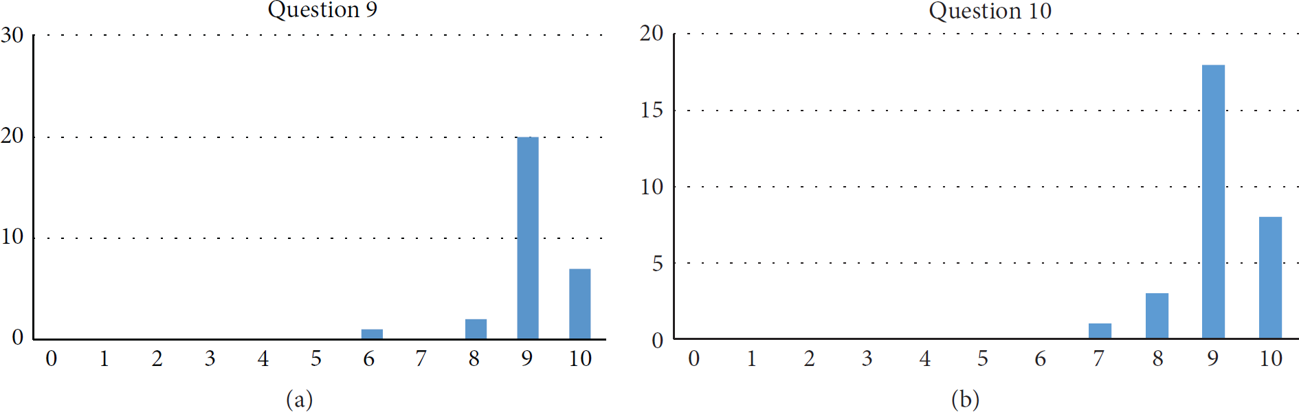
The answers to question 9 (a) and question 10 (b).
Most participants give a high score, indicating that they regard our system as one providing effective visualization interface to users to finish their tasks. As for aesthetics of our system, the scores concentrated in 9 and 10. We observe that the distribution of the usability and aesthetics is almost the same, which means that the aesthetics of the visualization system directly affects its availability or has close relations.
In order to let the readers make their own conclusions about the effectiveness of our system, we provide in Figure 26 the pie charts of all directors. Readers can refer to it to understand the accuracy of our user study results.

The pie charts of directors.
7. Conclusions
Based on the multimodal conception, we propose a method based on traditional force-directed algorithm and the nature of the movie data to improve the combination of node-link layout and design different control function for different modes. At the same time, we use density map, glyph, and other methods to present different modes of data in a visual interface, retaining relationships between and within modes. By combining a node-link diagram with density map, our system allows the user to analyze the relationship among the director, the actors, and the film overall. Users can obtain their own conclusions by themselves.
In this paper, the choice of parameters related to force-directed algorithm is computed via setting and tuning. In the future we will work on the semiautomatic interface for users to interactively adjust the parameters according to the layout results. In this work, for movie data visualization, we did not make full use of the time attribute. In the future work we will incorporate time factors into our visual analysis system and provide users with more flexible interactions to enhance their insights of the visualization. The results of analysis will be recorded for all users to do future research.
Footnotes
Conflict of Interests
The authors declare that there is no conflict of interests regarding the publication of this paper.
Acknowledgments
This work was supported by National Natural Science Foundation of China (Grant nos. 61003265, 61173097), Zhejiang Provincial Natural Science Foundation of China (Grant no. LY14F020021), and the National Key Technology Research and Development Program of the Ministry of Science and Technology of China (Grant no. 2014BAH23F03). The authors are also grateful to the volunteer participants of their user study experiments.