
Abstract
Introduction:
Recent experiments provide evidence that diluting the blood plasma restores the plasma environment to a more youthful level at least partially restoring the health of organs and tissues throughout the body.
Objectives:
We analyze whether a dynamical-systems model representing the plasma constituents could support the optimization process and help determine the appropriate dilution level, frequency and any simultaneous plasma infusions to achieve the most favorable outcome.
Methods:
We use a combination of a gradient descent, a simulated annealing and a genetic algorithm to find a population of models that fit illustrative data.
Results:
We analyze this population and present distributions of the model parameters and include a collection of plots of the dilution process for illustrative models.
Conclusions:
We find that, if we had more data to disambiguate the models, these dynmical-systems models could give useful predictions for plasma-dilution/addition experiments as well as support the interpretation of their results.
In a stunning pair of experiments, Mehdipour etal.1,2 showed that simply diluting the blood plasma with a combination of saline and 5% albumin, which they called neutral blood exchange (NBE), was sufficient to rejuvenate all three germ layers, improve cognition, and attenuate neuroinflammation in old mice. In fact, they found that a single NBE treatment, replacing 50% of the plasma in old mice, resulted in enhanced muscle repair, reduced liver adiposity and fibrosis, and increased hippocampal neurogenesis to at least the level seen in earlier heterochronic parabiosis experiments3 and surpassing the level seen in earlier heterochronic blood exchange experiments.4 Moreover, they showed that a single NBE treatment surpassed ABT 263, a senolytic that does not pass the blood–brain barrier, in its rejuvenative effect on the brain.
Additionally, the authors found that the protein composition of the plasma was reset to a more youthful, more rejuvenative composition, and although in this more youthful plasma, some proteins were reset to a lower level, as might be expected from a dilution experiment, perhaps surprisingly, many were elevated as a consequence of the NBE treatment. They noted that this was evidence that some of the age-elevated protein factors suppressed the age-reduced protein factors, and that once those suppressive proteins were diluted, the inhibited proteins were allowed to upregulate to a higher, more youthful level.
Noting that an equivalent procedure in humans, therapeutic plasma exchange (TPE), has already been approved for treatment by the US Food and Drug Administration (FDA), they further measured the blood proteomics of aged humans before and after TPE treatments and found that the protein composition reset in an analogous way to the old mice. The resetting and rejuvenating effect of TPE was further summarized in Refs. 5–9. Although TPE appears capable of inducing a resetting of the plasma composition, it is not yet fully clear how much plasma must be removed in order to see this resetting. The NBE experiments outlined above replaced approximately 50% of the plasma with saline and albumin, while typical TPE treatments replace the entire plasma volume.
Before continuing, we should also note that some researchers have considered the rejuvenating effect of some factors in young plasma and have performed some experiments where, rather than diluting plasma, they infuse young factors into the elderly.10–13 Of course, both may have merit, and the optimal protocol could very well involve a dilution combined with an infusion.
Beyond the measurement of the rejuvenative phenotype and the plasma proteomics, Mehdipour etal.1 also built a dynamical-system toy model that illustrated how a dilution might cause an enhancement to some plasma species in the system. This illustrative model had three species with the following set of differential equations (DEs):
We can see that in their toy model, species A positively affected C but negatively impacted B, while C negatively affected A and itself (which could be interpreted as its own decay). Schematically, this can be written as

With this model, beginning with the initial values
which they took to be diluted from

Although the toy model achieved the illustrative purposes of Ref. 1, we would like to improve on their model in a few important way. We first note that their model only contained one steady state for A and C, and, therefore, the proposed initial state before the dilution with
Another shortcoming of this toy model is that the species concentrations for A and C become negative before reaching the vanishing endpoint. This is clearly unphysical, and we would like to enforce that the model species never become negative in a more realistic system. In order to attempt an exploration of better models, we designed a system of DEs as described in Appendix A and wrote a computer code as described in Appendix B. We used our code to generate a population of models that fit the following data:
where dil stands for dilution and evo stands for evolution. These values are meant to be illustrative with m 0 and m 1 increasing to a higher value after dilution and m 2 and m 3 decreasing to a lower value after dilution. We modeled these values on the proteins ROBO4, Angiogenin, VEGF-C, and Epiregulin from Fig.5E from Ref. 1. However, these values are only used in a demonstrative way in order to show what might be possible had we a robust dynamical model for plasma dilution. As we will see, we do not yet have enough data to disambiguate the many models that would fit the data.
The remainder of this article is organized in the following way. In the “Minimal Models” section, we describe the statistical properties of a population of minimal models which only contain the “measured” species in Eq. (6), and no extra species beyond these measured species. In the “Dilution Variations” section, we consider modified dilutions in the models described in the “Minimal Models” section. That is, we consider other dilution scenarios such as flat dilutions at different values, flat dilutions with a single or two species enhanced, and other possibilities. In the “Summary and Conclusions” section, we summarize our findings and conclude. We also include several appendices. In Appendix A, we briefly review dynamical models and describe the structure and parameters of the models used in our analysis. In Appendix B, we describe our algorithms for generating a population of models that fit the data. In Appendix C, we present plots illustrating the behavior of the minimal models following the standard dilution (the models and dilutions analyzed in the “Minimal Models” section). In Appendix D, we show plots illustrating the behavior of one of the minimal models under different modified dilution scenarios.
Minimal Models
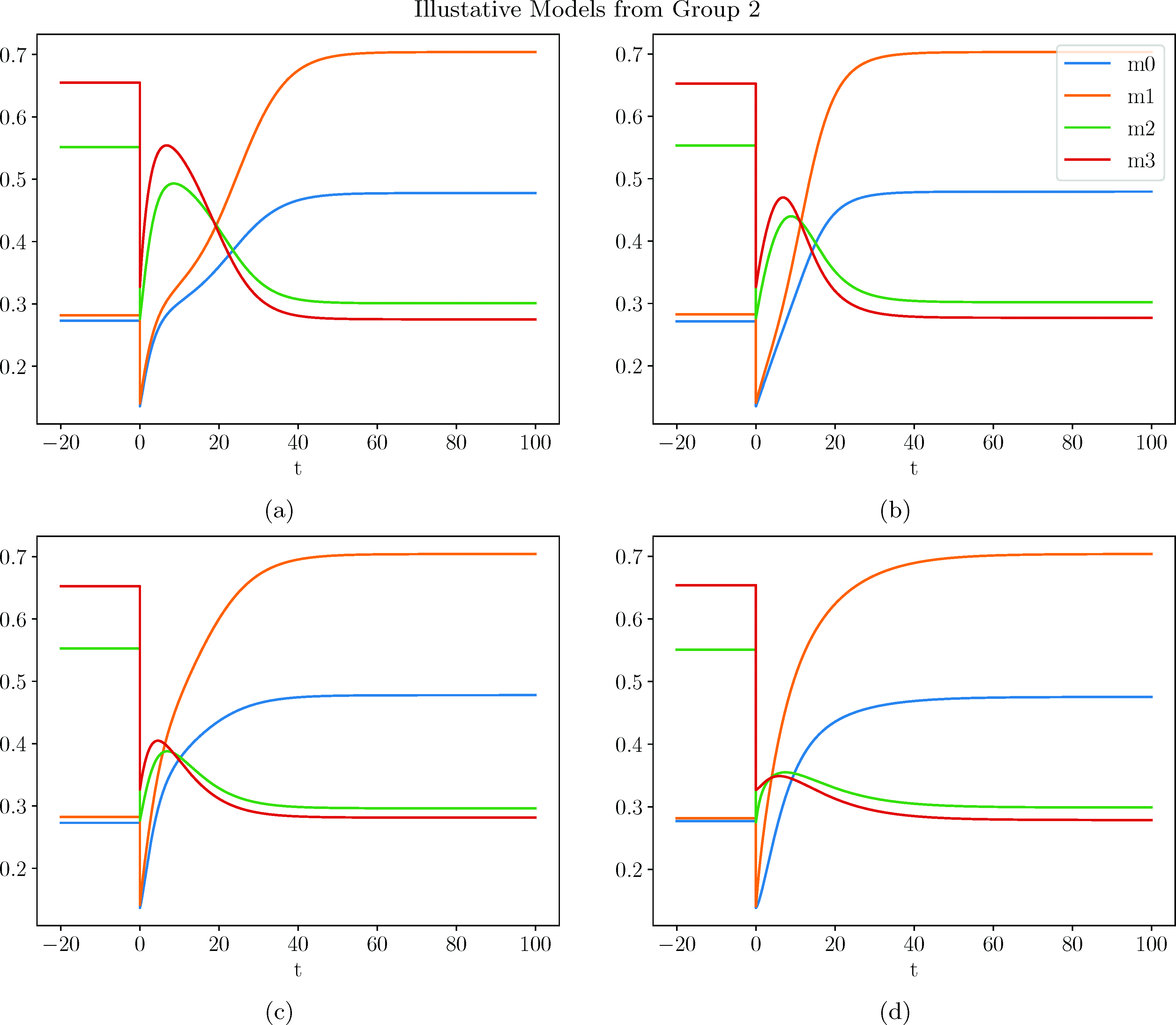
In this section, we consider minimal models with only the measured species, but none of the extra species described in Appendix A. A selection of the models usedfor the analysis in this section can be found in Appendix C. Although the genetic algorithm attempted to add extra species (of the type ui , hi , and ci —see Appendix B), none of the models with extra species had low enough model scores to remain in the population. However, it is, of course, possible for models with extra species to fit the data as well or better than these minimal models. In fact, in a separate calculation, we forced the model to retain at least four extra species and found many models that fit the data as well or better than the present minimal models. Nevertheless, we chose to present these minimal models because, first, they are minimal, and no extra species were required, and, second, since the models with extra species are more complex and have a much larger space of parameters to search, we were unable to obtain a large enough population of extra-species models with sufficiently low model scores that we could have confidence in the statistical properties of the distributions.
Each new minimal model took a little over 6 cpu-min to optimize, on average (some took much longer and some took much shorter). We generated a total of approximately 350 thousand new models that took a total of approximately 1,500 cpu-days of computation. We kept the 1,000 models with the best model scores (see Appendix B). In Fig.2, we show a distribution of the model scores in the final population. The maximum model score in the population depends on how many models we try. Greater run times produce models with lower model scores and lower population maximum score. In the future, with much greater data (especially data with more temporal measurements and data with a variety of dilution values), we would be most interested in only the few very best model scores and ignore all the rest. In the absence of sufficient data to disambiguate the many possible models shown here, we instead focus on traits shared by the many models that fit the data.
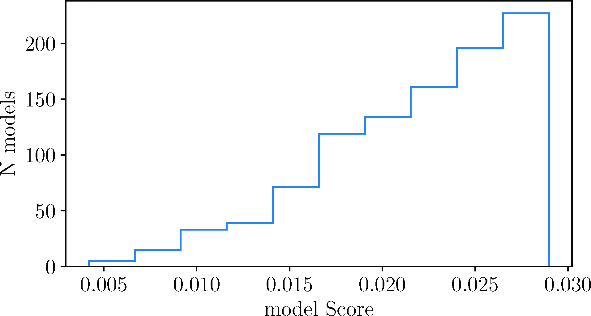
A distribution of model scores from our best 1,000 models with only four measured species.
As described in Appendix B, for each species’ equations, when creating a new model from scratch, we randomly chose (with a flat distribution) between 2 and 7 terms [the number of terms on the right of Eq. (A6)], including the final decay term. However, the genetic algorithm sometimes took a preexisting model from the population and either added a term or removed a term (see Appendix B), allowing the number of terms to exceed these bounds and change the shape of the distribution. Therefore, the final shape of the distributions is a combination of the flat distribution convoluted with the mating, the mutations, and the survival of the fittest algorithms. With this in mind, we present a distribution for the number of terms in the equation for each constituent in the top plot of Fig.3. We can see that the number of terms per equation is peaked at two terms for m 0 and m 2, at three to four terms for m 1, and at four to five terms for m 3. As expected, there were no models with only one term (only the decay term) on the right of any equation, since the steady state for such a species would necessarily be zero. There must be something to balance the decay in order for the species to be nontrivial. After the dilution, m 2 rises a very small amount, which apparently only requires one additional term, m 0 increases a moderate amount, which also only requires one additional term, but m 1 increases twice as much as m 0 and apparently needs at least two or three additional terms. On the other hand, m 3 decreases following dilution, the opposite of the other three, and this requires three to four additional terms. Furthermore, as we can see in the middle of Fig.3, typically, only the decay term is negative for m 0 and m 2. Once again, this must be the case, else m 0 and m 2 would be trivial with both terms negative and no nontrivial steady state. On the other hand, one or more of the extra terms is typically negative for m 1 and m 3, presumably due to the extra complexities of their evolutions. For each species’ equation, we have also analyzed how many of their terms are of the form Eq. (A2), with only a single species, or of the form Eq. (A4), with two species, and show a plot in the bottom of Fig.3. Once again, m 0 and m 2 are similar with around 80% being single-species terms, while m 1 has approximately half of its terms with two species and approximately 80% of the terms for m 3 have two species.
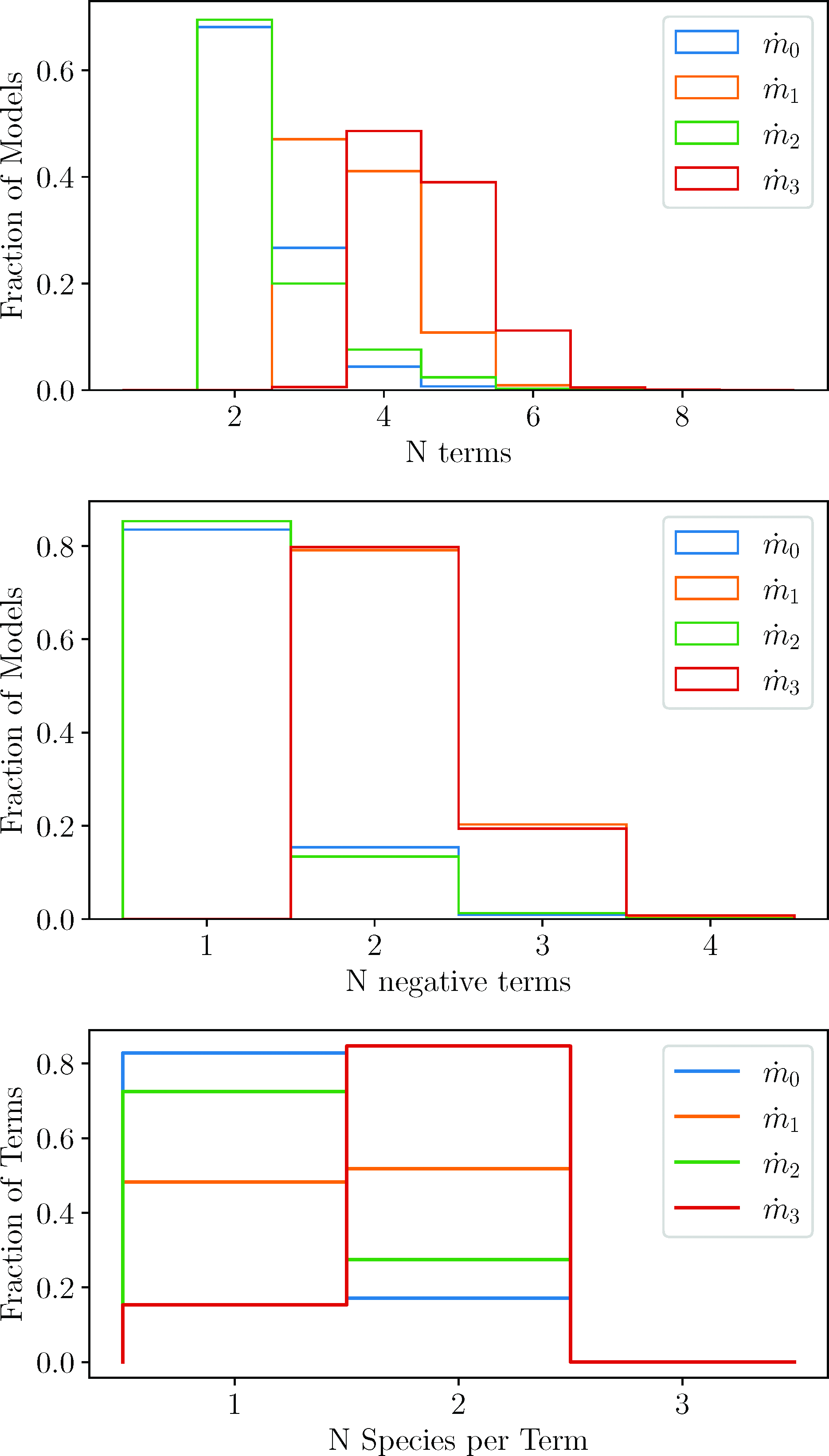
These plots show the fraction of models or terms that have certain properties in the equations for each species. The blue, orange, green, and red lines represent the equations for
If we look at each equation in greater detail, we begin to see further patterns. In Fig.4, we plot which species is included for single-species terms for each equation. These are terms of the form Eq. (A2). The blue line is for the first equation that gives

Fraction of single-species terms containing a particular species. The blue, orange, green, and red lines represent
In Fig.5, we plot distributions of the coefficient and thresholds for the most important single-species terms in each equation. These lines correspond with the peaks in Fig.4. Once again,

Percent of single-species terms with coefficients (top) and thresholds (bottom) with given values (horizontal axes). The coefficients and thresholds refer to g and K, respectively, in Eq. (A2). For each equation (
In Fig.7, we plot which species are included for double-species terms for each equation. These are terms of the form Eq. (A4). The first thing that we note is that, in the equation for
In Fig.6, we plot the coefficients of the most important double-species terms. As can be seen, we do not include any double-species plots for

Fraction of double-species terms with coefficients of given values (horizontal axis). The thresholds for these terms are shown in Fig.8. As described in the text, we have only shown the coefficients for the terms that occur most frequently.

Fraction of double-species terms containing two species. The plots are, from top to bottom, for
As we look at the (blue and orange) distributions for
In Ref. 1, the authors noted that it was interesting that many constituents of the plasma increased rather decreased following dilution. This might be surprising since, naively, one might expect a dilution to reduce the concentrations to a lower steady state. Moreover, inspecting their Fig.5 reveals that all of the reported mouse proteins increased beyond their original values, while nearly 80% of the reported human proteins increased. This appears to suggest that it is more likely for a protein to increase following a dilution event rather than decrease, although they only showed a fraction of the plasma proteins, and it is possible that there is a bias in which proteins were shown. In this paper, we have shown that, at least within the constraints of the limited data we have, single-species terms tend to increase species concentrations, while a decrease tends to require greater contributions from double-species terms. We might hypothesize that the reason a decrease is less likely is that the evolutionary path to enzymes that were catalyzed by a single species was more efficiently explored, and that enzymes requiring two species for catalysis were more difficult to achieve stochastically and, therefore, less efficiently explored. Further analysis of dynamical models might shed greater light on this biological trait.
We note one last property of these coefficients before we move on. We can see that there is a preference for larger magnitude coefficients, around 1, rather than smaller ones. Although the percentage of terms with coefficients larger than 1 decreases rapidly, it should be kept in mind that every search was begun with a random value whose magnitude was between 0 and 1. The simulated anneal process and gradient method were free to search outside this range, but their initial starting point effectively reduced the distance they searched beyond unity. We attempted to increase the initial value to a magnitude that was randomly chosen between 0 and 2. What we found was a similar deficit around 0, followed by a quick growth to a maximum value around 1, a nearly flat distribution between magnitudes of 1 and 2, followed by a quick decline afterward. There are some exceptions, such as the green line for
In Fig.8, we show distributions of threshold values for the most frequent double-species terms. These are the Ks in terms of the form Eq. (A4). The main thing to note here is whether the thresholds are very small, intermediate, or very large compared to the concentrations of the species during the dynamic response to dilution. We can see that there are two instances of very small threshold values, and both occur for

Fraction of double-species terms with thresholds of given values (horizontal axis). The coefficients for these terms are shown in Fig.6. As described in the text, we have only shown the thresholds for the terms that occur most frequently.
Turning to
In Fig.9, we consider the decay rates for each species. The λ refers to the coefficient in Eq. (A1). The red line for m
3 immediately stands out. It has a very strong preference for very small decay rates,

Fraction distributions of the decay rates for each species.
In this section, we consider statistical distributions of models that fit the illustrative data in Eq. (6). Since the data for these four species were so limited, there was a very large amount of ambiguity in which model could fit the data. However, we have shown that some correlations could, nevertheless, be inferred that might be useful as more data are collected, and the models are improved. We also note that these models and the associated statistical inferences are further limited by the ability of the algorithms to generate instances of unique classes of models that fit the data. We have attempted to make a robust algorithmic system that does not prefer any type of model, but we can never be sure, and further studies are always warranted. Finally, due to our limited computational resources, we were necessarily constrained to including a very small set of measured species, only 4 in this analysis, and no extra species that were not measured. This is important because the presence of feedback interactions with other species not included here could modify the results of this study. It may be that the dependence of one species on another found here might be shifted to a dependence on other species which were not modeled here. This is a major direction we would like to consider in future studies by enlarging our computational power and analyzing models with a greater number of species. Moreover, we would like to include further data, both with a variety of dilution values and data at more time points. This last point, of course, will depend on the experiments being performed but will lead to the greatest improvement in these models.
Dilution Variations
In this section, we consider variations on the dilution from the experiment. We would like to explore what predictions a dynamical system trained on sufficient data might make. Since we do not have much data for training, we cannot expect the predictions of individual models to match Nature yet. Instead, we have a population of models and, therefore, a population of predictions, each unique. On the other hand, we can see patterns among the models, suggesting that there might be a greater likelihood of a prediction to have certain characteristics. Nevertheless, any predictions made at this point are premature and should be seen as illustrating what might be achieved had we sufficient data to find a more robust, realistic model of an actual biological system. We note that all the figures in this section have dilutions that range from 0.02 up to 1.4. Dilutions above 1.0 are, of course, not dilutions. They are enhancements (infusions). However, for convenience of language, when referring to them together with the dilutions, we will simply call them all dilutions. On the other hand, when we focus on values larger than 1, we will use the more appropriate term enhancements.
We begin by considering a flat dilution where we dilute every species by the same amount, although not necessarily the 50% discussed in the “Minimal Models” section. In Fig.10, we show the range of final values for each of the species if they are all diluted by the same amount, shown along the horizontal axis. The solid curves represent the median values, while the shaded regions show the range of the middle 67% of the models. We can see that if we dilute all of the species by any value below 1, 67% of the models evolve to the same final steady state that occurs with a 50% dilution. We will call this the original final steady state (OFS). This suggests that in these simple models, the OFS is an attractor, and we will see further evidence of this in the rest of this section. If we instead enhance the species, we see that the majority of the models tend toward final values where m 0 and m 1 are nearly 0, while m 2 tends toward a range between 0.98 and 1.4 and m 3 tends toward a range between 2.3 and 11.3, all in 67% of our models.

Final values following a flat dilution. The shaded region covers the final value of 67% of the models. All the species were diluted by the same amount, shown along the horizontal axis. The dotted lines give the final steady states of the original data (the OFS).
In Fig.11, we consider a flat 50% dilution for all the species except one. The excluded species is instead diluted at a range of values including greater dilution, lesser dilution, and enhancement. If the dilution or enhancement is greater than 50% for the decoupled species, this could be achieved by a dilution followed by an infusion of the separated species. However, if the singled-out species is diluted by a greater amount than the rest of the plasma, this could not be done with a dilution–infusion combination. Rather, this might require the infusion of some agent that could bind to the species and remove it in some way. These comments also apply for other scenarios discussed in this section.
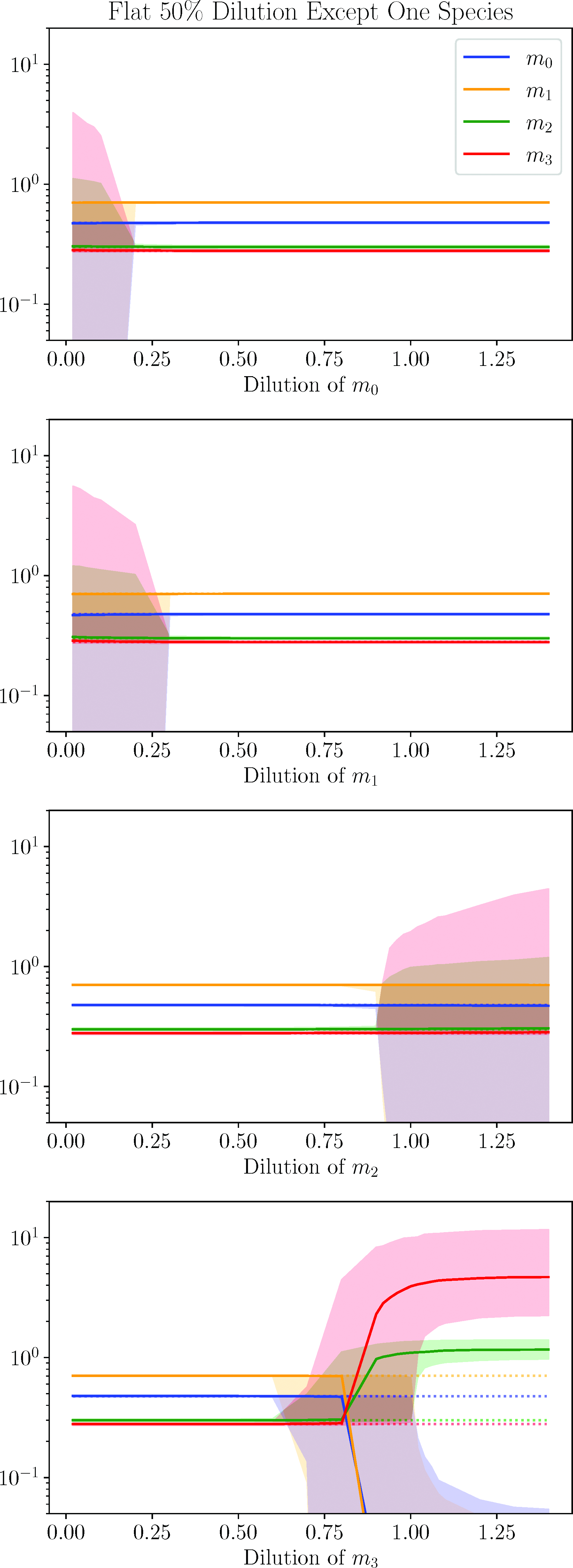
Final values following a 50% dilution of all species except for one. The single species not diluted by 50% had a varying dilution given by the horizontal axis. The shaded region covers the final value of 67% of the models. The dotted lines give the final steady states of the original data (the OFS).
We begin with the top plot, which considers a decoupled m 0 dilution. We see that, given a 50% dilution for everything else, the system is very insensitive to the dilution value for m 0. For nearly the entire range, the final value coincides with the OFS for 67% of the models. If the dilution reaches down below approximately 0.2, the final steady states begin to spread out, although the median value still coincides with the OFS. A very similar statement can be made for dilutions of m 1 and m 2. For the majority of dilution values, the final steady coincides with the OFS. However, if the dilution of m 1 falls below approximately 0.3 or the dilution value of m 2 falls above approximately 0.9, the final steady state begins to spread out, once again with the median remaining true to the OFS. These are the three species which increase following dilution. The main difference between m 0 and m 1 on the one hand and m 2 on the other hand is that they are sensitive to opposite ends of the dilution spectrum. The reason for this is that the OFS for m 0 and m 1 is above their initial steady state; therefore, they are more sensitive to severe dilutions which are in the opposite direction of their OFS. The behavior of m 2 is the opposite with its OFS below its initial steady state; therefore, it is more sensitive to enhancements, which lead in the opposite direction of its OFS.
The species that really stands out here is m 3, which is sensitive to both dilutions above 0.7 and enhancements. Or to put it differently, in order to reach the final steady state of the data, m 3 must be diluted by at least 30%. If it is above that, even with all other species diluted by 50%, the model will tend toward a different final steady state. m 3 is the most unusual as we have seen throughout this note as it not only has a lower final steady state but also decreases following dilution and requires the greatest complexity of its dynamical equations. It appears that this confers a greater sensitivity on it than the other species. Interestingly, with enhancements, 67% of the models tend toward final values with m 0 and m 1 at or very near 0, while m 2 and m 3 tend toward values in the range 0.97 and 1.4 and 2.3 and 11.6, respectively. These are the same final values as occurred in Fig.10, where all species were enhanced by the same amount. This suggests that m 3 might have been the dominant change causing evolution toward this final state. Having the other species diluted at 50% here helped the transition occur, so that m 3 could take a larger range of dilutions and enhancements of 0.7 and above to achieve these final states compared with the flat dilutions shown in Fig.10.
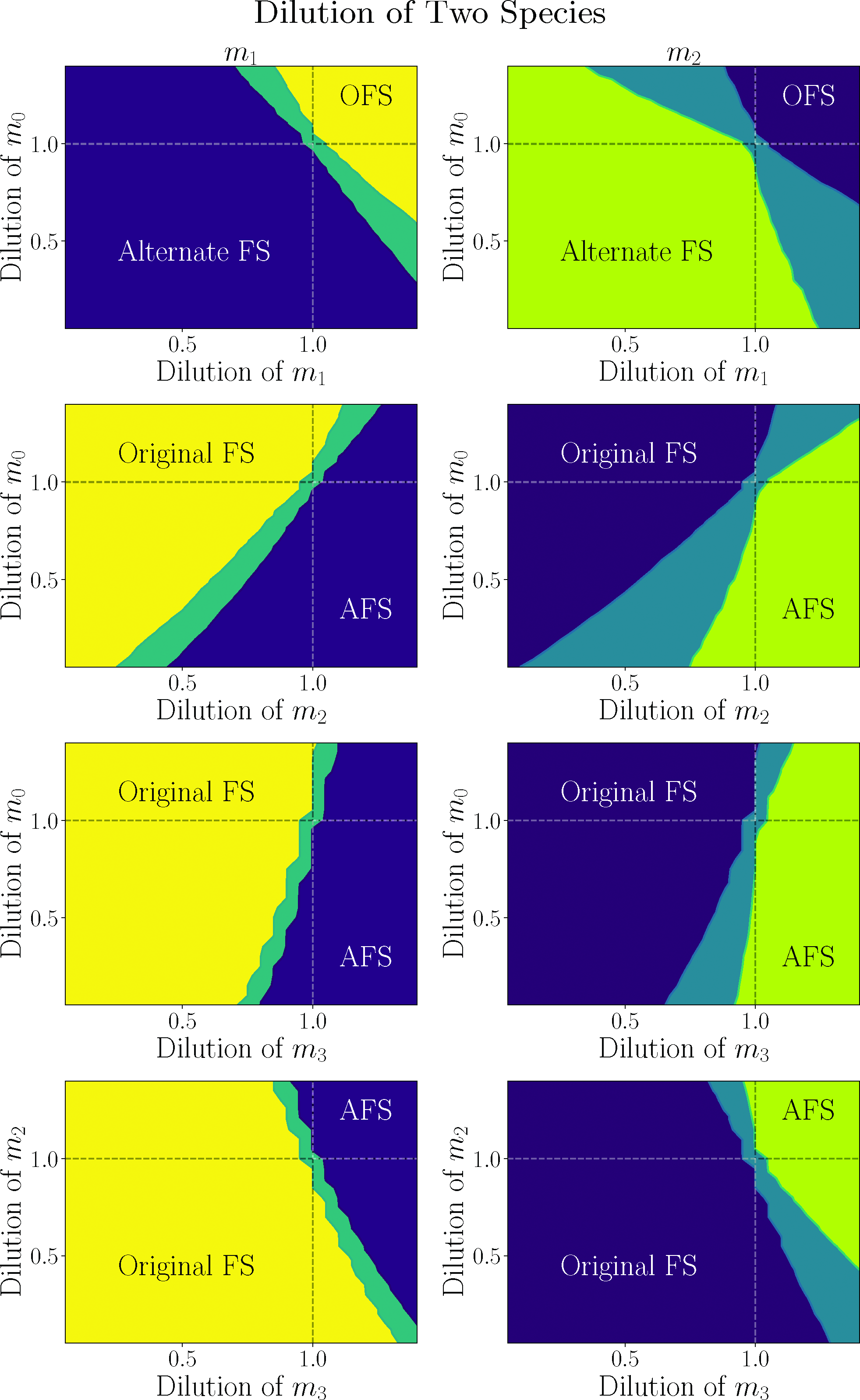
We also considered manipulation of two species independently while keeping the remaining two at a 50% dilution. So, for example, we diluted m 2 and m 3 at 50% and then varied the dilution or enhancement of m 0 and m 1, independently, over the range 0.05–1.4. We found roughly what we would expect if we considered the combined effect of two modified dilutions that are shown in Fig.11. Since there are too many plots to display here and since there is a large degree of similarity between the plots, we will focus on a few illustrative examples here. In Fig.12, we present the median final value of m 1. Along the horizontal axes and vertical axes, we present the dilution values for two species, while we hold the dilution of the other two species at a constant 50% dilution. So, although the final value after dilution is always presented for m 1, the dilution values depend on the values of the axes or are 50% if not on the axes. In these plots, the yellow region shows where the median final value of m 1 is the OFS, the right side of Eq. (6). The blue-green area is the transition region between final states, and the dark blue region shows the region where the alternate final steady state (AFS) occurs following dilution, shown on the right side of the bottom plot of Fig.11, for example. Although we only show plots for the final state of m 1, the plots for the other species, given the same dilutions, are analogous. The exact positions of the lines separating the regions are slightly altered but is in the same region and has the same qualitative shape.

Distributions of median final value of m1 when two species were diluted or enhanced, independently. These two species are specified in the horizontal and vertical axes. The other two species, not on the axes, are diluted at 50% in each case. FS stands for final steady state.
In the case that we dilute m 2 and m 3 at a constant 50% but vary the dilution of m 0 and m 1 (top plot of Fig.12), we find that, for the majority of dilution and enhancement values, the final state is the OFS. However, if we dilute either m 0 or m 1 to very small dilutions, the final state switches to the AFS. This is shown as the darker region at the bottom left. This is because, as we can see in the second plot of Fig.11, the final state begins switching at very low dilutions of m 0 and m 1, and when we combine very low dilutions of both, the switch becomes complete. We note that the solid orange line in the second plot of Fig.11 corresponds with a horizontal line in this plot at a height of 0.5 and is yellow for the entire length, as expected. Similarly, the solid orange line in the first plot of Fig.11 corresponds with a vertical line in this plot at a value of 0.5 and is also yellow for the entire height, as expected. Similar comments apply for the horizontal and vertical dashed lines in the other plots of Fig.12. We also note that we are only plotting the median value and do not have a clear way to include the 67% confidence region. In the second plot of Fig.12, we show the effect of varying the dilution of m 0 and m 2. We can see that the AFS switches from the bottom left to the bottom right. This makes sense since, as we can see in the third plot of Fig.11, the final state switches for high values of m 2, which is the right side in this plot. Again, we find that low values of m 0 hasten the transition. If we vary the dilutions of m 1 and m 2 instead (not shown), we find a qualitatively very similar plot to the second plot of Fig.12. Again, the transition region is at the bottom right. However, the transition line has a slope that is shallower.
The shape changes significantly when we vary the dilution of m 3, as we would expect based on the bottom plot of Fig.11. If we also vary m 0, we get the behavior shown in the third plot of Fig.12. The transition is most sensitive to variations in the dilution of m 3. However, a smaller dilution value for m 0 makes it more likely, while a larger dilution value (or enhancement) of m 0 makes the transition less likely, causing the transition line to slope to the right. Varying the dilution of m 1 along with m 3 (not shown) creates a qualitatively similar plot with the slope of the transition line to the right, but the slope is shallower. Finally, if we vary the dilution of m 2 along with m 3, as expected, the slope of the transition line flips to the left. We expect this, based on the third plot of Fig.11, since the transition is sensitive to large values of m 2 and, therefore, should occur more quickly the higher the dilution value of m 2.
In Fig.13, we consider what would happen if we only diluted (or enhanced) one species but left all the others at their original value. We can see that the behavior splits into two groups. In the first, as shown in the first two plots, if we enhance either m 0 or m 1 alone, the model evolves toward the OFS. This is likely because the OFS is higher than the initial steady state for m 0 and m 1, and so this begins the evolution in the direction of the OFS. On the other hand, m 2 and m 3 are just the reverse. Their OFS is below the initial steady state; therefore, a dilution moves them in the direction of the OFS. As we see in the bottom two plots, any dilution of either of these causes an evolution to the OFS. On the other hand, if we perturb any single constituent of the group in the direction opposite the OFS, it evolves toward a different final state. Interestingly, that final state is essentially the same for any single-species perturbation and is, in fact, the same as when we enhance all four species (as shown in Fig.10) or when we dilute all species at 50% except for m 3, which is enhanced (as seen in the bottom of Fig.11). Namely, in all four cases here, both m 0 and m 1 tend toward very small or zero values, while m 2 tends toward a range of 1.0 and 1.4 and m 3 tends toward a range of 1.8 and 10.5 in the first plot, 2.2 and 11.5 in the second, 2.2 and 10.4 in the third, and 2.3 and 11.4 in the fourth. Although the range for m 3 is not exactly the same, the regions overlap significantly. This AFS region is interesting because it was not included in the training data, and we did not build it into the models. It appears that, within the limitations of the data that we used, the presence of the steady states given in Eq. (6) and the evolution between the two is sufficient to predispose the model to have another steady state in this region. At least, it occurred in 67% of the models obtained using our algorithm. That is, the other 33% of our models that fit the data do not have a steady state in this region. So, if we had more data, we might continue to find a steady state in this region or we might not. However, a more robust model, generated with a greater quantity of quality data, might predict the presence of other steady states that might be interesting and might suggest ways of achieving an evolution to the alternate steady state (ASS).

Final values following a dilution of only one species while not diluting the others. The single species diluted is given by the horizontal axis. The shaded region covers the final value of 67% of the models. The dotted lines give the final steady states of the original data (the OFS).
Another important feature of Fig.13 is that the original steady state is not stable. A perturbation in any direction of any single species is sufficient to drive the model away from the original steady state toward either the OFS or toward some other final state, as described in the previous paragraph. This property is likely not physical as we expect the levels of constituents in our plasma to be stable to small changes. This is a feature of our models we would like to improve in the future. However, we would prefer to not build in a region of stability by hand since we do not know the sizes of these regions physically, and they likely are different for each species being perturbed. Furthermore, we suspect that the number of steady states as well as their stability is impacted by the size of the dynamical model. That is, as we increase the number of species in our model, including unmeasured, hidden and conserved species, as described in Appendix A, the number of steady states will likely increase, and their stability structure could change. Moreover, we would prefer to let the data determine the features of the model. Given sufficient data of the right type, the steady states should take on more realistic properties. In particular, as a place to start, we would like to see dilution experiments with a range of dilutions, including dilutions where the plasma returns to its original steady state. The OFS, as given on the right of Eq. (6), on the other hand, is stable to a wide range of perturbations of a single species in our models.
In Fig.14, we show the result of diluting two species independently while holding the others at their original value. As in Fig.12, we have only plotted the median final value of the models with each dilution. Moreover, as in that previous figure, we see that the dilution space is divided into three regions: the OFS (in yellow on the left and dark blue on the right) and the AFS (in dark blue on the left and green on the right) and an intermediate transition region separating them. However, this time, there is a qualitative difference between the behavior of m 0 and m 1 on the one hand and m 2 and m 3 on the other hand. In particular, the transition region is broadened for the latter two. For this reason, we have plotted the distribution for m 1 in the left column, and these plots are also representative of m 0, while we have plotted the distribution of m 2 (also representative of m 3) in the right column. We have also included dashed lines when the dilution of either constituent is 1.0, representing no dilution at all. These dashed lines correspond with the solid lines in Fig.13. As expected, these dashed lines cross in the transition region, where none of the species are diluted, and the final state is the original starting state [the left side of Eq. (6)], which is in between the OFS and the AFS.
Distributions of median final value of m 1 on the left and m 2 on the right when two species were diluted or enhanced, independently. These two species are specified in the horizontal and vertical axes. The other two species, not on the axes, are held at their original value in each case. FS stands for final steady state.
In the top row of Fig.14, we see the behavior of the constituents when only m
0 and m
1 are diluted. As we would expect, based on first and second plots of Fig.13, the OFS is obtained if both species are increased, but the AFS is preferred if they are both diluted. Additionally, in the top left and bottom right regions, we see that an enhancement of one but a dilution of the other results in the OFS if the dilution is not too much, but transitions to the AFS if the dilution is large. We also see, in the right plot for m
2 and m
3, that the transition region takes up a larger fraction of the space in the top left and bottom right, when one species is enhanced and the other diluted. This is presumably because m
2 and m
3 are more sensitive to the level of dilutions/enhancements, which appears to be a consequence of their decrease following dilution. In the second row, we show plots for dilutions in m
0 and m
2. Once again, if we compare this behavior with the first and third plots of Fig.13, we see that enhancing m
0 and diluting m
2 result in the OFS, while the opposite results in the AFS, as expected. On the other hand, either enhancing both or diluting both results in one or the other depending on which is stronger, with a transition region separating them. Once again, the transition region is larger for m
2 and m
3 (in the right plot). The plots (and behavior) are very similar for dilutions of m
1 and m
2, and so we do not include plots for this combination here. However, we do note that the transition region is closer to the diagonal for the
Summary and Conclusions
In this note, we considered dynamical systems models for plasma dilutions. The plasma dilution experiments, so far, have only been done at one dilution value, and the concentrations of plasma proteins have only been measured once before and once after the dilution event. Because these data are so limited, we were not achievable a unique model that faithfully represents the behavior of the plasma system in Nature beyond the measured data. That is, the predictive power of our models is admittedly and expectedly very low. Alternatively, our goal has been to demonstrate what might be achieved with a dynamical systems model if we had sufficient data to properly disambiguate the models that represent the plasma system. We did this by creating a large population of models that fit the limited data and creating and analyzing statistical distributions of their properties and their predictions. Admittedly, a large number of models giving a similar prediction do not imply that Nature is necessarily more likely to satisfy the prediction. The addition of new data, especially with alternate dilution values and frequencies of plasma measurements, could, in fact, greatly alter its predictions. However, it is, nonetheless, suggestive that a more constrained model, given superior data, might give interesting predictions that could guide further experiments. In particular, with such a more constrained model in hand, predictions could be made based on alternate dilution values and dilution frequencies as well as infusions. These predictions could be followed by laboratory experiments, and the results of these experiments could then be fed back into the model to improve it and its future predictions. Moreover, using such a constrained and improved model to guide laboratory experiments could make the search for the optimal laboratory and clinical procedure more efficient.
In order to achieve this goal, as described in Appendix A, we began by developing the structure of the DEs that would have the representational power for the plasma constituents. We considered simple decays that represented instability in the proteins in Eq. (A1) and did not require a catalyst. We also included catalyzed reactions that either created or destroyed a plasma constituent. Since catalyzed reactions were sensitive to the concentrations of each molecule attached to it, we used a model of the form Eq. (A2) for a single-species catalyzed reaction and Eq. (A4) for a reaction catalyzed by two species. With this term, the rate of production or destruction is nearly linear when the species concentrations are low compared to its threshold and nearly constant when the concentration is high compared to its threshold, and the catalyst is saturated. Additionally, we reasoned that destruction of a plasma species could only occur when the species was present in the catalyst. Therefore, we only allowed a destructive catalyst, where the coefficient is negative, when the species being destroyed was included in the catalyzed reactions. In other words, we only allowed negative coefficients in terms such as in Eqs. (A3) and (A5). This removed the possibility that the species concentrations ever became negative. All these dynamical terms were then added together to create a system of DEs of the form Eq. (A6). We also considered different classes of plasma constituents (which we call ui , hi , and ci ), which might be important to the dynamical reactions creating and destroying each measured species. However, only the measured species ended up playing a role in our final population of models.
In Appendix B, we described the computational methods that we used to create a population of models that fit the data. We used a combination of a genetic algorithm, simulated annealing, and a gradient descent method. For our genetic algorithm, we began by generating a population of random models. We then trained these models using simulating annealing and gradient descent obtaining a model score that represented how close the model was to fitting the data, as seen in Eq. B2. After this, new models were iteratively created based on this population. At times these models were a combination of two models in the population, representing sexual reproduction, at other times a new model was a “mutation” of a population model with a new term or a new species in the dynamical equations, or a term or a nonmeasured species removed, and at times a brand new random model was created from scratch. With each new model, it was trained, using simulated annealing and gradient descent, and its model score was compared with that of the population. If its score was better than the worst in the population, it replaced the worst model-score model. This process was continued until the model scores of the population were satisfactorily low. Simulated annealing was accomplished by randomly choosing parameter values in a hypercube around the current point, where the size of the hypercube decreased over time. To accomplish the gradient descent method, we calculated the slope at each point and moved the parameters iteratively down the slope. The gradient descent method was done for each iteration of the simulated annealing process, and this seemed to give us the most efficient and successful results.
With the form of our DEs and our algorithms in place, we ran our program for 1,500 cpu-days to produce of population of 1,000 models as presented in the “Minimal Models” section. The model scores all fell below 0.03 as compared with the illustrative data shown in Eq. (6) and as shown in Fig.2. Using our present computational resources, we were unable to generate sufficiently large populations of models with sufficiently low scores if we increased the number of measured species much beyond this, and four species were a compromise. However, in the future, with increased access to computer clusters and with improved algorithms, it would likely be possible to scale this up to more interesting collections of data. In Fig.3, for each species, we showed distributions of the number of terms, the number of negative terms, and the number of species per term in each DE. From this initial point and throughout, we saw that there was a large difference between m
0 and m
2 on the one hand and m
1, especially m
3, on the other hand. We noted that these were the two species with the largest change to their concentrations following dilution with m
3 standing out even further because of its great reduction. In Fig.4, we presented the fraction of single-species terms for each constituent [see Eqs. (A2) and (A3)]. In this case, we saw a strong connection between m
0 and m
1 on the one hand and m
2 and m
3 on the other hand. We pointed out that this was likely due to the fact that both m
0 and m
1 increased between their initial steady state to their final steady state, while the latter two decreased. The single-species reactions appear to mainly be of positive feedback loops. We displayed the coefficients and thresholds of the dominant single-species terms in Fig.5. In this case, we found that all the coefficients were positive and constructive, and that the coefficient for the dominant term in the equation for
We presented the fraction of two-species terms [see Eqs. (A4) and (A5)] for each equation in Fig.7. We noted that only five of these were present in large enough numbers in the population to make their analysis interesting. The first two were for the terms with
In Fig.9, we exhibit the decay rates for each species and find m 0 and m 2 are comparable, while m 1 is smaller and m 3 even smaller. Once again, we suggested that this was because m 1 and m 3, with their larger changes following dilution, required a greater amount of their dynamics to come from balancing creative and destructive catalyzed reactions and less from breaking apart uncatalyzed.
In Appendix C, we showed a variety of examples of models from the population. We found that the population was organized into three broad groups, and we presented plots and the full DEs for four models from each group. The first group was composed of models, where


In the “Dilution Variations” section, we explored and illustrated the properties we might learn about the dynamical system and about alternate dilution values if we had greater data and a more realistic, more robust model. In Fig.10, we considered the behavior if we diluted all constituents by a flat amount but at different dilution values. We found that for any dilution values, the system was likely to end up in the OFS, but if, instead of a dilution, an infusion of all four species were achieved, the system would evolve to an AFS. Although it is not likely we would infuse all the constituents of plasma in this manner, the AFS in this plot showed up in every other case we discussed in this section. In Fig.11, we considered what would happen if we diluted all species at the original flat 50% except for one species, which was diluted at a variety of levels. If the single species diluted at a different level were one of m 0, m 1, or m 2, then the system would typically still evolve to the OFS, even if the single species was instead enhanced. However, the model proved especially sensitive to the dilution value of m 3. Indeed, we found that any dilution of m 3 above approximately 70% would lead the system to finish at the AFS. Interestingly, and as mentioned, this AFS is the same as in Fig.10. We showed a similar behavior in Fig.12, when all the species were diluted at the original flat 50% dilution except for two species, which were diluted independently at a range of values. The region was again split into one region where the system evolved toward the OFS, while in the other region, the system culminated in the same AFS as before. Once again, we saw that the system was most sensitive to the dilution of m 3. Just as in the “Minimal Models” section, we see that the model is much more sensitive to m 3, presumably because it decreases by the greatest amount from its initial steady state to the OFS, which leads to greater sensitivity in its DE.
We also considered what would happen if we held all the species at a fixed 100% value while diluting only one of the species at a variety of levels and showed the results in Fig.13. Interestingly, we found that if we diluted or enhance any single species in the direction of its OFS, that is where the system evolved, while if we diluted any species in the opposite direction of the OFS, it would instead evolve to the same AFS as before. We further noted that this study showed that the initial steady state was unstable to small perturbations, and that we considered this to be an obvious shortcoming of this model. However, we discussed that artificially implementing a region of stability around the initial steady state would be arbitrary, and that, instead, we should seek experimental dilution data within the stability region as well as outside in order to guide our models. In Fig.14, we considered holding all but two species fixed at the initial steady state value and independently varying the dilution of the other two. We found a similar behavior to Fig.13, where diluting in the direction of the OFS leads the system there and diluting in the other direction leadsto the AFS. We also noted that the presence of an AFS and the near universality of it among these models, even though it was neither part of the training data nor explicitly programed, suggest that, with better data, we might predict ASSs which might be useful in the lab or the clinic and dilution regimens, which might achieve them. In Appendix D, we presented various dilution scenarios for a single model for illustration.
As we have stated repeatedly throughout this note, the available data are not yet sufficient to make robust predictions, and, therefore, the specific predictions made in this note should be taken as nothing more than illustrative of what sort of predictions we might make if we gathered better data. In particular, the data that would be, the most helpful would be:
Hourly measurements before dilution to determine the circadian cycle for the plasma constituents. Thebehavior post-dilution could be impacted bythe timing of the dilution events since they might be higher or lower in the morning relative tothe evening. This would also give a more realistic model and understanding of the plasma system. Hourly measurements following dilution. Such datawould have a large impact on disambiguating the various models that are only fit to the endpoints since it would constrain the models to fit the data in between the initial and final steady states. Measurements with a variety of dilution amounts, including some infusions. This would further disambiguate the models, establish a region of stability around the steady states, and lead to greater predictive power for new experiments.
We encourage the experimental community to carry out these experiments. We would also like to encourage the release of more precise concentration levels for each constituent, which would allow analysis beyond merely stating whether a concentration is relatively high or low. This could be important, in particular, in better understanding the catalyzed dynamics and their threshold values.
Footnotes
Acknowledgments
A preprint of this manuscript was posted at bioRxiv.org (bioRxiv preprint doi:10.1101/2022.03.15.484505).
Appendix A: The Structure of Our Dynamical System Equations
Modern systems14 are built on the realization that the reactions that create and destroy the constituents of the system are intrinsically random and determined by probability. For the simplest example, a protein is typically unstable and will decay at some point. However, we do not know when it will decay. The best we can do is to predict (or measure) the probability of decay per unit time. This is called the decay constant, and let us call it λ. With a large sample size, as we typically have in a biological sample, the approximate number of decays per unit time, then, is given by the expectation value for decays per unit time or, in other words, the probability per unit time multiplied by the number of species present, giving
We see that the decay rate is linear.
On the other hand, some creation and/or destruction of a chemical species might be catalyzed and require the presence of one or more other species. For example, suppose the production of species 1 is catalyzed and requires the presence of species 2. Once again, given the probability per unit time that a single member of species 2 will produce species 1, the expected number of new copies of species 1 would be the product of the probability per unit time multiplied by the number of species 2. As a result, our first guess might be that the production of species 1 is linear in species 2. However, before we write a formula, we note that here the catalyzed production per unit time is typically not linear. For very small concentrations of species 2, it is approximately linear, while there are plenty of free catalysts waiting for a member of species 2 to attach. However, as the density of species 2 increases, the catalyst eventually becomes saturated, and the production of species 1 asymptotically approaches a constant value. This process is typically modeled with a decay probability per unit time of
As constructed, this gives an approximately linear rate of
It is also possible that N
1 catalyzes its own production, such that N
2 is replaced by N
1 in Eq. (A2). Additionally, N
1 can catalyze its own destruction beyond its decay. In this case, we would have a negative sign, as in
We cannot, on the other hand, have a catalyzed destruction of N 1 that does not depend on the presence of N 1, since N 1 must be present to be destroyed. Therefore, we cannot have a negative sign in terms like Eq. (A2) where N 1 does not appear on the right. In particular, it is this fact that removes the possibility of any species becoming negative. Any decrease in a species depends not only on a negative rate but also on the presence of that species to occur. Therefore, with this requirement, the species in our models will not become negative.
Extending Eq. (A2), some creations that are catalyzed require the presence of more than one species. For example, a production catalyzed by two species can be modeled by
Finally, the creation and destruction of species 1 could have contributions from many sources, so, putting this all together, we have a system of equations like
In chemical systems studied elsewhere, the models have been analyzed in a narrow range of values for the constituents where each species has not traversed a significant range of its transition from low values (
Although this would be a simpler system, in the present context, where we are diluting the plasma to half or more of its original value, we expect the concentrations of the species to vary over a wide range including much of the transition region of each catalyst. We would also like to keep a description with greater meaning that might potentially give more insight into the dynamics. Therefore, we stick with the full Michaelis-Menten structure outlined in Eq. (A6).
The next thing we would like to do is split the species into four categories that we will call mi , ui , hi , and ci . Briefly, these categories have the following properties:
Before moving on, we note that as greater data accumulate and these models become more sophisticated with a large number of species, it will likely be advantageous to further divide and clarify the plasma factors. For example, the half-life of some plasma factors might be so short and their production in the body so rapid that no dilution is measured in them even though they are present in the plasma during the dilution event. We might distinguish these from mi
and ui
above by calling them mui
and uui
, where the subscript u stands for undiluted. Moreover, as we distinguish the plasma factors that decrease following dilution from those that increase (due to a feedback loop), it might be advantageous to give the two groups different names. For example, species that increases following dilution might be labeled mpi
and upi
, where p stands for positive change, to distinguish them from those that decrease and have a negative change, which we might call mni
and uni
. Furthermore, some species are directly impacted by hematopoietic processes following the dilution of platelets and heparin and might warrant a separate category. And, there may be other interesting categories. Not only does each further category warrant a new name, but we might also find that the terms in the dynamical equations are unique to each category in interesting ways. On the other hand, in this note, as our data are rather limited, we will keep our models simple with only four categories, which we call
In the last category, for ci
, the number of excited copies plus the number of unexcited copies add to a total that does not change. Because of this, in principle, we would have two equations for each ci
: one for the excited state and one for the unexcited state. For example, if we focus purely on c
1 and call c
1 and
The symmetry between the two is required in order for
That is, this is required, so that the total of the excited and unexcited states does not change. However, this symmetry enables us to remove one of the equations which is redundant. In particular, since
Appendix B: Algorithmic Methods
Since neither the exact structure of the model nor the values of the parameters are known, we searched the space of models using a combination of simulated annealing and gradient descent to find the parameter values within a model structure and a genetic algorithm to find the optimal model structure. We will explain each below.
In the first step of the genetic algorithm, we created a random population of model structures. During the random creation of a model structure, we began by choosing the number of each type of species (the number of mi , ui , hi , and ci ). The number of mi was always fixed by the number of observed species chosen from Ref.1. The minimum number of other species was an argument that was specified by the user. In this stage, the algorithm chose a number of the other species exactly equal to the minimum number requested, but split them randomly between the ui , hi , and ci .
Once the number of each species was determined for a model, the algorithm cycled through the equation for each species and randomly chose a number of terms between 2 and 6 for the right side of the equation. It then cycled through each of these terms. For each term, it randomly chose whether it only depended on one species or two. It then randomly chose which species was in each term, choosing either one species or two for each term. If either species was conserved, it randomly chose whether it used the excited state (and used ci
) or the unexcited version (and used
Given a new model structure, the next step is to regress the parameters to optimize the fit to the data. The data are a series of measurements with an intermediate dilution. In the present case, it is a set of two time points. The measured species were observed before the dilution, the dilution occurred, and the species were measured at a later time after a steady state was reestablished. Although the before and after species concentrations may not strictly be constant (they likely vary cyclically each day and depend on daily nutrition and other factors), in the absence of sufficient data, we took them to be constant for the purpose of illustrating what could be achieved with these models.
Given a model with a set of parameters, we began by solving for a set of initial values for the species that was constant (where the right side of the equations was zero). We did this by using the scipy.optimize Python package by scanning over initial values in a grid and finding nearby roots. With these roots in hand, which are constant steady states, we diluted each one by the dilution amount in the data. We then used the Stimator Python package16 to solve the DE and find the time series after the dilution.
For each initial steady state tested, there were several checks performed on the resulting time series. If the results failed any of the checks, the initial steady state was discarded, and the next one was tested. The checks are as follows: the final species concentrations were tested to be a steady state, both pairs of steady states were tested to not be trivial (the measured values could not be equal to zero), the concentrations were tested to never become negative, any conserved species were tested never to exceed 1, and the final steady state was tested to not be identical to the initial steady state (we did not want the dilution to return the system to the original steady state).
For each model and parameter point, each initial steady state that passed the previous tests was scored for their proximity to the experimental data. For each measured species, the following was calculated:
This score served the basis of comparing models. A model with a lower score was a better fit and more optimized to the data.
Since our parameters are nonlinear and of high dimension, we chose the method of simulated annealing to efficiently search the space. Given a parameter, perhaps g 31, and a current best value for that parameter, we choose a new value with a flat random distribution within a radius. The radius begins at a large value and diminishes slowly to a vanishingly small value. We found that a simple linear reduction in this radius worked well. In the beginning, when we are not confident and are near an optimal parameter point, we search a wide region of the parameter space. However, as our search progresses and our parameters approach closer to a locally optimal solution, we search a smaller and smaller region around that parameter point looking for an even better solution.
We further augmented our search by using a gradient descent method for each parameter point randomly chosen by the simulated annealing function. In particular, for each random parameter point, we calculated the gradient in the parameter space around that point and then followed the gradient down toward more optimal solutions. We found that coupling these two methods performed better than either method in isolation. We note that these two methods do not necessarily produce a globally optimized solution. They only find an optimized solution within a local region of parameter space, and there still may be other more optimal parameter points within the same model structure.
Once a model is locally optimized, we add it to the genetic population if its model score is lower than the worst score in the population. If we add it, we remove the worst score to keep the population size the same. Once we have filled the requested population size, we begin producing new models in a few different ways. We randomly choose among the methods of producing new models. With 20% of the time, we simply create a brand-new random model as above. With 40% of the time, we choose two models from the population with the same number of each type of species (the same number of measured mi , unmeasured ui , hidden hi , and conserved ci species) and mate them. This consists in producing a new model with the same species but with a mixture of terms coming from the two parents. With 10% of the time, we choose a model from the population and add a new species from among the ui , hi , and ci and a random set of terms for its DEs. With 10% of the time, a model is chosen from the population, and a new term is added to one of its DEs. With 10% of the time, a model from the population has a species from among ui , hi , and ci removed. With 10% of the time, a model from the population has a term removed from one of the DEs. If any of these fail, a new attempt to create a new model is tried again.
Finally, a central program starts jobs on each cpu of a parallel machine and monitors the progress of each job, collecting its results, inserting it in the population if appropriate, and starting new jobs. Each job runs in parallel on its own thread, using the Condor cluster software.17
Appendix C: Minimal Models
In this appendix, we will present plots and DEs for a selection of representative models. Although we collected a population of a thousand such models, we found that they could be organized into the following three groups depending on their behavior following dilution. They are
Of our population of a thousand models, 460 were of class 1, 528 were of class 2, and 12 were of class 3. Within each class, the models differed in how quickly they approached the final steady state as well as how far they overshot before returning to the steady state.
Appendix D: Modified Dilution Examples
In this appendix, we present a few examples of the transition from the OFS to a new final state when we change the dilution of one or more constituents.
In Fig.18, we present the response of the model in Fig.17d and Eq. C12 to three scenarios. In the first column, we consider a flat 50% dilution of m
0, m
1, and m
2, but a varying dilution or enhancement of m
3. We can see that for dilutions below approximately 1.0 (a nondilution), the constituents still evolve to the OFS (top plot), as shown in the right of Eq. (6). However, once enhancements begin, in this example, the species instead evolve to an ASS (bottom plot) with final values of
Behavior similar to this, although with different transition dilution values, different evolution details and different AFSs, is expected in a large number of models based on the analysis in the “Dilution Variations” section, especially that surrounding Fig.11, especially the bottom panel, and Fig.13. In fact, that is what we find, generally speaking. We chose this particular model because the AFS was not very high, so we could show the behavior over many different dilutions in a single figure, and it had interesting evolution properties. As noted in the “Dilution Variations” section and here, the models are most sensitive to m 3 in the case that the other constituents are held at a flat 50% dilution and that is interesting. It suggests that a dilution followed by an enhancement of one of the plasma constituents that previously fell substantially might be enough to move the system into a different final state. Moreover, the system is very sensitive to even a single species changing, while the others are not diluted at all. In fact, we see, at least in these very limited models, that the enhancement of a single species is sufficient to drive the system into either the OFS or AFS, depending on which species is chosen. On the other hand, we consider it important to remember that these models are still extremely limited by the lack of sufficient data. Given greater data which force the models into more complex structures with hidden constituents could change this behavior. Nevertheless, the fact that his behavior emerges in a large number of the models even though it was not built in suggests that this general behavior should be considered in future studies of dynamical models for the plasma system.