
Abstract
Abstract
The days of surprise about actual election outcomes in the big data world are likely to be fewer in the years ahead, at least to those who may have access to such data. In this paper we highlight the potential for forecasting the Unites States presidential election outcomes at the state and county levels based solely on the data about viewership of television programs. A key consideration for relevance is that given the infrequent nature of elections, such models are useful only if they can be trained using recent data on viewership. However, the target variable (election outcome) is usually not known until the election is over. Related to this, we show here that such models may be trained with the television viewership data in the “safe” states (the ones where the outcome can be assumed even in the days preceding elections) to potentially forecast the outcomes in the swing states. In addition to their potential to forecast, these models could also help campaigns target programs for advertisements. Nearly two billion dollars were spent on television advertising in the 2012 presidential race, suggesting potential for big data–driven optimization of campaign spending.
Introduction
The lion's share of modern presidential campaign expenditure in the United States belongs to television advertising, 1 which has been elevated by the 2010 Citizens United versus Federal Election Commission law. According to the Wesleyan Media Project the 2012 presidential ad war established a new record of over three million ads which cost the presidential campaigns over $1.9 billion. 2 Research has shown that these dollars can be effective if properly targeted. Gordon and Hartman 3 have examined the designated market area (DMA)–level political advertising and highlighted its positive effect on 2000 and 2004 county-level vote shares that could shift the electoral votes. Researchers have also started drawing on the information that becomes available during the presidential campaigns to improve the fit and predictive accuracy of election forecasting models (e.g., see Graefe, 2013 4 ).
Research thus far has been limited when it comes to highly specific insights into allocating television advertising expenditure across specific programs and geographic locations. Ridout et al. 1 have demonstrated that the presidential campaigns have been ahead of academics in what they call “macrotargeting”: campaigns' advertising distribution among the program genres is not as random as some used to suspect. In ongoing research, Lovett and Peress 5 have been studying congressional and presidential television advertising and show that the differences in viewers' characteristics allow for effective targeting for persuasion. In industry, Facebook Data Science 6 has drawn on the number of likes to identify a political spectrum of television shows with regard to the 2014 midterm elections.
There is potential in the use of sophisticated analytics to help presidential campaigns effectively distribute their ads across television programs. This paper sets the stage for our ongoing research in this area, providing some important insights on television (TV) viewership (or “watch data,” a term we frequently use in the paper) and the 2012 U.S. presidential election. Using data in the immediate four weeks prior to the 2012 U.S. presidential election (from Nielsen's TV watch panel), we extract several television programs for which watch behavior had strong signals for the 2012 presidential election outcomes both at the state and county levels. We also demonstrate that there are television programs whose watch behavior in the safe states until the election day can train a model that can forecast the presidential election outcomes in the swing states.
We emphasize that this paper makes no attempts at establishing causality. We are primarily analyzing whether television watch data alone can provide useful signals that have value when it comes to making predictions about presidential election outcomes. Nonetheless, in the world of big data, where spurious correlations are certainly possible, it is worth asking why such signals might even exist before proceeding to discuss any findings. Our conjecture here is that the same latent factors (e.g., their values) that make an individual watch a certain TV show might also potentially play a role in deciding their political affiliation or voting decision.
The rest of the paper presents the methodology, formalism, and results.
Data Preparation
We aim to use the television watch data to predict the presidential election outcomes at two different levels of political divisions: states and counties. Accordingly, the essential feature vector for the analysis comprises the watch measures of different television programs in a specific state/county, which is subsequently paired with the corresponding election outcome (i.e., Democrat or Republican) in that state/county as the target variable. Yet the granularity of Nielsen's streaming panel data is person/telecast/minute (the analysis data are not identifiable, as both Person ID and Household ID are encrypted). This section briefly explains the process of transforming the granular watch data to the datasets that are essential for the study's analysis.
Electorate, political divisions, and television programs
We restrict the present analysis to the panel data in the 2012 presidential election hot phase (i.e., October 1 through November 5, 2012—a day before the 2012 election). In the data, we only include the in-tab electorate; that is, the participants who (a) are 18 years old or older by the election date, and (b) remain in-tab throughout the analysis window.
With regard to political divisions, at the state level we exclude Alaska and Vermont due to the smaller number of in-tab electorates in these states. In the remaining 49 states (including District of Columbia) in the 2012 presidential elections, 26 voted for Democrats and 23 for Republicans. At the county level we focus on 165 populated counties where enough data was available, 110 of which voted for Democrats and 55 of which voted for Republicans.
The present analysis focuses on popular television programs according to TV.com's 2010 rankings of 25 genres. One reason to focus on the popular programs is that they are available in all states, unlike niche programs that could be shown in some DMAs only. In each genre ranking we focus on the top 100 programs that have at least five telecasts aired throughout the hot phase. We also include any show that is related to the 2012 race (e.g., debates and analysis). Given the overlaps between the shows in different genres, this leaves us 547 television programs to investigate as the potential predictors of the 2012 presidential election outcome.
Program watch measures in political divisions
The analysis target variable is the 2012 presidential election outcome at the state/county level. Thus we propose two watch measures that capture the popularity of a television program in different states/counties. The first is based on the time that a program is watched by the division's electorate, and the second is based on the percentage of the program's “fans” in the political division.
The first measure, minutes per voter (MPV), is defined as the time that a typical county (or state) in-tab voter spent watching the program throughout the hot phase, T. If VC denotes the set of in-tab electorate in county C, and time(v, P, D) denotes the minutes that the in-tab voter v has spent watching program P on day D, and T denotes the analysis window (i.e., hot phase), then the first watch measure for program P in county C is:
The finest granularity of Nielsen's streaming data is one minute. With a two-minute cutoff in the MPV formula, we exclude the viewers who tune into a channel, watch it for less than a minute, and instantly turn to another channel. Changing the cutoff from two minutes to a slightly higher number (three minutes, for instance) will have a negligible impact on these numbers from what we have seen, due to the fact that the only difference in the numerator is excluding the cumulative time for all the two-minute watches, which collectively does not contribute significantly to the measure.
The second watch measure concerns the percentage of “fans” of the program within a county (or state). We note that any definition that could flag a person as a program's fan would be ad-hoc due to a lack of conventional norms for this. In this paper we rely on a more inclusive approach in which one of several factors that we identify as a series of intuitive criteria might be enough to flag a person as a fan. In the hot phase, an in-tab voter is defined here to be a program's fan if at least one of the following conditions holds:
(1) She has watched the program at least four times, each time for at least 10 minutes. (2) She has watched the program at least three times, each time for at least 20 minutes. (3) She has watched the program at least twice, each time for at least 40 minutes. (4) She has spent at least 90 minutes in total watching the program.
If FC,P denotes the set of such fans of program P in county C, the second watch measure, percentage of fans (POF) for program P in county C is:
To extract the two watch measures for each program, we drill up on the time dimension from minutes to the 36-day analysis window, and on the location dimension from households to counties/states. Besides the political divisions and the 2012 election attributes, the data schema (Table 1) has 1,094 fields (i.e., 547 programs, two watch measures). The schema is used to extract the analysis datasets separately at county and state levels.
MPV, minutes per voter; POF, percentage of fans.
The analysis schema makes the extract, transform, and load process worthy of attention. The data was transformed from a finely granular data model with nearly a half billion minutes of watching 138,000 telecasts that were registered as approximately 20 million of <Person_ID, Telecast_ID, Minutes, …> tuples, and finally loaded in the analysis schema (Table 1). The perpendicular transformation involved dynamic SQL programming in which precautions were taken to preserve the data integrity since not all the telecasts that belong to a program were reported under a unique program name. As a simple case, the telecasts that belong to Scooby-Doo were reported under eight different program names including Scooby-Doo! Mystery Incorporated and What's New, Scooby-Doo?
As a higher-level schema, in addition to the time and location dimensions, we drill up on the program distributors dimension to extract the first measure (i.e., MPV) for specific program distributors—as opposed to specific programs in the first schema. The second schema (Table 2) specifically contains the first watch measure for ABC, ABC Family, CBS, CNBC, CNN, CW, ESPN, Fox, Fox Business, Fox News, MSNBC, NBC, and PBS.
Methodology: Challenges and Solutions
The goal of this study is to see if we might be able to forecast the presidential election outcomes at the state/county levels if we only had data on what TV shows were watched in the states/counties. Thus, we intentionally do not include any control variable to check if solely watch-related statistics can be used to predict the election outcomes. As a result, we make no statements on causality here; we solely focus on any predictive power from the watch data. In this section, we present the unique challenges for the problem and subsequently describe how our methodology addresses them.
Challenges
The main challenge is the curse of dimensionality; the sample size is limited to the number of states and counties (i.e., n = 49 and 165 rows in the data respectively), whereas there are thousands of programs as the potential predictors.
There are two ways this affects our analysis. First, the high dimensionality and very limited records prevents us from potentially trying many complex models. The high degree of dimensionality in this study would even prevent one from extracting a few stable principal components. Second, testing the resulting models is a real issue. With merely 49 records in the dataset at the state level, large holdout testing set is not feasible.
A second challenge is the potential for false discovery that stems from the dimensionality curse in the context of this study. Among thousands of programs, there could be programs whose watch measures are aligned with the presidential election outcomes in 49 states purely by chance. Therefore, those models end up passing the base rate test due to chance alone. Such errors could cast doubt on any predictive accuracy that is achieved through the analysis of the high dimensional watch data.
A third challenge is that the U.S. presidential elections are once in four years, while television programs change constantly. Unless a model can be built in real time as an election season progresses, the chances that it can be practically relevant are not very high. But how can models be built in real time, when the target variables are the actual outcomes of the elections?
Addressing these challenges is complex and calls for simplifications and some innovations in benchmarking the results. Below we describe the choices we made to address these challenges.
Methodology
To address the curse of dimensionality, rather than building one combined model using over a thousand variables across 547 shows, we instead build individual models, one for each TV show, to predict the presidential election outcomes. Clearly, our expectation here is muted; it is unlikely for a single program's viewing statistics to explain the outcomes. However, it would be particularly interesting if TV shows could be ranked based on their individual ability to potentially make predictions. Moreover, the program trees' structures can be used by political campaigns to effectively target programs.
In this approach, a model for a single TV program has just three variables: The MPV and POF constructed for a specific state/county (see “Data Preparation”), and the target variable, which is the election outcome (Democrat/Republican) in that state/county. The number of records is still 49 at the state level and 165 at the county level.
Next we decide how to estimate a single model's accuracy, as well as how to authenticate the practical significance of its accuracy.
For a single model at the state level, we use leave-one-out cross-validation as the method of estimating the error. This approach works as follows at the state level. Using 48 data points (states), a model is built and then tested on the remaining (49th) point (state) and the error is recorded. This is repeated 49 times (leaving each state out once) and the errors are averaged to report the overall error. At the county level, since we have slightly more data we use ten-fold cross-validation. In special cases we use traditional train/test data sets as explained later in this section.
At the state level, our baseline accuracy is 53% (26/49), since there are 26 states that went Democratic. Hence, a model that simply predicts the majority class will be correct 53% of the times. Similarly, at the county level the baseline was set to 66% (110/165).
We now turn to the second challenge noted in this section, the problem of false discovery. Our methodology results in several hundred models that are built (547 to be exact—the number of TV programs we consider in this paper), making it possible to find models that have accuracies greater than the baselines by pure chance due to the large number of models built. For instance, if there are x models with accuracies greater than 53% at the state level, then the issue is whether these x models were found simply because a large number of models were built.
To address this challenge we use randomization to establish a baseline for identifying the number of models that have higher accuracies than the baseline by chance alone. Specifically, at the state level we have 547 datasets—one for each TV program. We run several rounds of randomization as follows. In each round, we keep the program watch measures but shuffle the election results (i.e., the base rate is preserved), construct the models again, and record their accuracies on the corresponding shuffled election data. If with the original data we find 10 models with accuracies higher than the baseline, and in the shuffled data we also find 10 models with accuracies higher than the baseline, then this suggests that perhaps none of the shows are truly significant. We run similar randomization tests for the county level datasets as well to establish baselines for the number of models with higher accuracies than the baseline. As we show later in the paper, some of the main results that we find are in fact consistent with a report from Facebook Data Science. This provides further evidence that the signals we learn here are likely to be useful and not purely due to chance.
The final challenge that we turn to is how to make these models relevant in real time, since the presidential elections are once every four years and TV programs and viewership tastes evolve over time. In this paper we used an interesting methodology to address this. As we record data leading into the election day, we have accurate measures of the watch variables for each program in each state/county. However, we certainly do not have the election outcomes to build models (since the election results are recorded only at the end of the four-week period). To address this, for the 2012 election, we tested an interesting scenario, in which we build models on the “safe states” (i.e., the states where the election results could be assumed even prior to the elections, e.g., California, New York etc.) and kept as the separate hold-out test set the swing states, where the outcomes are usually uncertain. We performed similar tests at the county level. Such a methodology is applicable in real time even for the 2016 elections, and the results of that approach in particular are notable. This is not leave one out cross-validation anymore, since the model is built on the 39 safe states and is tested on the separate hold-out set of ten states.
Results
We let each program construct an independent decision tree model for the 2012 election at both the state and county level using the two measures explained in “Data Preparation” (i.e., MPV and POF); that is, we constructed 547 trees at the state level and 547 trees at the county level. Considering the sample size, at the state level (n = 49) we extract the accuracy of each program tree using leave-one-out cross validation, whereas at the county-level (n = 165) the accuracies are projected through ten-fold stratified cross-validation.
To highlight any evidence of predictive accuracy beyond what might arise through chance, we repeat the above process ten times with the same feature vectors (i.e., program watch measures), yet on randomized data as discussed previously. Specifically, in each round we keep the program watch measures but shuffle the election results (i.e., the base rate is preserved), construct the independent program trees again, and extract their accuracies on the corresponding shuffled election data. In sum, since we did this over ten rounds, we constructed 5,470 program trees based on shuffled election outcomes at the state level and 5,470 trees at the county level and subsequently registered their predictive accuracies.
Our results show that there are 3 programs with accuracies over 79%, 15 programs with predictive accuracies over 69%, and 99 programs with predictive accuracies over 59%. Table 3 benchmarks this against the trees that were extracted and tested using the shuffled election results.
Table 3 indicates the informative value of TV programs; there are more informative programs with regard to actual data from the 2012 election results as opposed to the shuffled results. The conclusion is robust with regard to both average programs' performance (RAVG) and their best performance (e.g., R1 for accuracy greater than 59% and 69%, and R5 for accuracy greater than 79%). Figure 1 plots the number of informative programs in each genre. It should be noted again that the genres rankings have overlaps.
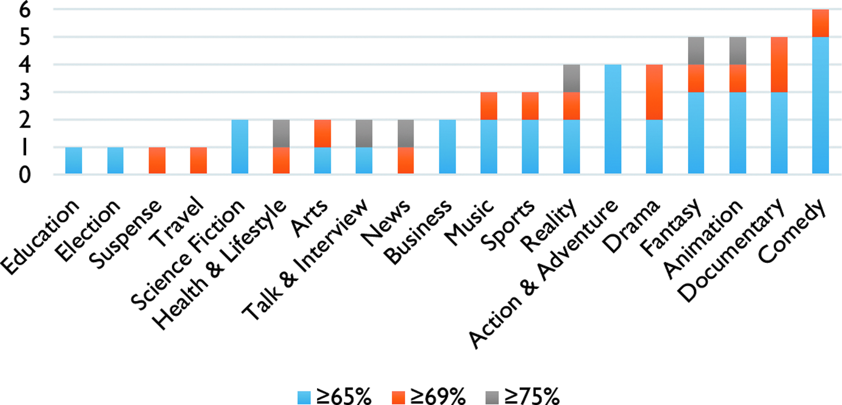
Informative programs by genre.
At the county level, where the base rate is 66.67% (110/165), there were four programs with accuracies over 70%. In the ten shuffled-election results datasets, however, there is no program with accuracy better than the base rate.
There are TV programs whose decision trees clearly categorize the counties and states to 2012 Democrats versus 2012 Republicans. Duck Dynasty, which is predictive at both county and state levels, is an illustrative example for such shows. Duck Dynasty's county-level tree (Fig. 2) accuracy is 75%. The Duck Dynasty's logit also corroborates its tree (i.e., the odds of voting for republicans increase as the in-tab electorate watch more Duck Dynasty). Duck Dynasty's accuracy is 80% at the state level. The logistic regression results for both state and county levels analyses are provided in the Appendix.
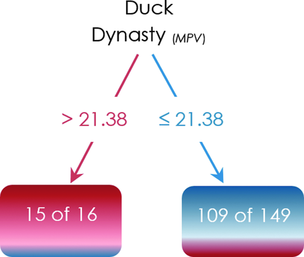
County-level tree example. MPV, minutes per voter.
At the other extreme The Daily Show with Jon Stewart is among the shows whose trees separate the states into Democrats versus Republicans. The show's predictive accuracy is 82% at the state level (Fig. 3); however, it was not among the informative shows at the county level. The trees' confusion matrices are provided in the Appendix.
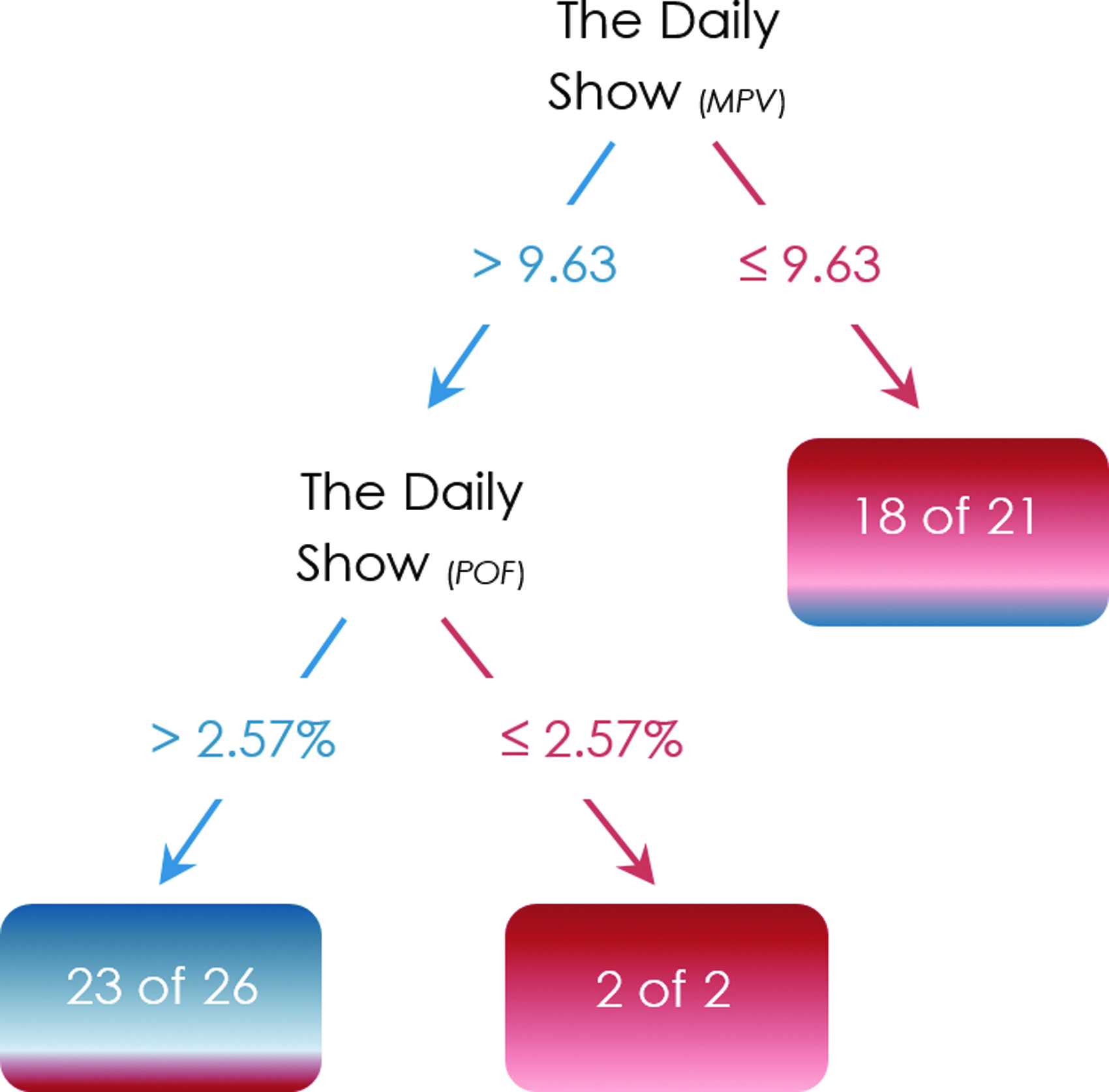
State-level tree example. POF, percentage of fans.
Interestingly, these results from TV watch data are in line with the Facebook Data Science report on the 2014 midterm elections where both Duck Dynasty and The Daily show are located at the two extremes of the television programs political spectrum. 6 It should be noted, however, that “heavy versus light watch” is not the only pattern among the program trees for predicting the election outcome. As an illustration, there are programs whose moderate watch categorizes the county as Democrats, whereas its heavy and light watch categorize the county as Republicans.
We conclude this section with comparing the distributions of the time that the 2012 Democratic and Republican states (and counties) spent watching the thirteen distributors' programs. Specifically, we examine the data to see if there is a significant difference between the 2012 Democratic and Republican states (and counties) with regard to any attention allocation inequality.
Using the state-level and county-level data that are generated using the second schema (Table 2), for each political division, we first extract the Gini index as a measure of distributors watch inequality. The Gini index of zero corresponds to a scenario where the state's in-tab electorate spent equal time watching each distributor's programs, whereas the Gini index of 100% means that the state's in-tab electorate spent all the time on watching the programs of one distributor.
We conduct an analysis of variance (ANOVA) to compare the distributors watch inequality in 2012 Democratic and Republican states/ counties. At both levels of analysis ANOVA is relatively robust with respect to the normality assumption as both Democrats and Republicans contain more than twenty observations.
7
Furthermore, at both levels of analysis the Levene's null hypothesis
Both state and county levels ANOVA results demonstrate that the mean of the watch Gini index in Republican states/counties is significantly greater than the ones in the Democratic states/counties (α = 0.05; ANOVA results at the state and county levels are provided in the Appendix). Specifically, the mean of the Gini index for Democratic and Republican states were
Battleground Analysis
An important set of states that deserves subtler attention with regard to the trees structures and performance is the battleground—that is, swing/purple states. Specifically, in this section we want to see if it is possible to train a program tree with the watch behavior in the safe states until the election day, to subsequently forecast the presidential election outcomes in the swing states. Colorado, Florida, Iowa, Nevada, New Hampshire, North Carolina, Ohio, Virginia, and Wisconsin were the states that The Washington Post highlighted as the battleground prior to the 2012 election. We also include Pennsylvania in the battleground, as suggested by other sources (e.g., Reuters).
We train the Daily Show's election tree with the 39 safe states (we do not include Alaska and Vermont; see “Data Preparation”). Figure 4 depicts the tree trained on the safe states. We let the Daily Show tree predict the election outcomes in the ten unseen purple states. Table 4 demonstrates that except for Nevada and Wisconsin, the tree predicts the election outcomes in the battleground states correctly, even in North Carolina, the only purple state that voted for Republicans in 2012.
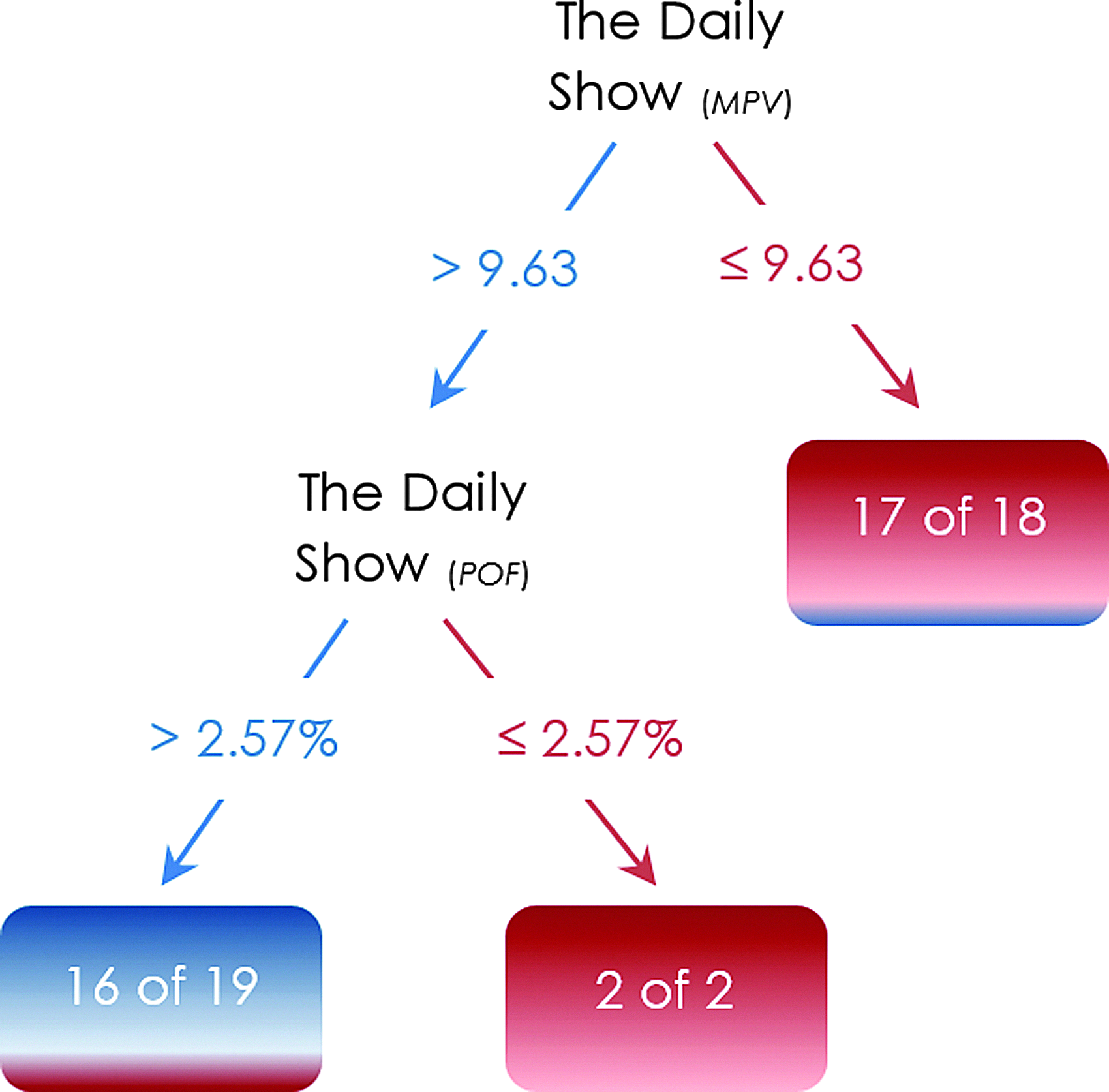
The Daily Show's election tree.
This is interesting since the tree was trained on the safe states with the base rate of 56% (22/39) and yielded the predictive accuracy of 80% on the battleground states that are 90% Democrat.
As explained earlier, the election tree in Figure 4 was trained with the Daily Show watch in the safe states whose vote outcomes could be assumed before the election (i.e., the tree does not have to be trained ex-post the election). In the same vein, the watch measures (i.e., predictors) are projected using the watch data until November 5, 2012 (i.e., a night before the election). Accordingly, the program election forecasting trees could be set up a night before the presidential election. Similarly, Nate Silver's forecasting model achieved 51/51 accuracy by flipping the results in Florida on the night before the 2012 presidential election. 9
At the county level we examine four conditions that deserve further investigation:
1. The unseen test data contains the counties that are in the battleground states (n = 61, 28 Republicans and 33 Democrats). These 61 counties are excluded from the data; the training dataset includes the remaining 104 counties. 2. The unseen test data contains the counties that have that have narrow victory margins— i.e. less than 6% (n = 33, 10 Republicans and 23 Democrats). These 33 counties are excluded from the data; the training dataset contains the remaining 132 counties. 3. The unseen test data contains the counties that have narrow victory margins and are in the battleground states (n = 14, 5 Republicans and 9 Democrats). These 14 counties are excluded from the data; the training dataset includes the remaining 151 counties. 4. The unseen test data contains the counties that voted differently than the states that they belong to (n = 42, 32 Republicans and 10 Democrats). These 42 counties are excluded from the data; the training dataset includes the remaining 123 counties.
For each test, we first train the Duck Dynasty election tree (Fig. 2) with the training data and subsequently let the tree predict the election outcomes in the corresponding counties of interest. It is noteworthy that the set of populated counties in the present study is skewed (i.e., 110 Democrats and 55 Republicans), which can potentially harm the first and the last tests as the test data sets contain more than half of the republican counties. Nonetheless, the predictive accuracy of Duck Dynasty's tree is 69.7% and 71.4% in the second and the third tests respectively, again suggesting the potential value of such models.
Discussion
In this research we analyzed voluminous television watch data and highlighted the potential of forecasting the presidential election outcome from data about who watches what television programs. The corresponding trees are not meant to imply causality or compete with election forecasting models, but suggest the potential in making predictions from TV watch data alone. We also found that the models are robust with respect to the battleground states and the counties with narrow victory margins.
At a broader level, this paper presents yet another example of how big data can be used to make potentially obvious connections. The conjecture that people who vote for a political party may watch certain shows with higher propensities than those who vote for a different party is likely one that is potentially obvious as well, at least for some shows. We provide evidence here in support of this. More interesting, we show that it may even be possible to forecast outcomes in real time, since “labeled data” can be assumed to exist since U.S. presidential elections are often characterized by many “safe states” or “safe counties” where the outcomes can be assumed prior to the election. Using such labeled data might provide valuable predictions for the swing states and counties, which are clearly the focus for the campaigns as well.
The present study is subject to a number of limitations. Regarding the panel data, it is not an unlikely scenario that an individual leaves her TV on yet not watching the program. Unless the panelist explicitly pauses the tracking there is no way to determine if this happened. Our conjecture though is that although this could affect the minutes watched (MPV) it does not affect the choice of the specific channel or program that is left on, since the person most likely chooses to pick this program/channel. Another limitation concerns the watch measure POF as its definition is certainly ad hoc as noted earlier. Lastly, there are other aspects of program watch that could be incorporated into the analysis here such as the timing of program watch (e.g., morning, afternoon, evening). In ongoing work we are continuing to work on various extensions.
Of course, there is a lot more data beyond TV watch data that could be mined for political signals. If data on what sites users visit, what searches they make, and what shows they watch were all available in the days or weeks prior to an election, it is perhaps likely that the outcome might be forecasted in many cases even before the actual election is held. Hence the days of true surprise about actual election outcomes in the big data world are likely to be fewer in the years ahead—at least to those who may have access to such data.
Our results also have implications for political advertising, given that billions of dollars are spent in presidential elections by the campaigns. Here we discuss a few ways political advertising might change in a world of big data driven analytics. First, these models identify programs that are potentially correlated with voting outcomes (clearly there is no assumption on causality; i.e., viewing a show is unlikely to make a voter change their decision). While shows like The Daily Show might be obvious for political pundits, these models can identify many other less obvious shows that have such connections. Campaigns can use such programs for messaging, sometimes at potentially lower costs since these programs may be relatively less known for their political signal correlation. Second, these models might in real time provide signals on the relative outcomes within a battleground state/county. Based on the directions of these signals campaigns can potentially consider stepping up (or down) advertising in those regions. While attention is often paid to where to advertise, the question of when to adjust the levers, to spend more or to spend less, as the days roll by leading to the election, is one that deserves a lot more attention. Being efficient in such decisions can result in the most effective use of campaign funds.
Footnotes
Author Disclosure Statement
No competing financial interests exist.
Abbreviations Used
Appendix
| True Republican | True Democrat | Class precision | |
|---|---|---|---|
| Predicted Republican | 15 | 2 | 88.24% |
| Predicted Democrat | 40 | 108 | 72.97% |
| Class recall | 27.27% | 98.18% |