
Abstract
Questions of trust are increasingly important in relation to data and its use. The authors focus on humanities data and its visualization, through analysis of their own recent projects with museums, archives and libraries internationally. Their account connects the specifics of hands-on digital humanities work to larger epistemological questions. They discuss the sources of potential mistrust, and examine how different expectations and assumptions emerge depending on the use and user of the data; they offer a simple schema through which the implications may be traced. It is argued that vital issues of trust can be engaged with through design, which, rather than being conceived as a cosmetic finish, is seen as contributing insights and questions that affect the whole process. The article concludes with recommendations intended to be useful in both theory and practice.
Keywords
Introduction
In the context of visualization, a fundamental question about trust, ‘Can I believe what I see?’ takes on a particular cogency. Data visualization, for us, serves a number of functions including exposition, exploration and analysis. In museums, archives and libraries, the end-user may be a member of the public (a highly varied constituency), curator, educational outreach officer, historian, researcher, administrator, or in some other role. They may be a passive observer of the visualization, or have varying degrees of interactivity and control. We show later that their role has a significant effect on their expectations of trust.
We write at a time of widespread concern with questions of trust in data and computation. We first discuss some of the general issues, then focus on the ways that these questions are manifested in data visualization. We provide examples from our own work with ‘cultural data’ that is now fundamental to the work of cultural institutions. We end with some broad principles that we propose should inform future work in this field. In doing so, our discussion connects the specifics of hands-on digital humanities work to larger epistemological questions that extend beyond the confines of our discipline(s). We write as critical designers, that is, as designers engaged with research and intellectual inquiry as much as with ‘mere’ appearance. We work collaboratively with curators, archivists, librarians and researchers. Our expertise includes software engineering, visual design and interaction design. Most of our work deals not with quantitative but with nominal data, typically involving multiple attributes of discrete entities, and often organized according to time. This brings into play issues around the nature of entities and the precision with which their properties can be defined. While visualization may transmit or even exacerbate problems related to trust, we will suggest that, rightly used, it may also be part of their solution, in which design plays a vital role.
Current issues of trust and data
Data and its use are attracting increasing attention. Recently over 90% of respondents were concerned about the data that companies can collect about them (Microsoft Corporation 2020, 6). Examples have emerged of significant omissions in data, prejudicing policy and decision-making (Williams, Brooks, and Shmargad 2018; Criado-Perez 2019; Favaretto, De Clercq, and Elger 2019; Linder and Svensson 2019). Uncritical use of data derived from past practice will tend to embed and perpetuate discrimination (Žliobaitė 2017; Noble 2018; Obermeyer et al. 2019; Park and Humphry 2019; Babuta and Oswald 2020; Givens 2020). Language datasets perpetuate the human biases captured in the data (Bolukbasi et al. 2016; Caliskan, Bryson, and Narayanan 2017), as do image datasets (Buolamwini and Gebru 2018; Crawford and Paglen 2019; Prabhu and Birhane 2020). Misuse of data may be innocent, but also malicious (Briant 2018; Ward 2018).
Issue of trust in cultural history and its data
Models shaped by past human behaviour are necessarily models of a particular cultural context including its prejudices (Underwood 2018). Cultural institutions have their own particular problems with data and its use, including the very objects they contain: for Dekker (2018), the product of plundering, looting, and unethical practices. Huxtable et al. (2020) document the legacies of slavery and empire in the UK National Trust. Sheppard (2010) shows how Petrie's collecting owed as much to eugenics as it did to Egyptology. With digitization, a range of new problems arise. What constitutes ‘scholarly data’ may be contentious; rich pre-digital metadata may be lost in digitizing records (Setlhabi 2012; Tóth-Czifra 2020, 237); false precision and quantization may arise when uncertain information such as dates is digitized (Kräutli and Boyd Davis 2013); changes in place-names and boundaries can lead to misleading geo-coding (Bouk 2020, 5).
The inherent characteristics of cultural history
An important aspect of cultural history and therefore of Digital Humanities, unlike most of the hard sciences, is that subjectivity, lack of precision, and conflict of opinion are inherent to both the material under study and the processes applied. Various kinds of uncertainty are unavoidable and fundamental to historical work (Nyhan and Flinn 2016; Edmond 2019; Franke et al. 2019). Vagueness ‘plays a crucial role in humanistic models’ (Martin-Rodilla and Gonzalez-Perez 2019). When subjectivity and imprecision of history are defining characteristics, this affects trust in a particular way. Presenting data, the task is seldom to maximize the user's trust in it and its transformations, but rather to reveal the extent to which these may be untrustworthy.
There is increased recognition of the issues involved in representing subjectivity and uncertainty, including visually (Nowviskie 2004; Drucker 2011; Nowviskie et al. 2013). The problems of specious authenticity in digitally ‘reconstructing’ archaeological sites have attracted considerable attention (Strothotte, Masuch, and Isenberg 1999; Schäfer 2018; Lengyel and Toulouse 2020).
Three broad categories of problem, shown as columns. Each column is populated with indicative examples related to issues of trust, against the three phases identified at the left.
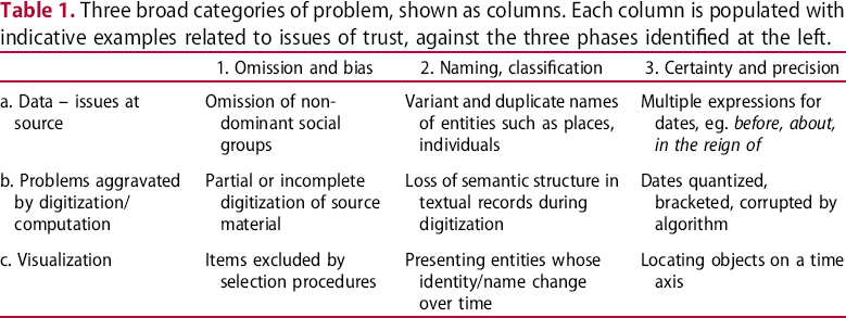
Problems of trust 1: omission and bias
Omission and bias: data – issues at source
Problems of omission and bias within data show up in cultural history in both familiar and distinctive forms. Moltrup (2019) highlights the under-representation of women in archives of graphic design. Klein (2013) highlights Thomas Jefferson's slave Hemings, who never appears in Jefferson's correspondence as a writer, yet is extensively written about. Klein reveals Hemings’ ‘ghost’ by graphically mapping his every appearance. Agostinho, Dirckinck-Holmfeld, and Søilen (2019) similarly make visible the occluded documents of Denmark's slave trade. While not all omission and bias in cultural data is so political, it still matters greatly to the historian.
Omission and bias: problems aggravated by digitization/computation
When faced with a digital display of search results, how do we know that what we are currently looking at is all there is, all that is relevant? Murphy and Villaespesa (2020) point to museum bias and machine bias combined. Back in 1987, Conklin pointed out the particular difficulties arising from the loss of physical cues in the digital (Conklin 1987, 21). At London's Victoria & Albert Museum, Vane worked on the Royal Photographic Society collection that had recently been transferred from the Science Museum Group and was in the process of being digitized through reproduction and digital cataloguing. Representing the history of the art of photography, it includes over 270,000 photographs. Vane began visualizing the collection early, when only 2% had been digitized. The result was dominated by albumen prints and daguerreotypes simply because they had been digitized first. Isolated clusters elsewhere represented photographs by key figures such as Julia Margaret Cameron. Dialogue with museum staff revealed a convergence of practical reasons and wider institutional factors – particularly the opening of a new photography gallery – behind these biases. A member of staff referred to the particular themes selected as ‘a very V&A … story.’ Clearly, institutional policy and culture leave distinctive ‘fingerprints’ on collections and their digitization – which visualization may uncover. The distribution of items at this stage was unrepresentative of the total collection; it might have been incomprehensible without access to expert insider knowledge. Visualization by a designer was revealing, but what it revealed required the specialized knowledge of curators to explain.
In a second context, Living with Machines, a five-year collaborative project using digital collections and methods to explore lived experiences of industrialization in nineteenth-century Britain (LwM 2019a), decisions had to be made based on understanding the existing digitized newspapers in the British Library collection, and which new digitization to undertake. This involved trying to reconstruct earlier, sometimes opaque, choices behind previous digitization. Hauswedell et al. (2020) point out that there have been few in-depth analyses of the processes and motivations influencing inclusions and exclusions in such digital archives, while Tolfo et al. (2021) cite many other sources on the lack of transparency in digitization policies and the need for ‘paradata’ (Fyfe 2016) to account for past decisions. Online access to over 33 million newspaper pages might imply a representative selection, but is only about 6% of the physical newspaper collection (in turn an unknown percentage of newspapers originally published). Using an external, contextualizing source rather than the collection itself, Tolfo et al. uncovered an unexpected and substantial under-representation of the conservative press.
Omission and bias: visualization
In the project Dive into Color with the Cooper Hewitt Smithsonian Design Museum, Vane developed a visualization of the collection based on colour, at the request of the curators (Vane 2019, 78–99). Colour was seen as offering a visual way to explore a digitized collection for those without specialist knowledge, opening up fashions and innovation in colour technology among other themes, coinciding with a physical exhibition on colour theory and design. Considerable effort was put into devising and testing a user-friendly touchscreen interface and fine-tuning the algorithm that selected the collection objects in response to the user's choices. But behind the scenes lay colour data containing errors, derived from a previous computation of the colours in each digital photograph. This data, unsurprisingly, captured no information on the landmark nature of certain items in the collection and, in fact, just such a moment was missing from the visualization. As one of the curators remarked, Perkin's mauveine scarf, that is the invention of purple dye in 1856, doesn't show up on here. But we're calling it a major moment in color history [it is the invention of the first synthetic dye] … If there are key points, we want to make sure they aren't missed in this interaction.
Problems of trust 2: naming, classification
Our focus on data that is generally nominal or categorical rather than quantitative introduces a particular need to address issues of naming and classification.
Naming, classification: data – issues at source
Libraries, archives and museums may be simplistically conceived as collections of objects, for which they hold data and metadata commonly structured as a catalogue that involves naming, classification and the assignment of various attributes. Naming and classification schemes are institutionally contingent (Hooper Greenhill 1992) and culturally contingent, reflecting the locus of cultural power (Berman 1971; Harris and Clack 1979; Cherry and Mukunda 2015; Duarte and Belarde-Lewis 2015). Cultural entities are not always the well-defined units we might imagine, nor is their identity necessarily easy to establish. Bell and Ranade (2015) tackle the surprising difficulties in ensuring the identity of historic individuals using name, date of birth and other standard attributes through algorithmic entity matching. A particular problem is the mutability of apparently unitary cultural entities. White and Dunleavy (2010, 16) show how, of the roughly 20 UK government departments, only 4 remained broadly unchanged in the period 1979–2009, with most experiencing multiple mergers, splits and renamings. We discuss below how we have tackled the changeable form of a ‘single’ text, the Sphaera of Sacrobosco, and traced the changing identities of historic newspapers. Additionally, of course, few objects can be regarded as simple: they have constituent elements, which themselves may be hard to classify unambiguously. Within an apparently single text, fragments as small as individual words may need a provenance trail with connections both internal and external (Kuster et al. 2011, 317). Valleriani, Kräutli et al. (2019) describe a process of document atomization into texts, illustrations, and tables, that may encounter multivalent objects such as illuminated capitals that function as text parts, decorative elements and illustrations.
Naming, classification: problems aggravated by digitization/computation
In the V&A photography work already discussed, we applied machine intelligence to the question of visual similarity. This was based on the calculation of feature vectors, multi-dimensional numerical representations of images describing their visual characteristics, a technique of increasing interest to support search in cultural image collections (Yale University Library Digital Humanities Lab 2017; Pim 2018). It raises important questions about the trust we place in algorithms in these contexts, and the transparency and comprehensibility of machine intelligence more generally; Ayesha, Hanif, and Talib (2020) discuss how transforming high dimensional to low dimensional data risks losing essential information. In their view, selection of a suitable method according to the type of data remains a key issue to be addressed. Our own similarity computation (deploying the Keras library written in Python) used a pre-trained VGG16 model (Simonyan and Zisserman 2015) previously trained on the ImageNet database. At the time we were unaware of the highly problematic nature of ImageNet's labelling later revealed by Prabhu and Birhane (2020), but fortunately our work only involved the graphic content of the images.
Similarity computation offers natural-seeming and understandable visual paths through a collection in ways that are not possible with cataloguing data alone. Unfortunately, it also produces results of which the user has every right to be suspicious. As with the Cooper Hewitt colour computation discussed above, extraneous objects in the image such as colour charts and rulers inevitably mislead machine calculation of similarity. Similarity is computed that seems obscure or unhelpful to the human user. In one case an image returned by the algorithm turned out to be the back of a historic photograph, whose blotchy surface was deemed similar to a photograph of a grassy field. Some lace was computed to be similar to dewdrops on a leaf. As with the issues discussed above, a key problem is not visibly nonsensical results. The problems are that images that ‘should’ have been returned as similar (by the standards of human judgement) may not be – and the user will be unaware of the omission – with no indication of the machine reasoning available. In this case, even we, as programmers and designers of the visualization, did not have access to the inner workings of the similarity computation process (Figure 1).
Annotated t-SNE plot of the Royal Photographic Society data at the V&A. t-SNE is a form of Stochastic Neighbour Embedding, a nonlinear dimensionality reduction technique. Visual design and coding: Olivia Vane 2019.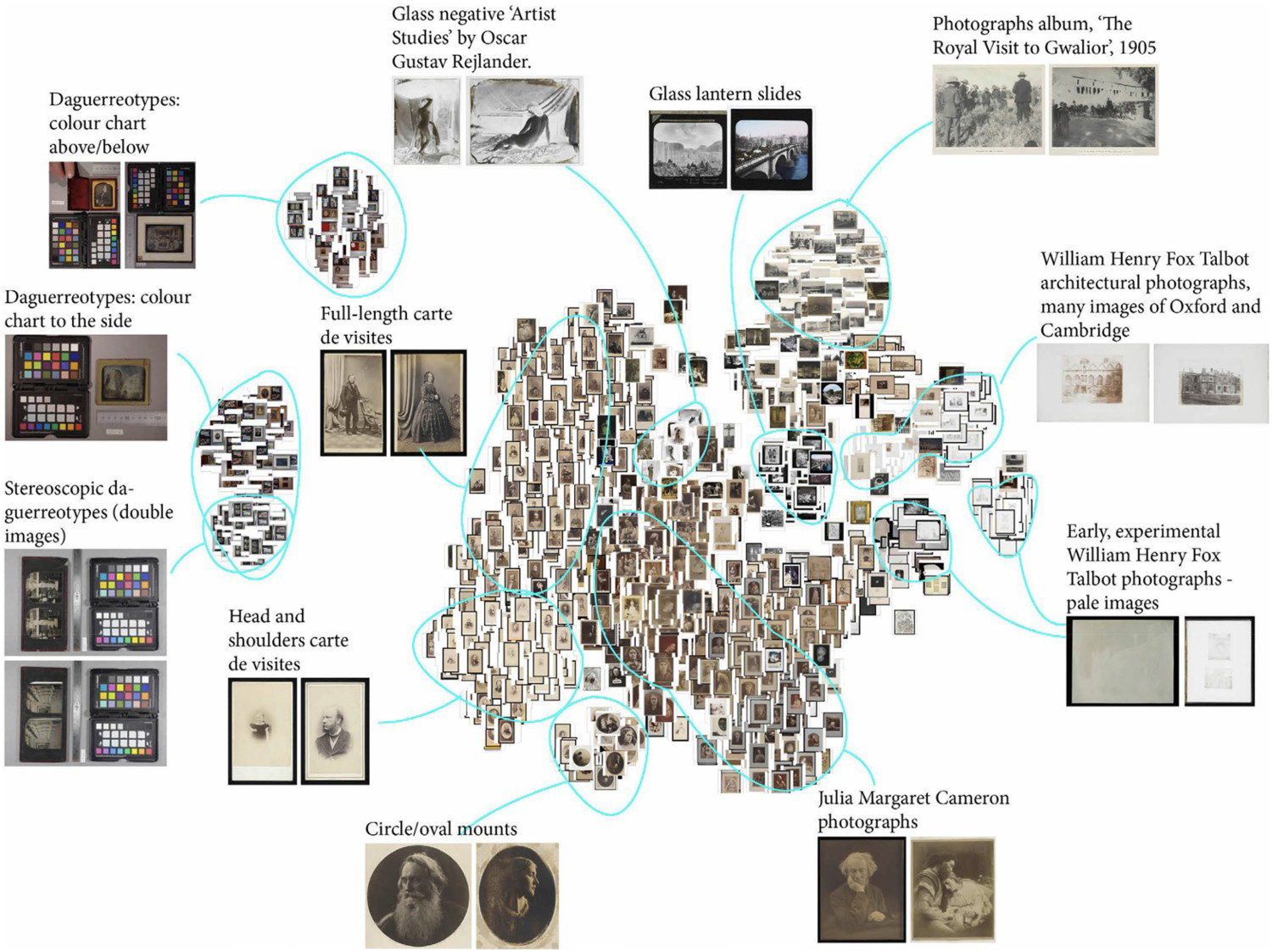
As already discussed, questions of trust are highly dependent on both the use and user of such visualizations. If, as in this case, the visual interface is designed to encourage serendipitous exploration by a wide range of users, and seems to offer no guarantees of infallibility or completeness, both the designer and user can perhaps afford to be somewhat careless of trust. But for any kind of serious scholarly work, such an approach would be unacceptable. There is also a risk of raising expectations that cannot be fulfilled. A V&A curator dreamed of searching for all studio photographs containing the same painted background, as an indicator that they were taken at the same studio, but in practice this would almost certainly be unreliable in accuracy and completeness. To a historian, such questions are not incidental but fundamental. In an earlier project, with the Wellcome Library (Vane 2019, 43–57) the question arose of how to manage the display of large result-sets. Historians interviewed had divergent views about the use of relevance ranking to filter the results. For some, it was an acceptable means to control the possible information overload, but others felt that a general algorithm could never anticipate the specificity of their search and would be unhelpful. There was agreement on the need to be explicit about removing any results if a filter has been implemented, and that there ought always to be an option to see all the results if a user wished. Trust and transparency in the processes by which results are returned was very important for these users: ‘when it comes to academic research … what I conclude from your tool feeds into my reputation.’ This echoes previous research in search interface preferences for historians, demonstrating how they value control in aspects of searching and browsing (Crymble 2016).
Naming, classification: visualization
We introduced above the problems associated with the ill-defined nature of entities. In our early visualization of the entire Tate Gallery collection (Kräutli 2016, 145–150), the large disk shown at centre (Figure 2) testifies to the overshadowing dominance of Turner in Tate's collection, accounting for about 40,000 works, or more than half of the entire art collection. It transpires, however, that most of these works are actually individual pages of Turner's sketchbooks. His dominance is, in part, the result of a decision to catalogue every single page as an entity in its own right.
Visualization of the Tate Gallery collection, showing the combined real and misleading dominance of Turner. Algorithmic and visual design: Kräutli 2014.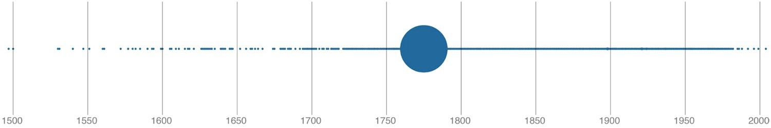
In our more recent work, we have directly addressed the problem of the mutable cultural object in two projects. In the British Library newspapers project introduced above, a complexity emerged that exemplifies the problem (Tolfo et al. 2021). Newspaper titles undergo incorporations, amalgamations, and name changes through time. For example, The Athletic Reporter in 1886 had three new names before becoming The Coventry Reporter and General Advertiser in 1890. The British Library dataset treats each as a new and separate title. Fortunately, the connections between titles are recorded under two facets: ‘preceding title’ and ‘succeeding title’, though the nature of the connection, eg. amalgamation, is not made clear. For many purposes, these connections needed to be apparent in a visualization. The Press Picker (Figure 3) reunites discrete newspaper titles and indicates bound volume and microfilm holdings of each over time. It has proved a valuable tool within the project, making previously inaccessible structures visible.
Press Picker visualization, reuniting discrete newspaper titles and indicating bound volume (black/dashed line) and microfilm (red line) holdings over time. Connected titles are brought together with a branching design at the left of the line graphs. Algorithmic and visual design: Olivia Vane, Kasra Hosseini and Giorgia Tolfo 2020. Data: British Library 2019.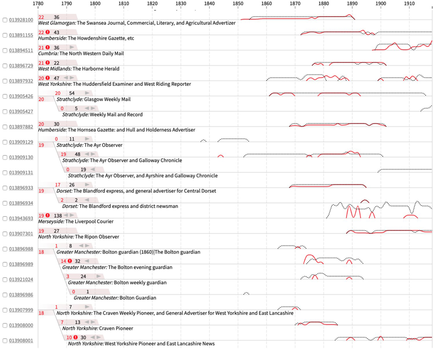
The project Sphaera: Knowledge System Evolution and the Shared Scientific Identity of Europe (sphaera.mpiwg-berlin.mpg.de) is investigating how scientific knowledge evolved during the early modern period (Valleriani et al. 2019). It traces the history of a specific treatise around which a corpus of other sources accumulated, the Tractatus de Sphaera of Johannes de Sacrobosco, in 359 different editions printed in 41 European cities between 1472 and 1650. The corpus is collected in a database, CorpusTracer, using CIDOC-CRM to represent ‘text parts’ (see Kräutli and Valleriani 2018 for definition and discussion), such as the Theoricae novae planetarum of Georg von Peuerbach which began being printed together with the Sphaera as early as 1482, or much shorter text parts – ‘original part’ and ‘adaption’ including ‘annotation’ and ‘translation.’ A total of 563 text parts were identified, of which 239 were considered important because they reappeared more than once in different years, in a total of 1,653 appearances. Thus while the Sphaera might loosely be considered as a unitary ‘book’ in several editions, the original treatise becomes a label for the field of geocentric cosmology comprising a multitude of treatises (Zamani et al. 2020). The underlying linked-data structure, assisted by visualization (such as Figure 4), allows access to a sophisticated model of its internal and external relations.
The Sphaera corpus presented as time-slices. The red dots are nodes that represent books, linked by the blue arcs. Algorithmic and visual design: Valleriani et al. 2019.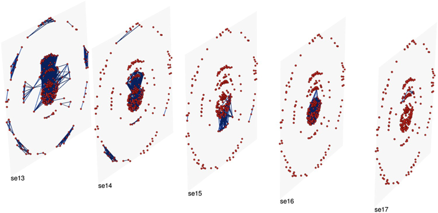
Apparently, simple classification masks a wealth of difficulty over terms such as content illustration, frontispiece, printer's mark, title page, initials, title page illustration, even the term page itself. The nature of the object, and its relation to the digital object, is eternally problematic.
A recent state of the Sphaera data model is reproduced here (Figure 5). It captures the bibliographic data of each treatise as well as data on the individual texts they contain. It continues to be adapted and extended in response to new findings. There is a clear tension here between the honesty and the complexity of such a diagram. While it captures explicitly and visibly each relation between facets of knowledge, it may be intimidating to many humanities scholars, who by default are instead presented with conventional data-entry screens rather than the underlying map. The project raises important questions about the interrogability of data-structures that are inevitably also records of curatorial and scholarly decisions. At least here the model is accessible for those who wish to explore it.
The CIDOC-CRM data model used in the Sphaera project. It captures the bibliographic data of each treatise as well as data on the individual texts they contain. Model architecture: Kräutli and Valleriani 2018.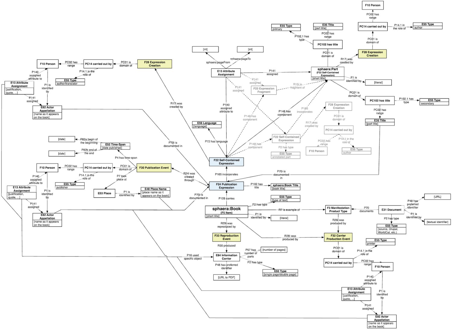
Problems of trust 3: certainty and precision
We have discussed how uncertainty and imprecision are inherent characteristics of most humanities data and processes. There have been many useful definitions and taxonomies of uncertainty (Pham, Streit, and Brown 2009; Skeels et al. 2009; Schäfer 2018; Therón Sánchez et al. 2019; Windhager et al. 2019). Distinctive humanities sources of uncertainty include language changes over time, spelling variations, transliterations, OCR errors, and sources written in multiple languages (Won, Murrieta-Flores, and Martins 2018; Smith and Cordell 2019), unfaithful digitizations of artists’ colours (Malis 2020), and the inherent (non)equivalence of translation (Franke et al. 2019). Cottrell (2017) found ‘circa’ with dates in 11 cultural collections, from 0.6% of records (Wellcome Library) to 67.8% (State Hermitage Museum) while Kräutli (2016, 77) found more than 60 expressions used to express imprecision of date in Victoria & Albert Museum collections data. Burgess (2016, 89) found that provenance information with uncertain or incomplete times was rarely able to be adequately captured.
Van Ruymbeke, Hallot, and Billen (2017) extend CIDOC-CRM to represent conflicting opinions about a historical object. Moncla et al. (2019) discuss an approach to the problematic geolocation of place names in the great eighteenth-century Encyclopédie ([1766] 2017) using qualitative relative locations rather than coordinates. But digital interventions also introduce new problems, especially when responding to conflicting or imprecise sources.
Certainty and precision: data – issues at source
Among the many issues of inherent imprecision, contestability and other uncertainties within the (digital) humanities, we focus now on a single problem that we have investigated in some depth: that of dates. We discussed above the longitudinal history of a ‘single’ publication with its mutable instances of the apparently simple object over time. Even records for apparently unitary objects may have multiple dates referring to the item's history: dates of production, accession, cataloguing, exploitation such as loan or exhibition (Kräutli's time maps are unusual in capturing such events [Kräutli 2016, 215–217]). In Swedish Open Cultural Heritage data, Vane (2019, 21) found multiple dates even for an item's ‘production.’ Historic buildings may have production dates for rebuilding, extensions, remodelling, etc. – a church had 46 such dates. A photograph may have a different date for when it was taken, and when it was printed, and more. In visualization, which production date (or how many dates) could and should be represented? Even a printed date of publication may conceal unexpected invitations to mistrust. The National Library of Scotland database of historic Ordnance Survey maps (https://maps.nls.uk/os/; NLS Maps 2020), notes early sheets reprinted with updated information added (for example adding in a new railway), but with no change to the printed publication date, and 1930s and 1940s maps where the printed ‘publication’ date is after the date of ‘revision.’
Certainty and precision: problems aggravated by digitization/computation
When turning data into numbers for visualization, decisions must often be made that could be evaded when using words or quasi-numeric expressions for approximation. Windhager et al. (2018), in a survey of 70 visual interfaces to cultural history, found 60 that deployed temporal ordering; this forces the designer to make choices about dates and precision. Both Kräutli (2016) and Vane (2019) have worked extensively with these problems, revealing that, in any but the simplest cases, there is no ‘right’ solution, especially in the typical situation where dates in a dataset are specified with widely ranging levels of precision. As Rocha Souza et al. (2019, 21) discovered, to locate full-century dates, such as ‘C18,’ as though they belong to the mid-century year, produces potentially misleading quantized spikes at those dates. Assigning them a random date in the century is no more satisfactory, since it invites the user to make perhaps wrong inferences about sequence, and even cause and effect. In the Cooper Hewitt visualizations discussed earlier, Vane attempted to overcome this problem by distributing the icons – miniature representations of the museum objects themselves – within chronographic displays in a dithered pattern, aiming to discourage the user from forming uncalled-for quantitative or sequential judgements. Arguably this satisfies the standards of trust appropriate to a browsing member of the public but is quite unsuitable for scholarly work.
Estimation and precision: visualization
Visualization has been long recognized as dangerously persuasive. Priestley, an originator of modern visualization, identified its deceptive power (Priestley 1764, 7–8) as have many others more recently (Tufte 1983; Wainer 1997; Cairo 2019; Kosminsky et al. 2019). Priestley realized that his invention of a single line to represent each life within a biographical timeline (Priestley 1765) invited the user to imagine that the start and end of each life were known with precision, so he pioneered the visual expression of uncertainty, grading it into five levels using varying quantities of dots at the ends of his lines (Boyd Davis and Kräutli 2015). Despite this early intervention, there has been little empirical research on the effectiveness of particular graphic approaches in representing uncertainty (MacEachren et al. 2012).
Windhager et al. (2019) specifically address the visualization of uncertainty in relation to cultural data, and point out how issues of trust will be different for different kinds of users. They discuss two kinds of end-users, but, as we have noted, there are important differences also within organizations, such as the difference between outreach staff and curatorial staff, and in the purposes of particular visualizations. They present the representation of uncertainty as a key strength of proper scholarship, implicating questions of trust, where representing uncertainty ‘values veracity, rigor, and truthfulness above all else’ eschewing ‘prettified or euphemized representations.’ Franke et al. (2019) also emphasize how confidence lies in the relation between the evidence and the historian, whose expertise is a strong influence.
There is widespread concern that the techniques to represent data vagueness emerged from the hard sciences, and lack the expressiveness required for humanistic contexts, a difficulty that ‘only increases when we try to implement these models as software systems to organize, query, annotate, or search data and assist in the generation of new knowledge’ (Martin-Rodilla and Gonzalez-Perez 2019). Bowman (2019) sees standard graphic conventions such as error bars as counterintuitive in their hardness, recommending tone as a better visual analogy. He emphasizes that the graphic image is an intermediary between the underlying data and the user. Kräutli similarly found that his format to model uncertainties graphically (Kräutli and Davis 2013) risked implying greater confidence about the degree of uncertainty than was supported by the data. D'Ignazio and Klein (2020, 90–92) suggest digital graphics should enact, not depict, uncertainty, for example using movement. Tackling subjectivity, Tateosian, Glatz, and Shukunobe (2020) create maps that show, not only the dispositions of the troops at Gettysburg, but participants’ sometimes fatally erroneous perceptions of those dispositions.
Conclusions and recommendations
We have discussed three components of cultural historical visualization and the broader digital humanities, that have implications for trust – omission and bias, naming and classification, certainty and precision – and shown these manifested in the source data, in digital transformations, and in visualization. We now distil these issues into four recommendations, focusing on the need for: principles and policies within organizations; interdisciplinary working and knowledge sharing; interrogability of data, processes and systems; and an ethical commitment to eliciting scepticism.
Principles and policies are needed in organizations
The Ada Lovelace Institute (2020) calls for issues in data projects to be assessed before implementation, and for their nature and impact to be analysed afterwards. Cultural organizations increasingly recognize that they must account for their past and present collection policies (Gazi 2014; Kidd 2017; Giblin, Ramos, and Grout 2019), and their role in broader society (Sandahl 2019); they have similar responsibilities in relation to data (Chilcott 2019; Wright 2019). Lin et al. (2020) expect repositories to earn the trust of the communities they serve, including by conforming to standards. Poletti and Gray (2019) see data as questioning, not just as representing: digital scholarship and visualization take on a critical role, with implications for the design of the tools and processes employed. For Burgess (2016, 83) the apparently familiar concept of provenance is as much about subsequently created (meta)data as the original object. Tolfo et al. (2021) similarly demand early and thorough documentation of digitization processes, together with institutional capacity to share this information publicly. This has implications for our next recommendation.
Interdisciplinary working, including designers, is a benefit
We have noted on several occasions the limits on making sense of data, including through visualization, without contextual knowledge. Tóth-Czifra (2020) emphasizes the loss of essential expert interpretation when records are digitized: personal decisions, inevitably biased because human and contingent, foreground certain information while other knowledge risks loss by being tacit. Ruis and Shaffer (2017) also demand engagement with the source material and the context in which it was produced. In technical processes such as dimensionality reduction or network analysis, human collaboration with computation is often needed to achieve accuracy (Ayesha, Hanif, and Talib 2020) or to validate the underlying model (Ruis and Shaffer 2017). D'Ignazio and Klein (2016) similarly express concern at the misinterpretation of data once it is isolated from its context.
Visualization, and the involvement of designers, cannot be regarded as a simple, one-way process that receives data, organizes and displays it – as our vertical pipeline in Table 1 might suggest. Kandel et al. (2011) emphasize early-stage use of visual tools that integrate verification, transformation, and visualization to discover problems. This can only be effective if visualization is integrated into the interdisciplinary discourse at the heart of projects. Just as there is no neutral data, there is no neutral visualization: the intention must therefore be based on a shared understanding of the objectives across disciplines (Vane 2019, 126). The power of science-humanities collaborations is increasingly recognized (Williams 2019; LwM 2019b). The first of Kusner and Loftus (2020, 35) five measures against bias is interdisciplinary collaboration, including between data-scientists and humanists, to better understand the context of the data used to train the algorithms. For Underwood (2018) we need both mathematical inquiry about culture, and cultural criticism of the mathematical models used. Trček (2009) points out how technical questions in computer science increasingly require an understanding of the temporal, subjective and qualitative nature of trust. But as Griffin and Hayler (2018) argue, challenges then arise including competing disciplinary norms, actual and perceived inequalities within knowledge production, and the denigration of certain kinds of expertise, both during projects and when they are reported as research.
We have discussed elsewhere the varied relationships of design to knowledge, research and critical practice (Boyd Davis and Vane 2020). Dörk et al. (2013) emphasize the need to ask how values and intentions shape visualization practice and how visualization can influence, manipulate, and empower, in a critical approach that is reflexive about the tools, methodologies, and theoretical frameworks it employs. While data visualization has been taken to imply a distanced perspective that provides only summative overviews, it is increasingly able to support close reading of individual objects, challenging the traditional contrast between overview and detail (Junginger et al. 2020). To do this, designers will be obliged to engage with their subject-matter rather than ‘simply’ present data that is presented to them. Indeed, the whole question of the extent to which data alone, even visualized, can articulate meaning about collections is an open one (Boyd Davis, Vane, and Kräutli 2016). Our accounts of projects above show how useful design can be to other disciplines – as an interrogative, not a decorative practice – but also how much designers need to learn about the materials, projects, objectives, histories, cultures and other aspects of the collections and institutions they work with in order to make their fullest contribution.
The need for interrogability
Discussing big data, O'Neil (2016, 8) asks ‘How do you justify evaluating people by a measure for which you are unable to provide explanation?’ There is increasing concern at the lack of interrogability of machine intelligence. While the earliest systems were accessible to interpretation, this is no longer true of opaque decision systems, ultimately affecting people's lives, such as deep neural networks. There is a need for access to how they are generated (Barredo Arrieta et al. 2020). For Babuta and Oswald (2020, xii), human-interpretable features are essential to provide transparency. Smilkov et al. (2017) use interactive visualization to make the workings of machine learning systems more accessible. While current attention is on machine intelligence, we propose that interrogability should be the goal of all digital systems, including their institutional contexts. International bodies increasingly expect accountability and transparency in relation to personal data (eg. the EU's GDPR) and the same should be true of archival data (Goodman 2016). For the Ada Lovelace Institute (2020), audit systems should: aim to make data as trustworthy as possible; indicate where data or its representation should be treated with suspicion; provide users with the means to interrogate data and algorithms. Academic researchers and third-party investigators should probe and test data and its representation. D'Ignazio and Klein (2016) propose design process questions – can the team work backwards from given data to document provenance, and talk to the data owners? what are the roles and responsibilities of the team? – and design output questions: can a metadata visualization be provided that shows the provenance of the data and those responsible at each step? D'Ignazio (2017) advocates ‘data biographies,’ contextualising meta-data that captures the origins of datasets and their elements. Sacha et al. (2016) note how analysts themselves may be unaware of uncertainties in their data sources or of undeclared pre-processing, and may ignore the opacity of process within visual analytics systems. Kleinberg et al. (2018) point to a perhaps ironic advantage of algorithms that they formally codify knowledge and practice, in place of the ambiguity of human decision-making, thus potentially facilitating transparency. Edwards and Veale (2017, 81) point out that machine learning explanations are conditioned by the type of user: any explanation needs to be usable by its audience. Developing a visualization for recommender-system results that reveals some of the origins of its decisions, Verbert et al. (2016) found that users, as one might hope, place greater trust in explained than in unexplained results.
An ethical commitment to eliciting scepticism
Our final recommendation expresses an important epistemological position. At many points above we have noted how questions of trust are dependent on both the use and user of a visualization. We discussed the increasing interest in representing uncertainty of many kinds, including subjectivity and conflict of opinion. Lengyel and Toulouse (2020, 50) emphasize the ethical responsibility to communicate uncertainty through visualization: not just particular uncertainties but that archaeology (in their case) is fundamentally uncertain. Importantly, they are committed, not just to such honesty when serving experts: it is also their concern as scientists to convey uncertainty as a fundamental part of their discipline to the public. Elsewhere we have described (Boyd Davis and Kräutli 2015) the temptation, when designing a visualization for public exhibition, to tidy up the display, correct supposed errors and even omit data in order to create a clear picture that communicates a coherent history. Such tidiness, even for public consumption, risks presenting not only a deceptive view of historical events, but also of the nature of historical knowledge itself. As we have already stated, the task is seldom to increase trust in the data and its transformation. On the contrary, the task is usually both to accept and to reveal the extent to which they may be untrustworthy.
Footnotes
Acknowledgements
We gratefully acknowledge the collaborations with our colleagues at our own institutions and at our partner organizations. We thank the reviewers of the draft of this article for their valuable suggestions.
Disclosure statement
No potential conflict of interest was reported by the author(s).